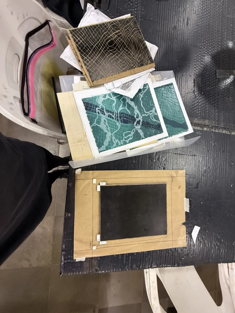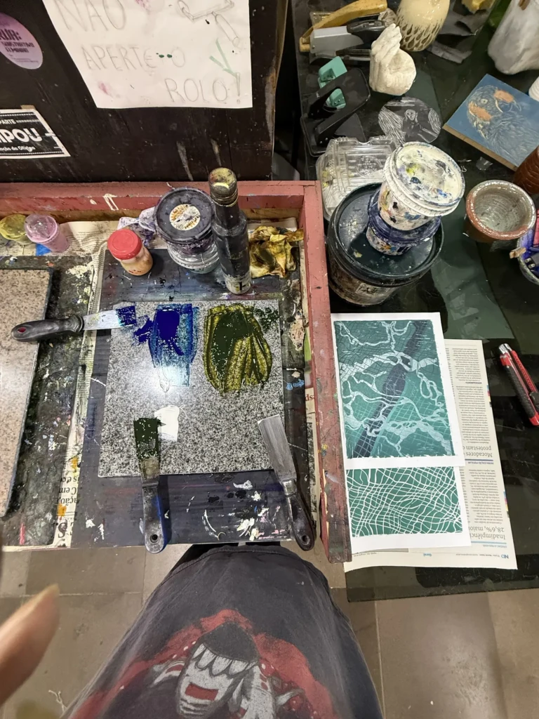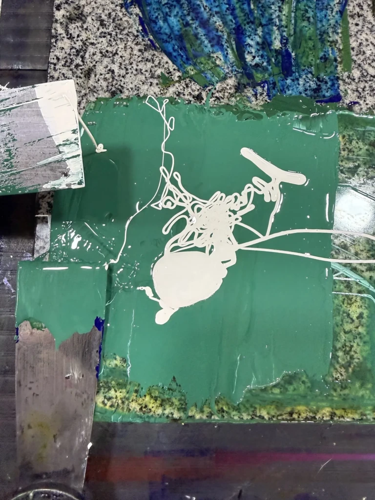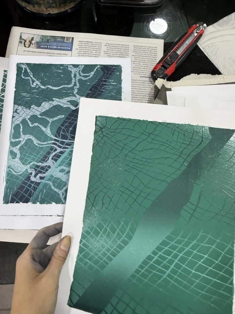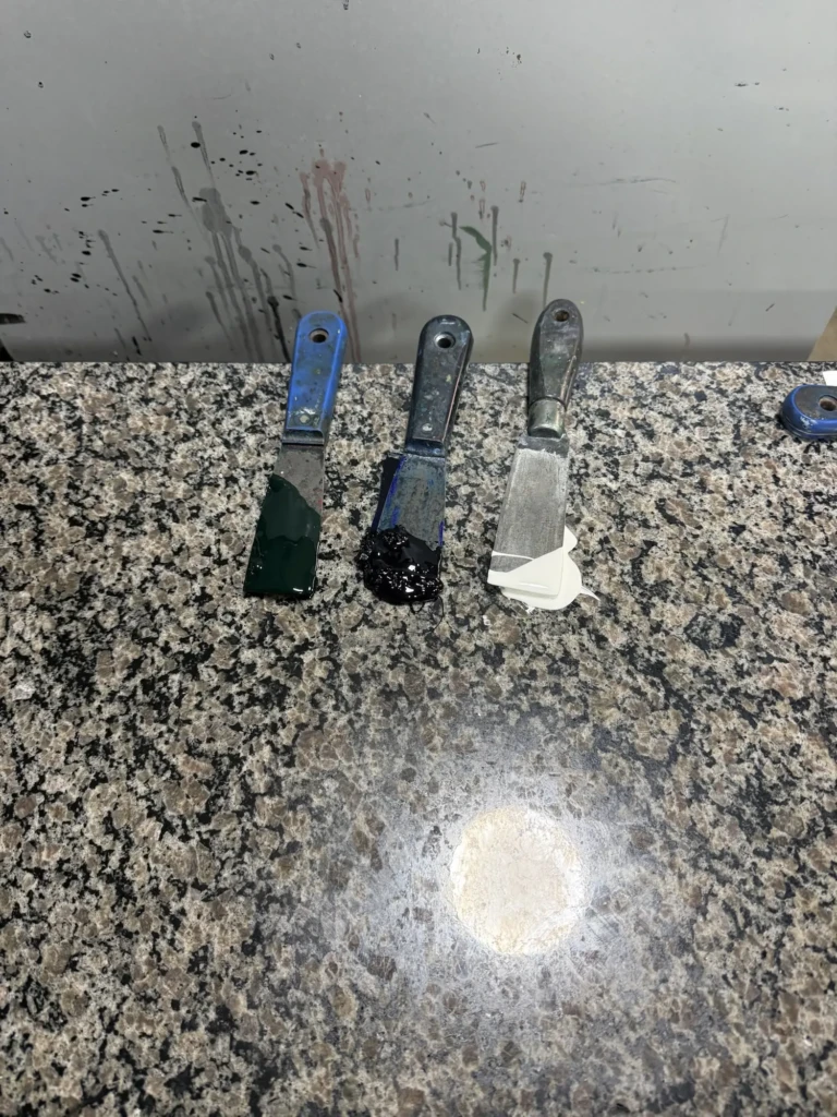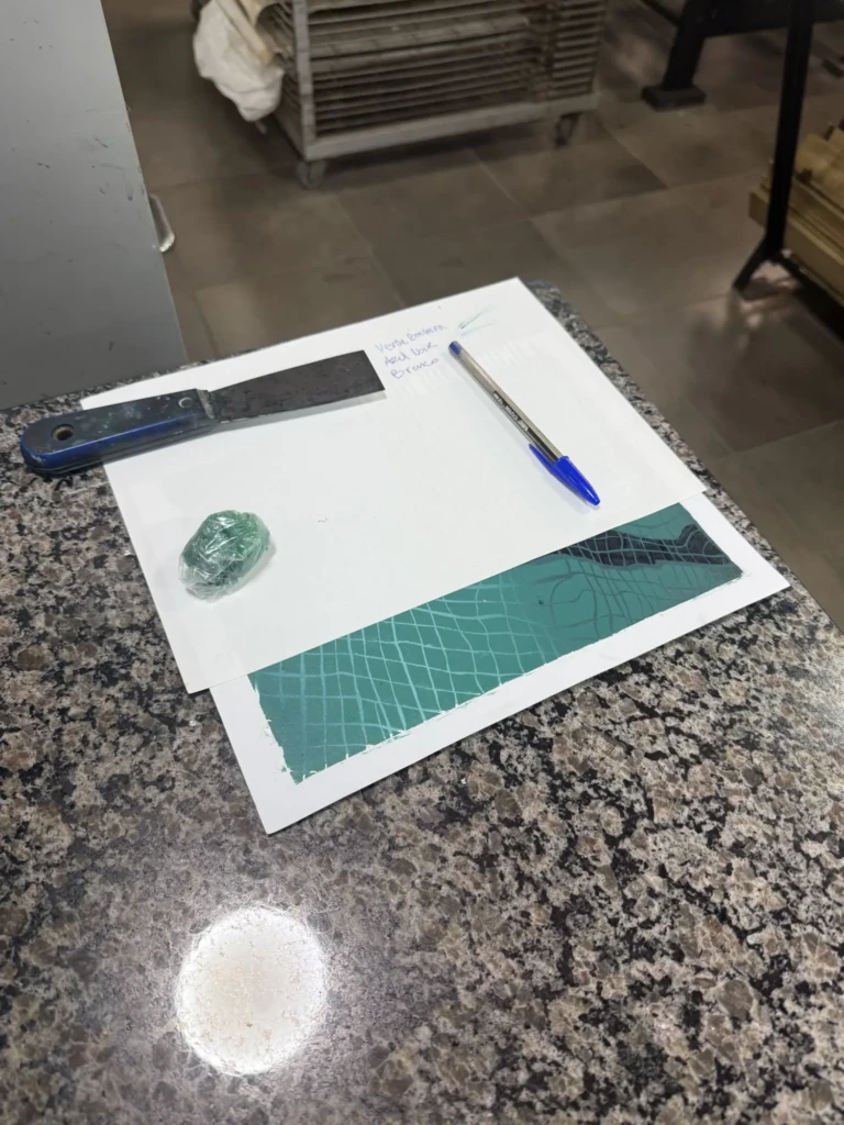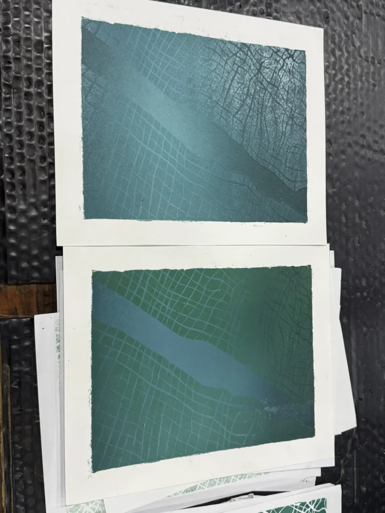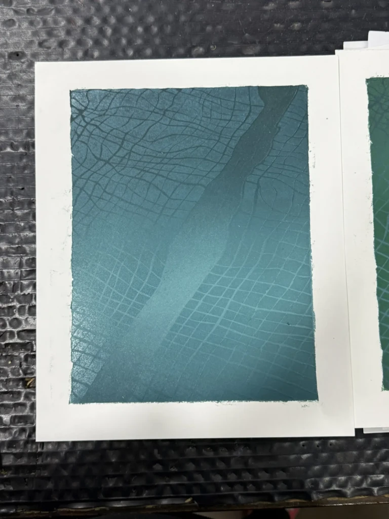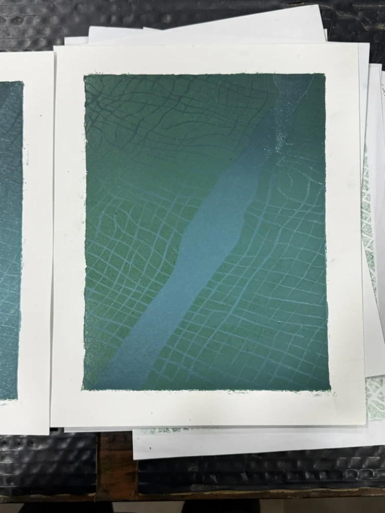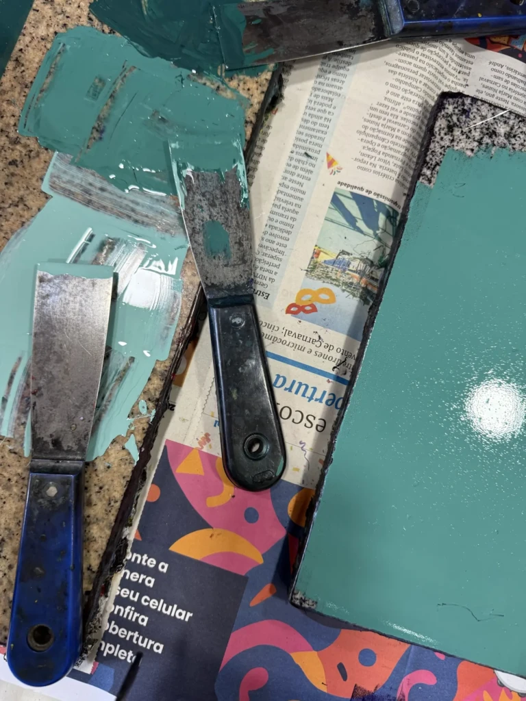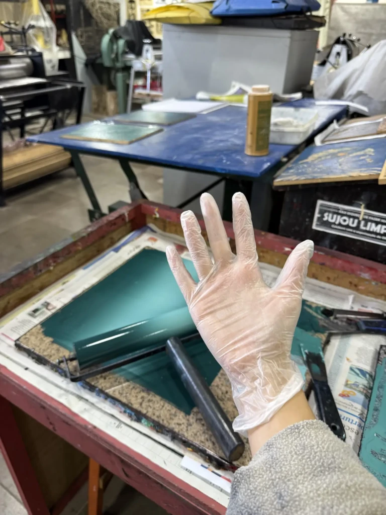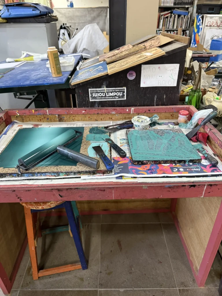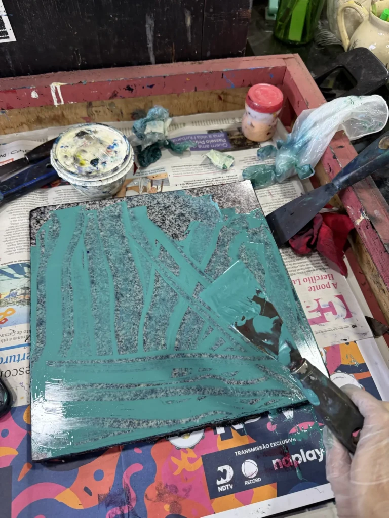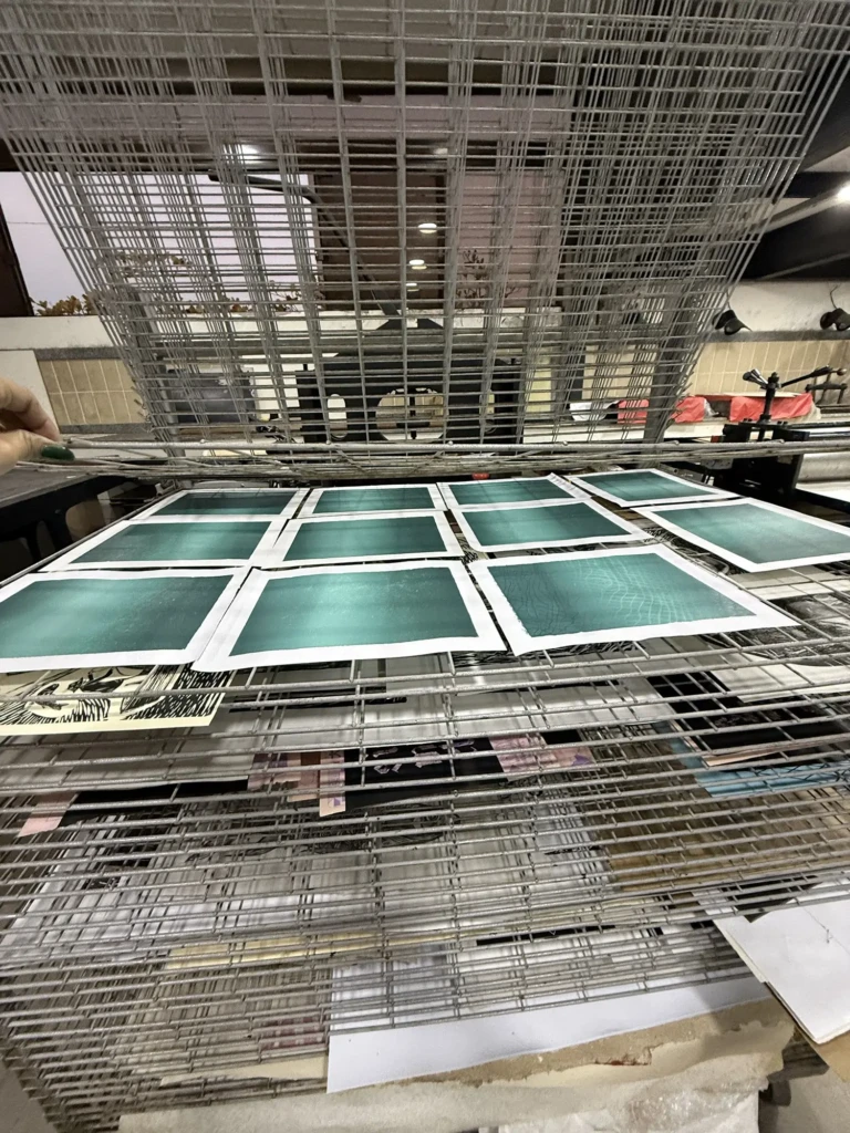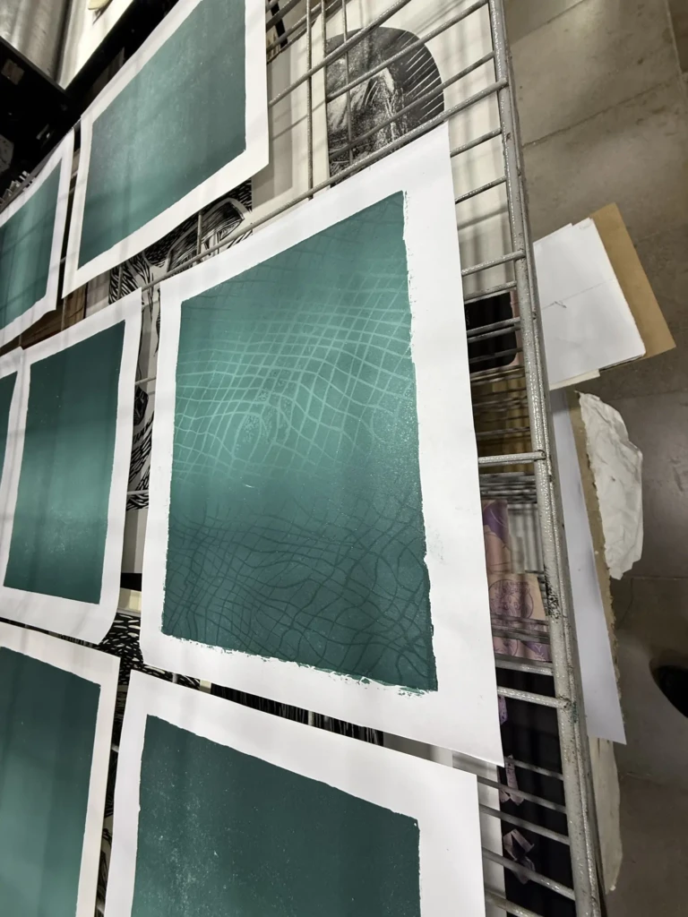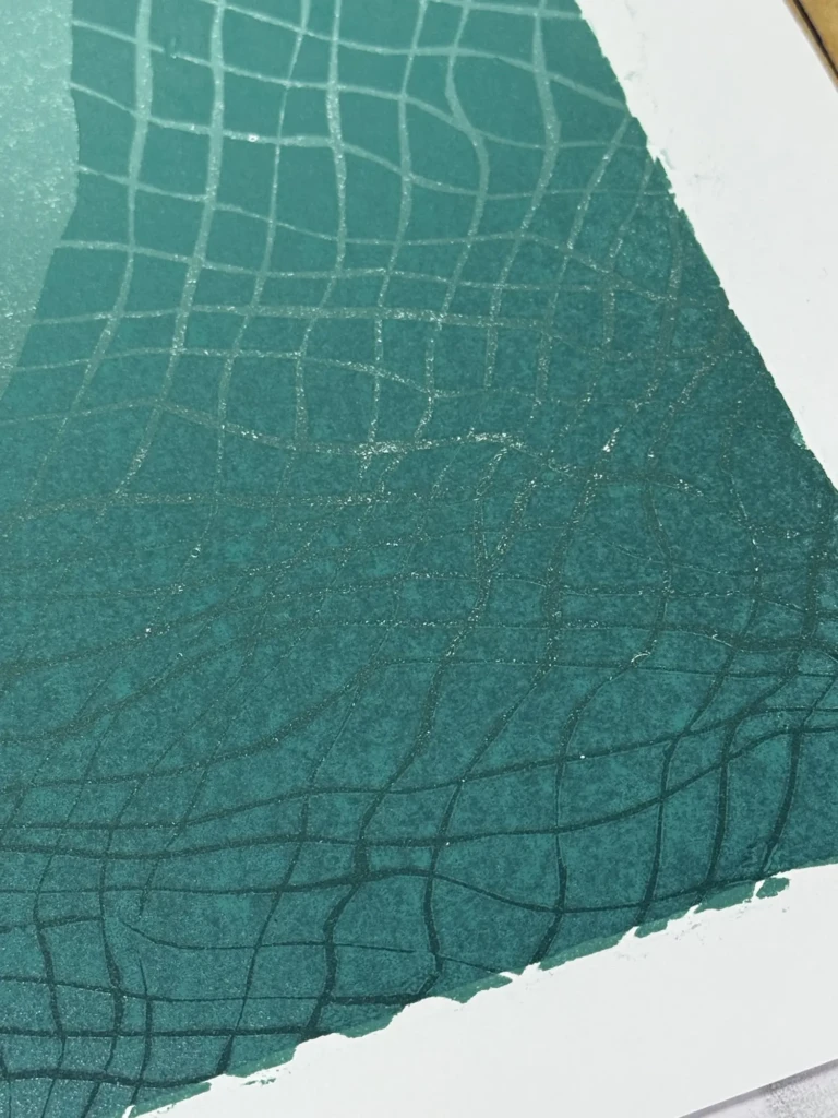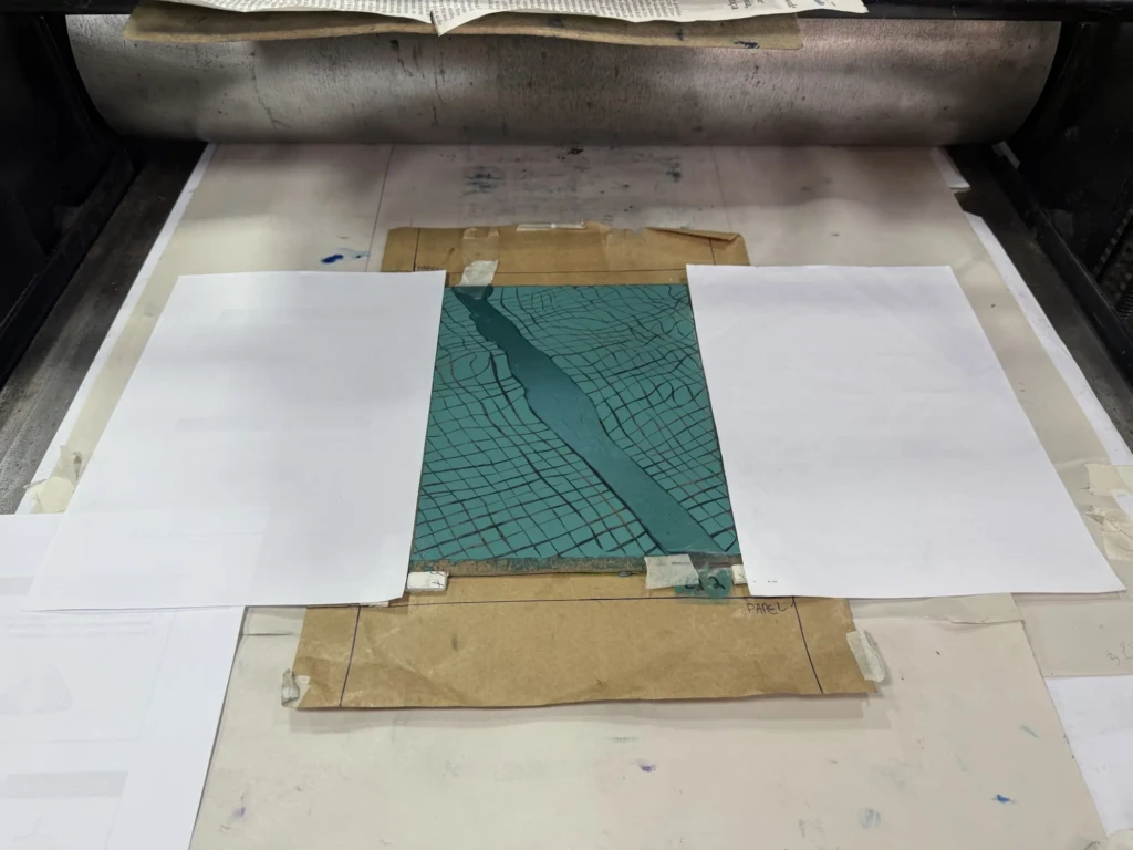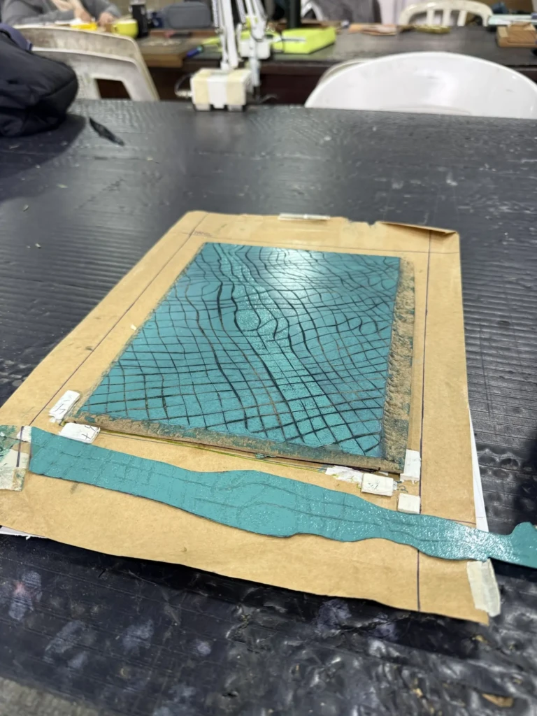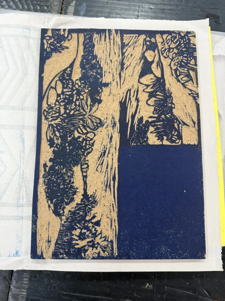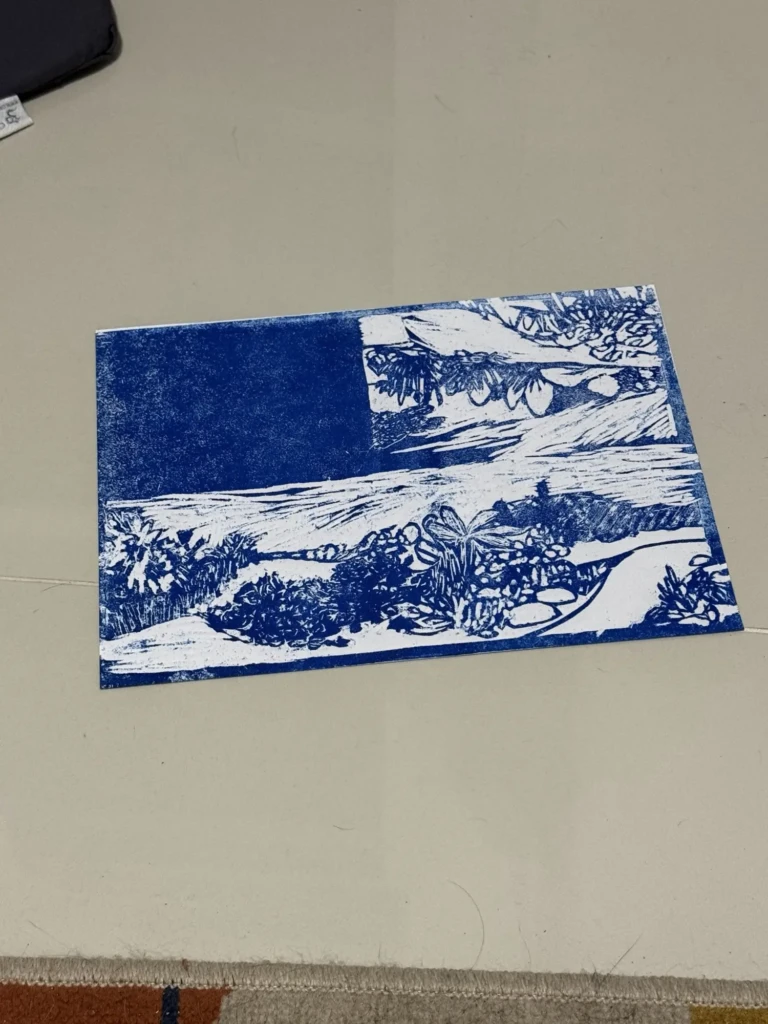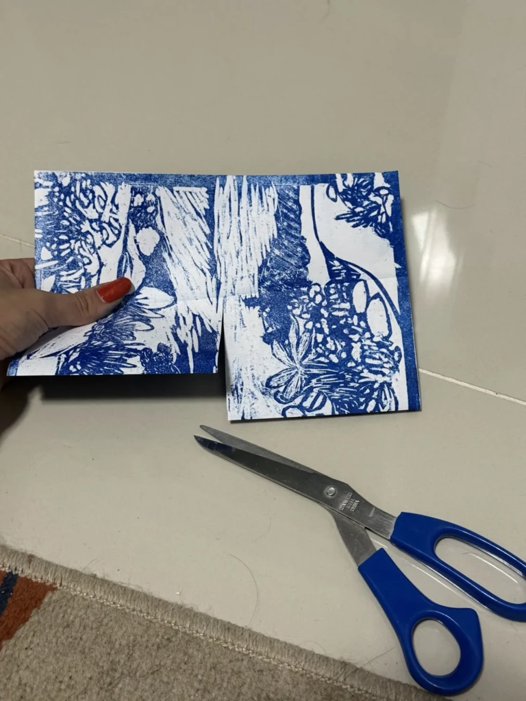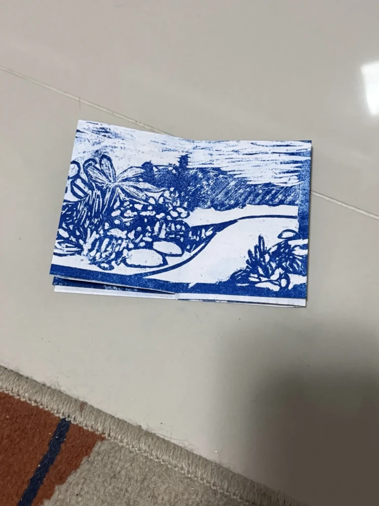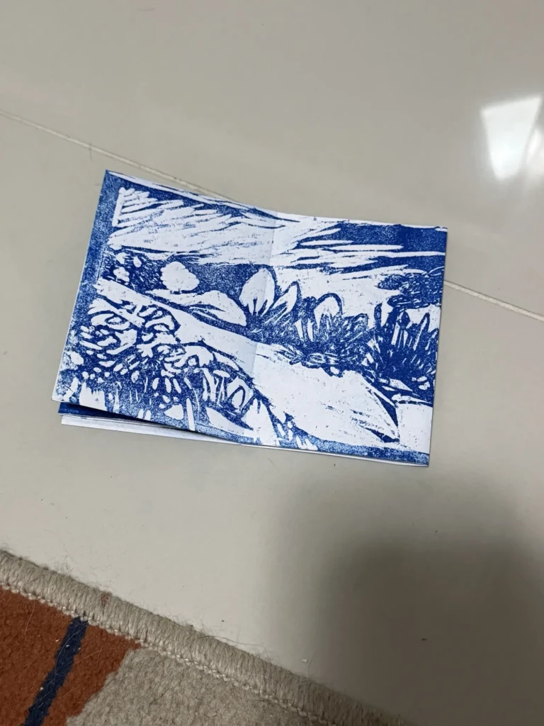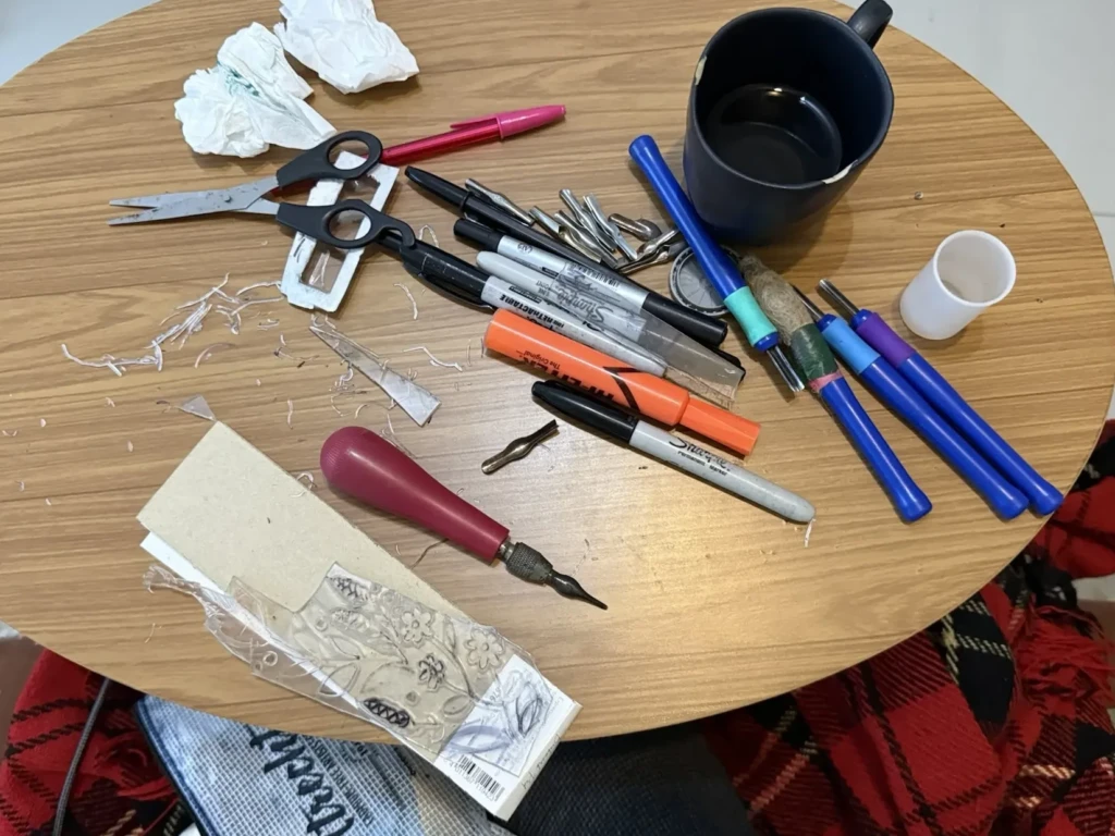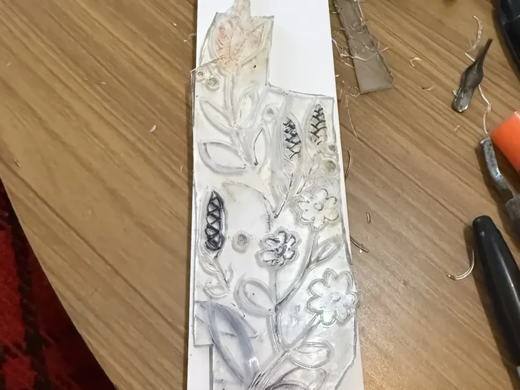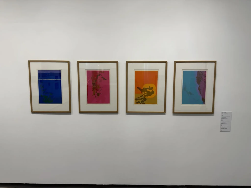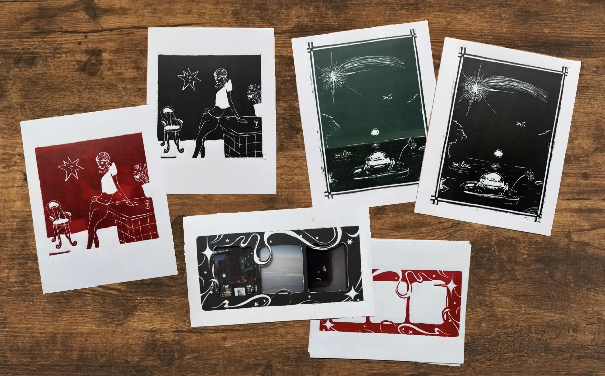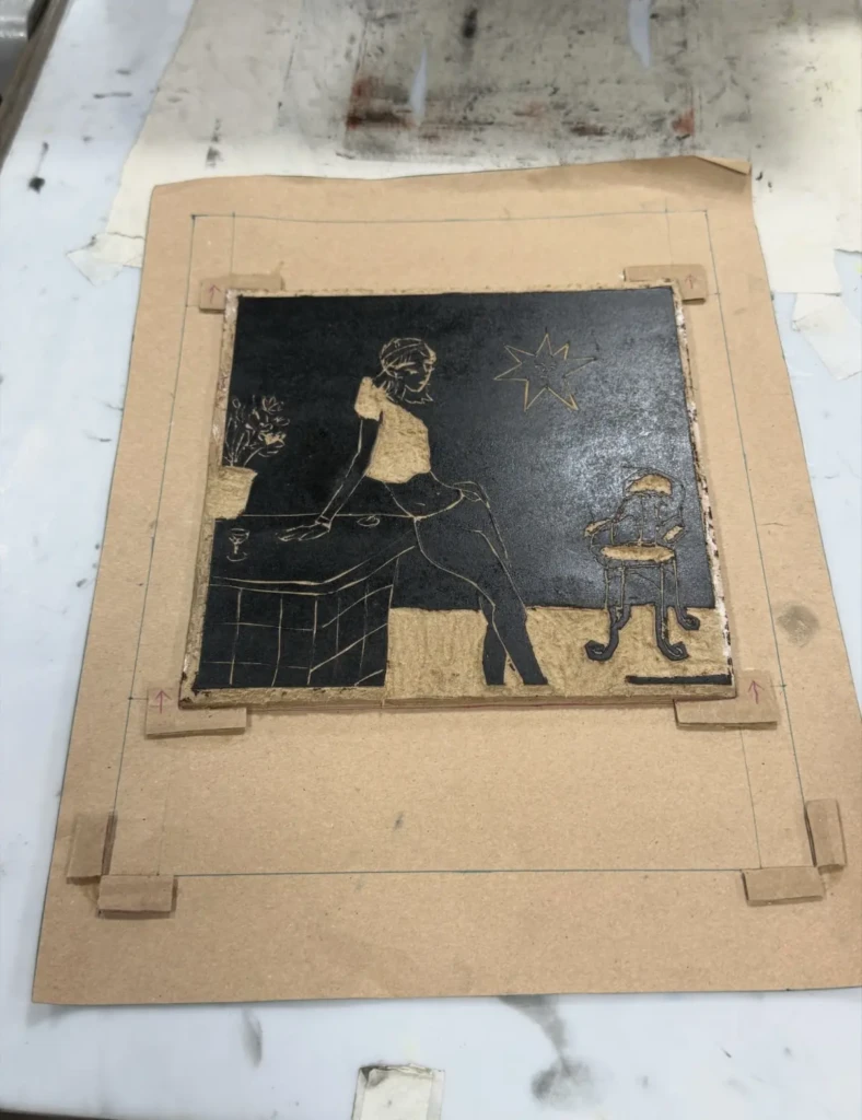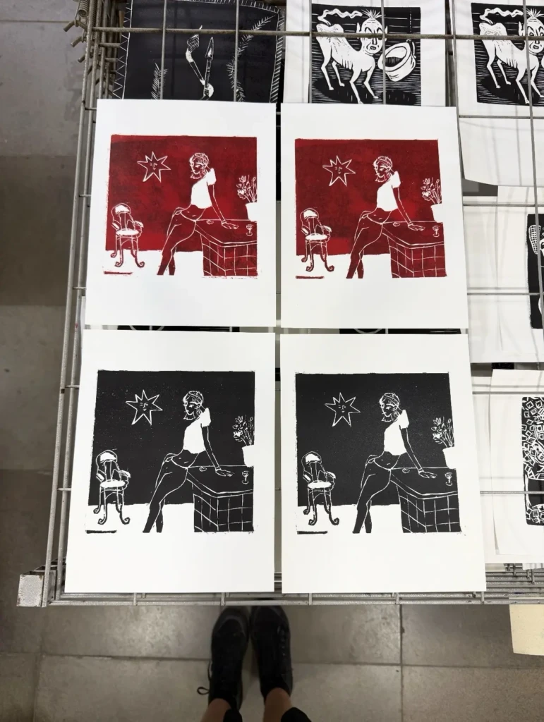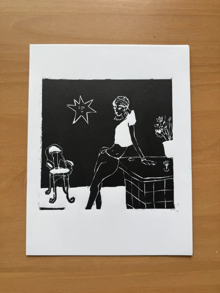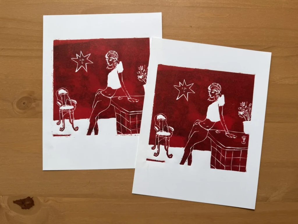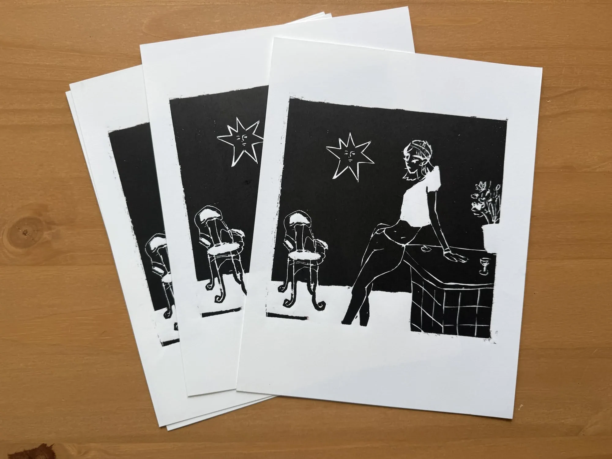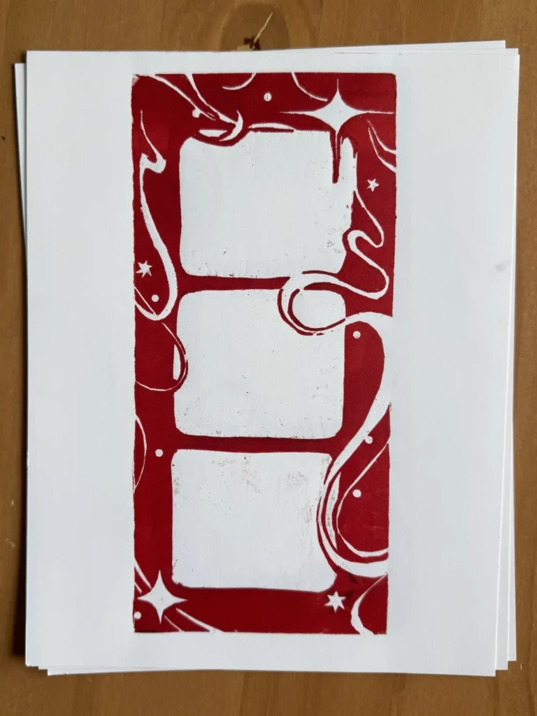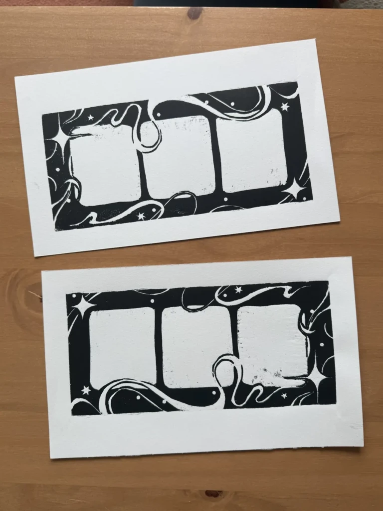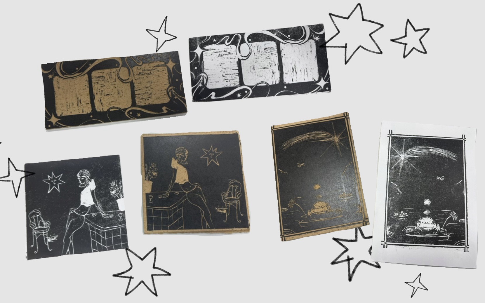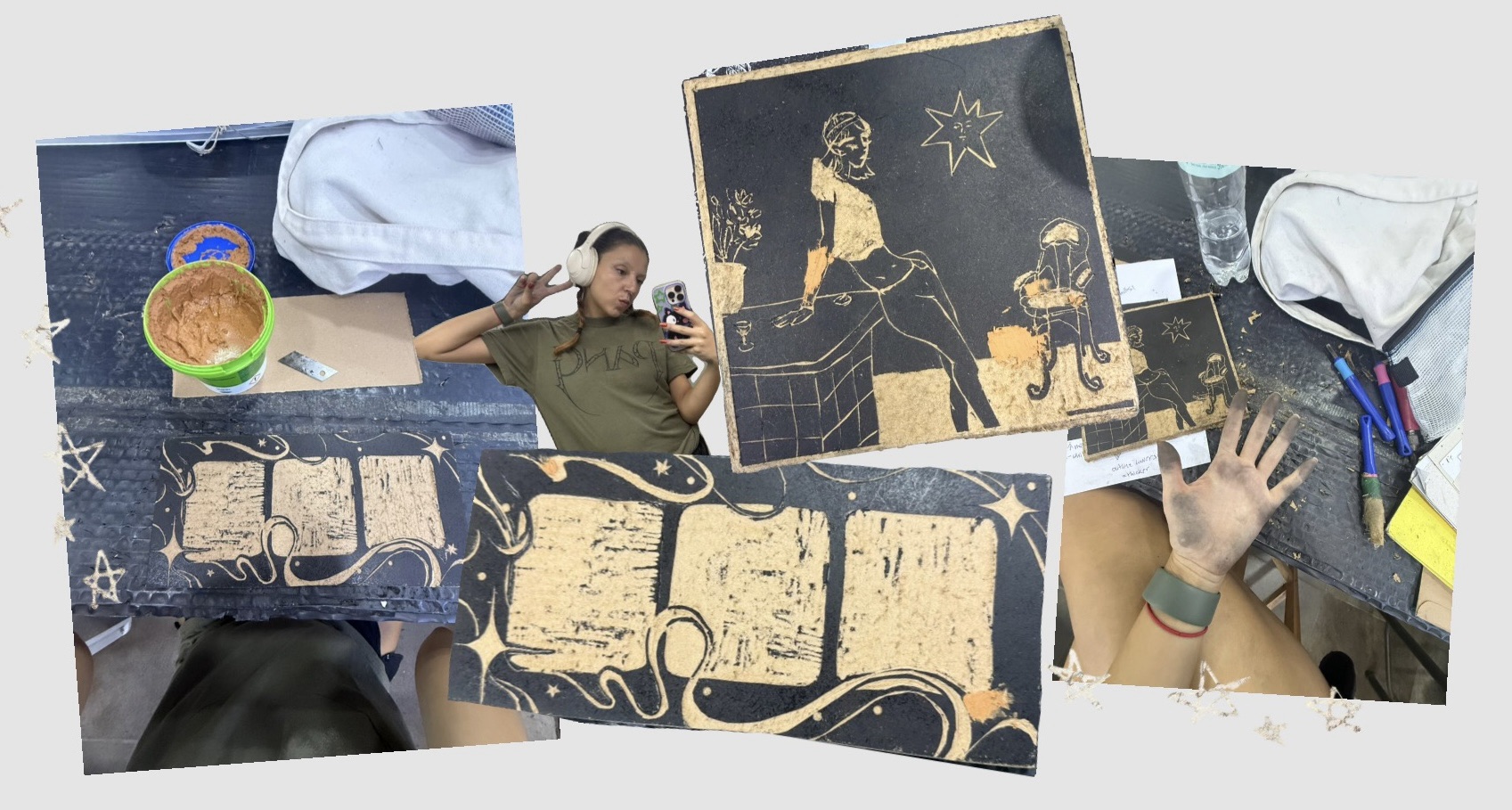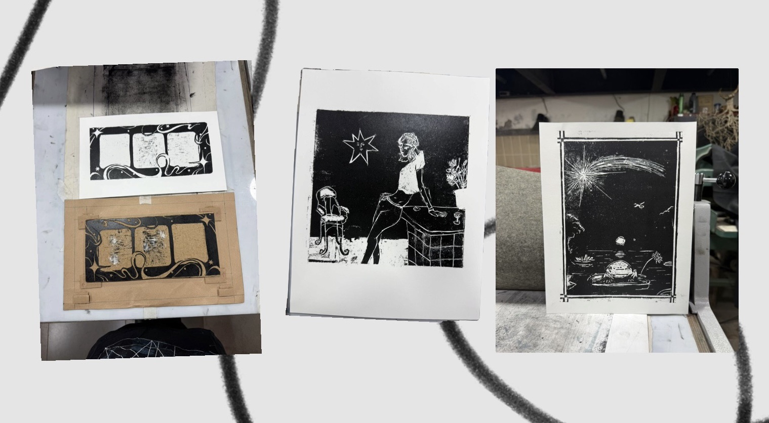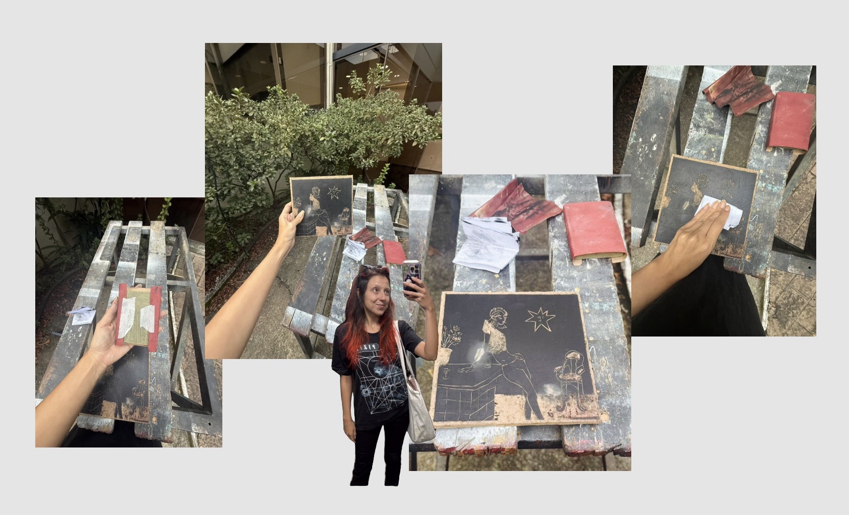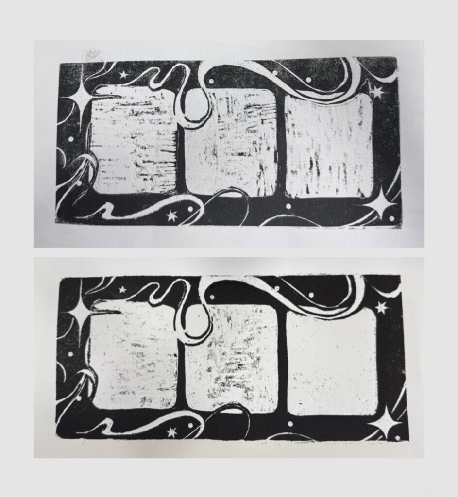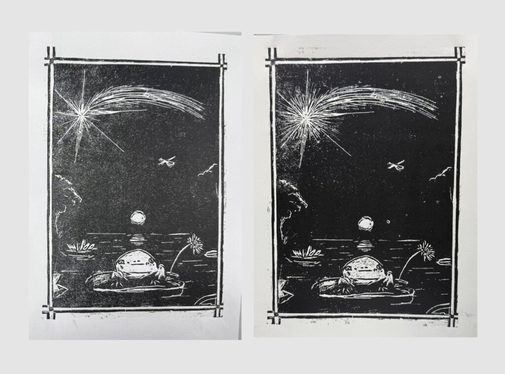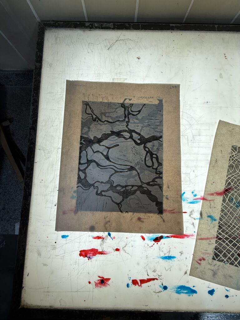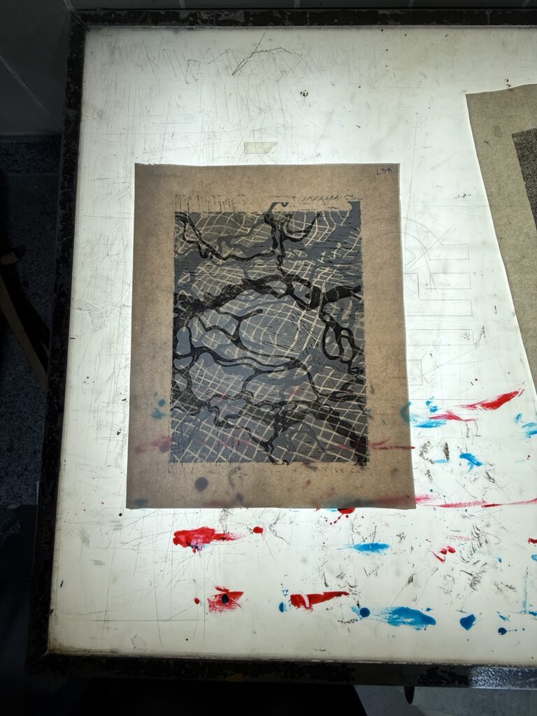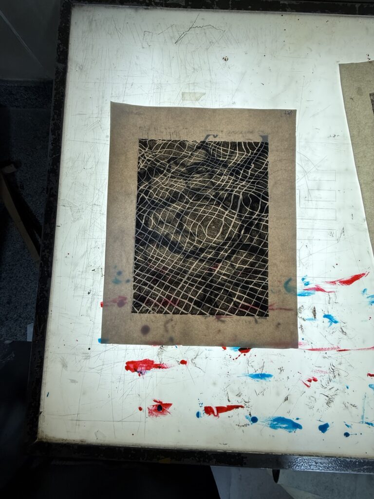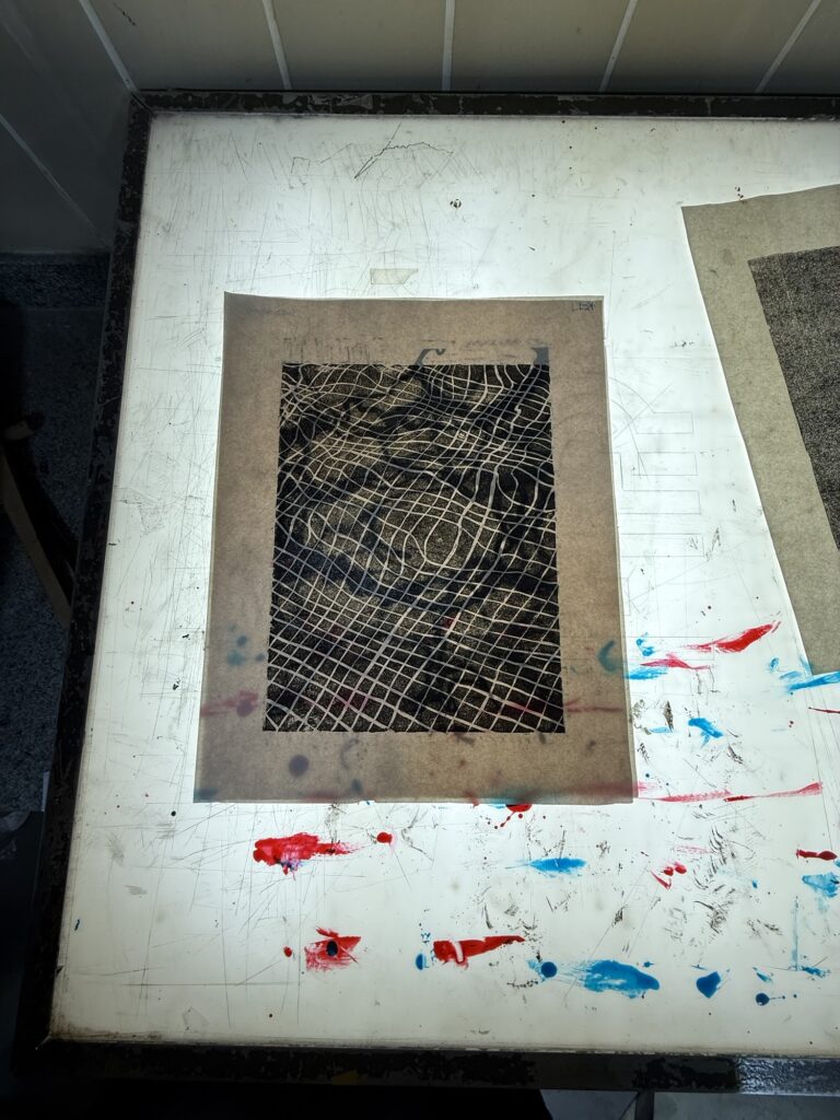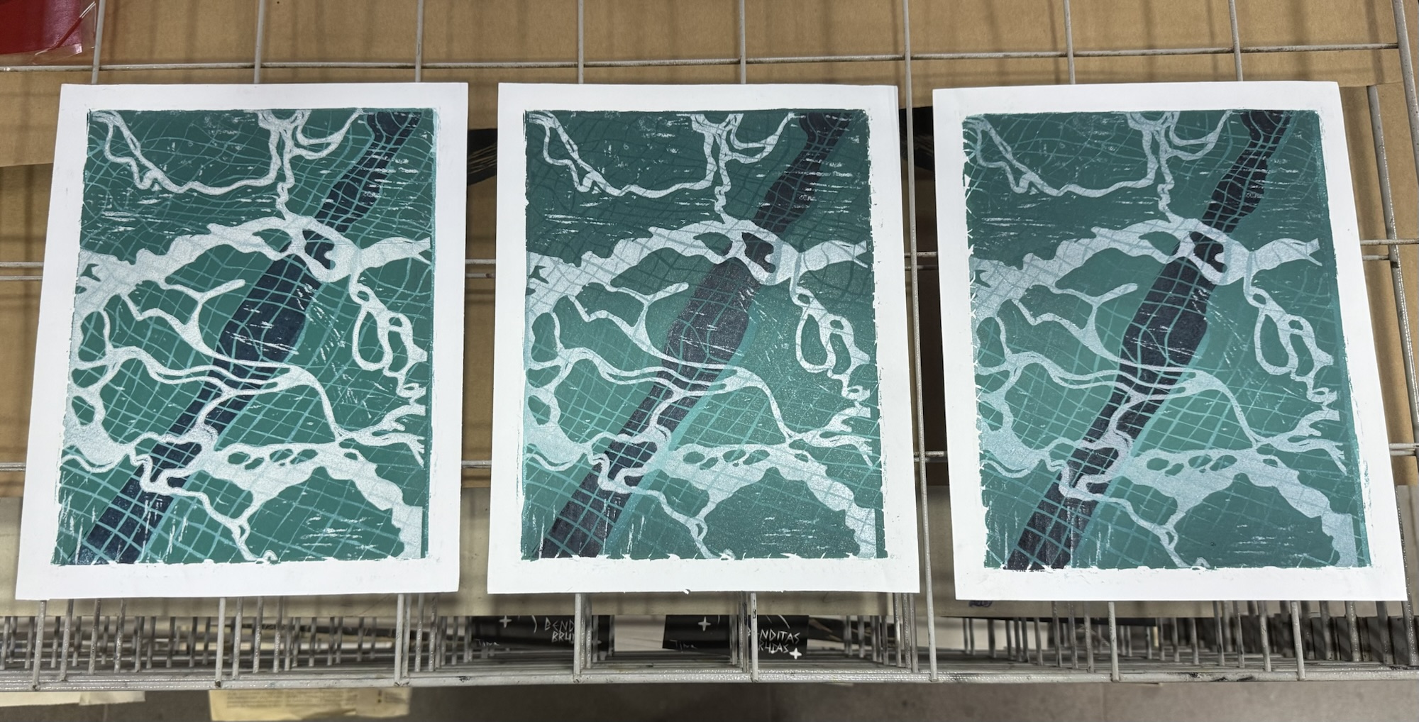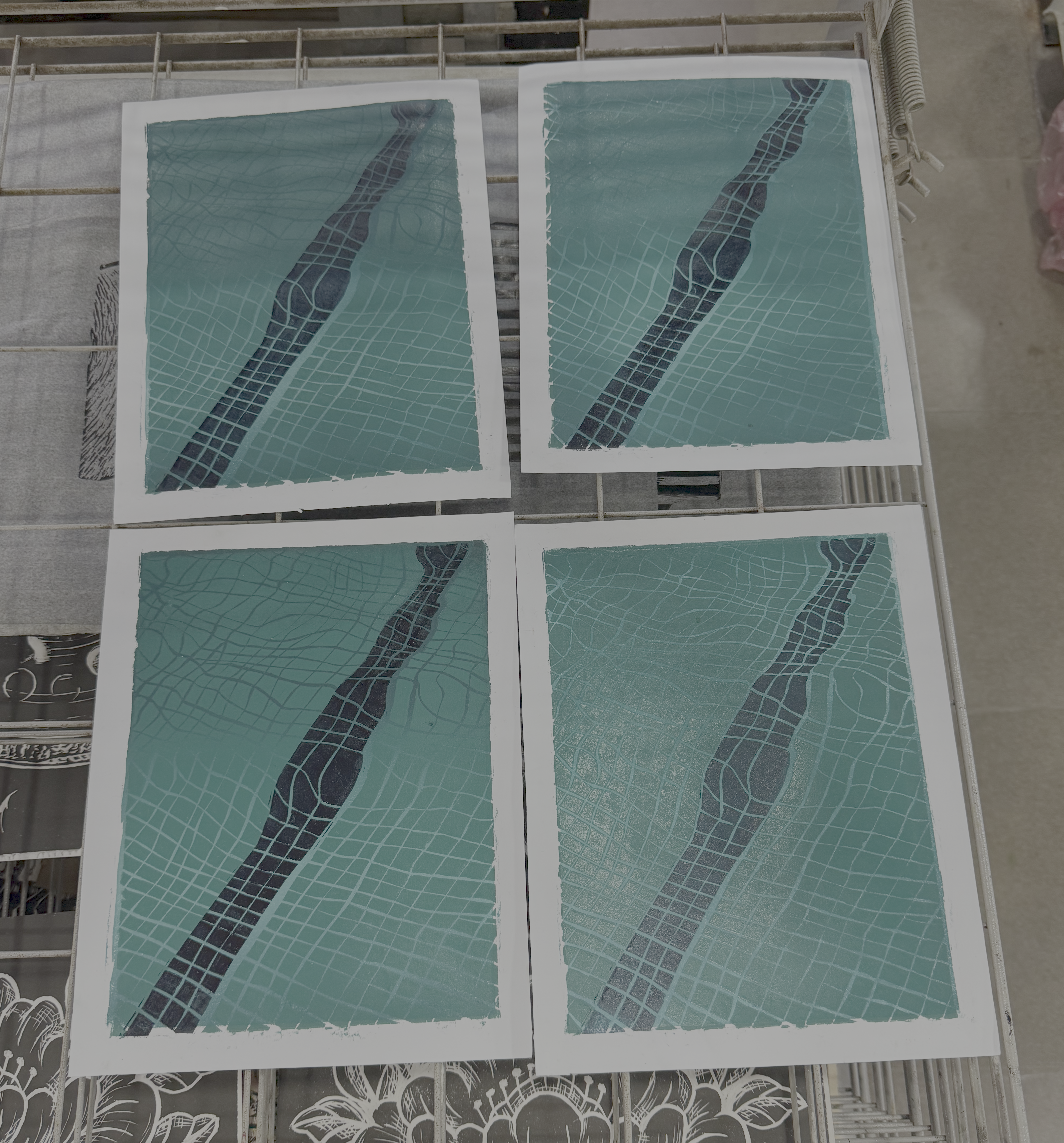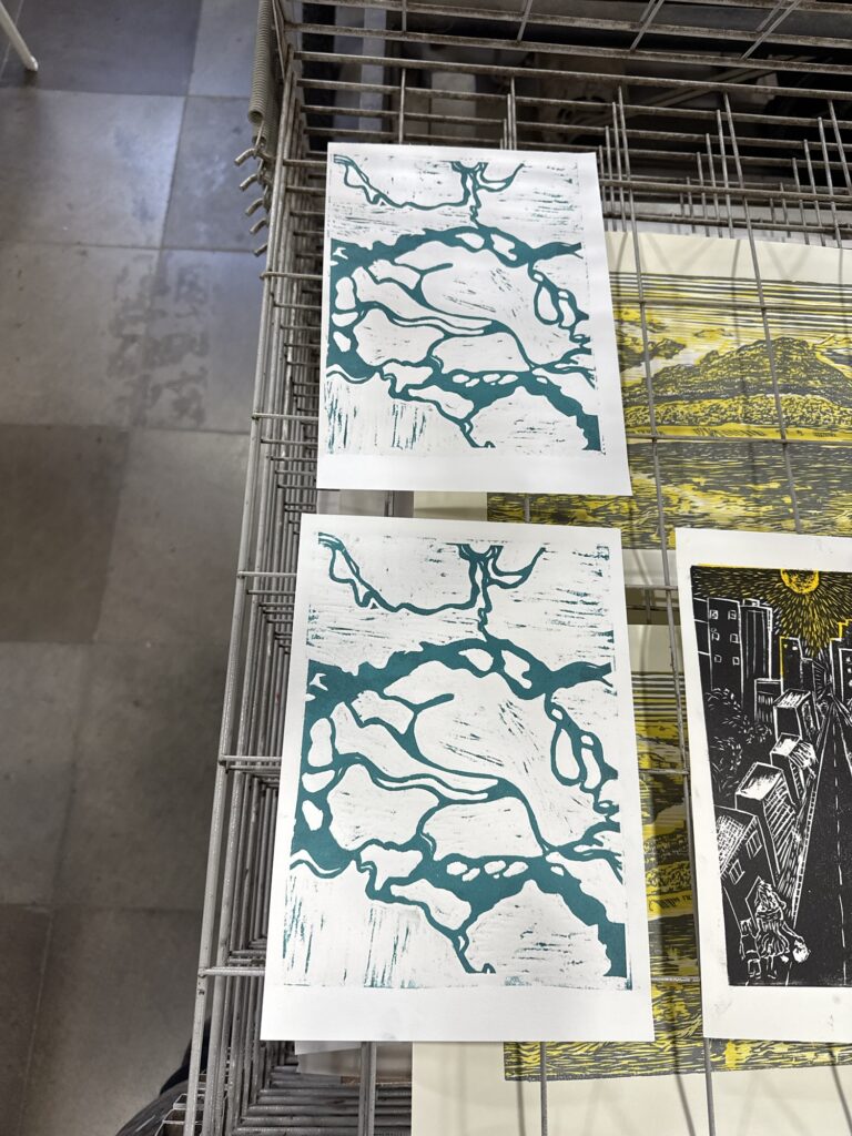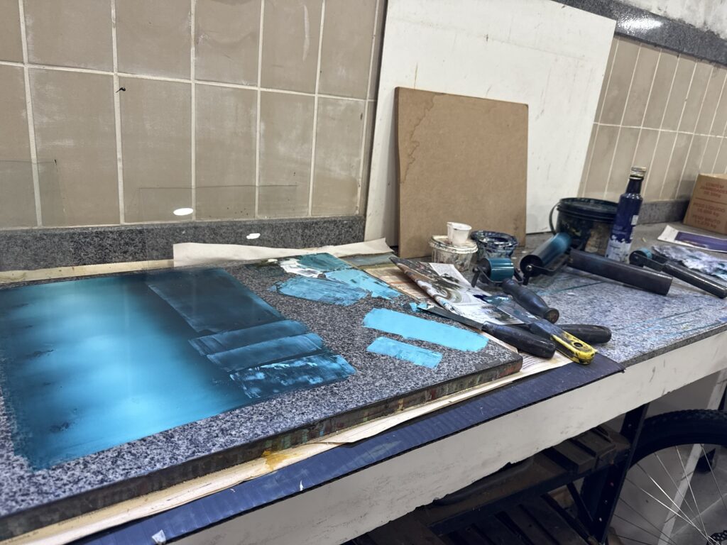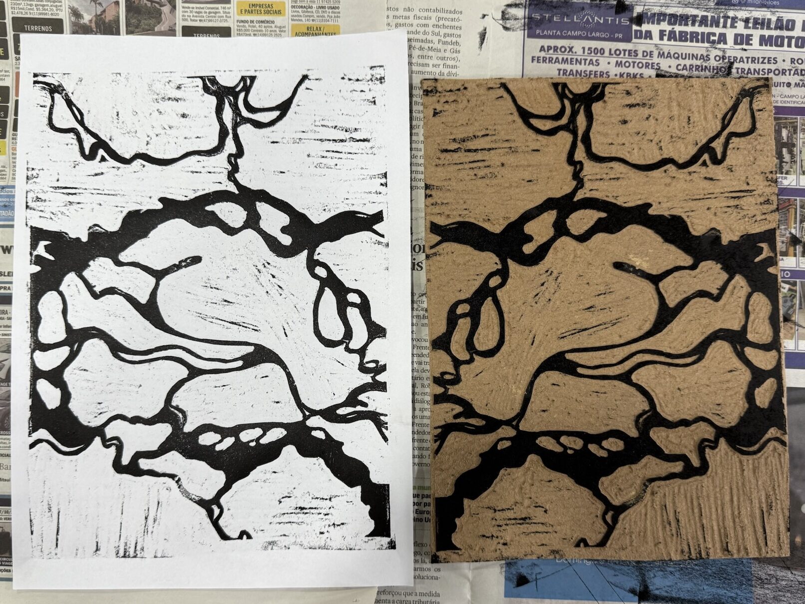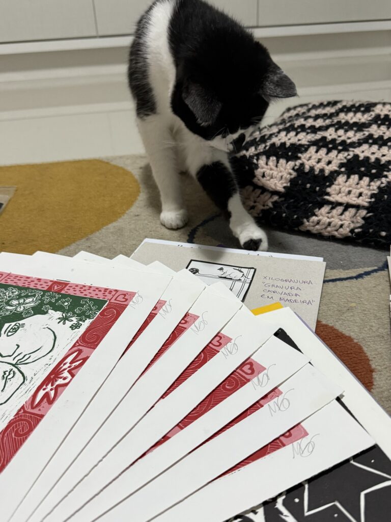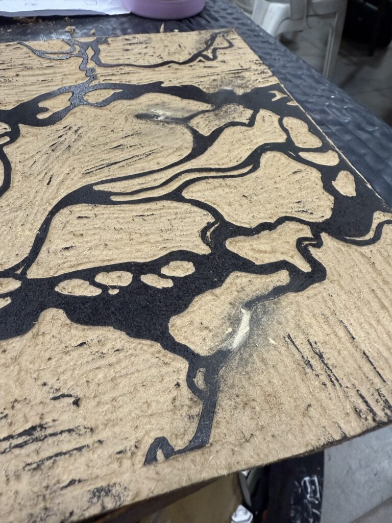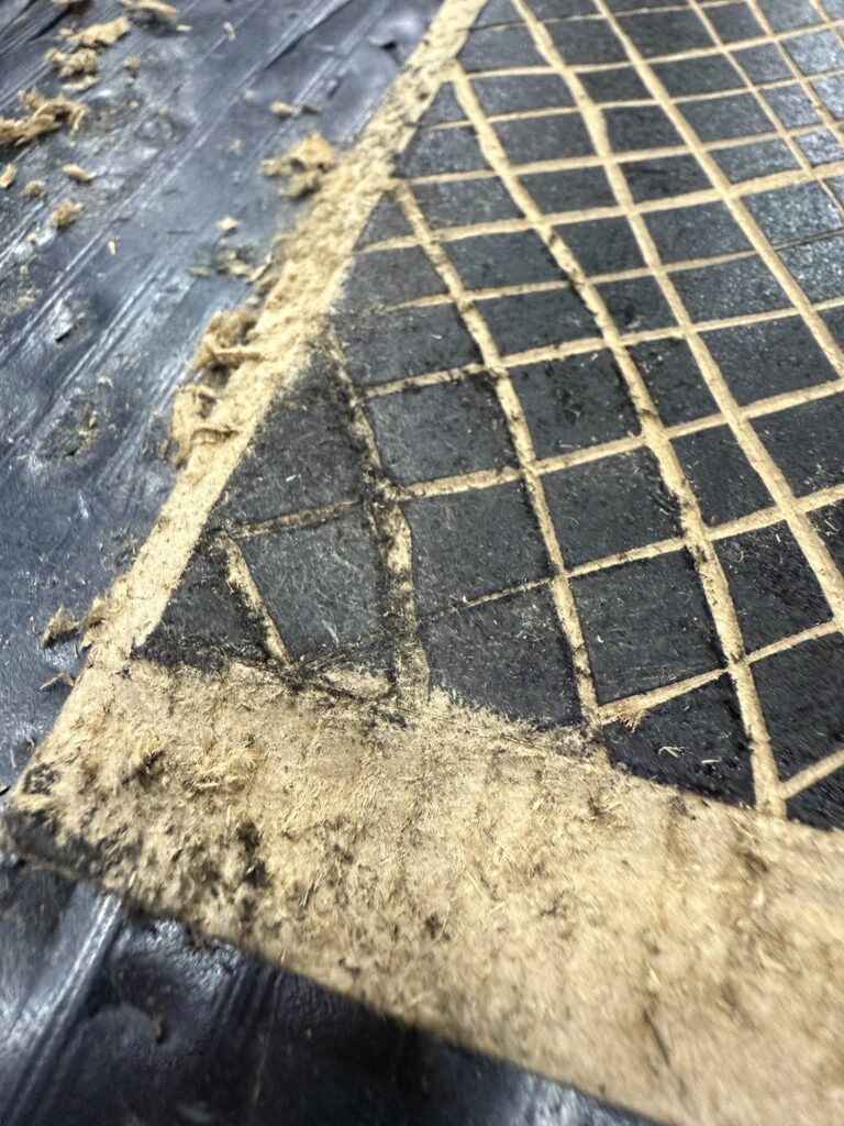
After a couple more weeks of work, I’m finally done with at least the first batch of prints I’ve been working on. I’m really happy with the resulting four series, plus an interesting experiment that I think still has more potential to explore in the future.
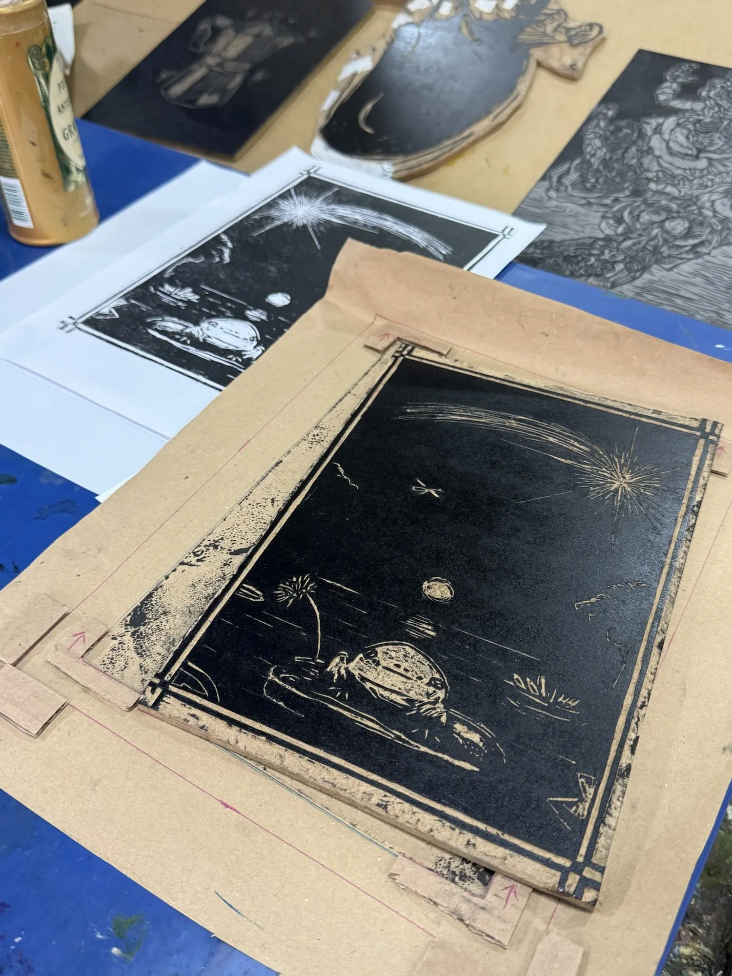
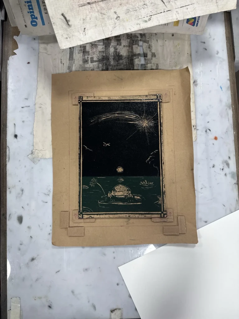
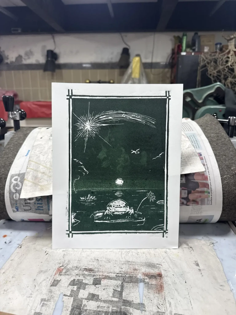
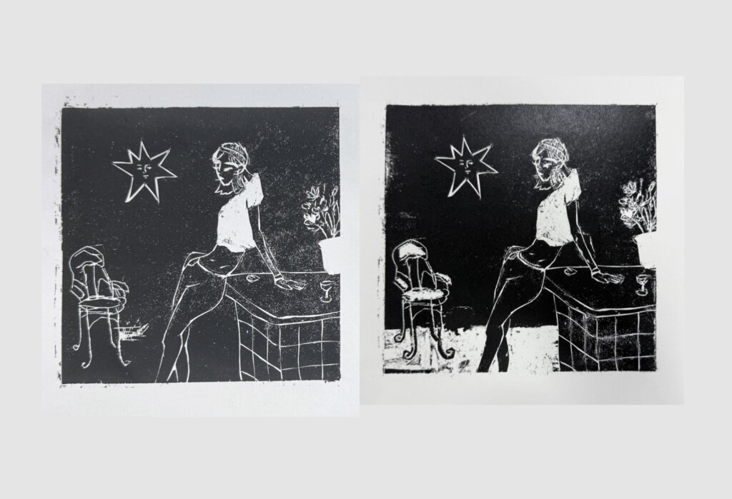
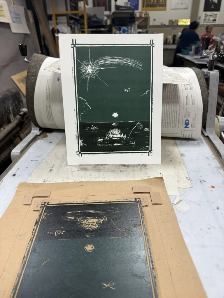
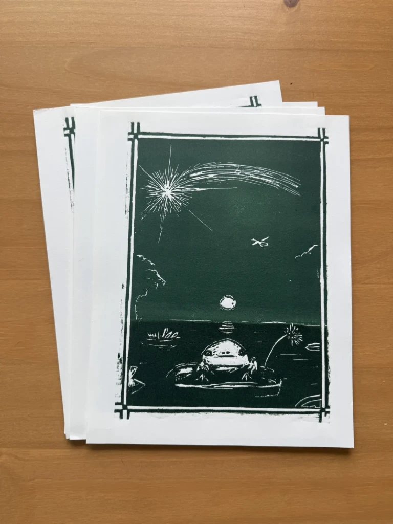
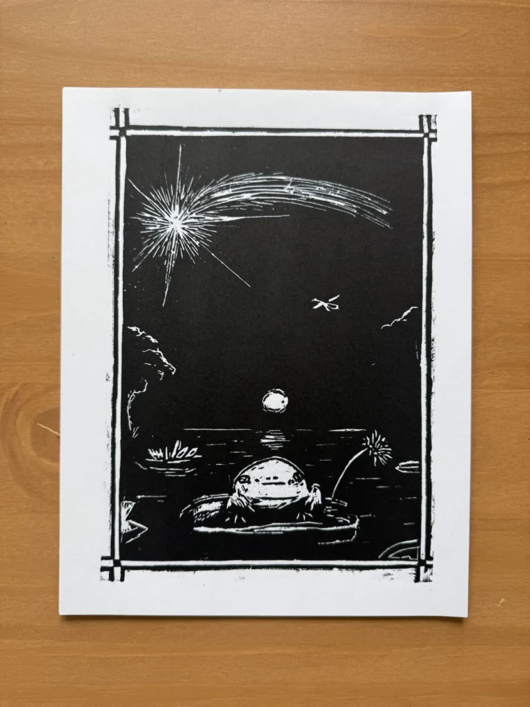
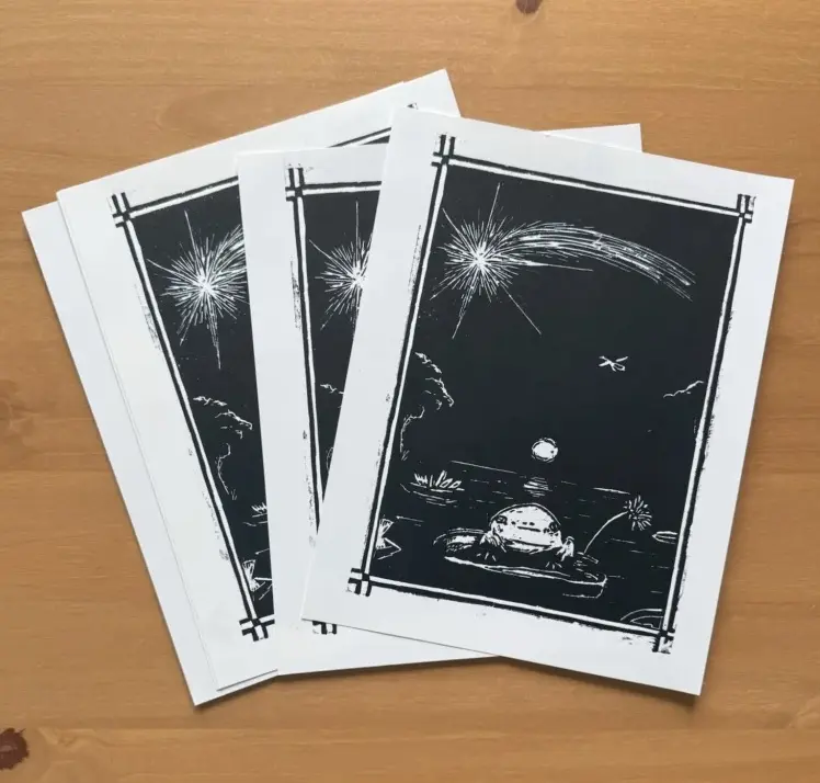
Enchanted Night – the Froggy print
I never took this piece too seriously. It started as a sketch and a test piece for an exhibition a couple of years ago that ultimately didn’t go anywhere. However, whenever I showed it to friends, they seemed surprisingly amused and drawn to it, so I decided to go ahead and finish the design.
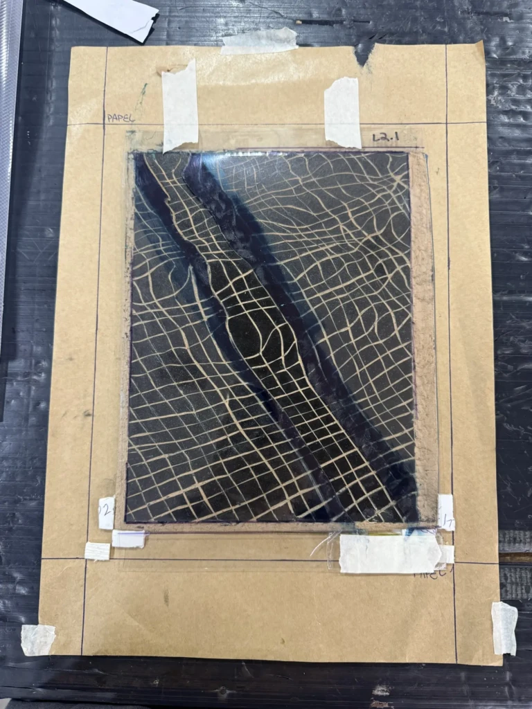
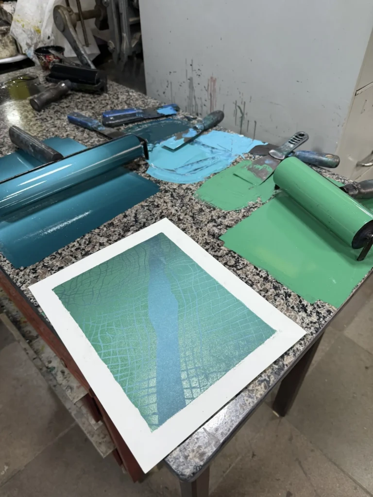
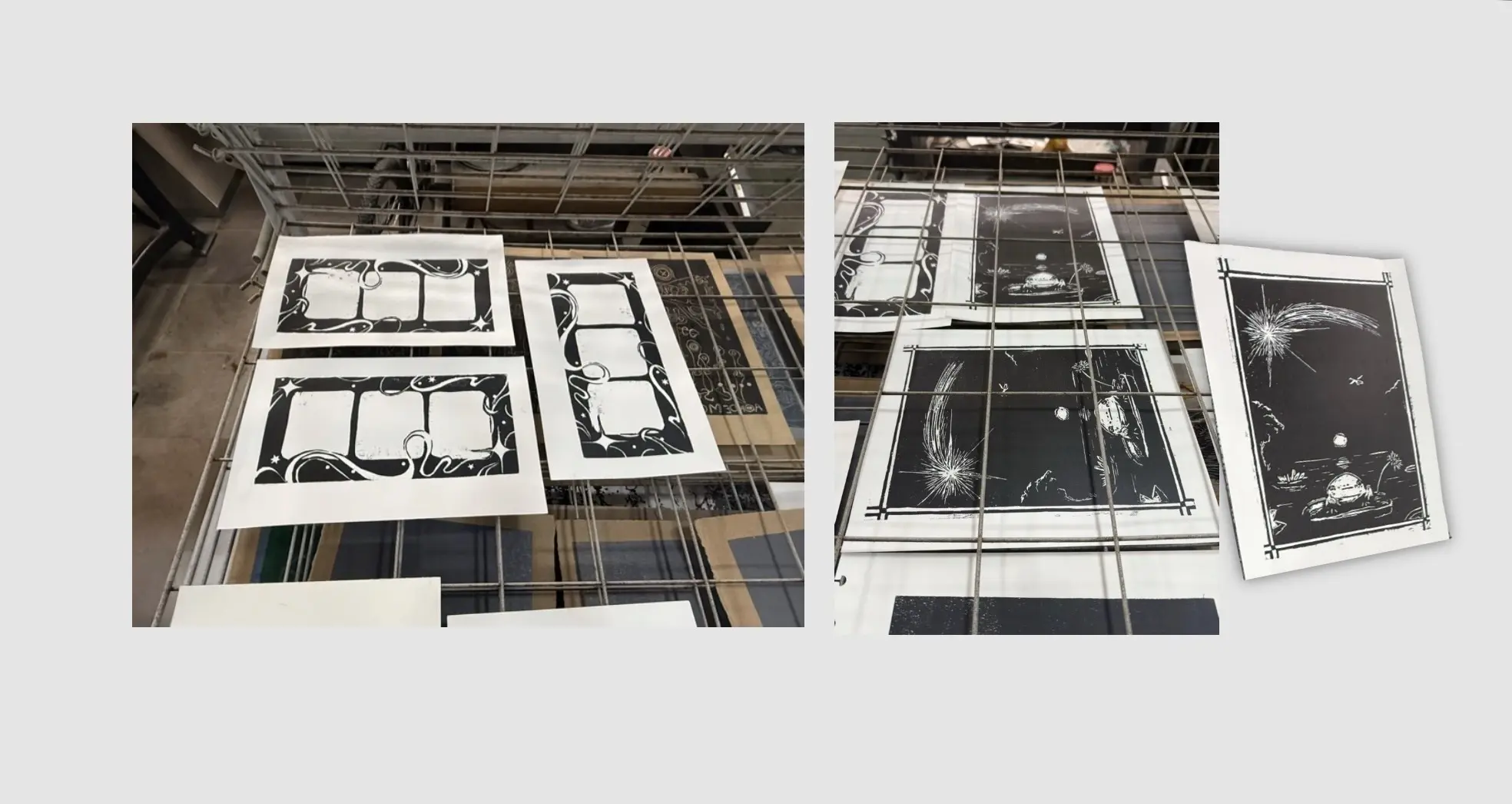
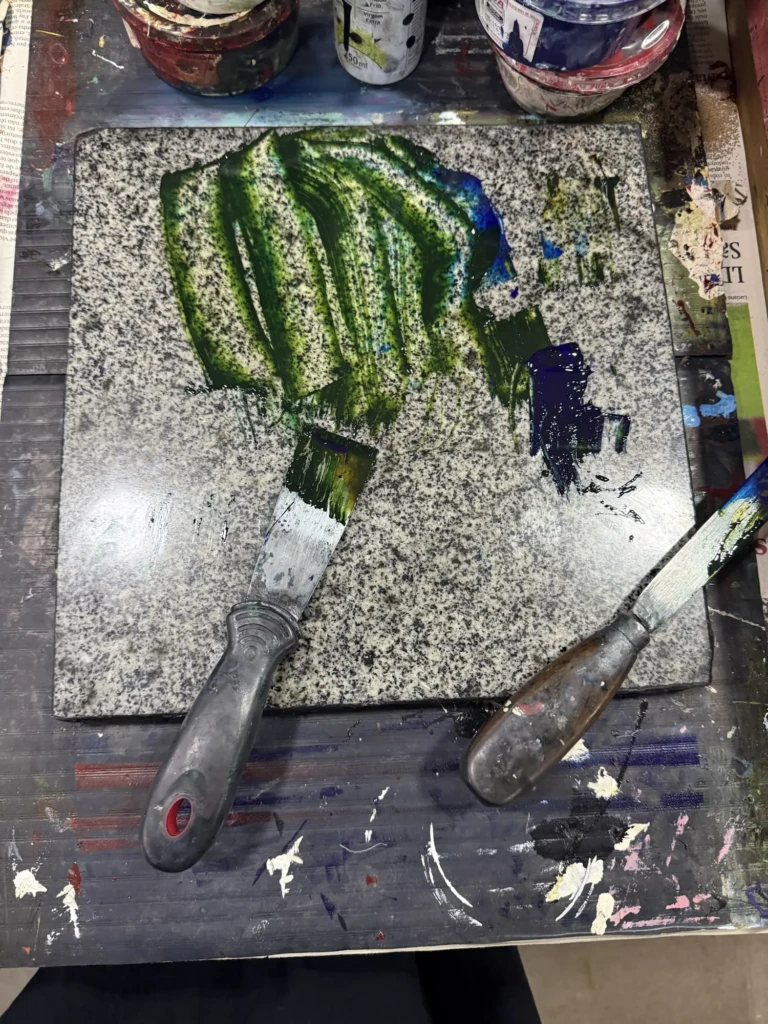
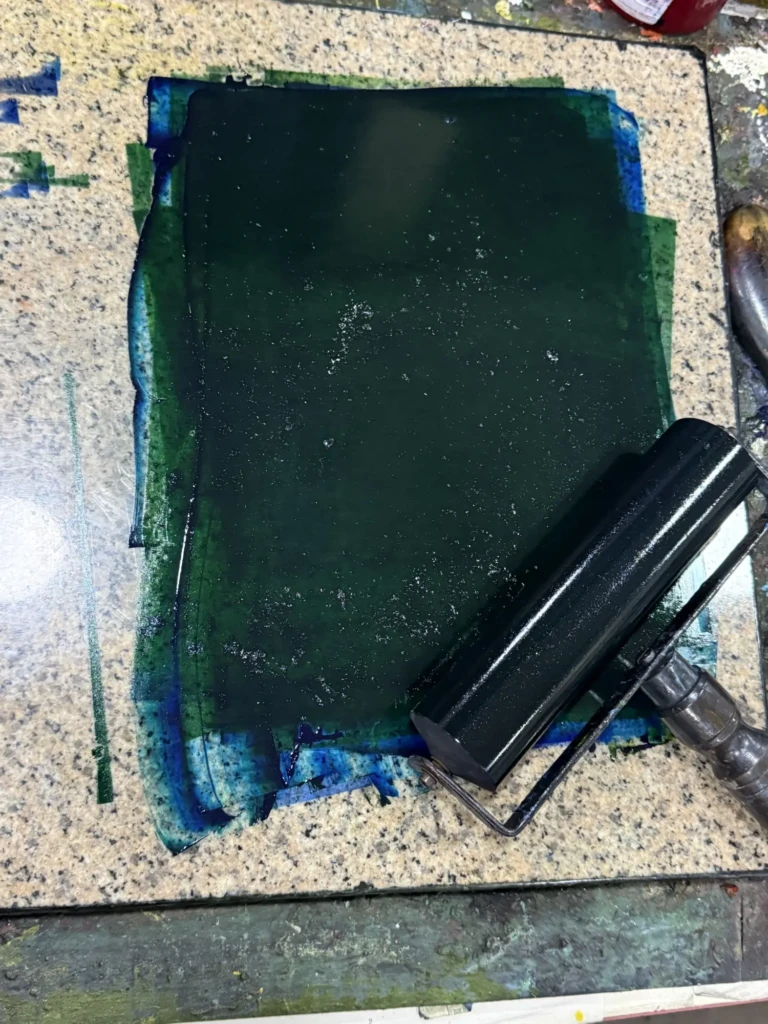
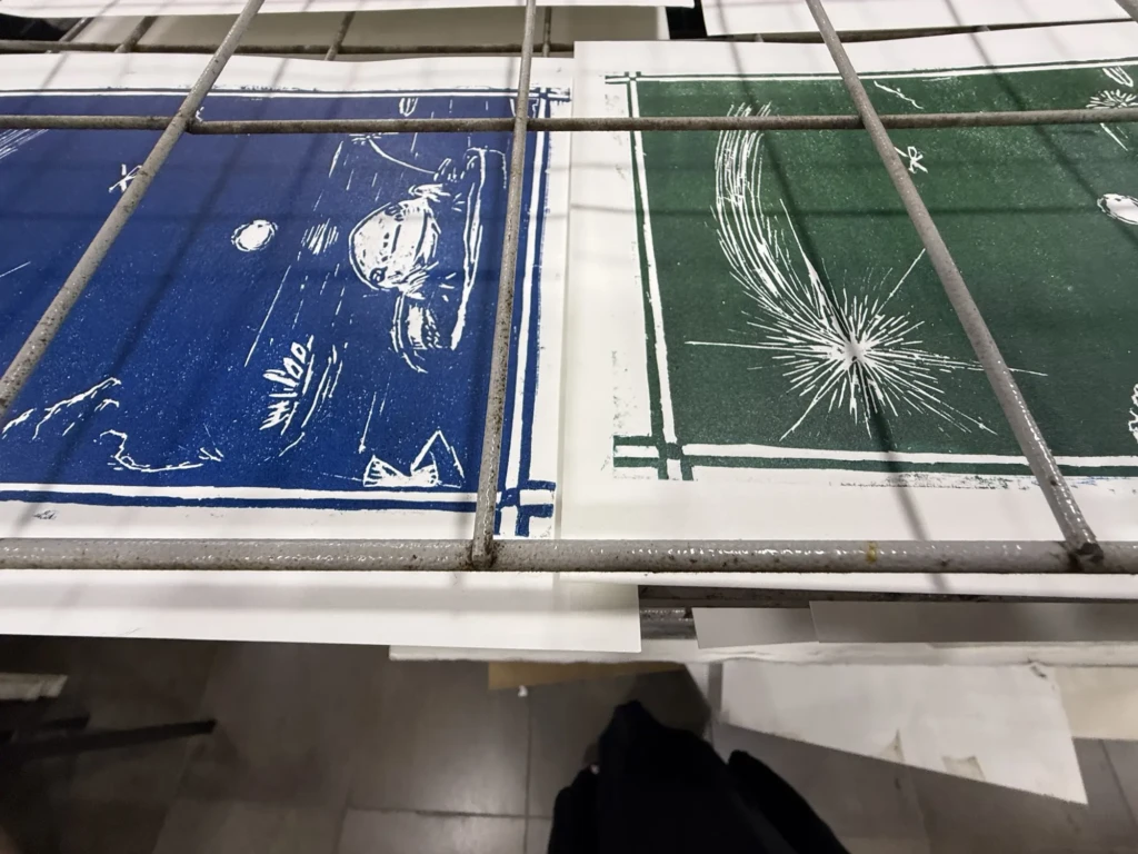
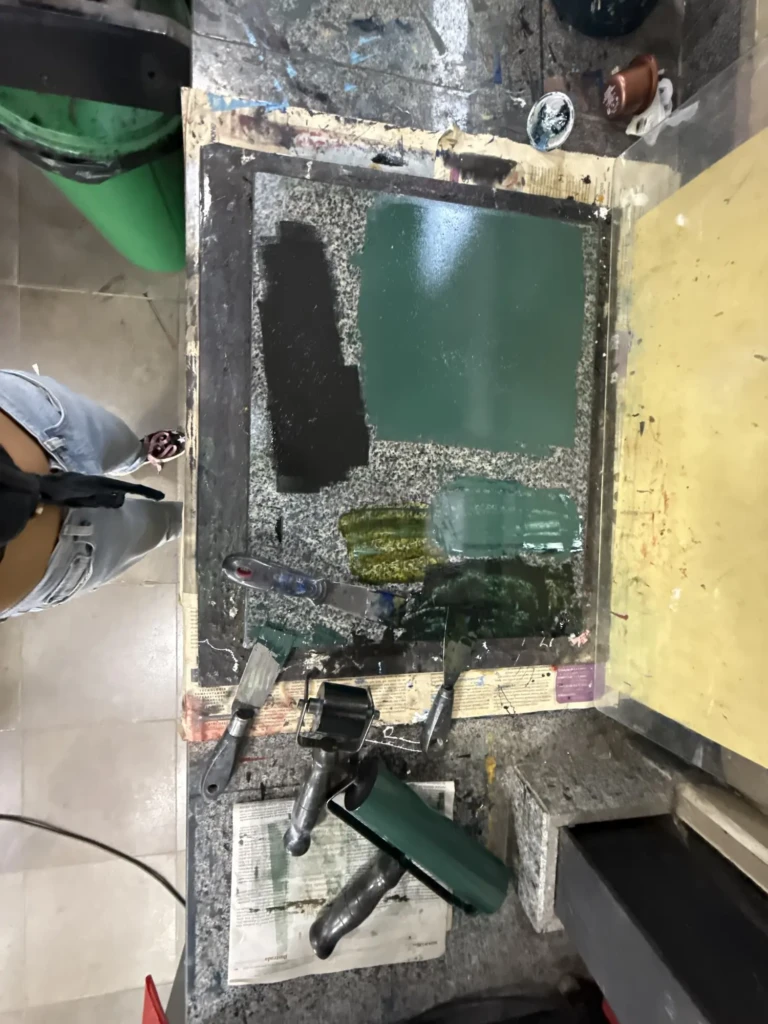
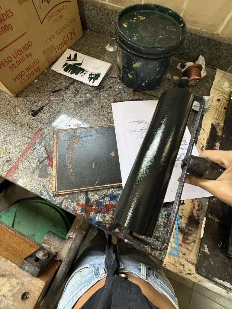
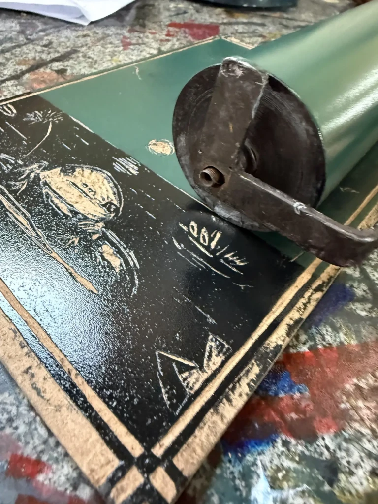
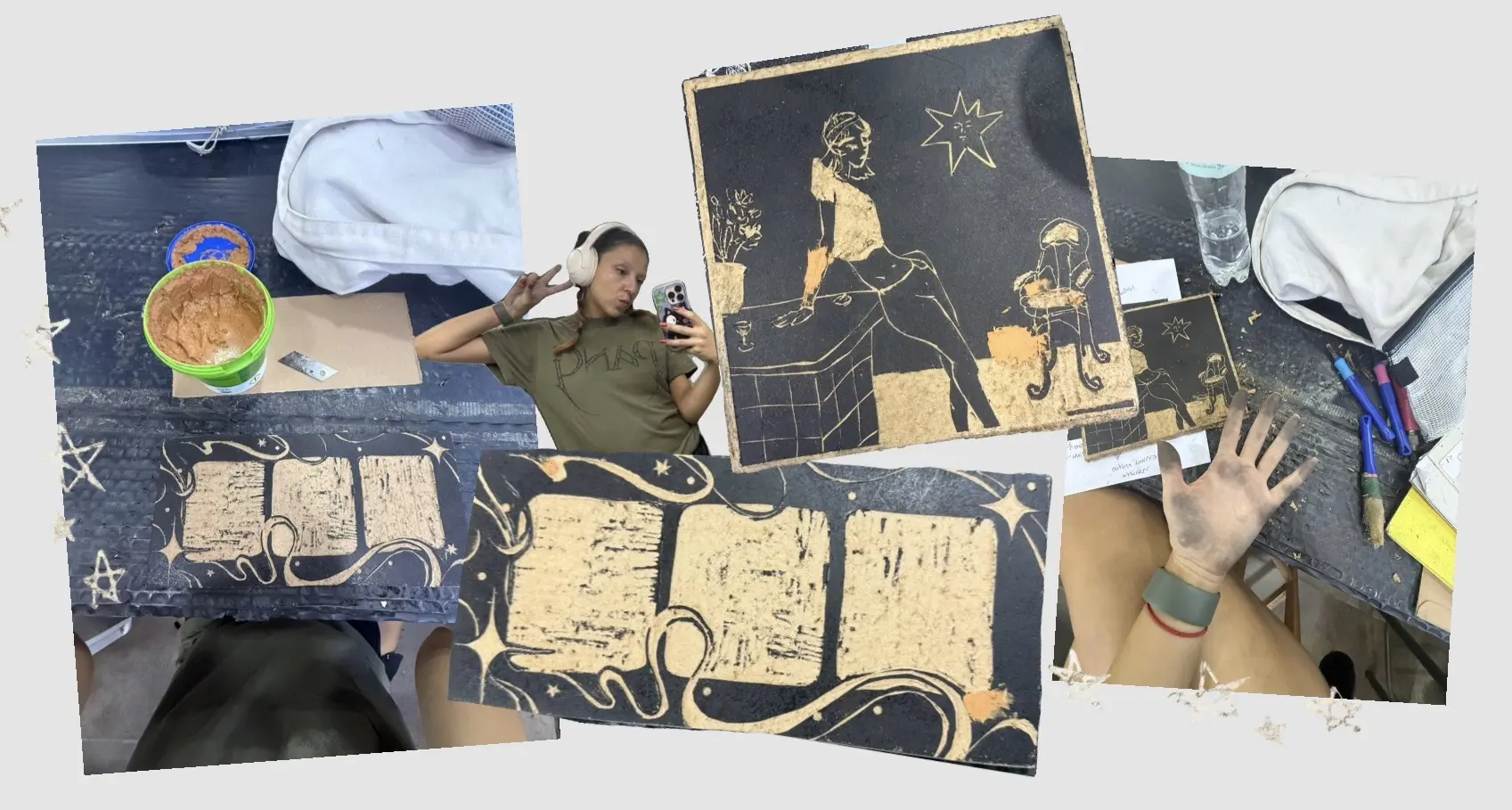
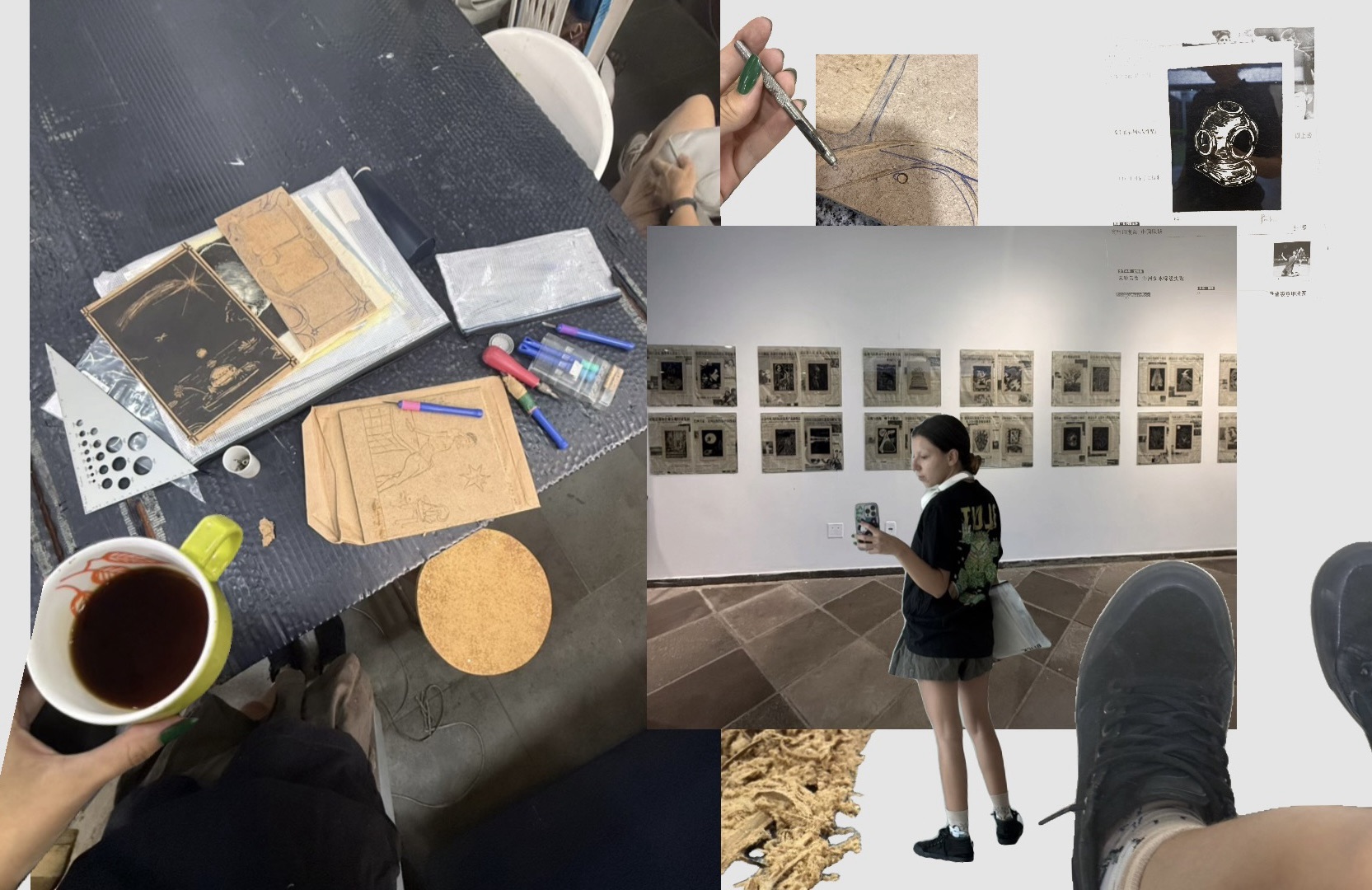
I’m really happy with how it turned out, especially the second series of multicolored prints. Here are some process pictures from several studio visits. Thankfully, I didn’t have to do any further cleanup on the design after the long cycle of test prints and adjustments described in my last studio log. You can read more about that process here, including all the ups and downs that got these designs to where they are now.
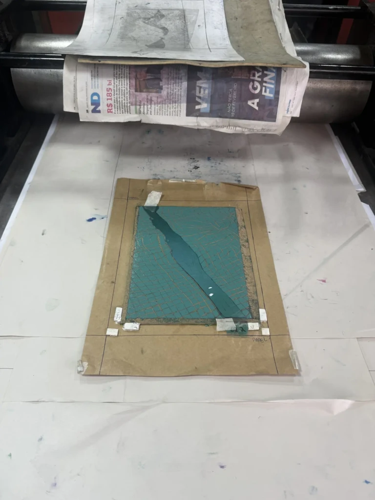
To achieve these split-color prints, I had to go through quite a bit of trial and error. My first attempt involved using a sheet of paper to mask half of the block while inking, but the results weren’t very clean. Once the masking paper touched the inked surface, it would leave behind subtle textures and inconsistencies, even if I rolled over the area again afterward.
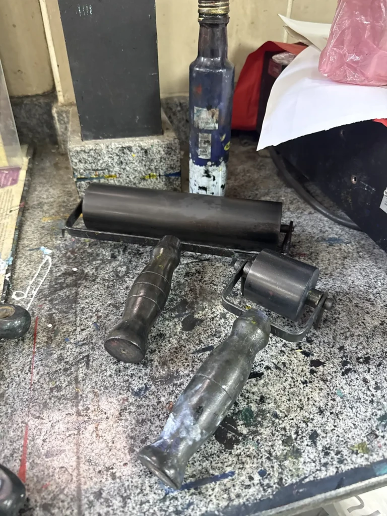
The best results came from simply being very careful and following the dividing line with the edge of the brayer. It took a steady hand and several failed prints, but the color separation ended up much cleaner that way.
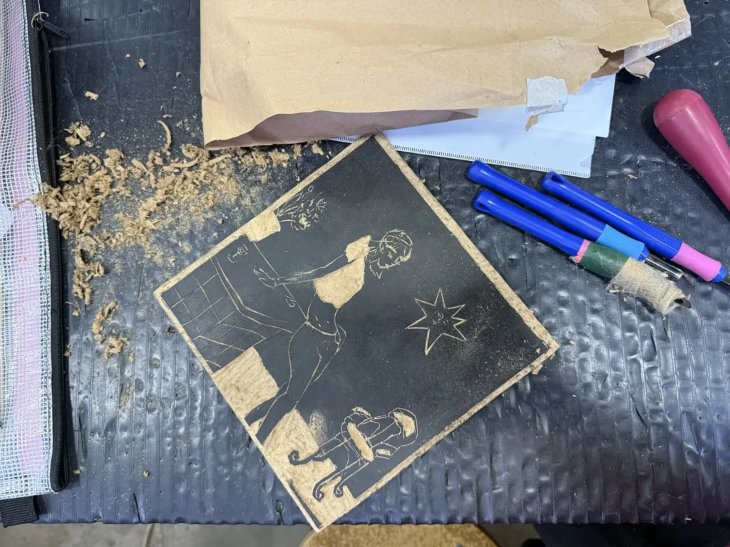
Untitled portrait design
Although this design required several rounds of testing, cleaning, and adjustments, I’m beyond excited with the final result. I really like the composition, which originated as a digital illustration and transferred to printmaking much better than I expected.
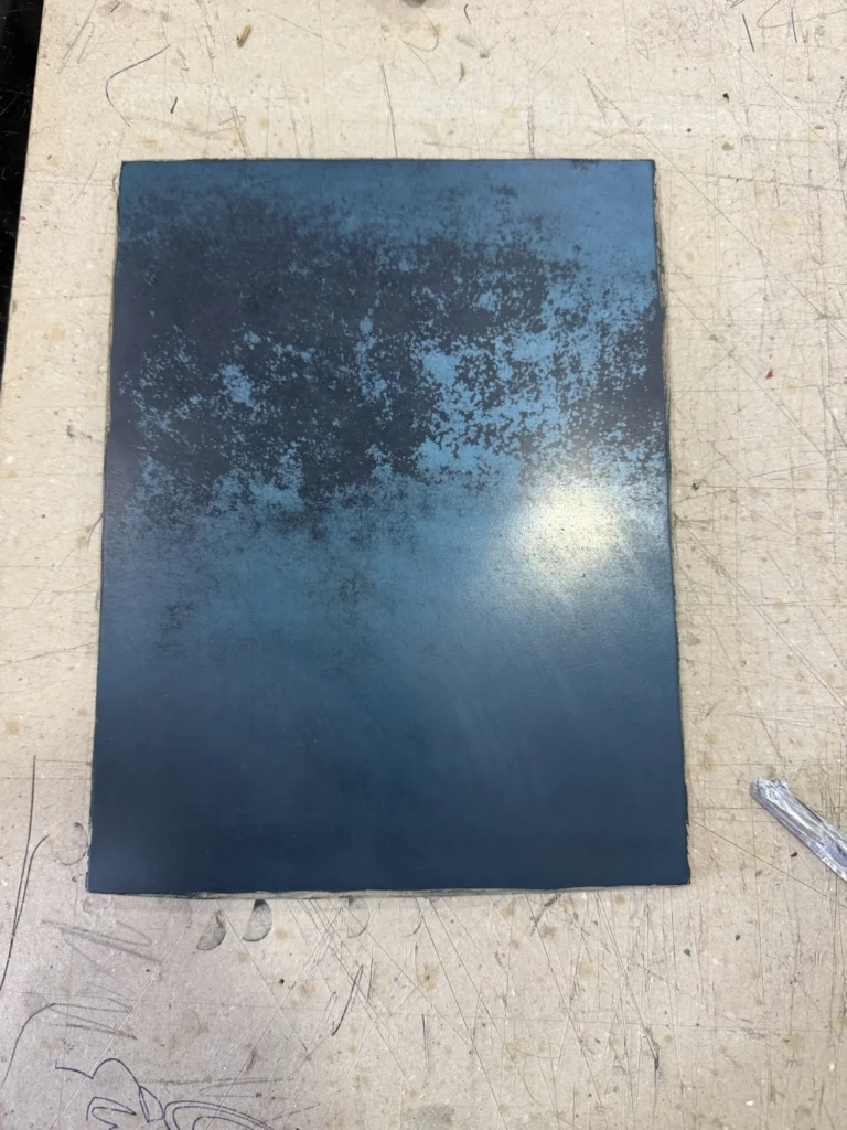
I also printed a small experimental series using a deep red ink. Despite my efforts to clean the block thoroughly, the prints came out a little blotchy. In the end, though, I think it created a beautiful rusty texture that adds character to the piece. Another happy accident, I guess.
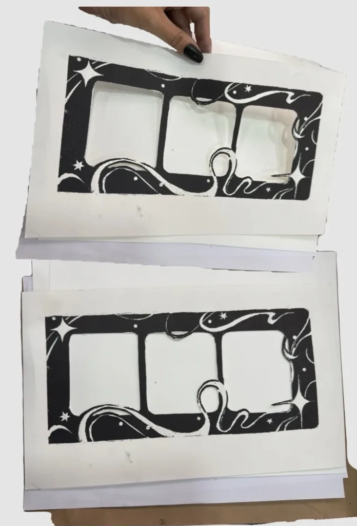
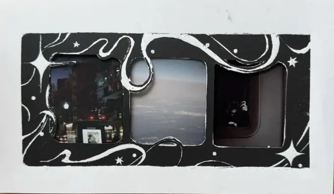
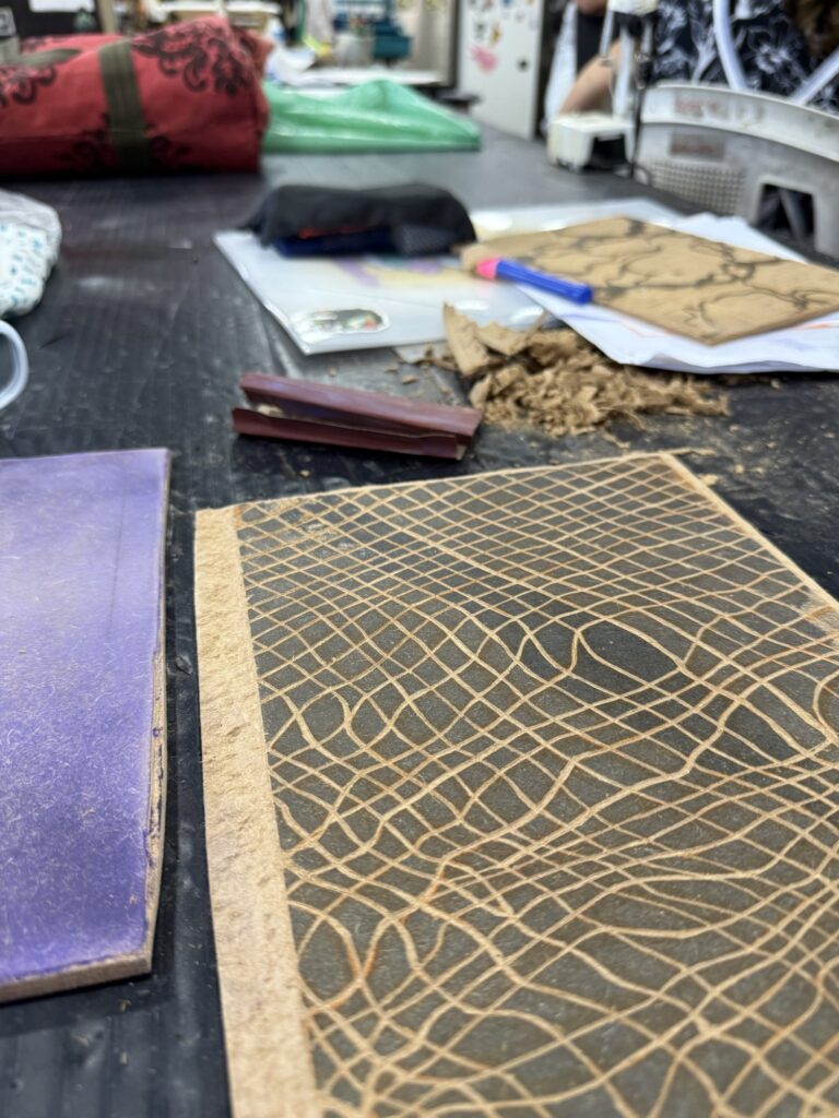
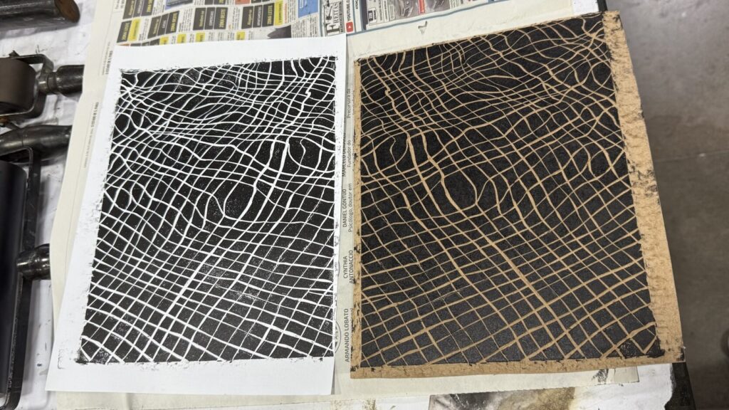
Frame Design
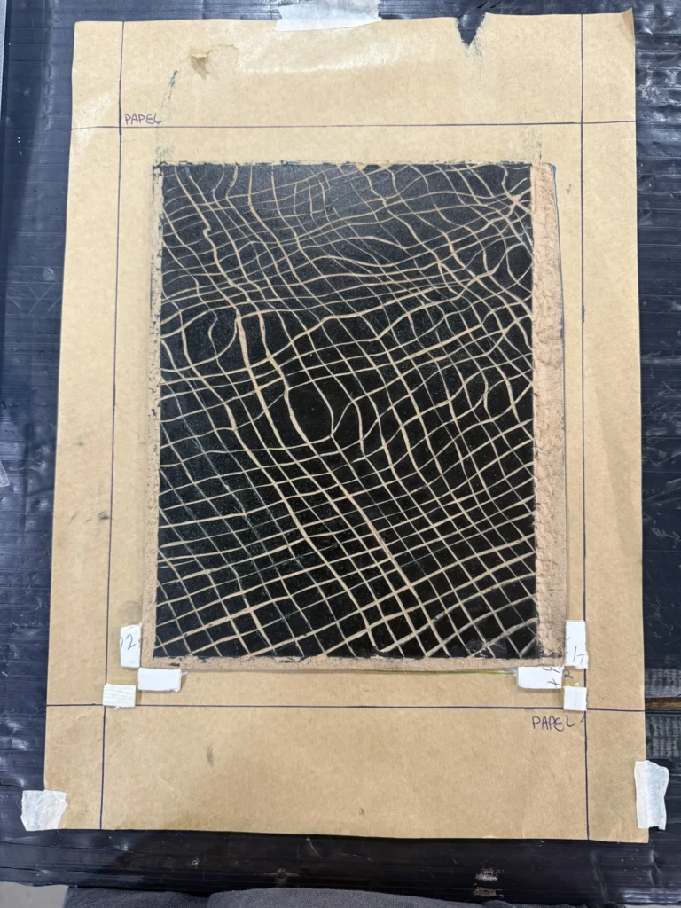
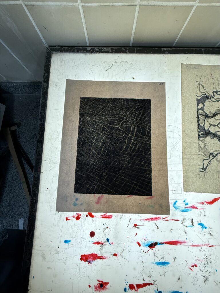
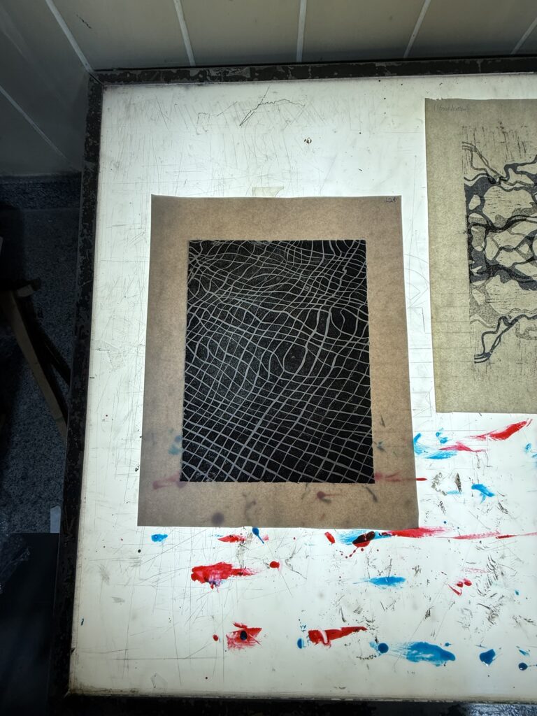
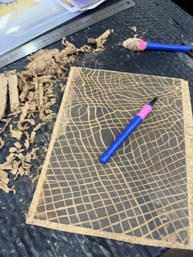
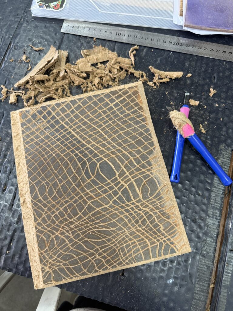
The third print I completed recently is this experimental design that could potentially be used as a decorative frame for photographs, stamps, or other small works.
This piece wasn’t particularly well planned—there are very few straight lines and almost no consistency in the construction—but I love the swirling elements and the overall sense of movement in the composition.
I printed the design in both black and red. I think it would work well in almost any color, including gradients, depending on its intended use. That said, the black version is probably the most versatile as an actual frame.
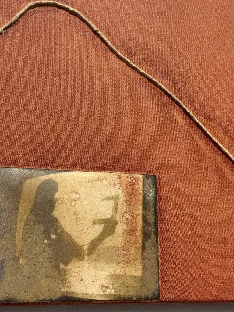
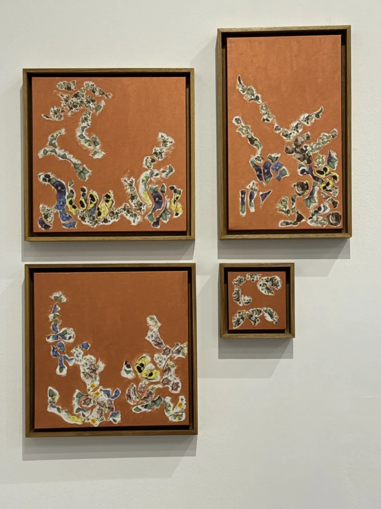
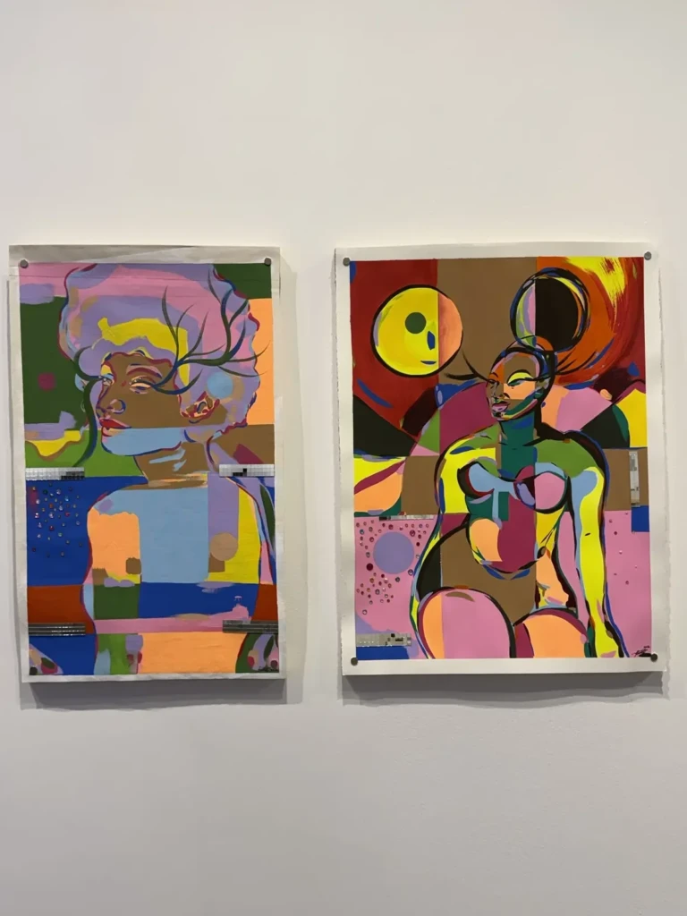
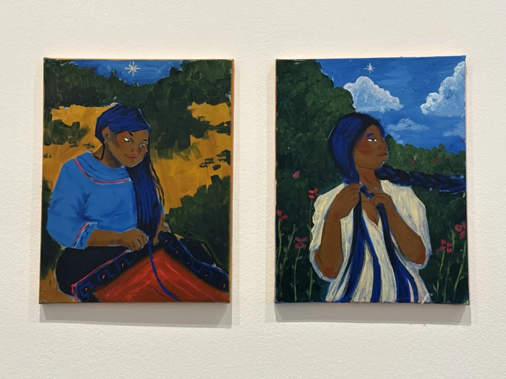
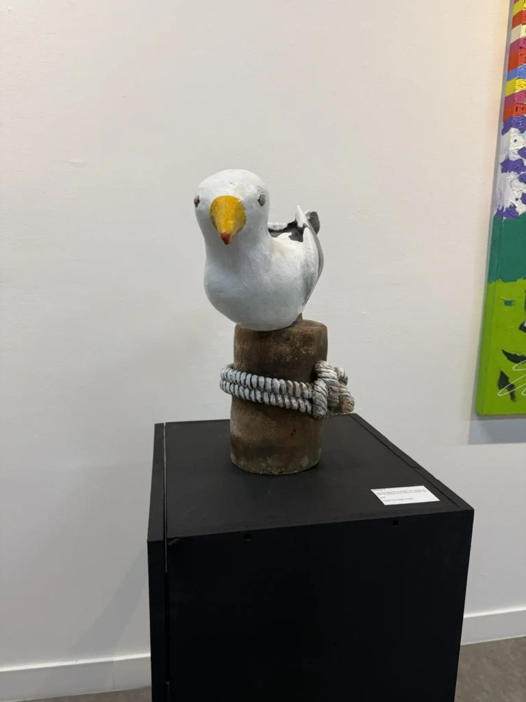
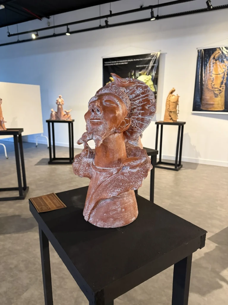
CIC expositions
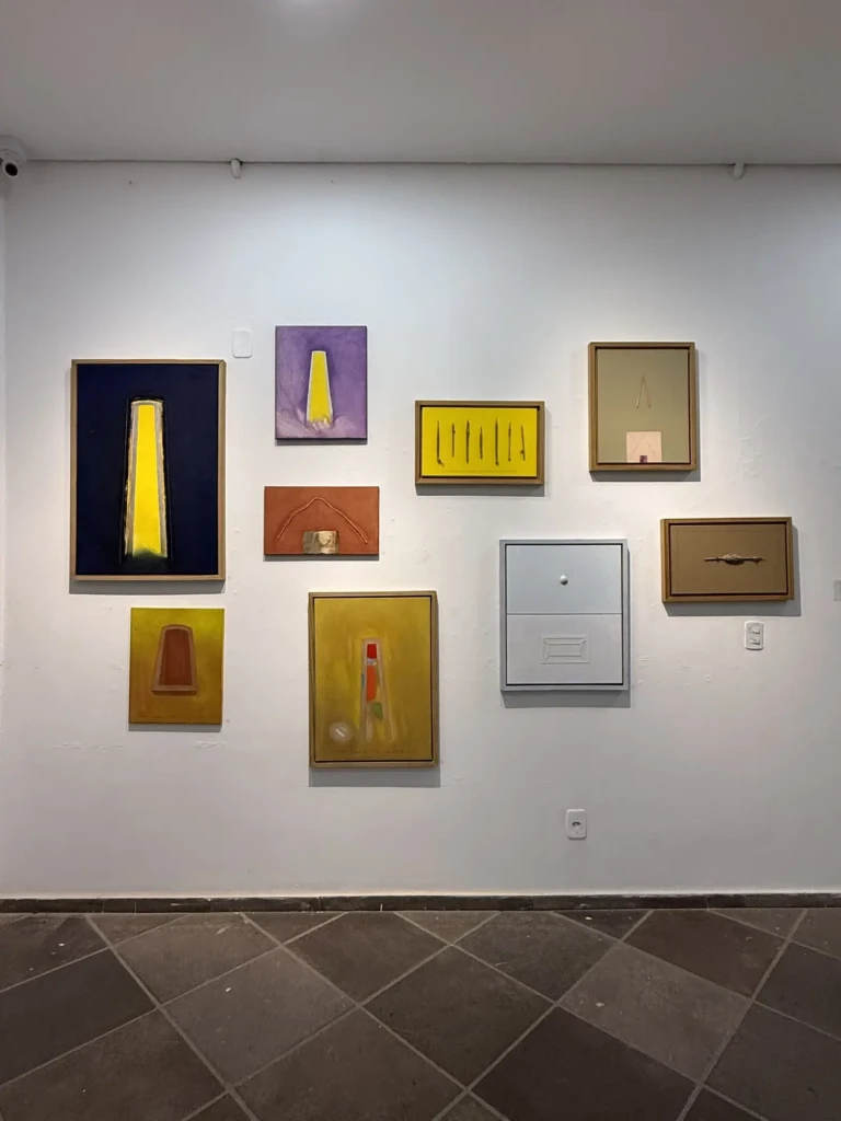
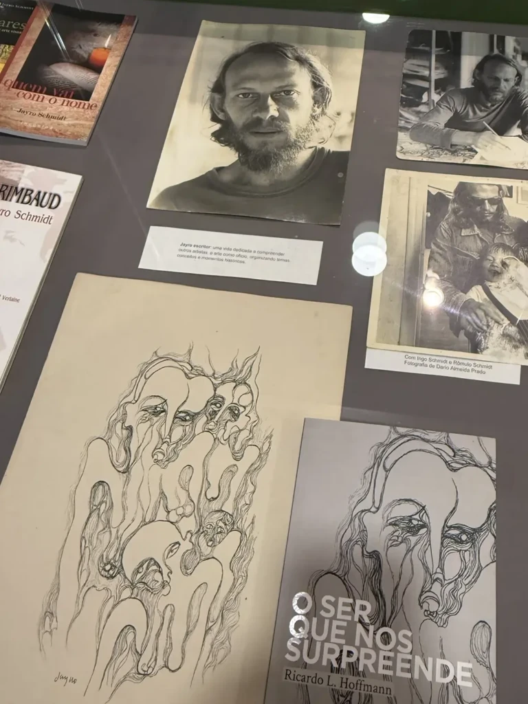
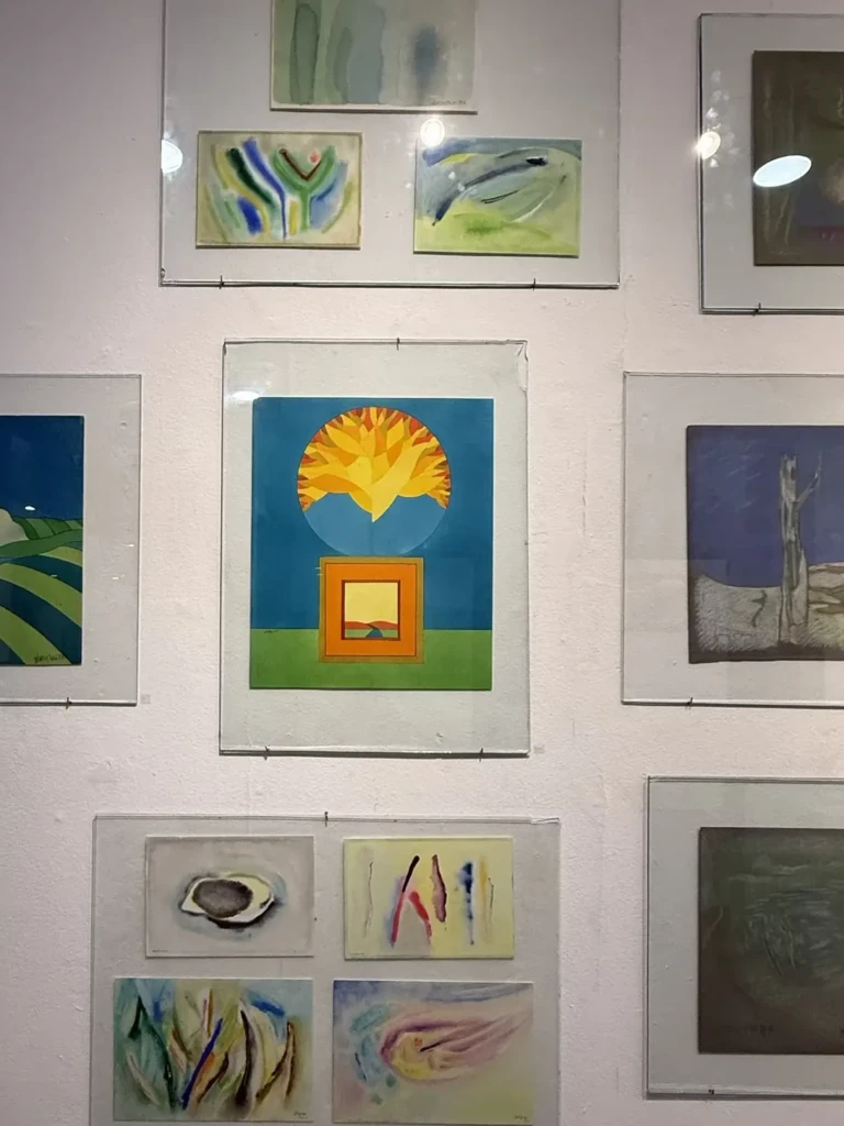
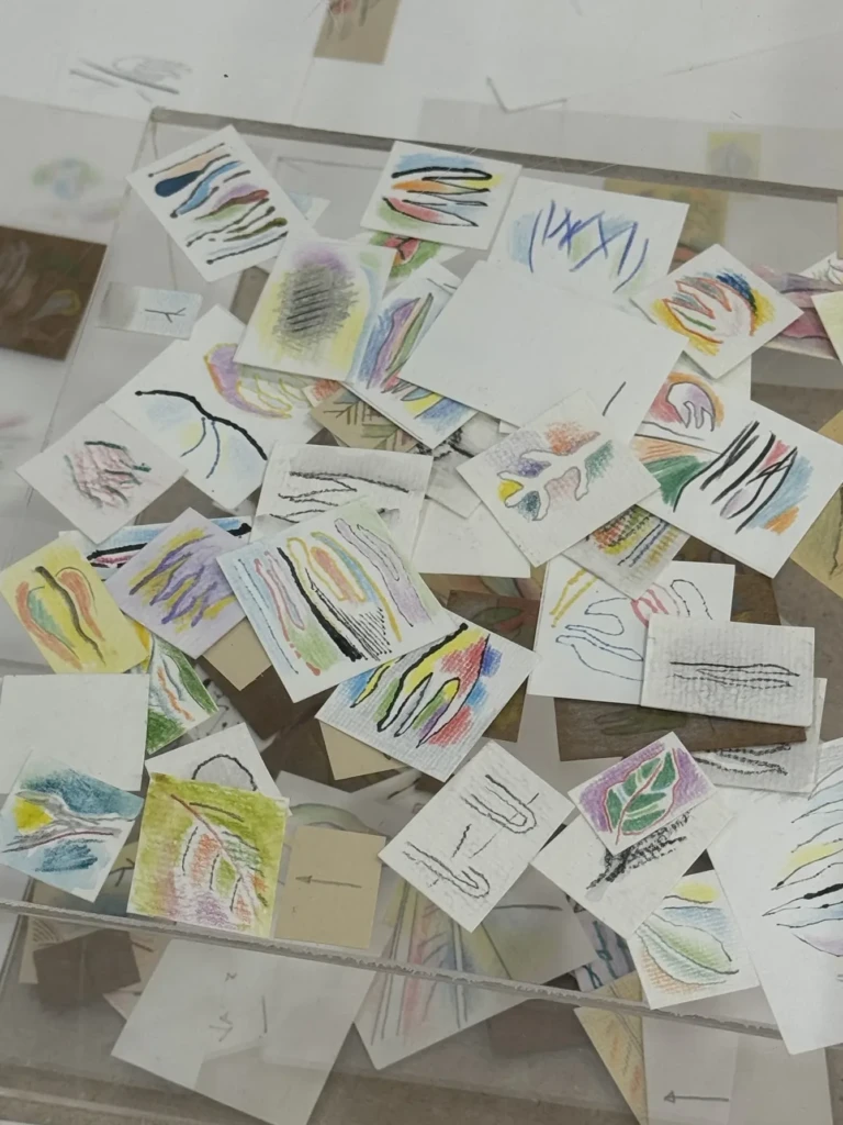
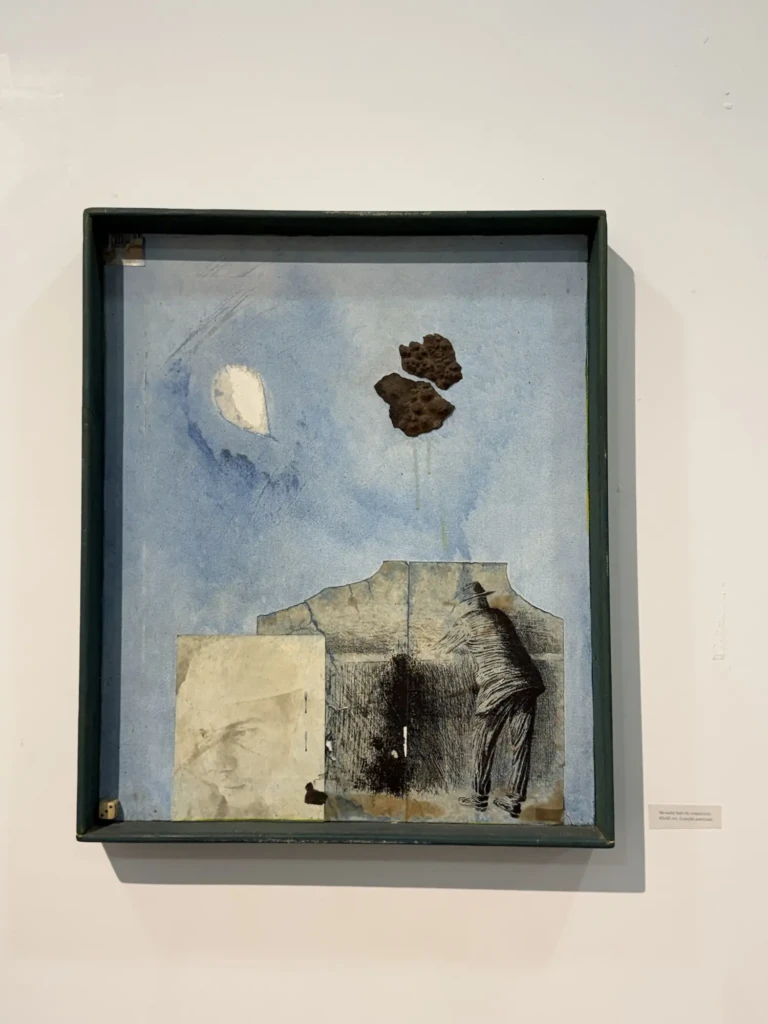
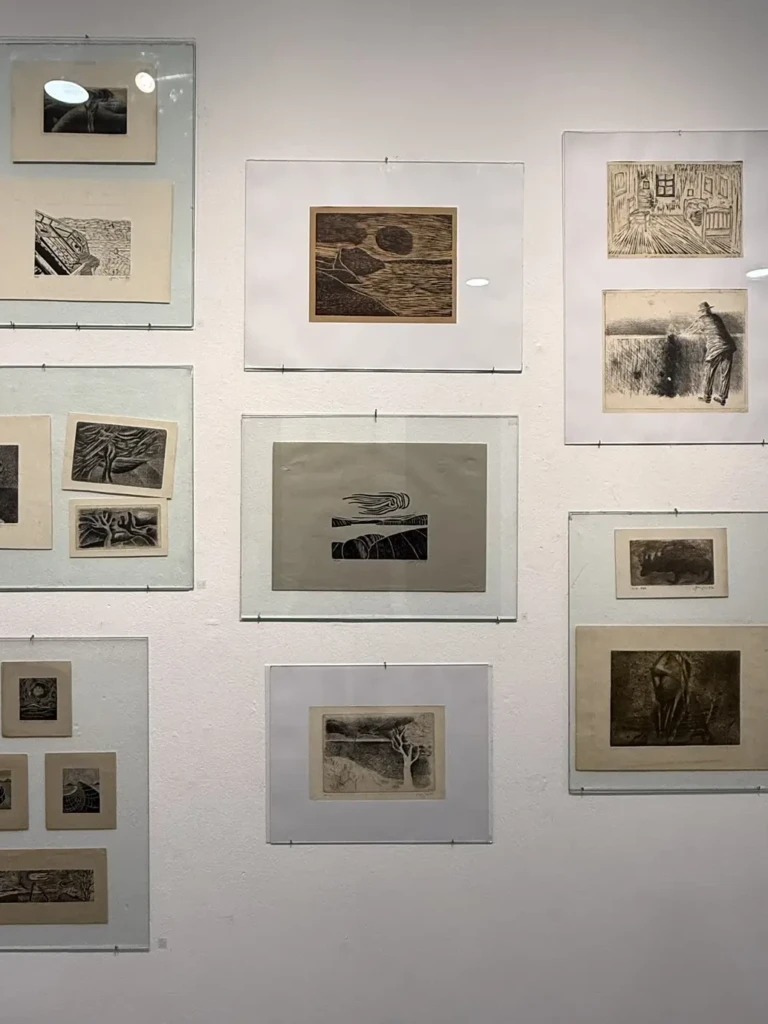
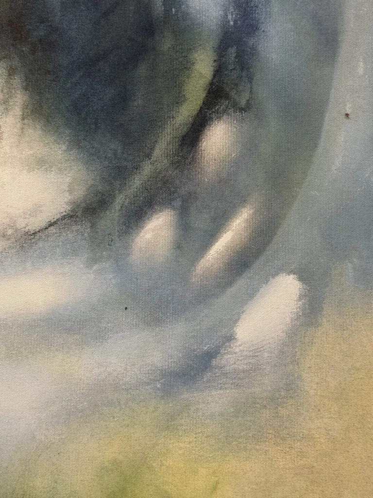
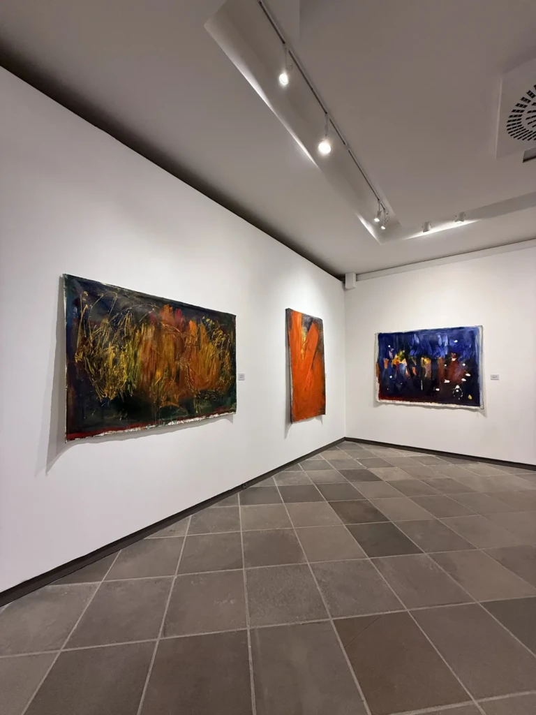
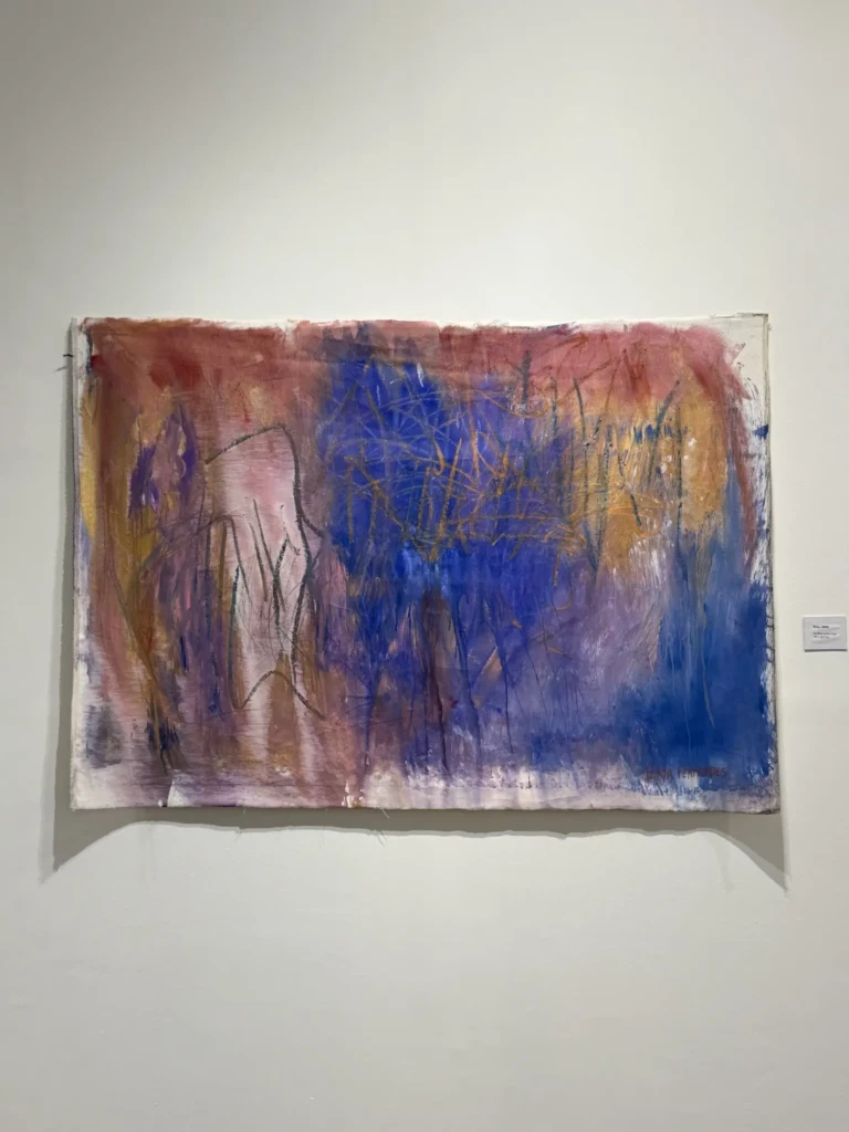
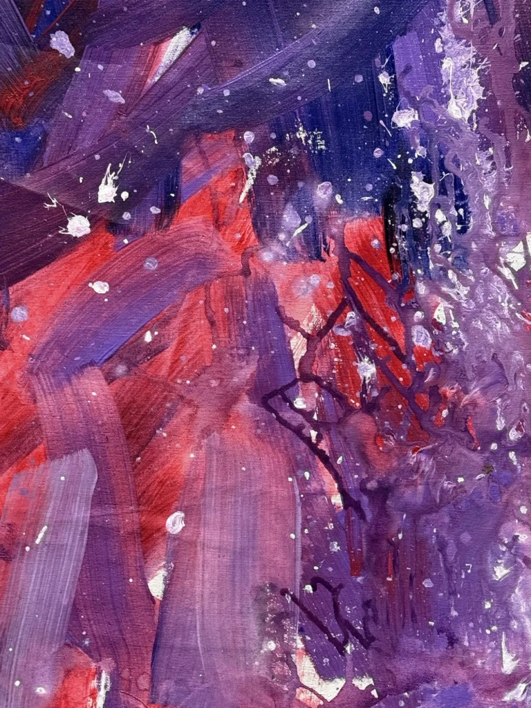
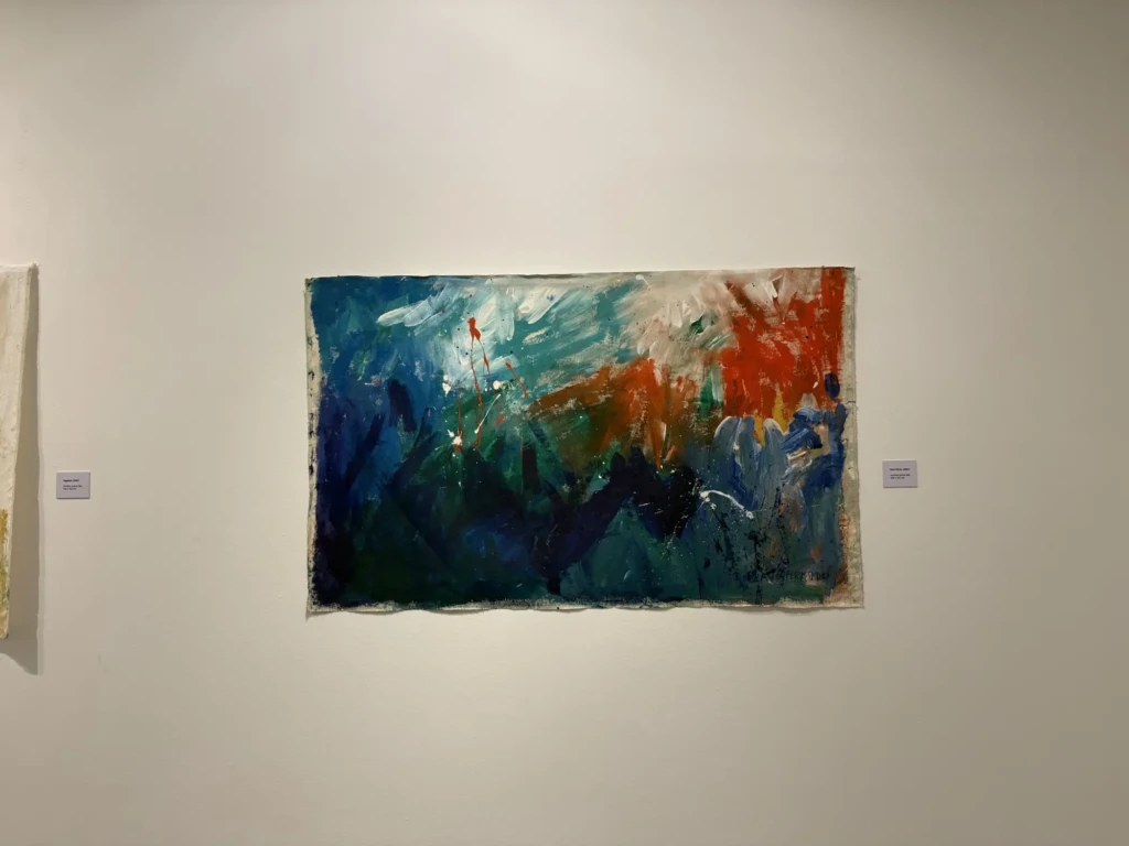
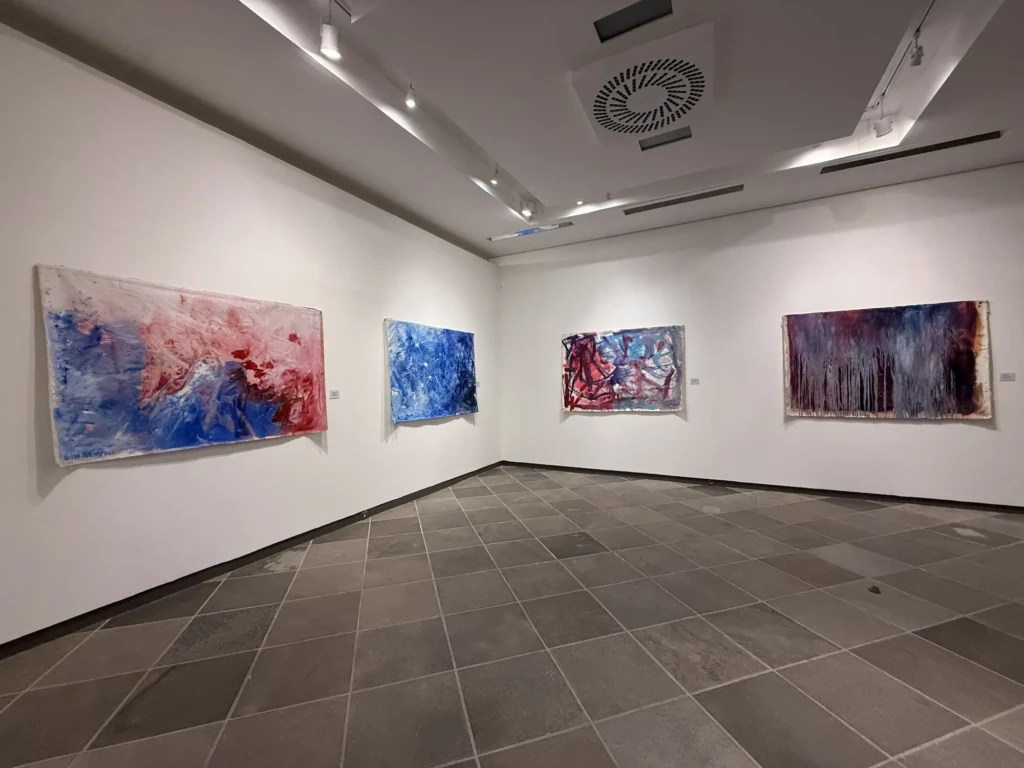
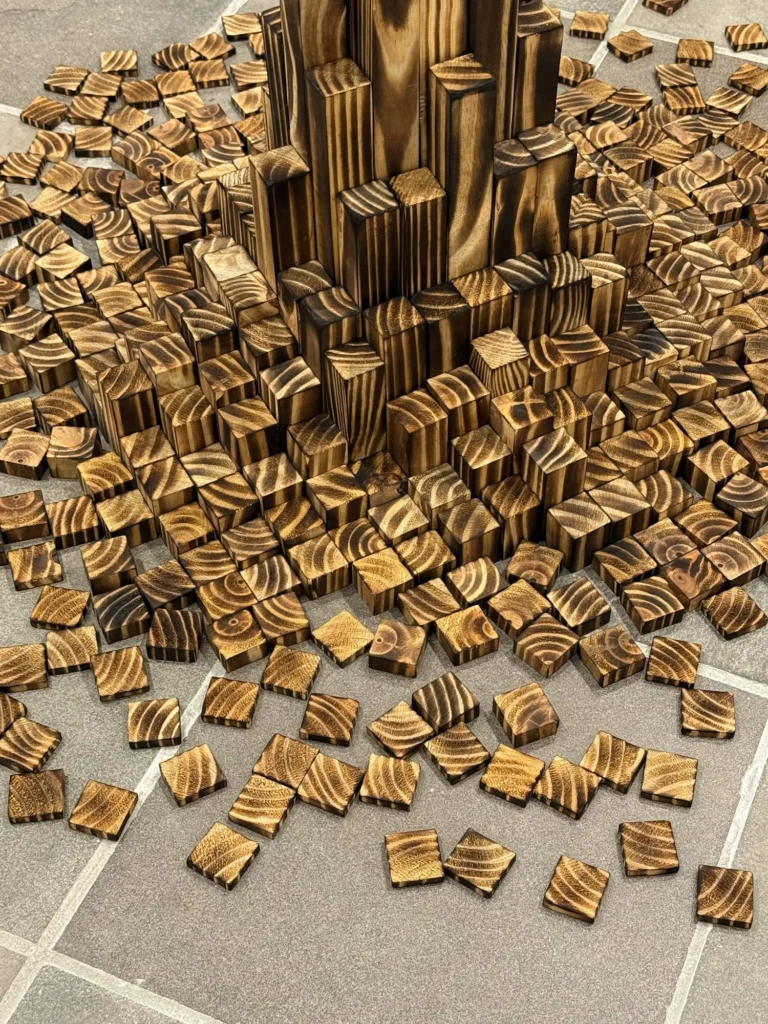
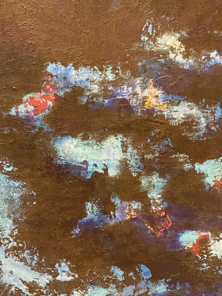
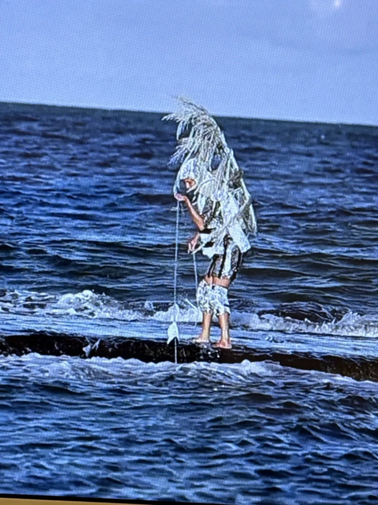
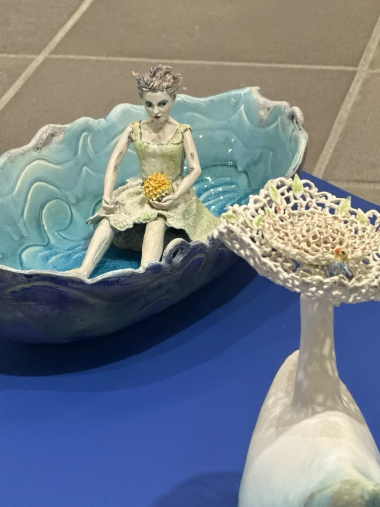
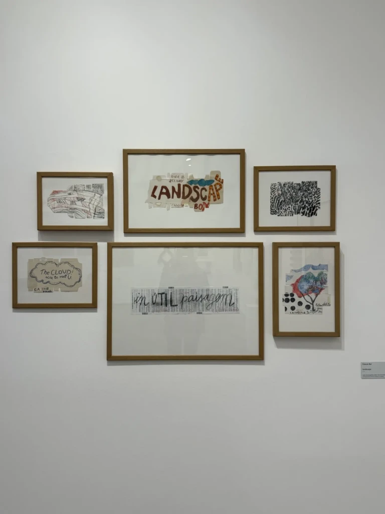
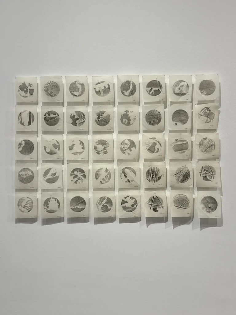
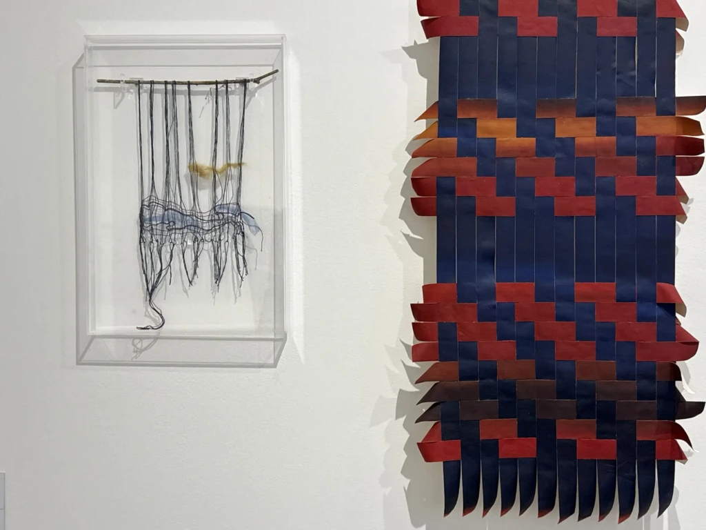
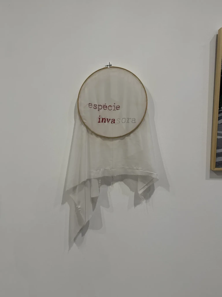
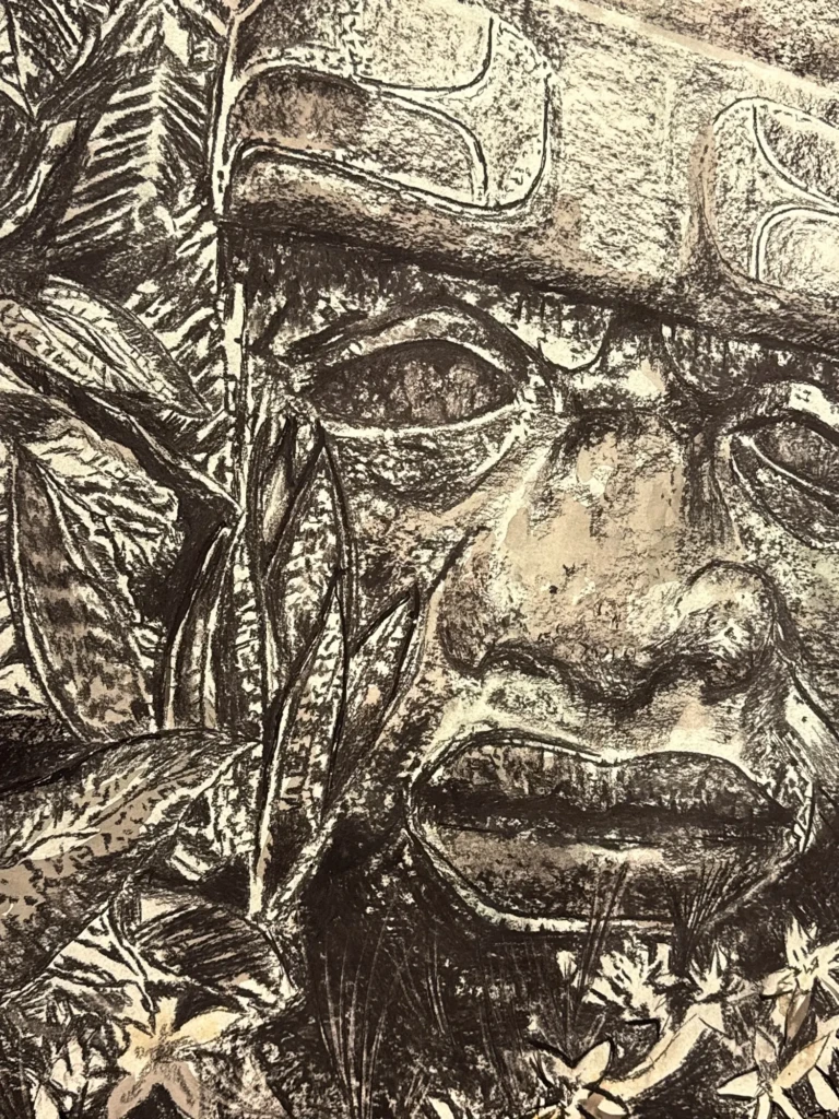
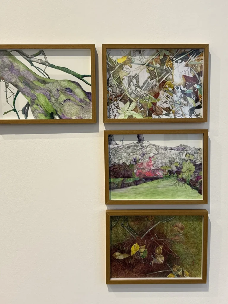
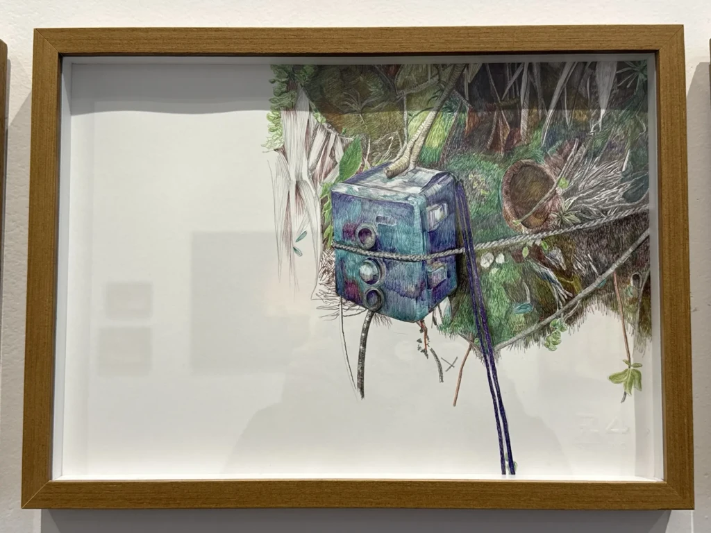
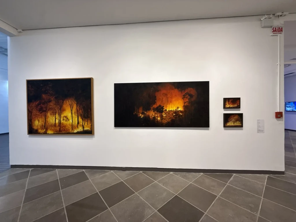
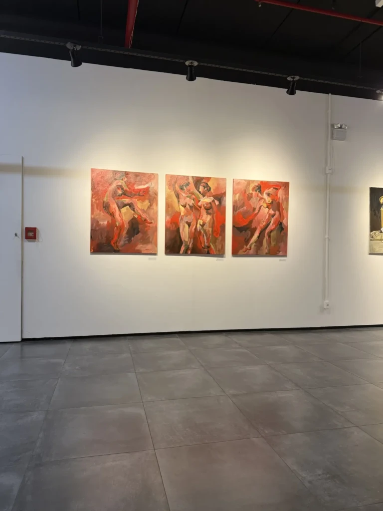
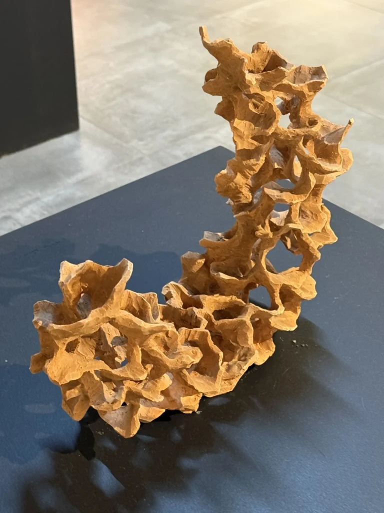
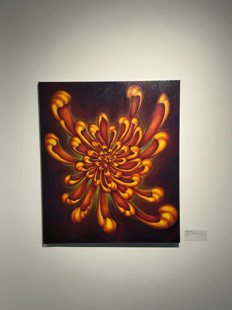
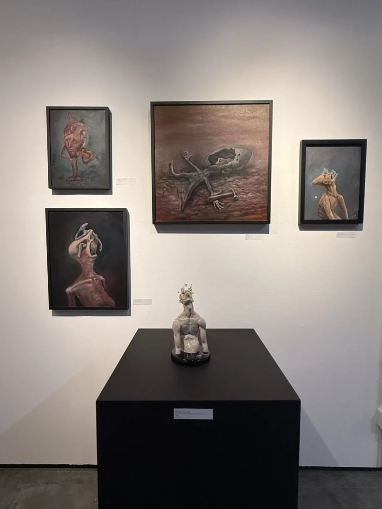
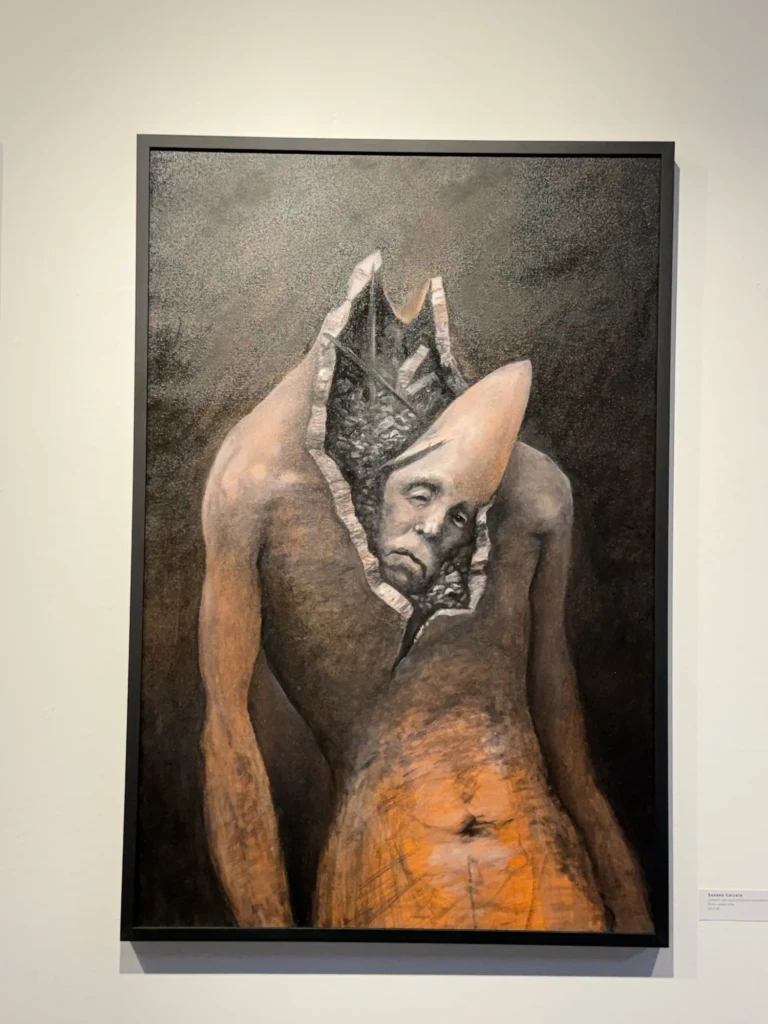
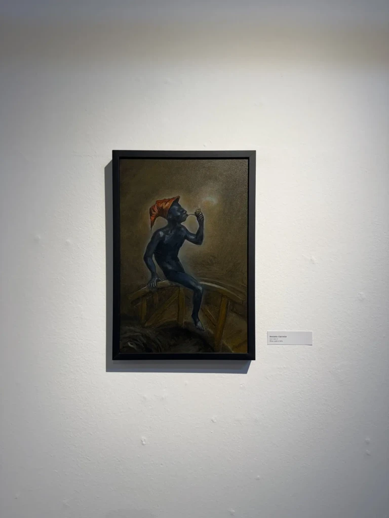
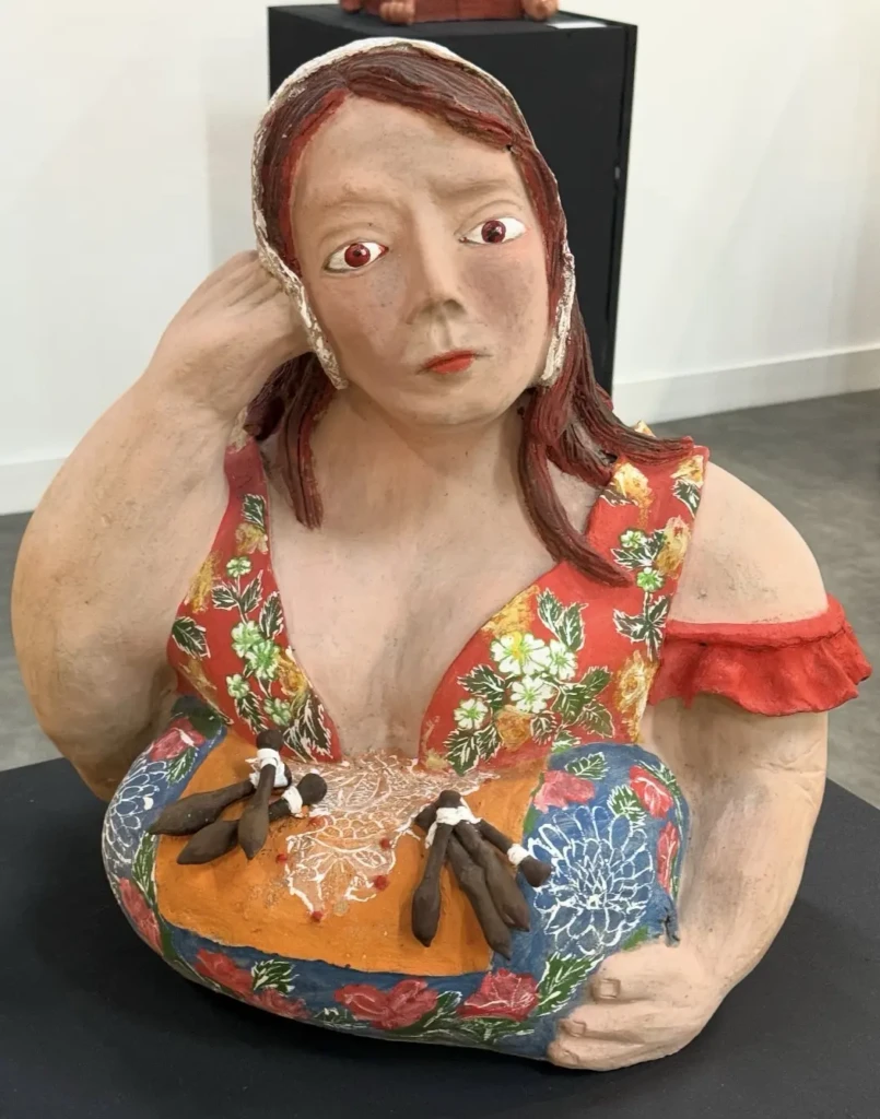
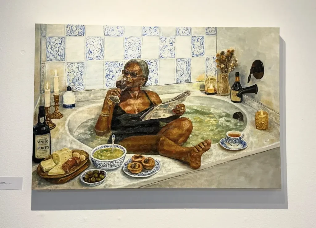
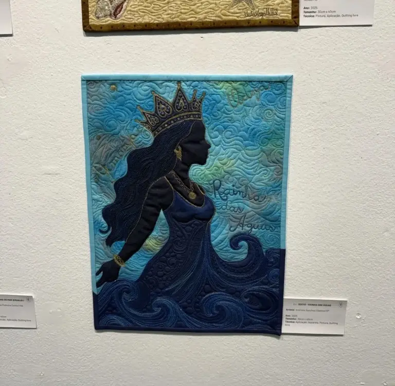
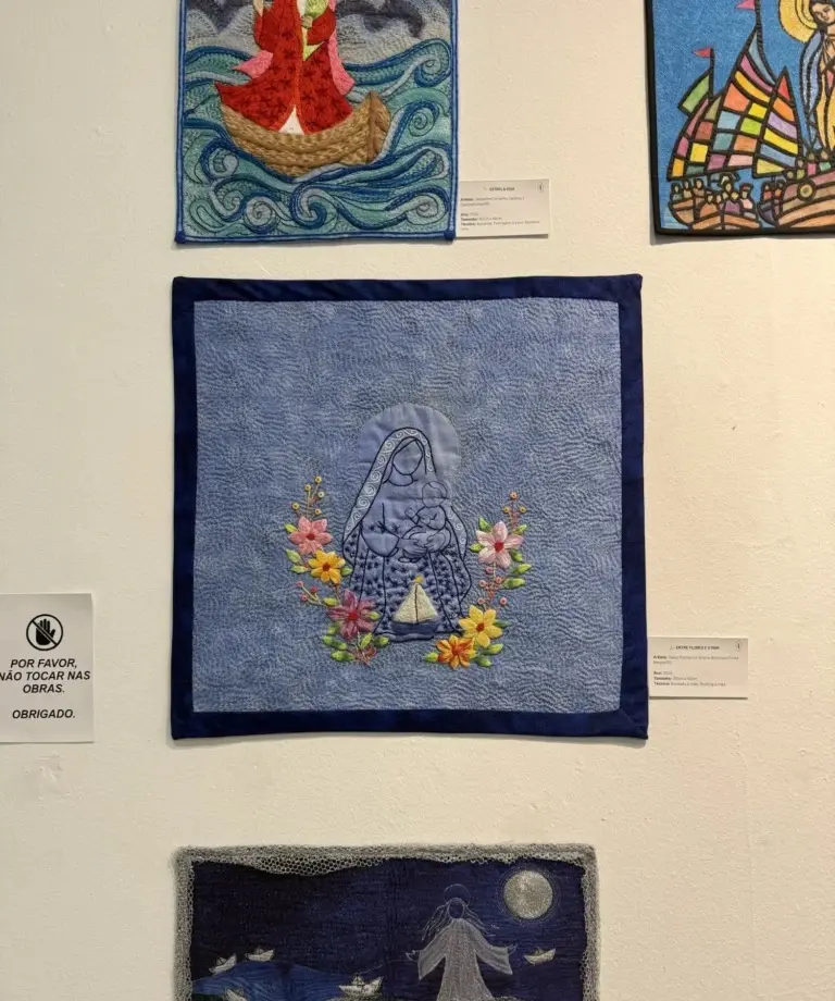
Throughout these studio visits, I also spent time wandering through CIC’s current exhibitions, drawing inspiration from a wide range of multimedia works by local artists. Here are a few pieces that particularly caught my attention, featuring the artist’s names:
Claudio Salvalaggio SchmitzJ. Dias (Dão)MousseMurilo LealBeatriz ReySusano CorreiaSusano CorreiaSusano CorreiaClaudio Salvalaggio SchmitzKarine AbbatiAndreza SanchezDalva Romariz e Ariane Antunes
The woodblock printing studio I attend recently open back up after a long summer break, and I am beyond excited to return to my printing practice!
A bit of context: Last year I spent a few months working on a multi-layered pool print. I love the piece and I almost had it, but I struggled a lot with aligning the layers correctly because of some early decisions(and mistakes) I made in the process. The frustration of spending months without seeing the expected progress, layered on top of communication challenges within the studio dynamic, eventually got the better of me and led to months of inactivity with the craft.
In the meantime I took DJ classes and explored my creativity in multiple other ways I’ve been sharing here. Enough time has passed now that I finally feel recharged and motivated to get back into the studio, workshop some new solutions and give the big project another try.
Since the studio reopened in early March, I’ve been working on some simpler pieces I had on the ‘back burner’ from last year. They are experimental, single color, low-stakes pieces. I thought they were a good way to get back into the groove, polish up my rusty skills, and re-familiarize myself with the full process before jumping back into the pool project – pun intended 🙂
The main challenge I had with the pool print was the alignment of the layers. I had already tried a few registration techniques (systems that help align paper and multiple print layers consistently) but none gave me reliable results. So I decided to use these experimental pieces as an opportunity to test better registration methods.
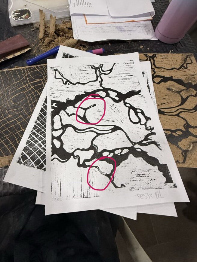
Over these first weeks back, it’s been a constant cycle of test printing, spotting imperfections, carving corrections, printing again, noticing new issues, making more fixes, testing again… and yes, somehow still finding more things to adjust. At this point, I’m heading into round four of test prints.
Each phase often takes an entire studio day, and many steps require drying time in between, so progress is slow, methodical, and honestly a real test of patience. It’s been a powerful reminder that this craft really demands presence. I always imagine things moving faster and smoother in my head than they actually do, so part of this return has also been about accepting the pace, trusting the process, and resisting my urge to rush results. Easier said than done… but we’re working on it.
Here’s a compilation of process-pictures from all the cleanup work, test prints, revisions, and multiple rounds of “polishes” of the design, along with some insights into my decision-making rationale:
1. The Designs – Where we Started
My first day back was a relatively chill one: revisiting my ongoing experiments, refamiliarizing myself with old projects, and deciding what felt most achievable.
Out of six unfinished projects, three were close enough to completion that they became my priority pieces. I had coffee, learned how to use a fun hole puncher my professor lent me, and checked out the current exhibition of woodblock studio artists.
2. First Round of Test Prints
The following week, I came in ready to print. After doing finishing touches and border cleanup both in the studio and at home, I finally tested the designs. Overall, the prints came out pretty well, but of course the process immediately revealed more issues: spots that needed cleanup, small imperfections, and even areas where the wood itself was beginning to lift and needed gluing. So… back to fixing.
3. Cleanup, Corrections, and Wood Putty
During that same visit, I spent a lot of time refining the blocks, including adding wood putty in areas where I had made carving mistakes and needed to essentially “reset” sections.
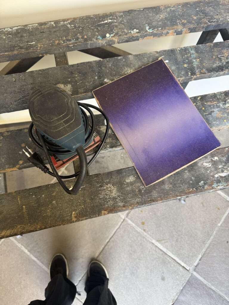
This meant waiting for the putty to dry, returning later, carving those areas again, and trying to sand everything flat enough that the repairs would disappear into the print surface. Spoiler: I did not sand it quite enough.
4. Registration Guide Experiments
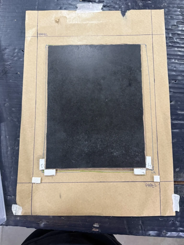
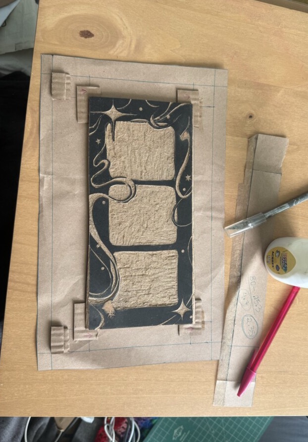
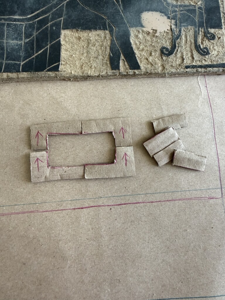
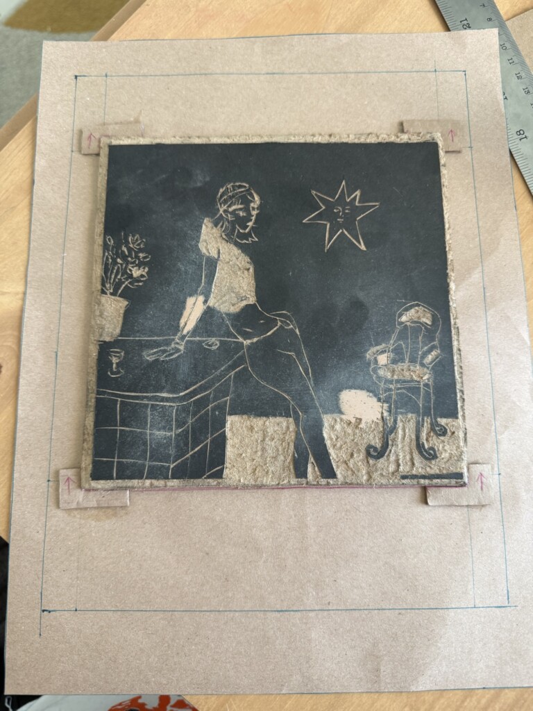
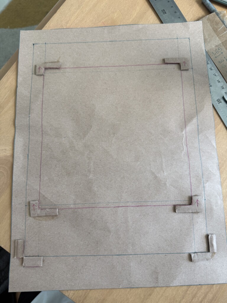
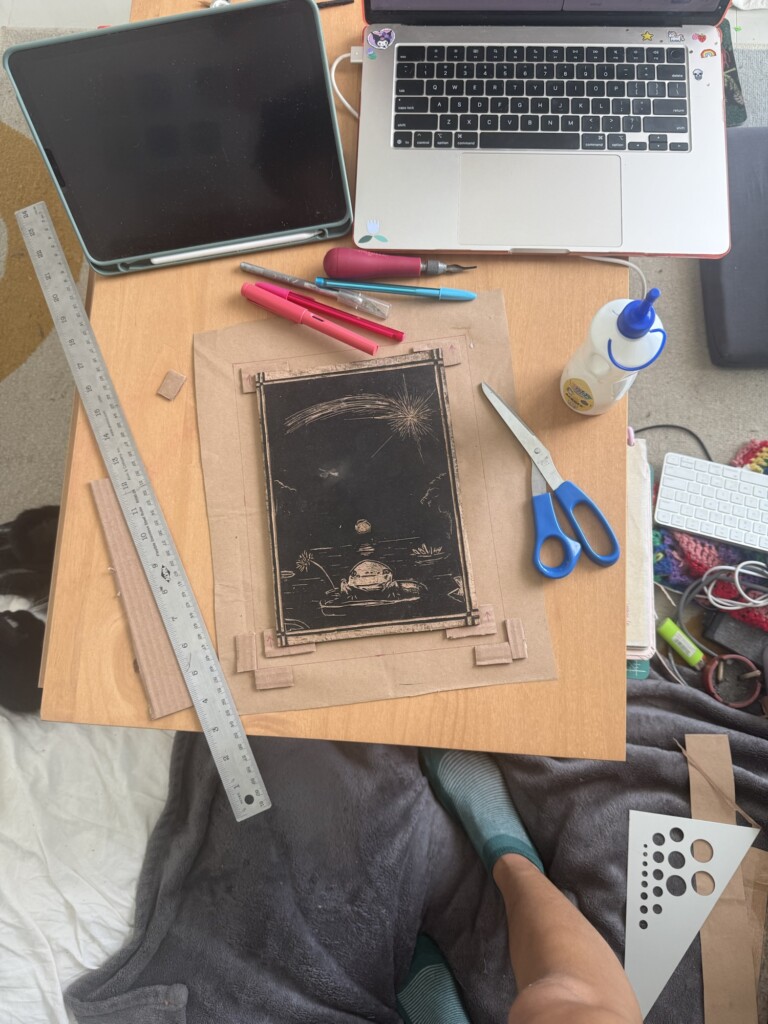
At home, I also built a new set of registration guides for all my designs.
This was a major step. I created upgraded templates with physical slots for the woodblock itself, plus two different paper alignment systems:
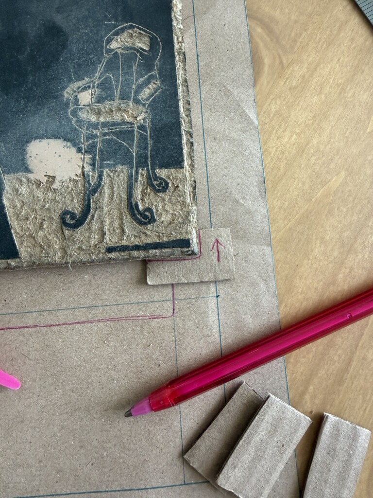
Outer alignment: paper fits inside corner slots
Inner alignment: paper corners align against raised squares
After testing both, I found that for my medium-thickness paper, the raised-square method worked better. The corner-slot version sometimes let the paper dip below the edges, causing shifts.
5. Second Round of Test Prints
Back at the studio, now with my new registration guides and my intended final paper, I was ready for another set of test prints.
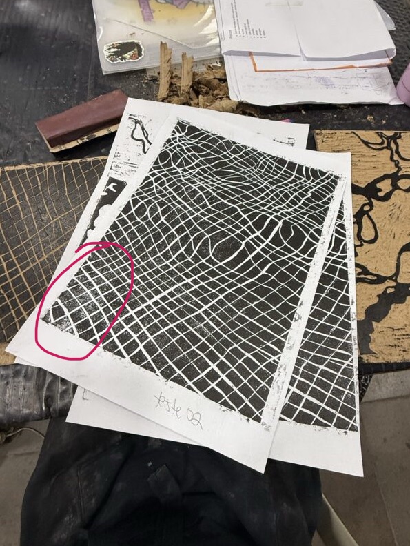
As I printed I kept getting “grainy” results, instead of a solid layer of color. Bebeto, the studio master, helped me figure out that the blocks had gotten grainy after sitting in storage for months. Another issue I noticed was that I could see the border of the wood putty applications. So back to sending and smoothign these surfaces. Hopefully that would be the last fix.
6. Sanding, Polishing, and More Problem-Solving
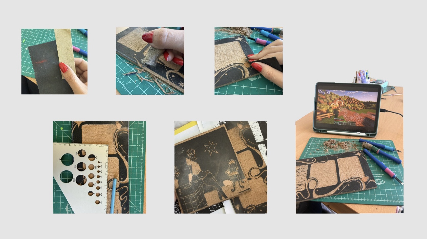
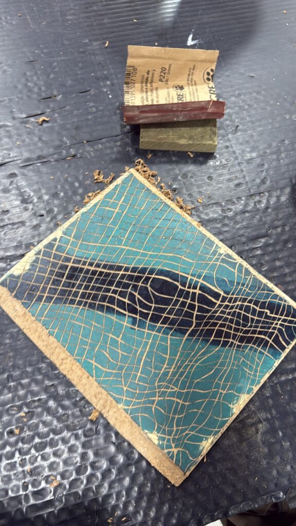
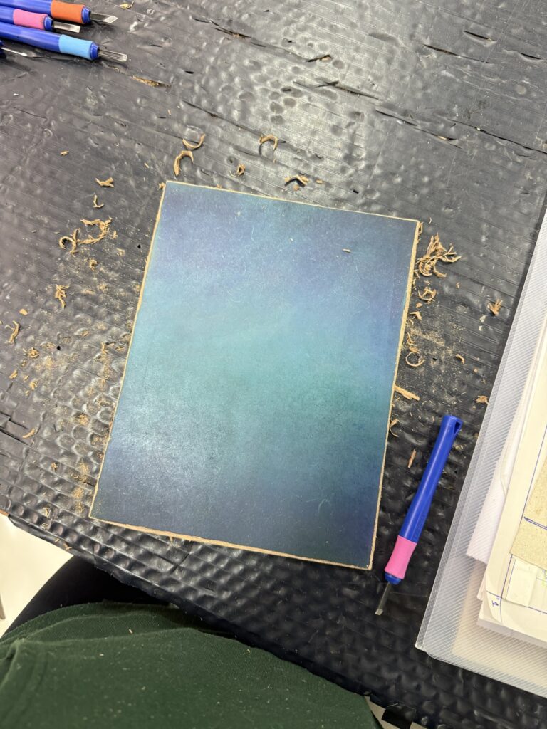
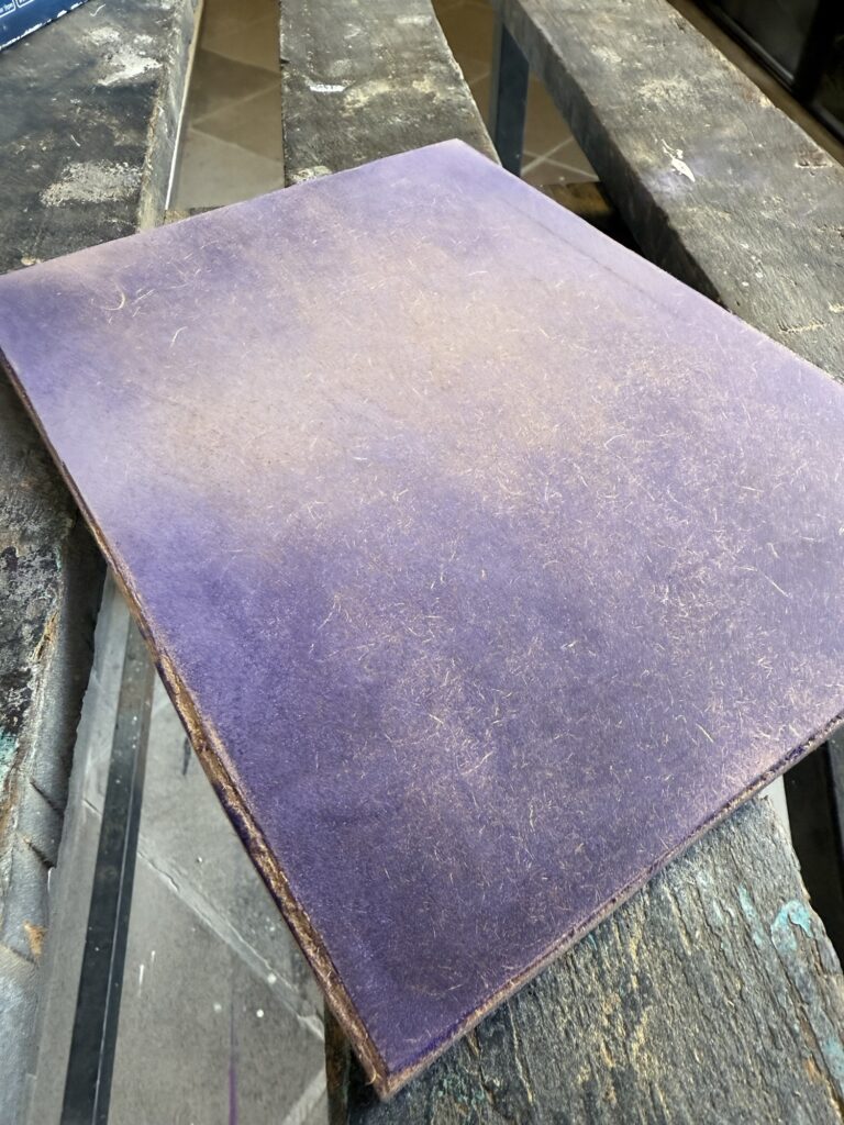
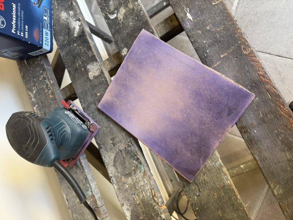
After a few days I went back into the studio to sand my blocks down but unfortunately one or two were still not fully dried. Thankfully a studio friend was around and thought me a cool way to remove the paint and do a fine polishing/sanding to the board using regular printing paper as sandpapaer, slowly removing the ink and then polishing the surface. I was afraid that using actual sandpaper might remove sharpness of details (made that error before) and this was the perfect solution for 2 of my designs.
For the design with the wood putty I had no other choice but to actually file it down, very carefully. Hopefully I didn’t mess it up :}
After giving the ink time to dry, I returned to the studio planning to sand everything down.
Some blocks still weren’t fully dry, but thankfully a studio friend showed me a brilliant trick: using regular printing paper like ultra-fine sandpaper to gently remove residual ink while polishing the block surface.
Honestly? Game changer.
This worked beautifully for two of my designs and avoided the risk of over-sanding delicate details with real sandpaper.
For the wood-putty-heavy design, though, I had no other choice but to actually file it down, very carefully. Hopefully I didn’t mess it up :}
Where we are at and future steps:
At this stage, I can already see clear differences between test print rounds one and two, which is encouraging.
I still need at least one more full round of test prints to see whether these latest fixes actually pay off — and I’ll also keep experimenting with paper smoothness, thickness, ink quantity, and alignment consistency.
A bit of an exhausting process of trial and error. However, one that continues to teach me to be patient and mindful of my process.
I hope you have been patient with yourself as well.
It’s been a minute since I last posted about my printmaking process, right?
Well… We hit a rough patch — talked it out, cried our feelings — and I didn’t want to drag you into the drama. We made up, but like any complicated relationship, we’re still figuring out our next chapter together…
All jokes aside, I really did have a hard time during the past few studio visits. I’ve been dealing with some personal things, and it was frustrating that one of my creative outlets became yet another challenge when I was looking for comfort.
Making art and learning new skills require a lot of introspection: facing challenges, sitting with difficult emotions, and figuring out ways to process and overcome them. And when life gets messy, of course it spills into your craft too. In the end, it’s not just about mastering a skill — it’s also about practicing bigger life lessons.
I’ve been struggling to finish this piece. You can probably see my frustrated decline into paralysis in the past posts — or in the lack of new updates altogether. I’ve been trying to figure out how to align the layers of the print, which has proven very difficult because of mistakes (or let’s be honest, my deviation from the recommended process) early on. I should’ve been more careful when cutting my boards so they were all the same size from the start…
Part of the struggle is technical, but it also touches on bigger things: my communication style, my resistance to rules, and the tug-of-war between perfectionism and artistic freedom. It’s frustrating to explain my problem and not feel understood. I’ve asked for help, followed tips, and still ended up stuck. I wish I had someone who could sit with me, look at it from my perspective, and help me problem-solve instead of brushing it off with, “just fix it next time.”
And yet — this project is my best piece so far. It took real research and reflection before I even began, and I’m proud of the gradient technique paired with the patterned layers I developed. It’s effective, original, and to have come up with it on my own in just my second year with this medium feels huge. That’s why it hurts when others don’t see what it means to me, or when I can’t quite get the help I need. At this point, it’s bigger than just aligning layers. It’s tied to my personal struggles and my growth as an artist.
After a few frustrated attempts, broken up by weeks away, I finally decided to take a proper break from this piece. I’ll return with a calmer mindset and fresh eyes. That was a hard call — I’m stubborn, I’m deeply invested in this work, and honestly, I felt pressure from this blog too. This is the first project I’ve shared with you step by step, and it feels strange to pause without finishing it. But that’s part of the process. And since I committed to sharing my creative process with you, here we are!
What projects and challenges have you been working on lately? Can you relate to my experience? Let me know 🙂
Another week goes by and, honestly, I still have no idea what the fuck I’m doing. I was so ready to start printing today — but, of course, that’s not quite how things turned out.
I arrived at the studio feeling centered and determined. Nothing could throw me off. I had a solid plan: finish my guide, get Bebeto’s approval, and print 20 gradients (aka layer 1). I did knock out the missing elements of the guide, plus I cleaned up some messy edges on both layer 1 and 2. So far, so good.
Finished Guide 2.0Cleaned Up Layer 3Cleaned Up Layer 1’s edges
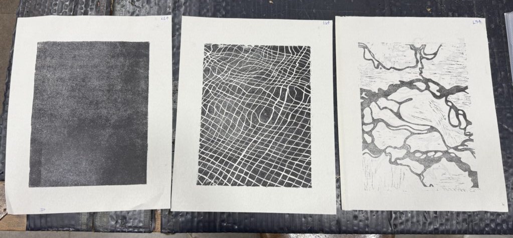
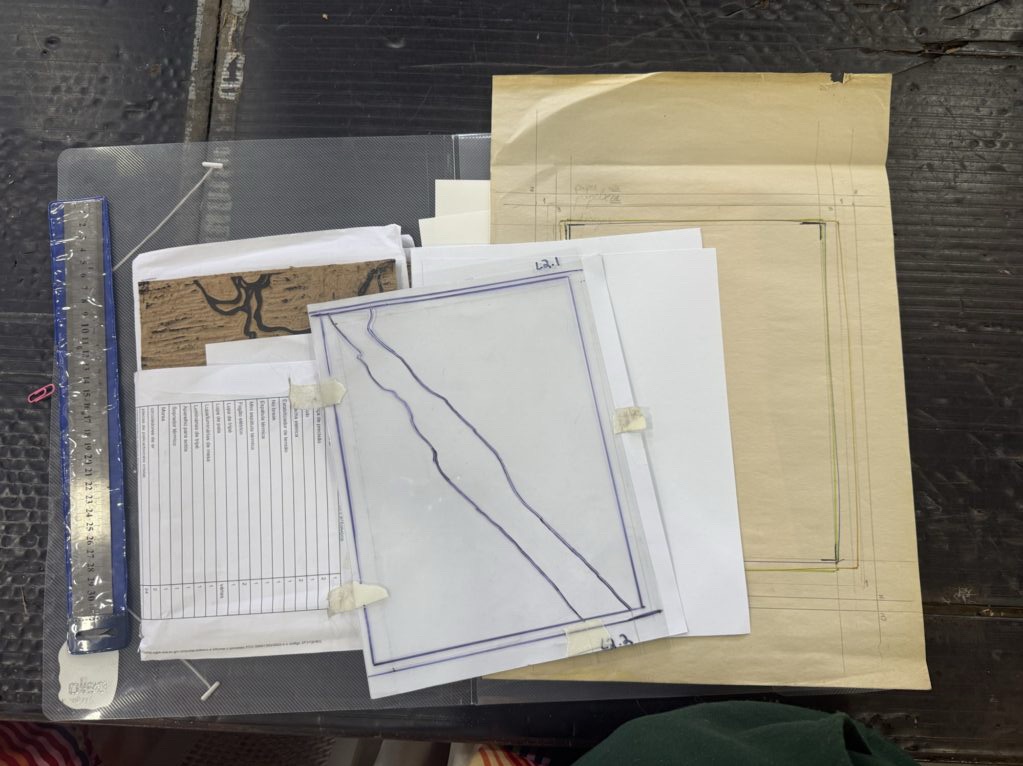
I got some feedback on my guide from peers, and finally checked in with Bebeto. He suggested I do three test prints using black ink on journal paper (cut to match my guide, not the final paper size) so I could properly compare the alignment of the layers.
So that’s what I did. I carefully cut three sheets to size, then printed all three layers according to my guide.
When I checked the results on the light box, layers 1 and 2 looked great — almost perfectly aligned. But layer 3? Off. Both vertically and horizontally. It clearly needed some twisting and adjusting. I could see the problem… but had no idea what to actually do about it.
L2 over L1L2 over L1L3 over L1L3 over L2L2 over L3All 3 layers “aligned”
Should I try measuring the offset and reverse-engineer the guide marks? No clue. So I asked Bebeto again, and he suggested a different approach: next week, I should print on vegetable paper and use needles to align the corners, then mark the board from there.
I get the gist of what he described (after asking him about a million questions), but I don’t fully understand how it’ll work in practice. I asked if he could help me with it next week — fingers crossed this method does the trick. I’m definitely feeling frustrated with how long this piece is taking. It’s been over three months!
As for the studio vibe, it was mellow today — the usual mix of quiet focus and background chatter. I caught a few stories, exchanged some small talk, and got some tips and curious glances at my test prints. At one point, I overheard a conversation that echoed a theme I’ve been thinking about — and writing about — a lot: the joys and challenges of sharing a studio.
How valuable it is to have access to this kind of community. And how hard it can be to navigate the artistic process alongside others. I’ve been sitting with this tension lately. On one hand, art is how I express myself, process emotion, and quiet my brain — and I often prefer to do that alone. But it’s also a chance to build something together. To share, exchange, witness, and connect.
Still figuring out where I land between those two ends.
This week marked the final round of testing for the Pool piece — all that was left was printing the last layer. Since I’d already learned (the hard way) that I’d need a new guide to align everything properly, I came in calm, focused, and ready. I felt good about where things were heading, and I was genuinely excited to refine the process ahead of the official print run.
I came in with a friend — we were catching up on the way, and he has another friend who works at the studio, so he popped in to take a look around. He didn’t stay long, though; I was laser-focused on getting this piece DONE.
I set everything up: dry prints, the matrix for the third layer, tools, and ink. Originally, I’d designed the final layer as a very light blue. But knowing how transparent it might look on a dark background, I decided to test with plain white ink first — just to see how it would react when layered.
I printed three variations, each with a different level of ink saturation. Here’s how they turned out:
I was so happy with the color — no need to add blue at all! The middle option was my favorite; the way the colors layered and interacted felt just right.
I did notice some texture left behind from this layer that I think I’ll need to clean up. Normally, I like leaving behind a bit of that raw woodblock texture — it gives a nice handmade feel and shows the printing method. But in this case, where the piece is really graphic and clean, the rough edges are doing more harm than good. I’ll plan to clean up the matrix before I do the next round of printing.
Honestly, once I pulled the third layer, I was amazed. The depth and light came together beautifully — almost magically. Sure, there are some dirty bits on the edges and my layers still need better alignment (my studio mates keep reminding me, haha), but those are exactly the kinds of things I can now fine-tune with confidence. The colors are working. The concept holds up. That moment when all the layers finally come together — even in test form — is one of the most rewarding parts of printmaking.
With that part done, I moved on to repairing the board from layer two. Remember how I lost a square last time? Well, turns out even more little bits had chipped off. I used wood putty to patch everything up, being careful to keep the surface level — not too smooth, so it sands evenly without flattening out too much. It’s a tricky balance, but it’s ready for the next phase.
BeforeAfter
So! With tests wrapped up and boards repaired, I’m finally set to start the official print run for this piece. But that’s a story for next time.
I wrapped up with some good studio chitchat and headed home a little early — proud, satisfied, and very ready for what’s next.
Today was Brazilian Valentine’s Day, and all I wanted to do was quickly go in, run the next layer of color, and get back home to enjoy the afternoon with my boyfriend. But things are never this easy with printmaking, right?
I started by getting my dry prints of the rack and getting the second mask attached to the top of my board. The dry prints looked gorgeous, and although it was a bit tricky, I figured out a way to secure both sides of the mask together with tape so they wouldn’t move so much when placing it down – since both sides of the mask were only attached to the top, it was pretty flimsy. I taped up the bottom section where the mask hangs outside the design to help keep everything in place.
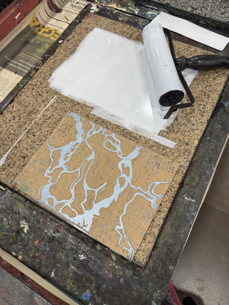
I did not need to ink the whole board for this layer, since I was printing only the center section of the board. I used a narrow roll to only ink the desired stripe.
Inked board with mask placed down.
Detail of the missaligned layers
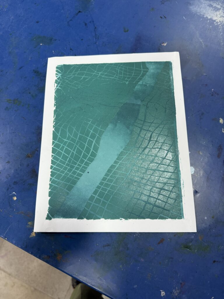
After a few pulls, I was confused. I kept getting a weird result that I could not make sense of. Even though my guide was improved from the second layer to this third one (with the raised corners to help secure the paper in place, read more about it in the last post), I was getting the last two layers aligned (2&3) but not the first. This was odd because the latter one should be aligned with the first one, if I am now using the guide properly, or with none of them, since I have not been using it correctly/I have been working on improving it along the way. So the big lesson is that the guide is still incorrect and needs to be redone and that I need to be very careful in the printing process of multiple layers and right down all the details of the pulling process like the placement of the which corner in which order, the direction the board is being press through and such.
BeforeAfter
Printing the first four pieces and realizing my guide was completely off was frustrating in itself, but what made it even more difficult was how hard it was to communicate with others about it. I was struggling to talk things through with my peers and with Bebeto, the studio manager and printmaking master. I found it hard to stay focused on my work, to fully process the alignment issues, and to express what I was thinking or needing. It became a kind of emotional labor, and I felt once again the challenges of working in a shared studio space.
Talking about the art-making process is hard. Trying to explain what was going wrong or to share my hypotheses with Bebeto was mentally exhausting. Writing it all down here hasn’t been easy either. It’s always a challenge to decide what details to include, what to leave out, and how to describe things clearly without it turning into a confusing mess. Honestly, the first draft of this post read like a 14-year-old’s diary entry—but hey, it’s all part of the process. In the end, this is good practice and a fun way to stretch the big thinking box.
Besides all that was going through my mind, during the fourth pull, another problem emerged; one of the squares on the board came off, messing up the design. To make it worse, I was so scatter-minded that I misplaced and lost the piece. All that was left to do was to stop the printing process for the day and patch up the board with some wood putty.
I decided to keep the two leftover pieces unprinted as color guides for the future.
I was feeling a little down, so I sat down with a cup of coffee to take a break. Absentmindedly, I started carving a different project I’ve had waiting to be finished. As I worked, I overheard a lively conversation between a few older women in the studio. They’re from a generation quite different from mine, and I loved listening to their stories and experiences. One of them used to be an illustrator for a magazine that the other adored—and got in trouble at her Christian school for reading it. Moments like these are what I treasure about the shared studio experience: hearing about different artists’ perspectives, their adventures, who they’ve met, where they’ve been, and what they’ve studied.
However amused, I was still hungry, cold, and tired. So then, I called it a day and enjoyed the rest of the evening with my partner.
Today was another printing day at the studio, this time printing the first out of two colors of the second layer of woodblocks.
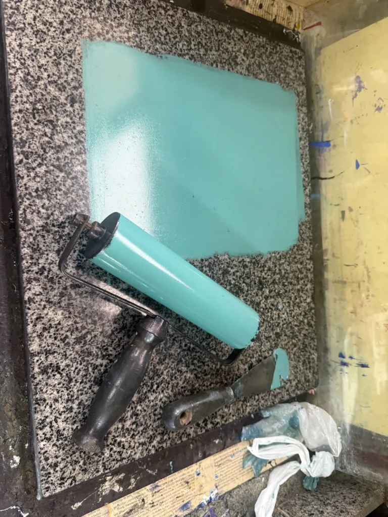
I jumped right in, grabbing my dry prints from last week and all the supplies to create the needed turquoise paint.
Dried out prints from last week
After carefully adding more and more paint until I got to the correct tone, I tried pulling my first print on my worst copy from last week since it was my first trial aligning the layers. I always organize my prints from worst to best in the hopes of getting better with the experience and optimizing my chances of getting at least a few “perfect” prints.
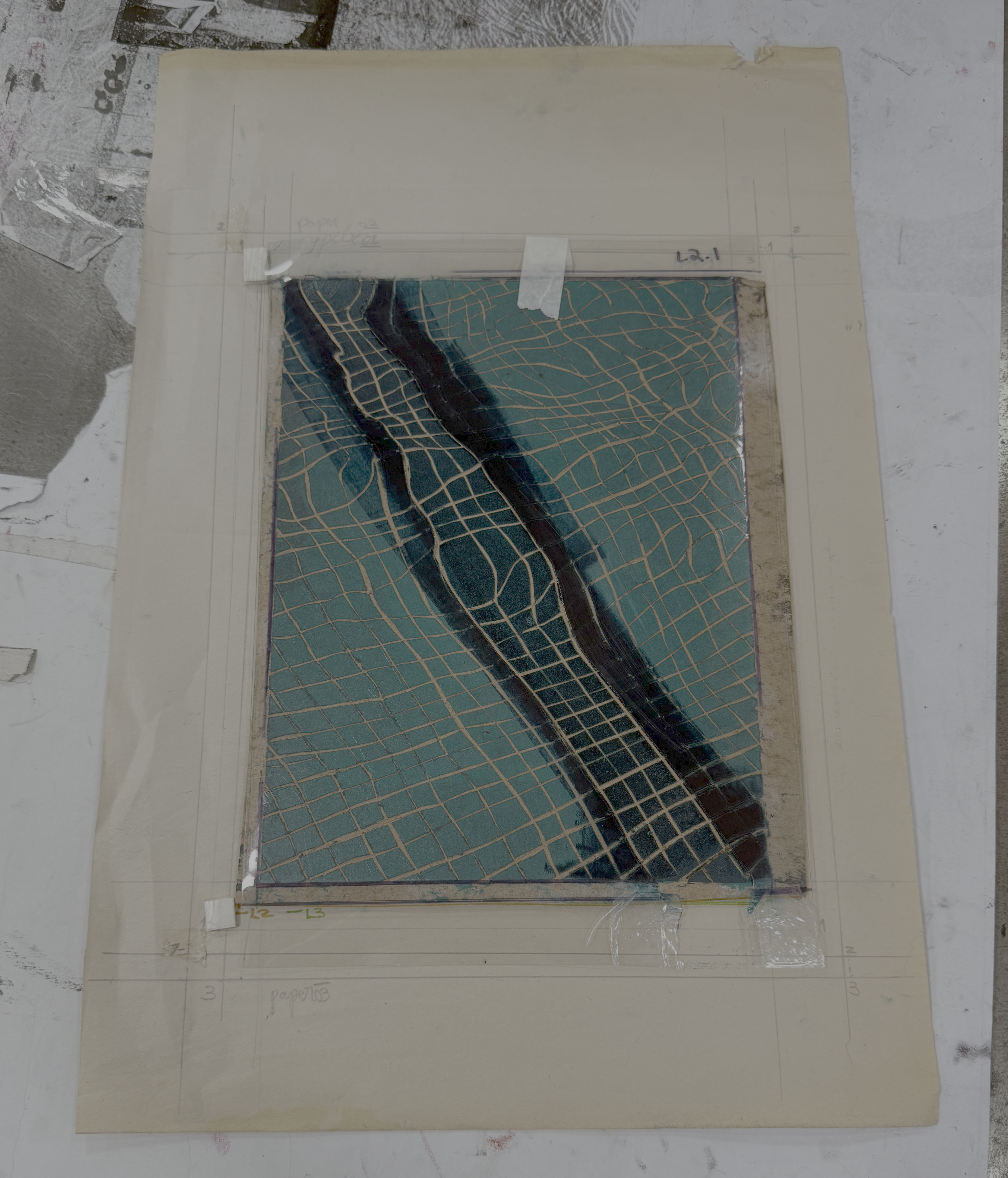
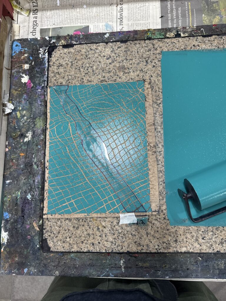
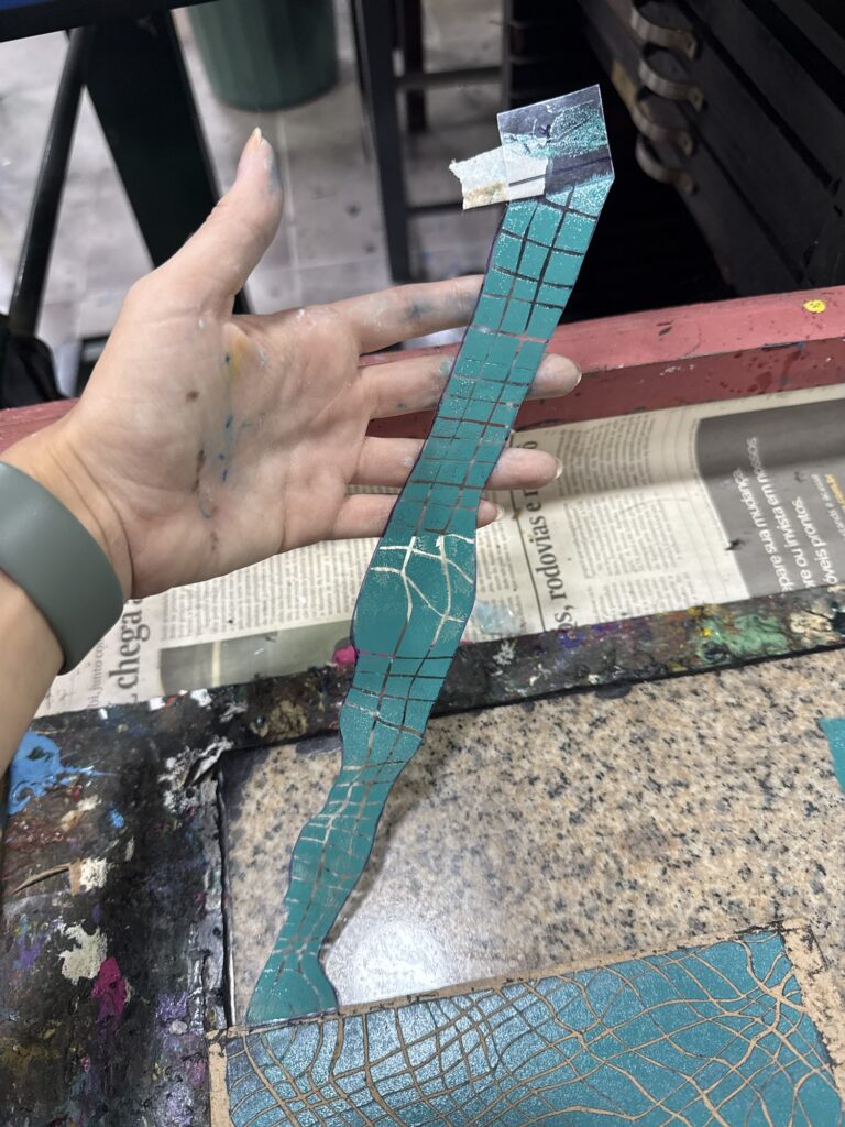
I taped the mask (which was a long vertical strip in this case) to the top of the board from the back so I could flip the mask back when I inked the board and flip it back forward, sticking it in place. I had another tape in the bottom facing up from the back of the board just to secure the mask on the bottom, although the ink does a pretty good lob at keeping the acetate in place.
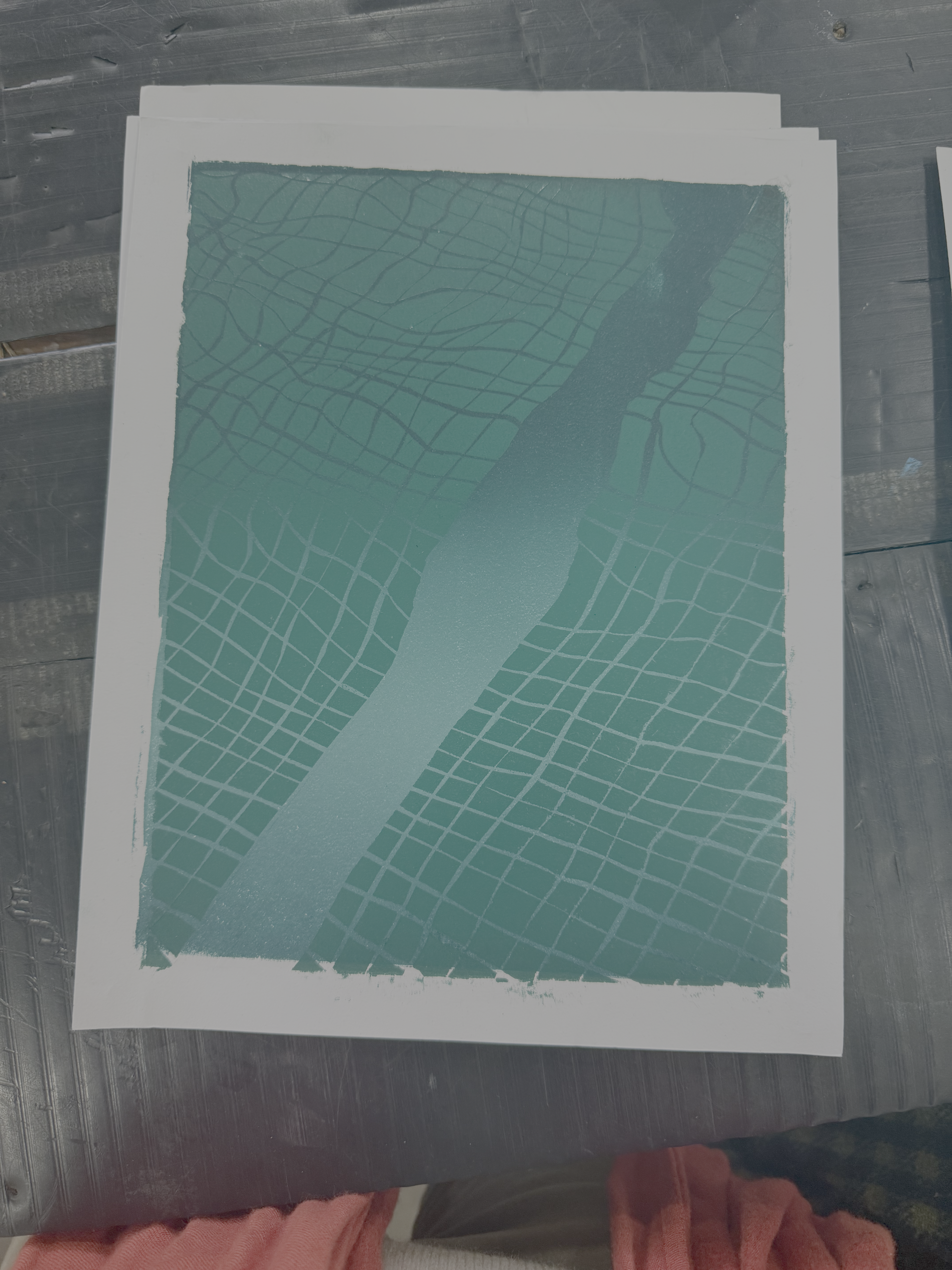
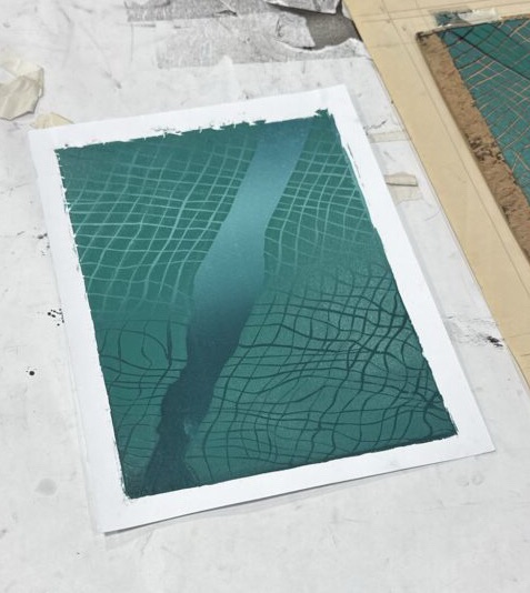
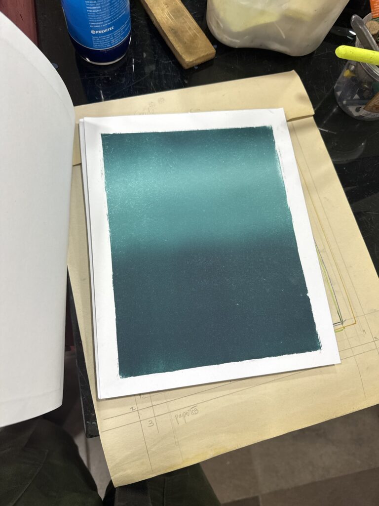
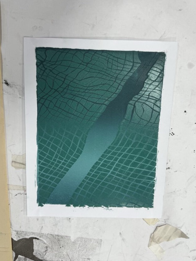
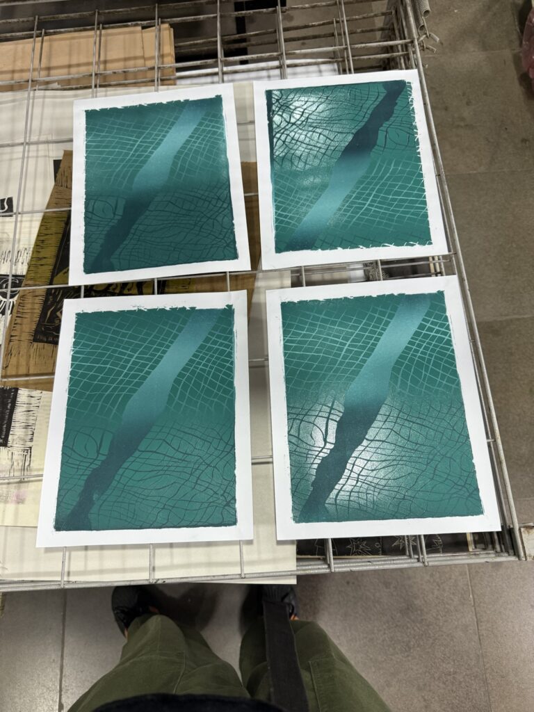
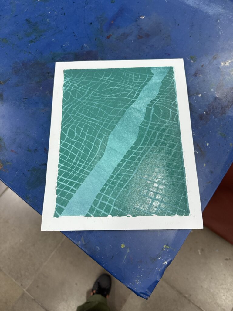
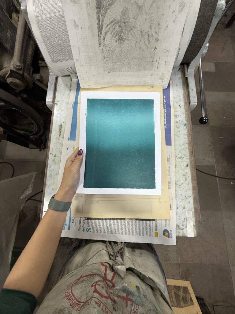
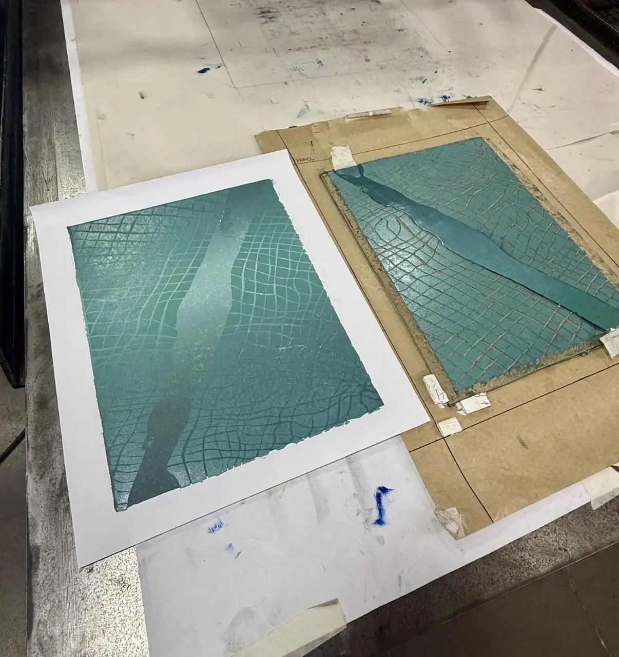
My first print came out really nice! I love the result of the gradient underlay! It came out just like I planned it and it was great to be able to see it go from digital to real life. It made me have hope in this whole process and excited to continue. I was really happy and mesmerized with it.
As I was printing this and other copies, the unique results were bringing in a lot of attention from curious studio mates. At first I was welcoming the feedback and tips but people were more judgmental than I was being with my results, and to be honest that threw me off a bit. The main negative comments I was getting were about the “dirty” edges I was getting from not cleaning up my board edges well enough; and about my miss aligned layers. The later bothered me more than the first. I was just not getting the “layer down of the paper” correctly, test after test. And the worst is that I only had 4 of the linear gradients and 2 of the experimental bases to print on, and as I kept pulling them I kept getting things misprinted.
I was annoyed at myself that after such hard work planning things out I was not getting aligned prints. I was also overwhelmed to have to deal with peoples opinions while I was still processing my own. I kept trying to clean up the boarders and get the alignment right. As the prints ran out and my results did not improve a lot I started to get frustrated. The last two prints were even worse: The experimental backgrounds did not have as much of an effective result as the linear gradient. I felt like that gradient background was really pretty and now it was lost forever… All that bummed me out and overwhelmed me.
Acetate mask added after inking the boardThe base print and the inked board about to the pulledResults, I love the gradient effect The mask after the first print.
I was 4 prints in when I finally ask for help. Bebeto reminded me of the trick of using styrofoam corners to help lay the paper. I glued it wrong the first time and got mediocre results, but Bebeto helped me again and the last print came out perfectly aligned. At least there was some hope.
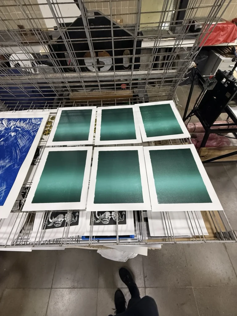
Gradient prints 1-4Experimental background gradient 2 (from last week)Experimental background gradient 1 (from last week)
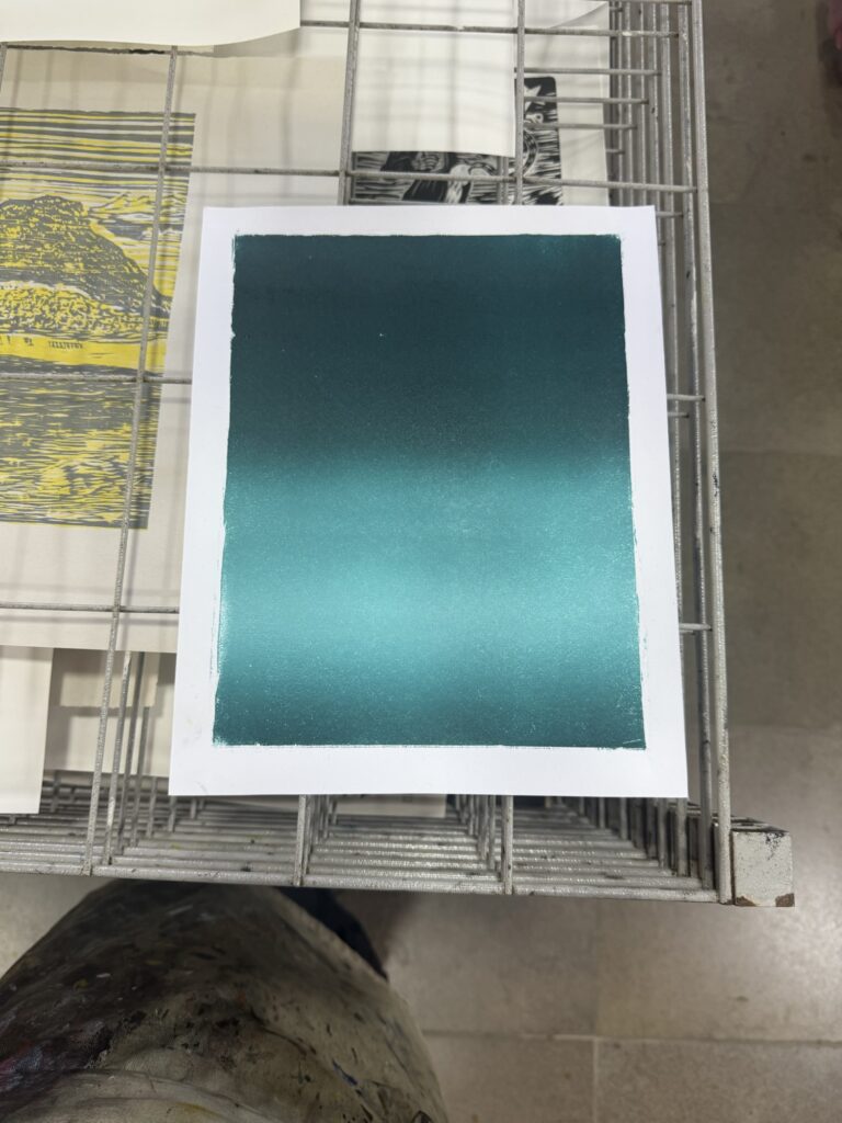
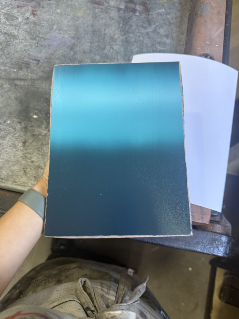
Note that on these pictures the light is reflecting on the fresh ink layer and giving the impression of a gradient, but that’s is incorrect. Here is a more realistic look on how the colors look in real life and will look like once it dries out:
Overall it was a bit of a chaotic day, with big ups and downs. After some time alone regulating myself I was able to come around and realize that this was a great test run. The effect of the design was amazing and I was super excited for the possible results of this print.
I decided to go ahead and continue all 6 of these prints as my trial of the process and in the future I will do an official pull, improved by my learned mistakes.
Let’s see how layer 3 comes together next week, and if my new improved guide will grant me better results.
This was quite the week! We’re finally ready to begin the printing process, but first there were some last-minute preparations to be done before jumping straight in!
During the week before going to the studio I finished up the two supporting elements to my printing process:
1. Cutting my masking shapes for printing two colors with one block (for the second and third layers). Note: I’ve been referring to the boards as layers 1-3, but from now on I’ll be referring to layers 1-4, counting the second block as 2 layers since it’s two colors, which are applied separately.
A quick process video of the acetate mask (with the special help of Potiro Biro)
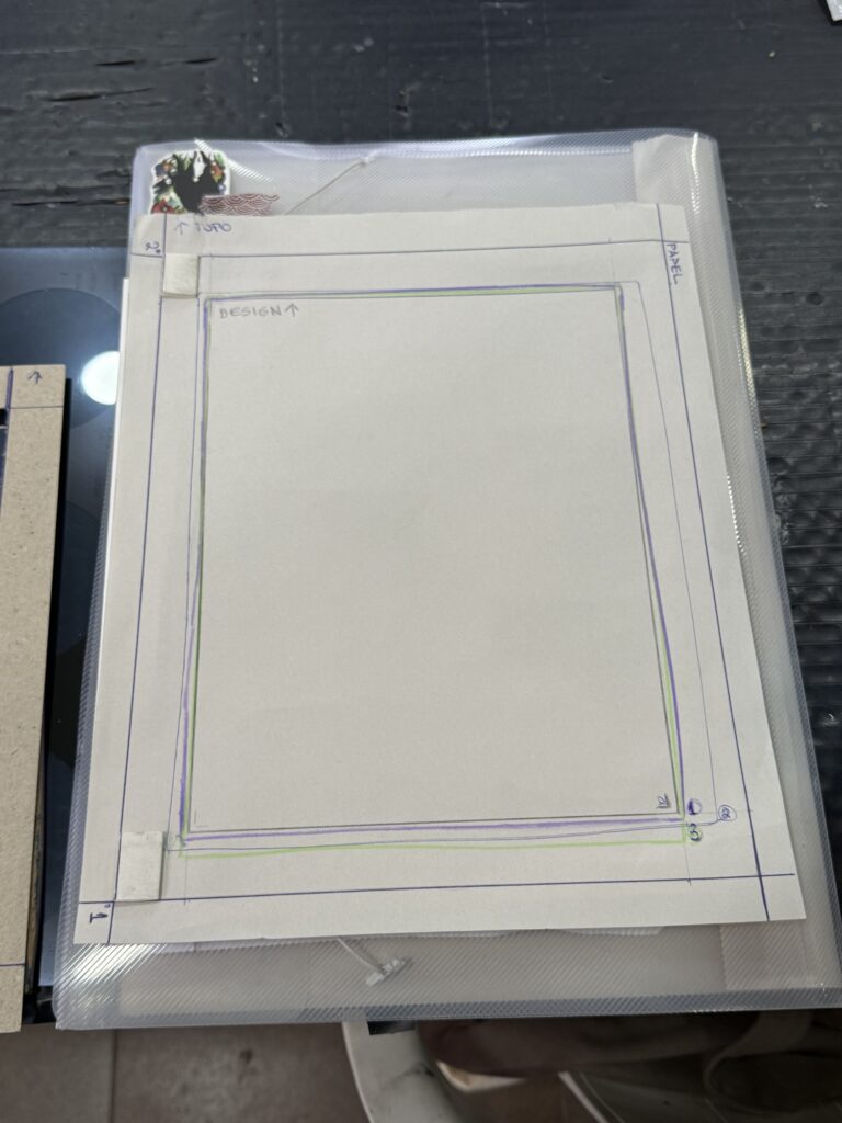
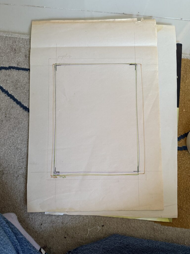
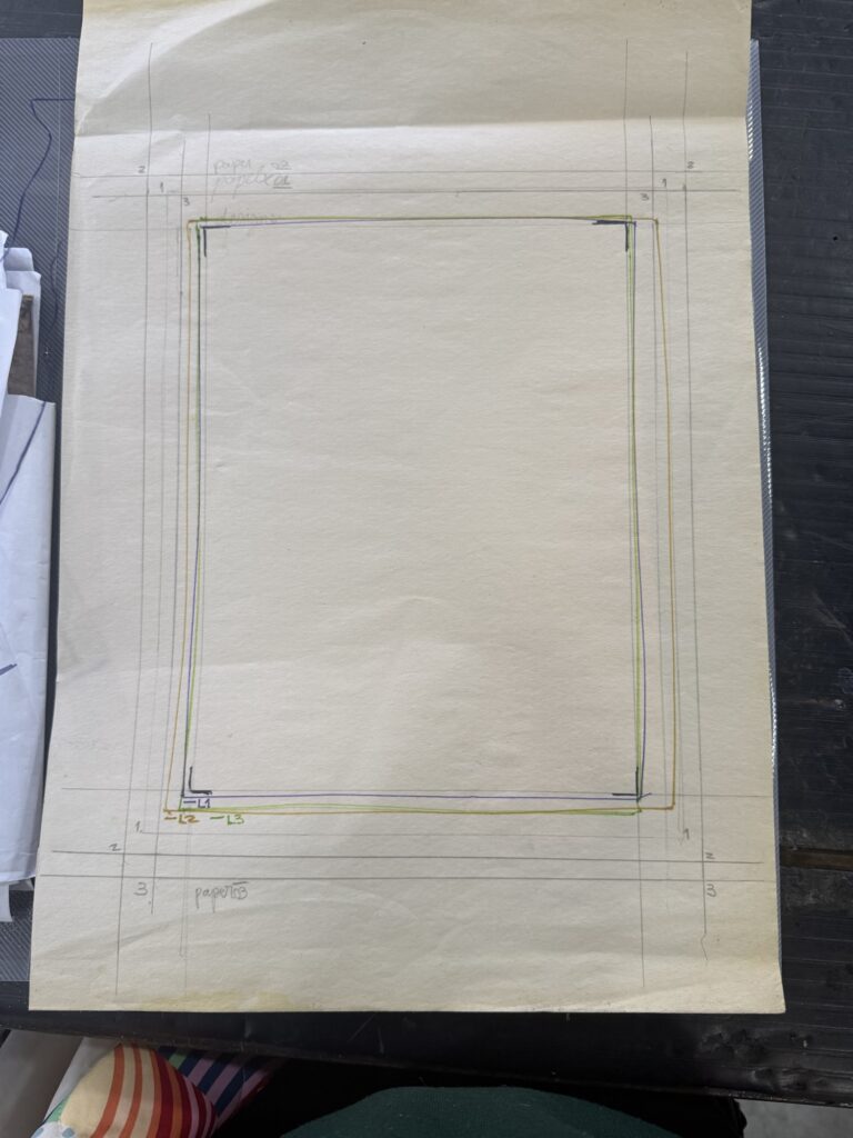
2.Creating the registration guide to help me print all colors aligned to each toner: It took me a while to get it right, but after a couple of trials and errors, I figured out my strategy.
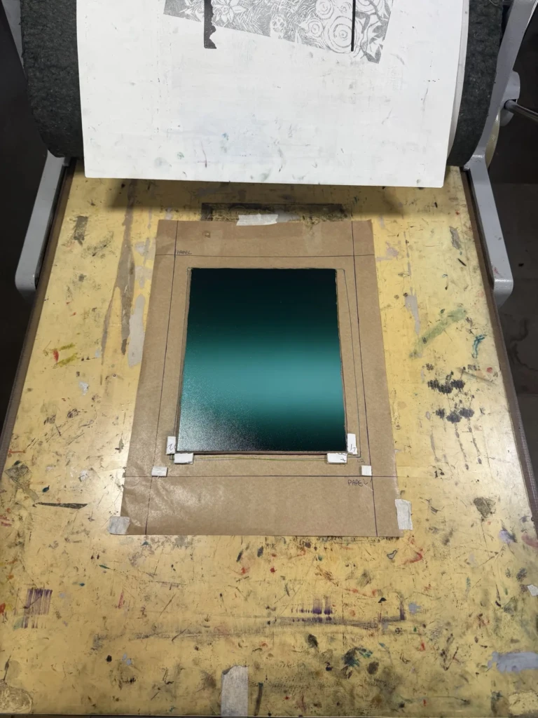
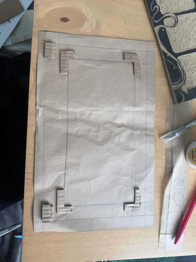
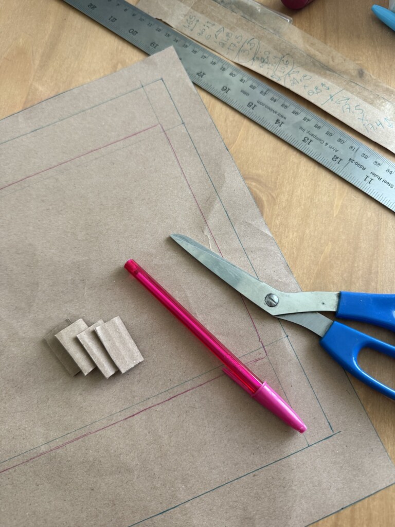
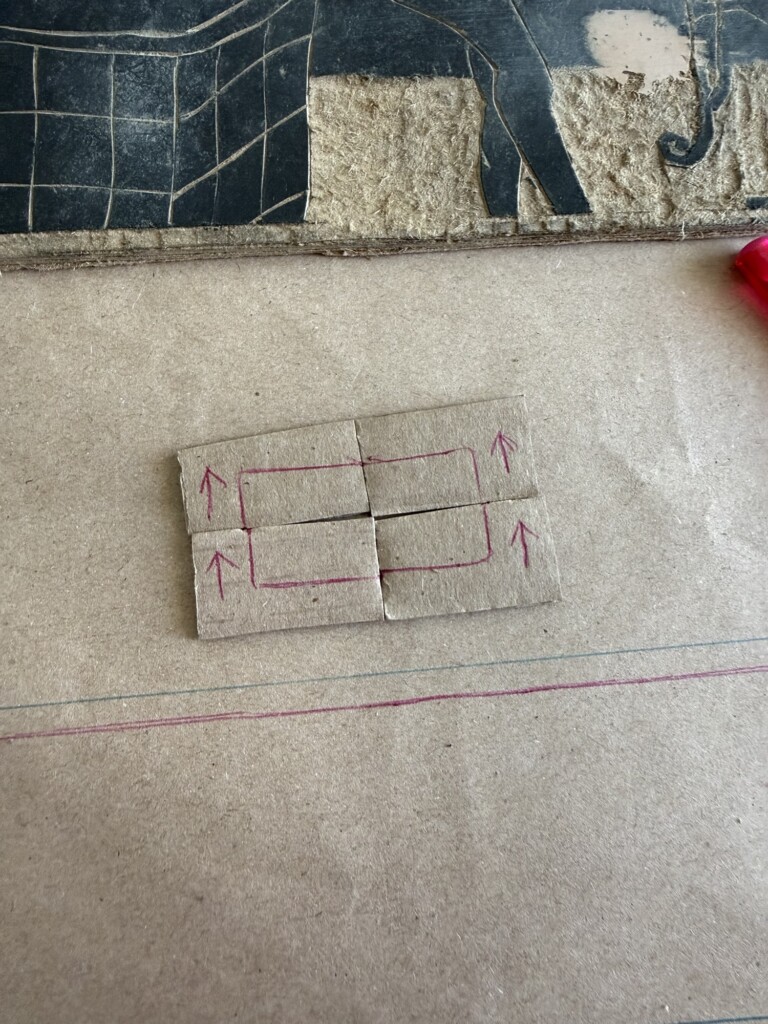
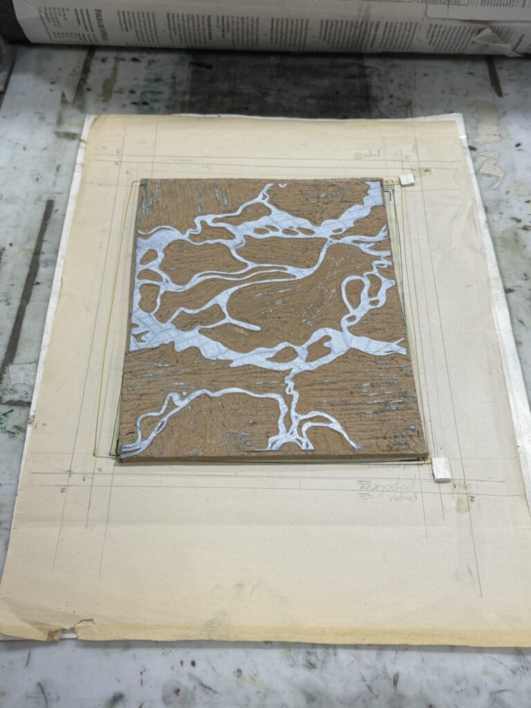
This is a very simple guide system, where I align each layer facing up on the press, and then I align the bottom of the paper to the bottom edge of the guideline and let it fall forward into place. The boards are color-coded and clearly numbered on the back, and I drew an arrow pointing the way the board should go. These extra steps can help to avoid a lot of future mistakes, as I’ve learned the hard way. – I’m glad I did this at home without the pressure of other people watching me, so I could really connect with my intuition and come up with the best strategy for myself. In the future, I want to experiment with the registration tags, but I have not yet figured out how to create them at home.
Registration Guide 1.1
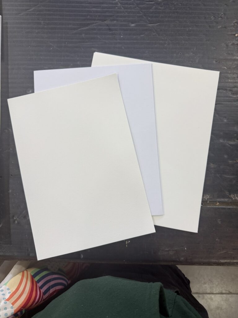
3. Cutting the paper for the prints: I had done this step previously, or so I thought. When I went to count my papers, there were only 6 sheets cut to size for my design. I could not find the same paper I had used, and the dimensions I had created did not fit efficiently in my available papers. To not waste material, I cut some sheets a bit larger and with a different weight than the first batch. (If I had cut the paper with the same size, I would be left with thin stripes of paper that I don’t have a use for besides recycling into more paper, and the thicker border enhances the design). With that, I had a total of 16 or so sheets made, when I found a closed package of high-quality Canson paper in A4, so I decided to take a few sheets of this too, to complete 20.
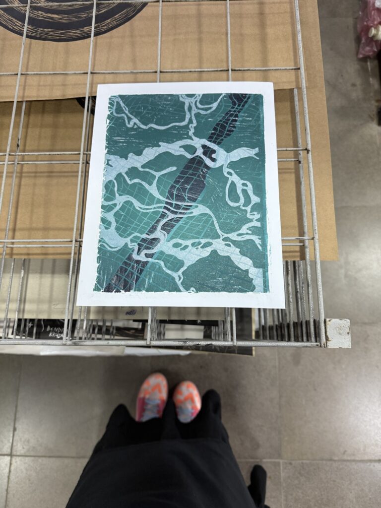
At this point, I’m bothered by this mismatch of papers, but at the same time, I want to work with what I have and avoid wasting materials. I reassure myself: “Who cares… It’s not like I’m selling this, and I enjoy the explorative process of creating non-identical prints!” But I will come back to debate this later on…
3 paper sizes Ready to start printingRegistration Guide 1.2 – with all 3 paper sizes
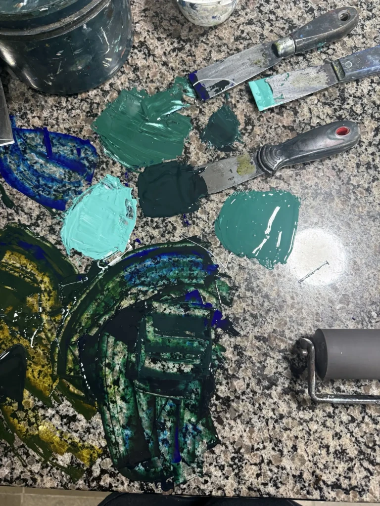
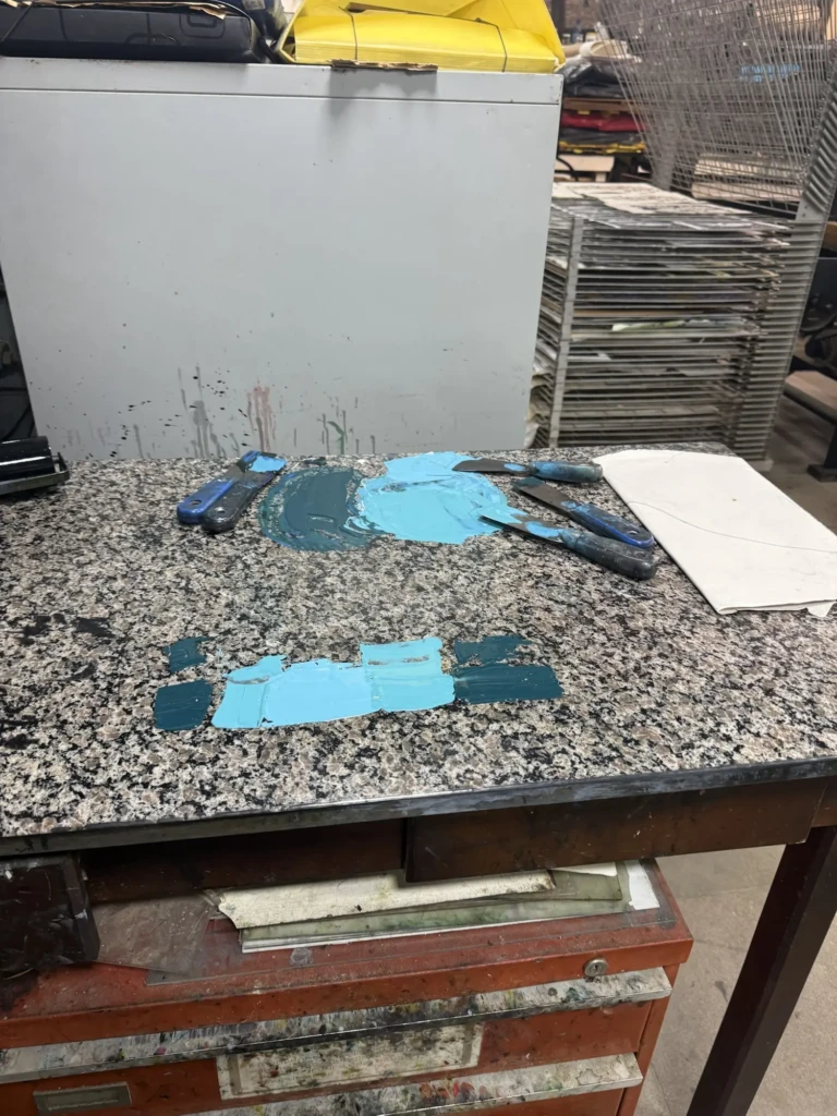
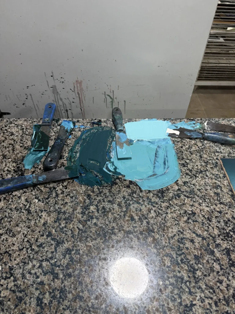
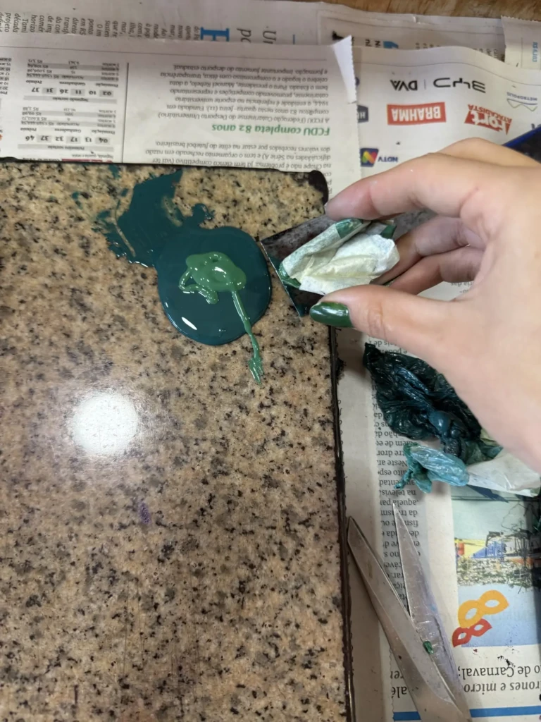
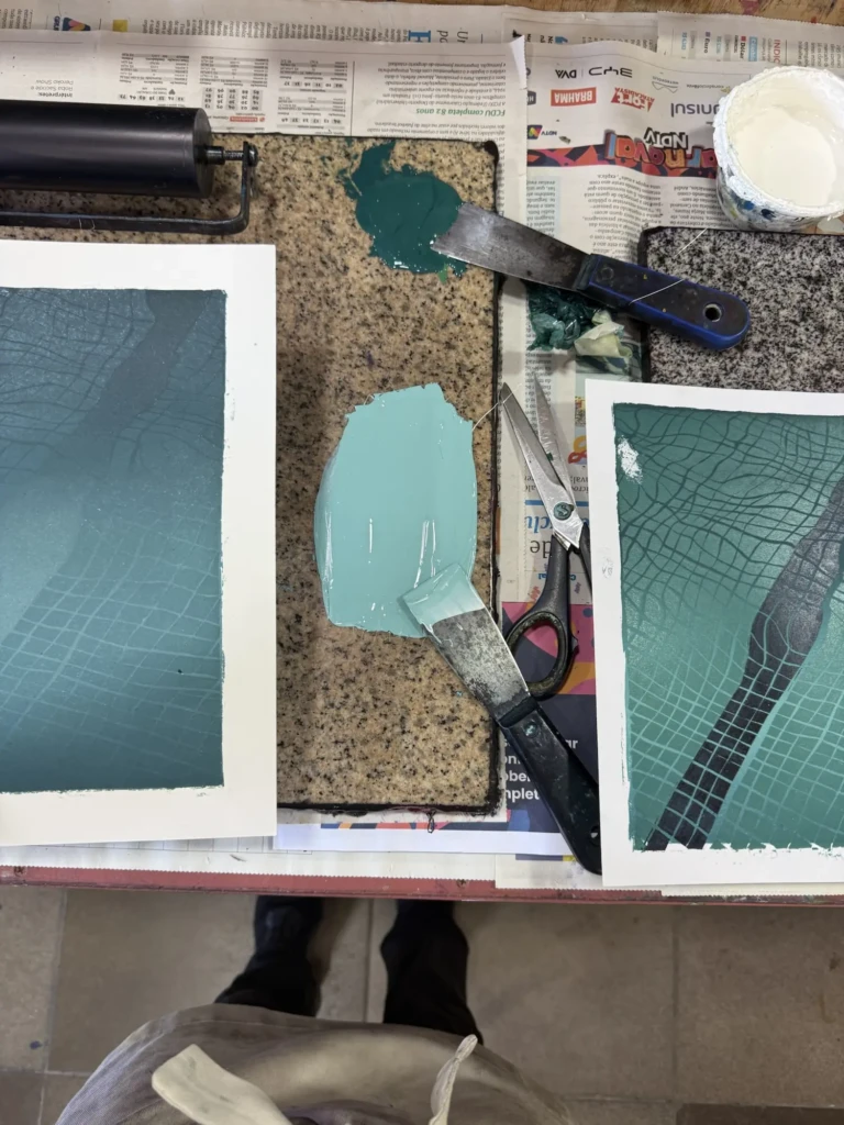
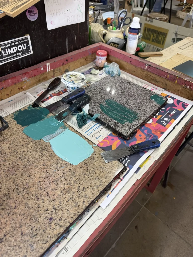
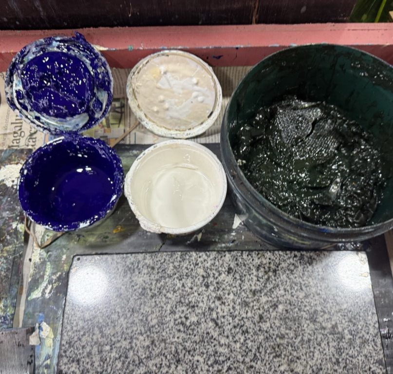
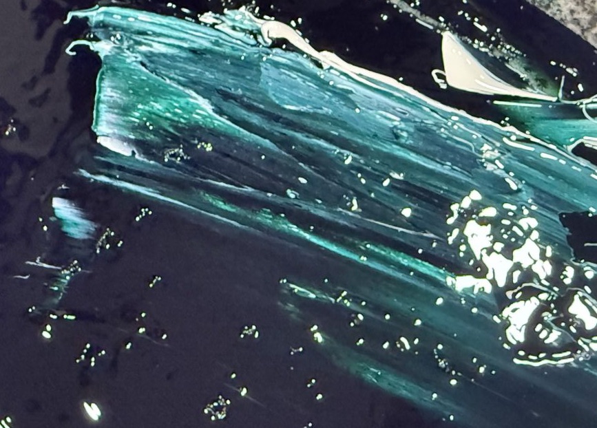
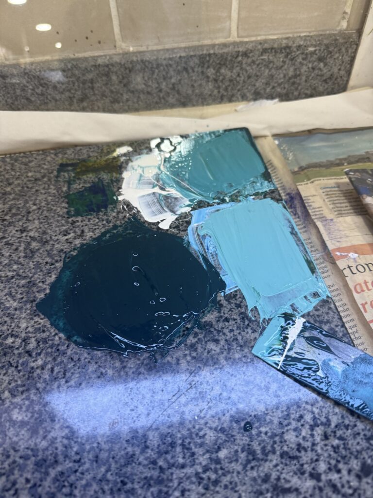
At the studio, I jumped right into work! I started by choosing the colors for the gradient and asked for Bebeto’s help to choose the best blue (so not to end up with purple this time). I blended blue, green, and white inks to achieve these 3 tones of tourquise – image below – (after some trial and errors, of course; Too much green, too much oil, too little paint… I always get a bit anxious mixing paints because I don’t want to waste material -it’s a theme, isn’t it? – but I often end up not making enough paint and waste more material this way… I’m getting more confident with practice, but I need to learn that sometimes being generous with the materials actually prevents more waste than the other way around.)
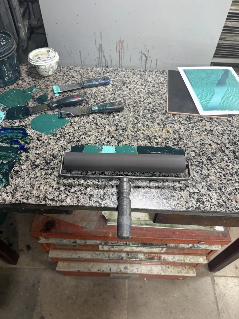
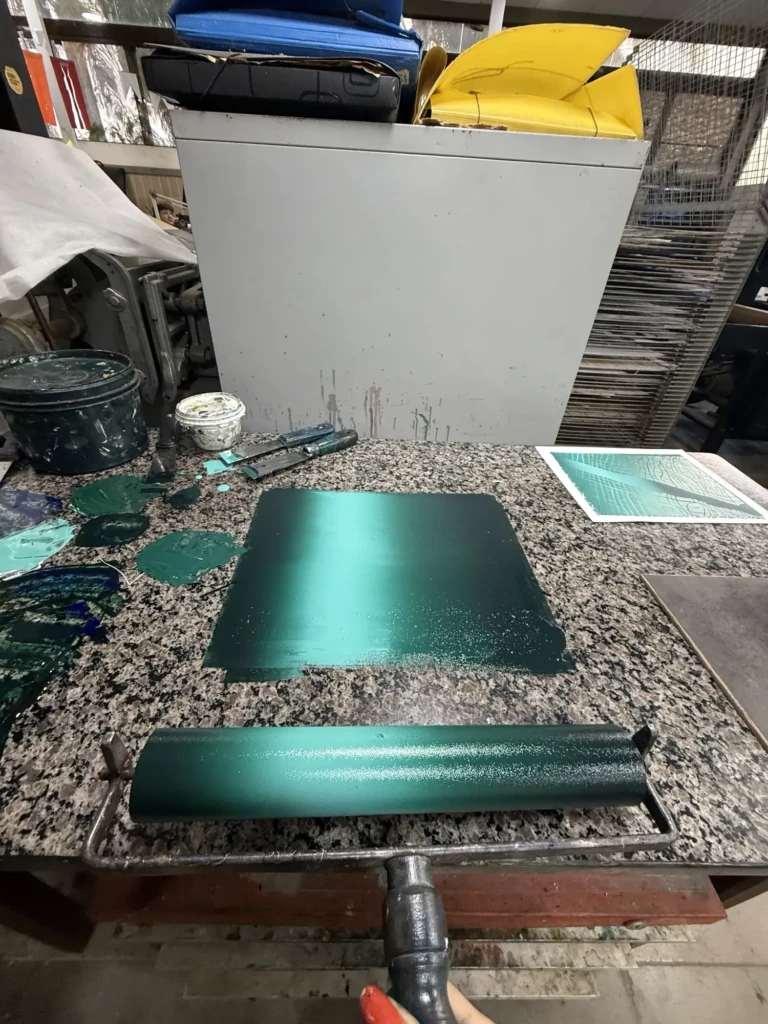
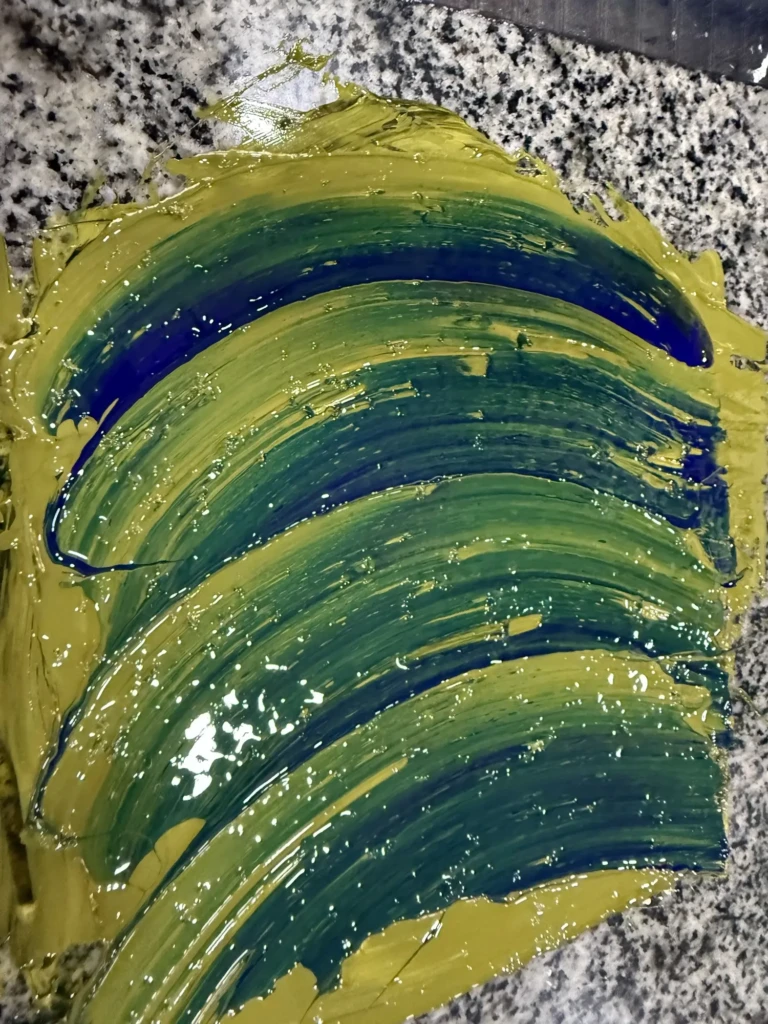
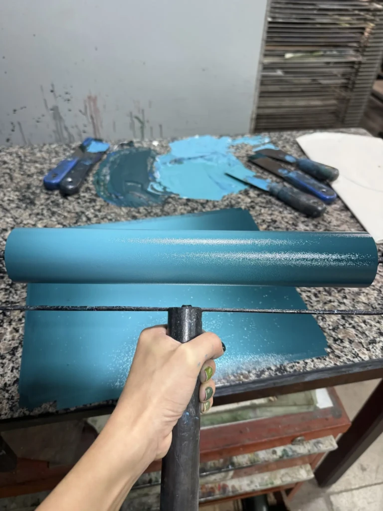
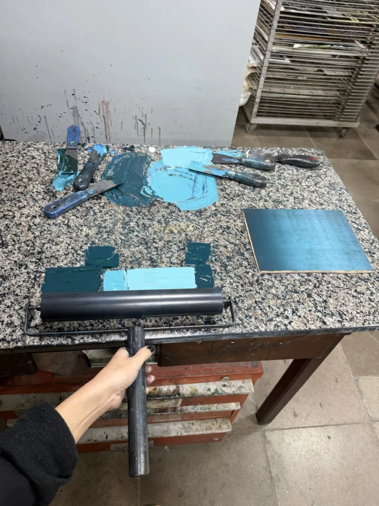
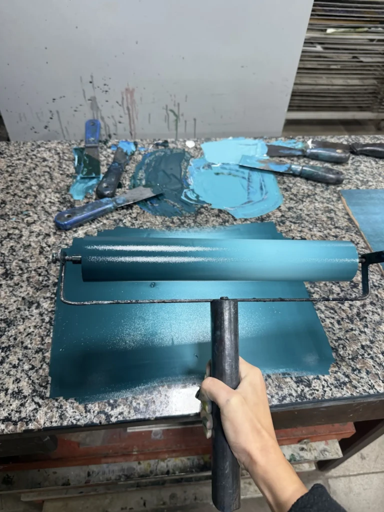
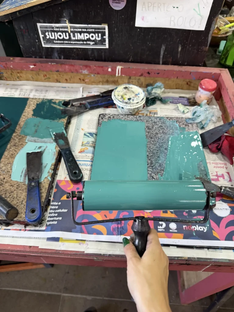
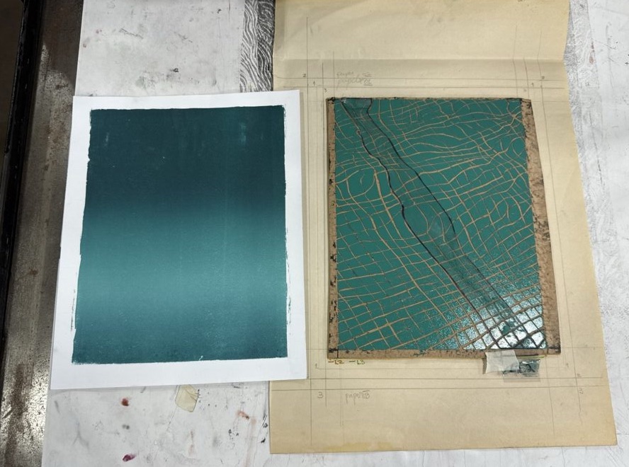
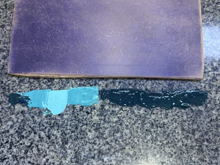
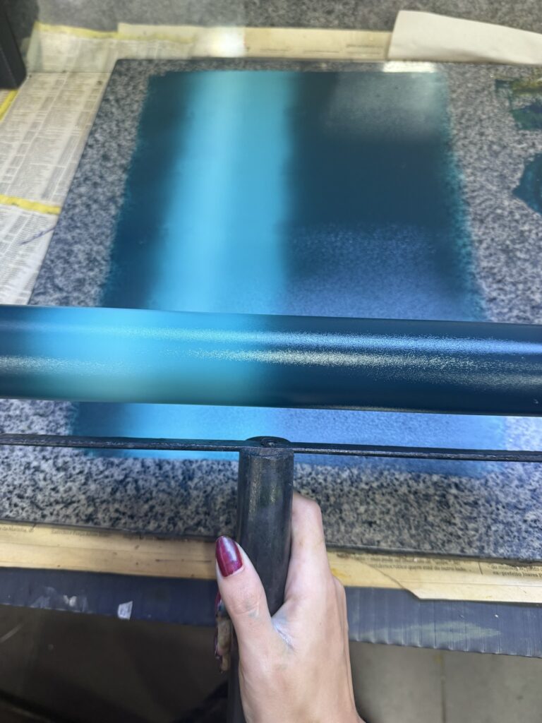
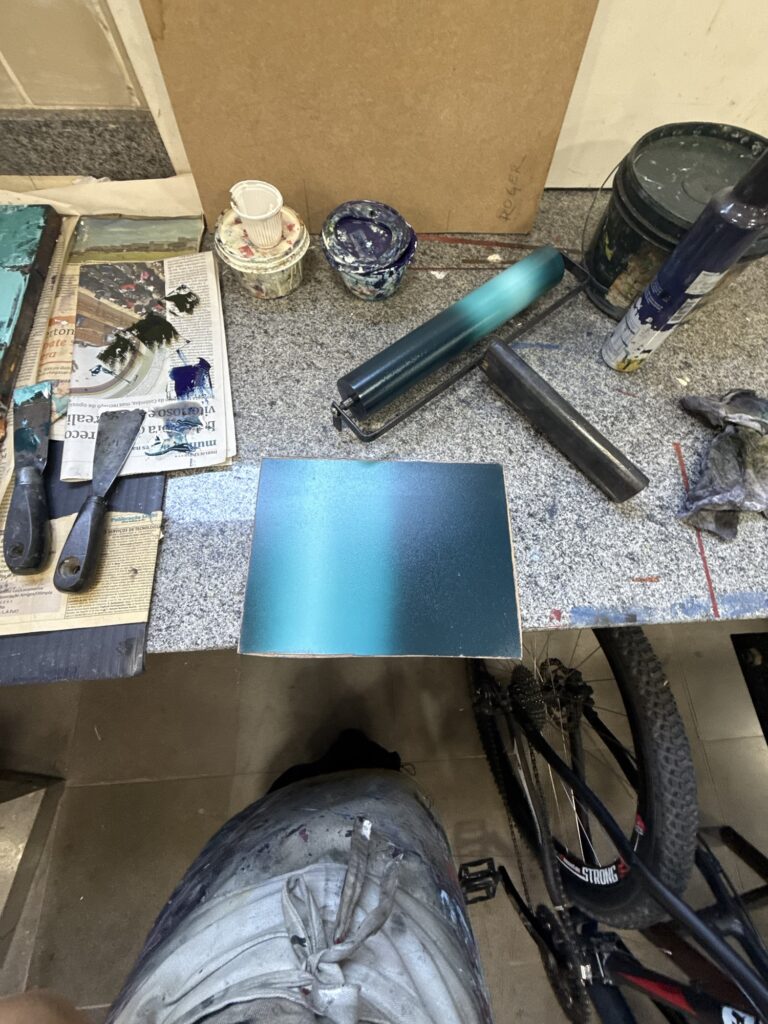
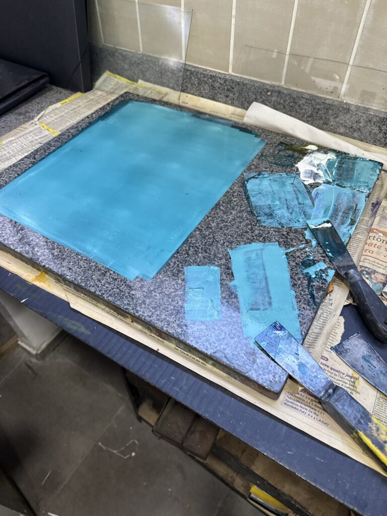
To make the gradient I chose a roll that was wider than my board, and used my board as a guide to create the gradient – since I wanted horizontal stripes I lay the board on its side and use the height as the measure for setting the ink in place. Then I rolled it out carefully to blend the colors, and it resulted in this beautiful linear gradient:
Color palette Gradient creation using plate as guide Rolled out gradientInked board – trial 1
I was anxious to pull the first print… I took my time aligning the board and the paper, and letting it go carefully so the paper would fall aligned correctly. Surprisingly it all went well and my first print came out beautiful! A nice smooth gradient with the right colors and in the right proportions, with no excess of texture or other glaring mistakes that bothered me. I had enough ink to create 4 mostly identical prints.
First trial result
With the gradient’s leftover gradient on the roll and on my working surface I diceded to do some experiments, against Leo’s (Bebeto’s assistant/studio manager) warnings of the limitations of woodblock printing.
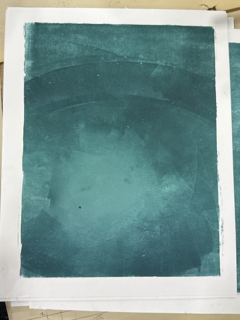
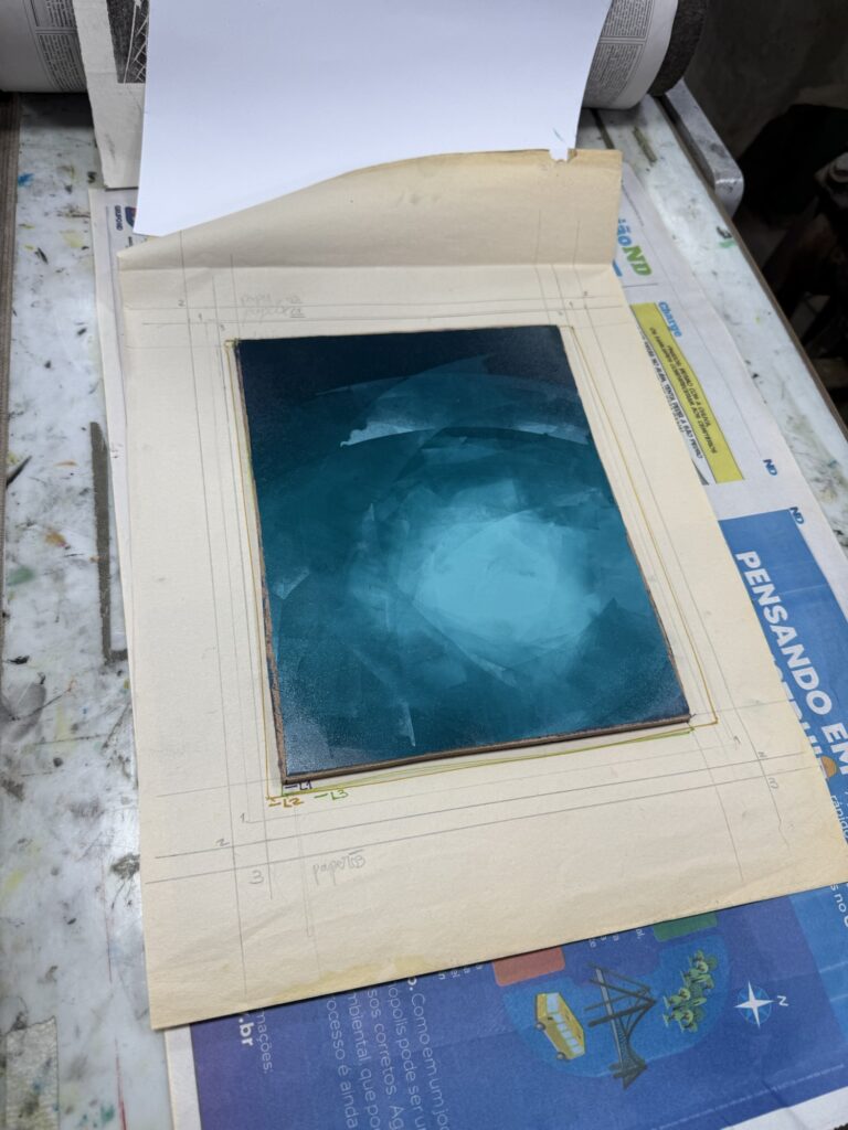
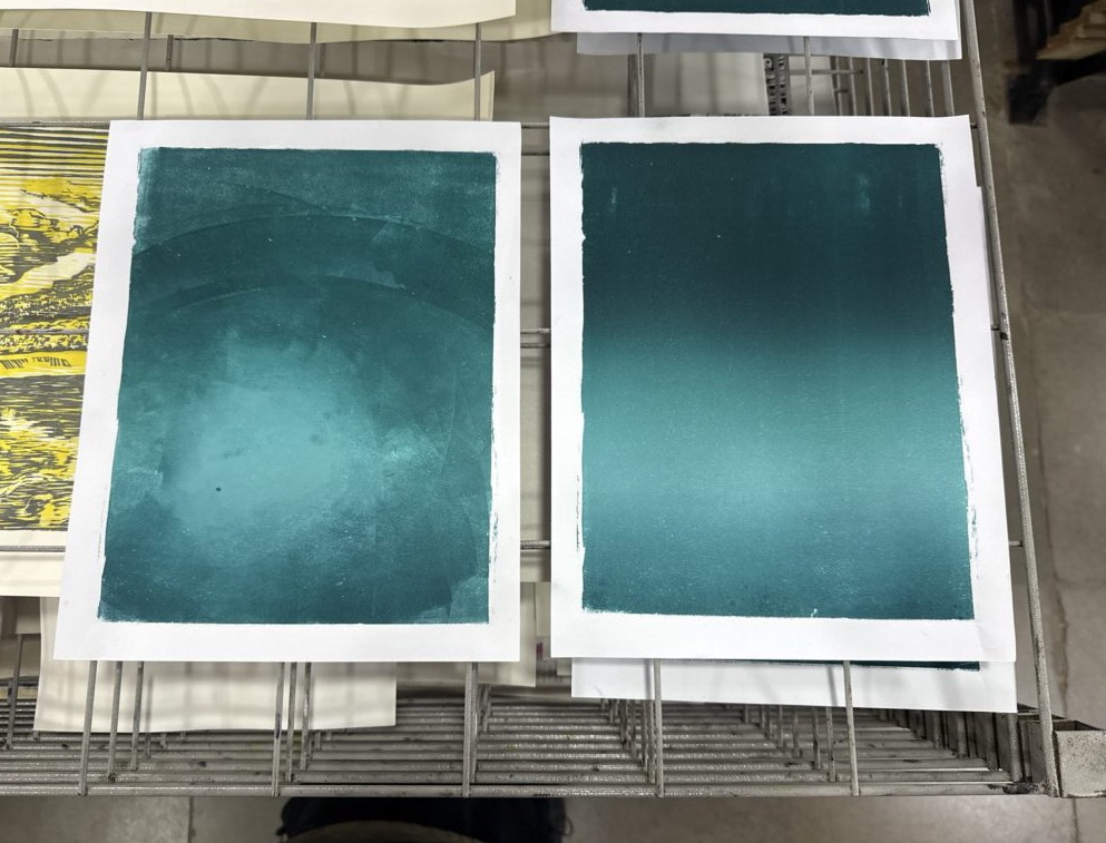
I had two sheets of paper on this batch, so I made two makeshift radial gradient prints using a couple of narrow rolls and an improvised technique: grabbing bits of color and applying to the board in circular motions, slowly mixing, moving and working with the tones.
The first trial came out beautiful, perfection, I love it. The second came out worse, there was even less paint on the stone now and the colors started to blend too much. Still might come out nice with the other layers added on top but we will see. (You can see the result of the last attempt at the end of the video below.)
Freestyle radial gradient – inked boardFreestyle vs linear gradient resultsLittle simplified process video of the whole printing process
At this point, I had used all the 8 sheets of paper of this set, but I did not have enough of the dark tourquise paint mixed to pull more prints. I took a quick break to think about my next steps and weight my options: I could try mixing more paint of the same color but my working station was pretty dirty already and I would probably need to clean up the whole thing and start the process over. I only had a couple hours left before the studio closed and I did not want to rush. Also I’m not super sure about the different paper sizes; I had a lot of questions and doubts about how to organize the series in the three paper sizes… Should I have them all be identical? Should I use the opportunity to have different color options on different papers? Do I still call it a series if they are all identical? (They are already not identical at this point since I did two freestyle/mono prints, so how do I split this). What order should I do things: print this first batch all the way through and go from there or print all sheets with layer 1?
This is something I struggled a lot last year and I’m starting to understand that it’s a theme on my work. I love making complex pieces with multiple layers, gradients and colors, and I tend to experiment as I go with variations throughout the whole process. I’ve done lots of research about how to number and signify prints in a series and varied editions, but I still don’t feel secure about making these choices. From my understanding it’s up to me at the end of the day, but why is it so hard to decide? I feel like I might need to decide on a personal system to how to deal with series for my work, and what I consider a variation and/or a series. I want to do more research and talk to other artists to make this decision though.
For now, I’ve decided to not make a real decision and just finish printing out these 6 copies I’ve started all the way through and see what I want to do at the end. I can chose if I want to make variations or not after testing printing the different layers and planned colors to learn from it and what I could/would want to do differently.
After this break, I still had to clean up my station, that although I did not have enough dark touruise it had plenty of the lighter tones, so I decided to do some prints of the third layer by itself with this nice aqua color. I really enjoyed the shape of this layer and I was already planning on doing some prints of it by itself so this was perfect. I love the results and the color came out beautiful! I did two pulls on those “extra” Canson sheets I had brought in. Between printing copies 1 and 2 I cleaned up the boarders of the design a bit – so that the noise would not go past the design boarders. Although it might look nice as a standalone print, I want to keep the boarders of the oficial design as clean as possible.
Used up all the leftover ink Inked boards – pretty color! Giving water vibes already Resulting pulls; top to bottom: cleaned version, first print.
I took the rest of my time at the studio to clean up a bit and talk with my peers about their projects and get some feedback and ideas about my process too. Leo was talking about how the colors might end up mixing or changing once the layers are printed on top of one another, and it is something important to consider. For example the last layer was design to be an icy white but just by adding white it will become blue tinted by being printed on top of a blue base. Let’s see how layer 2 goes next week, when I’ll put to test the masking layer!
I went to the studio yesterday after taking a two-week break due to a holiday and a personal trip to Rio. This is all the woodblock printing work I’ve done since my last studio visit:
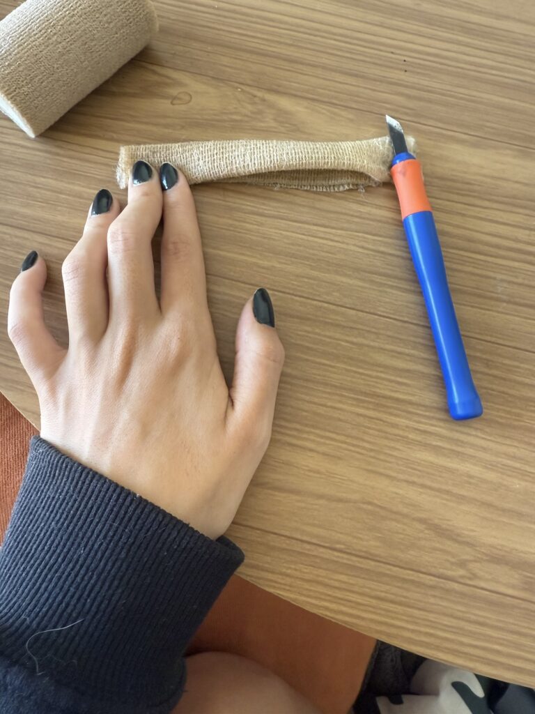
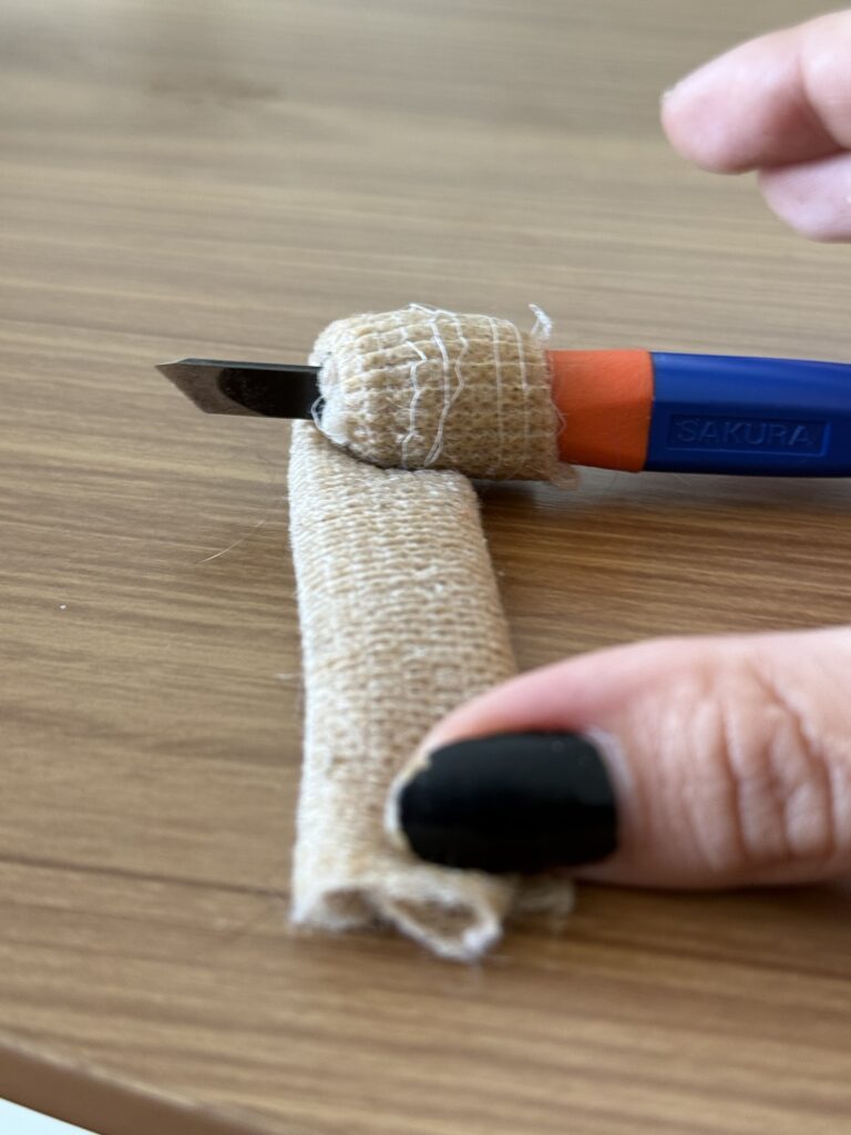
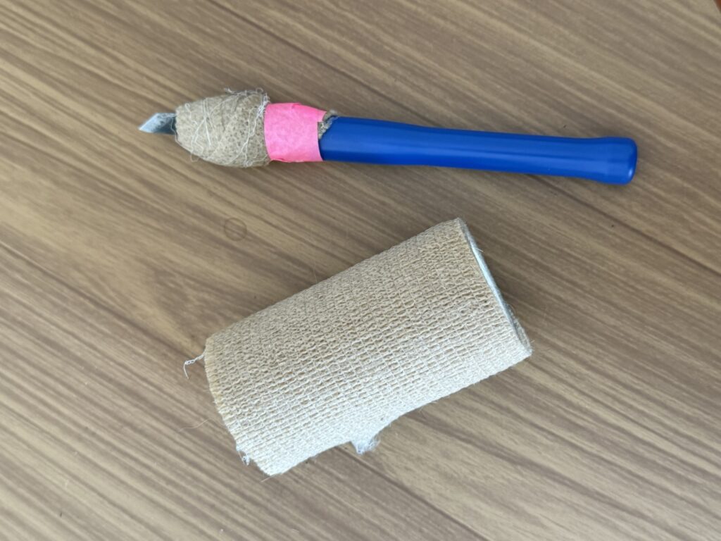
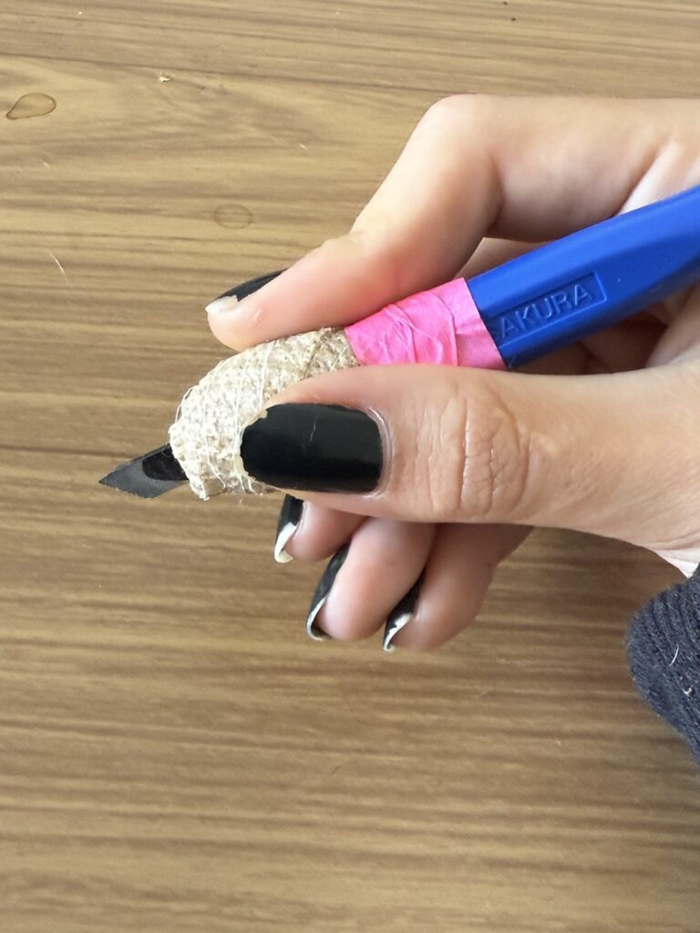
The first thing I did was to improve my straight edge carving tool to be more comfortable and prevent blisters. I used some of those surgical/athletic tapes to wrap the area where I grip the tool, which gives me more stability and a soft surface to hold onto. It’s not pretty or a permanent solution, but it helps.
ProcessBefore & After
2. With my improved tool and still at home, I finished carving the second layer of my project. I left the outer edges to be removed in the studio so as not to force my hand or damage my tables – this process is usually a little messy!
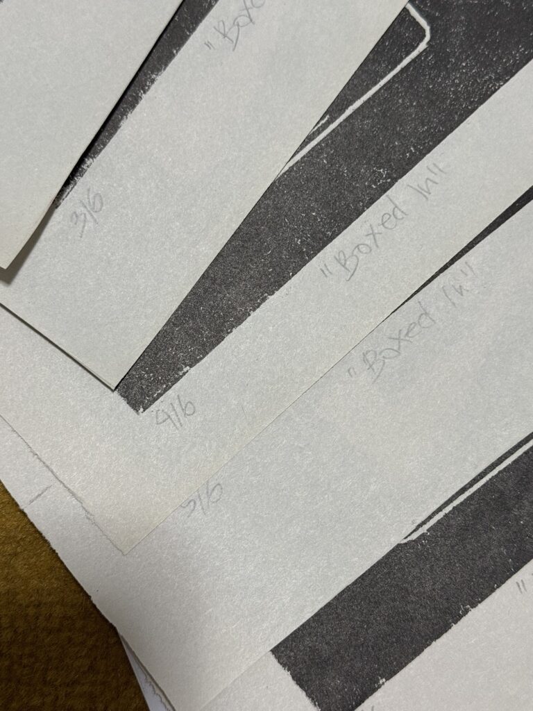
3. I also took this time to catch up on some maintenance work I had to: I organized my past work into files with all test and printing materials, and I titled, numbered, and signed some pieces. I’m very happy that everything is organized and up to date now, and I am grateful to have enough space to organize it all. Maybe I can do a studio tour sometime…
4. Finally, at the studio, I started the day by filing down this layer (the first one) since it came out textured on my first test print. I made it as smooth as possible, carefully keeping it all leveled out to maintain solid colors and sharp lines.
Before and After
5. Then, I cleaned out the edges of the second layer while chit-chatting with an old friend from the studio. I marked the edges of the image with the “knife” blade tool and then carved out a lot of the wood with a straight edge tool, always working outwards from my piece.
6. It was finally time to test out layers 2 and 3. I used the black ink that was already out by my studio mates, and did a couple of prints of layer 2 and one of layer 3. They came out with a few imperfections (listed below), but overall, I was very happy with the results. I especially love layer 3, and I think I should do a few prints of this design by itself, too.
7. To fix the imperfections of these layers (see the images below), I need to file down any texturized pieces. On layer 3 (on the left), the texture comes from some leftover wood putty I apparently did not sand down enough.
I filed the putty down to remove the textureI’ve also filed this area down, although I’m unsure of the source of the texture. Maybe it was damaged during transportation unfortunately.
Next week I’ll test it out all layers again and make any necessary adjustments The only 2 things to be done before I can actually print the whole piece out are: 1. Create an acetate mask so I can print two colors on the second layer and 2. figurie out and build a registration guide so the layers come out aligned. I might need Bebeto’s help for this last part since the boards have different sizes.
I will try to get the mask done at home before next week’s visit, so I have more time to work on this guide and start printing the first layer again! Hopefully I’ll get the colors of the gradient right on the first (second) try! There’s a lot of trial and error to come soon… Stay tuned to see what I come up with!
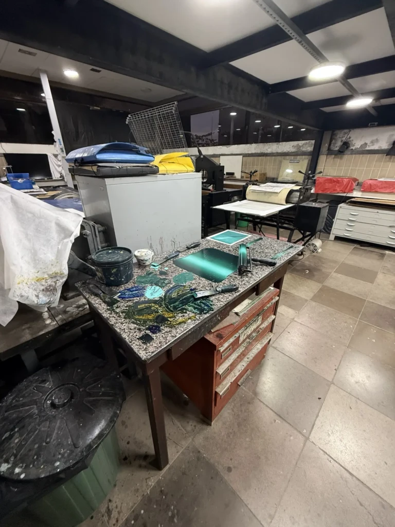
Today I went into the studio to continue working on my pool-themed experimental project.
I had no clear vision for what I wanted to accomplish, but I knew I had to finish carving my boards, and perhaps I could start doing some early prints and color tests.
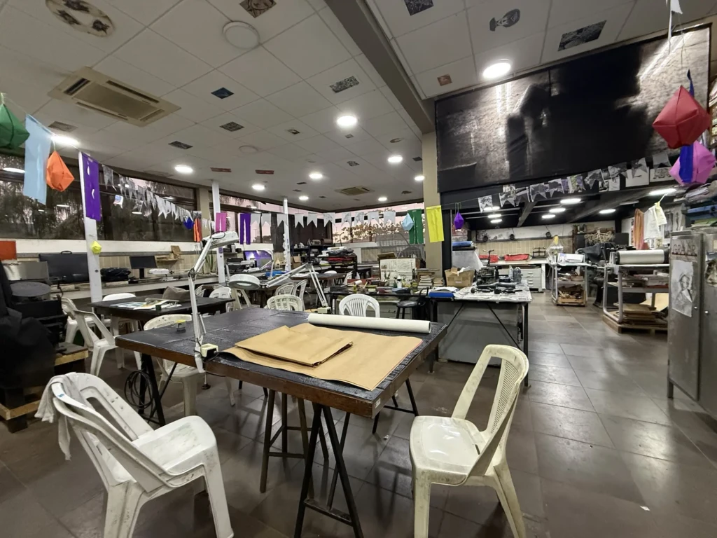
With the upcoming Good Friday holiday, the studio was crowded this Thursday. I chose one of the few open spots in one of the 4 communal tables. Last year was my introductory year at the studio, and now I’m joining the “experienced” classes with lots of new people, so sitting here was a good opportunity to start mingling with them.
Layers Reference
Carving
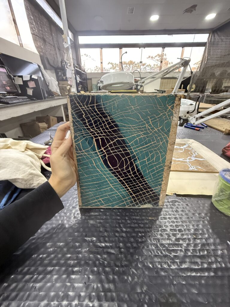
Last week, I used wood putty to fix a few mistakes I’d made when carving Layer 3 up, and so this week I started by cleaning it up: I removed the excess wood putty from the details and the outer edge, squaring it off to dimension. At this point, this layer is ready to be tested. Since this is the last layer to be printed of the piece -and it’s a straightforward, one-color print – I’ll just set it aside until I get to that point of the process!
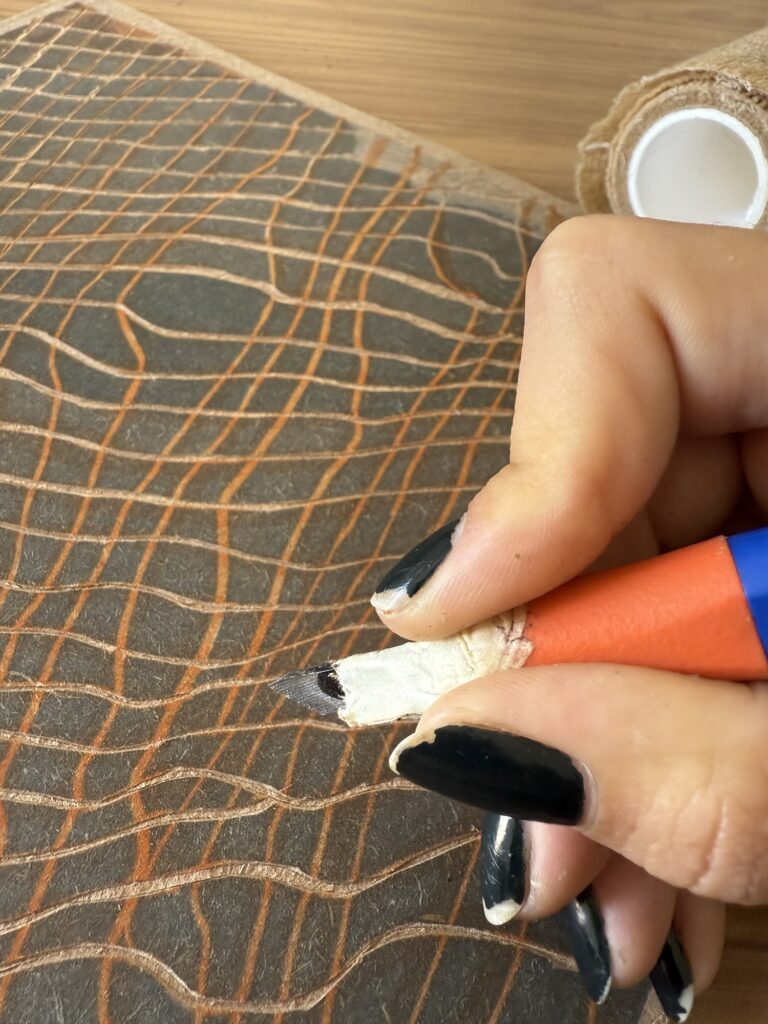
I started to clean up Layer 2, which was about halfway done. I did make some carving progress, but since I’m using the “blade cutter,” I wasn’t able to finish it; the blade puts a lot of pressure on the last articulation of my pointer finger, and since I have some hyper-mobile articulations, the hyper-extension of the finger hurts a lot. That’s why I add this piece of tape (see image) around my fingertip; it gives a bit more structure and stops it from bending so much and forcing it. On top of that, I guide the blade with my fingertip, which I also covered with a bit of tape for grip, but the constant pushing against the metal hurts my skin. I had to take a lot of breaks not to force it… Slowly, I’ll make progress on this.
Next, I was thinking about Layer 1. I considered using the back of one of the other layers’ boards to print Layer 1. This would save material, and since it’s a simple design (no carving besides delineating the edges), it would not be risky for the design on the other side of the board. However, when I started thinking about the printing and carving process, it became more of a hindrance than it’s worth it: it would stop me from being able to carve or print two layers on the same day, for example (at least not without wasting some time thoroughly cleaning it.) So I decided to keep Layer 1 on the board I had prepped for it last week.
I worked on cleaning the edges, and unfortunately, I made a mistake or two, but nothing too bad. I had to use the same blade tool for this step, so my hands were already tired. Maybe I should’ve taken even more breaks, and I think I should come up with an improved idea for making the tool more comfortable for me. This was all that I needed to do for this Layer. Now this layer was ready to start testing too! With this, I had 2/3 of the layers ready.
Printing
At this point, my hands were aching, and I did not want to carve anymore. I was itching to start doing some prints and so I decided to start doing gradient tests for Layer 1. This practice reminds me again and again that patience is key! Printmaking and rushing really don’t go together. I wasn’t exactly in the correct mind-space for this step.
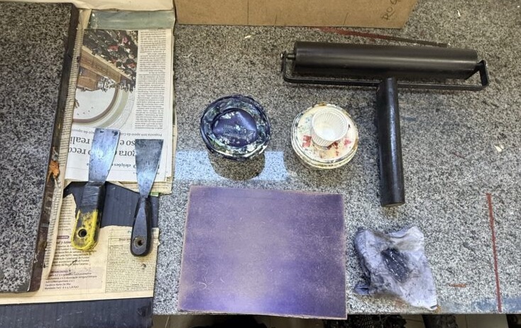
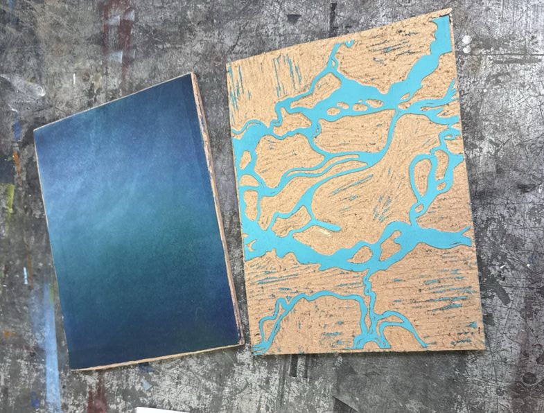
My first mistake was in choosing the colors. I went for what looked like a more purplish-blue, like a Bic pen blue. However, once I started blending it with white, I noticed how much of a purple this paint was, and very little blue. This is a problem because it’s a pool design, and even though the purple could be used later for a cool “night” version of the print, it’s not what I’m going for. I still used the paint to practice making a gradient and printing it out, of course – I wouldn’t want to waste the materials, even if just for an ugly test. I can always use this as the base for another drawing or something like that.
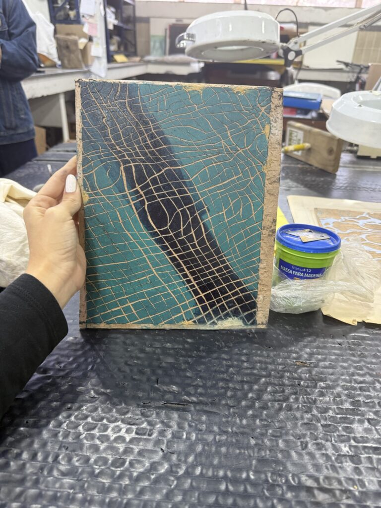
Another problem with the purple paint was its consistency: it was very thick and mostly dried up, so maybe I could’ve added some flaxseed oil to make it more malleable, or, even better, just asked for Bebeto’s advice on it. I kept adding more and more paint to the gradient, but 1. The gradient was coming out blotchy, and not as smooth as it could be 2. There was not enough paint to transfer to the board, which resulted in a faded and spotty print. I went through adding paint to the gradient and transferring it to the board a few times, but I could tell it was not enough paint… since it was also not the right color, I felt hesitant to keep adding more paint. I ended up pulling a test just to see how it would go, and it went as expected… not enough paint! This print also showed me a third mistake I had made: the board wasn’t smooth enough! There was still quite some grain showing, even though I sanded it last week.
Defeated, I spent the next 20 minutes cleaning up my mess, kinda ashamed for not getting any valid prints but also thinking about how I would fix my mistakes for next time: 1. I need to clean up my board from as much paint as possible and sand it again with a finer-grained sandpaper. 2. I also need to study the desired colors carefully, maybe even make some swatches to match-up when mixing the paints; Two things I could’ve done in this hour or two of studio time instead of doing a rush print job.
Another lesson to remember the next time I attempt this gradient is to be careful with how bright/light I want it to get. I think the lighter stripe on this test was too wide, and maybe keeping it more concentrated in a smaller area might give off a better result. To figure that out, I need to test it with Layer 2 and see what effect works best. This is the first layer, and this gradient is what’s going to seep through the tiles of the pool I carved on layer 2, giving off the idea of a light source shining on the grout at the bottom of the pool.
I did not have to start printing today. A couple of hours is not a lot of time to attempt a gradient, especially after taking a months-long break from printing. I ended up making a few silly mistakes along the way, forgetting steps, using the wrong supplies, and methods. It was nothing huge, but it resulted in mediocre results and wasted paint. But it’s all good because making mistakes is how we learn, and it’s all part of the process.
After all that hard work, I needed a little treat! Afternoon tea, or “Afternoon coffee” as we call it here, it’s an important Brazilian tradition. It is upheld in many houses, and also in this studio by the lovely group of elder lady artists who frequent the studio on Thursdays. They always bring cakes, breads, and spreads, and of course brew a nice pot of coffee – drip brewed by tradition.
This week, since it’s easter, there were lots of traditional Brazilian chocolate boxes, filled with an assortment of chocolate candy bars. I was not going to go for it – I’ve been to shy to grab food since I have not been contributed to the spreads these weeks, so I shyly been drinking coffee, but after this long day I treated myself to a chocolate bar and a quick chat with a friend I met at the studio but I had not seen since early last year. It was a good way to wind down.