The last few weeks at the print studio have been mostly dedicated to troubleshooting the final details of the forever-going “Pool” project. You can read more about this saga here. In this post I’ll walk through the latest rounds of trial and error, the reasoning behind each tweak, and my ongoing attempt to finally print a successful edition (or at least a handful of good copies) so I can move on.
Besides this project, I also started a couple of smaller print experiments on the side and continued taking advantage of the many exhibitions at CIC. I’ll share both of those experiences later in the post.
Part 1
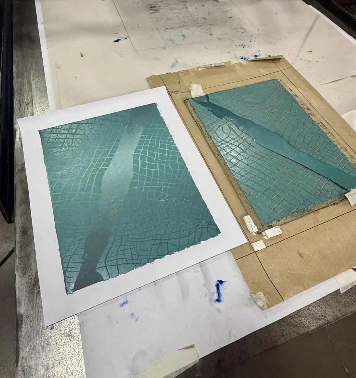
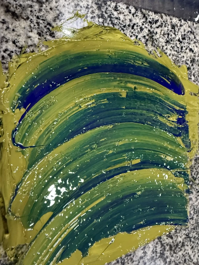
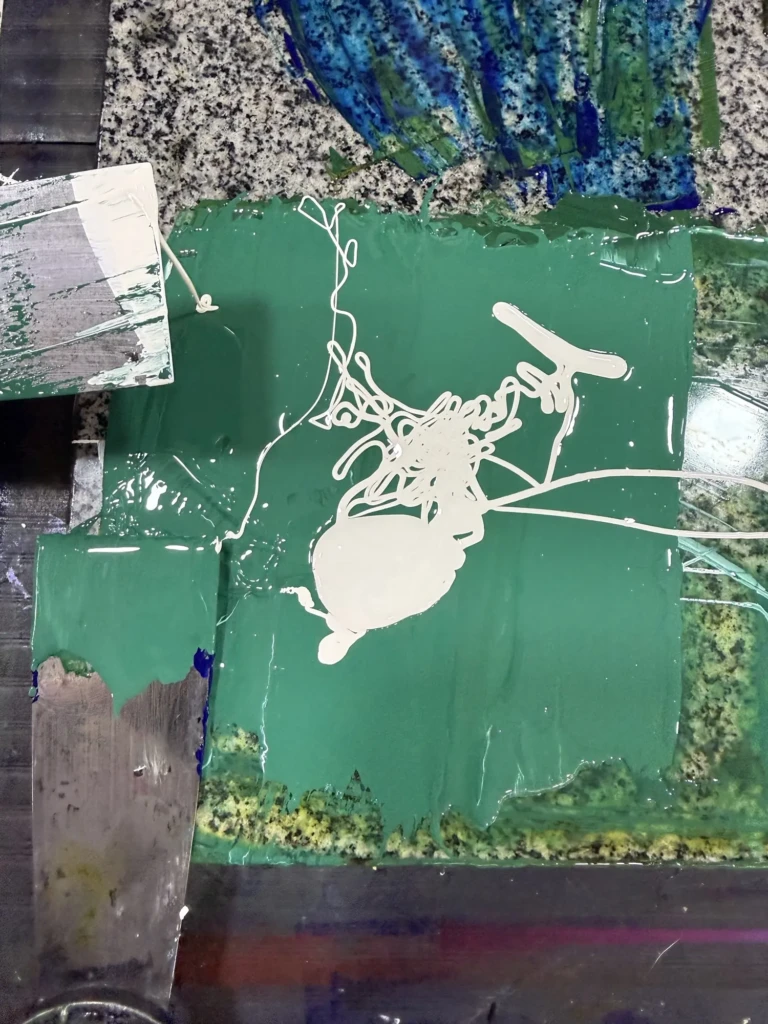
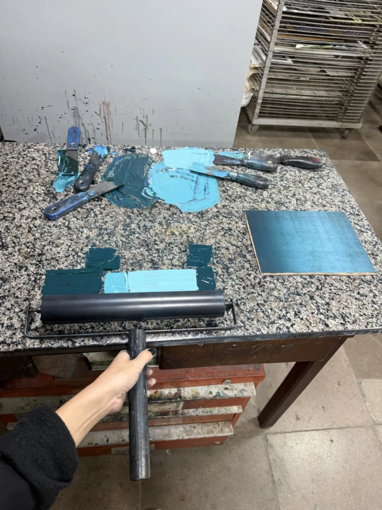
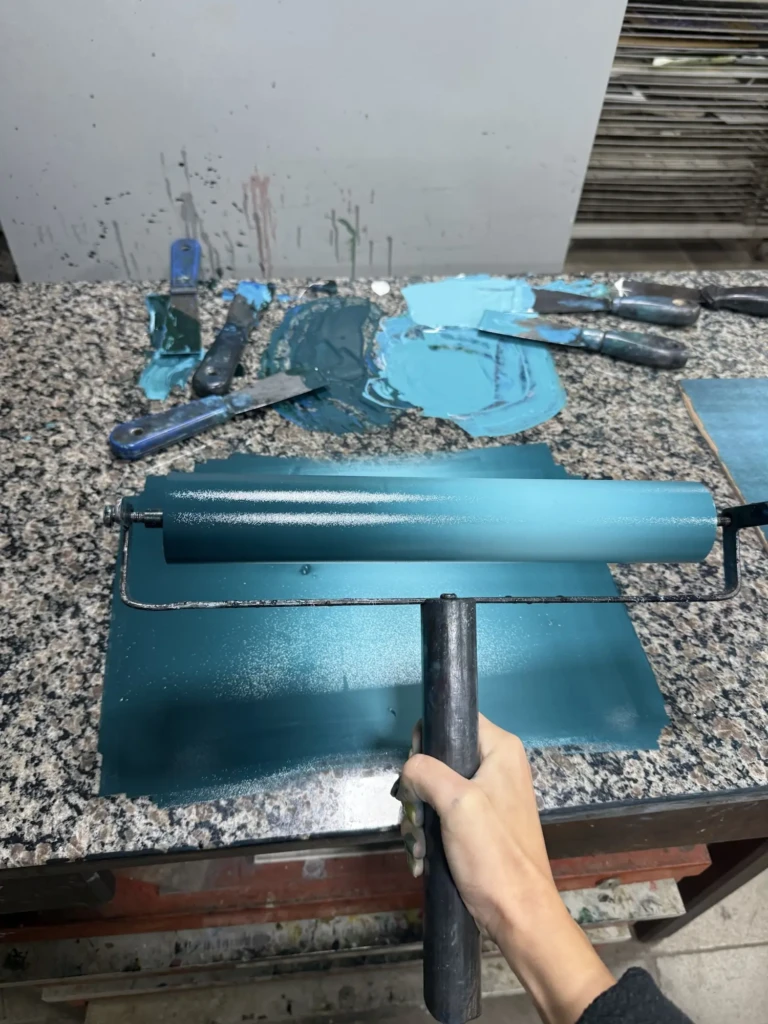
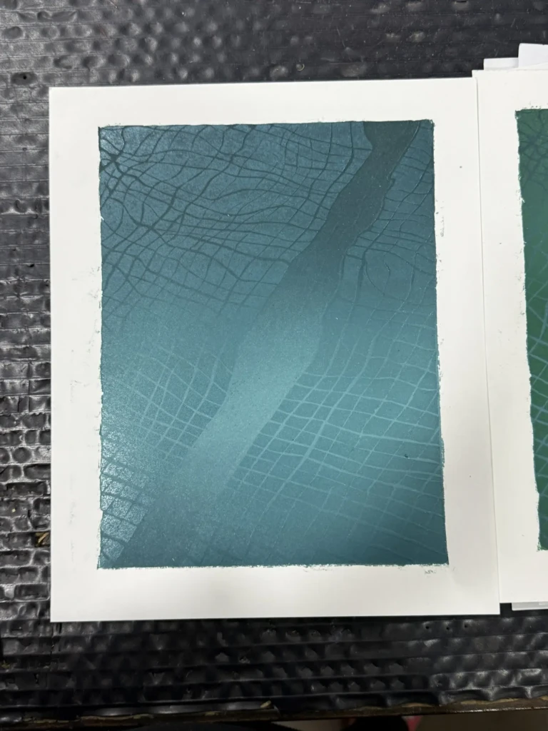
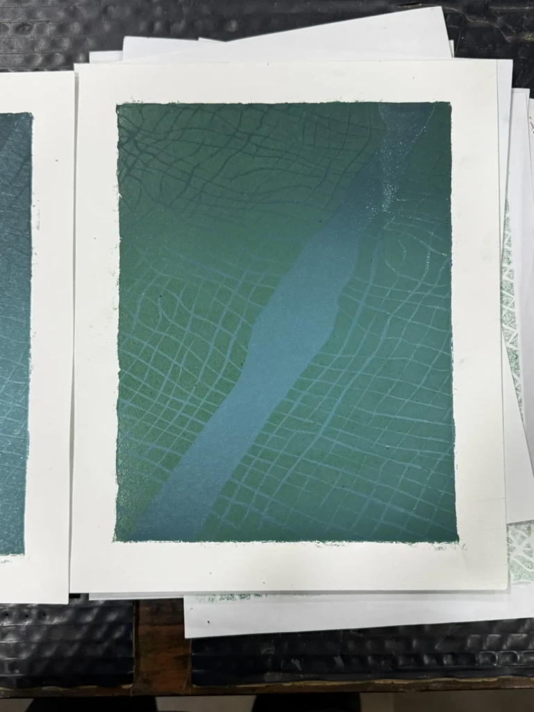
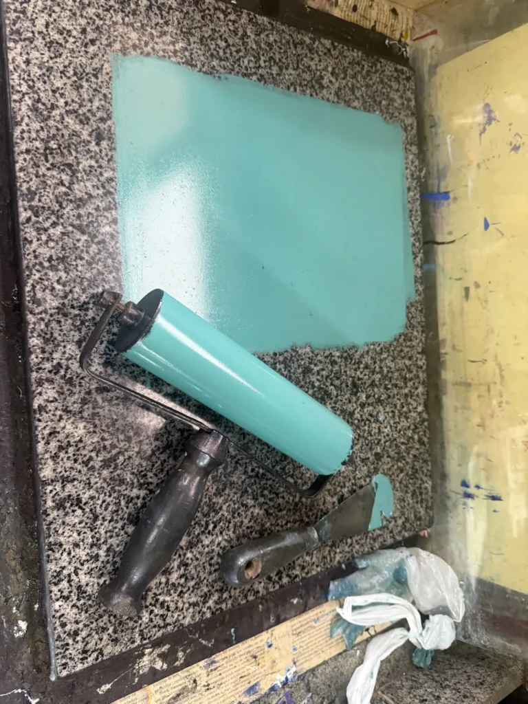
With the improved registration guide in place and all my materials ready, I went in for another test run: I mixed the gradient for the base layer using one of my previous successful prints as a color reference. Unfortunately, nothing is ever straightforward with this project. Instead of using the deep forest green from the original series, I accidentally grabbed a sepia green—a much warmer, yellower, slightly transparent color.
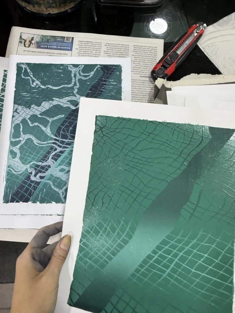
At first the difference seemed subtle enough to ignore. But the following week, when I printed the second layer using the same color proportions as the original series, the mistake became obvious. The whole piece suddenly felt too green, too dark, and the illusion of depth and light that I had worked so hard to create completely disappeared. Even with only part of the image printed, I could already tell something was off.
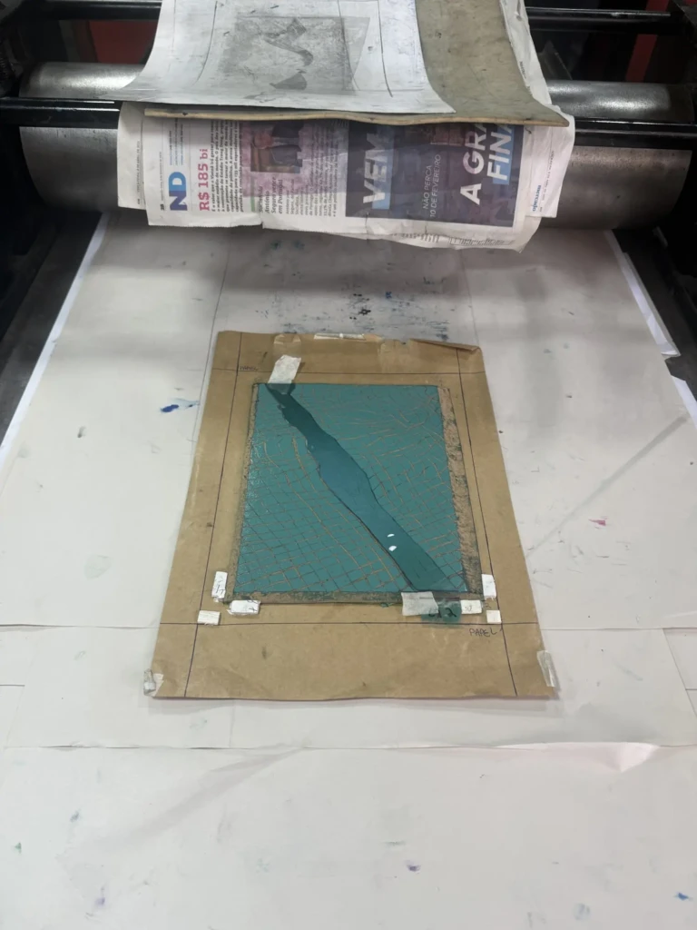
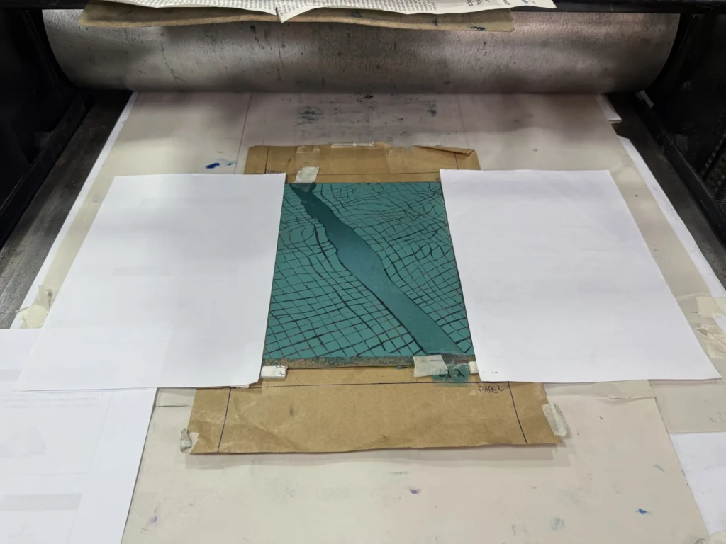
Check out details of the process below:
Week 1. Layer 1:
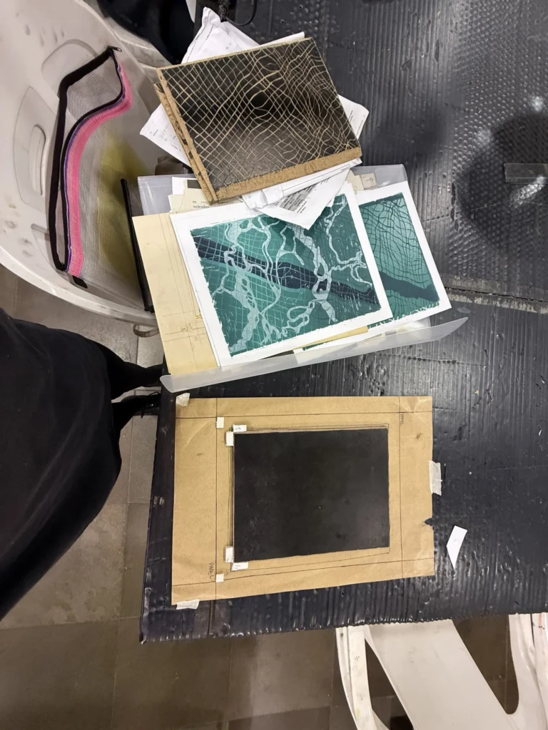
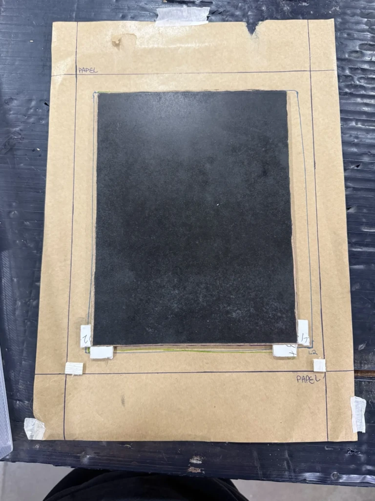
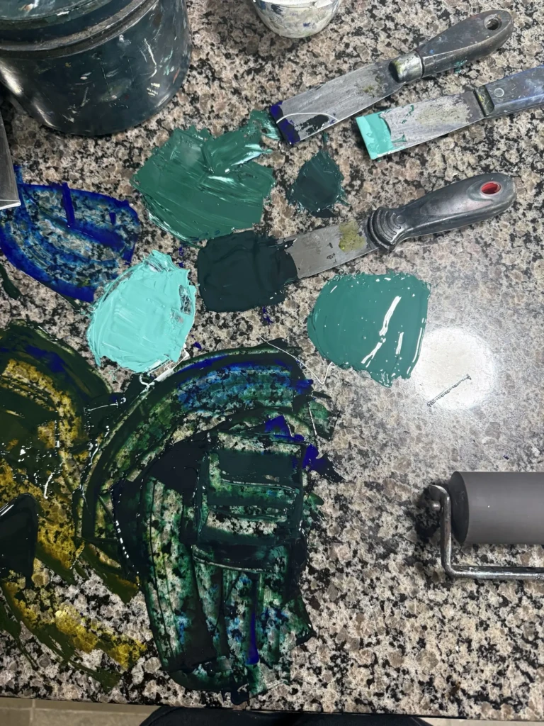
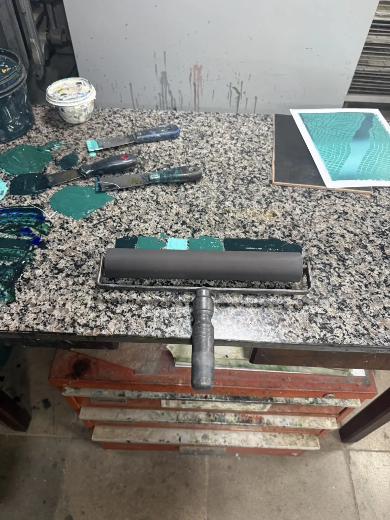
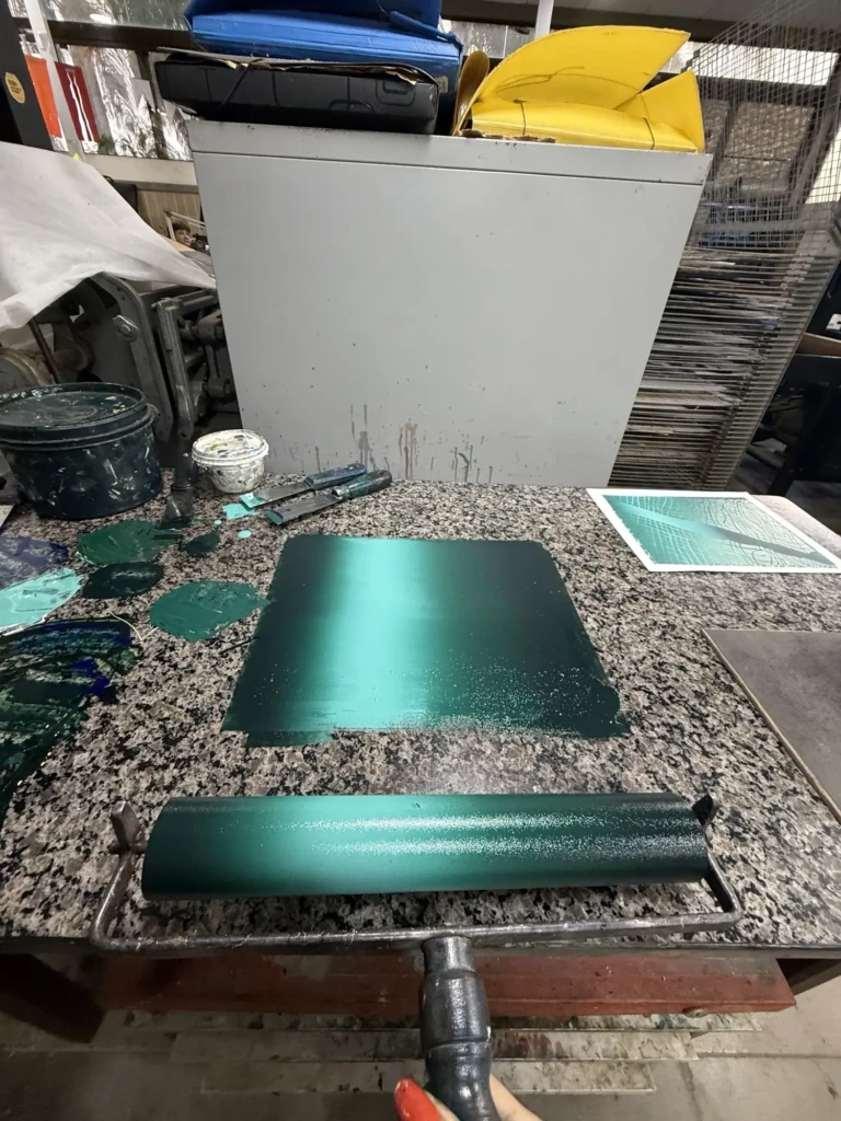
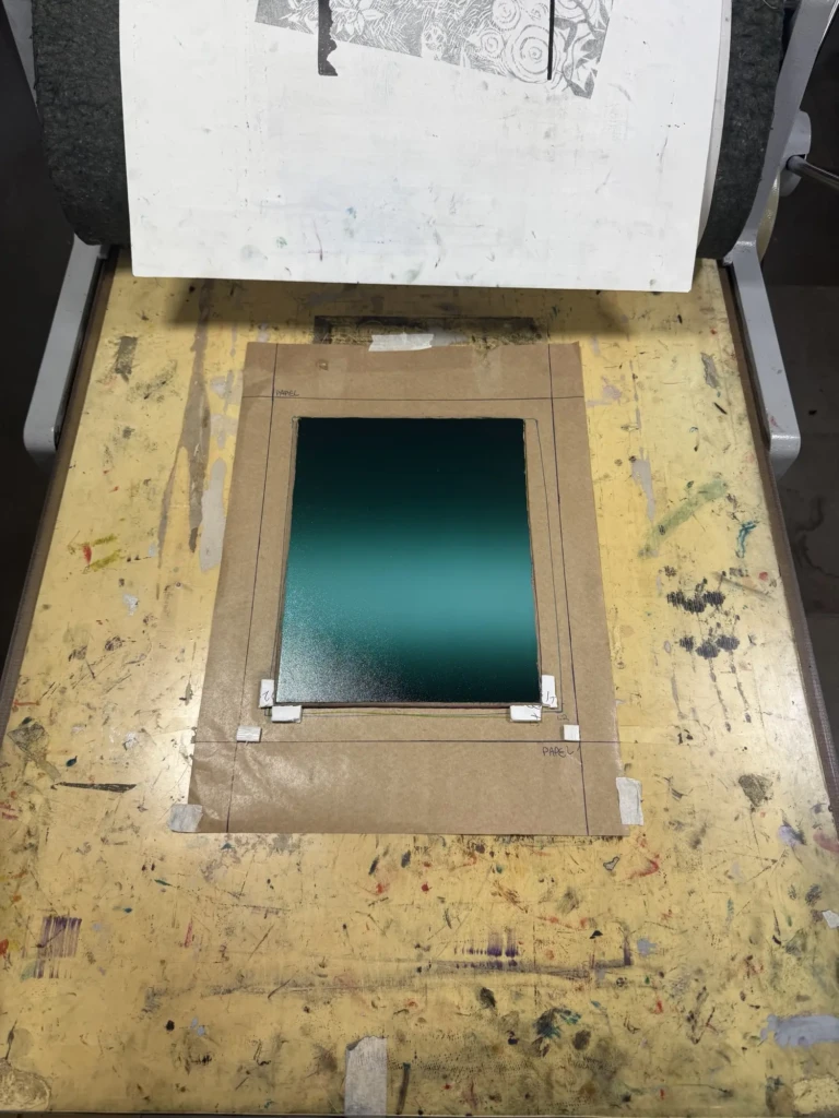
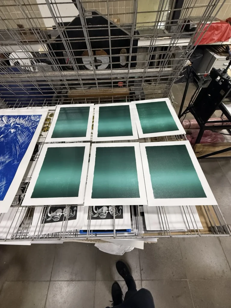
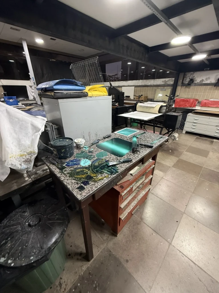
Week 2. Layer 2:
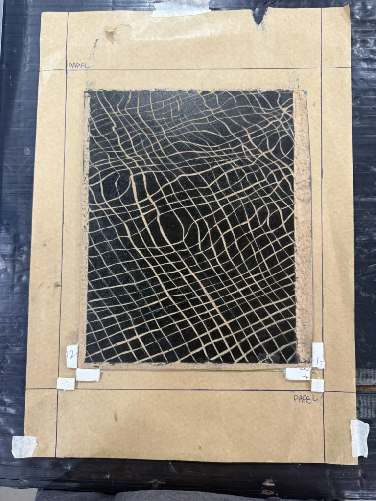
(Re-glued the styrofoam squares to hug the board.)
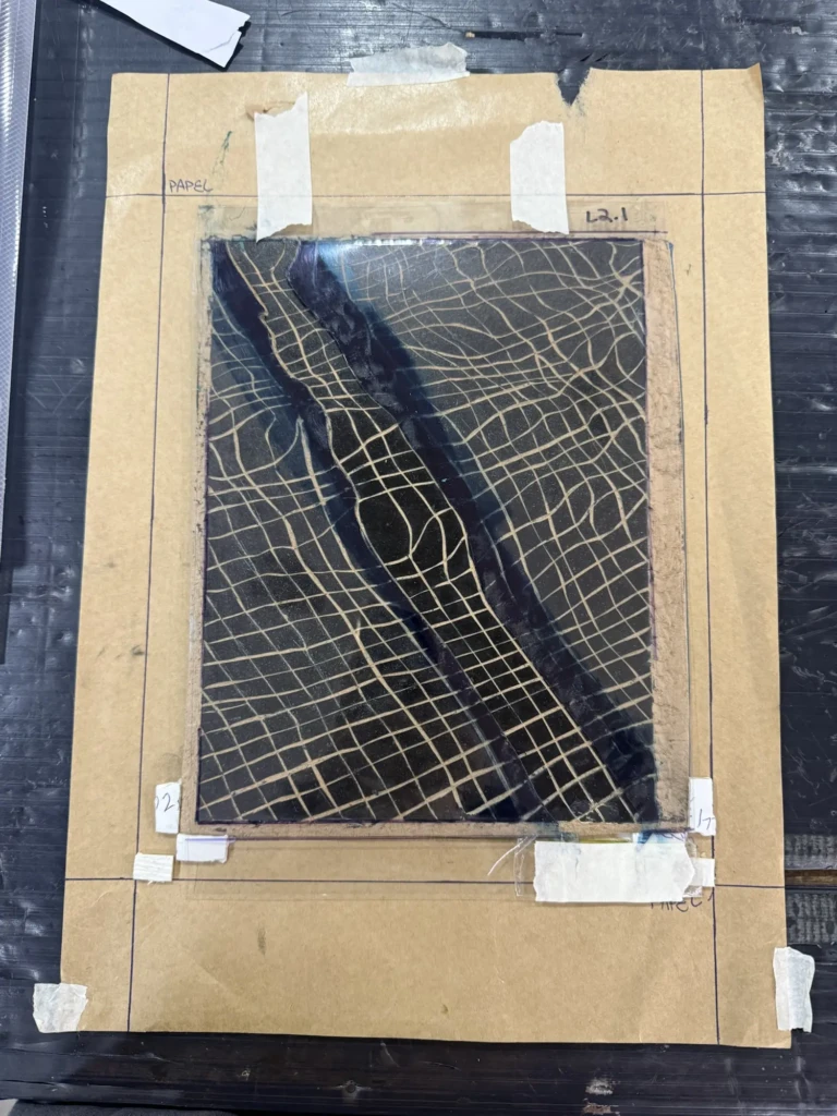
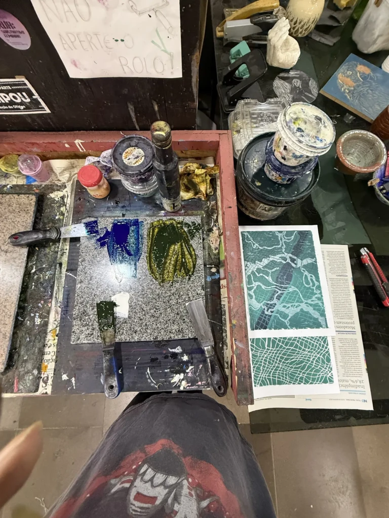
Part 2
So… back to the drawing board.
Feeling a little frustrated, I went into the next studio session with two goals:
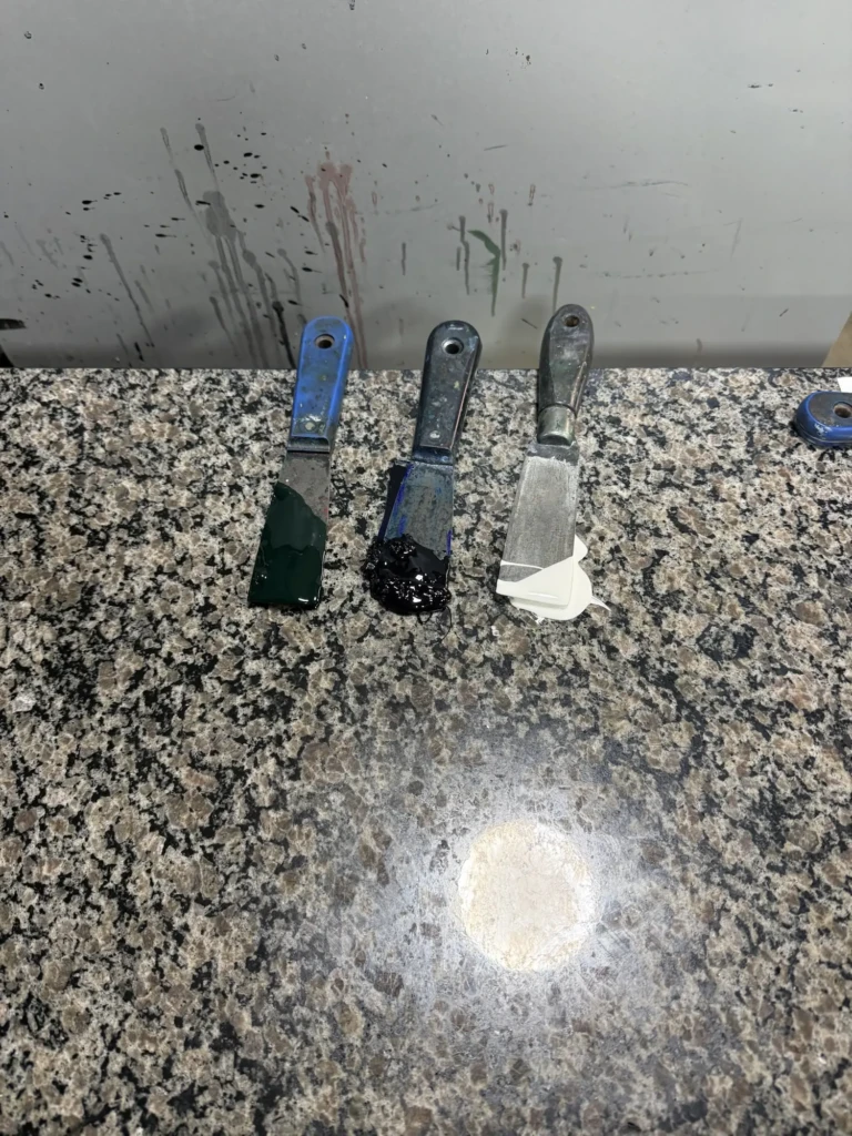
- Remix the gradient using the correct green.
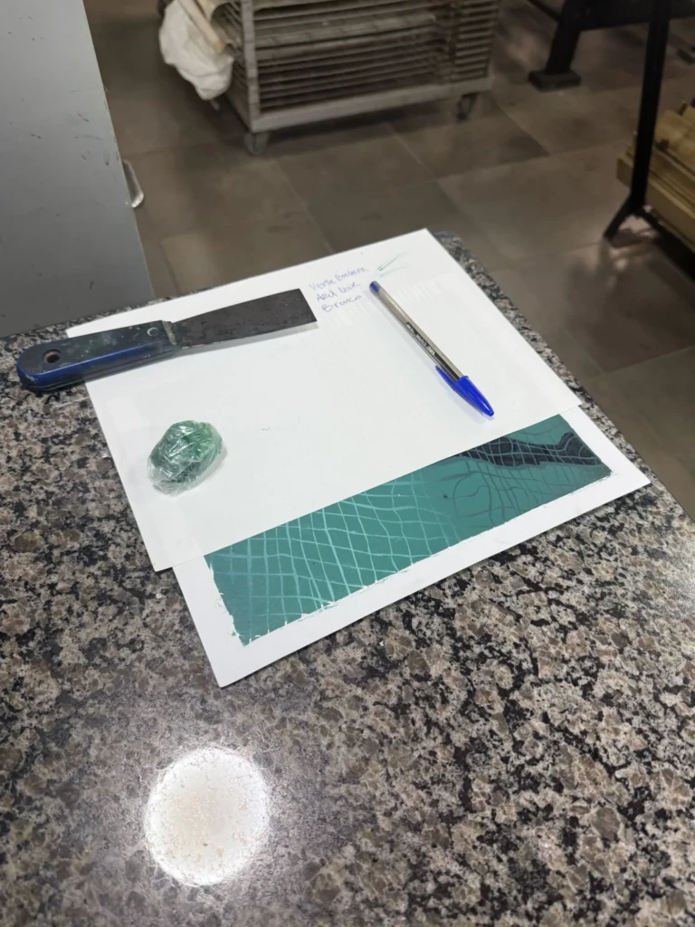
- Write everything down this time so I could actually reproduce the colors later.
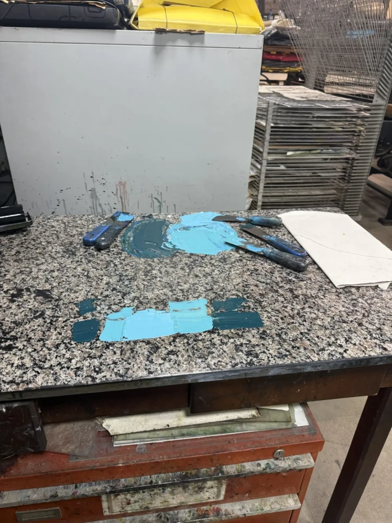
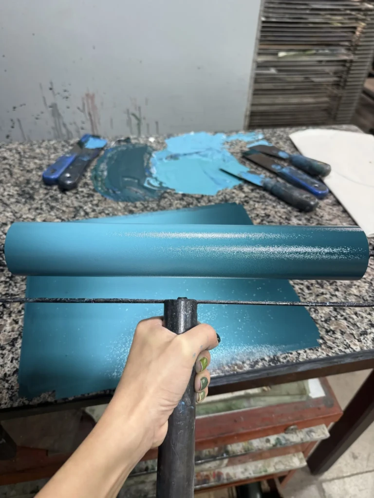
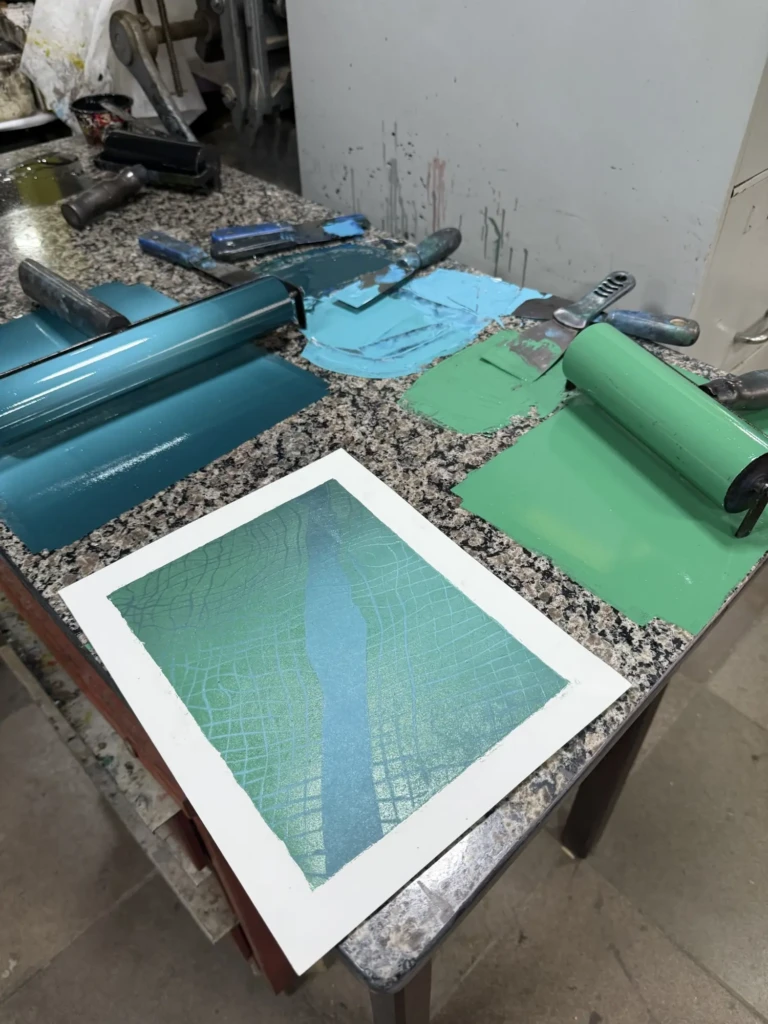
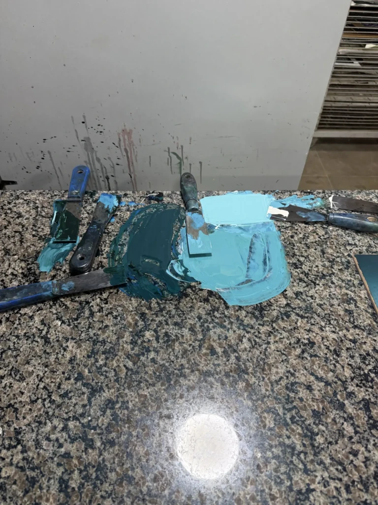
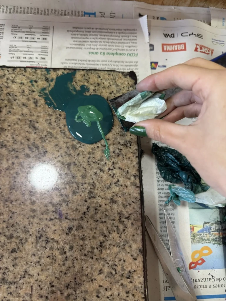
My notes are admittedly a mess—lots of guessed proportions, additions, and corrections as I mixed—but messy documentation is still infinitely better than no documentation. At least this time I also wrote down the names of the inks.
As soon as I finished mixing the new gradient, I could immediately see it was much closer to my original reference prints.
Bebeto (the studio instructor) was actually the one who spotted the green mistake. He also noticed something I hadn’t considered: I had changed paper between the first and second series. The originals were printed on a cooler white paper, while these new tests were on a warmer cream paper. That subtle shift also changes how we perceive the colors, making everything appear slightly yellower.
His third piece of advice was probably the most useful: mix enough ink for the entire print run instead of remixing it every week.
At first this felt completely wrong to me because I hate wasting materials. But the more I thought about it, the more it made sense. Every time I ran out of ink, I had to remix it from scratch, often wasting even more paint while trying to match the previous color. By mixing a larger batch and storing it, I would actually save both time and materials while keeping the colors consistent throughout the edition.
With those ideas in mind, I remixed the gradient and used the leftover paint from the previous session to test Layer 2. The result wasn’t great—but it taught me something important. Layer 2 needs to sit much closer in value to the darkest part of the gradient beneath it. Looking back at my original prints, I realized those two colors almost blend together in some areas, which is exactly what creates the illusion of depth.
Unfortunately I ran out of studio time before I could remix that layer.
Not my favorite studio day, but definitely one of the most educational ones.

Part 3
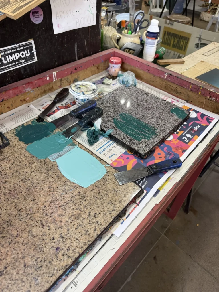
I went into the following session feeling much more optimistic. This time I had a plan:
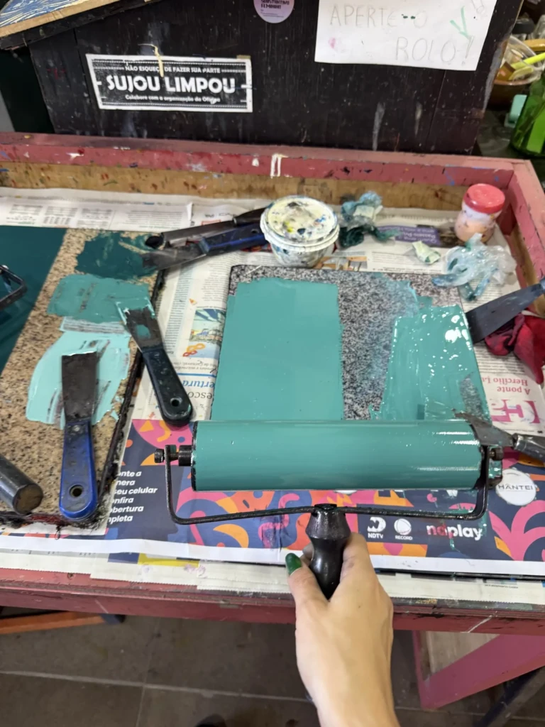
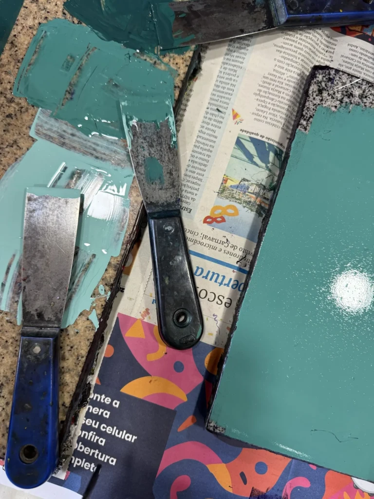
- Mix the corrected gradient and test one or two prints.
- Mix the color for Layer 2 while Layer 1 was still wet.
- Fine-tune both colors until they matched the original series.
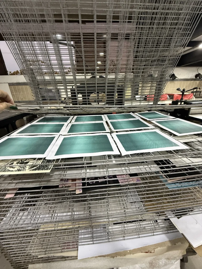
- Print the full batch of Layer 1 on both paper types.
Overall, the plan worked surprisingly well.
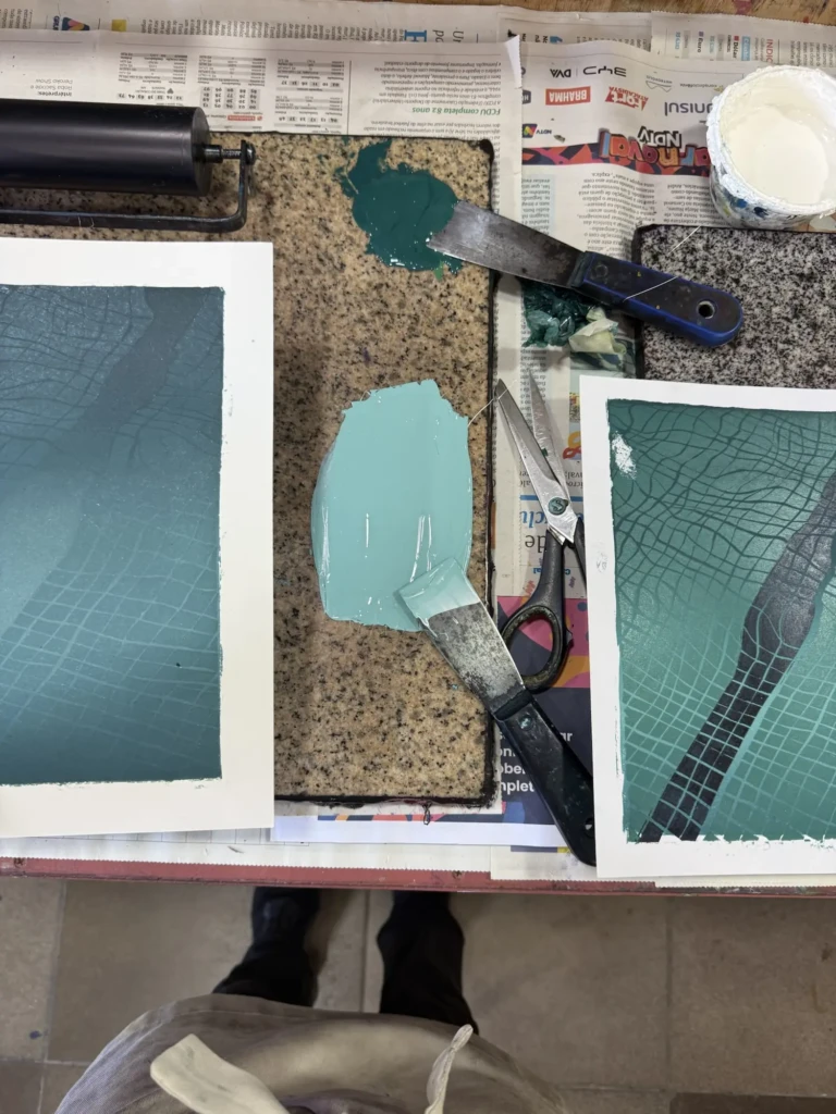
The villain of this episode, however, was texture.
Because I hadn’t stored my blocks properly after the previous printing sessions (I wrapped them in paper while they were still drying…), both boards developed problems.
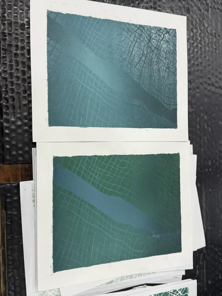
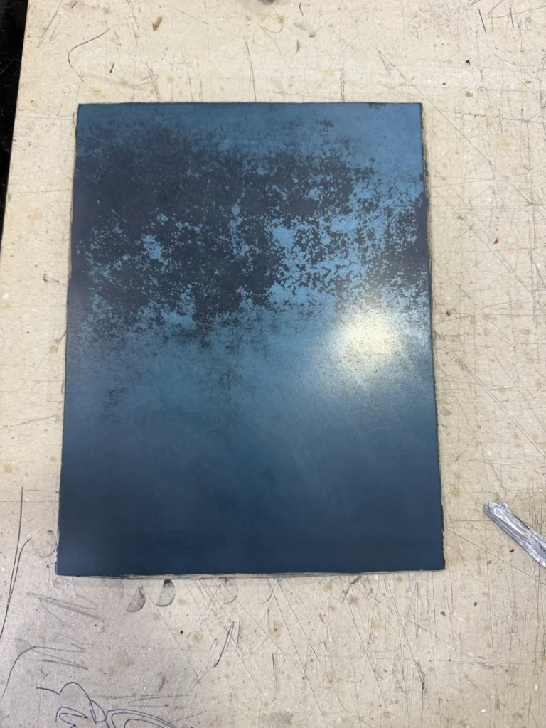
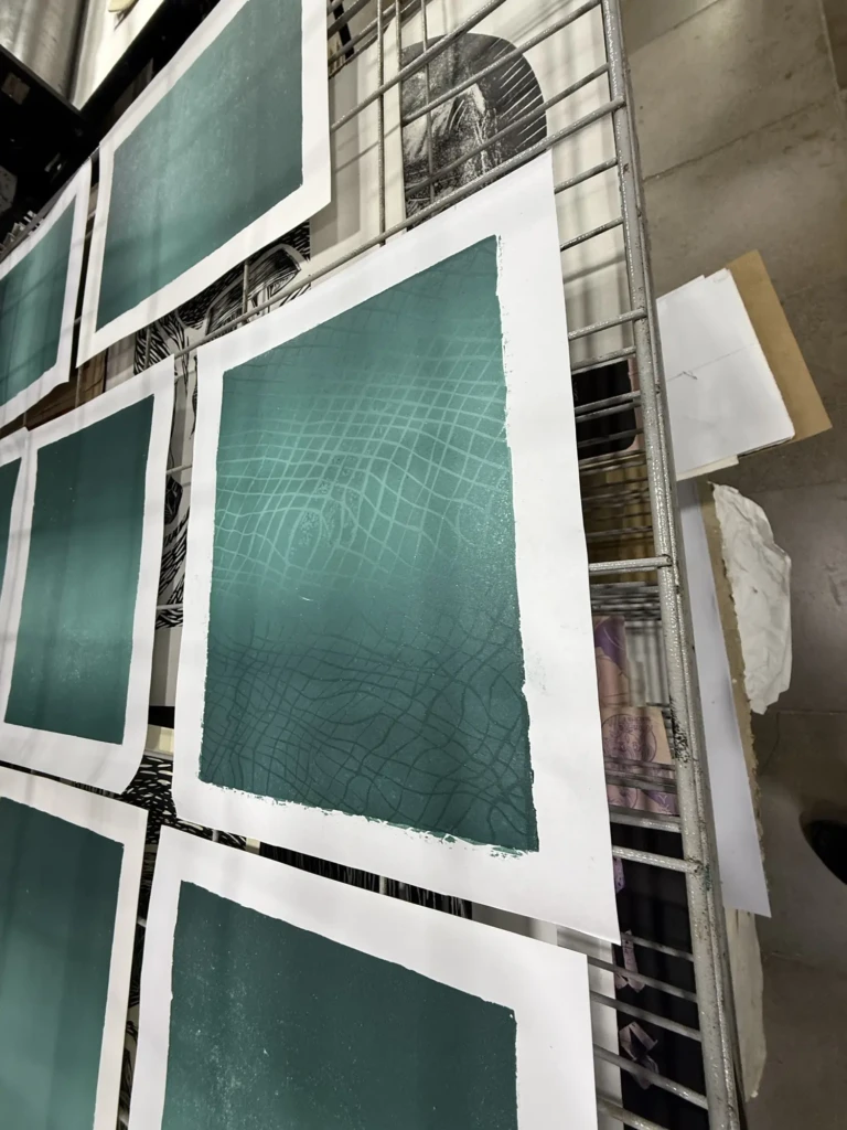
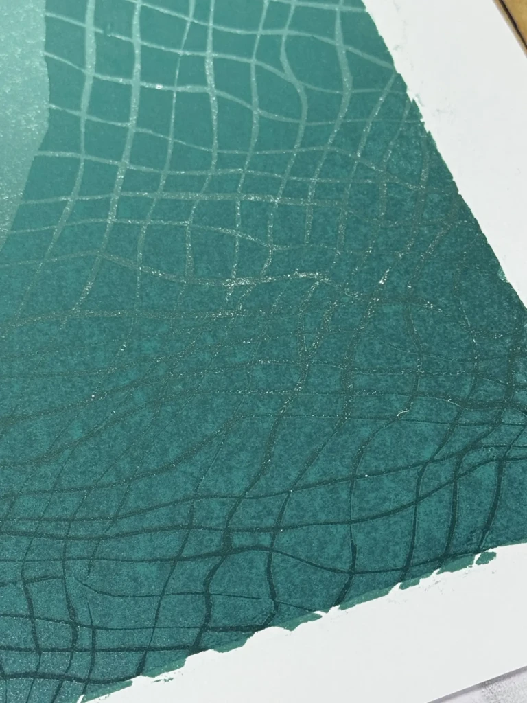
The first block developed a strange grainy texture in the lightest section of the gradient. It almost looked like corrosion and produced a vine-like pattern on many of the prints. Even after cleaning it thoroughly with solvent, the texture remained.
The second block had another issue: paint had dried into thick patches, especially where the acetate mask sat against the wood. I spent quite a while cleaning and sanding the surface before printing again.
The thinner, cooler-toned paper helped hide some of those imperfections, and running each print through the press multiple times (sometimes four!) also improved the results.
Were they perfect? Not even close.
But I finally achieved two things that had been holding me back for months:
- the gradient colors were finally mixed correctly and documented;
- the new registration system worked, keeping the layers aligned far better than in the original series.
That alone felt like a huge victory.
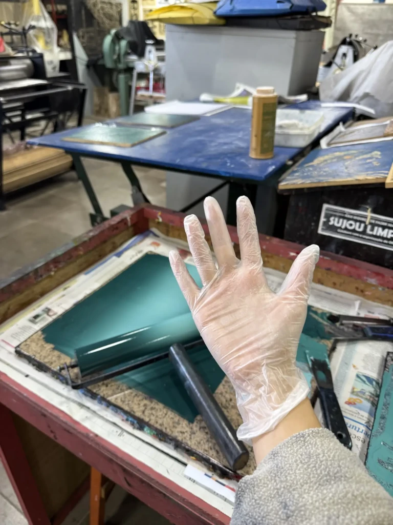
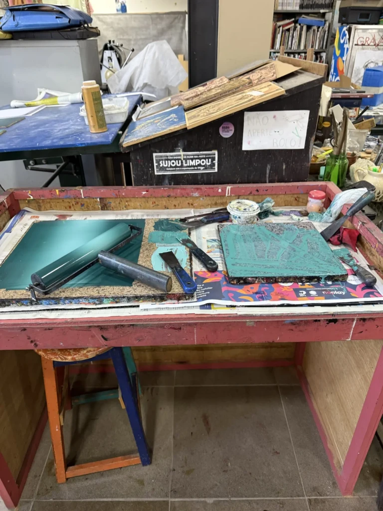
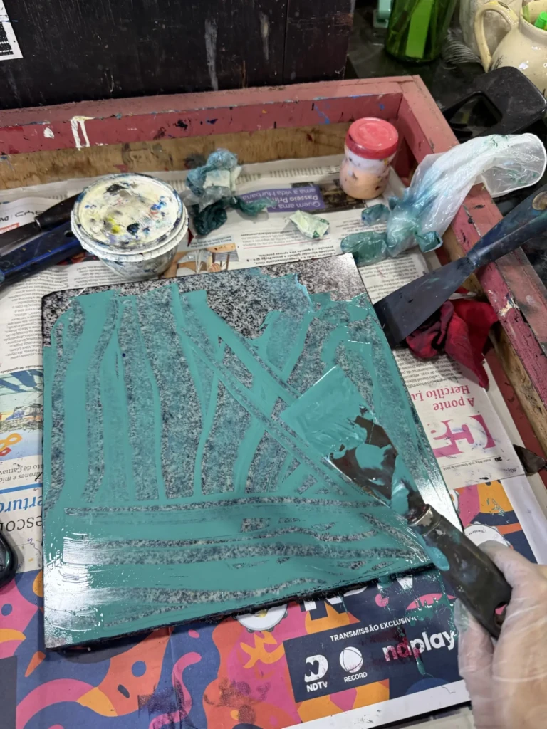
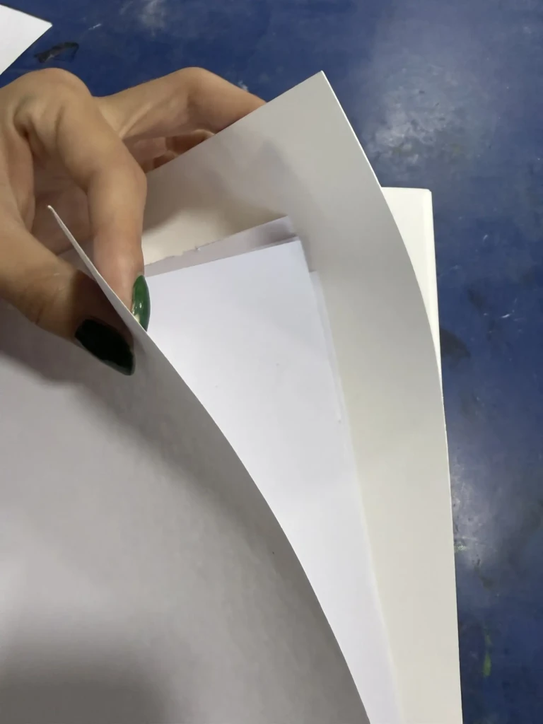
Part 4
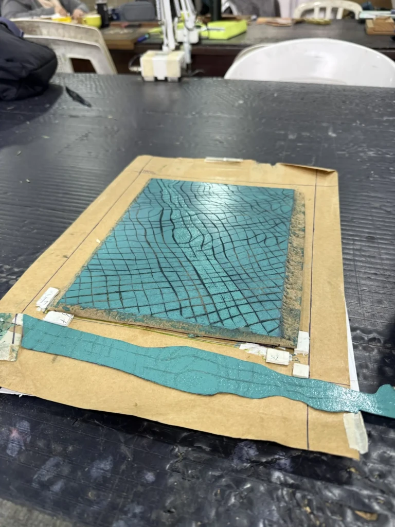
During my latest studio session, I finally tested Layer 2 using the corrected color.
I already knew the board still had some dried-paint texture left, but I decided to do one print before sanding it again, just to see how noticeable it would be. Since much of this layer is hidden by the acetate mask, I hoped I could get away with it.
I couldn’t.
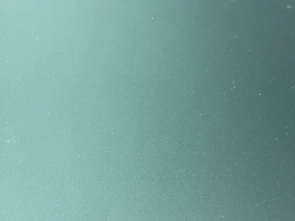
The print came out incredibly blotchy.
After thoroughly cleaning and sanding the block, I tried again. The results improved—but not nearly as much as I had hoped. I even tested a different paper, with similarly disappointing results.
By that point, frustration had definitely caught up with me.
I decided to step away from the project for a while and work on one of my side prints instead… only to immediately make a carving mistake and remove something I definitely shouldn’t have.
At that point I figured the universe was politely telling me to call it a day.
Now I’m left wondering whether it makes more sense to keep fighting this version of the project or simply start over from scratch, applying everything I’ve learned through what has become a surprisingly long list of mistakes.
Honestly… I’m still not sure.

Side projects
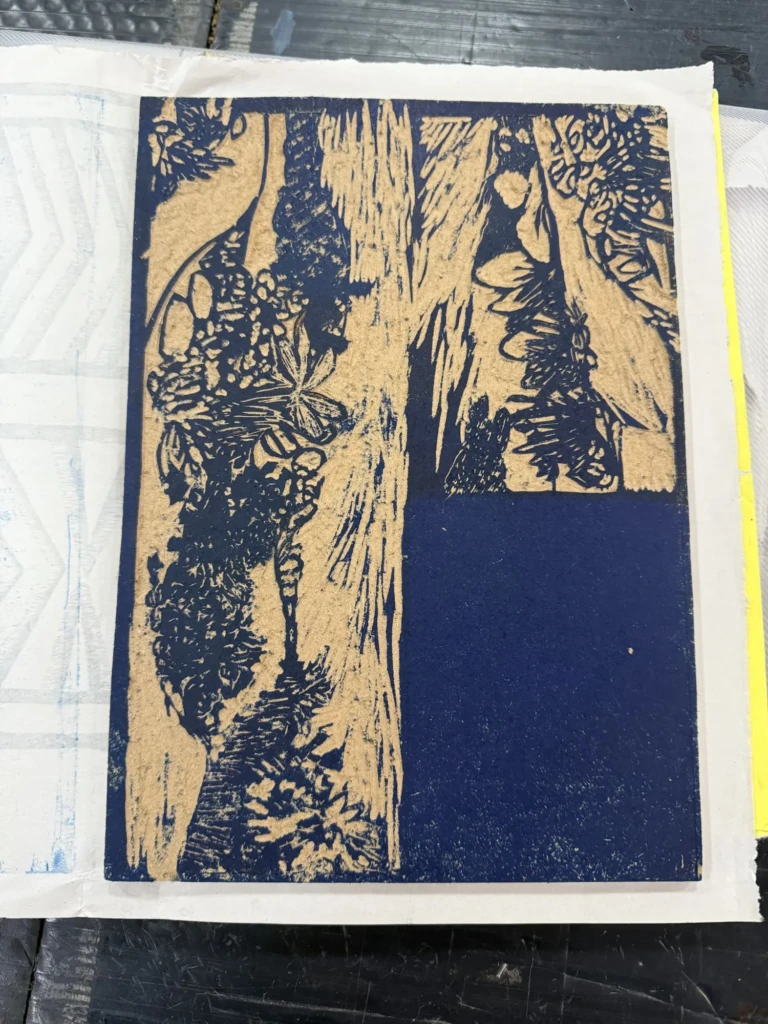
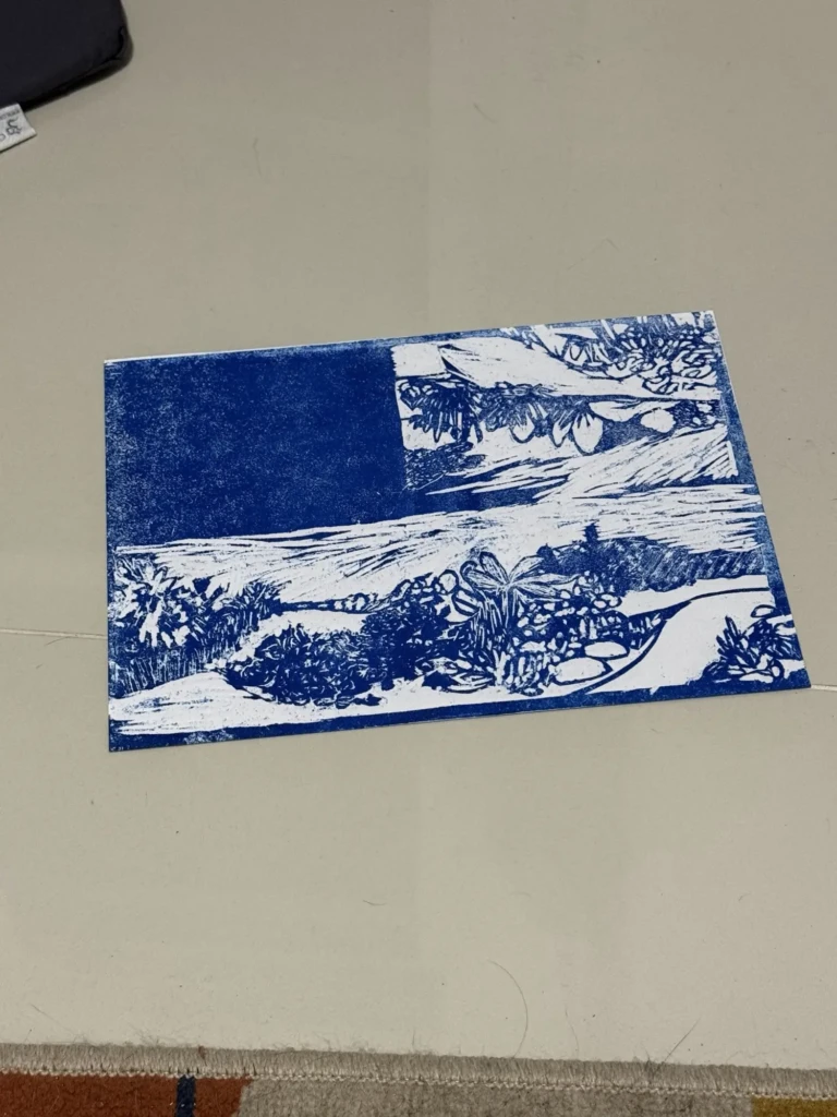
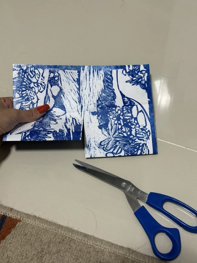
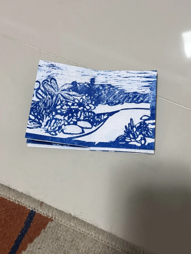
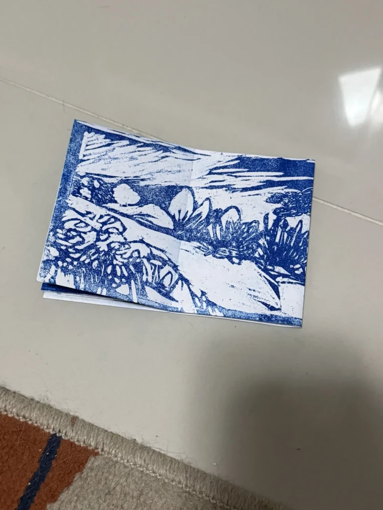
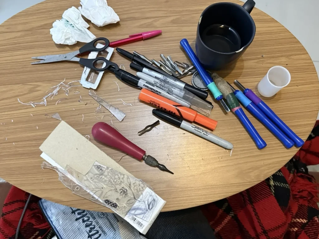
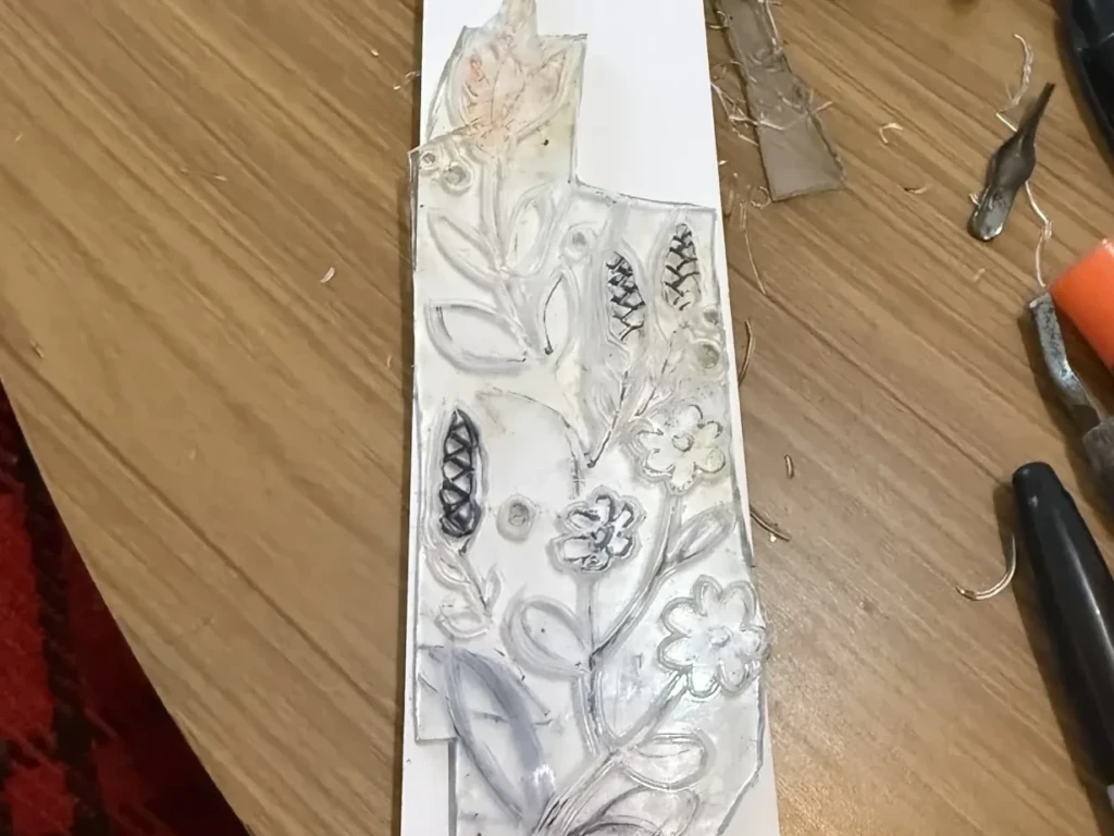
I’ve been working on some side-projects: a zine and a book-marker…. here are a few sneak peaks but I’ll share more later!
CIC (Integrated Cultural Center) expositions
As always the exhibits at CIC have been great recently and here are a few highlights from them:
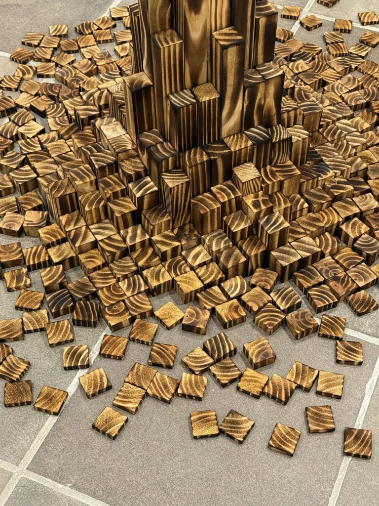
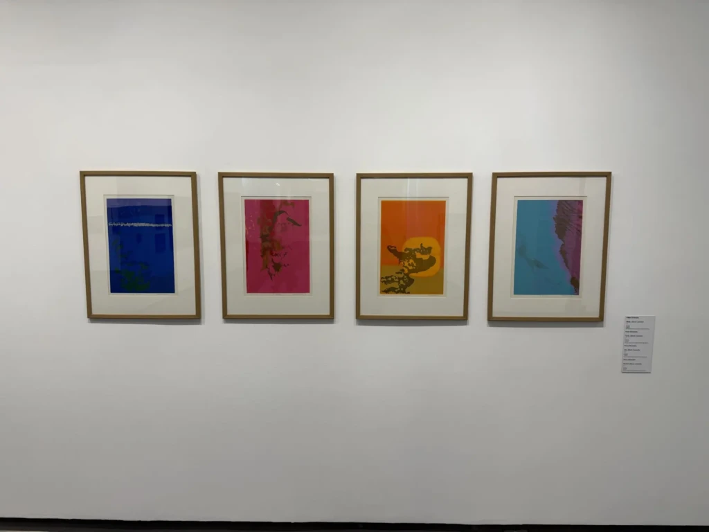
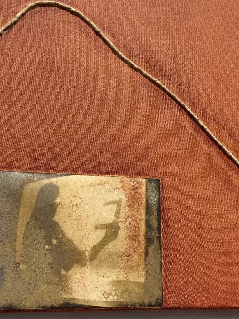
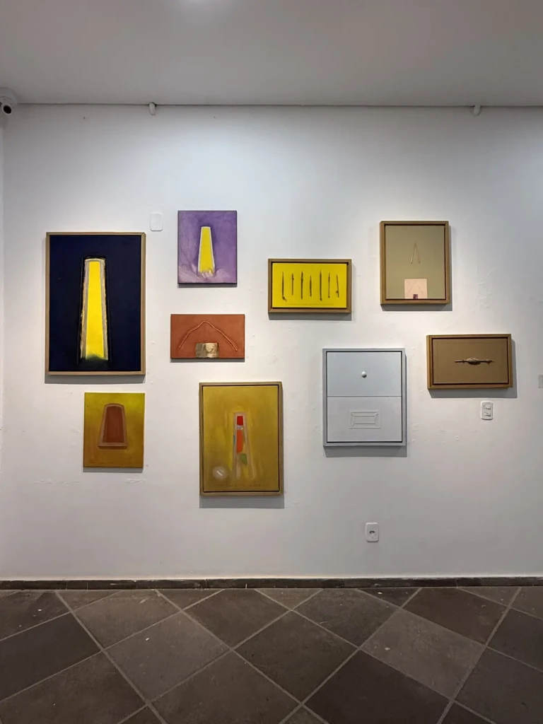
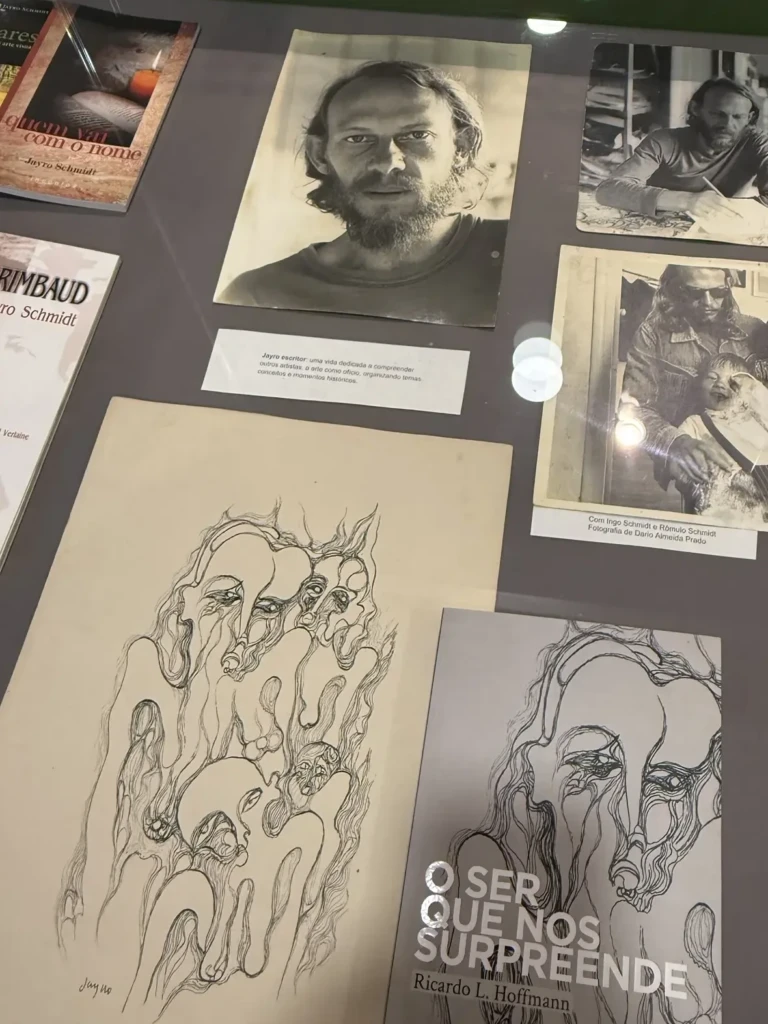
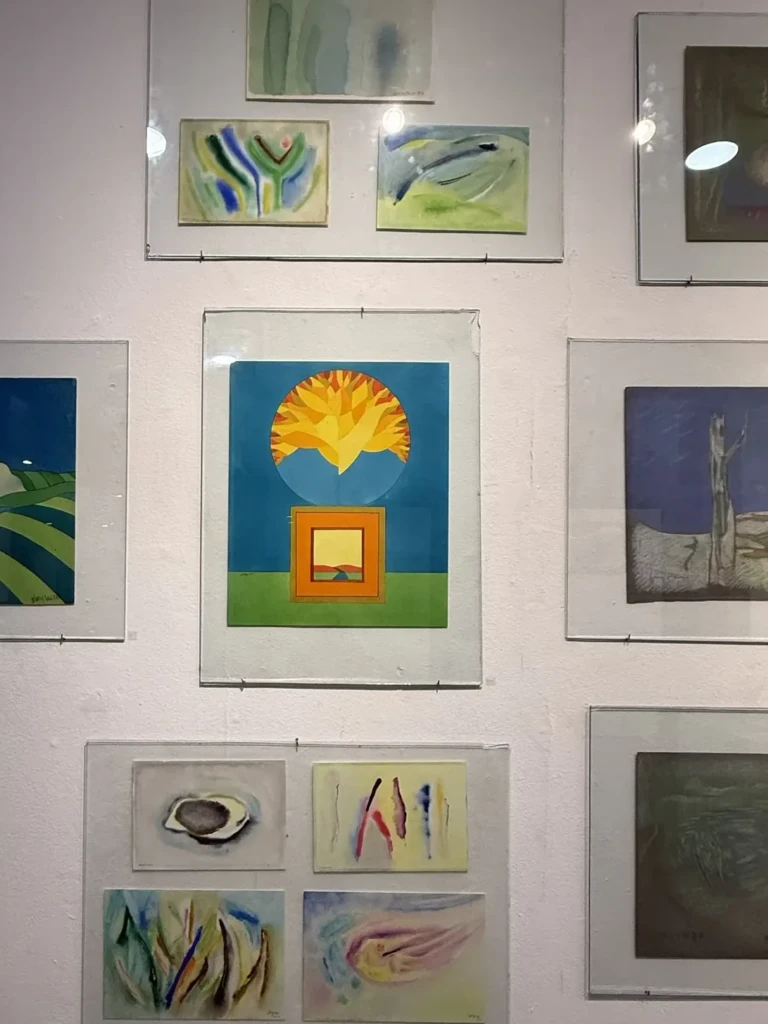
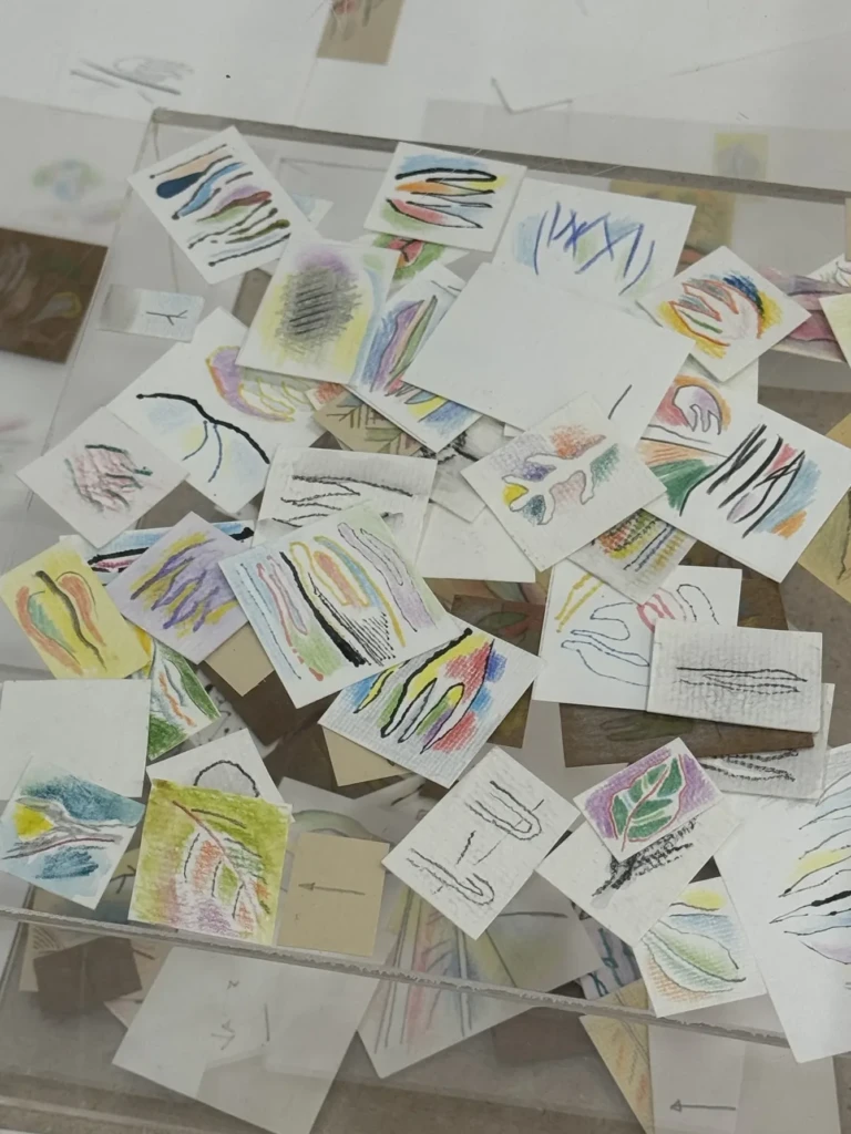
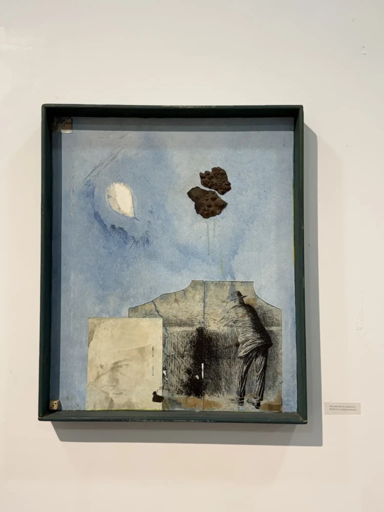
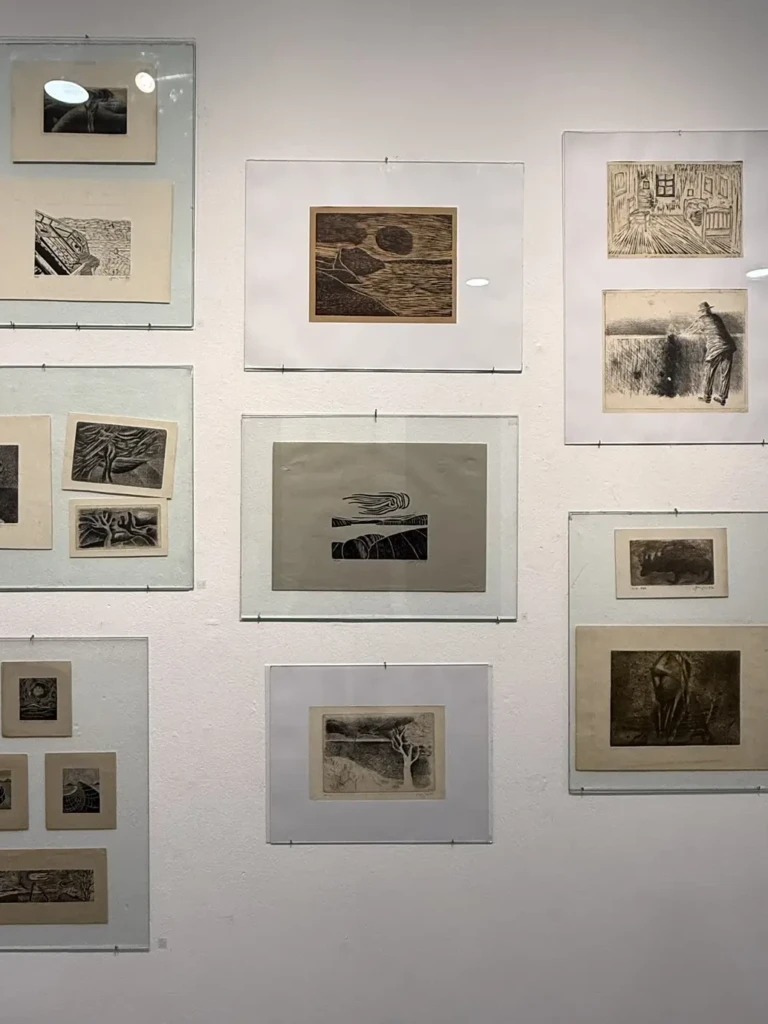
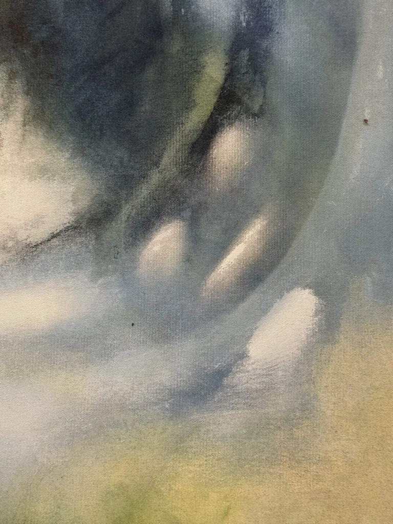
Jayro Schmidt solo exhibition – “O que eu nao posso dizer com palavras” // “What I can’t say with words”
I like his use of textures and layering of contrasting elements. His pile of tiny paper studies is very endearing.
The text accompanying the exhibition reads (translated from Spanish to English, written by a Daniel Ballester):
“This is more than an exhibition: it is a reunion.
Jayro’s works are the passport for a journey toward something that happened and, at the same time, is still happening, in a realm he inhabited as a place where the art of dialogue serves as a key.
Word and painting.
A single score for all possible combinations: speech is also color, volume, and territory.
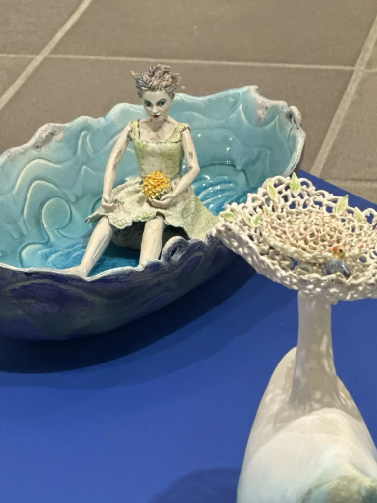
What remains is the bowl:
clay that absence fired so that silence would not spill over.
Because here there are voices, dreams, ideas that crossed the border of the possible and pierced through the chaos of oblivion.
This is more than an exhibition: it is an attachment.
A tribute to a great master of humility and observation, from those who were and are his companions along the way.
This is more than an exhibition: it is a path.”
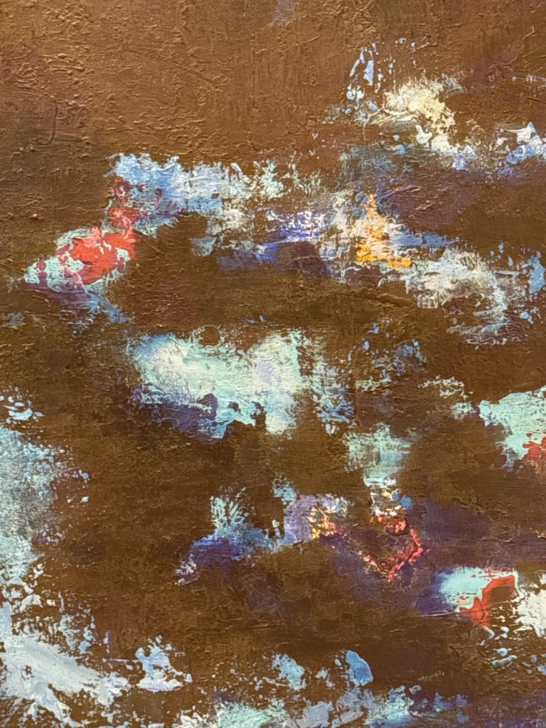
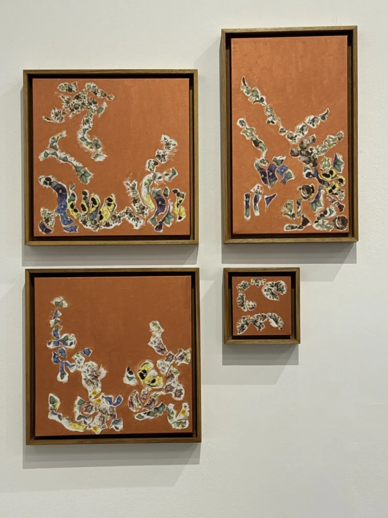
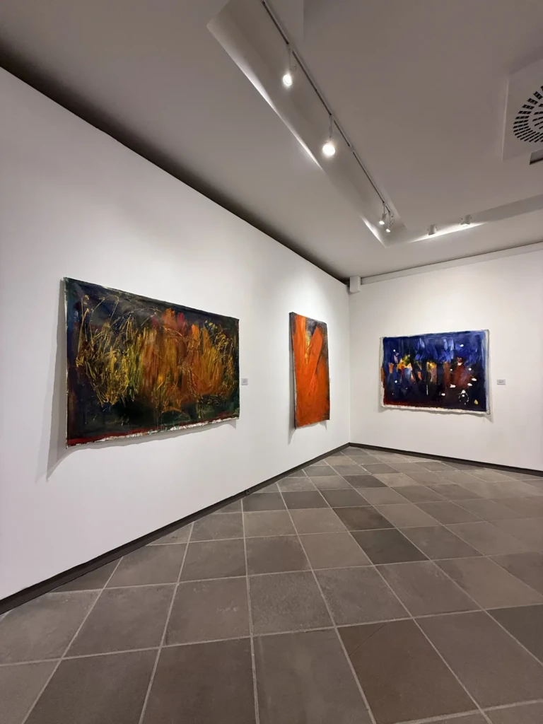
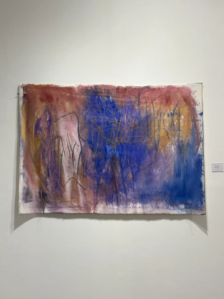
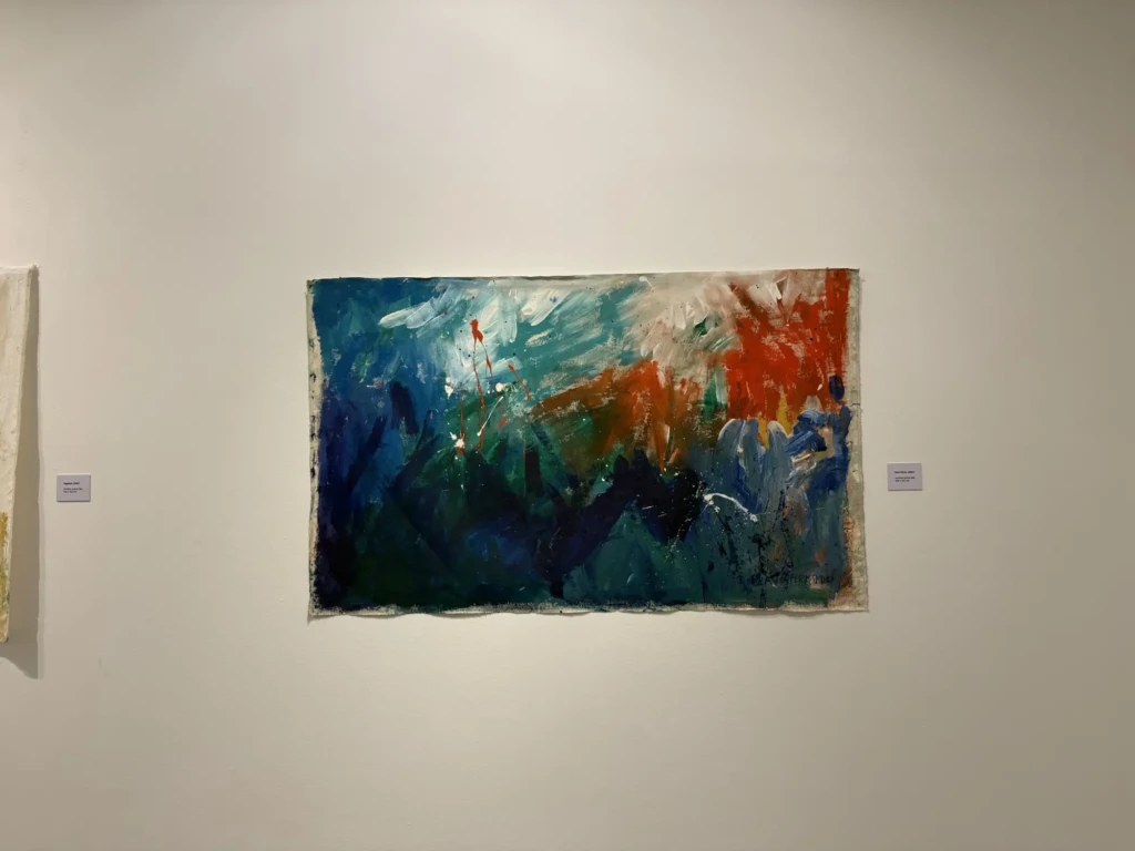
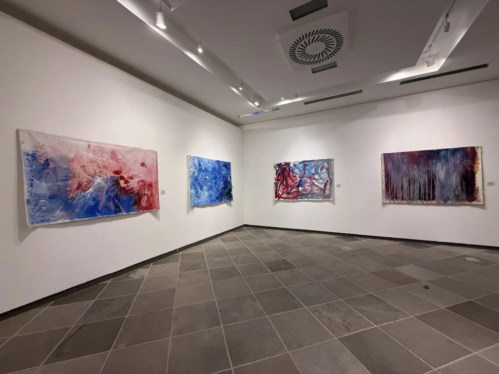
Flávia Fernandes solo exhibition – “Pinturas derivas” // “Drifting paintings”
This series reminds me of an experimental collab I did with my friend Marcela Christlieb back in college. Similar processes of playing with the process of mark-making and using contrasting paints. I thought it was sticking how familiar some of these color combos and marks were to me. It’s quite some provocative work.
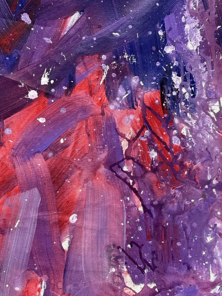
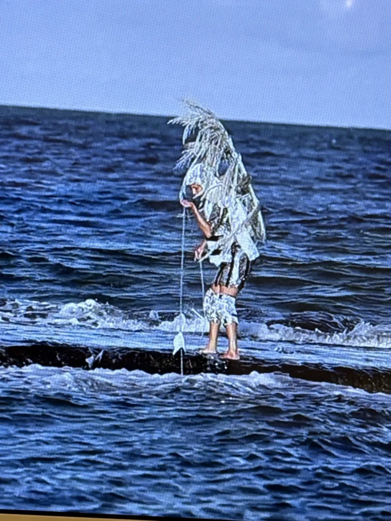
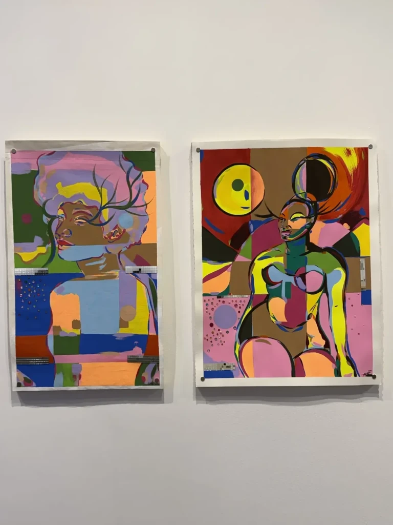
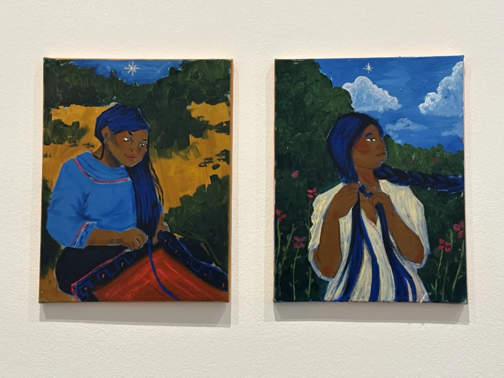
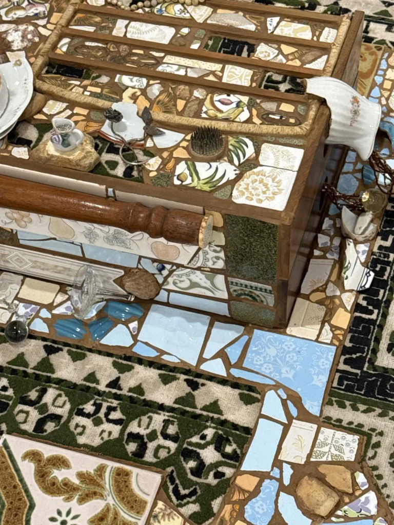
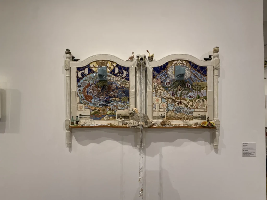
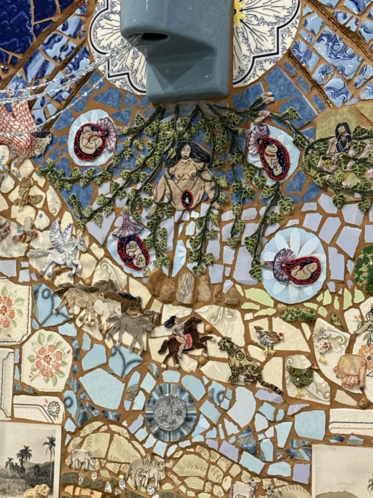
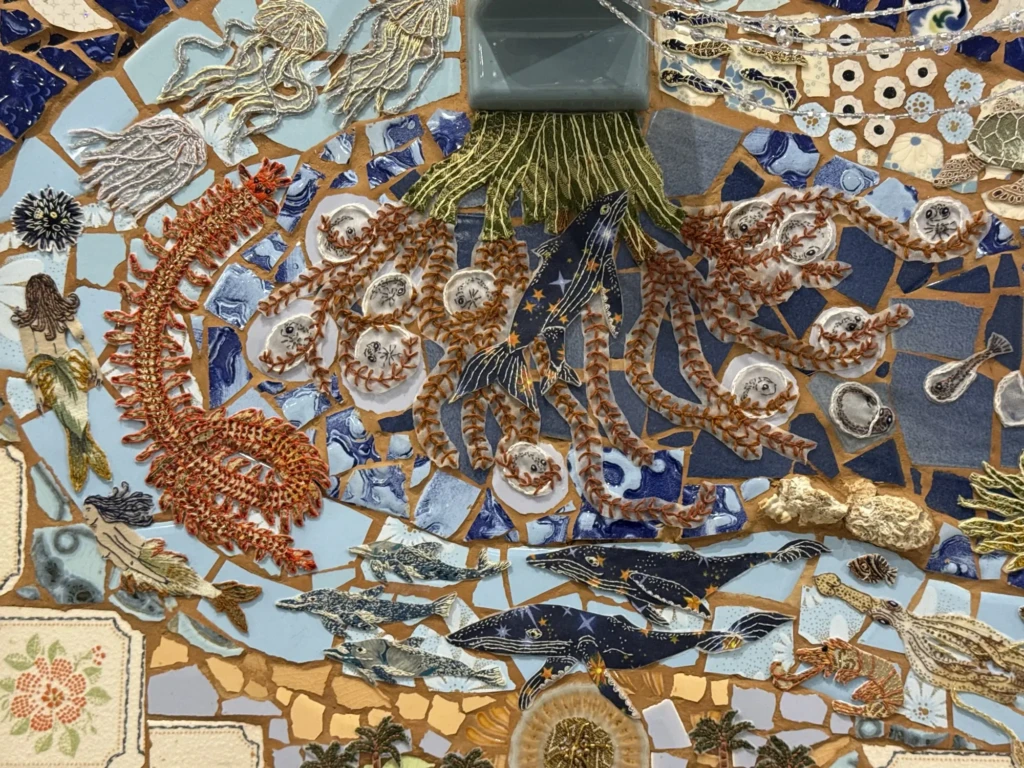
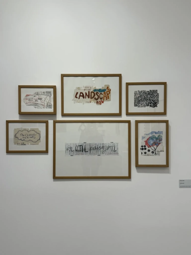
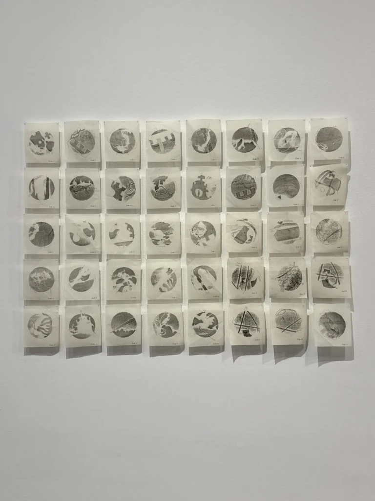
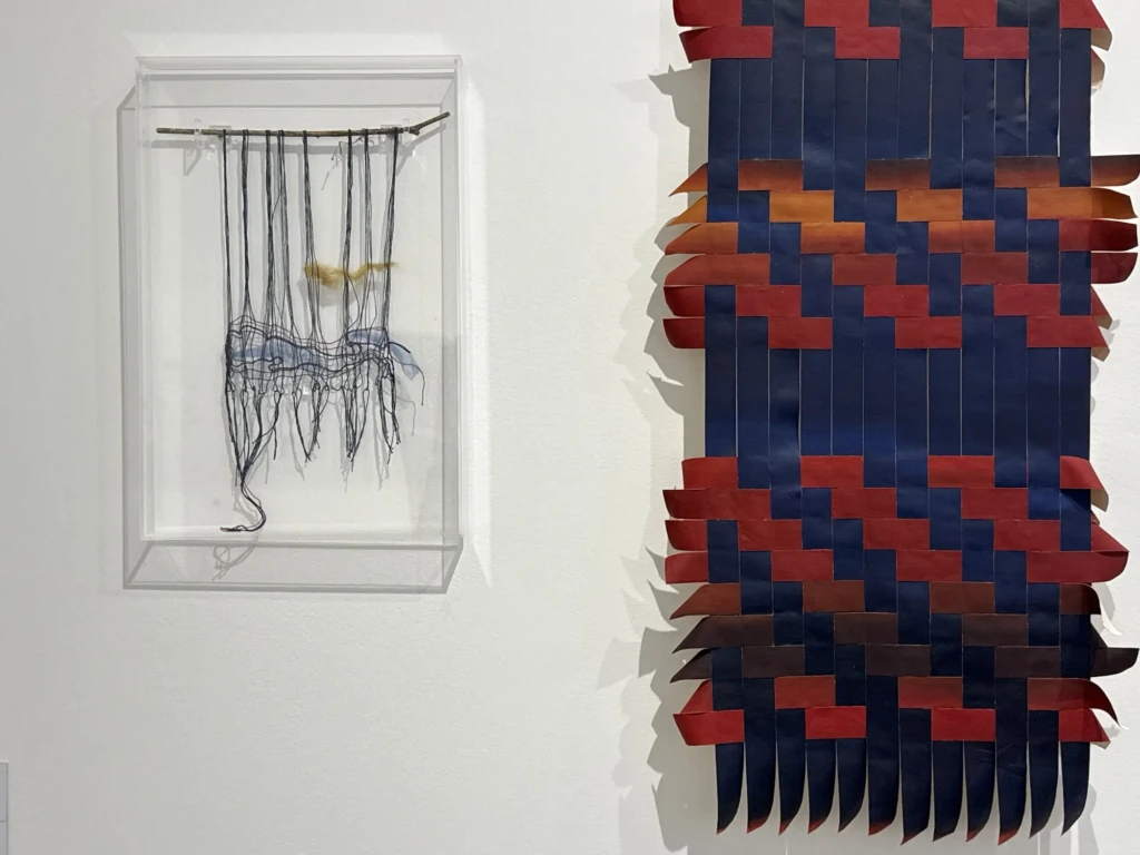
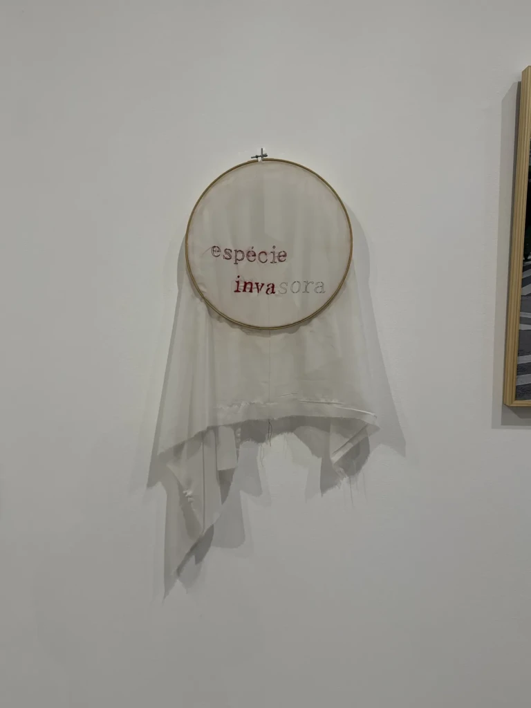
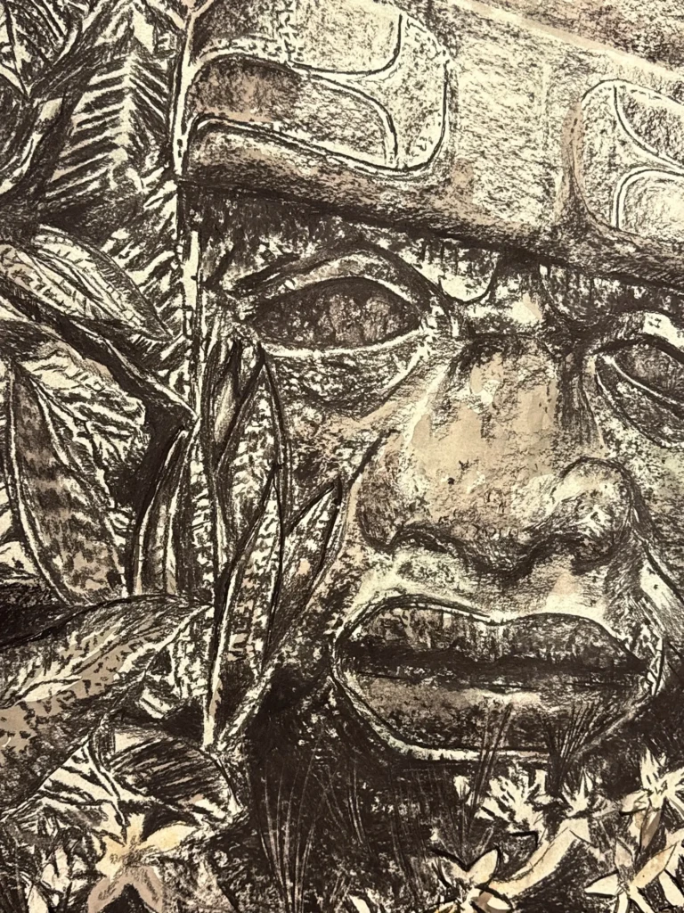
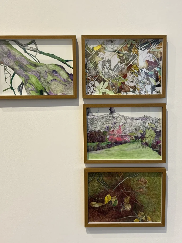
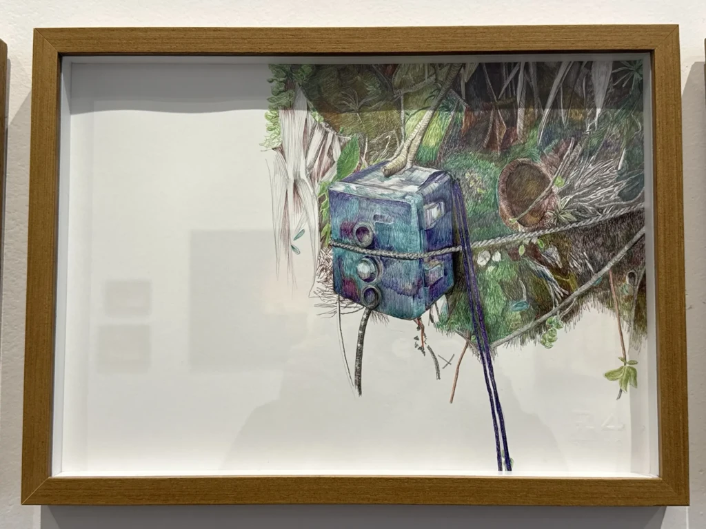
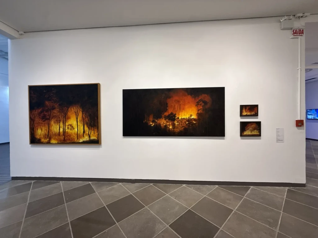
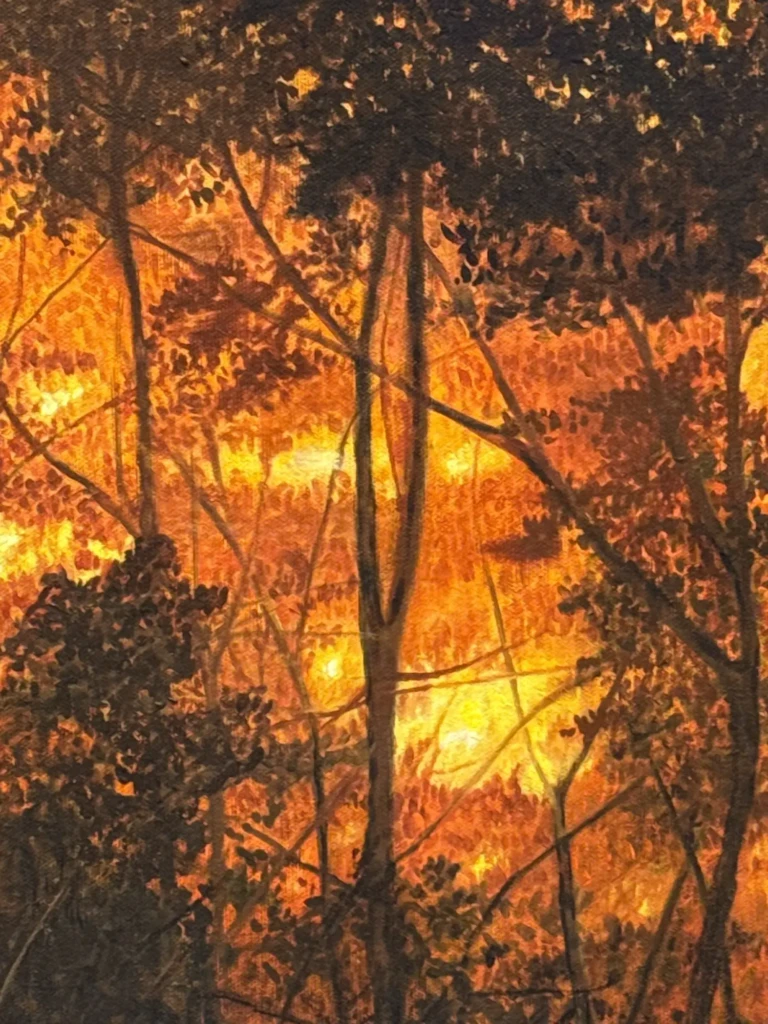
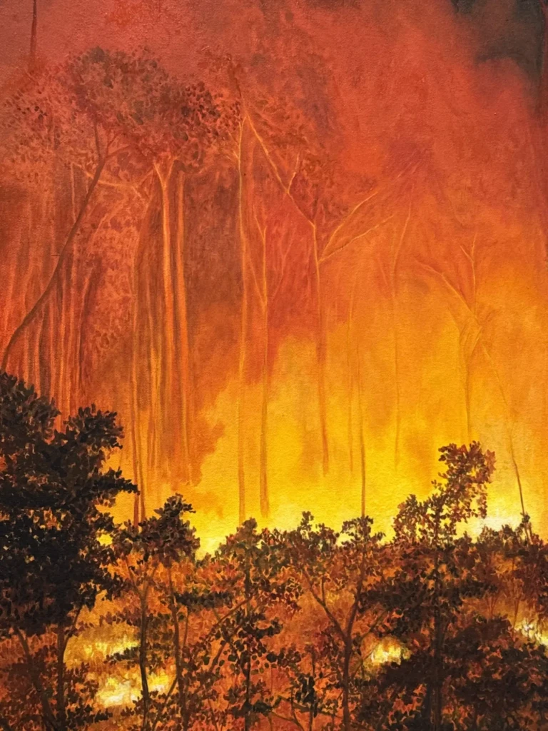
Curitiba’s 16th International Bienal 2026 – Titled: Outras Paisagens (Other Horizons)
This was a very diverse collections featuring works from artists with a wide range of practices. I liked how the pieces were placed in conversation with one another, with contrasting techniques and approaches to the central theme. Lots of beautiful textures and interesting provocations on the subject of self vs. the environment.