Author: Mel Gross

  • Welcome to the Rabbit Hole: A Life-Changing Journey

    Welcome to the Rabbit Hole: A Life-Changing Journey

    This post is a collection of some of the things that have been inspiring and intriguing lately. It started with a travel-log, but somewhere along the way it became much bigger than that. It is a documentation of the visual references I’ve been collecting, the ideas I’ve been researching, and the queer corners of the internet I’ve been discovering. Think of this less as a finished essay and more as a collection of doors you can open, links you can explore, and rabbit holes you can follow me into.


    Part I – An Inspiring Journey

    I just came back from a three-week trip to celebrate my 29th birthday. I was visiting my grandparents in NYC, but I took a few detours to Philly and Chatham too. It was lovely to see old friends, hang out with family members (many of whom I don’t see as often as I wish, unfortunately), revisit some of my favorite spots, and find new ones too!

    For a bit of context: my dad’s side of the family is from NYC, and I went to college in Philadelphia. So I was very surprised by how transformative a “return” trip was. I was expecting to see the same old things and indulge in some nostalgia, while spending quality time with my aging grandparents. I don’t know if it was my pre-birthday astral energy, the end of my fourth septennial, or something else, but I had a lot of realizations and insights throughout the trip—both personal, creative, and a mix of both.

    A lot of that doesn’t necessarily belong in this space, but I’m happy to share the infinite inspirations I found throughout the trip.

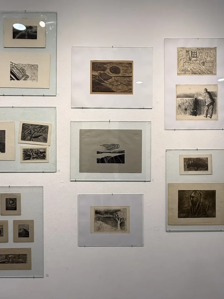
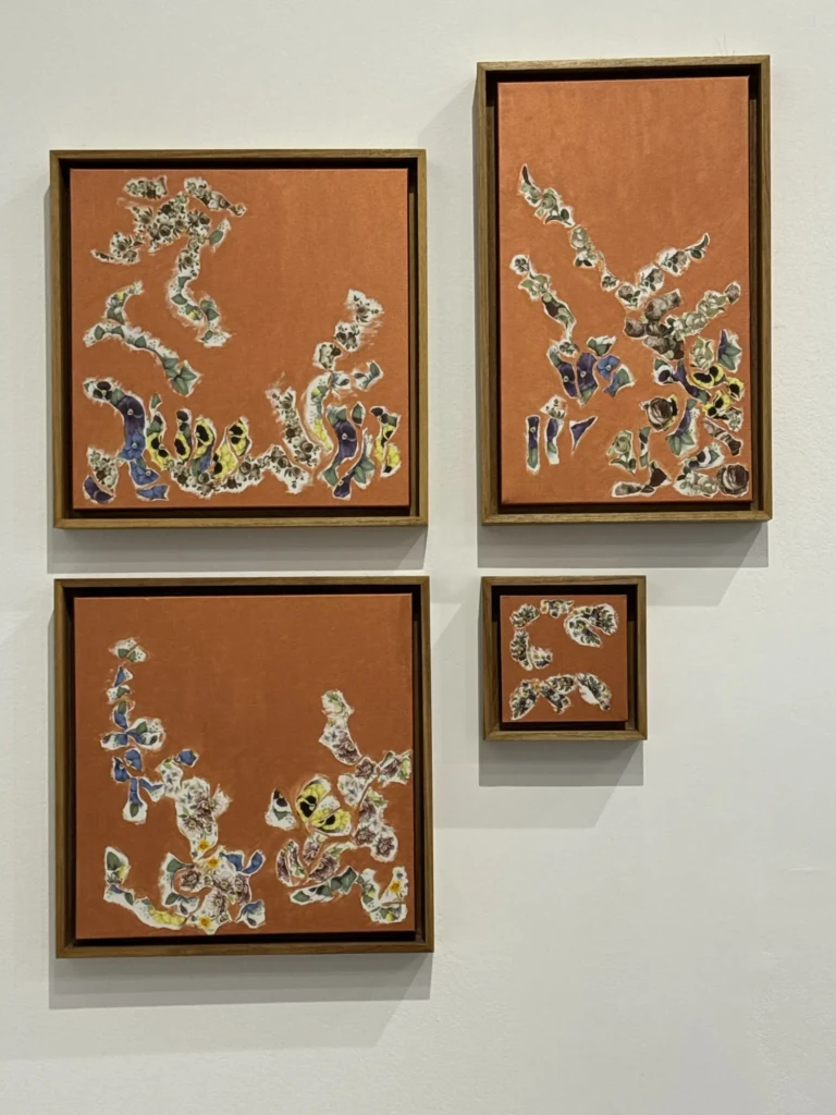
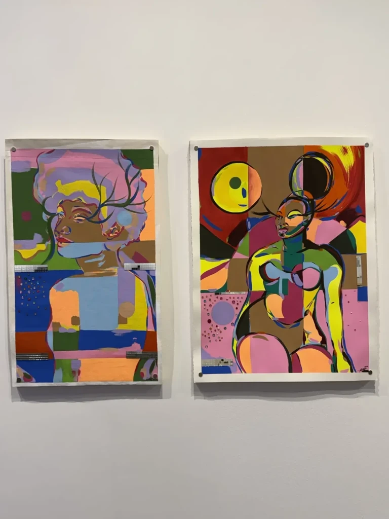
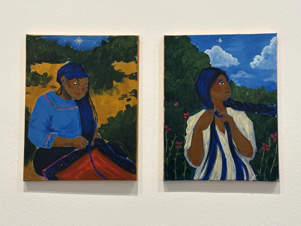
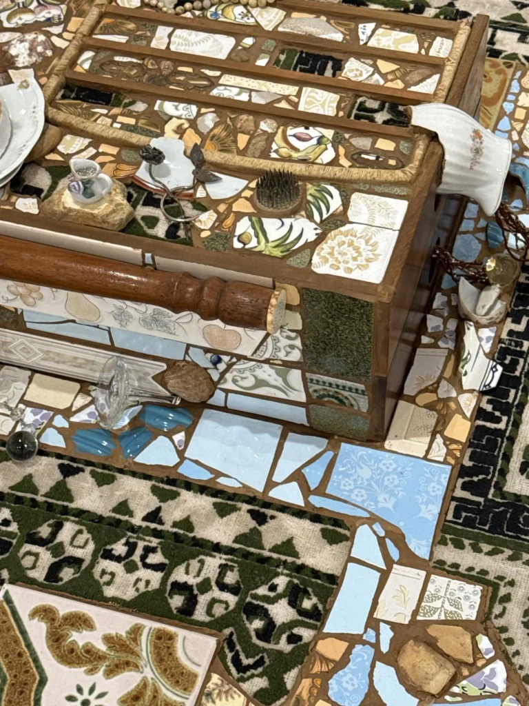
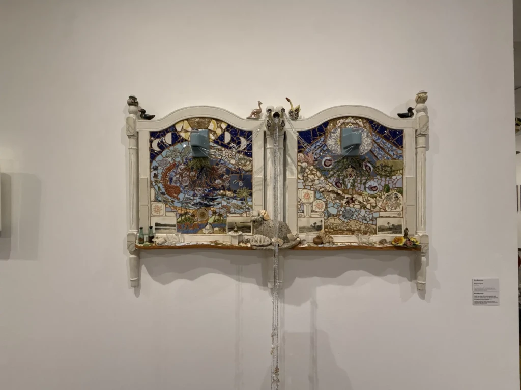
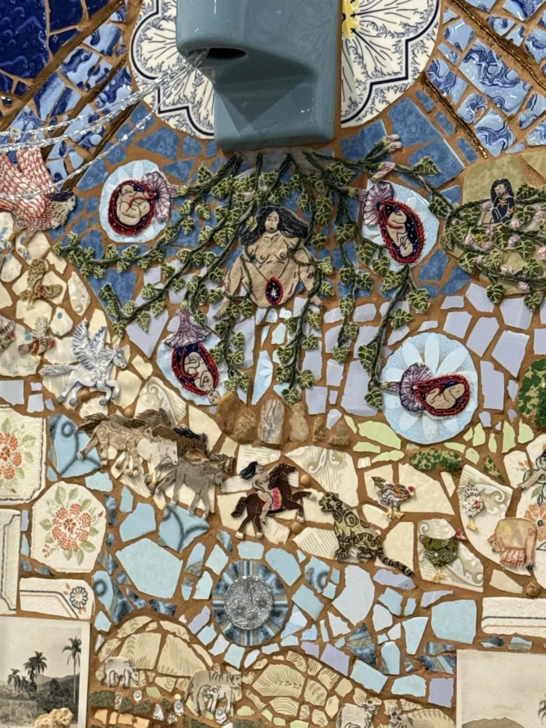
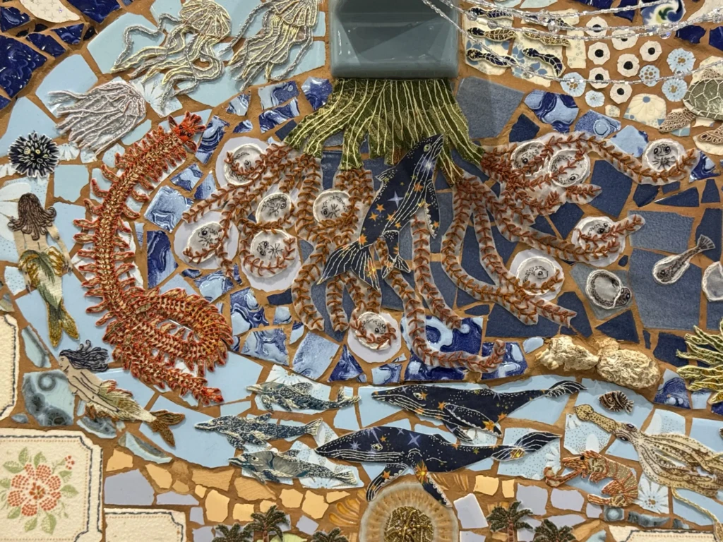
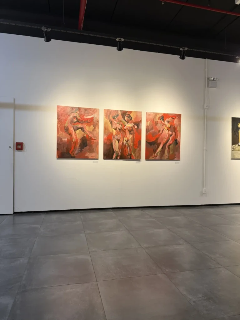
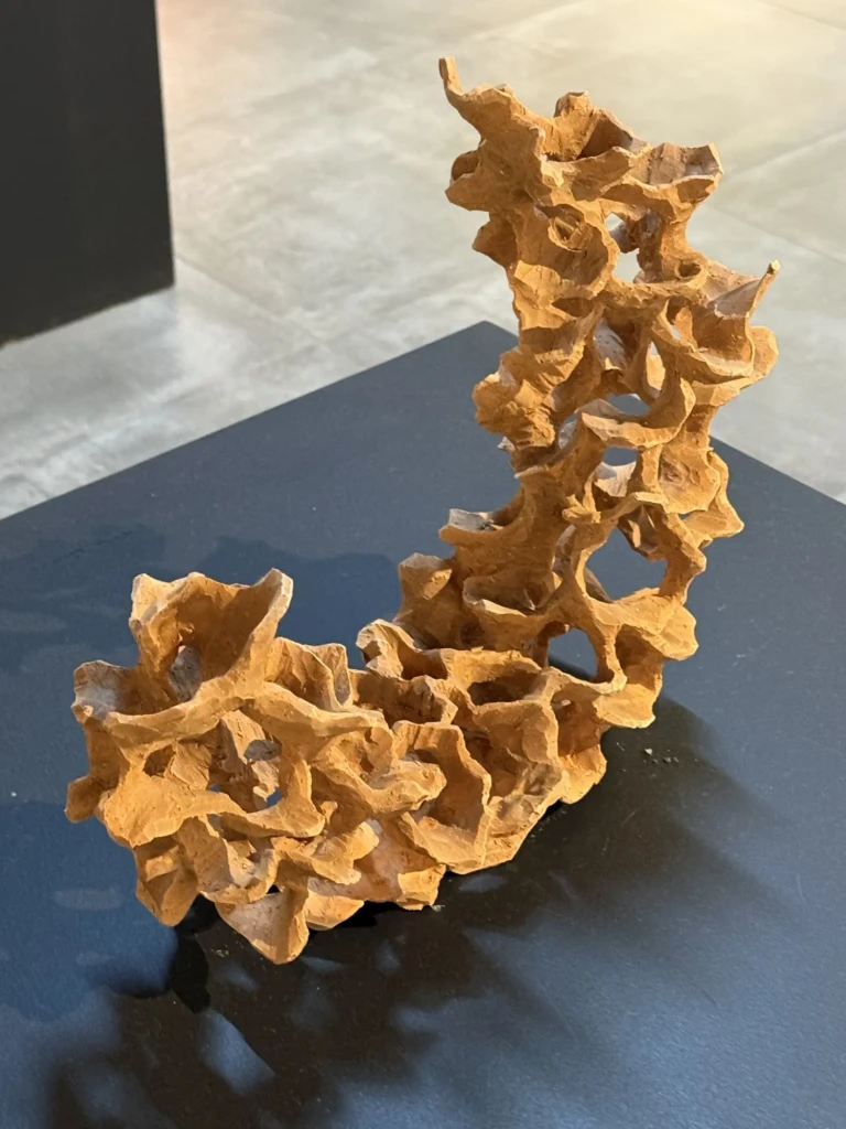
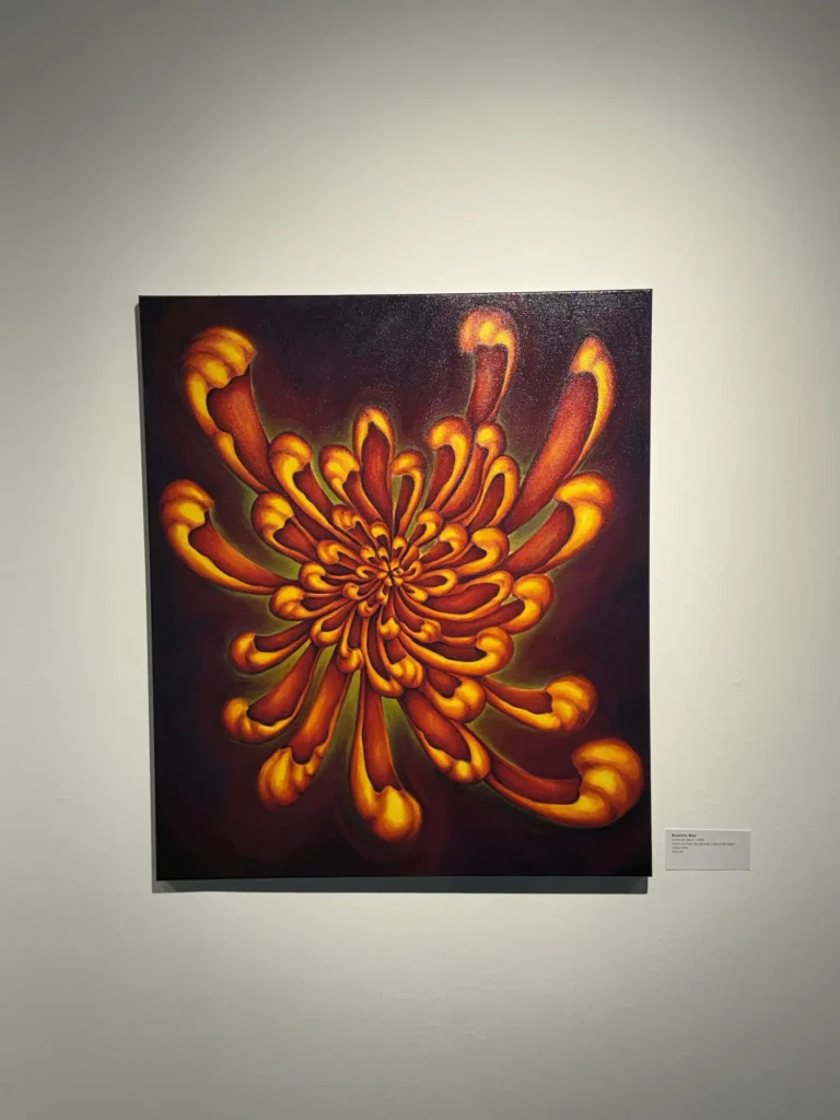
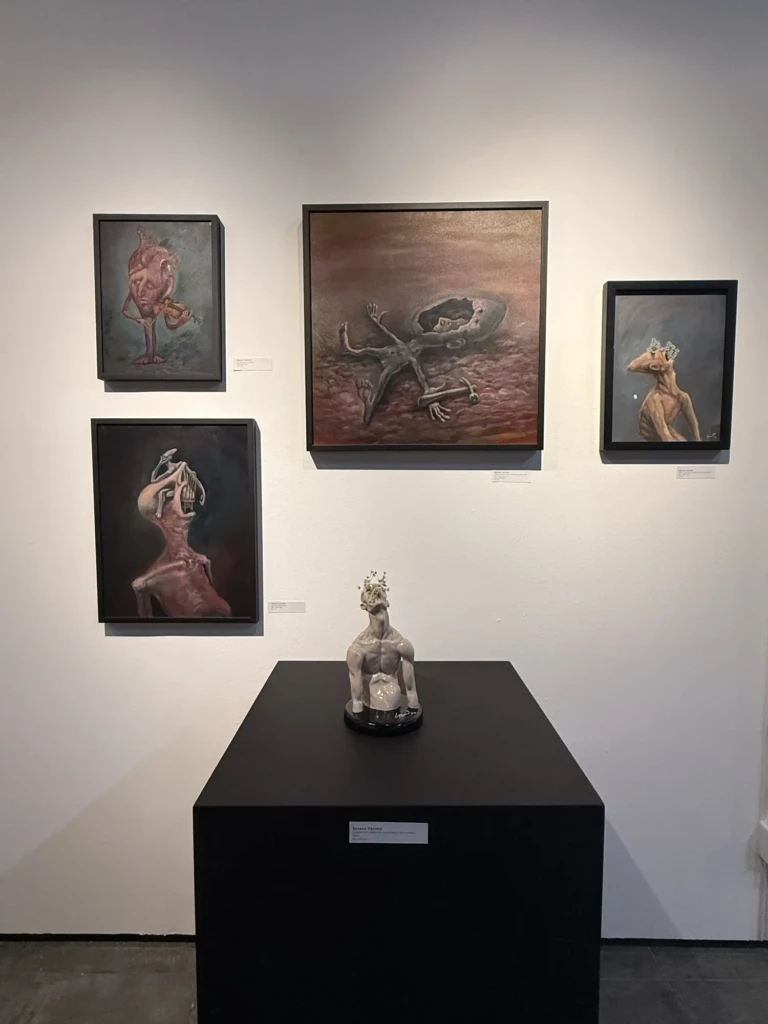
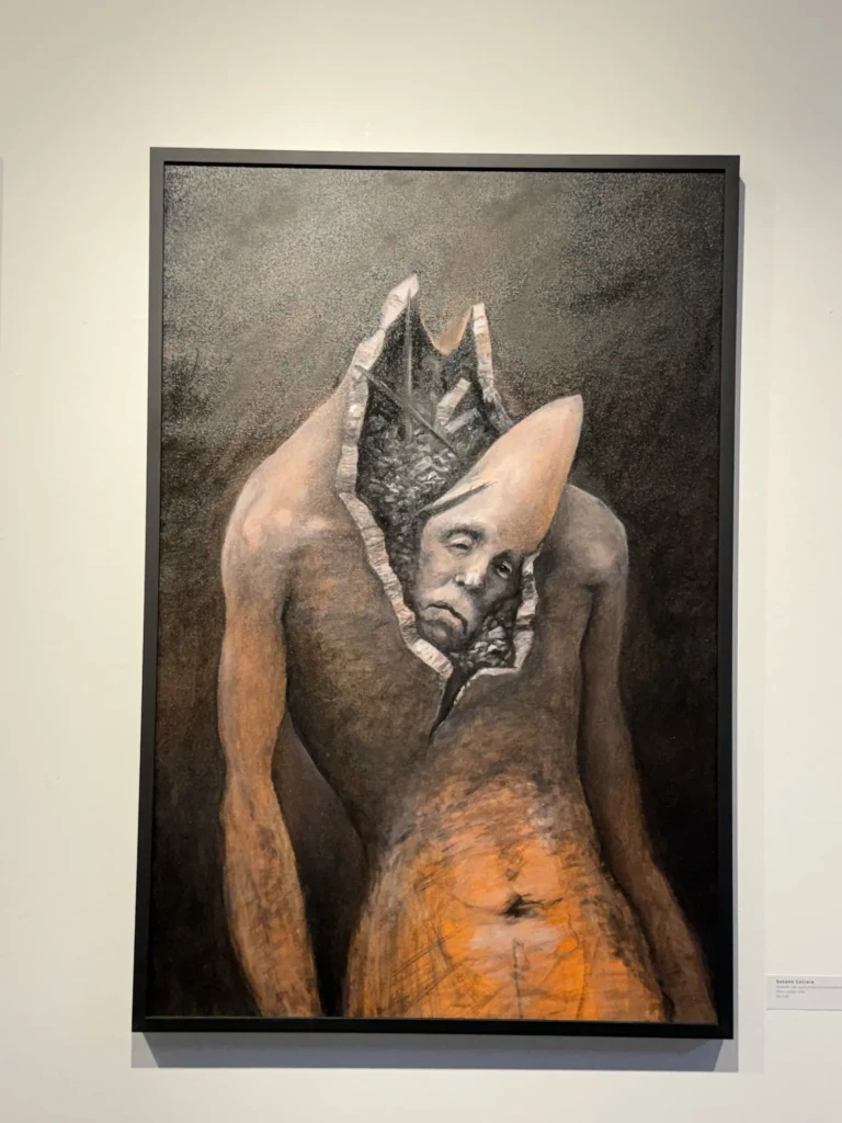
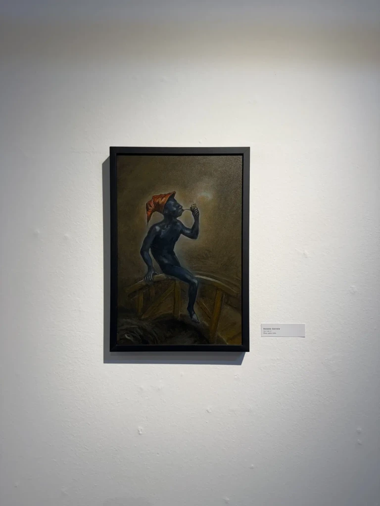
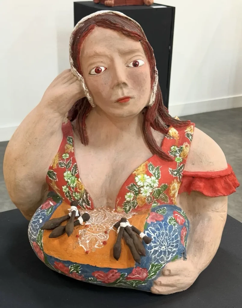
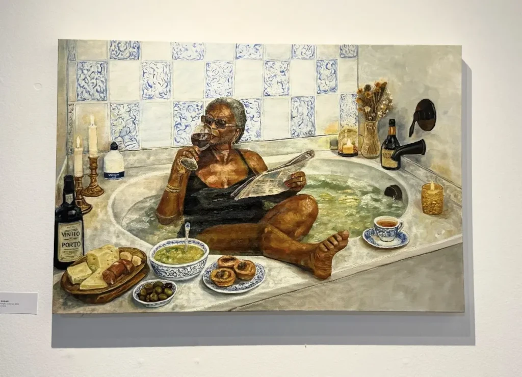
    I got to visit many museums and galleries, while also finding inspiration in the streets, familiar places, and all the little details in between.

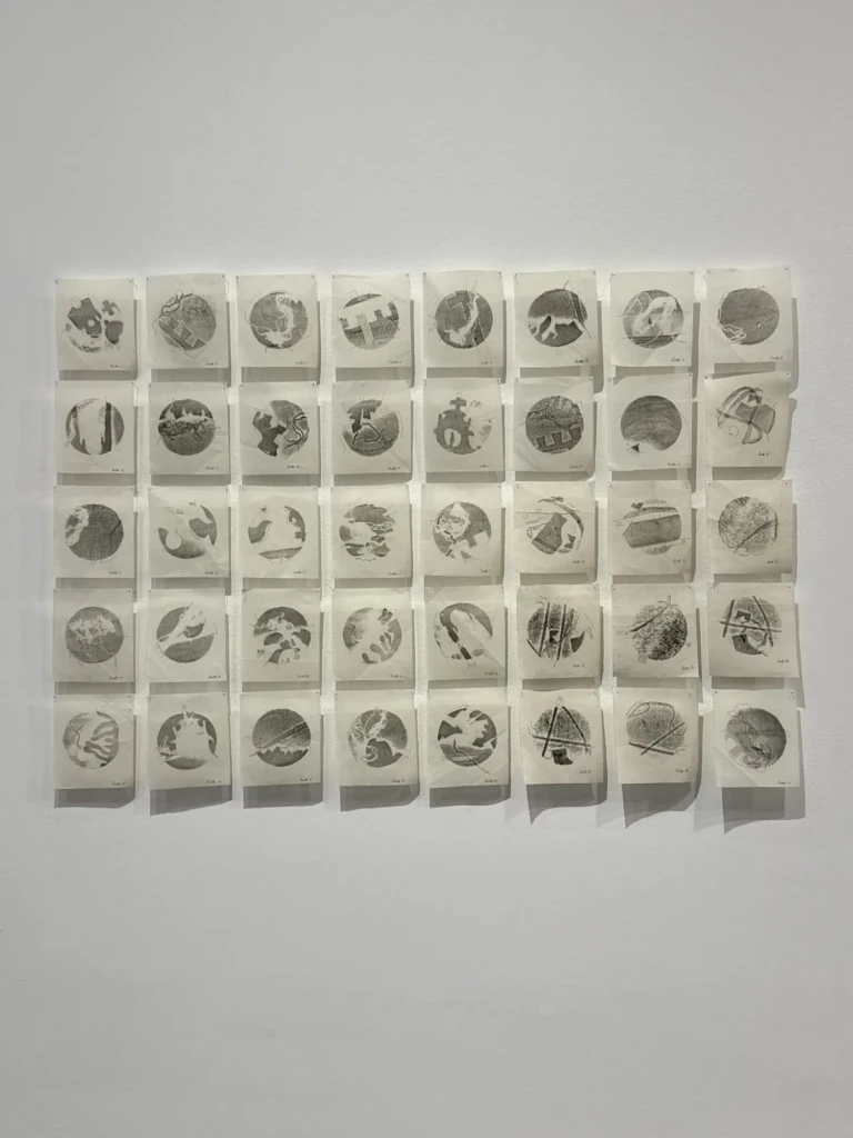
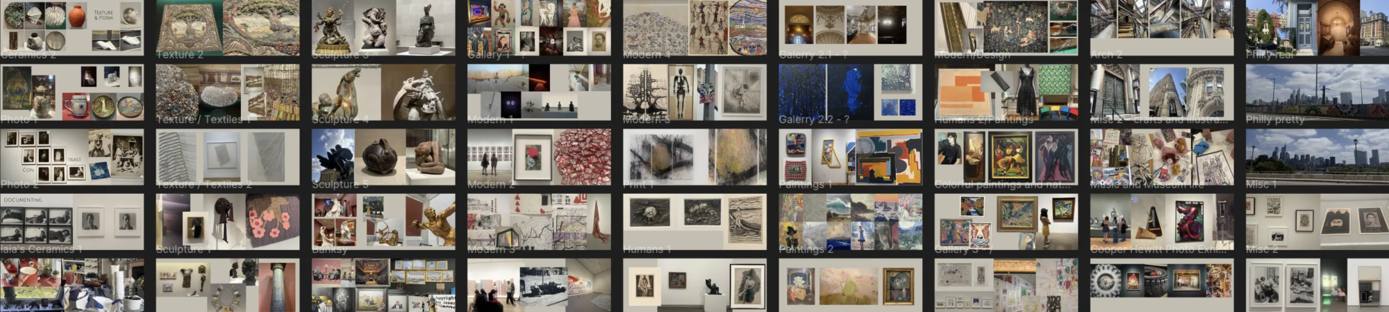
    Visual Research – I wanted to share a compilation of my art references, with all the pictures I took in the many, many museums and galleries I visited during this trip. But I ran into two issues: 1. The size of the files. The image collages are HUGE and would probably kill your phone data just by opening this page. 2. Copyright concerns. I’m a little worried about sharing images of artworks publicly, even if I properly cite and credit them.

    My solution was to share my visual research as a PDF for download (coming soon), if you’re interested in diving deeper into my recent inspirations. I’ve grouped my references into visual motif boards, so rather than being organized by museum or artist, they’re organized around the visual ideas and elements that caught my attention.

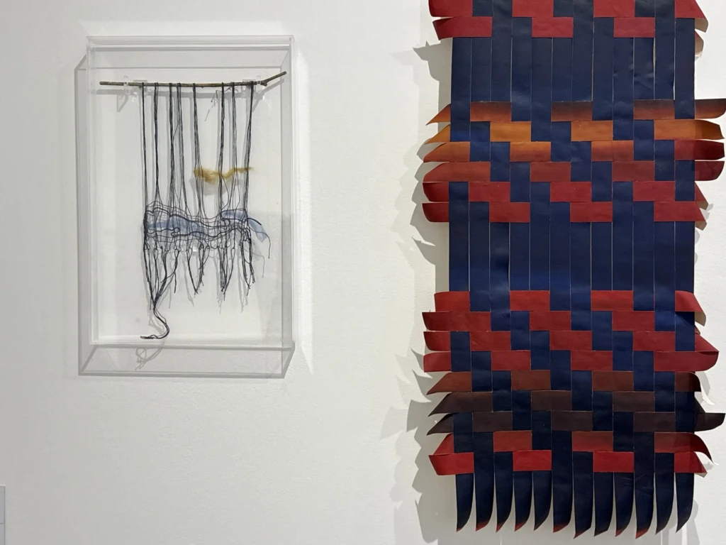
    A lot of the motifs I was drawn to were texture, scale, and movement, spanning textiles, documentary work, ceramics, paintings, architecture, photography, printwork, digital and multimedia work, among other oddities.

    You can also browse through the websites of the art institutions I visited to get inspired yourself. A lot of them have digital copies of their archives online, or at least photographs of their current exhibitions that you can learn more about through your own research.

    NYC Museums:

    The Met — What I saw: The new fashion wing, sculptures, Asian art, the classics.

    MoMA — What I saw: They changed the exhibits to be organized by chronology or themes instead of the former media-based categorization. Great improvement—much richer dynamics and conversations between works. The Frida and Diego – The Last Dream exhibit was breathtaking; Frida is an important inspiration to my work and it was a dream-come-true to see so many of her famous originals in one place.

    The Frick Collection — What I saw: My first time there. A great collection of the classics, glazed with a layer of patriarchal-ick.

    Cooper Hewitt — One of my favorite museums in the city. What I saw: Design Across Time: Exploring the Smithsonian’s Design Collection — an interesting design and multimedia collection on display downstairs; Made in America: The Industrial Photography of Christopher Payne — a surprisingly moving photographic exhibit; and the unique multimedia experience of The Substitute on the second floor.

    The Banksy Museum — What I saw: A wider range of mediums and themes than expected. A lot of comically subversive and acidic critiques of late-stage capitalist horrors.

    ⋆˙⟡ . ݁₊ ⊹ . ݁˖ . ݁ ✧˖°.

    NYC Galleries:

    The Drawing Center — Pope.L special exhibition, with multiple series of his visual and performative work. Worth knowing the name for its subversiveness.

    Artists Space — Shani Strand: Everything Must Be Returned

    Freight + Volume — True Colors by Meghan Brady, Mary DeVincentis, Jai Hart, Riad Miah, Ilse Sørensen Murdock, Julia Rooney, Cordy Ryman, and Paul Sevigny.

    Derek Eller Gallery — Sarah Gamble

    Isabel Sullivan — closed when I visited, but the online archive is interesting.

    ⋆˙⟡ . ݁₊ ⊹ . ݁˖ . ݁ ✧˖°.

    Philly:

    PMA — What I saw: American art, textiles, classical art, figure drawings, and a stop at the sister Rodin Museum. Specific exhibits: Workshops of the World; A Nation of Artists.

    ICA Philadelphia — I didn’t go this time, but it’s worth checking out!

    ⋆˙⟡ . ݁₊ ⊹ . ݁˖ . ݁ ✧˖°.

    Click Here Blue
    (Beware: heavy document! 7MB PDF)

    On a more personal note, you can also click here (Beware: Heavy doc!) to wander through the special moments of my trip, featuring loved ones, nature, city life, and cute memories.


    Part II – The Insight: Deep Diving into Cyberfeminism

    The trip gave me a lot to look at, but the most transformative part of it wasn’t any single artwork, place, or experience—it was the connections that started forming between them. There is something about being away from your usual routines, spending a lot of time on your own, moving through familiar places from a different point in your life, and simply having the time and space to notice your own thoughts. Visual references, conversations, books, passing thoughts, and those tiny moments where something suddenly clicks all began weaving together into a much bigger realization.

    It’s been a month since I came back from the trip (while I’ve been organizing all this material!), and the energy of rebirth and deep learning/inspiration has continued to flourish in my life. I’ve been playing with the new visual references I acquired in my ongoing practices, like woodworking, crochet, and drawing. I’ve been thinking, planning, and researching bigger projects for the future—both visual and multimedia ideas.

    But most of all, and most intenselly, I’ve been deep into research mode, specifically around the world of cyberfeminism—a term I learned right before going on my trip that has been the trigger for a recent creative/personal catharsis.

    The term connects multiple threads of interest for me and solidifies my lifelong research into a specific, existing field. It’s not a new term, either. In reading some of the pillar texts of this creative and political movement, I’ve been continuously surprised by how current and applicable these ideas feel to today’s world, even though many of them are 20–30 years old.

    Got HTML

    If you’d like to embark on this journey with me and read more about cyberfeminism, feel free to check out what I’ve been finding and consuming about the topic here.

    (BTW, Are.na is a great new resource I found for archiving and sharing references, links, and media online. It has a great community of academics and researchers, and you can easily find a lot of interesting new material to dive into and enrich your research. It’s also a simple and effective organizational tool.)


    Part III – Down the Rabbit Hole

    Connected, but not linearly, to all of this is the state of the internet and the cultural shift happening online.

    People are fed up with social media, big-corporate digital slop, AI-filled content, and the current state of the internet as a whole. A resurgence of the nostalgic, old-school internet, as well as a more tactile/material relationship with electronics, seems to be happening with a lot of strength.

    To me, it feels like a reflection of people’s mental states as we deal with late-stage capitalism, increasingly authoritarian and fascist governments, and the very real consequences of global warming. People are craving connection, community, and a stronger relationship with nature as a whole.

    With all this, a trend of creating personal websites and indie games is coming back with a lot of strength, and I am LOVING IT.

    As a zillennial, I grew up playing games online, rabbit-holing through the internet, and having this exploratory, community-based relationship with the web. The term whimsy is also very popular right now, and I think it describes this energy well: the wandering and wonder of the internet.

    I highly recommend browsing through this side of the internet! There is so much to see, read, and interact with. So many creative experiences and interesting corners of the World Wide Web are still very much active.

    Here is a list of websites I’ve found recently to start your journey. But don’t stop there—follow people’s digital neighbors and web rings (linked websites) to find new ones.

    Please share any gems you come across, and have fun!


    I think that’s what I’ve been most excited about lately: not necessarily finding the answer, but finding another interesting place to look.

    So consider this post an open invitation to wander. Take a link, follow a thread, fall down a rabbit hole, and see where it takes you.

    Reshirii GIF Part 4

    And if you find something wonderful along the way, send it my way too. ♡
  • Woodblock Printing

    Woodblock Printing

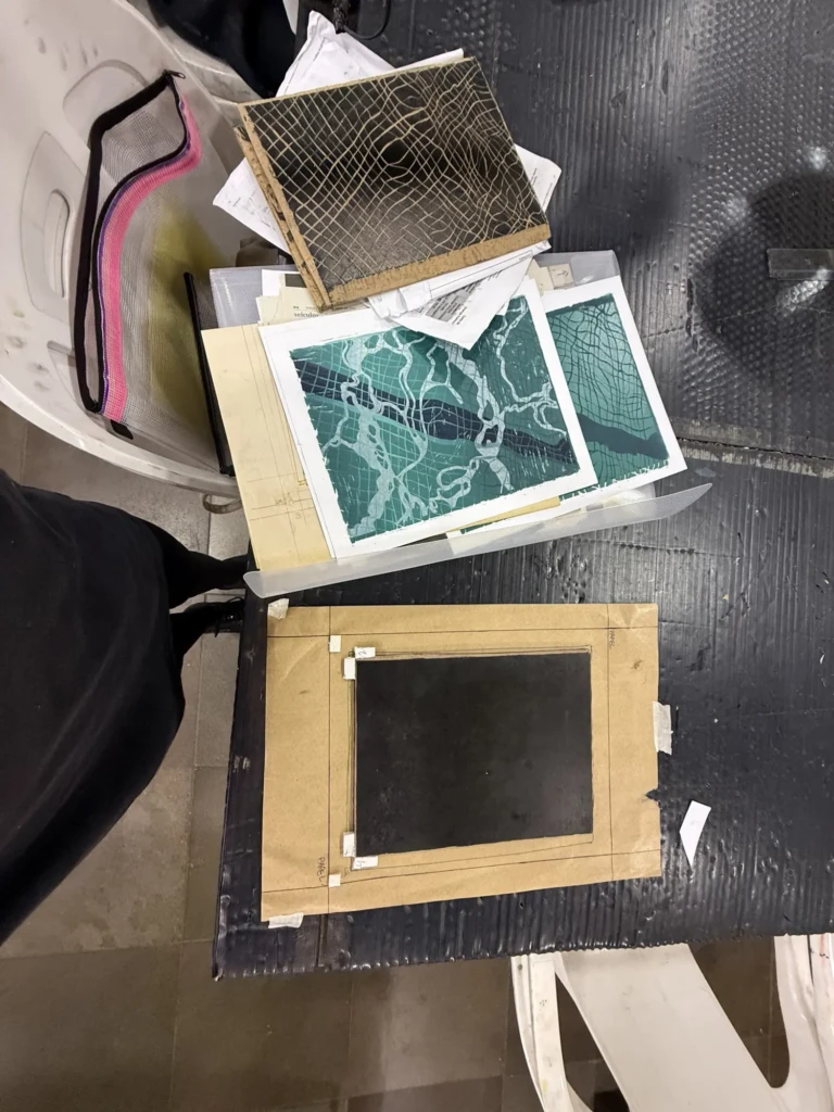
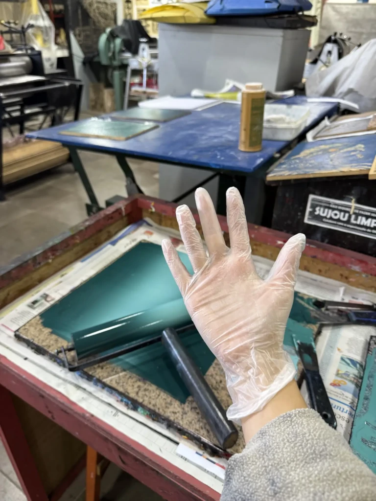
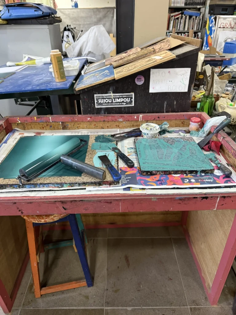
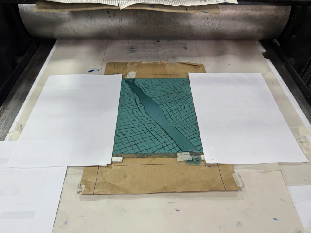
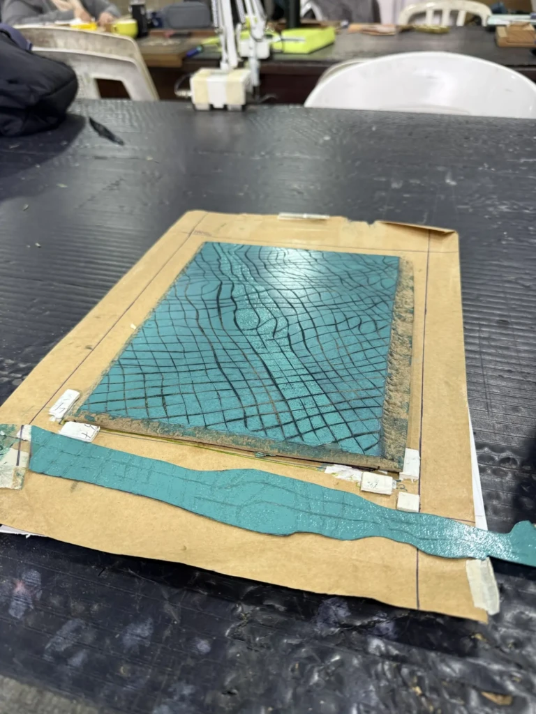
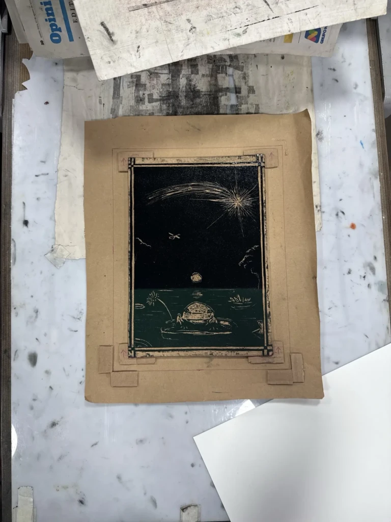
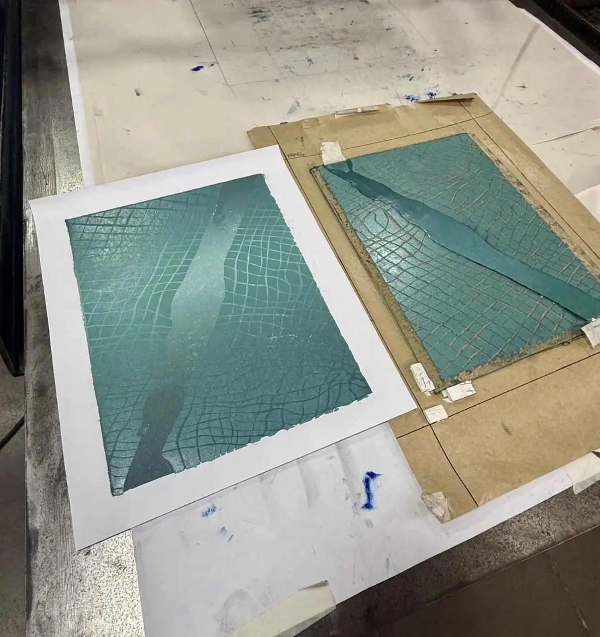
    The last few weeks at the print studio have been mostly dedicated to troubleshooting the final details of the forever-going “Pool” project. You can read more about this saga here. In this post I’ll walk through the latest rounds of trial and error, the reasoning behind each tweak, and my ongoing attempt to finally print a successful edition (or at least a handful of good copies) so I can move on.

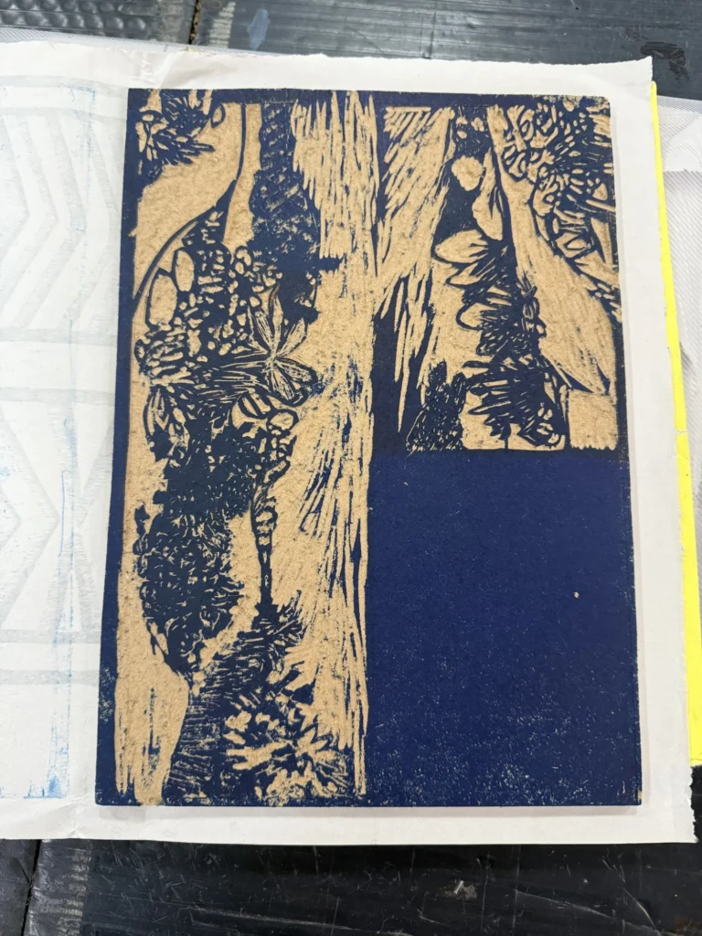
    Besides this project, I also started a couple of smaller print experiments on the side and continued taking advantage of the many exhibitions at CIC. I’ll share both of those experiences later in the post.

    Part 1

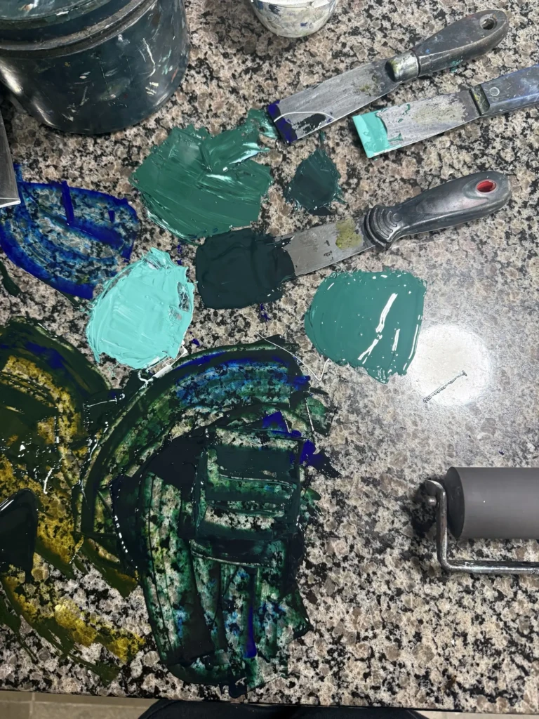
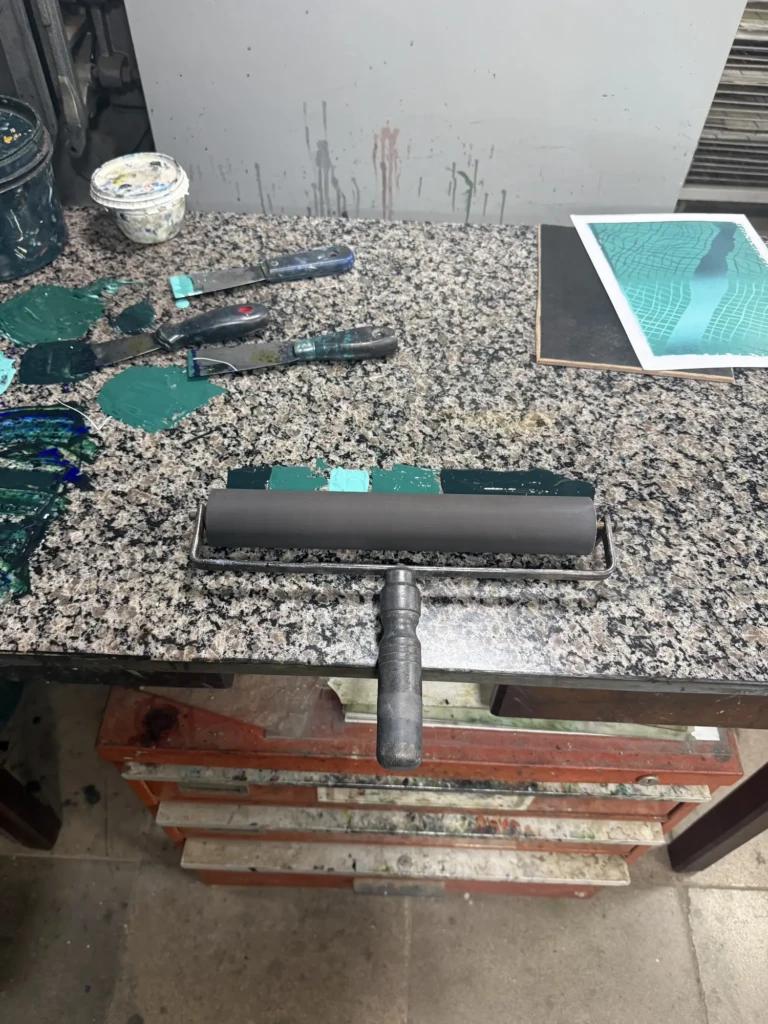
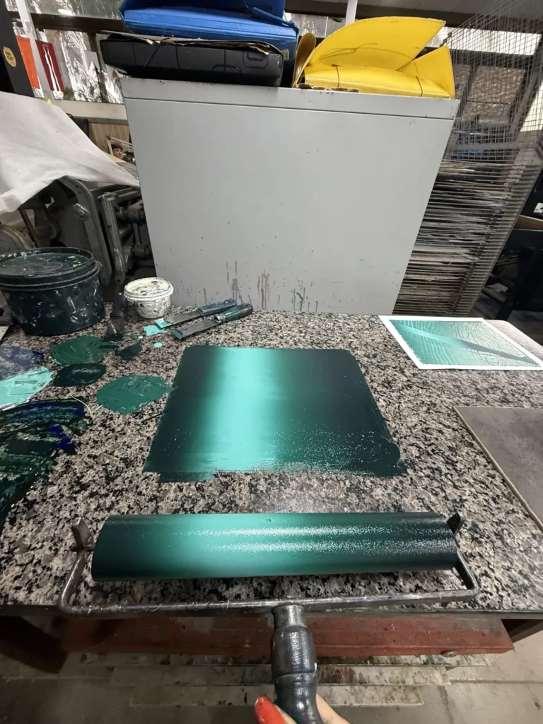
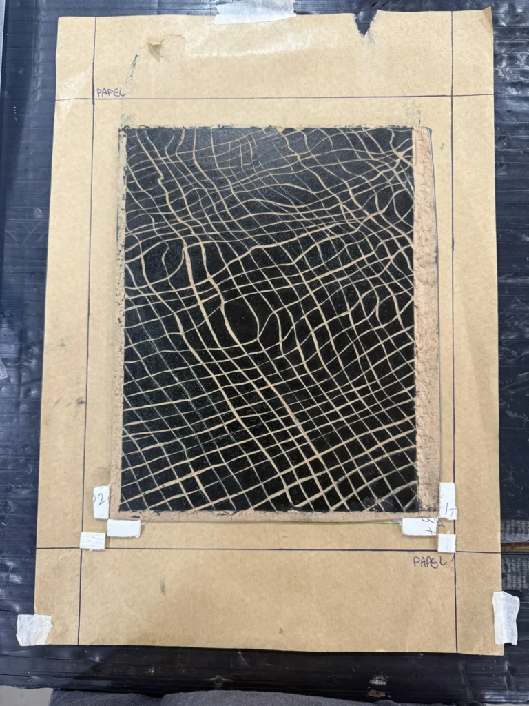
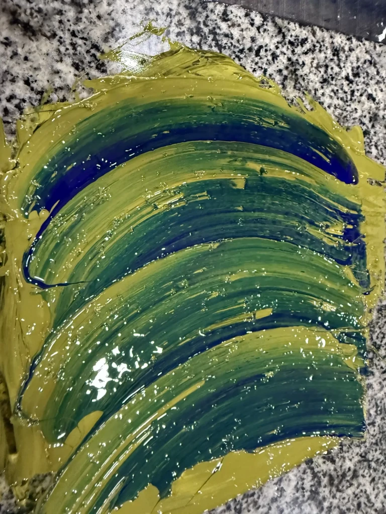
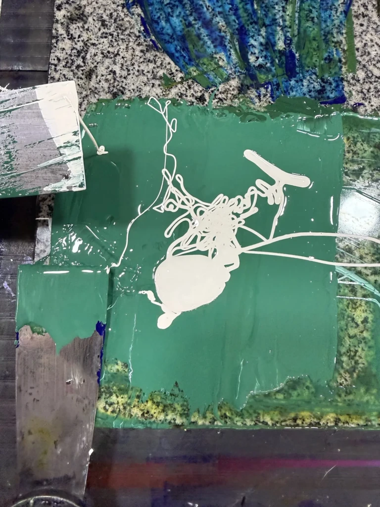
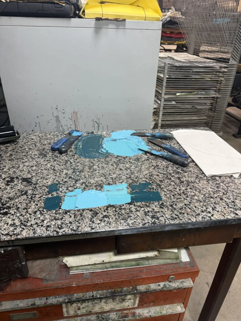
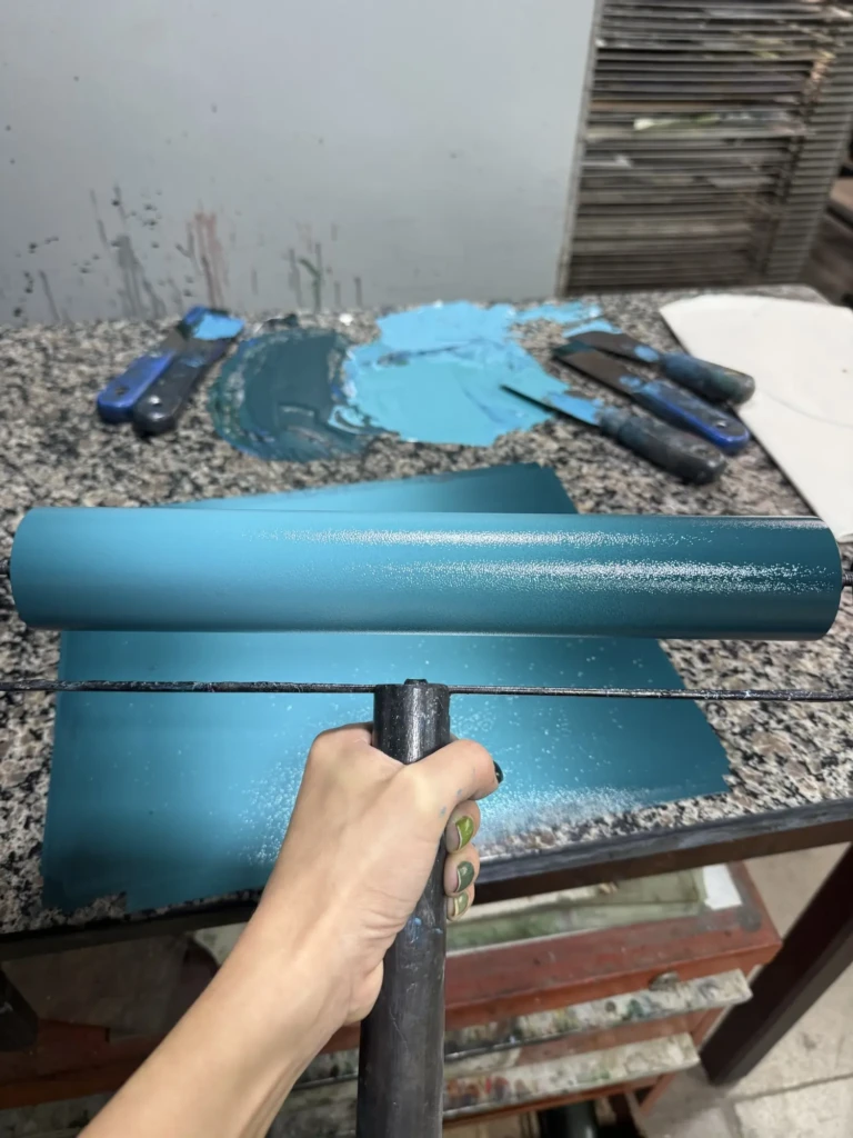
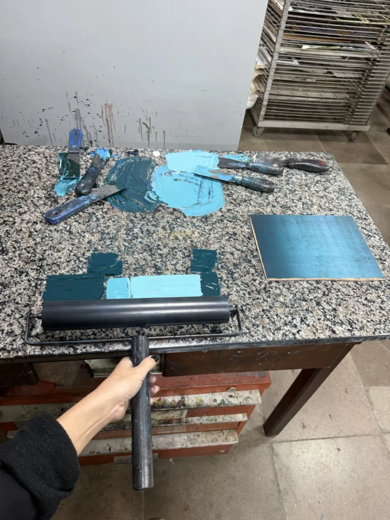
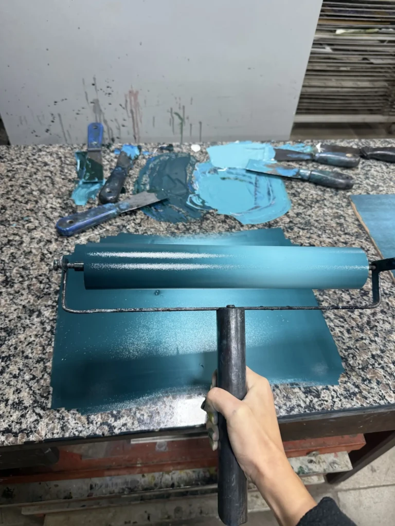
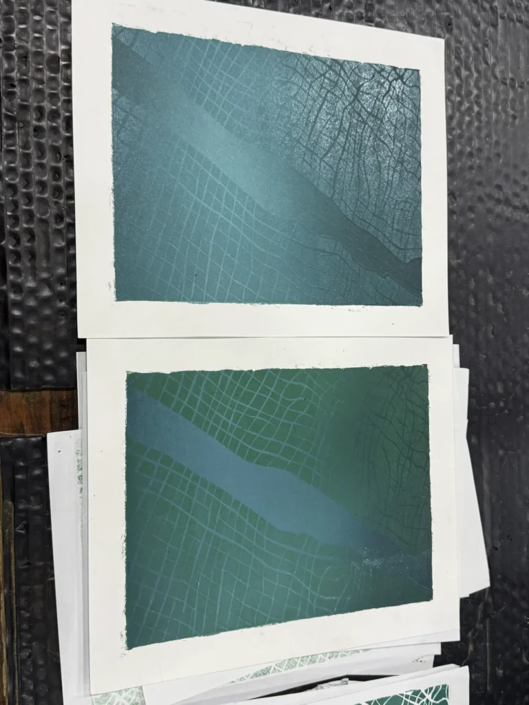
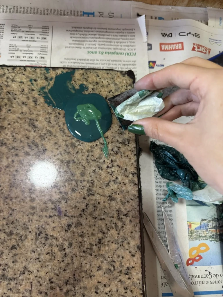
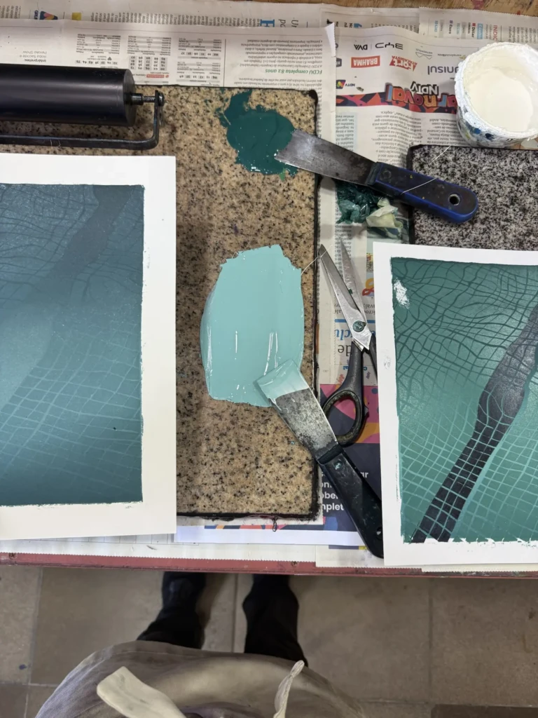
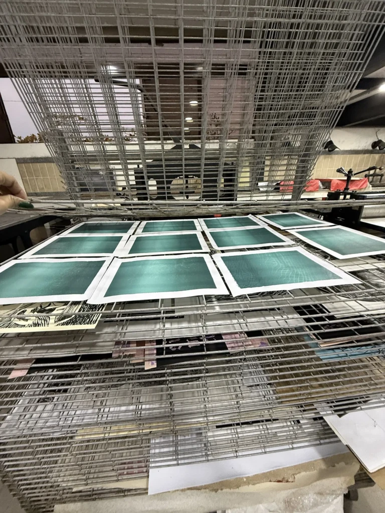
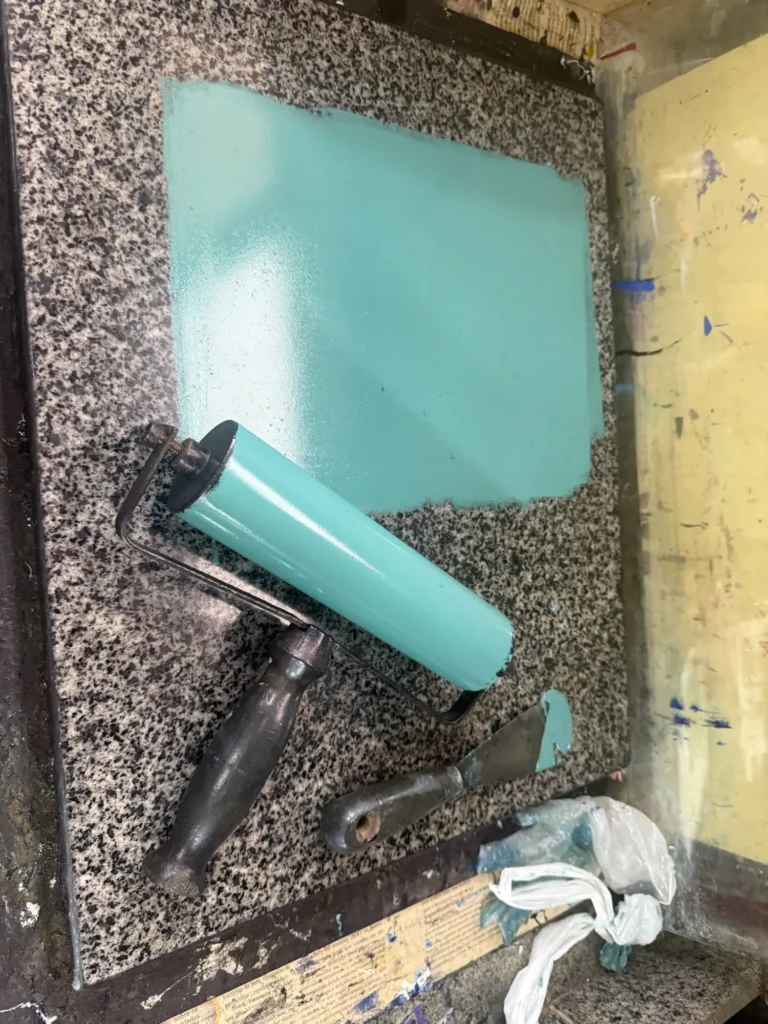
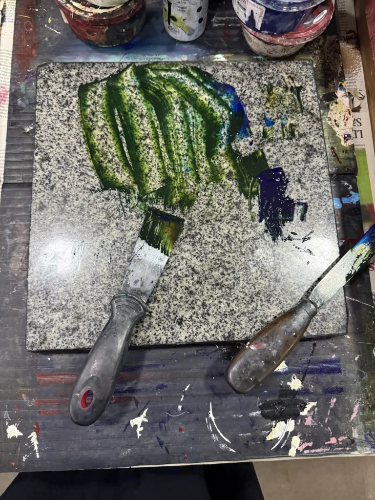
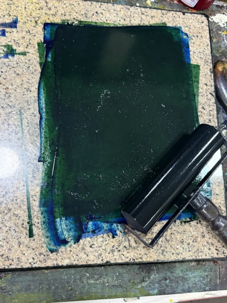
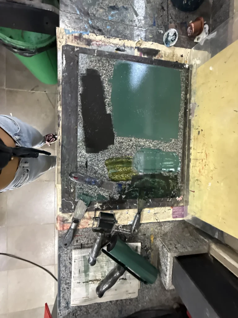
    With the improved registration guide in place and all my materials ready, I went in for another test run: I mixed the gradient for the base layer using one of my previous successful prints as a color reference. Unfortunately, nothing is ever straightforward with this project. Instead of using the deep forest green from the original series, I accidentally grabbed a sepia green—a much warmer, yellower, slightly transparent color.

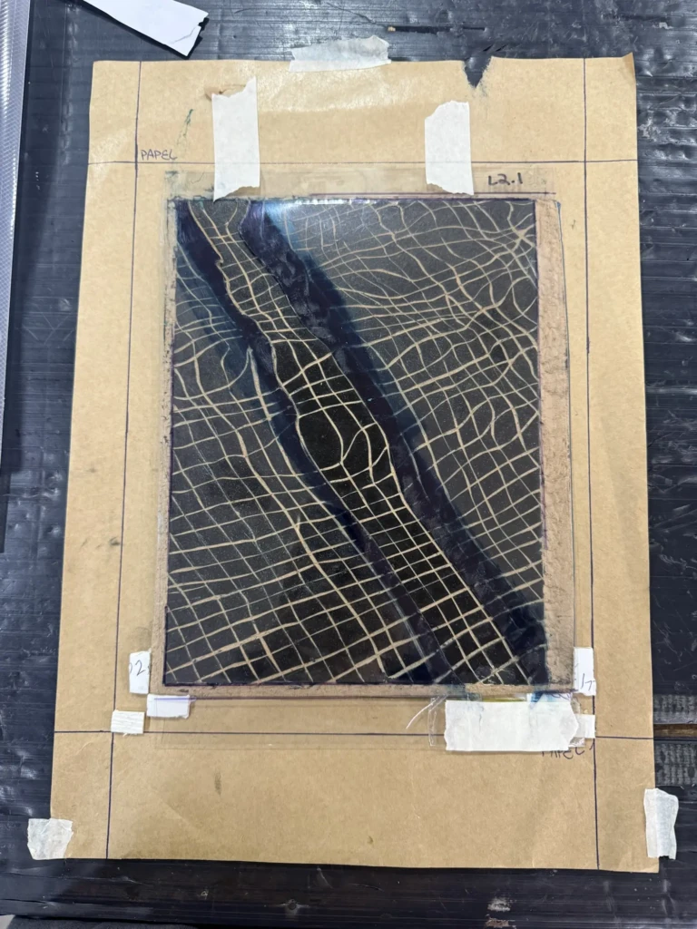
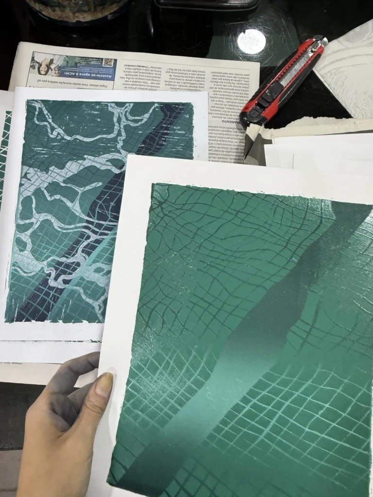
    At first the difference seemed subtle enough to ignore. But the following week, when I printed the second layer using the same color proportions as the original series, the mistake became obvious. The whole piece suddenly felt too green, too dark, and the illusion of depth and light that I had worked so hard to create completely disappeared. Even with only part of the image printed, I could already tell something was off.

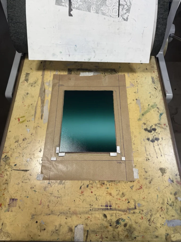
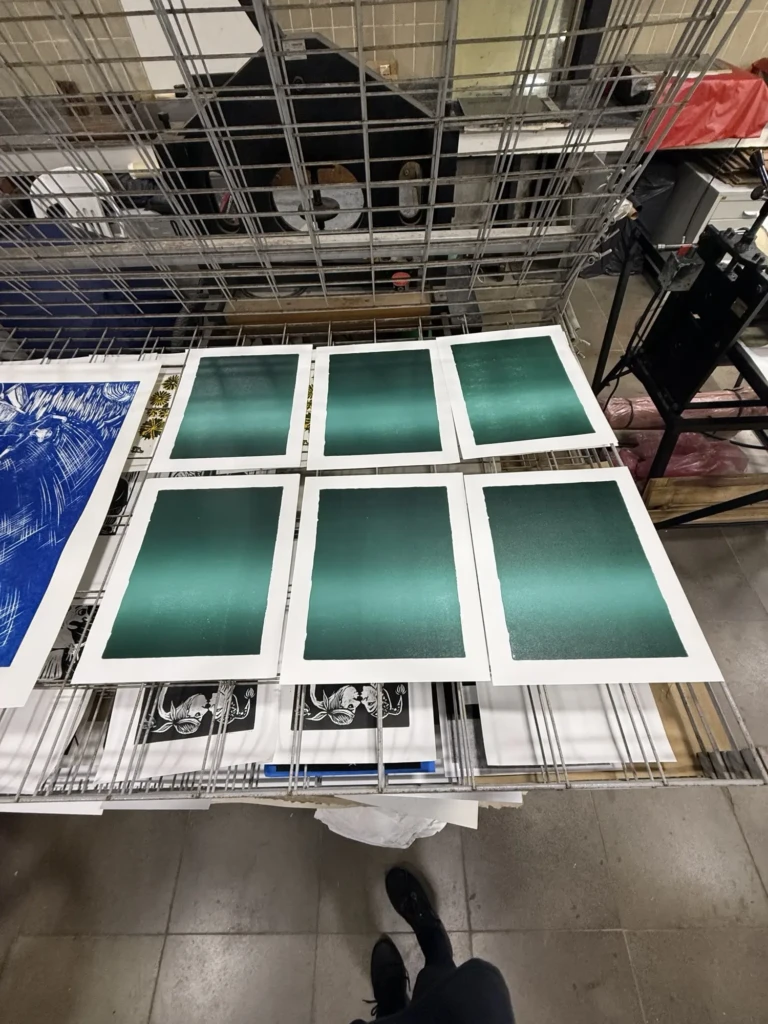
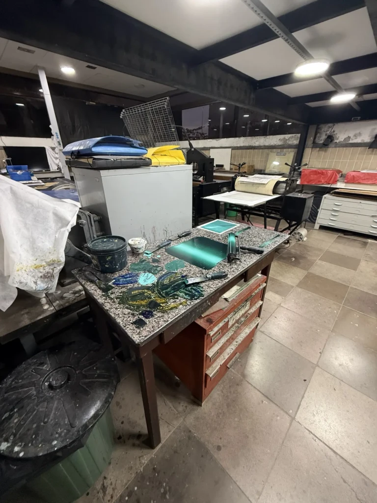
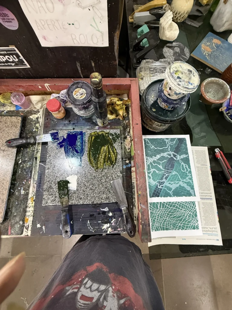
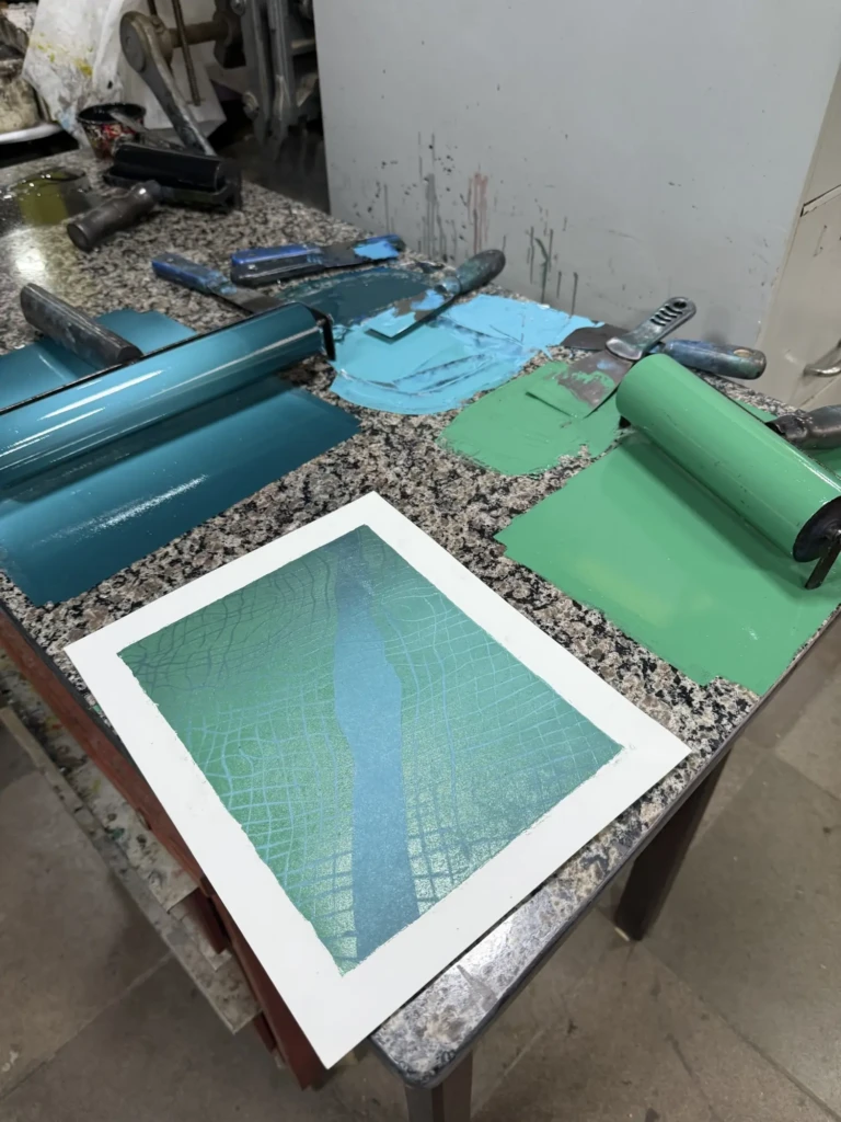
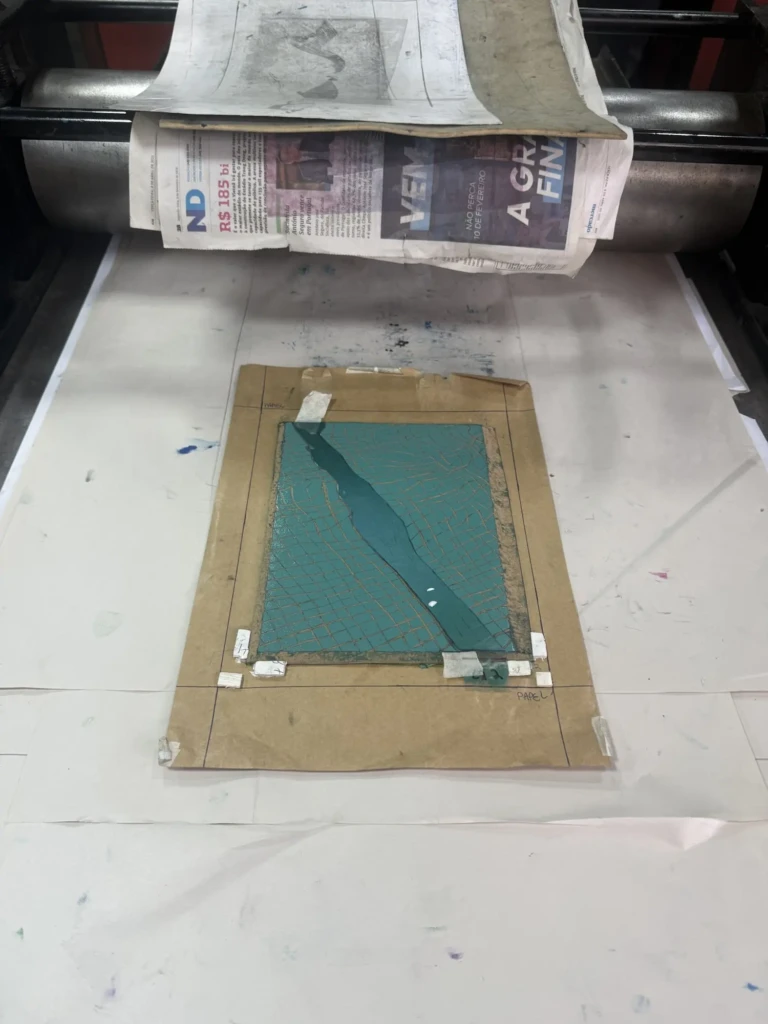
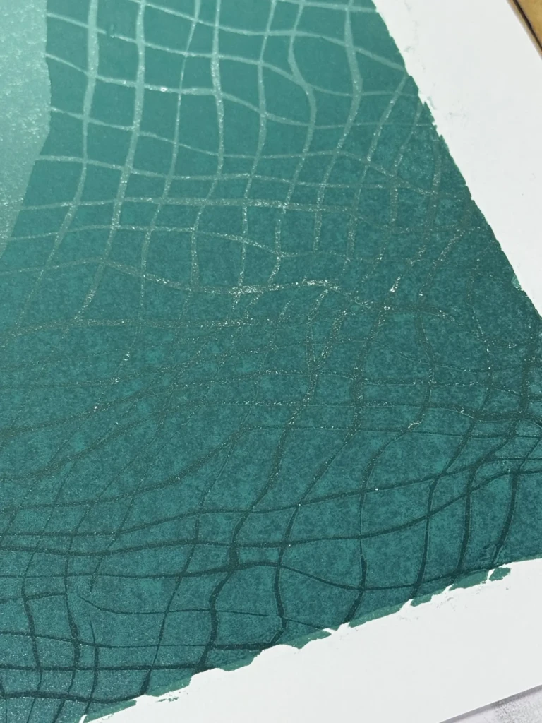
    Check out details of the process below:

    Week 1. Layer 1:

    Week 2. Layer 2:

    Part 2

    So… back to the drawing board.

    Feeling a little frustrated, I went into the next studio session with two goals:

    1. Remix the gradient using the correct green.
    2. Write everything down this time so I could actually reproduce the colors later.

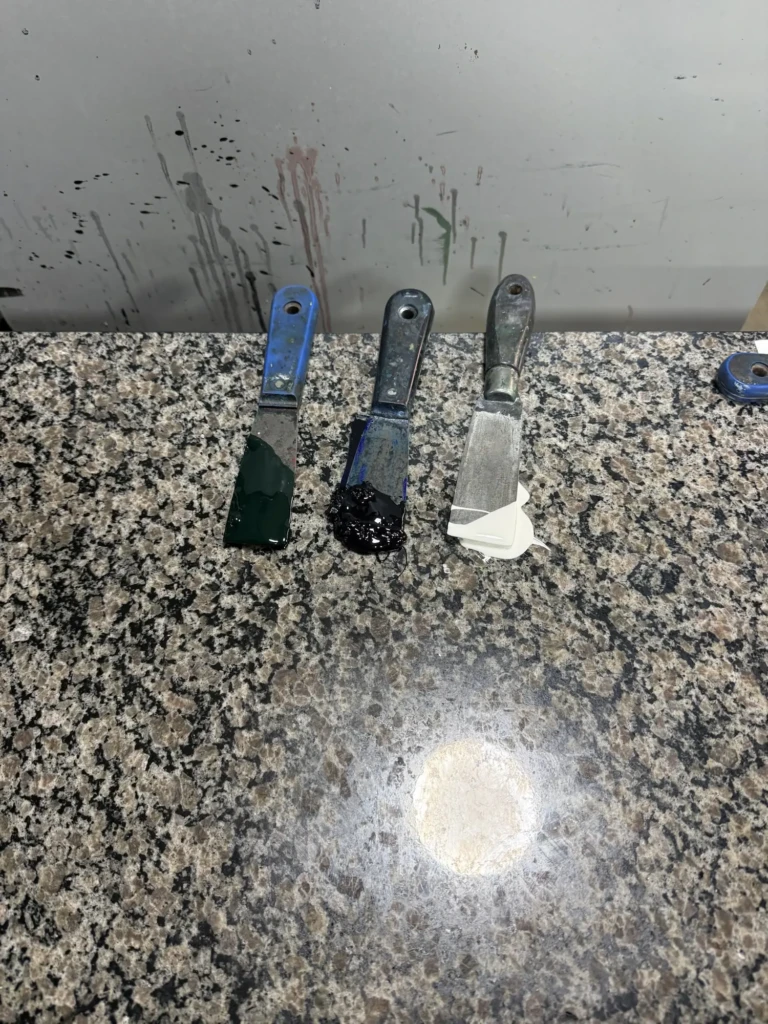
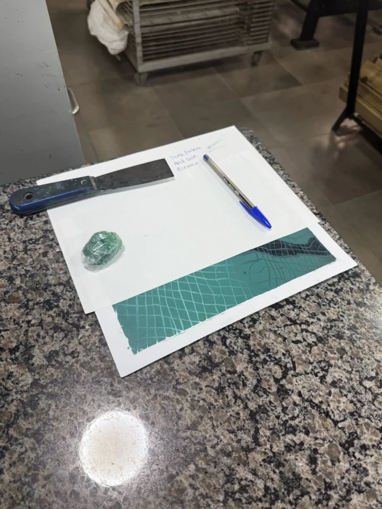
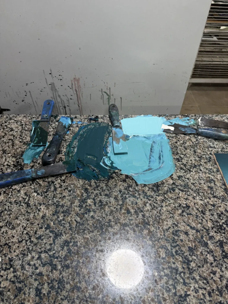
    My notes are admittedly a mess—lots of guessed proportions, additions, and corrections as I mixed—but messy documentation is still infinitely better than no documentation. At least this time I also wrote down the names of the inks.

    As soon as I finished mixing the new gradient, I could immediately see it was much closer to my original reference prints.

    Bebeto (the studio instructor) was actually the one who spotted the green mistake. He also noticed something I hadn’t considered: I had changed paper between the first and second series. The originals were printed on a cooler white paper, while these new tests were on a warmer cream paper. That subtle shift also changes how we perceive the colors, making everything appear slightly yellower.

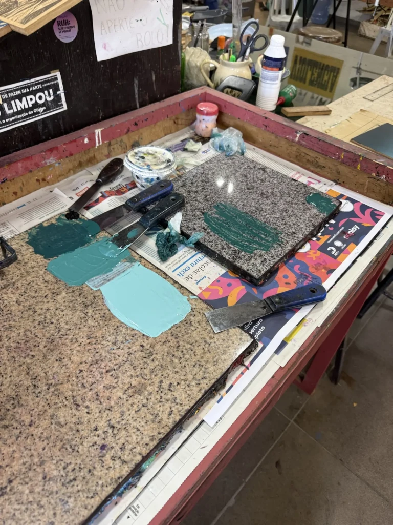
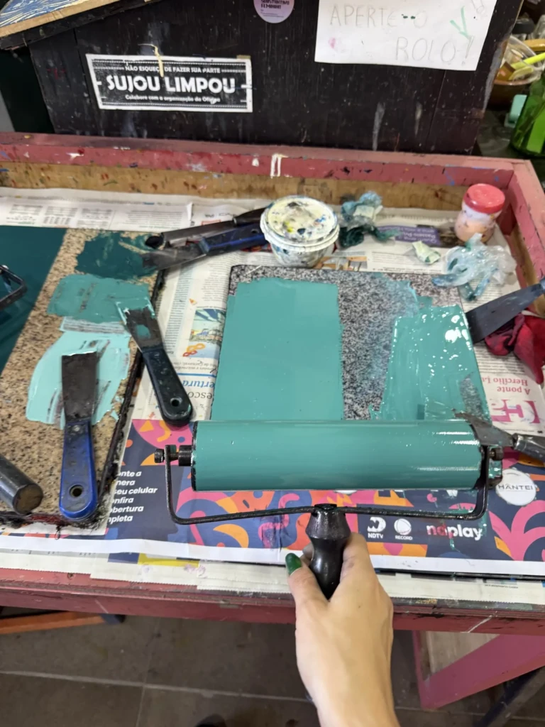
    His third piece of advice was probably the most useful: mix enough ink for the entire print run instead of remixing it every week.

    At first this felt completely wrong to me because I hate wasting materials. But the more I thought about it, the more it made sense. Every time I ran out of ink, I had to remix it from scratch, often wasting even more paint while trying to match the previous color. By mixing a larger batch and storing it, I would actually save both time and materials while keeping the colors consistent throughout the edition.

    With those ideas in mind, I remixed the gradient and used the leftover paint from the previous session to test Layer 2. The result wasn’t great—but it taught me something important. Layer 2 needs to sit much closer in value to the darkest part of the gradient beneath it. Looking back at my original prints, I realized those two colors almost blend together in some areas, which is exactly what creates the illusion of depth.

    Unfortunately I ran out of studio time before I could remix that layer.

    Not my favorite studio day, but definitely one of the most educational ones.

    Part 3

    I went into the following session feeling much more optimistic. This time I had a plan:

    1. Mix the corrected gradient and test one or two prints.
    2. Mix the color for Layer 2 while Layer 1 was still wet.
    3. Fine-tune both colors until they matched the original series.
    4. Print the full batch of Layer 1 on both paper types.

    Overall, the plan worked surprisingly well.

    The villain of this episode, however, was texture.

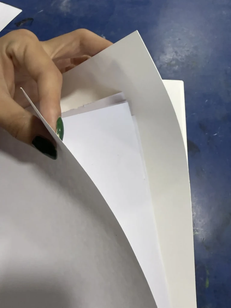
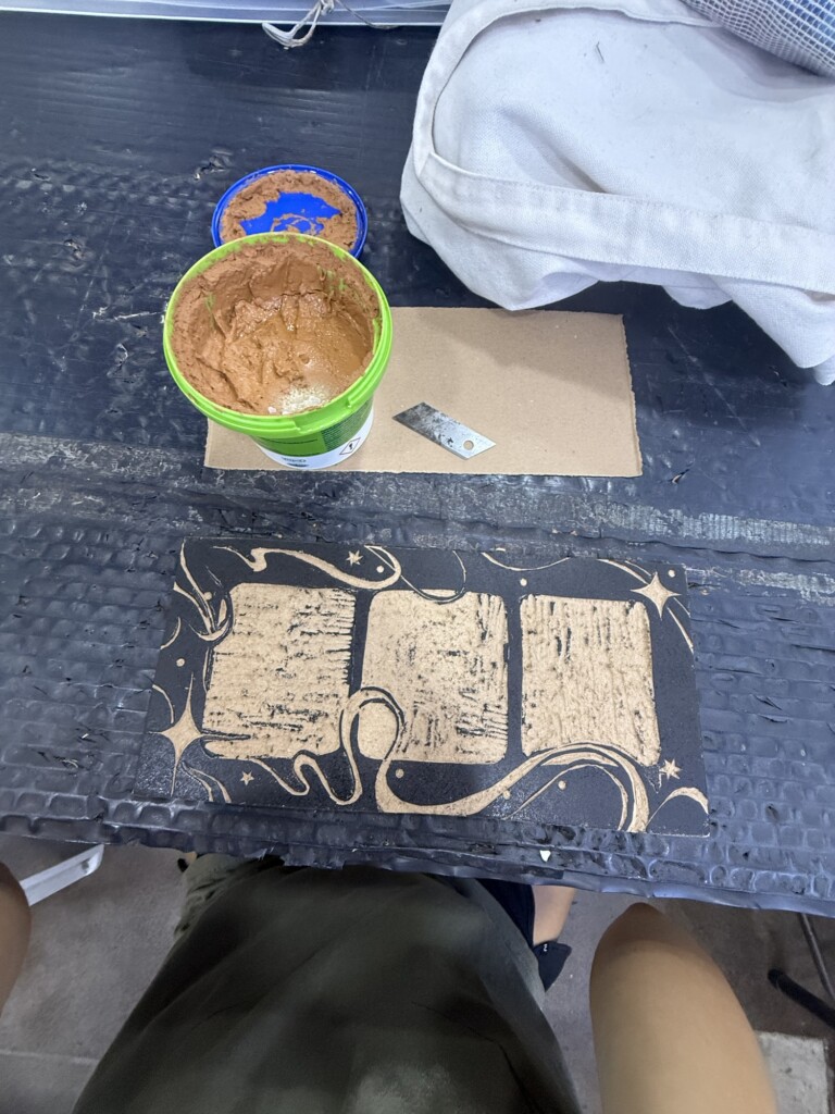
    Because I hadn’t stored my blocks properly after the previous printing sessions (I wrapped them in paper while they were still drying…), both boards developed problems.

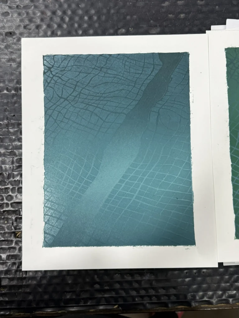
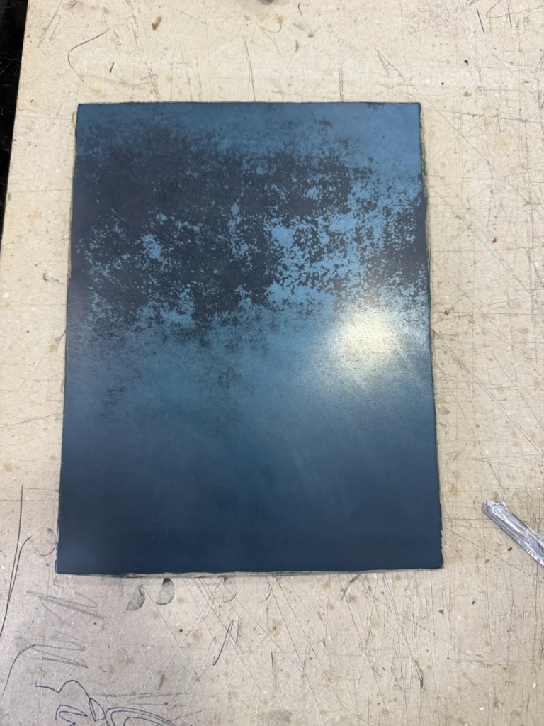
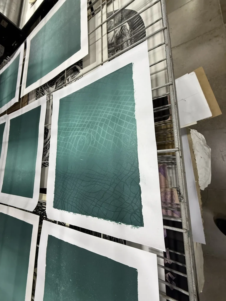
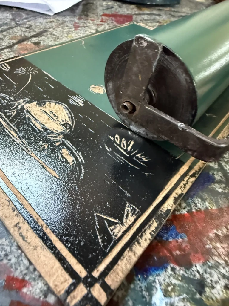
    The first block developed a strange grainy texture in the lightest section of the gradient. It almost looked like corrosion and produced a vine-like pattern on many of the prints. Even after cleaning it thoroughly with solvent, the texture remained.

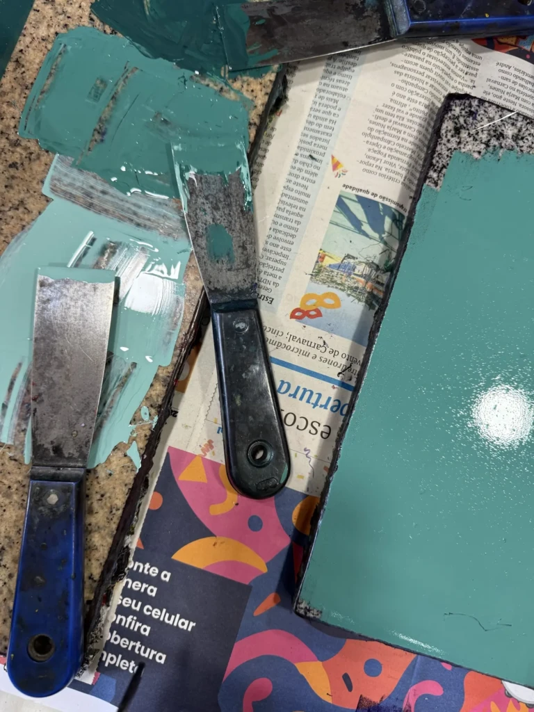
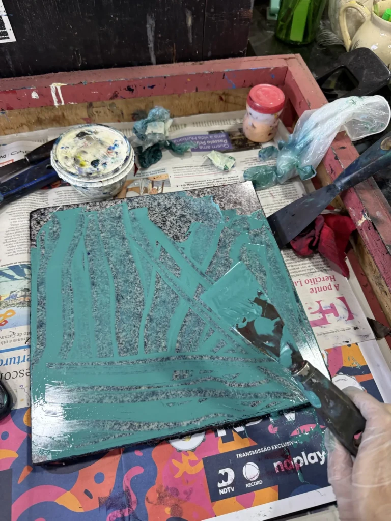
    The second block had another issue: paint had dried into thick patches, especially where the acetate mask sat against the wood. I spent quite a while cleaning and sanding the surface before printing again.

    The thinner, cooler-toned paper helped hide some of those imperfections, and running each print through the press multiple times (sometimes four!) also improved the results.

    Were they perfect? Not even close.

    But I finally achieved two things that had been holding me back for months:

    • the gradient colors were finally mixed correctly and documented;
    • the new registration system worked, keeping the layers aligned far better than in the original series.

    That alone felt like a huge victory.

    Part 4

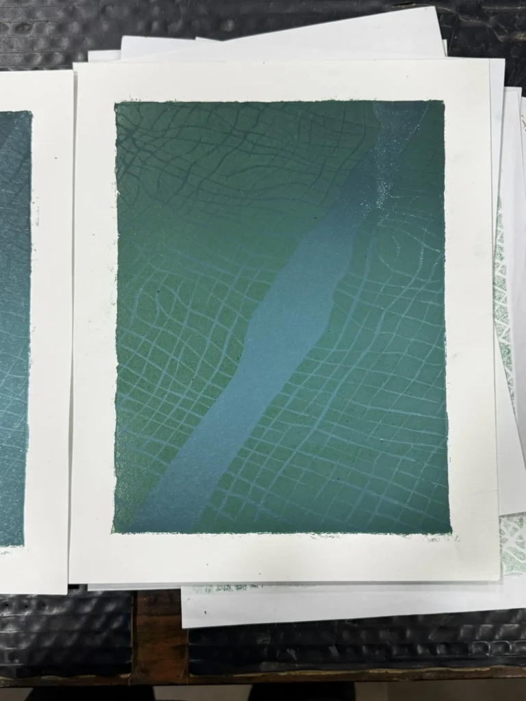
    During my latest studio session, I finally tested Layer 2 using the corrected color.

    I already knew the board still had some dried-paint texture left, but I decided to do one print before sanding it again, just to see how noticeable it would be. Since much of this layer is hidden by the acetate mask, I hoped I could get away with it.

    I couldn’t.

    The print came out incredibly blotchy.

    After thoroughly cleaning and sanding the block, I tried again. The results improved—but not nearly as much as I had hoped. I even tested a different paper, with similarly disappointing results.

    By that point, frustration had definitely caught up with me.

    I decided to step away from the project for a while and work on one of my side prints instead… only to immediately make a carving mistake and remove something I definitely shouldn’t have.

    At that point I figured the universe was politely telling me to call it a day.

    Now I’m left wondering whether it makes more sense to keep fighting this version of the project or simply start over from scratch, applying everything I’ve learned through what has become a surprisingly long list of mistakes.

    Honestly… I’m still not sure.


    Side projects

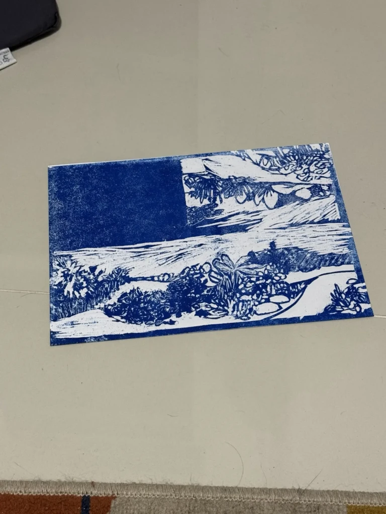
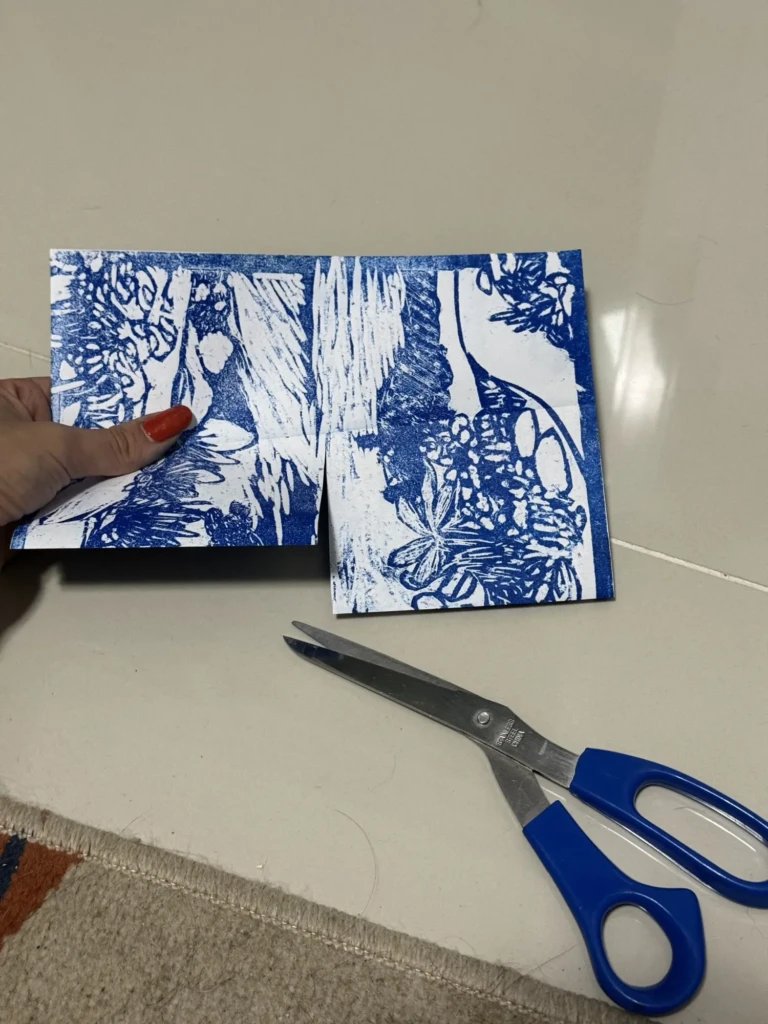
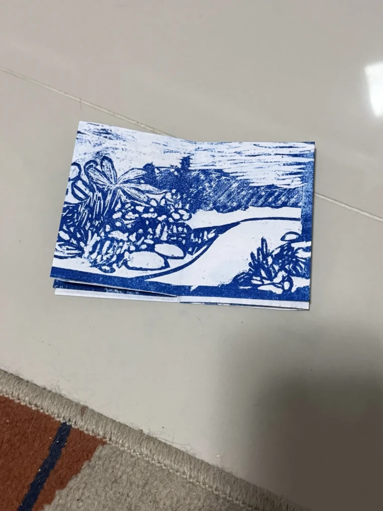
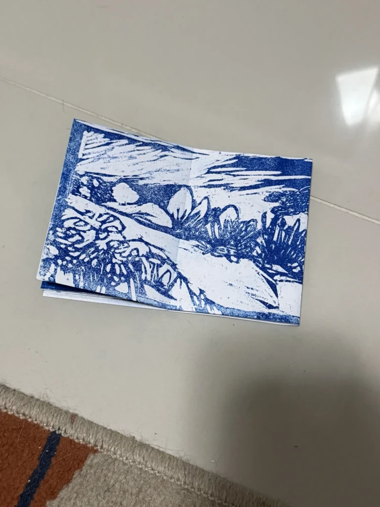
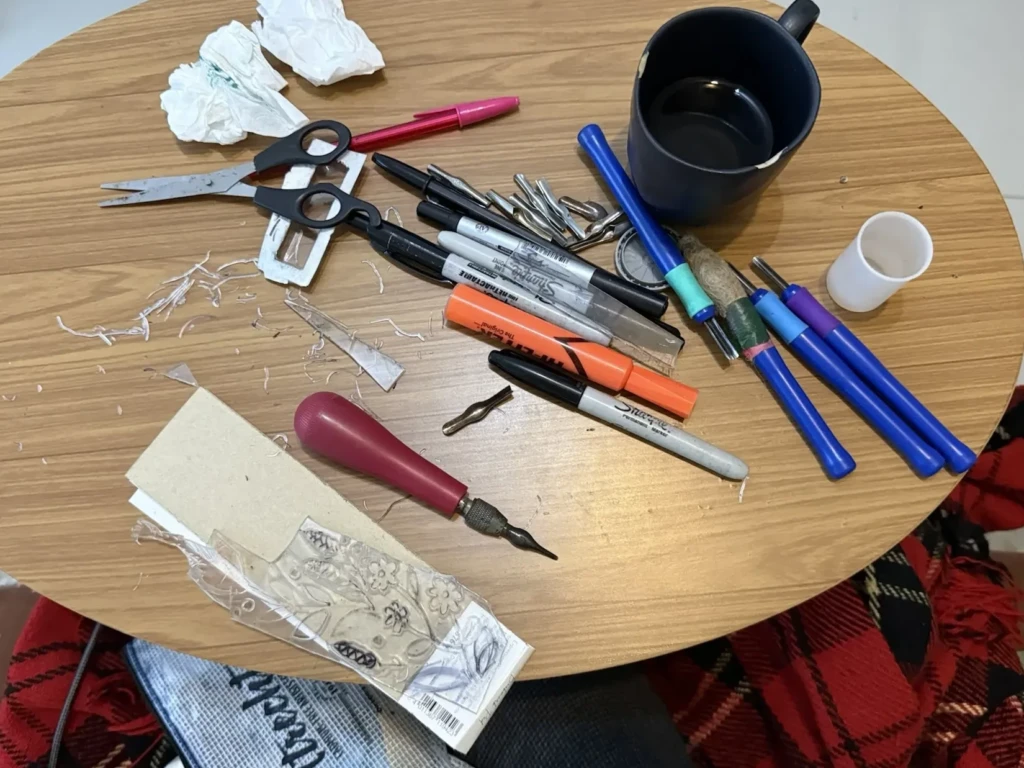
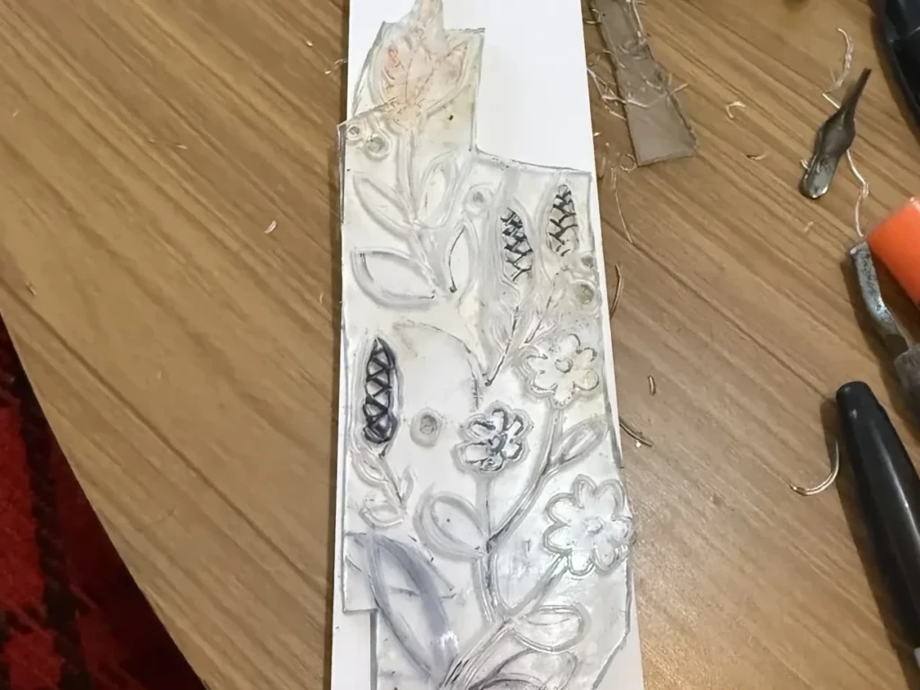
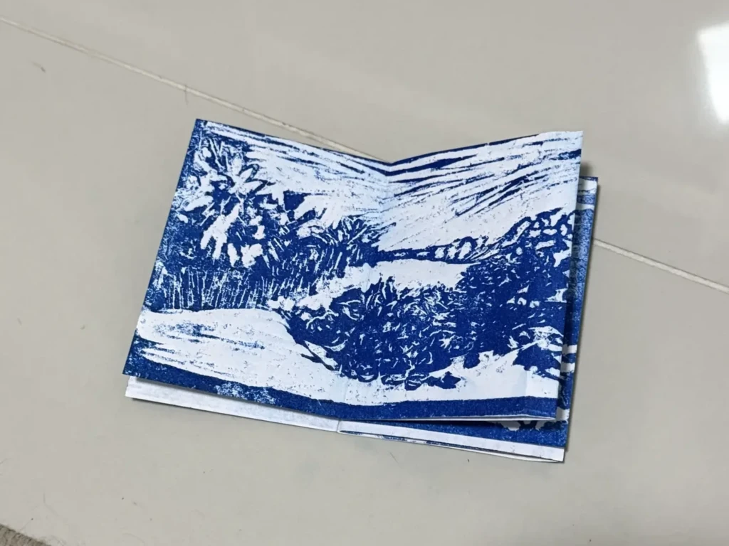
    I’ve been working on some side-projects: a zine and a book-marker…. here are a few sneak peaks but I’ll share more later!


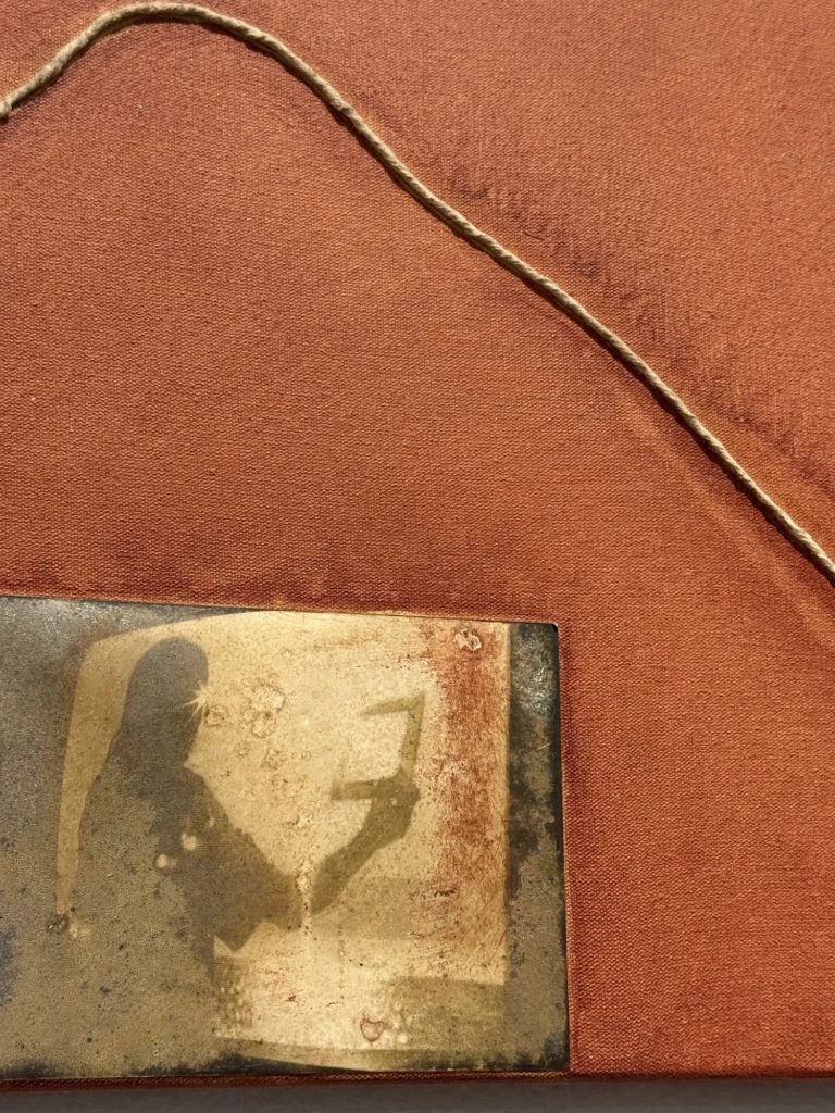
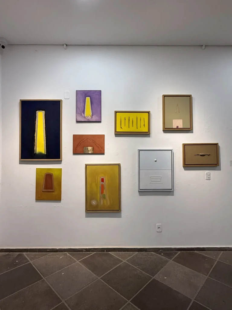
    CIC (Integrated Cultural Center) expositions

    As always the exhibits at CIC have been great recently and here are a few highlights from them:

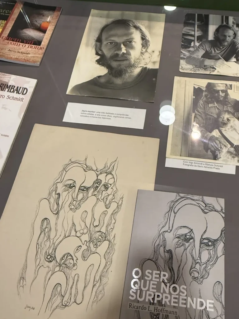
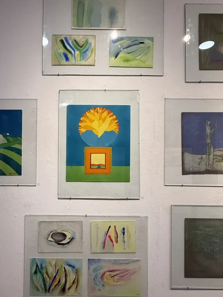
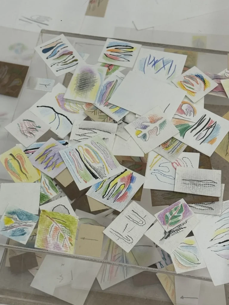
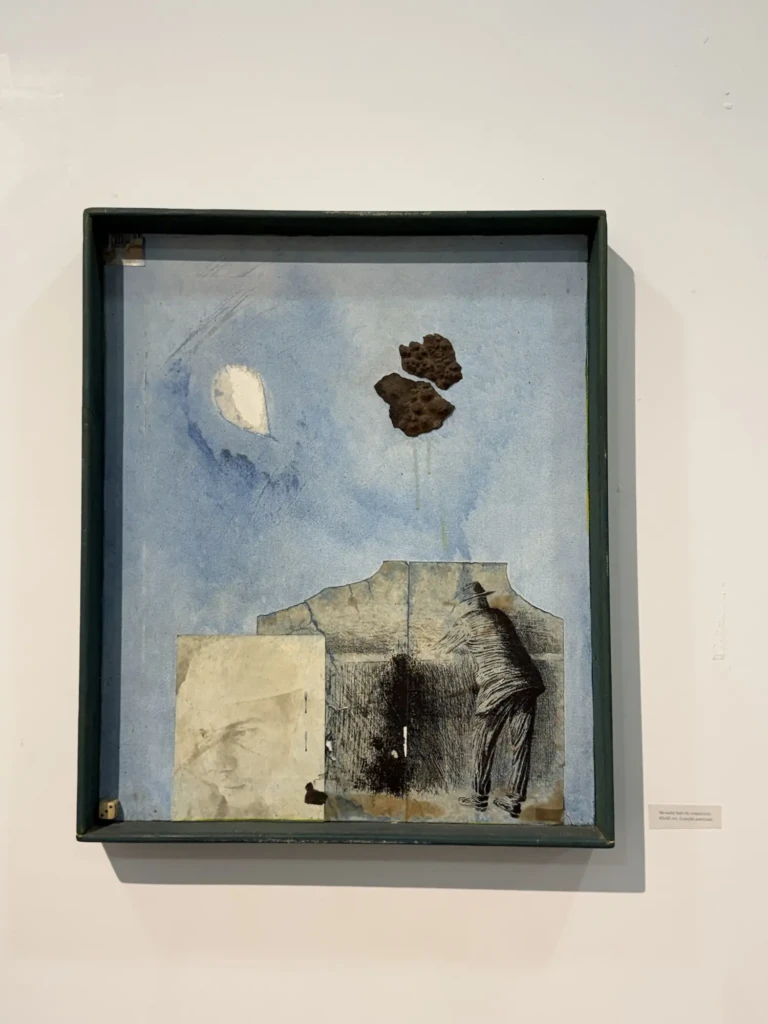
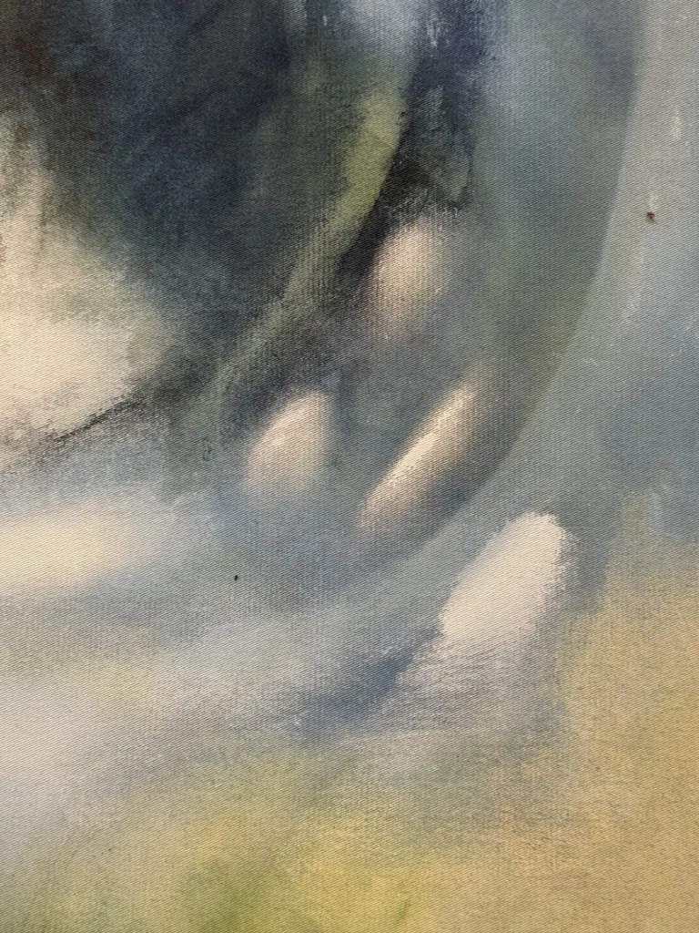
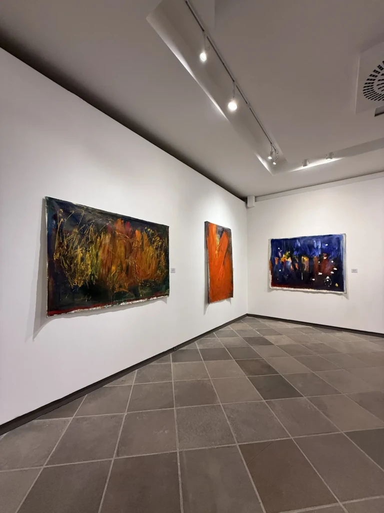
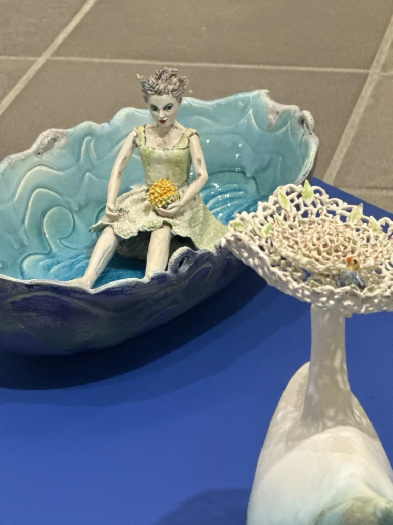
    Jayro Schmidt solo exhibition – “O que eu nao posso dizer com palavras” // “What I can’t say with words”

    I like his use of textures and layering of contrasting elements. His pile of tiny paper studies is very endearing.

    The text accompanying the exhibition reads (translated from Spanish to English, written by a Daniel Ballester):

    “This is more than an exhibition: it is a reunion.

    Jayro’s works are the passport for a journey toward something that happened and, at the same time, is still happening, in a realm he inhabited as a place where the art of dialogue serves as a key.

    Word and painting.

    A single score for all possible combinations: speech is also color, volume, and territory.

    What remains is the bowl:

    clay that absence fired so that silence would not spill over.

    Because here there are voices, dreams, ideas that crossed the border of the possible and pierced through the chaos of oblivion.

    This is more than an exhibition: it is an attachment.

    A tribute to a great master of humility and observation, from those who were and are his companions along the way.

    This is more than an exhibition: it is a path.”

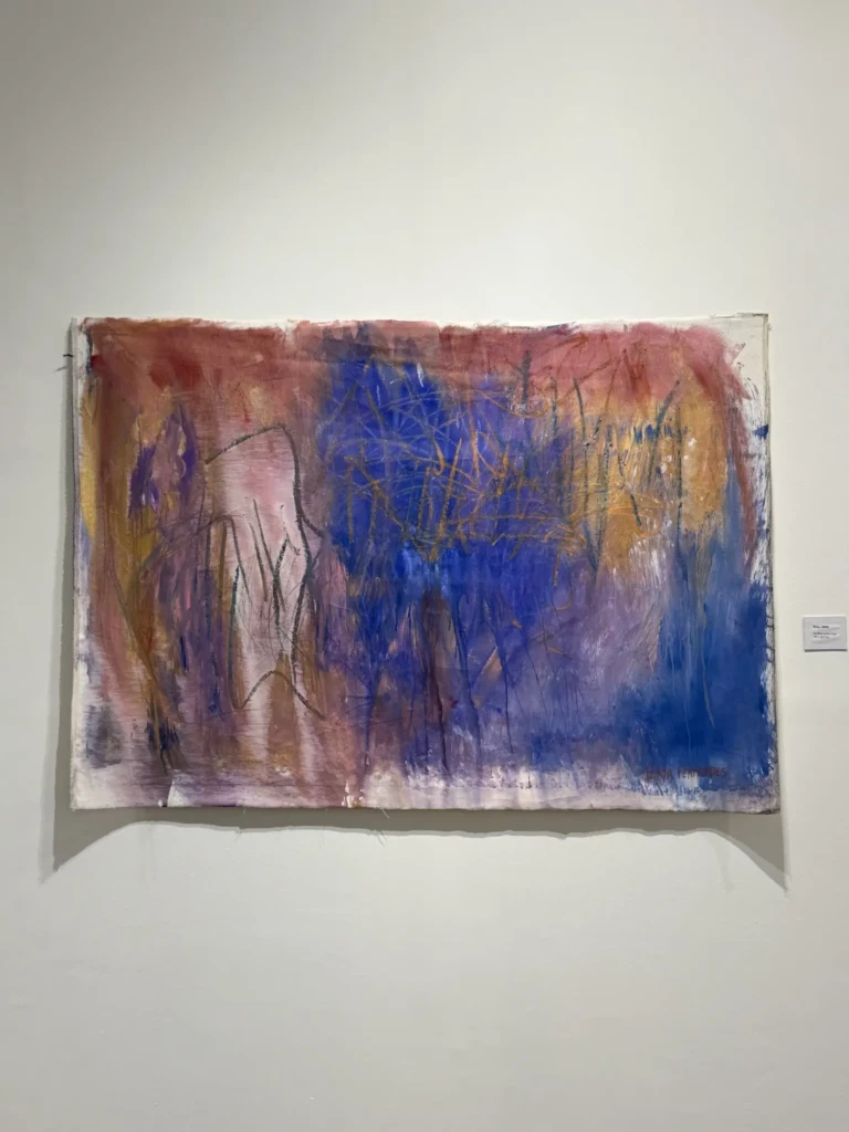
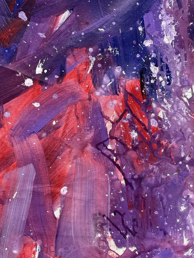
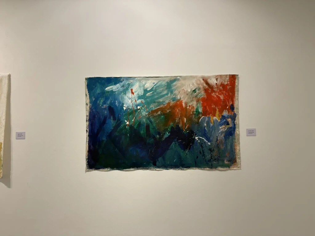
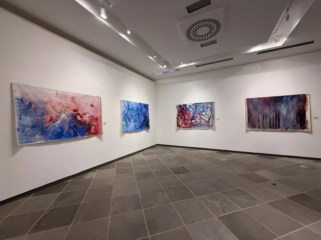
    Flávia Fernandes solo exhibition – “Pinturas derivas” // “Drifting paintings”

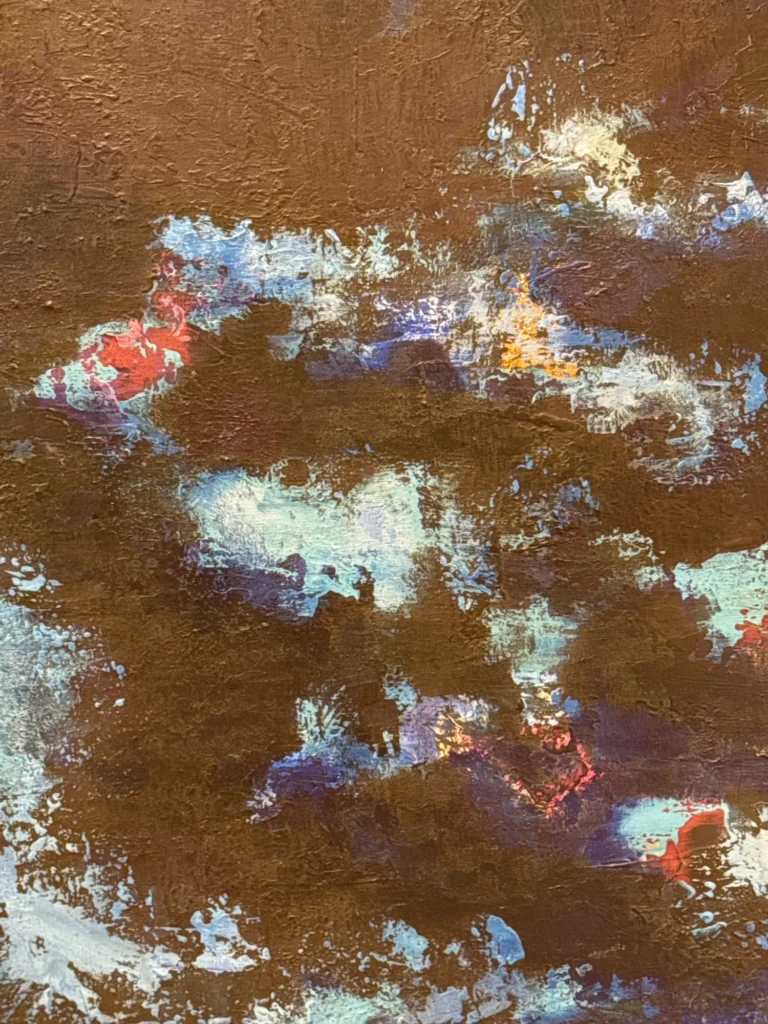
    This series reminds me of an experimental collab I did with my friend Marcela Christlieb back in college. Similar processes of playing with the process of mark-making and using contrasting paints. I thought it was sticking how familiar some of these color combos and marks were to me. It’s quite some provocative work.

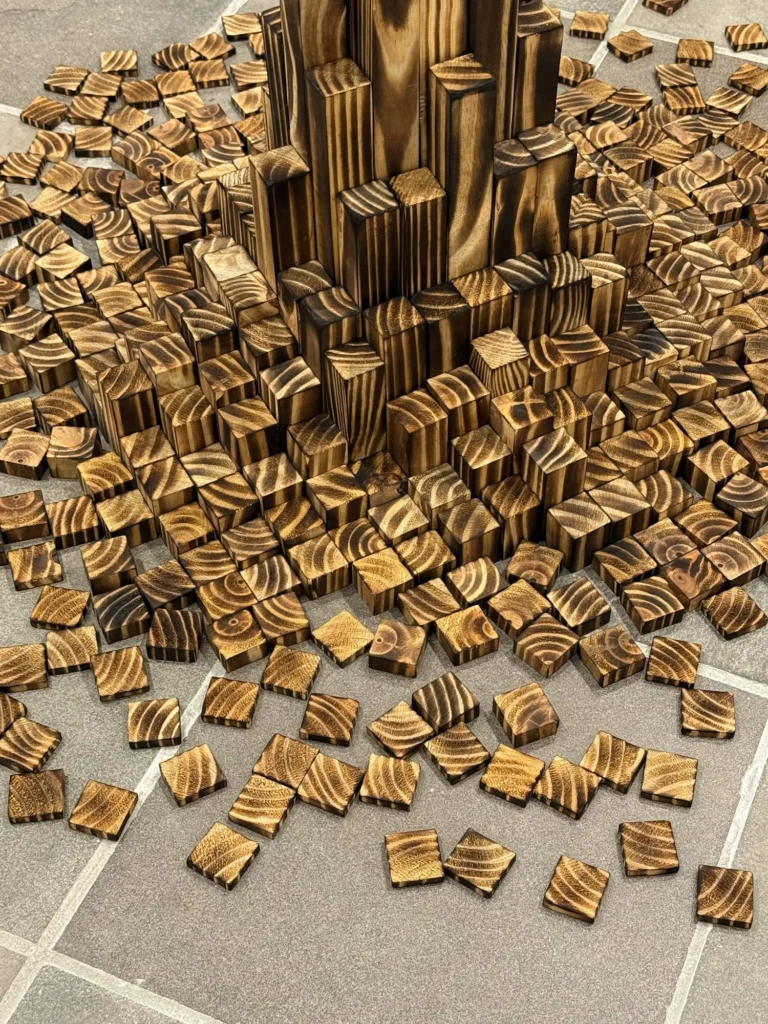
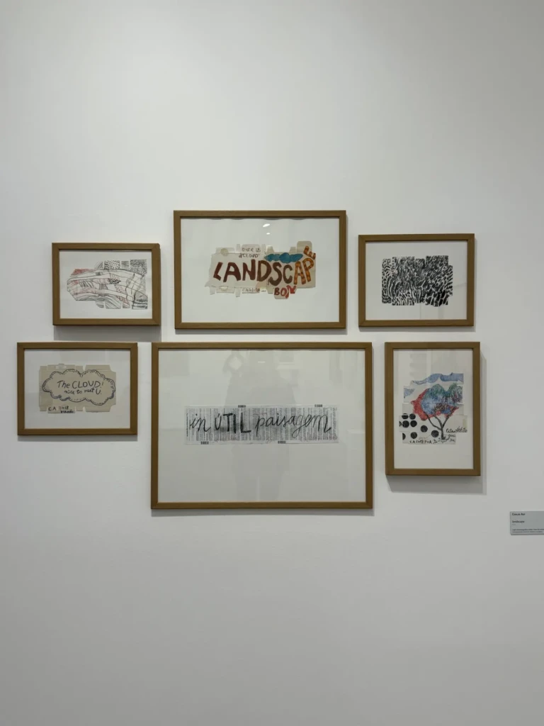
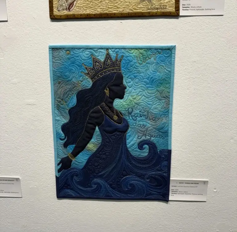
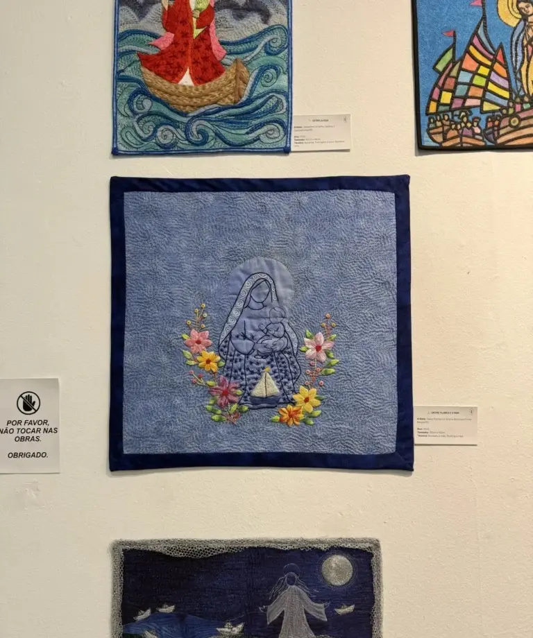
    Curitiba’s 16th International Bienal 2026 – Titled: Outras Paisagens (Other Horizons)

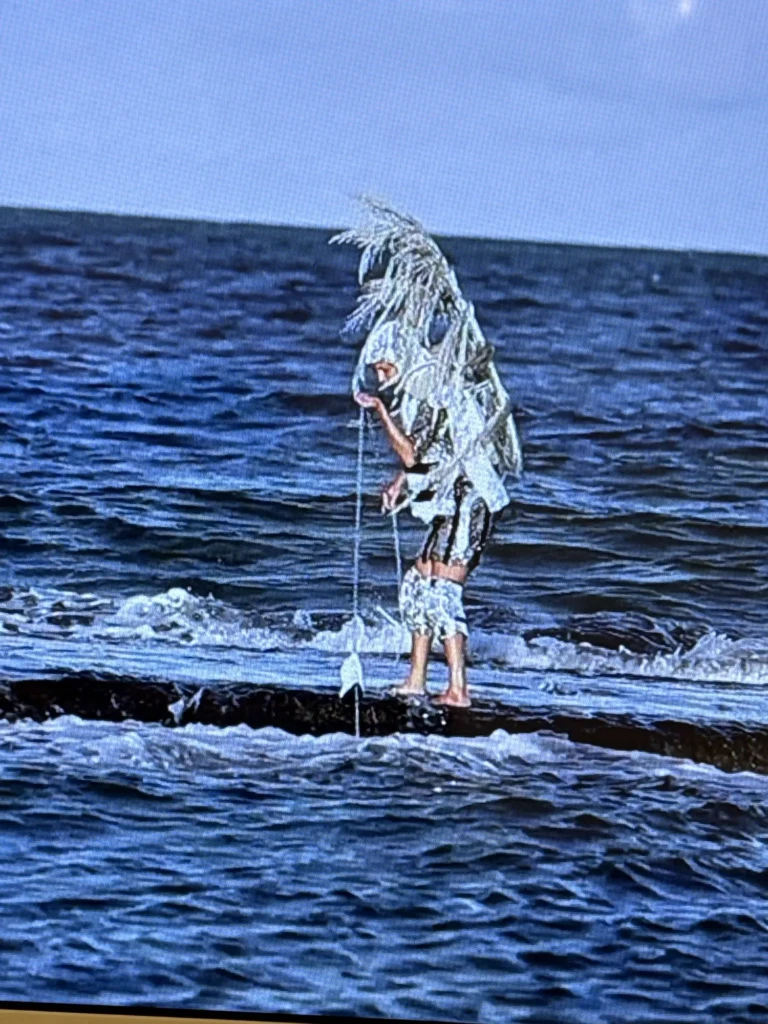
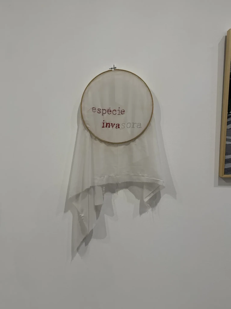
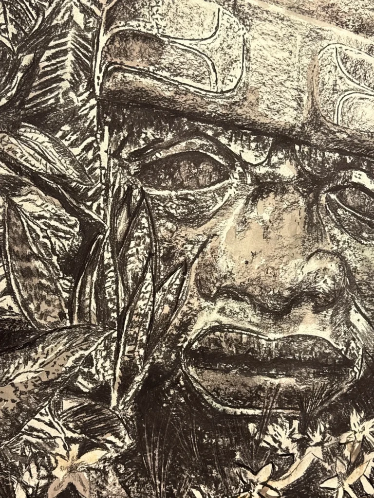
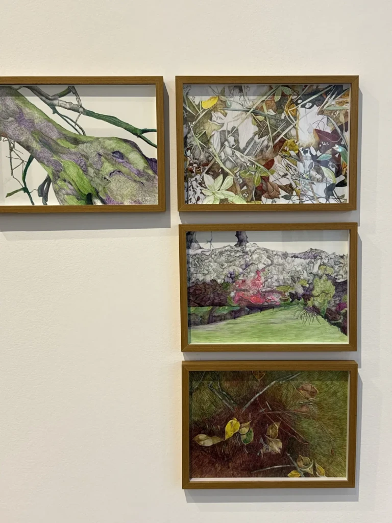
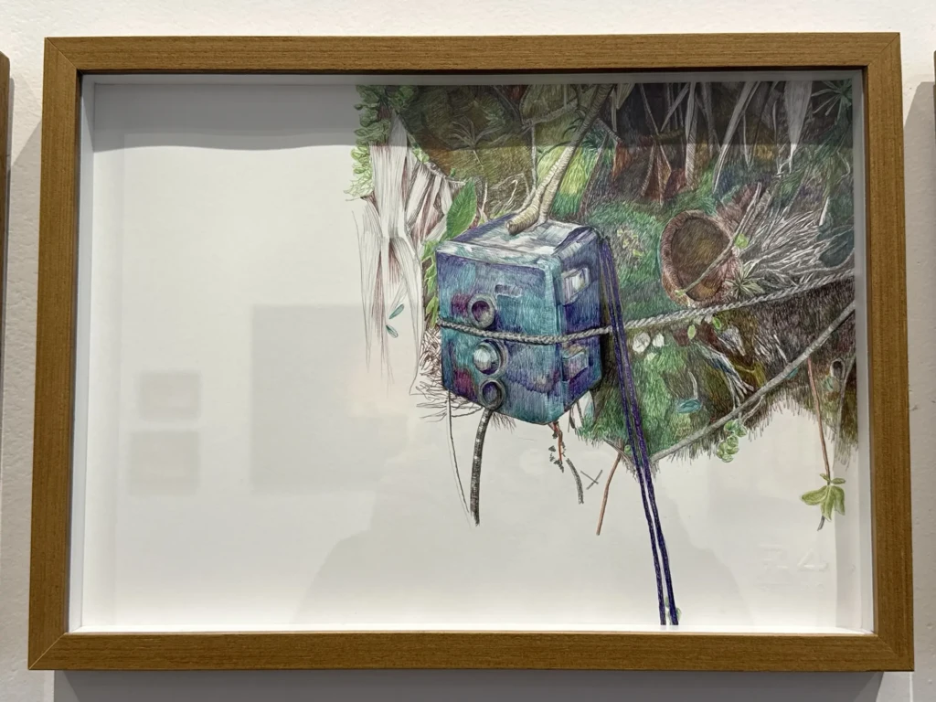
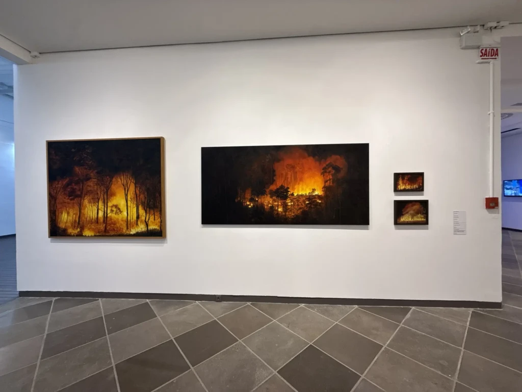
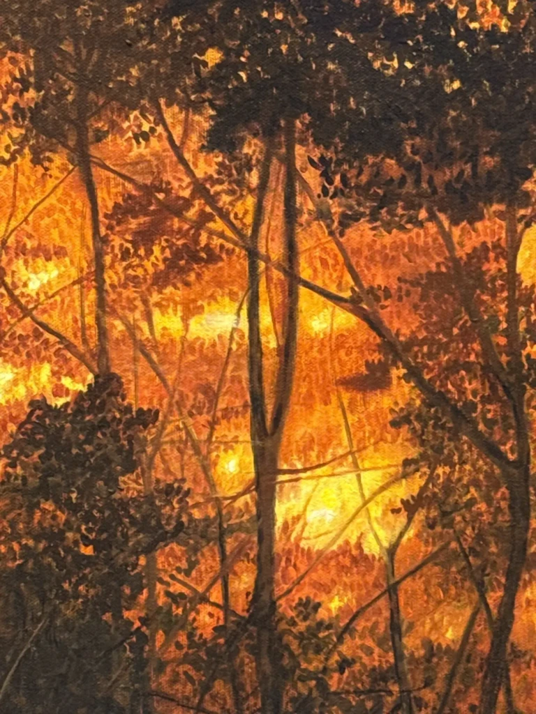
    This was a very diverse collections featuring works from artists with a wide range of practices. I liked how the pieces were placed in conversation with one another, with contrasting techniques and approaches to the central theme. Lots of beautiful textures and interesting provocations on the subject of self vs. the environment.

  • Creative Check In: Cozy Crafts+

    Creative Check In: Cozy Crafts+

    With the temperatures dropping here in the Southern Hemisphere, I’ve been slowing down a bit and focusing on cozier crafts lately.

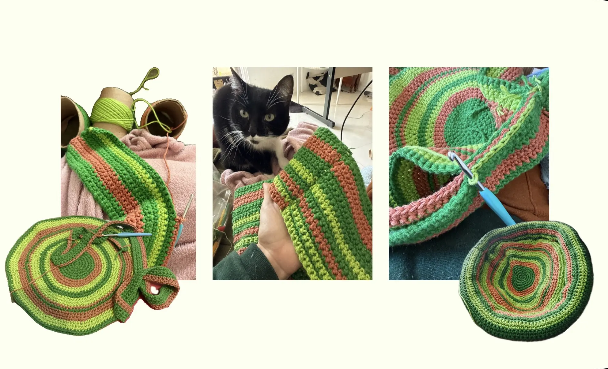
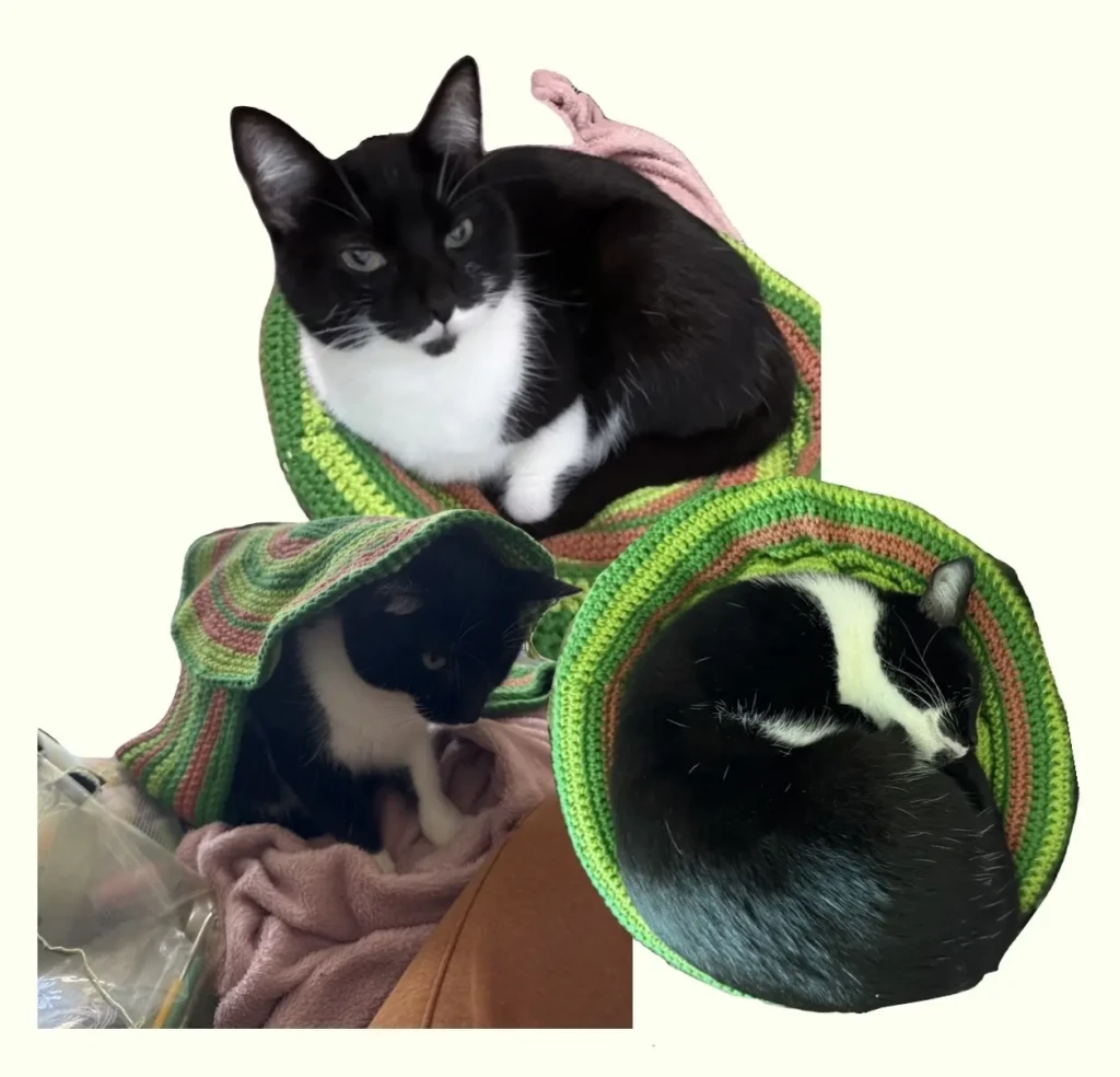
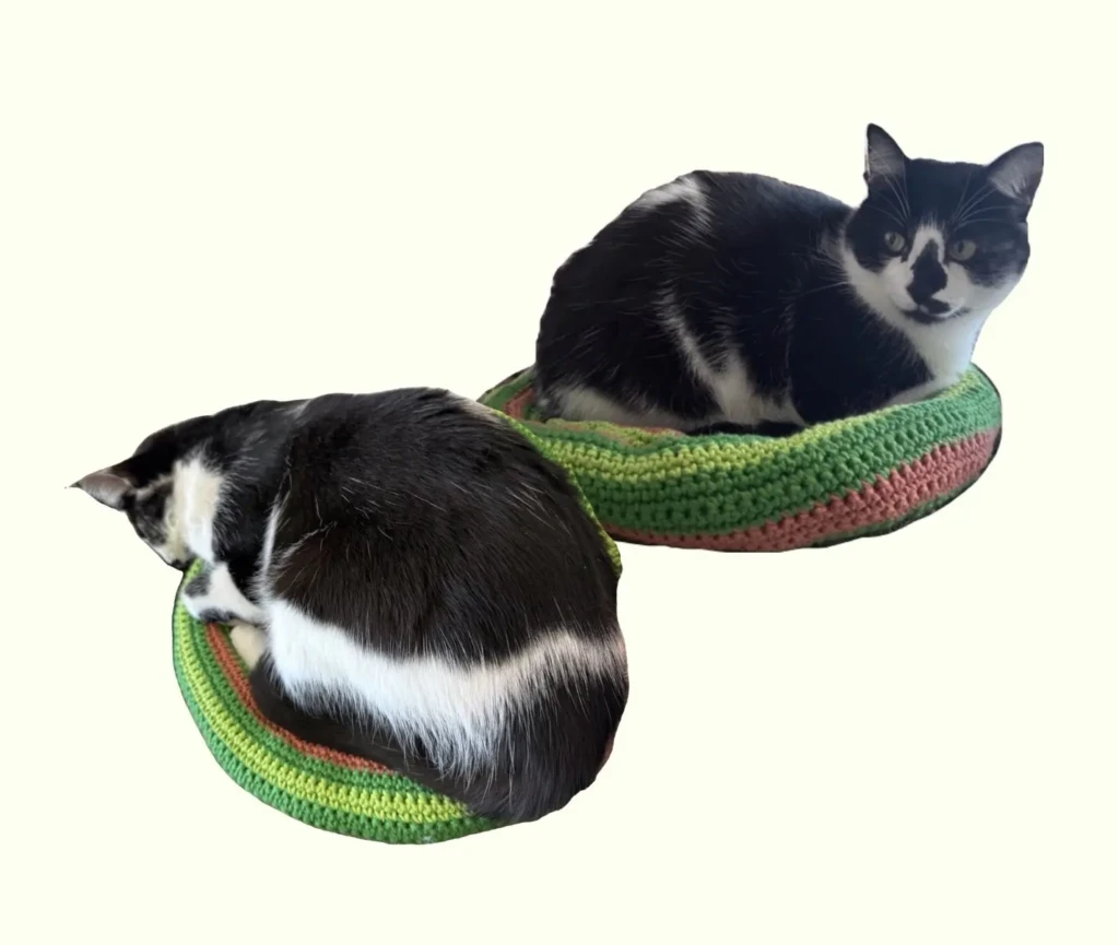
    Although most of what I’m sharing today is still a work in progress, I did manage to finish one project! This cute cat bed for my babies to stay cozy through the winter.

    It was nice to use up this leftover yarn I had lying around—pretty colors, and I got blessed by the yarn gods by having exactly enough to finish the project with no leftovers. 🙂

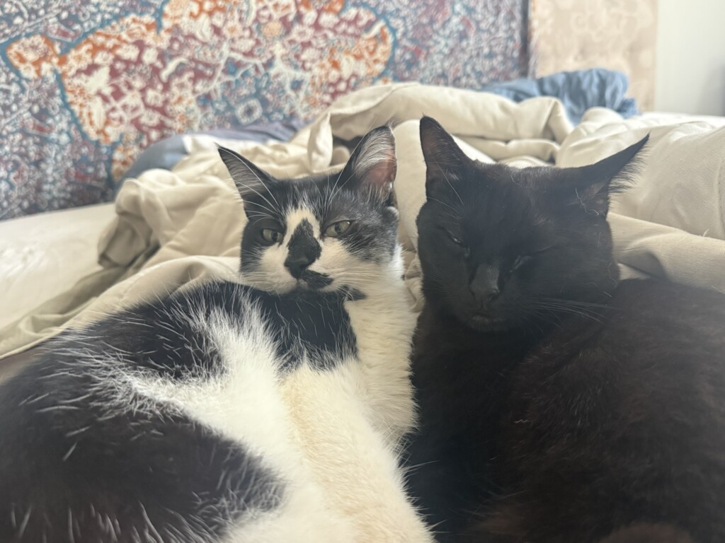
    I’m happy to share it’s been approved by my cats of all shapes and sizes. Cat tax below ⬇️

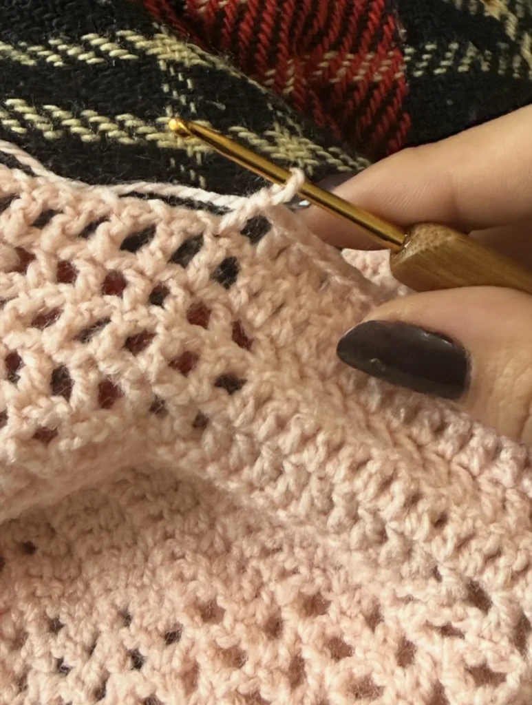
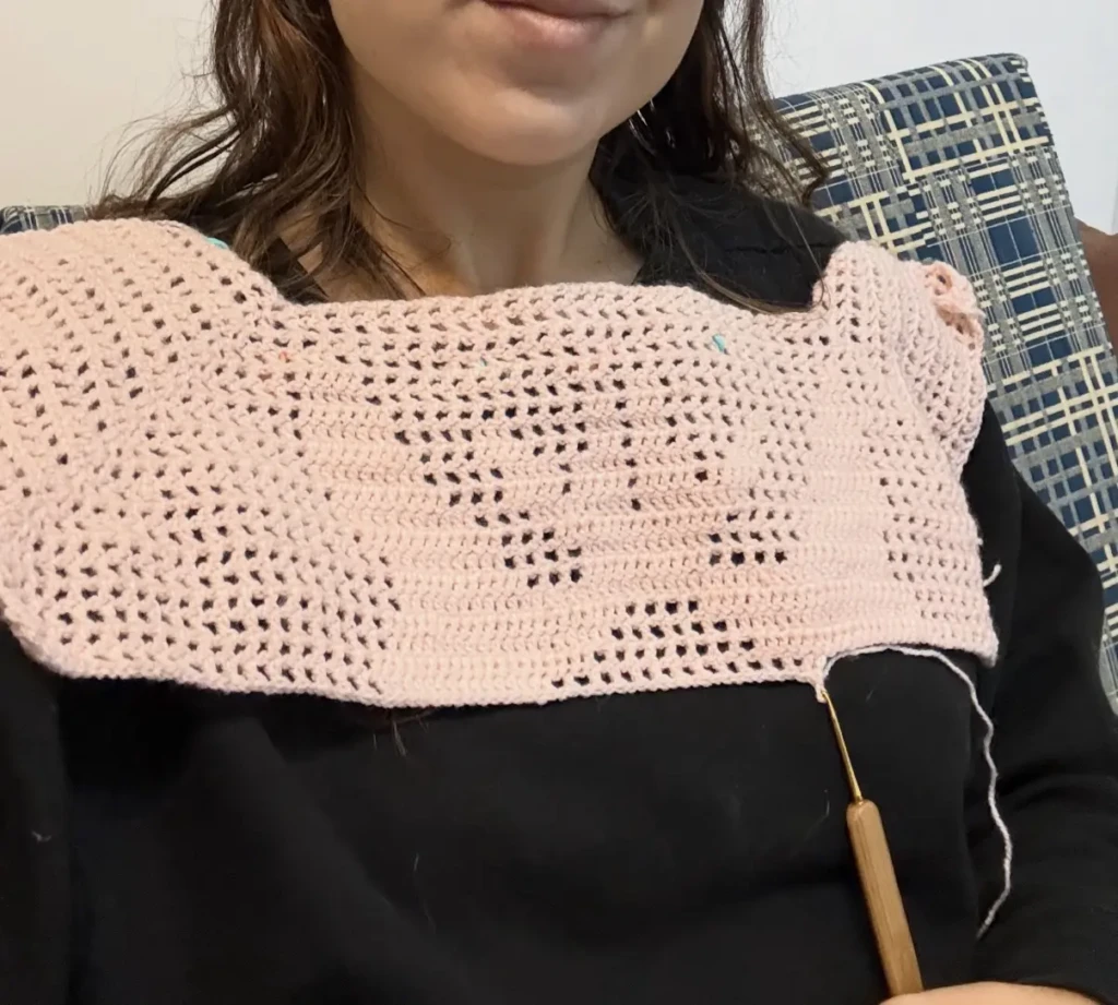
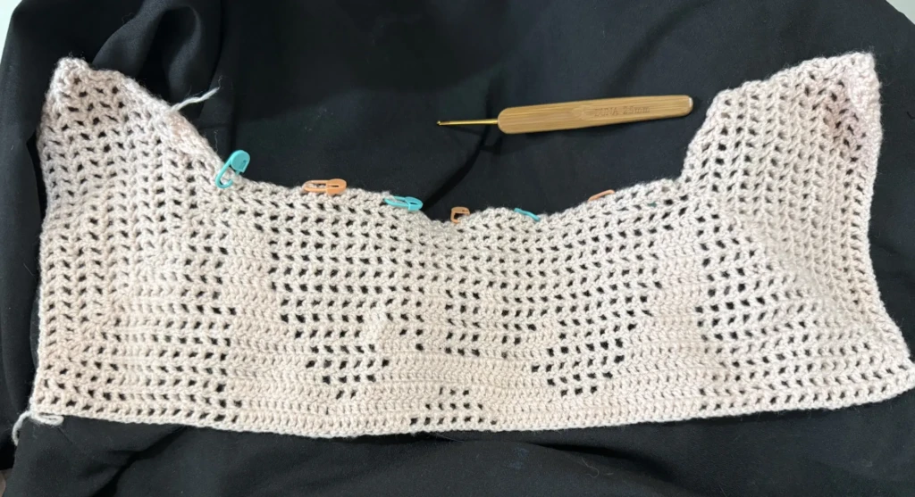
    On the other hand, I picked up this long-forgotten project (I think it had been about a year since I last worked on it?) and tried to make some progress—not very successfully… I’ve had to undo my work a thousand times and I’m having a hard time following the pattern.

    This is my first fillet crochet project, and following the grid is making me a bit crazy. I keep getting lost in the counting and all the tiny squares.

    Since I was already changing the design anyway, I eventually gave up on following the chart exactly and just started chasing the shapes I wanted through trial and error… and more error.


    Things I’ve Been Enjoying

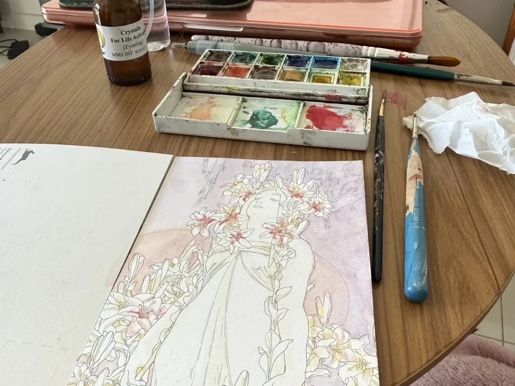
    Besides my textile work and my ongoing woodblock printing practice (which I share in more detail in dedicated posts), I’ve mostly been enjoying cozy crafts to keep the creative juices flowing without too much pressure. I’ve been enjoying whatever sun I can get, lots of reading, baking and color-in watercolor postcards!

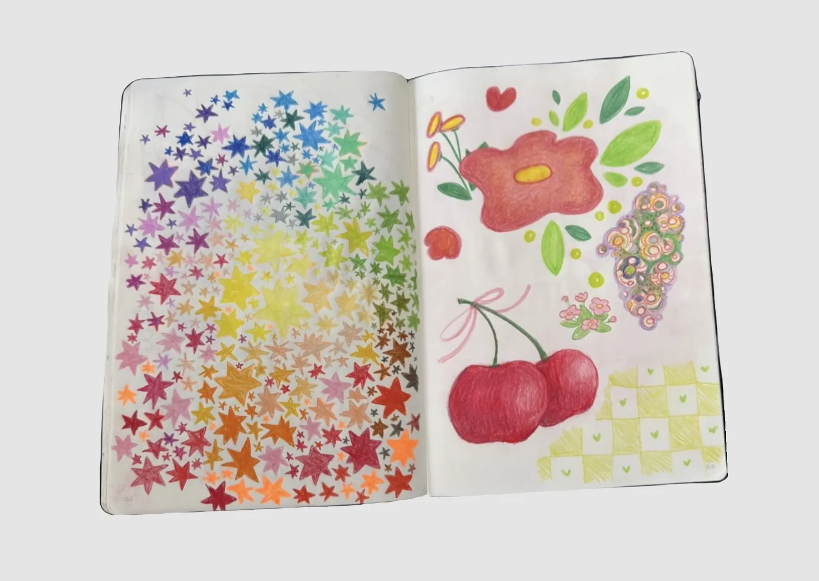
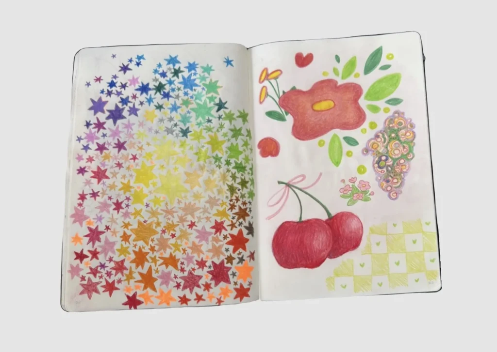
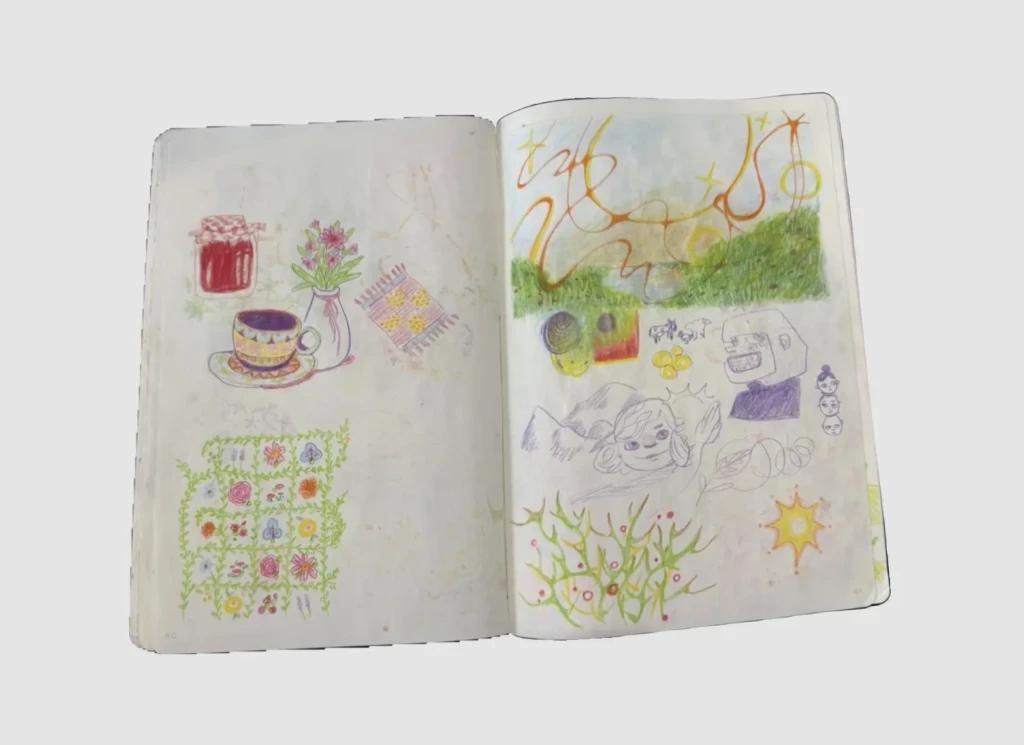
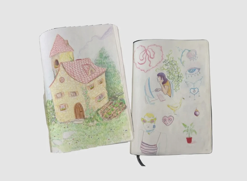
    I tried going back to drawing on my iPad but I ended up having much more fun with colored pencils and a good old sketchbook, just like the old days. I spent well over a decade drawing on paper almost every day, so it’s funny to realize how much I missed it. I’m really enjoying these loose sketching sessions—they’re full of little experiments, happy stims, and the freedom to simply draw without expectations.

    Overall, my creative practice has been a little less structured than usual: Lots of open tabs, lots of half-finished ideas, and waiting for enough energy (or clarity) to move certain projects forward. I’ve also had a handful of digital projects quietly cooking in the background… but those are best kept secret until they’re ready to share.


    A Little Inspiration

    Although it’s already been about a month, I did take a couple of trips recently, and traveling is always deeply inspiring for me. Spending time with loved ones, seeing new art, people and scenes, trying new things and having new experiences… that always fills my creative battery and they’re an intrinsic part of my creative practice.

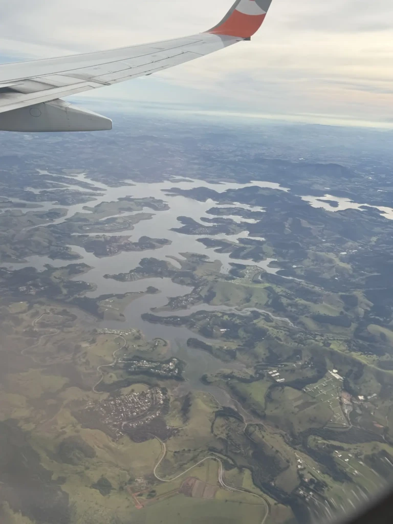
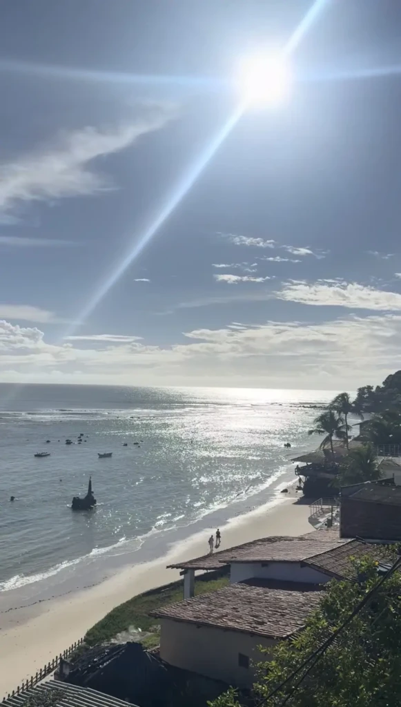
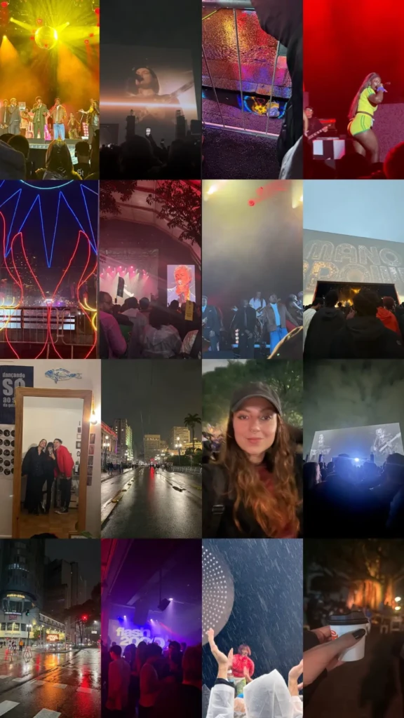
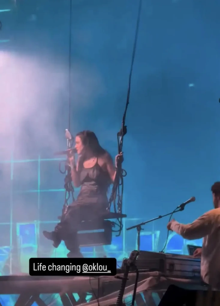
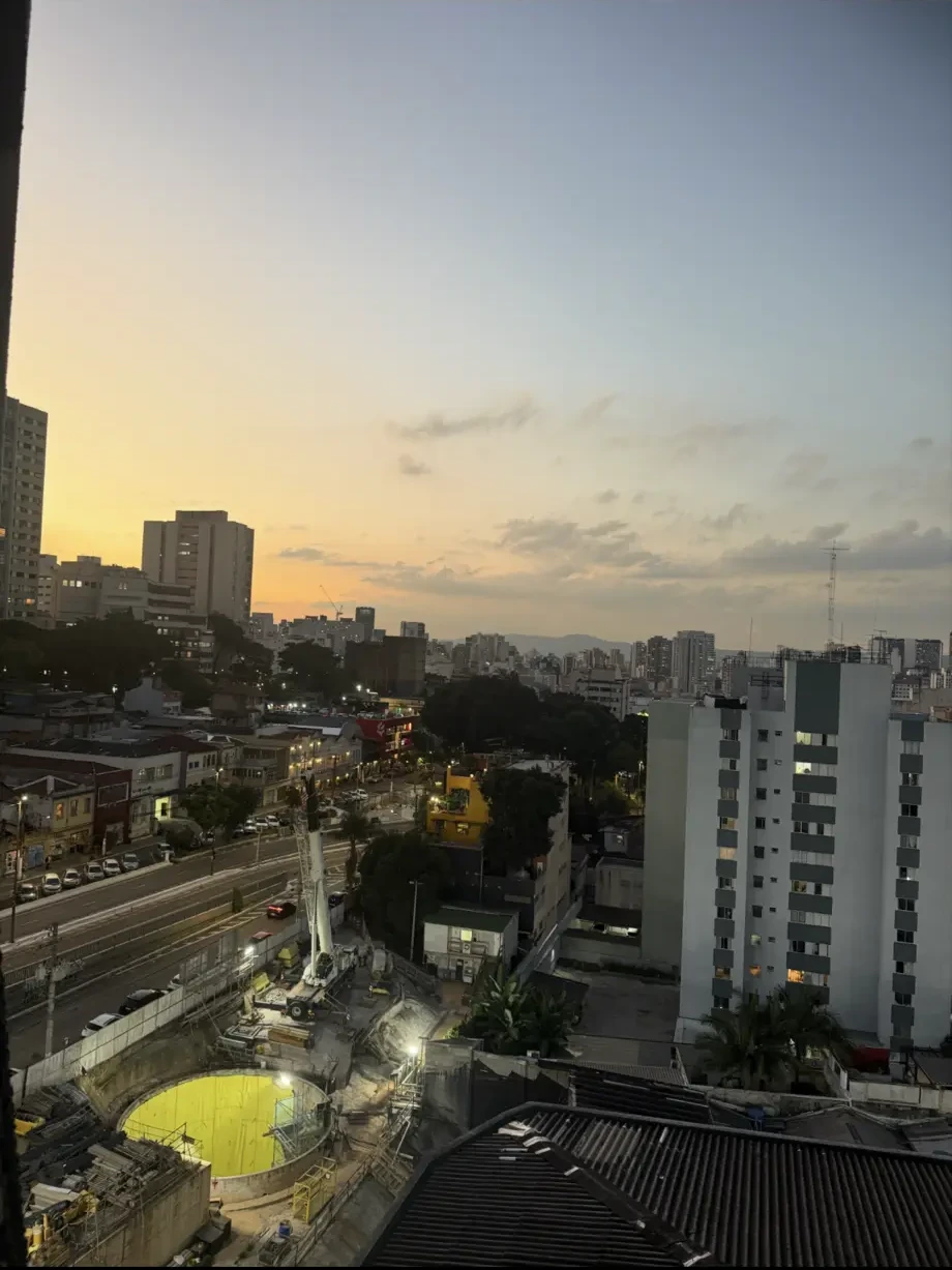
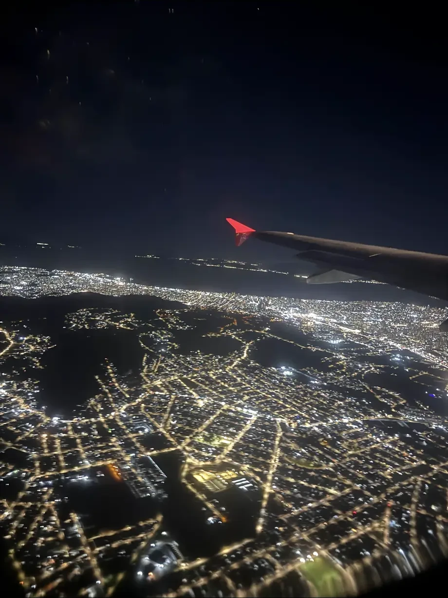
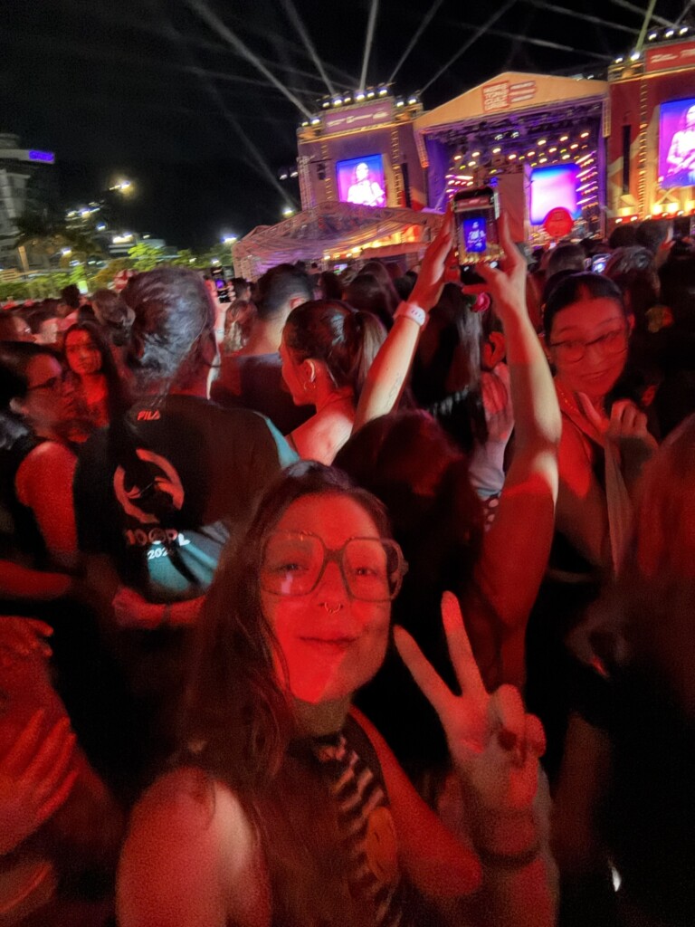
    Here’s just a few moments captured from my trip to Pipa, RN and São Paulo, SP; two wildly different destinations in Brazil. In Pipa, a good relaxing beach weekend with my dad. In São Paulo, an odyssey of a nonstop weekend where I saw more than sixteen concerts in one way or another.


    Creative fuel: My favorite Youtube videos recently

    A mix of video-essays and researches about topics I’m interested (mostly tech-related) plus some fun animations and songs/music related content too. I highly recommend them all!


    Creative fuel: More cool inspiration

    I’ve been surfing the internet old-school style – following links and rabbit-holes – more and more (to try and get away from the grasps of late-stage capitalism). Here are a few favorites I’ve stumbled upon. Have fun!

    Books, poetry and essays: plumbum/library

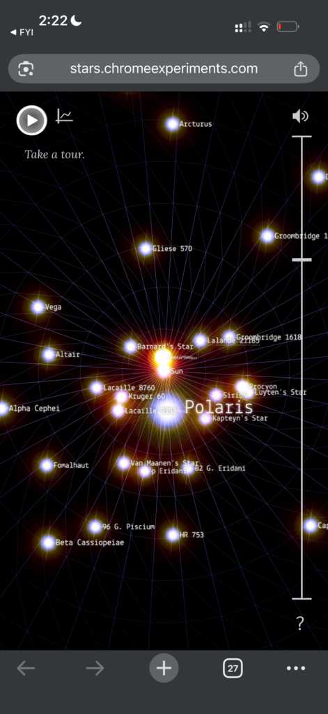
    Explore space: joshworth.com/pixelspace_solarsystem.html

    Philly-based cool-ass zine: philadelphiacitywide.com

    Medieval Beastiary: bestiary.ca/index.html


    Rather than tackling big ambitious projects, I’ve been enjoying the smaller, quieter kinds of creativity that make me want to keep me fueled, sane-ish and that feel right. (Of course there are always a few projects going on the back burner because that is the kinda-crazy I am, but taking it slow with my creative practice recently has been nice. I hope you are taking it easy too!)

    For now that’s it friends,

    Happy crafting! Stay safe & sane!

  • The Making of a “Crochete” – part 2: Crochet Fanny-Pack Process and Results

    The Making of a “Crochete” – part 2: Crochet Fanny-Pack Process and Results

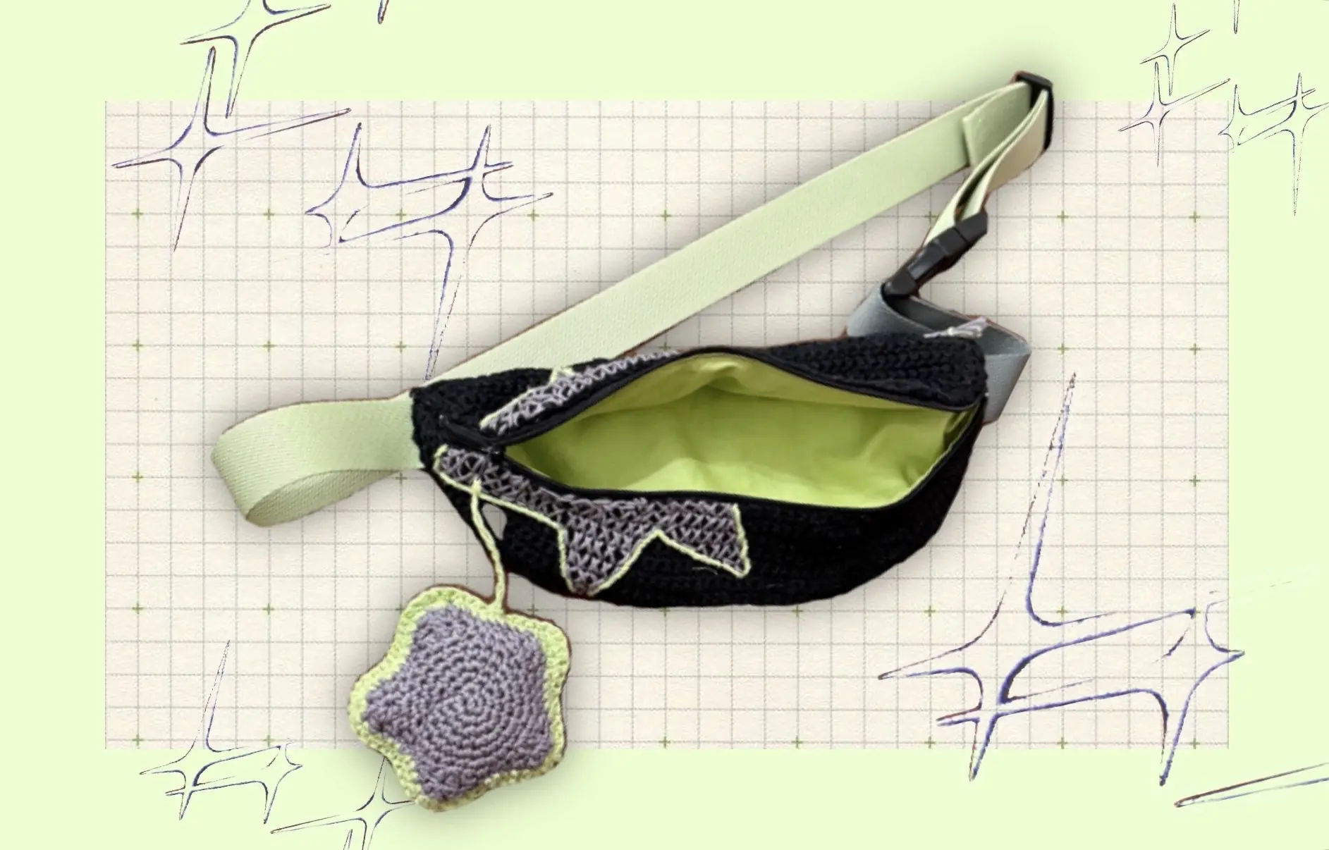
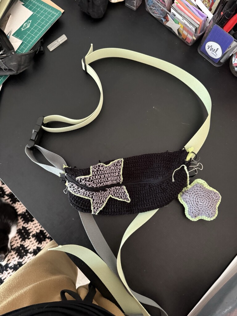
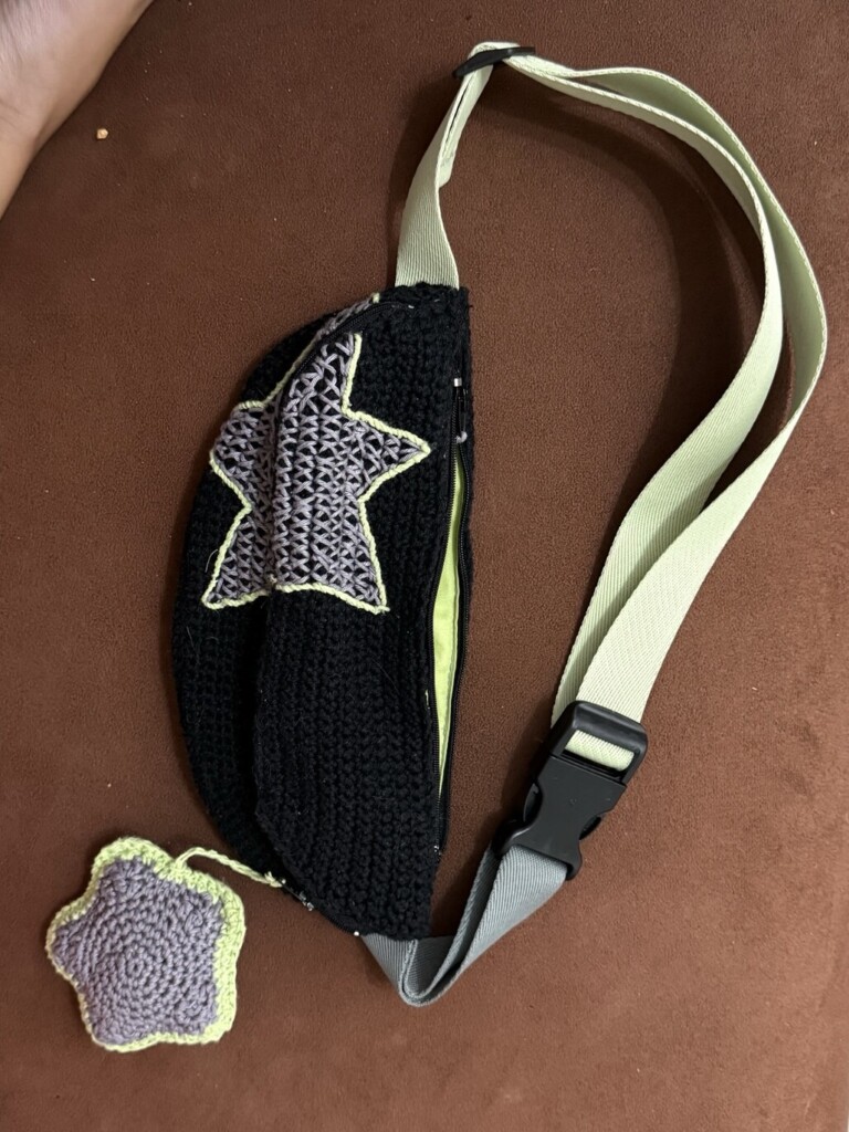
    -> This is the second post describing my process of creating a crochet fanny pack as a gift for my friend. Read Part 01 for context.

    Starting again with a clearer direction

    Starting the fanny pack the second time around was noticeably easier. I already had a better sense of what worked and what didn’t, which gave me more confidence to adjust the design instead of second-guessing every step.

    One of the biggest changes was the shape of the bag and the embroidery approach.

    In my first attempt, I tried a more squared shape, thinking it might be simpler and cuter in crochet. It didn’t work as expected—the result felt a bit awkward and, in my opinion, not very cohesive.

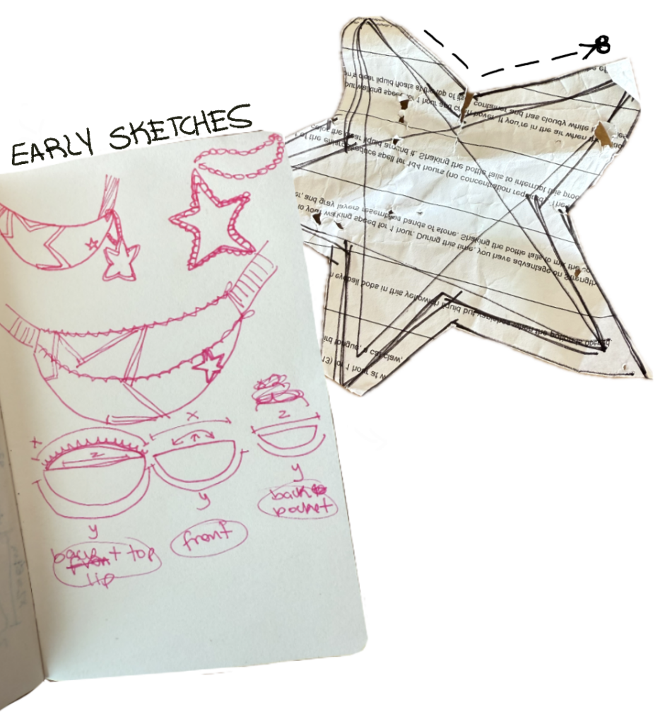
    So I went back to my original sketches and committed more closely to the initial design. It was more complex, but since I was starting over anyway, it felt like the right moment to improve the structure properly.

    And spoiler: it ended up much closer to what I wanted.

    Paper pattern and planning the structure

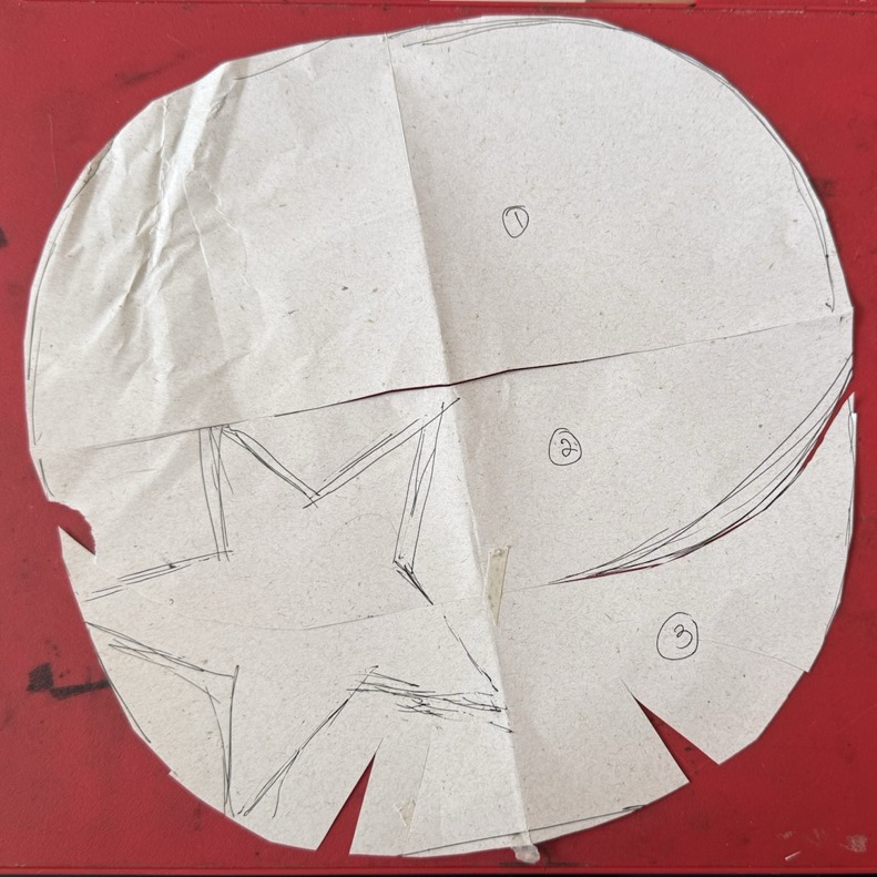
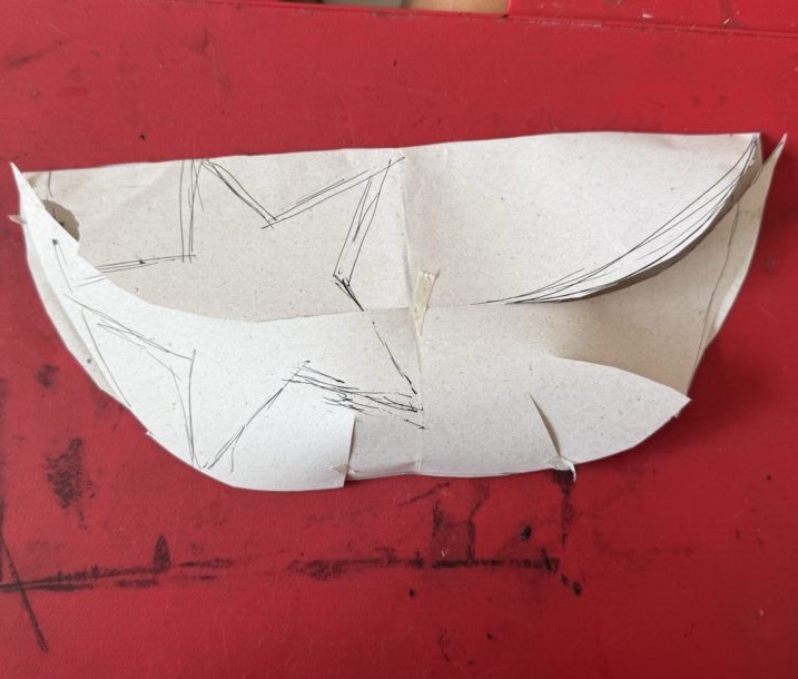
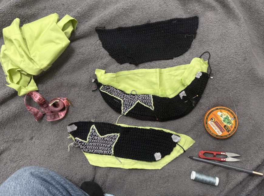
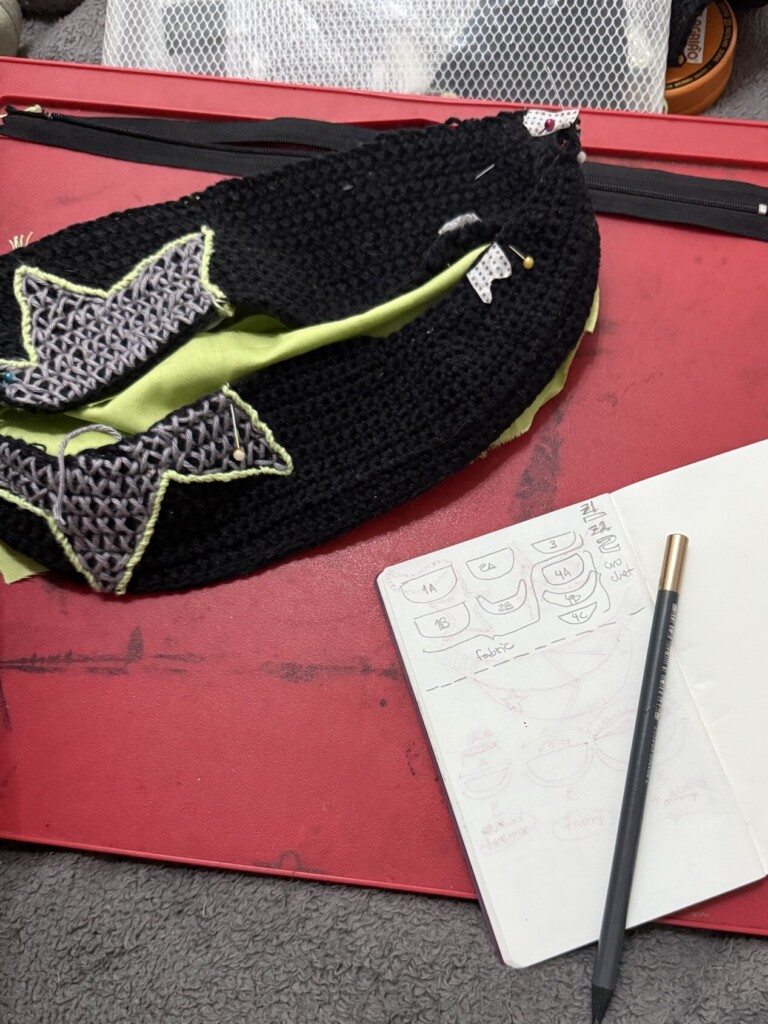
    My first step was to create a paper pattern of the updated bag shape.

    I did a bit of research and several paper mockups before arriving at a template that felt right. This became the base guide for the entire construction process.

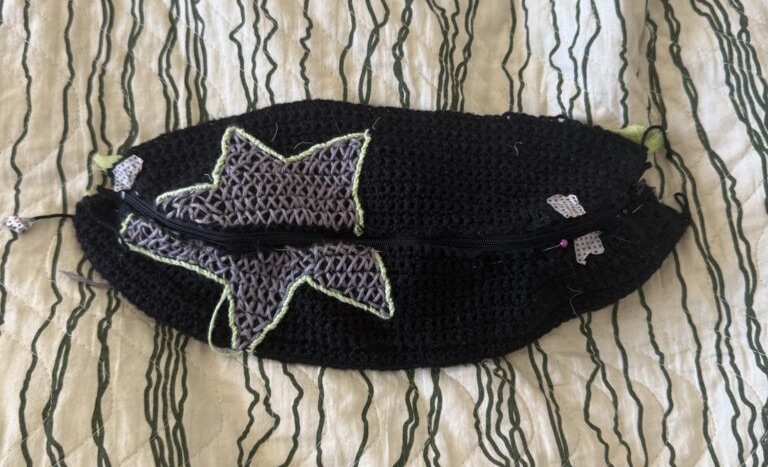
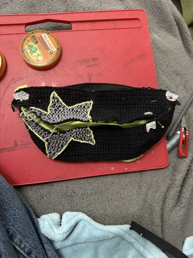
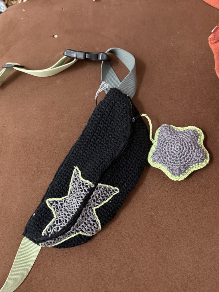
    I also added the star motif directly onto the template, so I could ensure the design would align continuously across the top and bottom panels of the bag.

    Crocheting the main structure

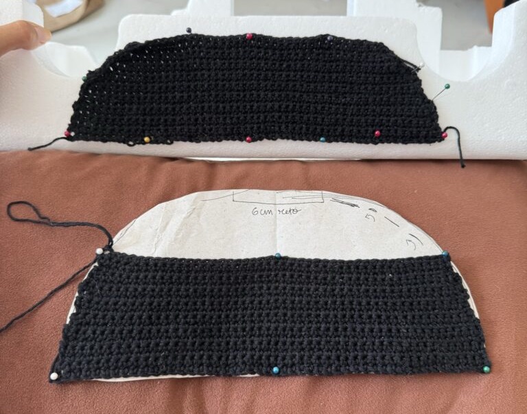
    With the template ready, I crocheted the three main pieces of the bag using it as a loose guide.

    Instead of following a strict pattern, I worked more intuitively—experimenting with increases and decreases until the pieces matched the intended shape.

    To help the structure form a 3D shape, I introduced subtle darts by decreasing stitches along the lower rows of the bottom panel. This helped the bag curve more naturally.

    The shaping wasn’t perfectly symmetrical, and the edges ended up slightly uneven due to the adjustments. My attempt to smooth them out didn’t fully fix this, but I knew it would be mostly hidden once assembled.

    Testing the embroidery technique

    Next came the more delicate part: the star embroidery.

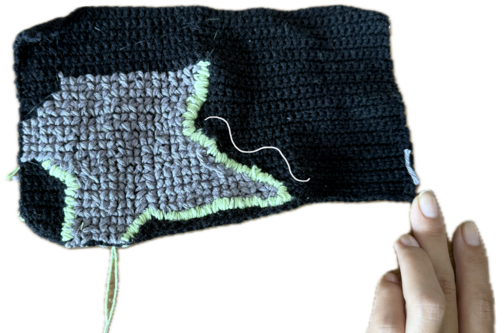
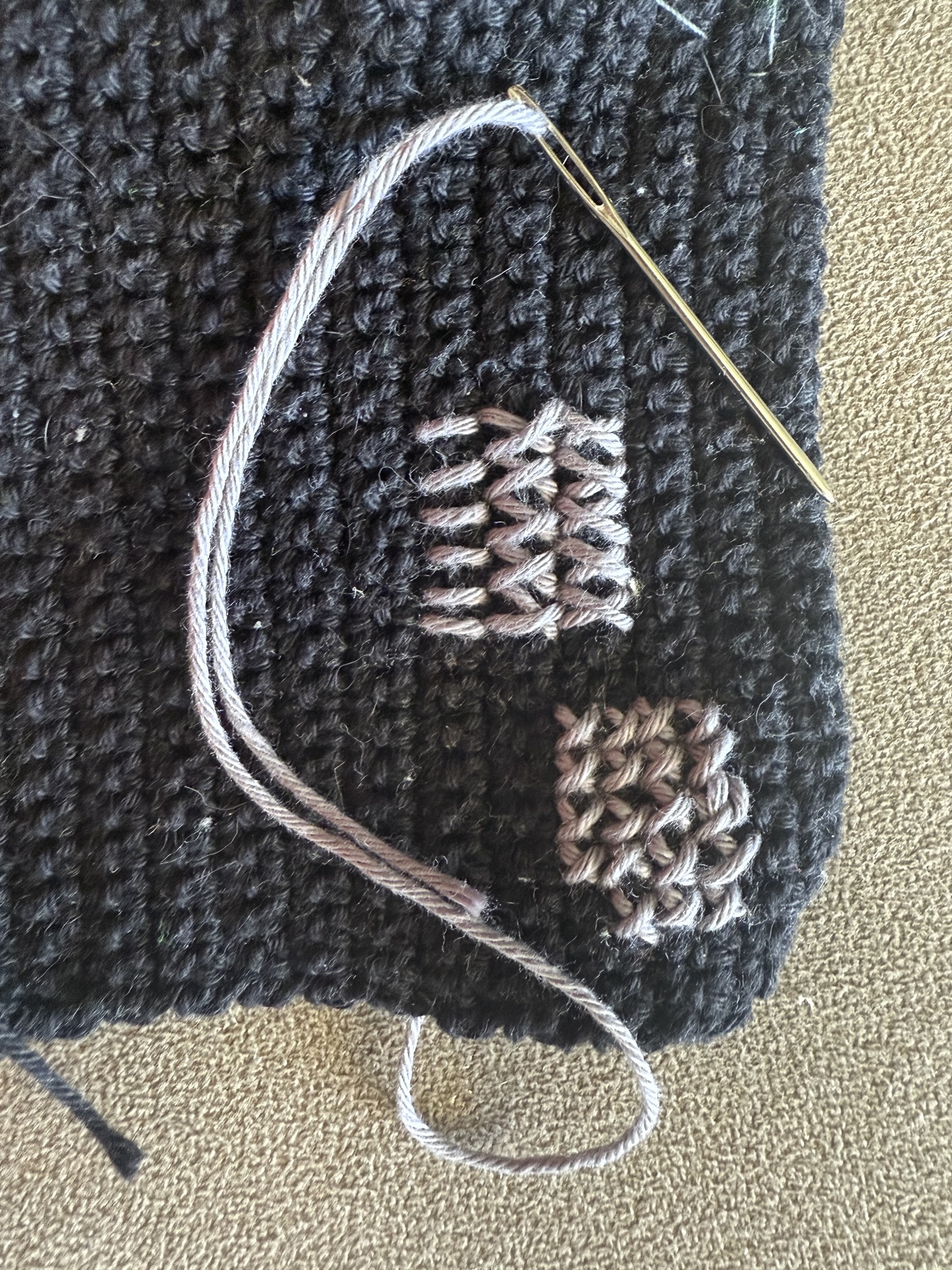
    Before committing, I tested different stitch options using leftover crochet samples from earlier experiments.

    From these tests, I found that:

    • a larger cross-stitch (1 crochet row high) worked best
    • using a single thread gave the cleanest result

    I was initially worried this might look patchy or semi-transparent, but I decided to trust the process and see how it would read once fully filled in.

    Mapping the star and stitching method

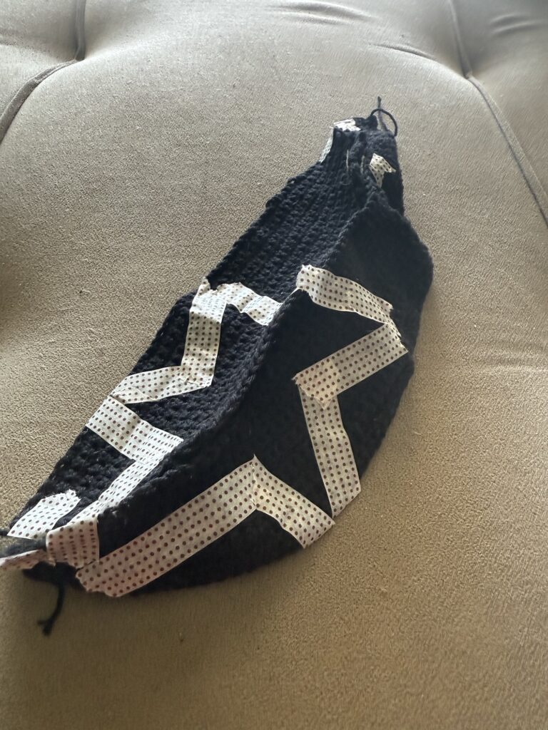
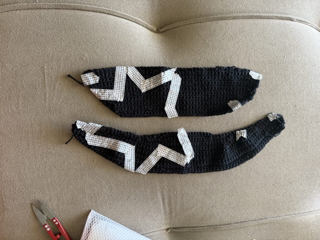
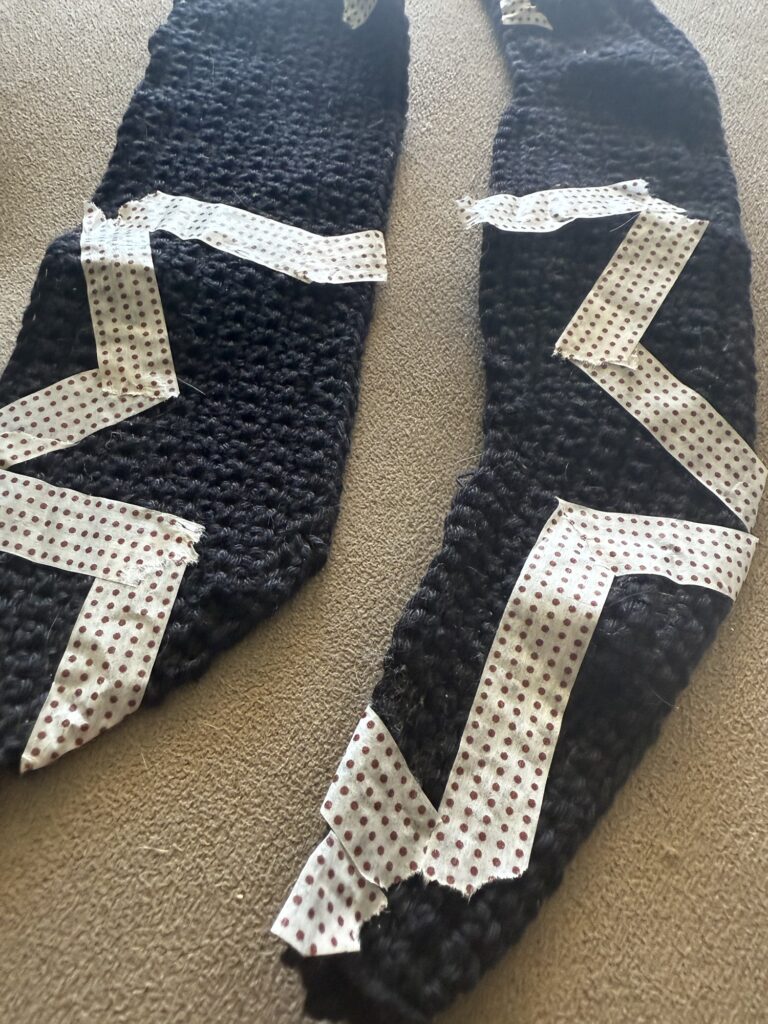
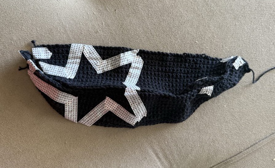
    To keep the star geometry precise, I used the same method I developed in the first trial: I blocked out the star shape using tape and then embroidered inside it.

    This technique worked well for maintaining clean edges, especially for geometric designs.

    I also added extra alignment tape across key seam points where the crochet panels would meet, ensuring everything lined up correctly before stitching.

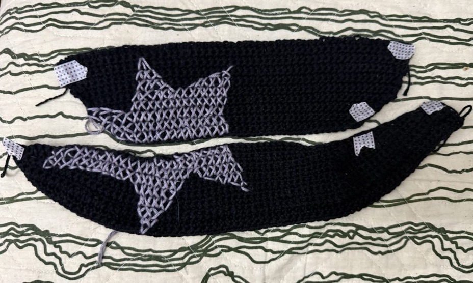
    Embroidering the final star design

    With everything aligned, I completed the embroidery.

    As the star took shape, I added a few extra contour lines—especially at the points—to sharpen the geometry and reinforce the edges.

    I also used a simple (slightly improvised) twist stitch around parts of the outline to give it more definition without making it visually heavy.

    At first, I wasn’t fully sure about this choice, but it grew on me as the piece came together.

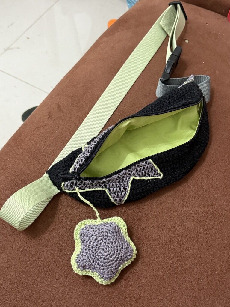
    Constructing the lining and inner structure

    Once the crochet exterior was complete, I moved on to the lining.

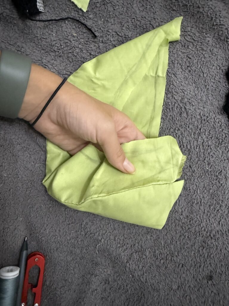
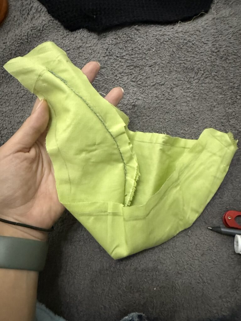
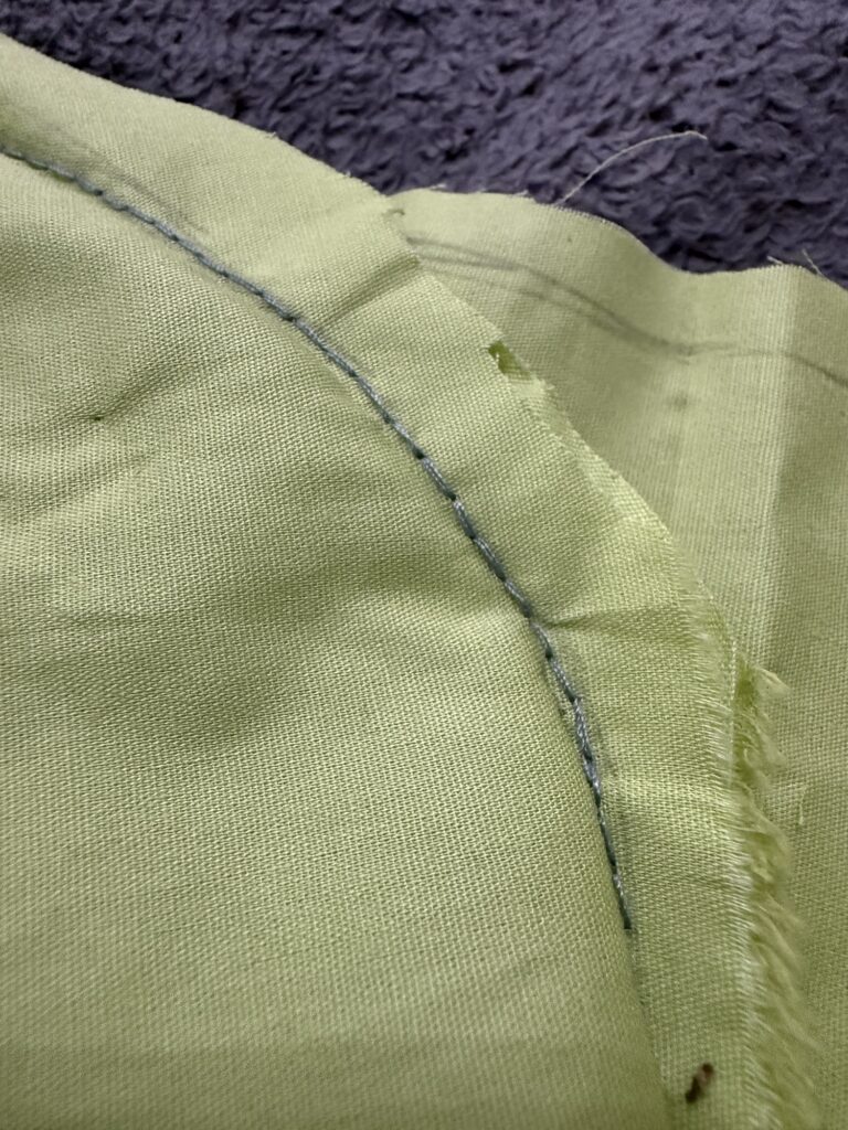
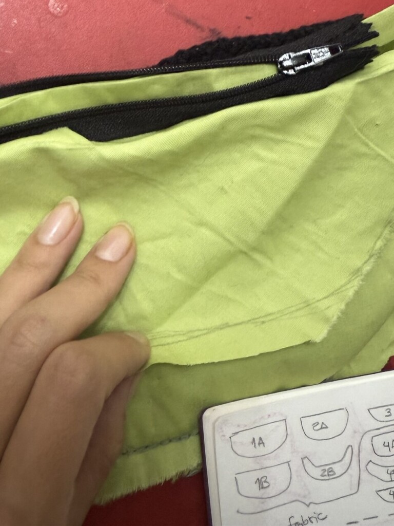
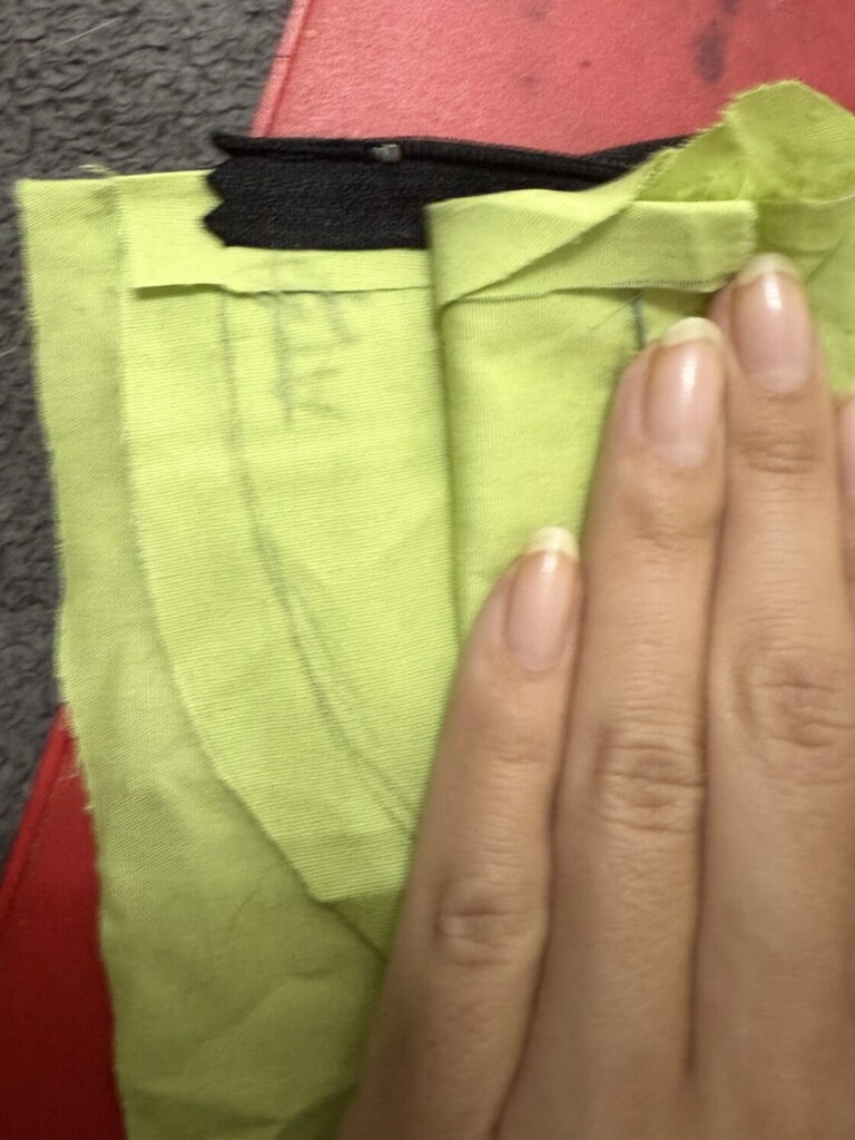
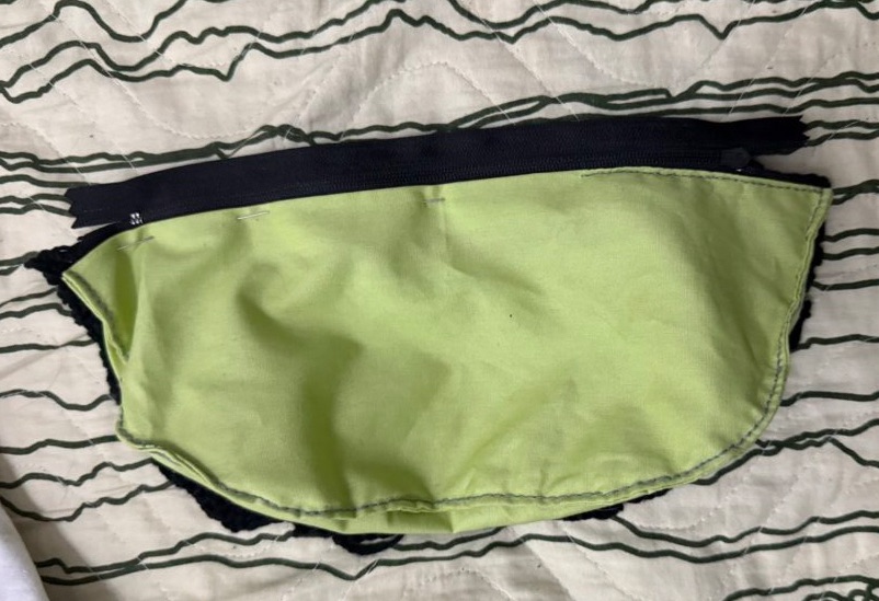
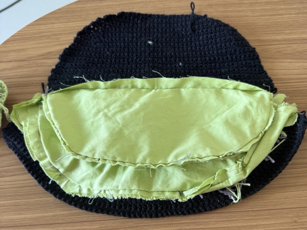
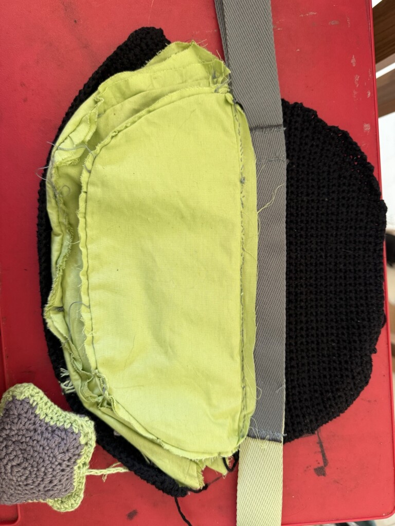
    Using the same paper template, I cut the fabric pieces and began hand-sewing the inner structure.

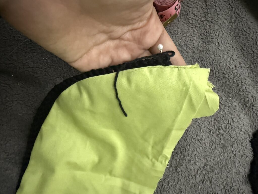
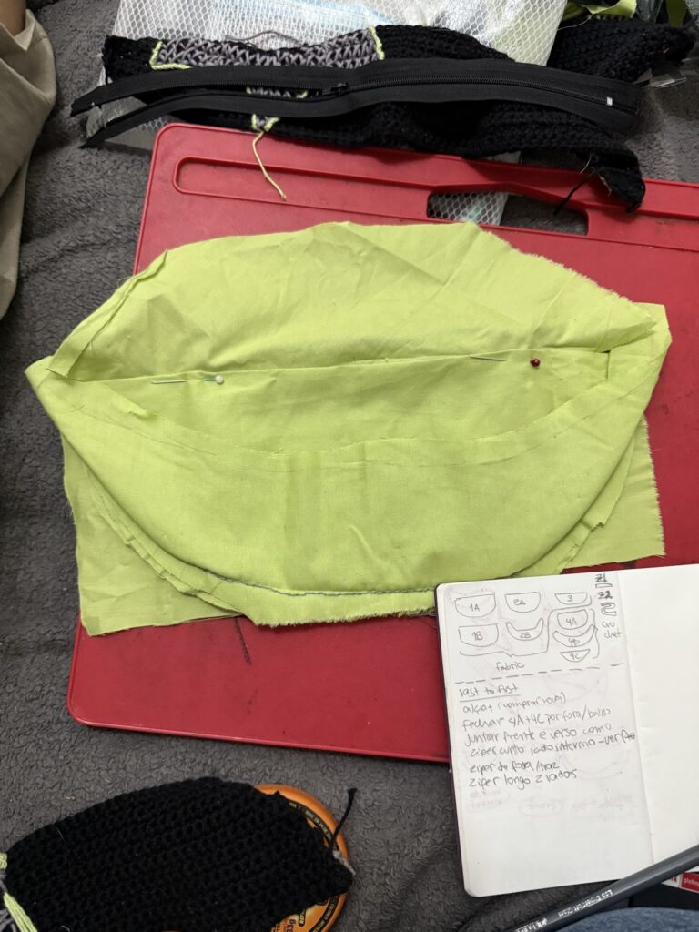
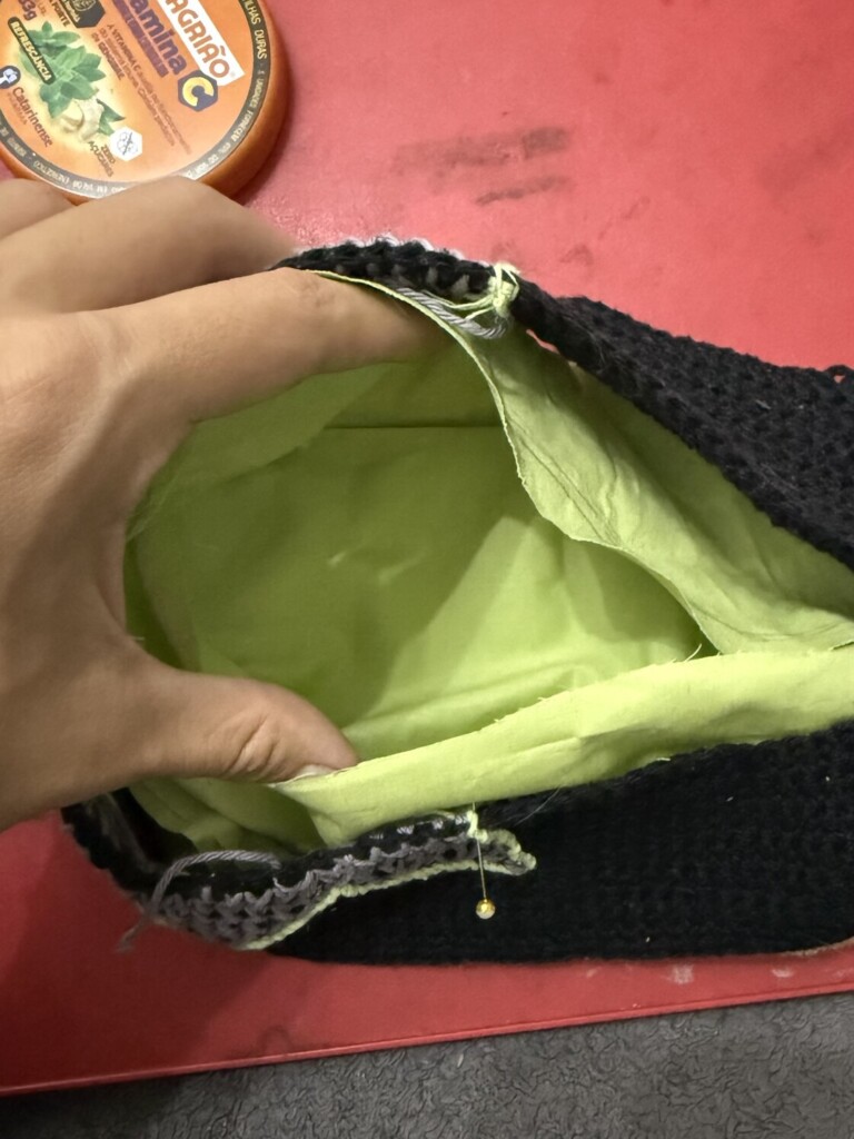
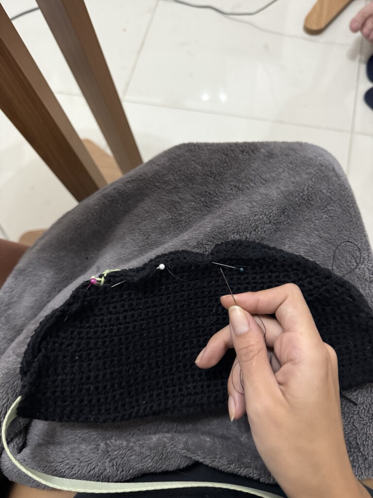
    Before sewing everything permanently, I pinned the entire bag together first. This helped me understand the order of operations more clearly.

    Once I had a working pinned version, I deconstructed it step-by-step and wrote down the assembly order, then rebuilt it in reverse.

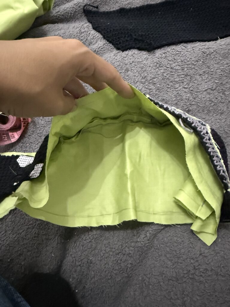
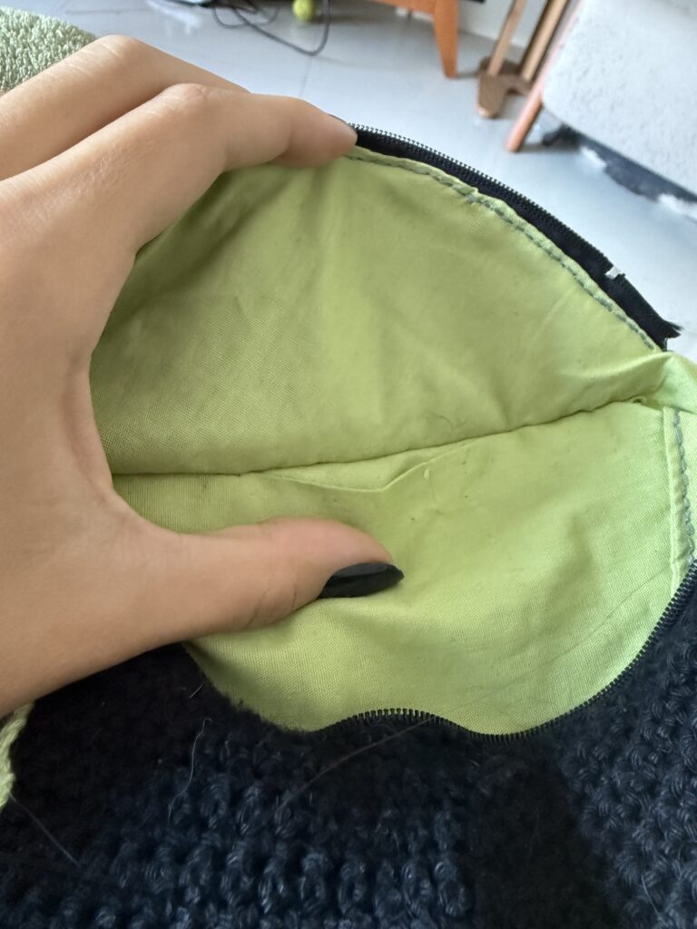
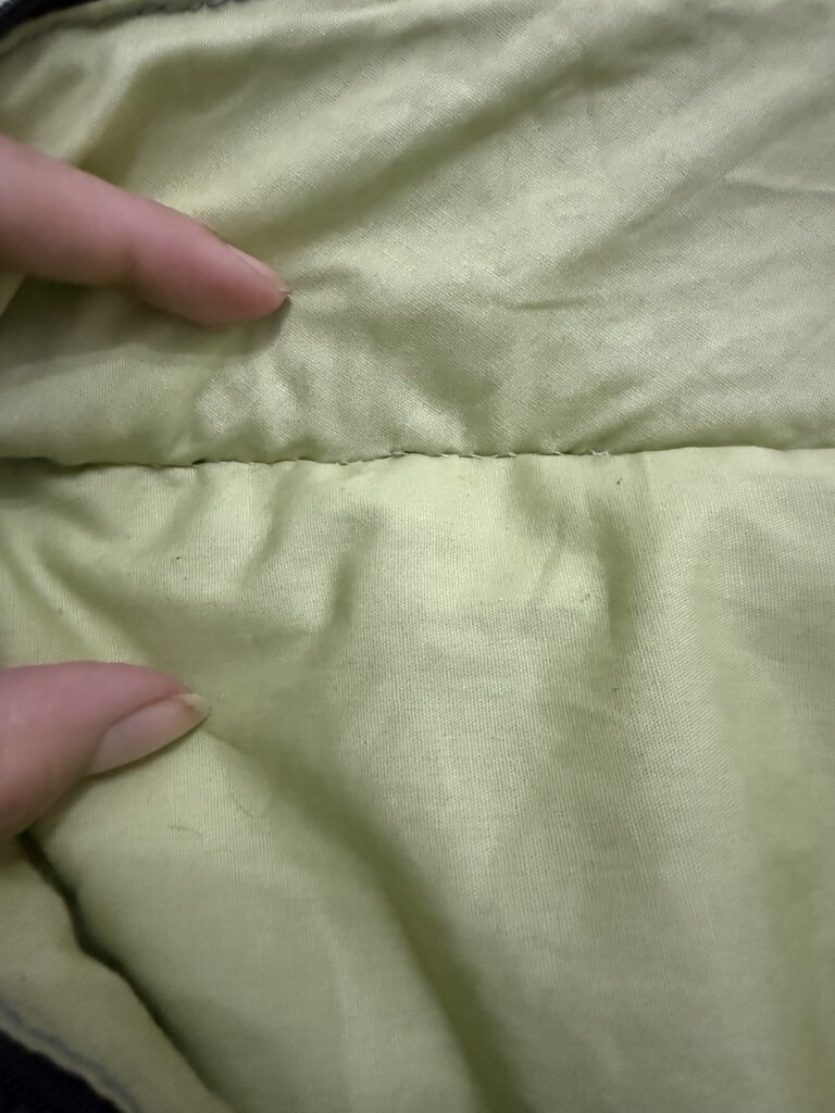
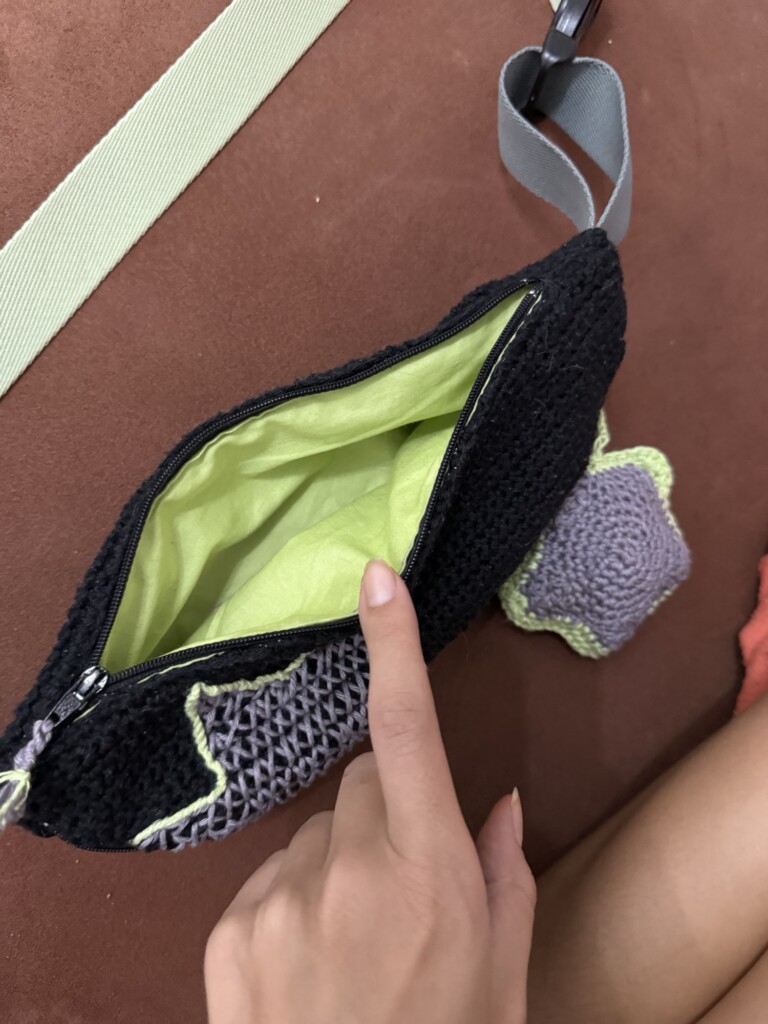
    The first step was sewing the bottom edges of both lining pieces, forming the internal pocket structure.

    Zippers and internal assembly

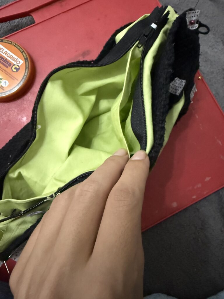
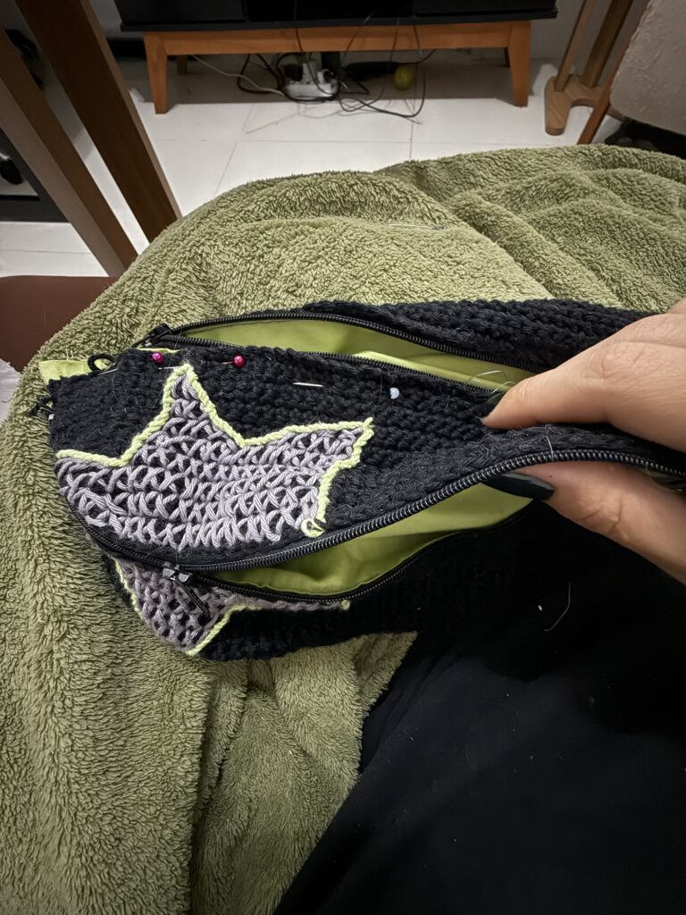
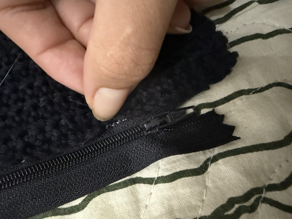
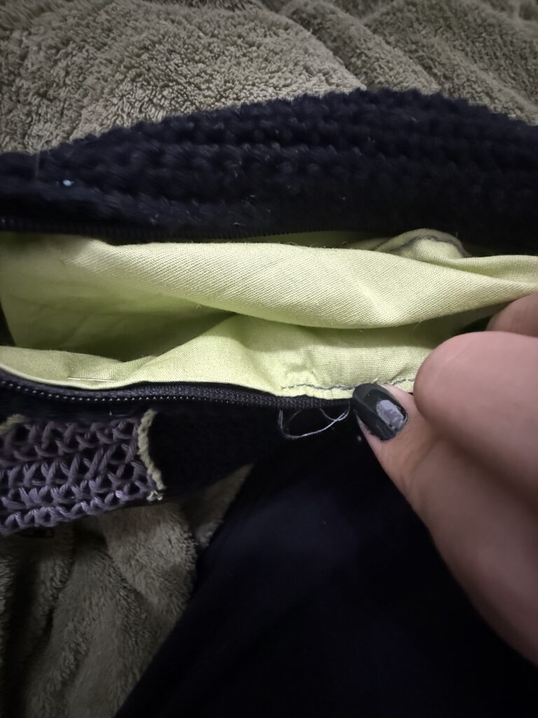
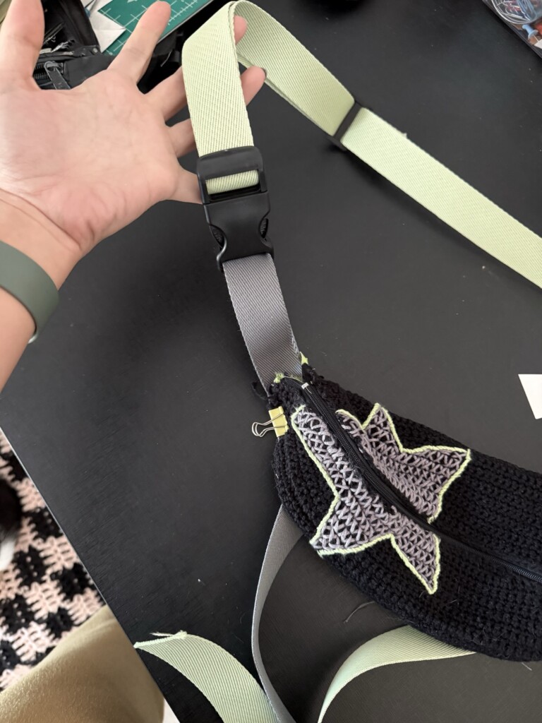
    Next, I installed the zippers.

    For the front pocket:

    • one side of the zipper was sandwiched between the crochet front and the lining
    • the other side connected to the matching lining piece

    The alignment of the star motif had to match precisely when zipped, which required careful adjustment and re-sewing in some areas.

    The back zipper followed a similar structure, connecting the top crochet panel and the back lining while maintaining a clean internal pocket separation.

    A key challenge here was ensuring there were no gaps between compartments once fully assembled.

    Straps and reinforcement

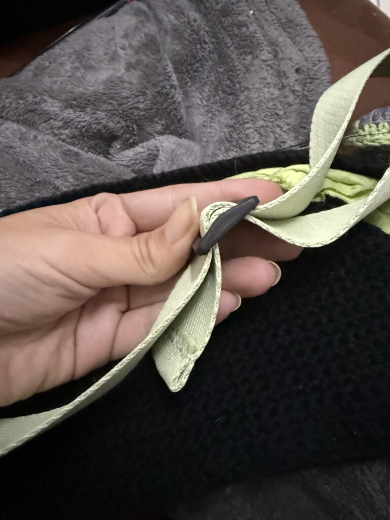
    Attaching the straps was one of the more structurally important steps.

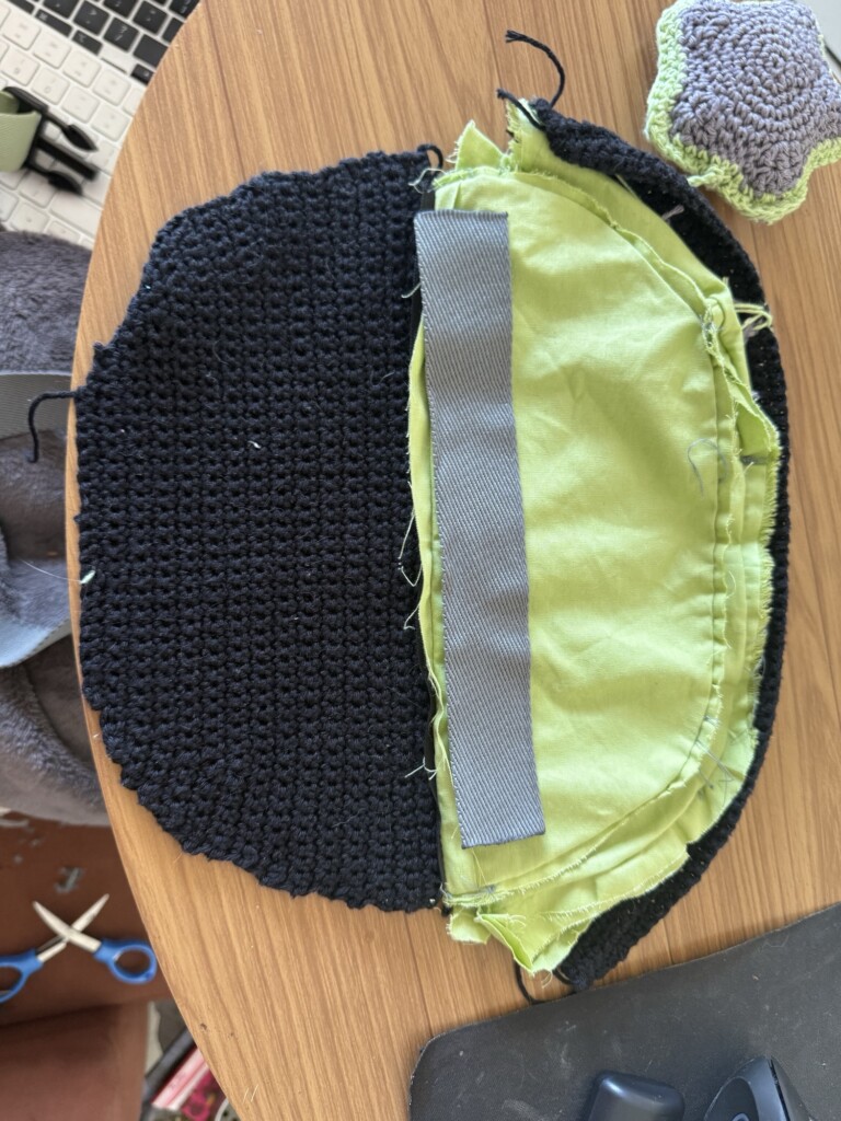
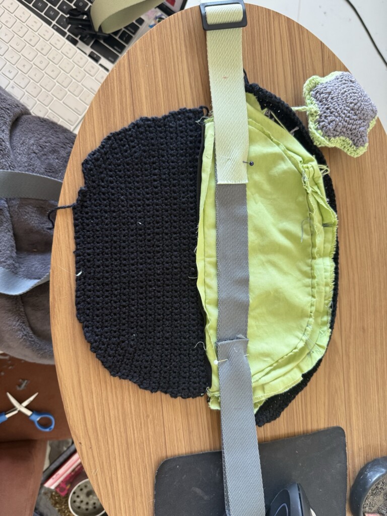
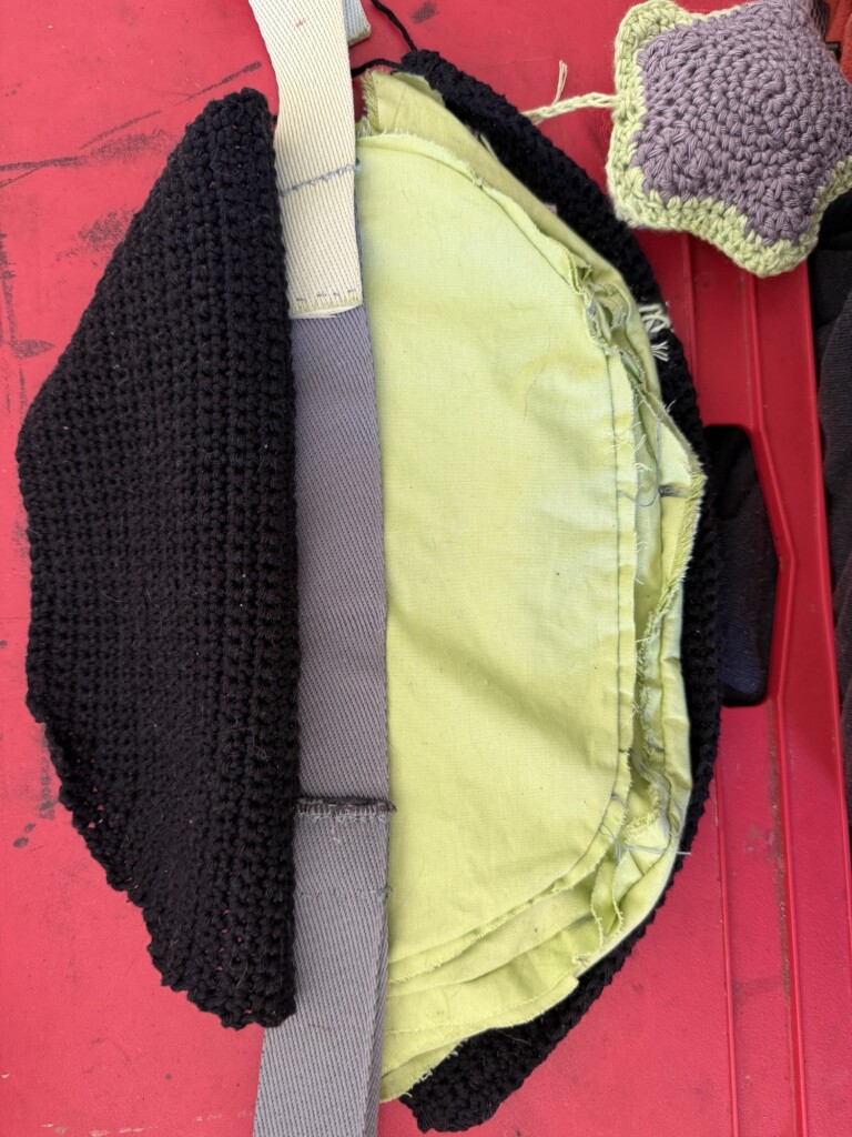
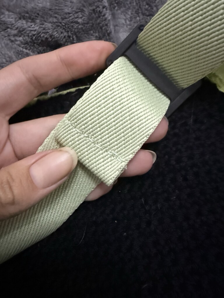
    Because crochet and cotton fabric alone wouldn’t provide enough strength, I reinforced the strap system by anchoring it through the middle structural layer of the bag.

    I cut a reinforcing fabric strip slightly shorter than the length of the bag and stitched it securely into the central structure between the two inner pockets.

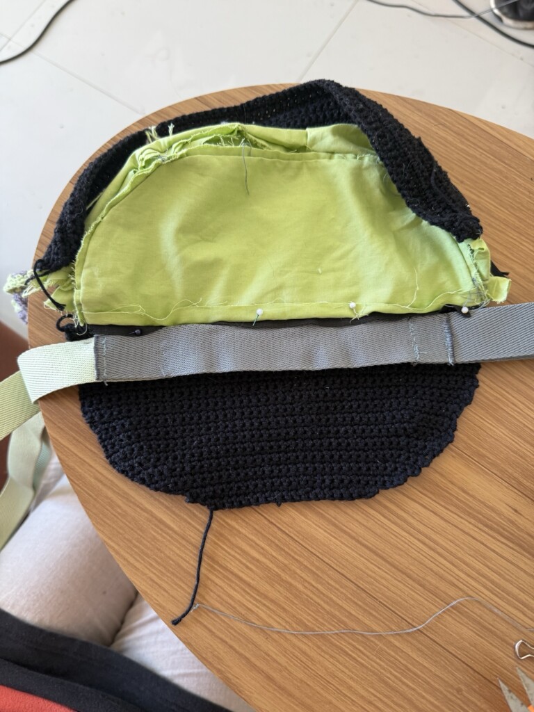
    The straps were then attached to this reinforced section, ensuring that weight would be distributed through the stronger internal structure rather than just the crochet or zipper seams.

    This helped stabilize the entire bag and improved durability significantly.

    Closing the structure

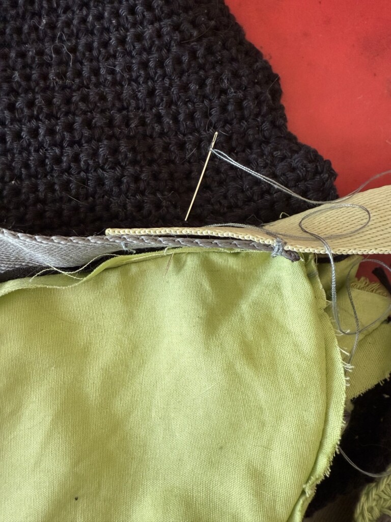
    The crochet panels were then sewn together at the bottom using strong black thread and reinforced stitching.

    This step enclosed the internal structure and locked the straps into place.

    At this point, the bag finally started to feel like a finished object rather than separate components.

    Final details: strap sizing and charm

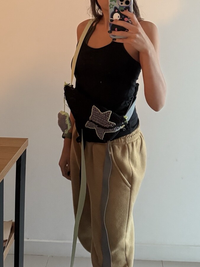
    After assembling the main structure, I adjusted and tested the strap length to ensure proper fit and comfort before final stitching.

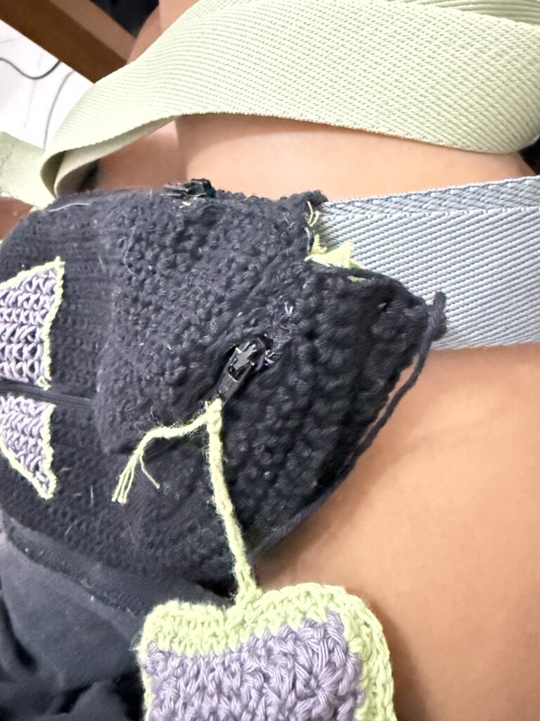
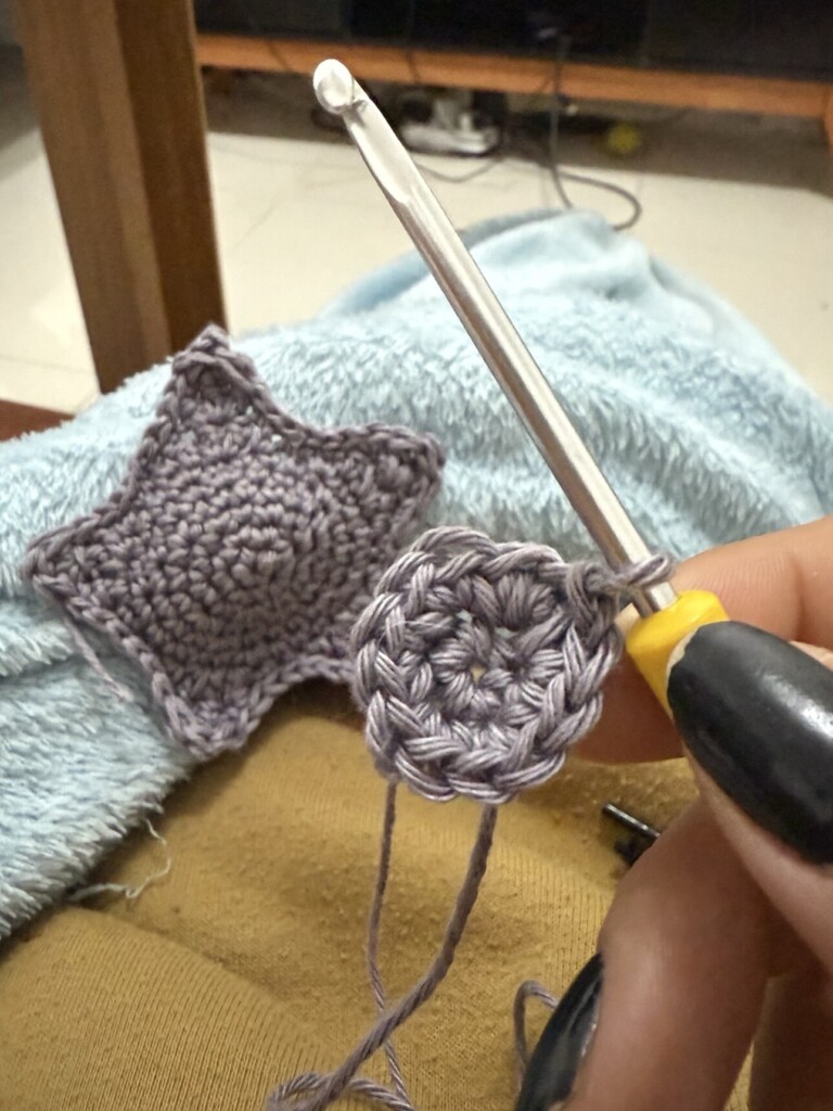
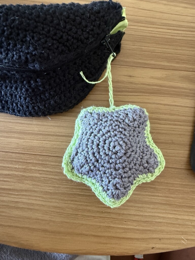
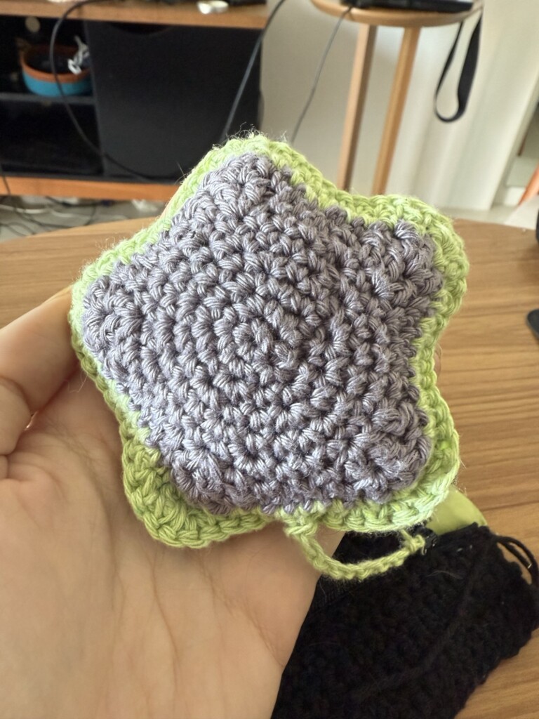
    Finally, I created a small star charm to match the main design.

    I crocheted it freestyle, made two matching star shapes, stuffed them lightly, and stitched them together. I added a small chain to attach it to the zipper pull.

    And that is how I created this crochet fanny pack!

    It came out both cute and functional, and I’m really happy with the final result. If I were to make one more adjustment, I would probably try to make the embroidered star a bit more filled in, closer to the look of my first trial. Perhaps adding an extra layer of stitching would help create a more solid block of color. That said, I don’t mind the slightly patchy look—it adds to the handmade character of the piece.

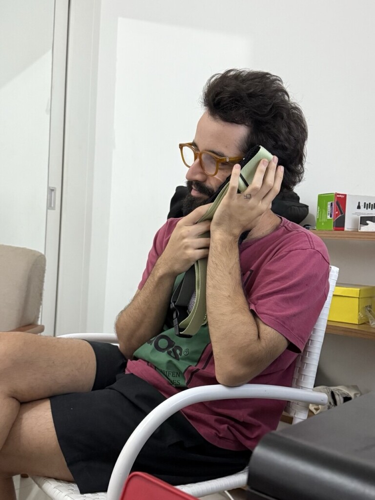
    I actually finished this project several months ago, and my friend Luiz has been wearing it almost nonstop ever since. It has become part of his everyday look, which is probably the biggest compliment a handmade gift can receive. The bag has held up remarkably well so far. The only repair it has needed was reattaching the star charm, along with the expected wear and slight matting that comes from regular use. I was especially happy to see that the interior structure is still intact and that the bag has proven to be as durable as I hoped when designing it.

    This post took me a while to put together because of how complex the project was. Some parts of the construction—especially attaching the zippers and explaining how all the layers fit together—are much easier to do than they are to describe. I hope this write-up is clear enough to be useful to anyone working on a similar project.

    Looking back, I think some of the strongest ideas in this design were the overall shape of the bag and the way I reinforced the straps and zipper area to improve durability. If you decide to try any of these ideas in your own projects, I would love to see the results.

    Until next time, happy crafting!

  • Woodblock Experiments: the Results

    Woodblock Experiments: the Results

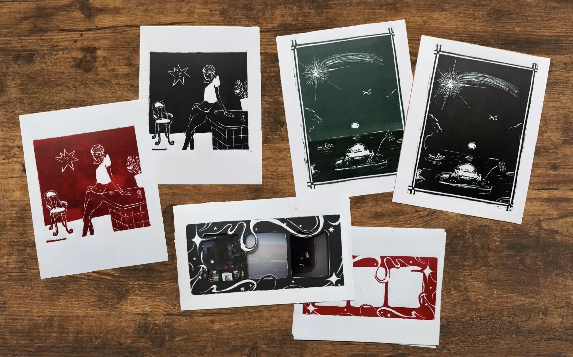
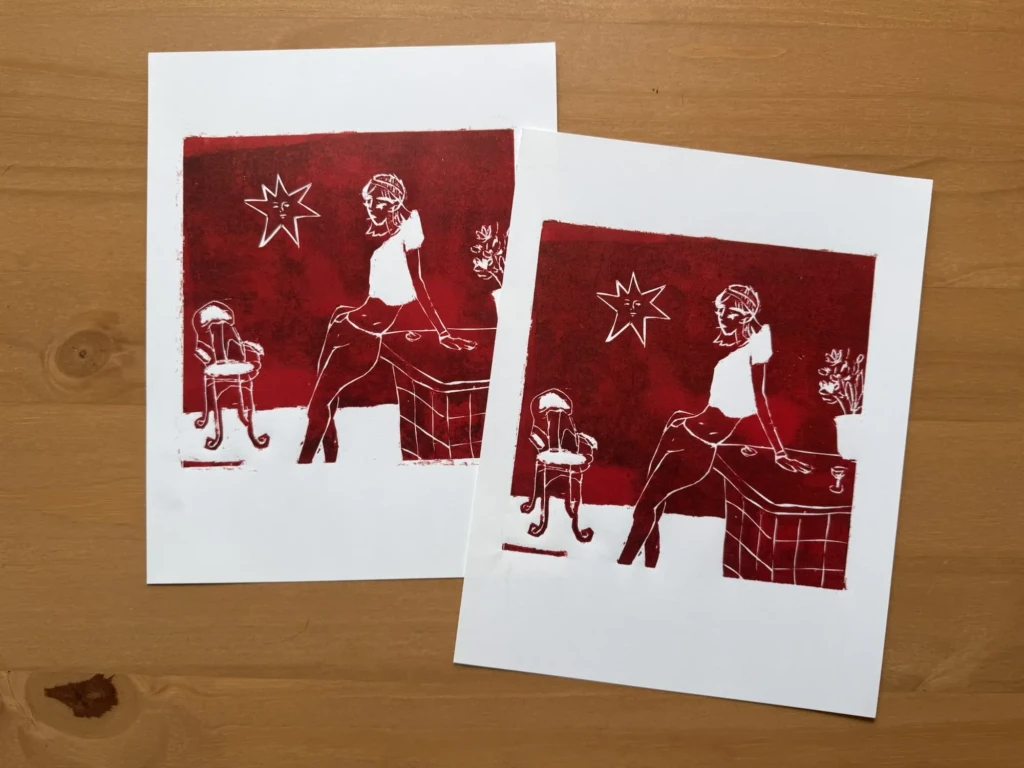
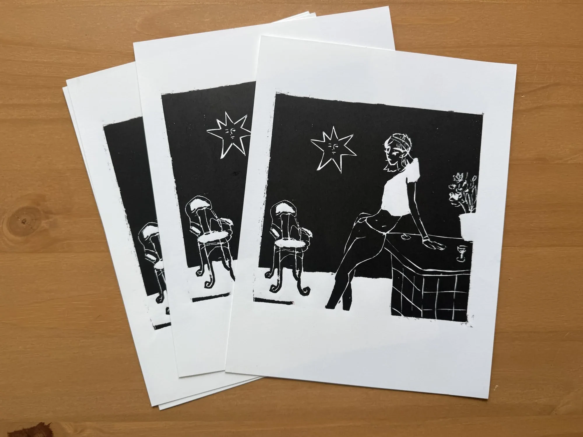
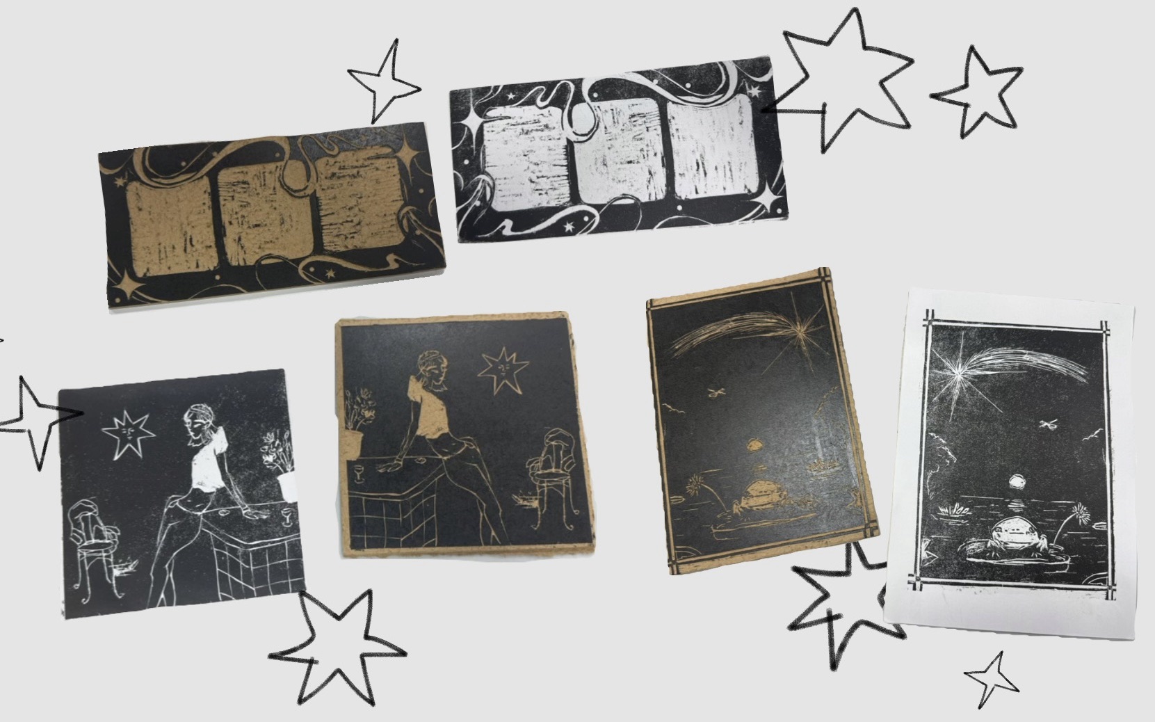
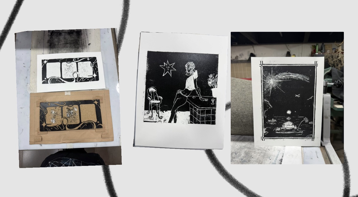
    After a couple more weeks of work, I’m finally done with at least the first batch of prints I’ve been working on. I’m really happy with the resulting four series, plus an interesting experiment that I think still has more potential to explore in the future.

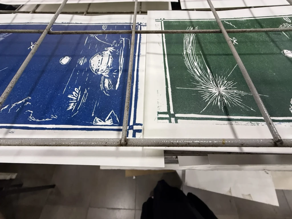
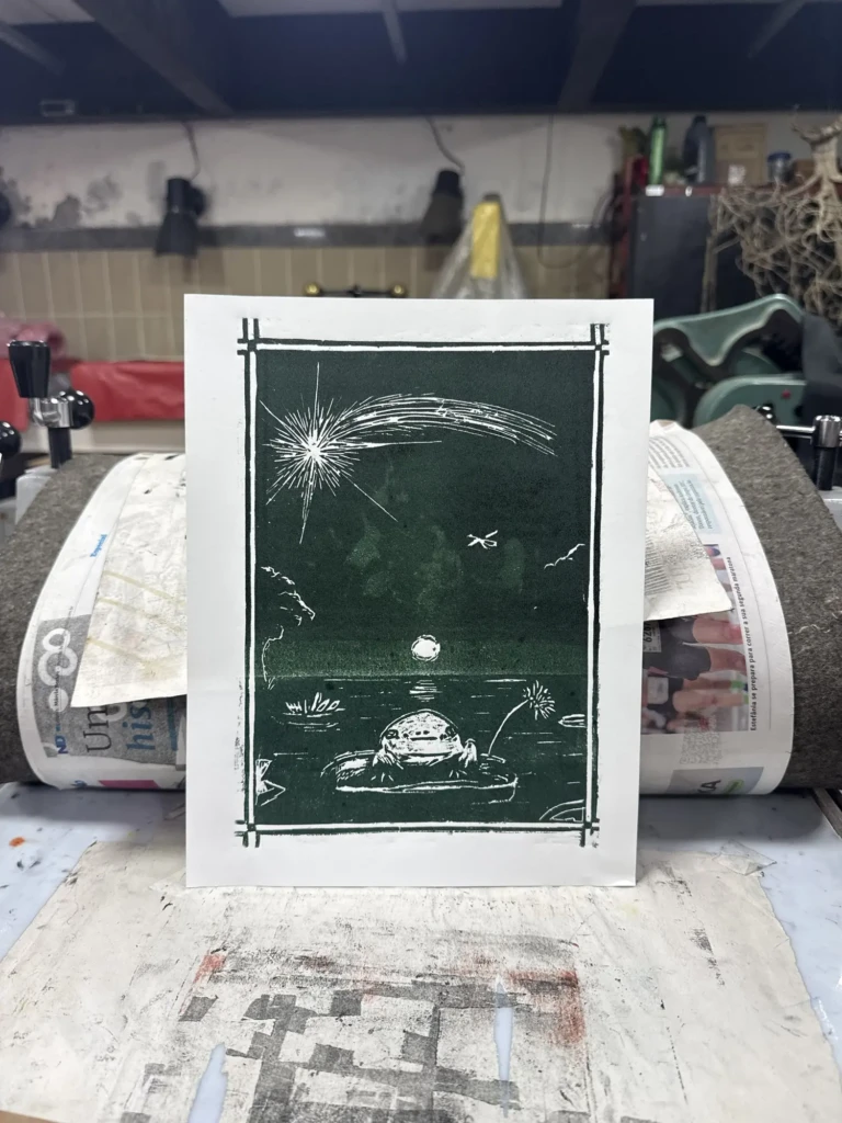
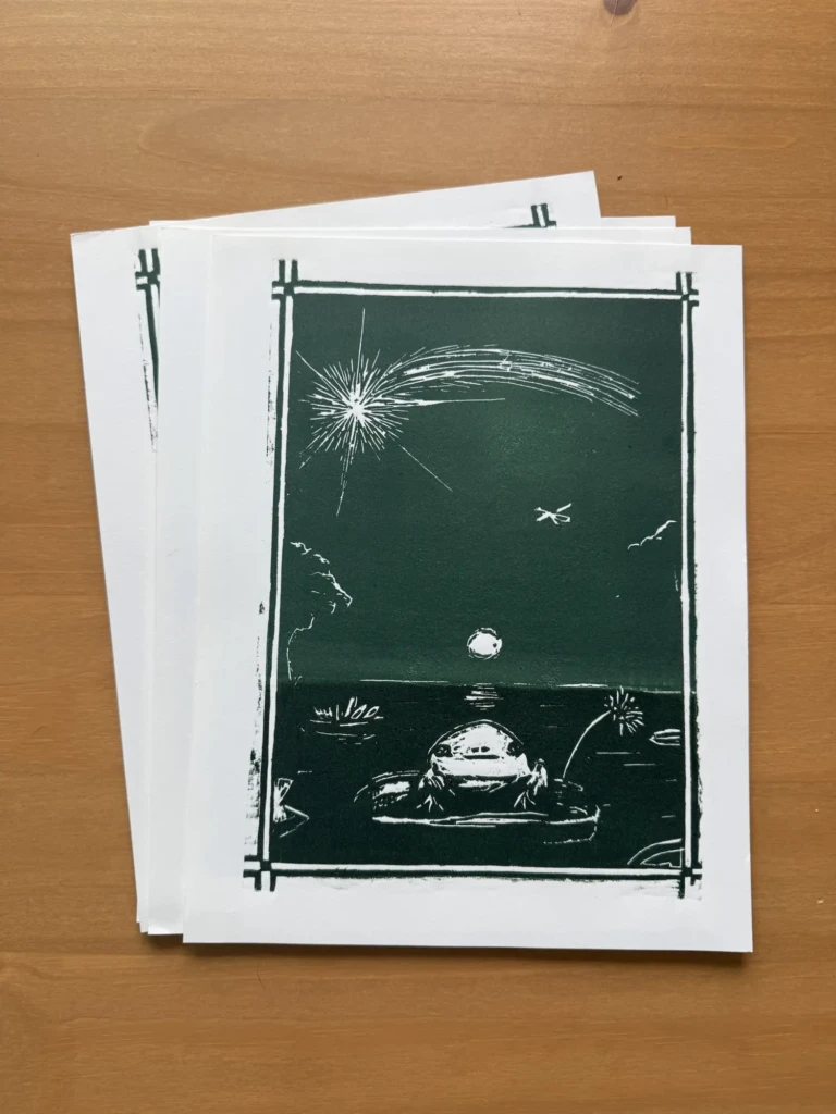
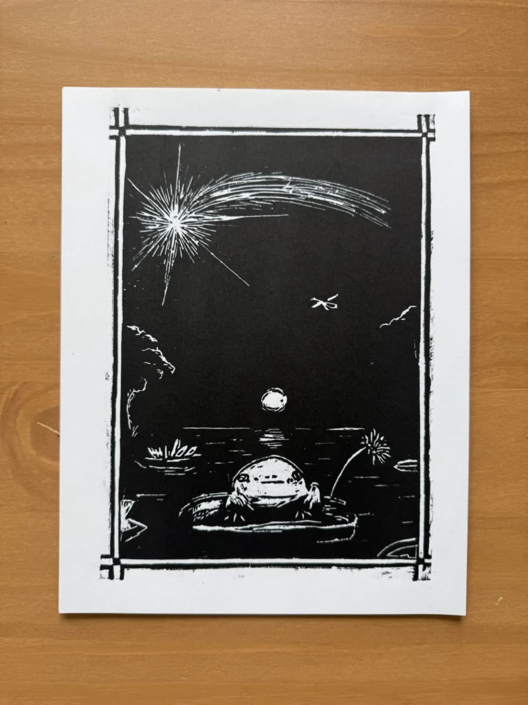
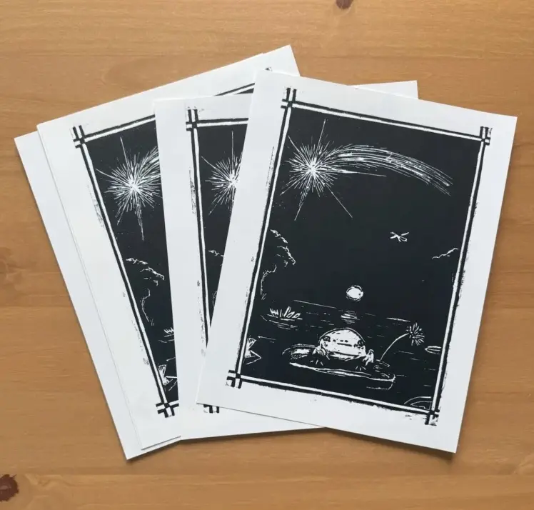
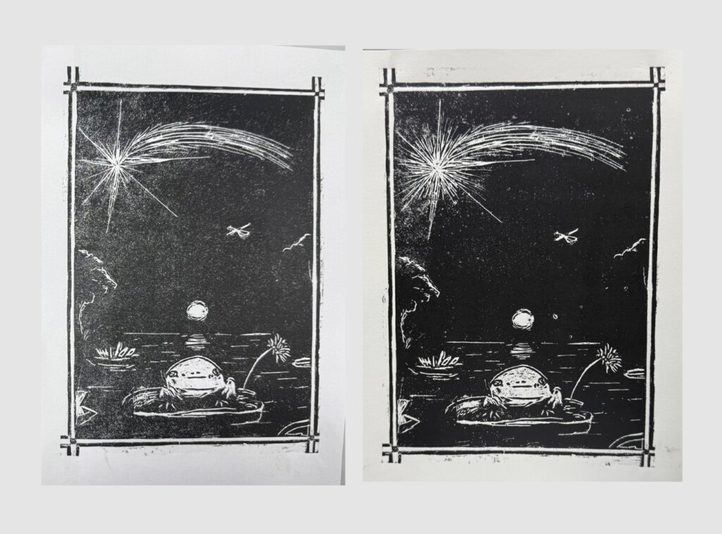
    Enchanted Night – the Froggy print

    I never took this piece too seriously. It started as a sketch and a test piece for an exhibition a couple of years ago that ultimately didn’t go anywhere. However, whenever I showed it to friends, they seemed surprisingly amused and drawn to it, so I decided to go ahead and finish the design.

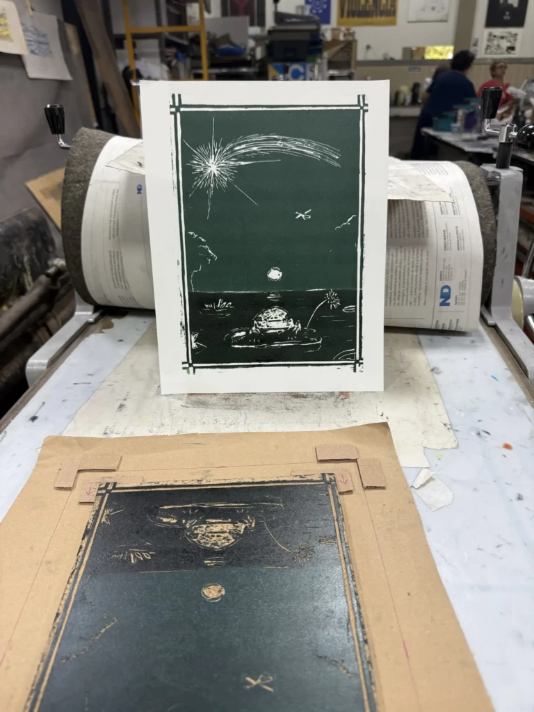
    I’m really happy with how it turned out, especially the second series of multicolored prints. Here are some process pictures from several studio visits. Thankfully, I didn’t have to do any further cleanup on the design after the long cycle of test prints and adjustments described in my last studio log. You can read more about that process here, including all the ups and downs that got these designs to where they are now.

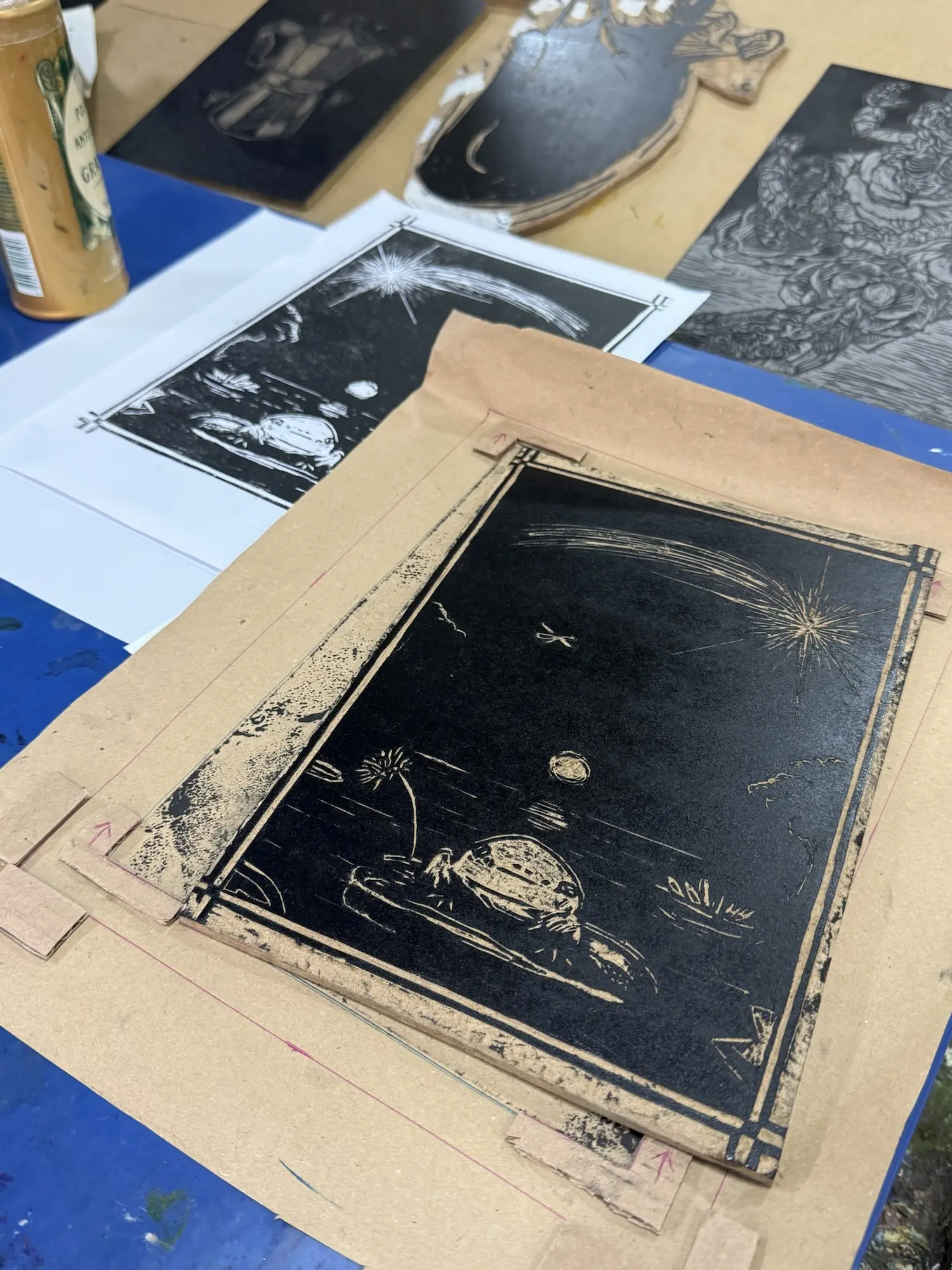
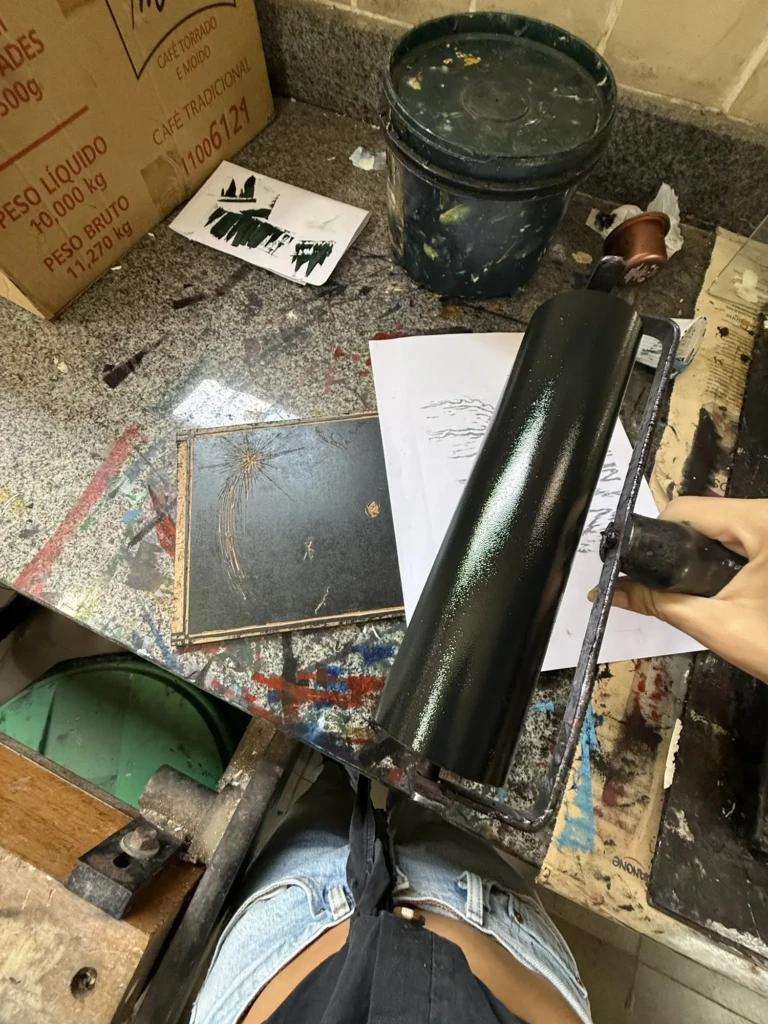
    To achieve these split-color prints, I had to go through quite a bit of trial and error. My first attempt involved using a sheet of paper to mask half of the block while inking, but the results weren’t very clean. Once the masking paper touched the inked surface, it would leave behind subtle textures and inconsistencies, even if I rolled over the area again afterward.

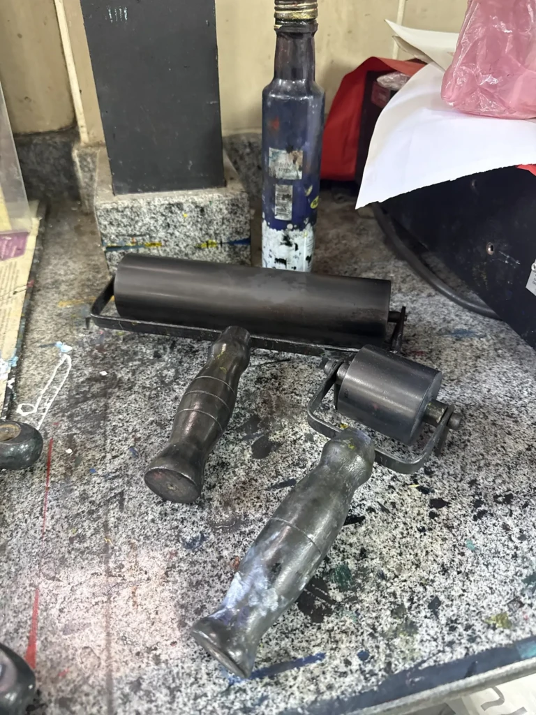
    The best results came from simply being very careful and following the dividing line with the edge of the brayer. It took a steady hand and several failed prints, but the color separation ended up much cleaner that way.

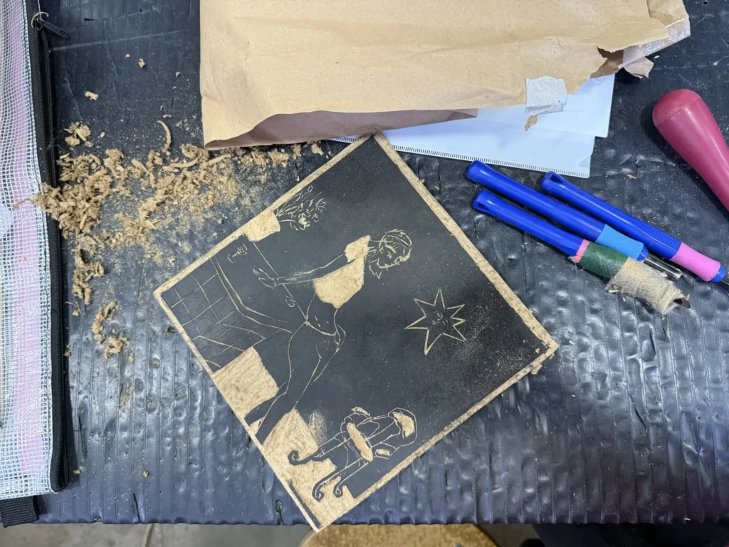
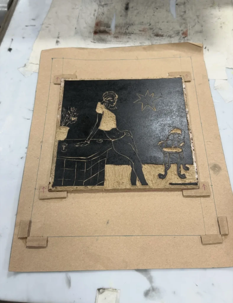
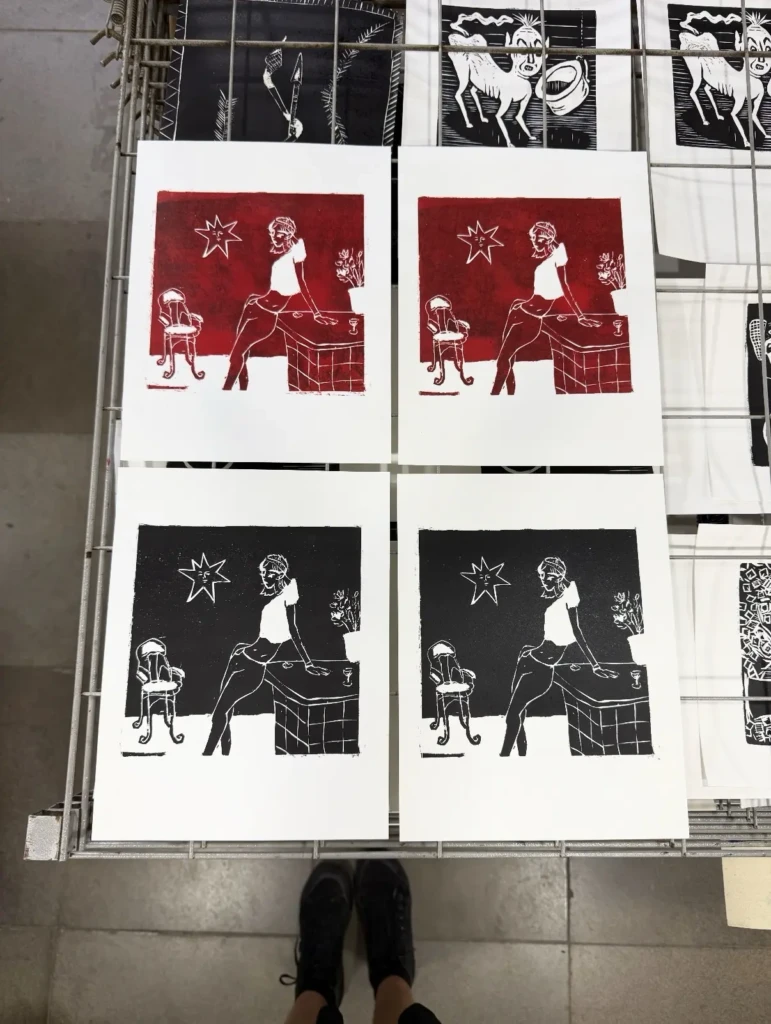
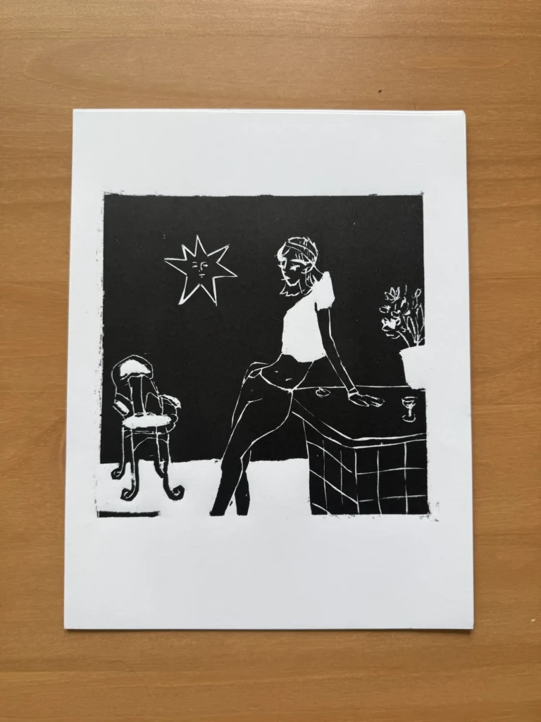
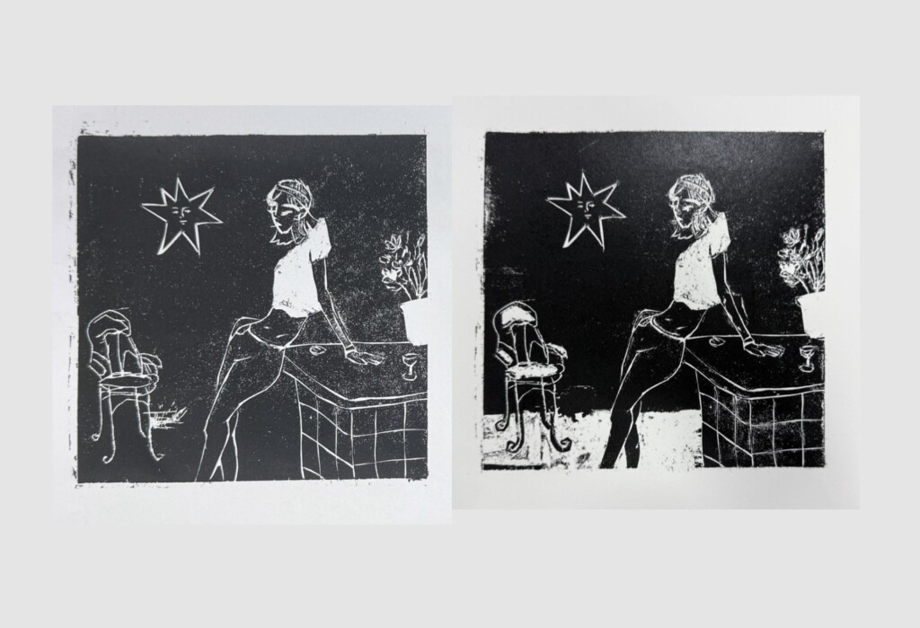
    Untitled portrait design

    Although this design required several rounds of testing, cleaning, and adjustments, I’m beyond excited with the final result. I really like the composition, which originated as a digital illustration and transferred to printmaking much better than I expected.

    I also printed a small experimental series using a deep red ink. Despite my efforts to clean the block thoroughly, the prints came out a little blotchy. In the end, though, I think it created a beautiful rusty texture that adds character to the piece. Another happy accident, I guess.

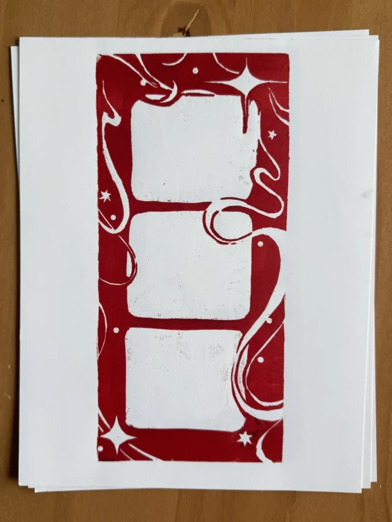
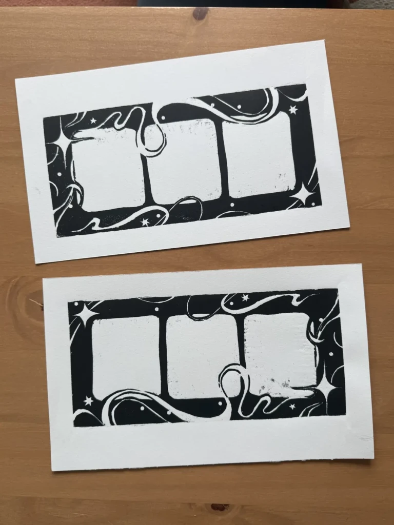
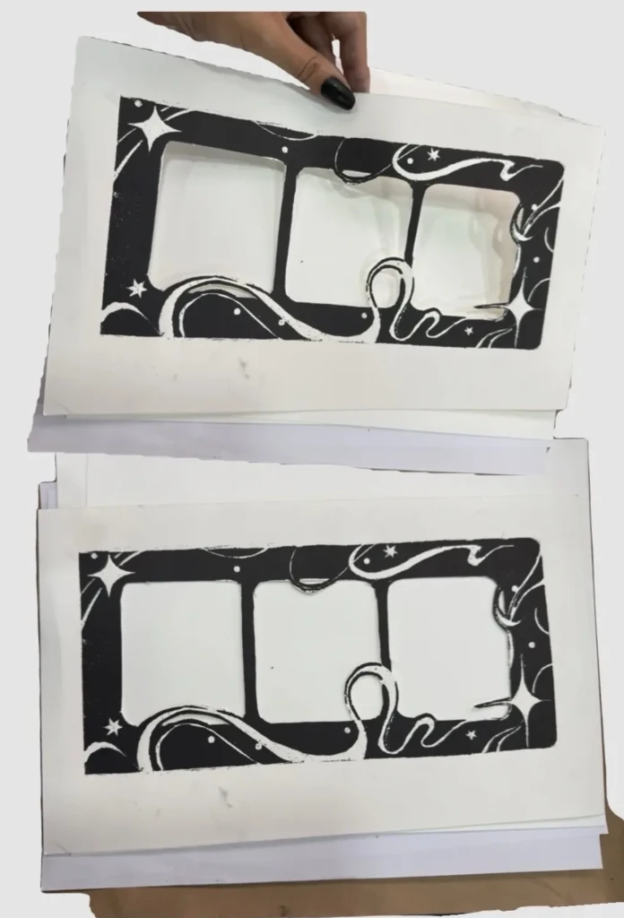
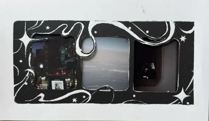
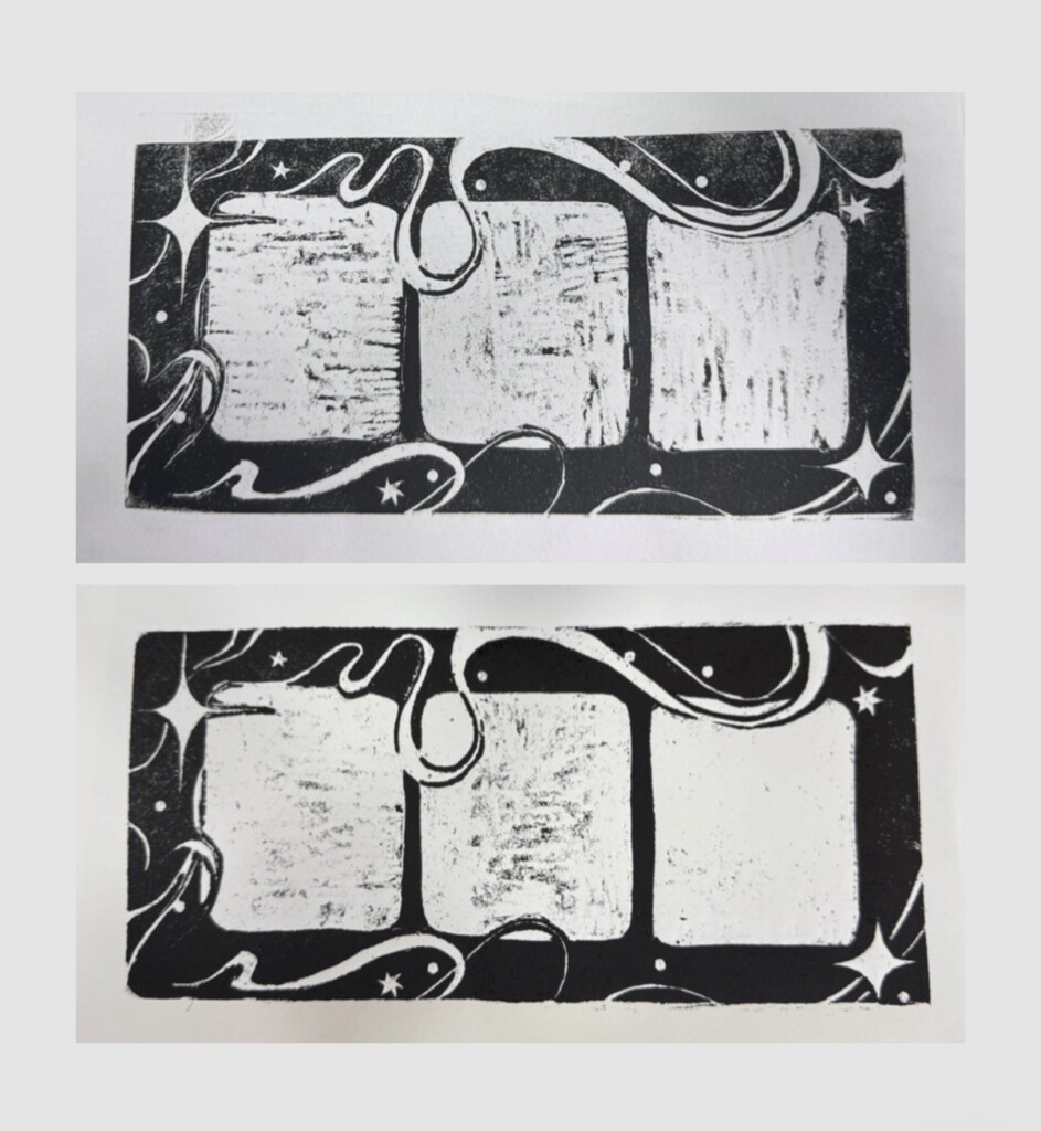
    Frame Design

    The third print I completed recently is this experimental design that could potentially be used as a decorative frame for photographs, stamps, or other small works.

    This piece wasn’t particularly well planned—there are very few straight lines and almost no consistency in the construction—but I love the swirling elements and the overall sense of movement in the composition.

    I printed the design in both black and red. I think it would work well in almost any color, including gradients, depending on its intended use. That said, the black version is probably the most versatile as an actual frame.

    CIC expositions

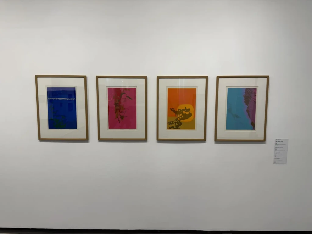
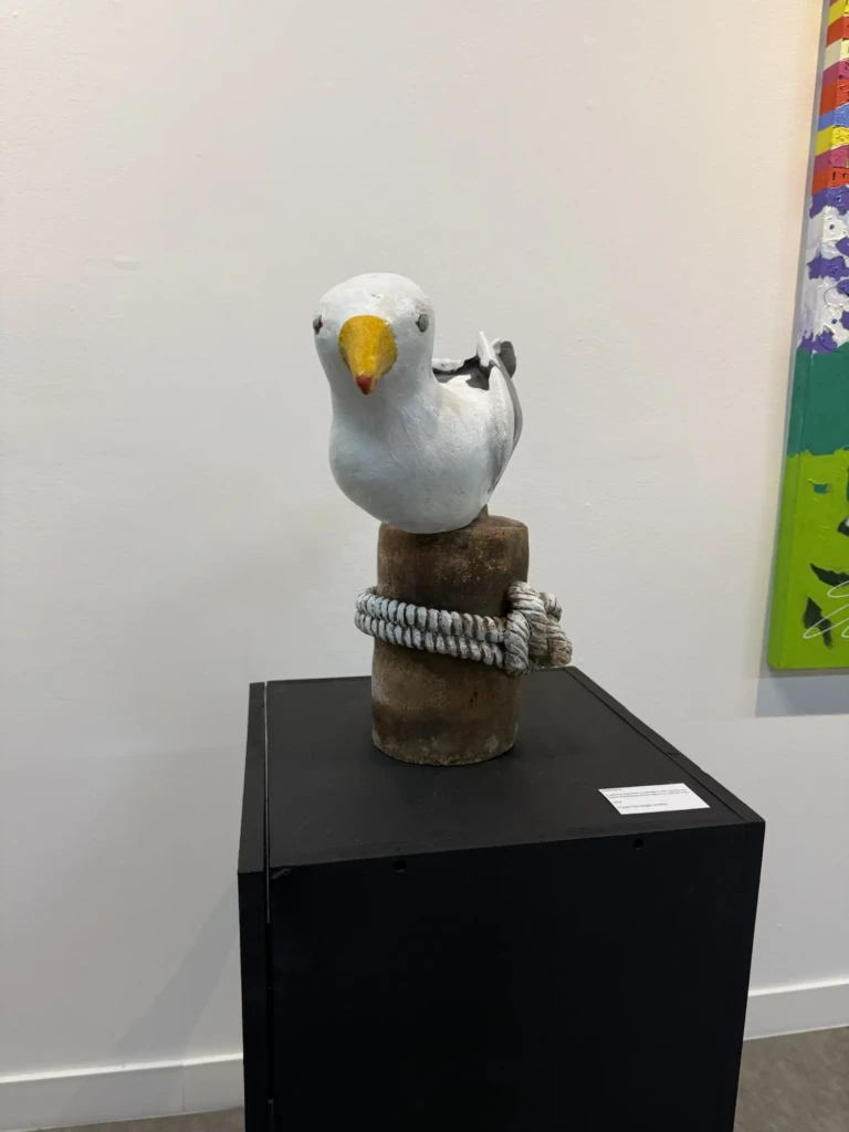
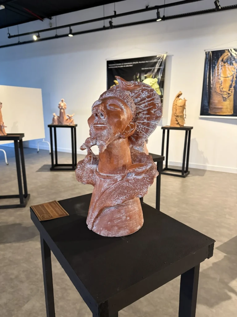
    Throughout these studio visits, I also spent time wandering through CIC’s current exhibitions, drawing inspiration from a wide range of multimedia works by local artists. Here are a few pieces that particularly caught my attention, featuring the artist’s names:

  • Crochet Roly-Poly: Process and Results

    Crochet Roly-Poly: Process and Results

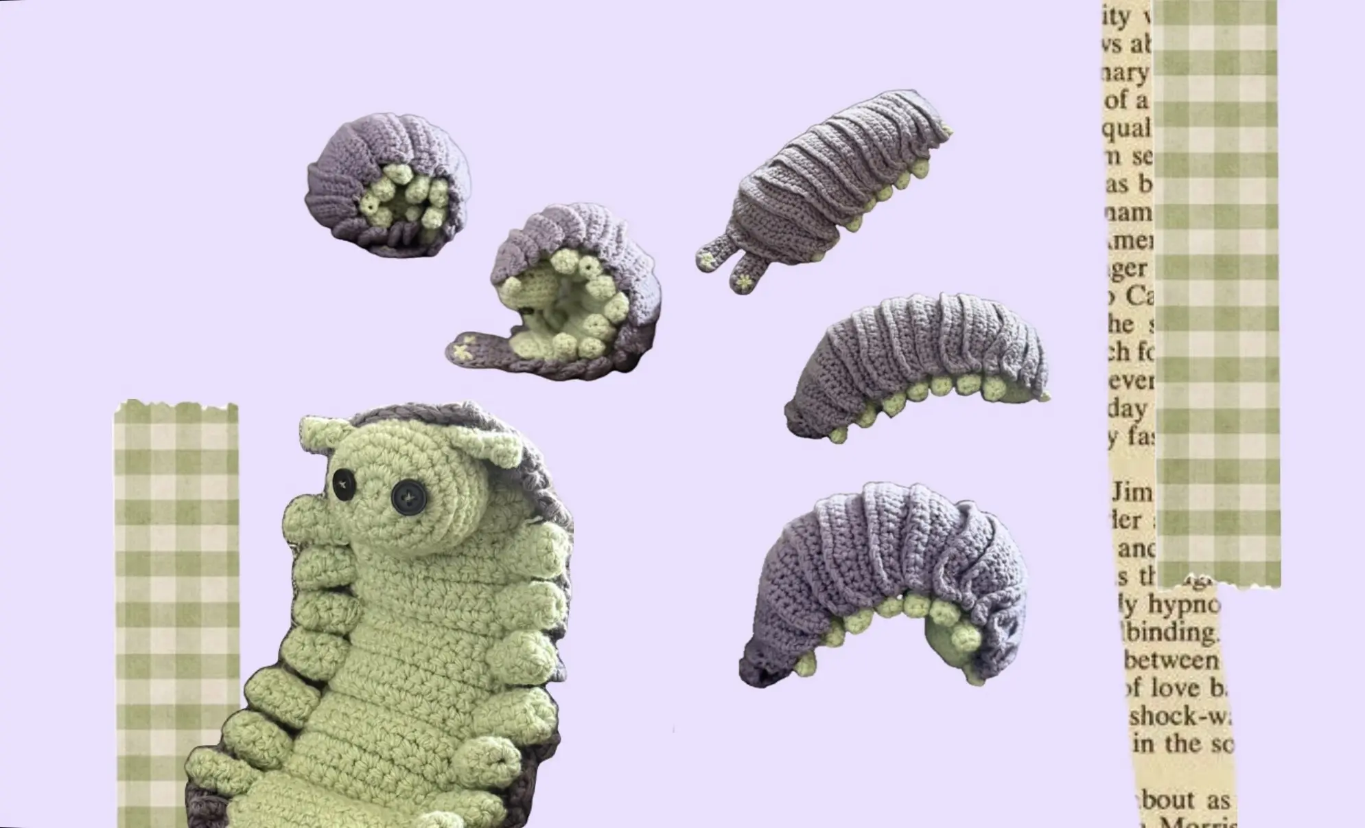
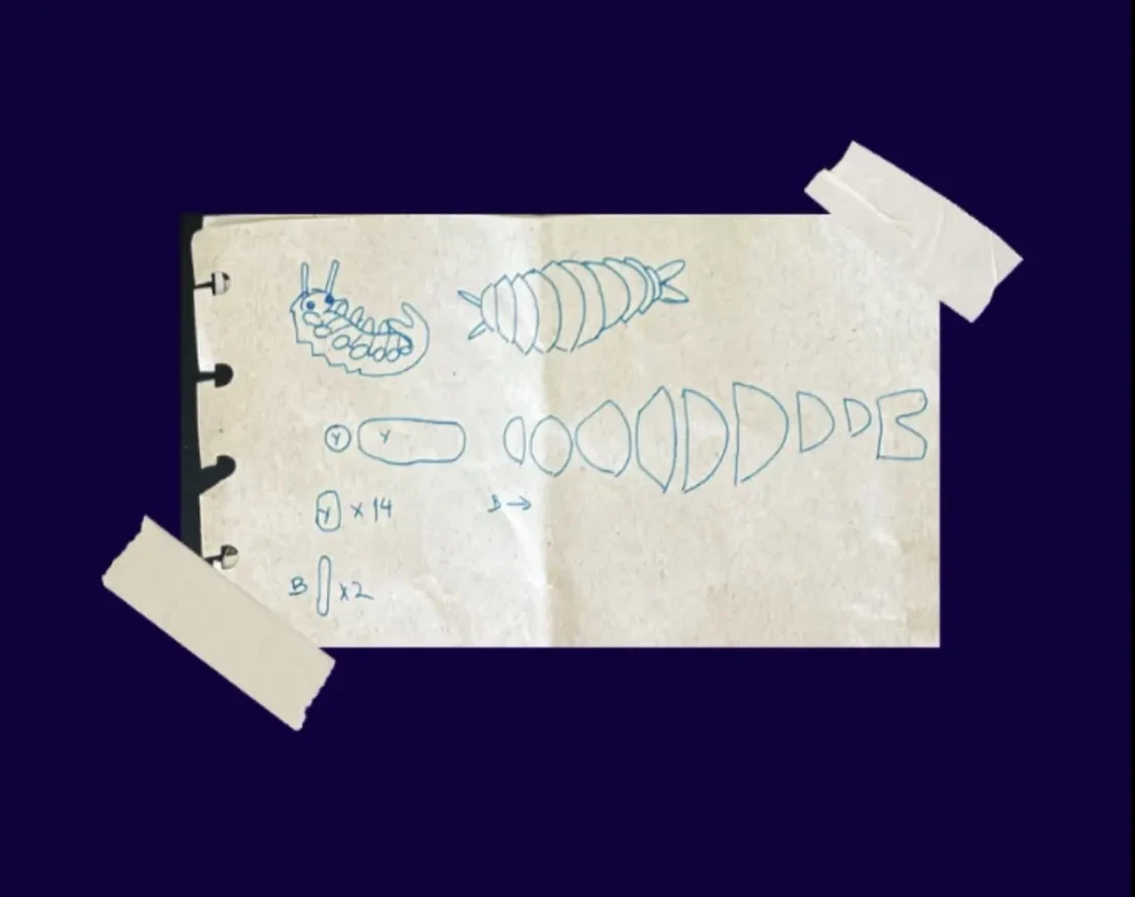
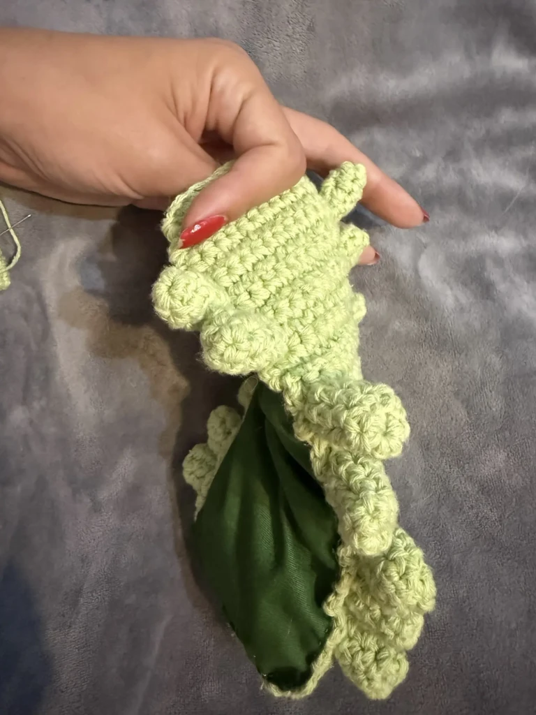
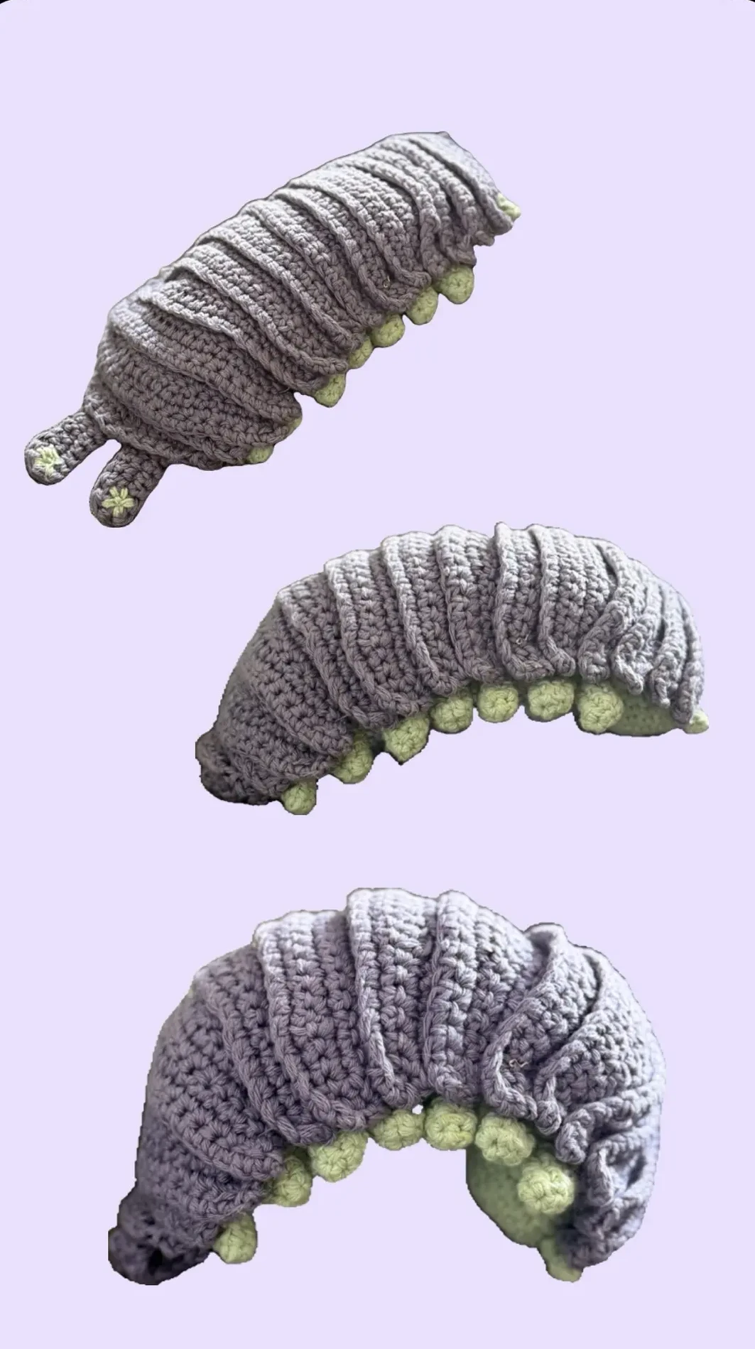
    I was inspired by this piece by Tumannart for this project, and although I expected it would be a little tricky with all the pieces it requires, I was not expecting the level of complexity this little dude would have. It ended up being one of those projects where you just have to trust the process and figure out the details as you go. This is how the process went:

    The base

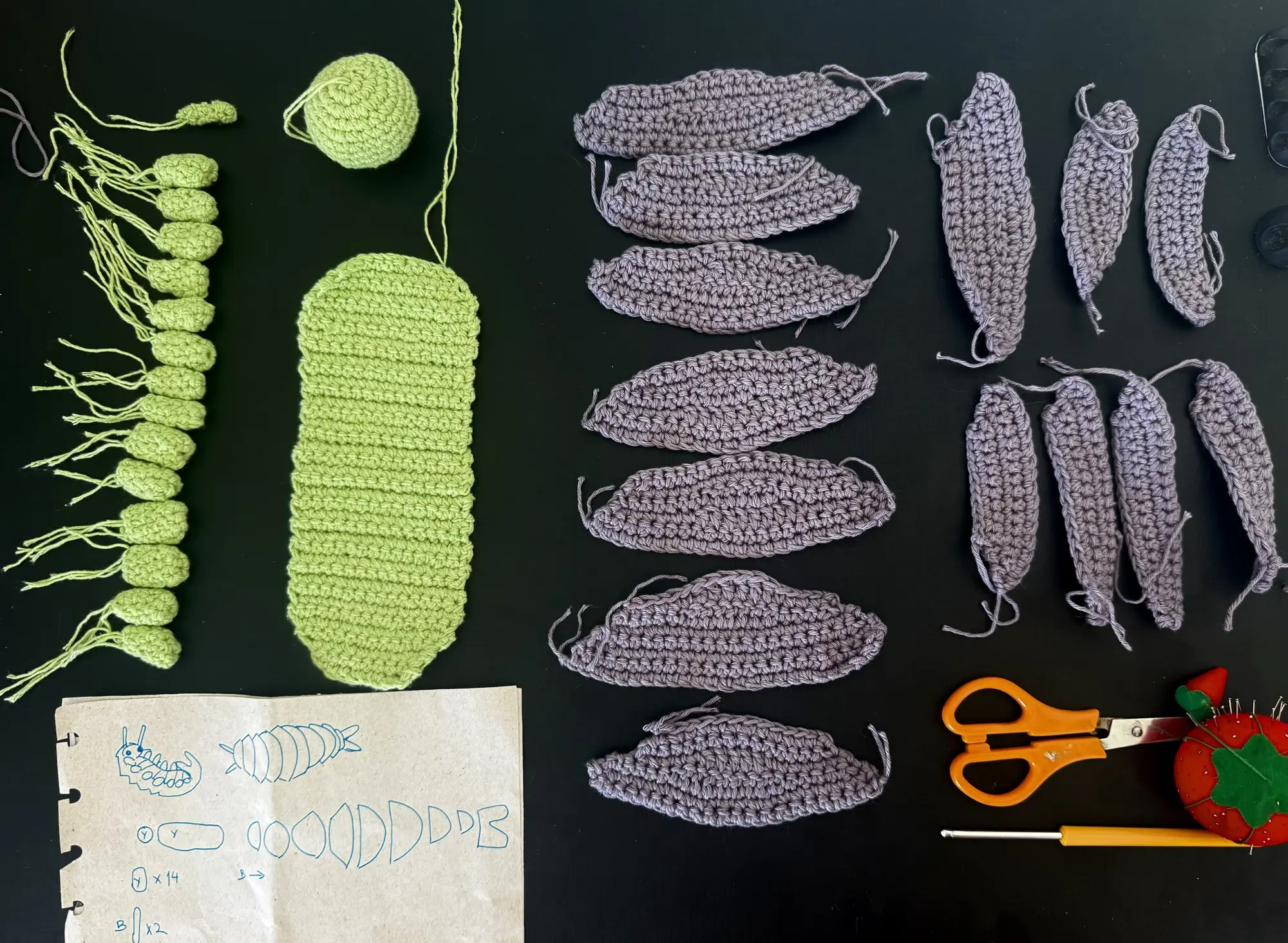
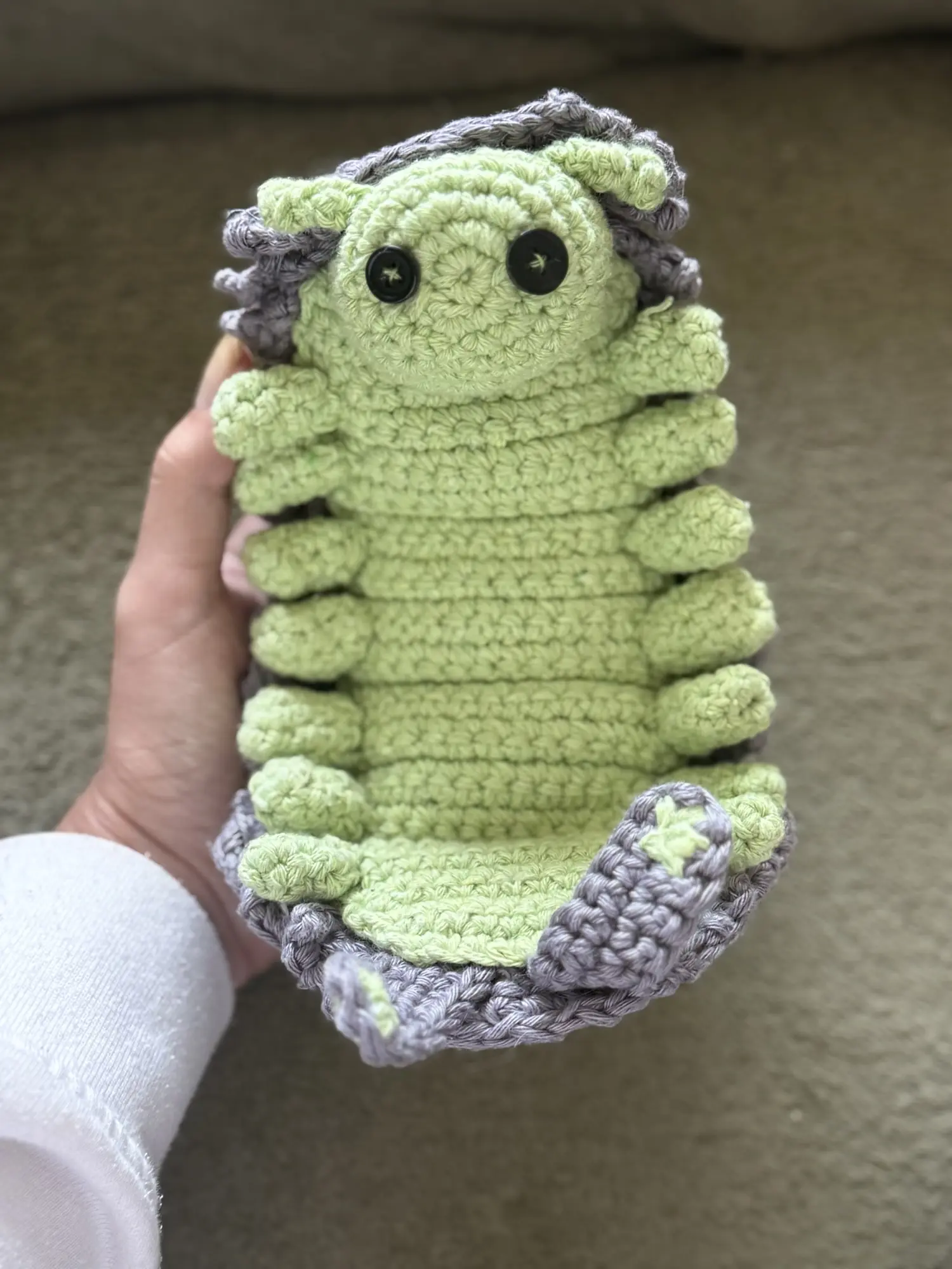
    The first piece I made was the inner body (or the “belly,” as I call it), since it would determine the scale of the entire project. I wanted it to be small, but not so tiny that it would make the project unnecessarily difficult.

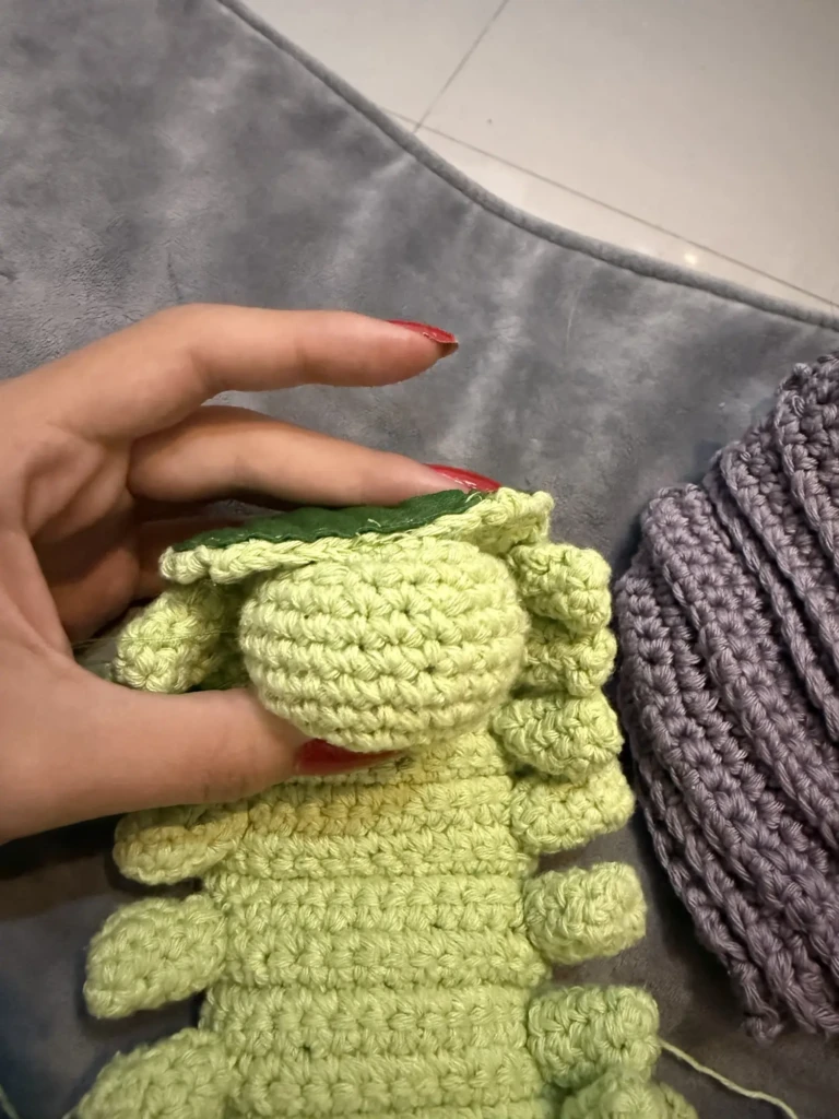
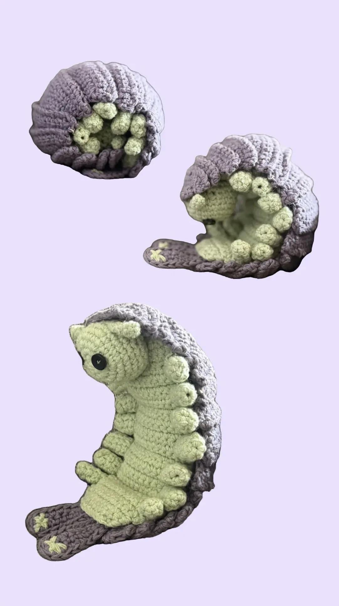
    I noticed in the reference image how the body was sectioned off, and I figured that was meant to help the plush roll up once finished. So I made sure to replicate that in my design by alternating back-loop-only rows every few rows. I also carefully planned the size of each section: large enough to later attach the little feet, but small enough that I could fit multiple pairs without making the body look too long. I ended up with five inner sections plus the two end sections.

    It was rewarding to get a glimpse of how the rolling mechanism would work in this early stage of the project already. I spent a few minutes playing with this first finished piece enjoying how it moved easily as I rolled it. It’s a neat simple trick that can be helful in a handful of projects that need a hinge-like movement.

    The legs, head and antennae

    The next step was crocheting all the smaller pieces that would later attach to the body: the seven pairs of legs, the head, and the antennas, all scaled to match the body.

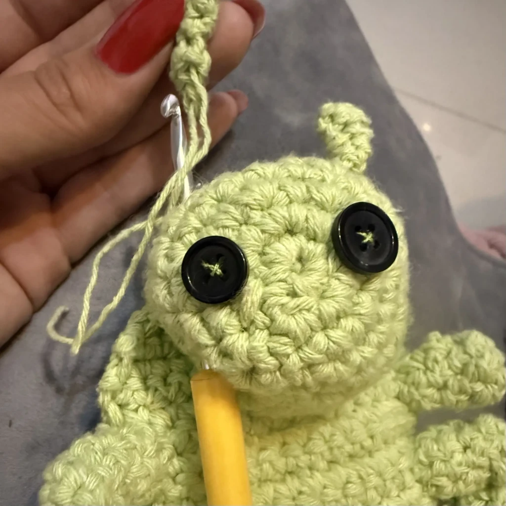
    I wanted the head to be slightly oversized, overflowing the width of the inner body a bit. It took me two tries to get the head right and several attempts for the antennas — they are so tiny and skinny! The legs were tedious at times, but also kind of relaxing because I only had to make matching pairs instead of having every single one be perfectly identical.

    The shell panels

    I was really looking forward to this step.

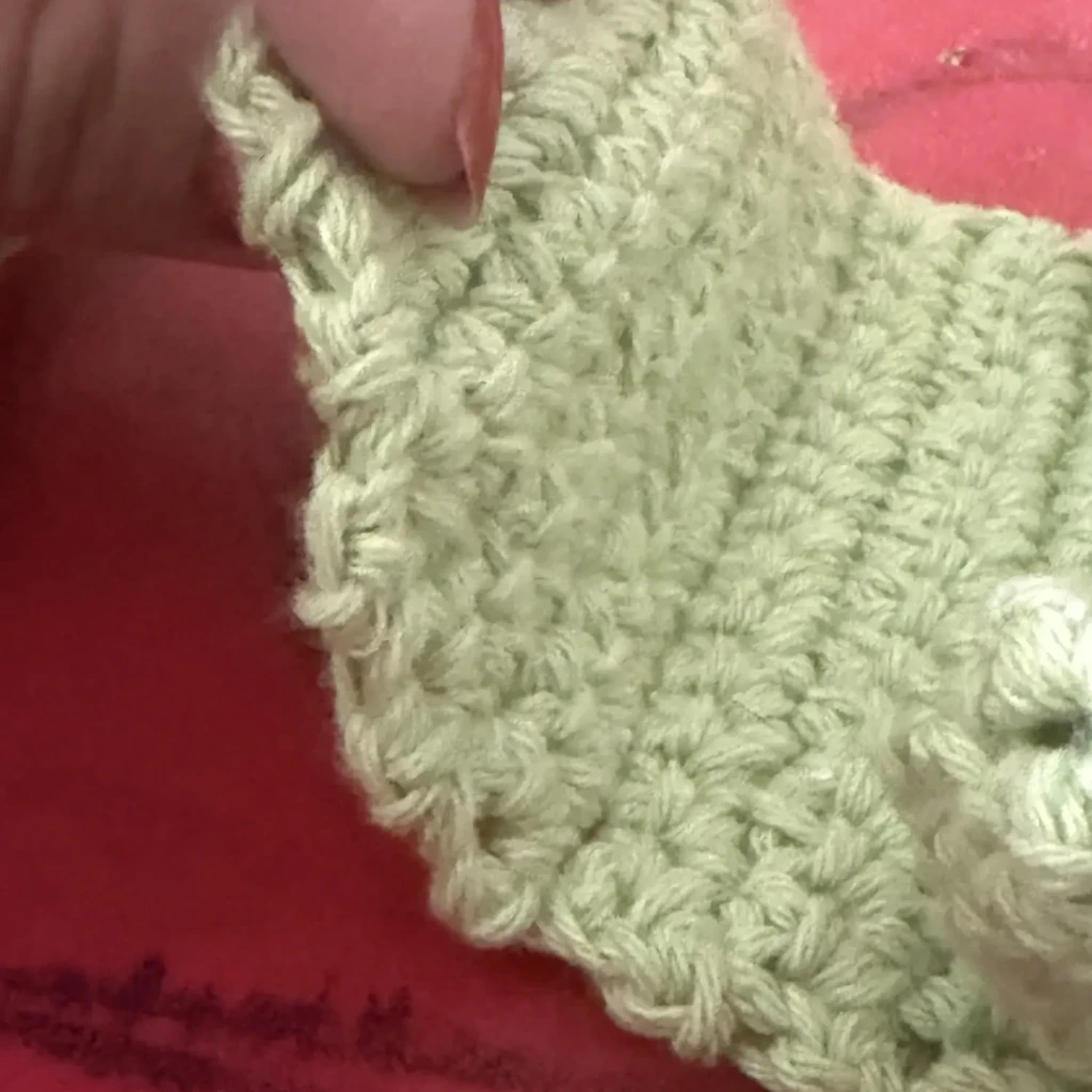
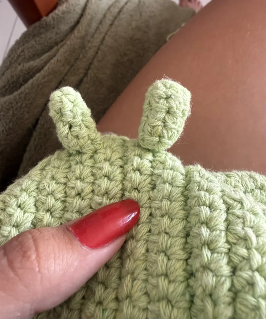
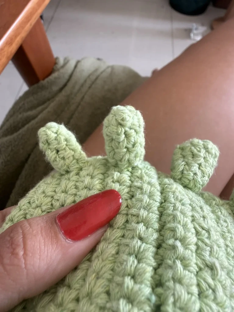
    I started by crocheting little trapezoid-shaped panels, but quickly realized they needed more padding and dimension in the middle top area to properly allow the overlapping shell pieces to move. I also intentionally varied the sizes a bit, making some larger and others smaller.

    At first, I tried crocheting the pieces in their final intended order, but I eventually gave up on that approach. Instead, I made a whole collection of panels in different widths and heights and figured out the arrangement later. I kept testing pieces directly on the body as I worked so I could better understand what shapes and sizes were still missing.

    Putting it all together

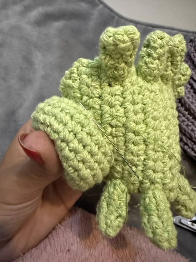
    I first tied all the legs onto the body using the leftover yarn tails from each piece. Then I reinforced everything with tiny careful stitches so the legs would sit and point exactly how I wanted.

    Next, I attached the button eyes to the head, then sewed the head onto the body, and finally added the antennas. I intentionally left the antennas for last — even though it would have been easier to attach them beforehand — because I wanted to double-check their placement once the head was fully attached.

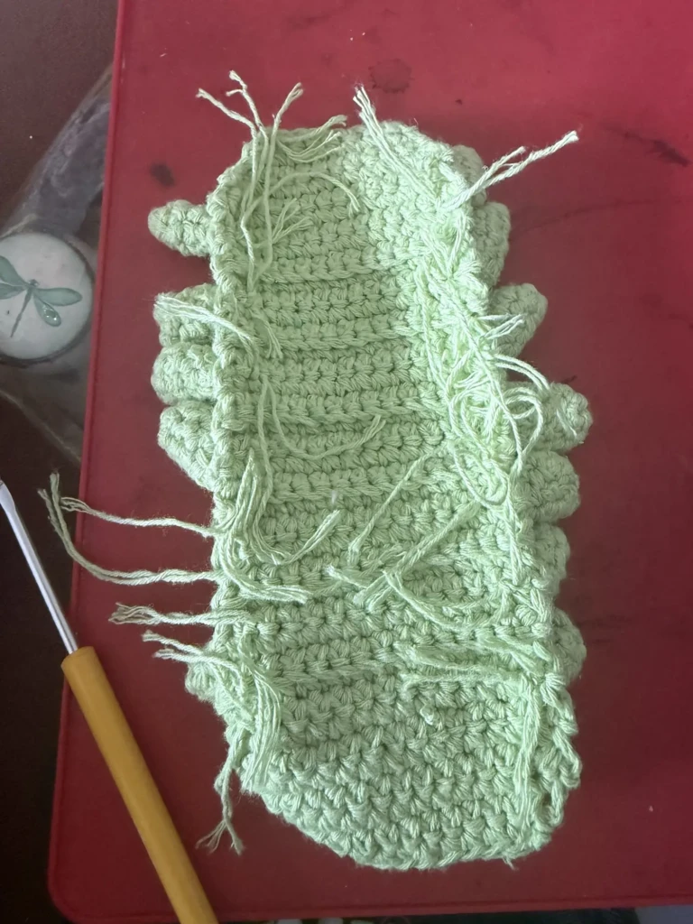
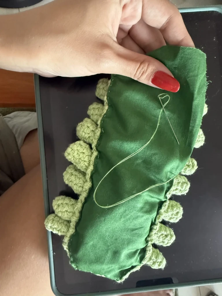
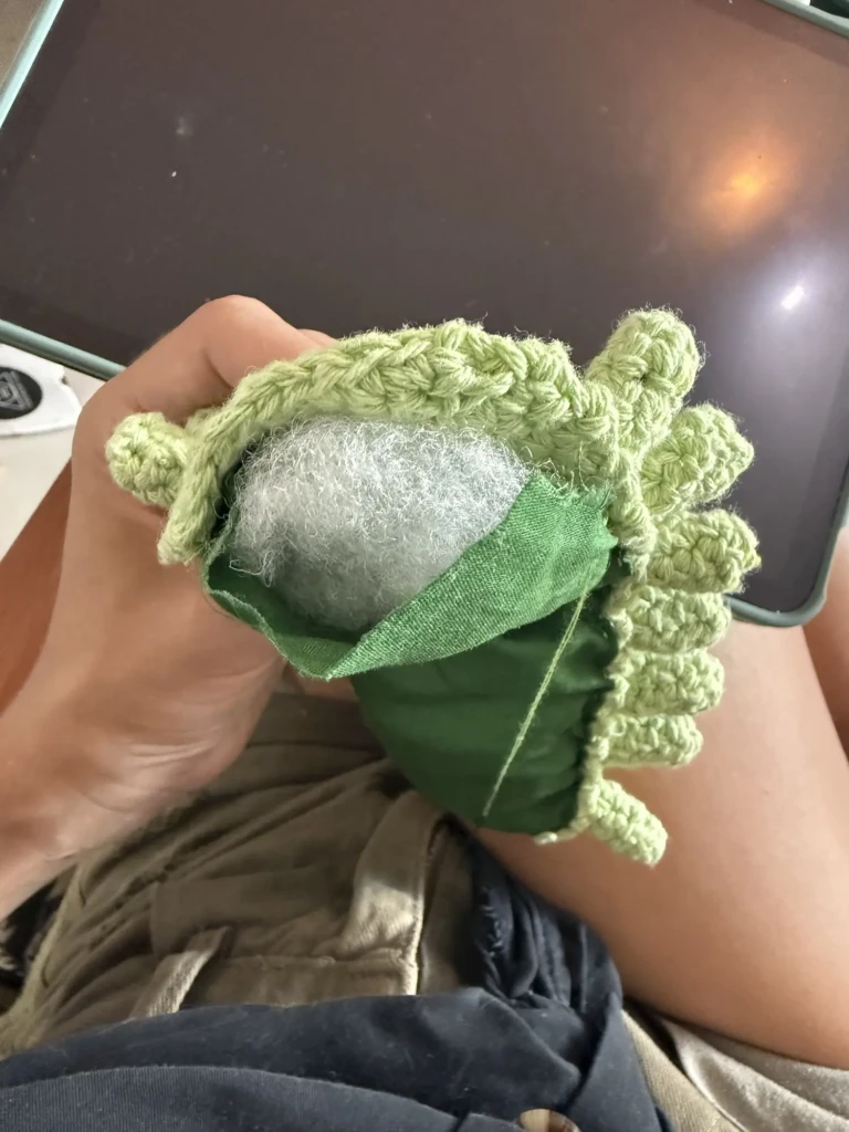
    After that, I sewed a back-panel (fabric and a a thin layer of stuffing) onto the body section using a piece of fabric cut to size plus a bit of filling. I made sure all the padding stayed hidden from the outside.

    Finally, it was time to attach the shell panels onto the back — by far the hardest part of the project.

    Challenges and lessons

    My biggest challenge was preserving the movement of the plush so it could roll up and unfold properly without exposing inner sections or awkwardly squishing pieces together. I went back and forth on whether to add a small internal pillow for volume and eventually decided to do it. That hidden bit of padding ended up being one of the key elements that gave the plush its bug-like shape and helped the rolling effect feel natural.

    One interesting thing is that the shell section ended up noticeably shorter than the body itself. This was partly accidental, but it actually improved the rolling movement by preventing too much bulk from building up at the ends.

    Another major challenge was sewing the shell panels together. If I stitched them too tightly, the movement became restricted and the layered “scale” effect stopped working properly. On top of that, I had very little edge space on the body to work with, so the sewing had to be extremely delicate. A curved needle helped tremendously here.

    After sewing and undoing the same sections three separate times, I finally realized I could only add one stitch per shell panel on each side if I wanted to preserve enough range of motion. High tension in those stitches was extremely important to make the mechanism work. The edge pieces mattered a bit less since they naturally needed less flexibility.

    This whole stage became a balancing act between structure and mobility — a little planning mixed with a lot of figuring things out as I went.

    Finally, I crocheted, embroidered, and attached the little tail details I had forgotten earlier, and that completed the project!

    I’ve considered adding tiny pieces of Velcro so the bug could stay rolled up on command, but I’m still unsure if I want to risk the long-term wear Velcro might cause to the crochet fibers over time.

    Results

    Overall, this was a challenging project, but one that felt very rewarding to complete. I really enjoy making 3D projects and stuffed creatures, and I’m slowly getting better at tackling designs with lots of moving parts. The sewing and construction logistics were definitely the trickiest aspects to figure out, but it was great practice.

    I think the finished piece turned out absolutely adorable. I love the mismatched eyes, the tiny antennae, and all of its textures and movement. It has so much personality packed into one little bug.

    I hope this inspires you to create a little friend of your own, too.

    Happy crafting!

  • A Very Creative Week

    A Very Creative Week

    I’ve been working on a lot of smaller projects recently, here’s a quick look into what’s going on in the studio:

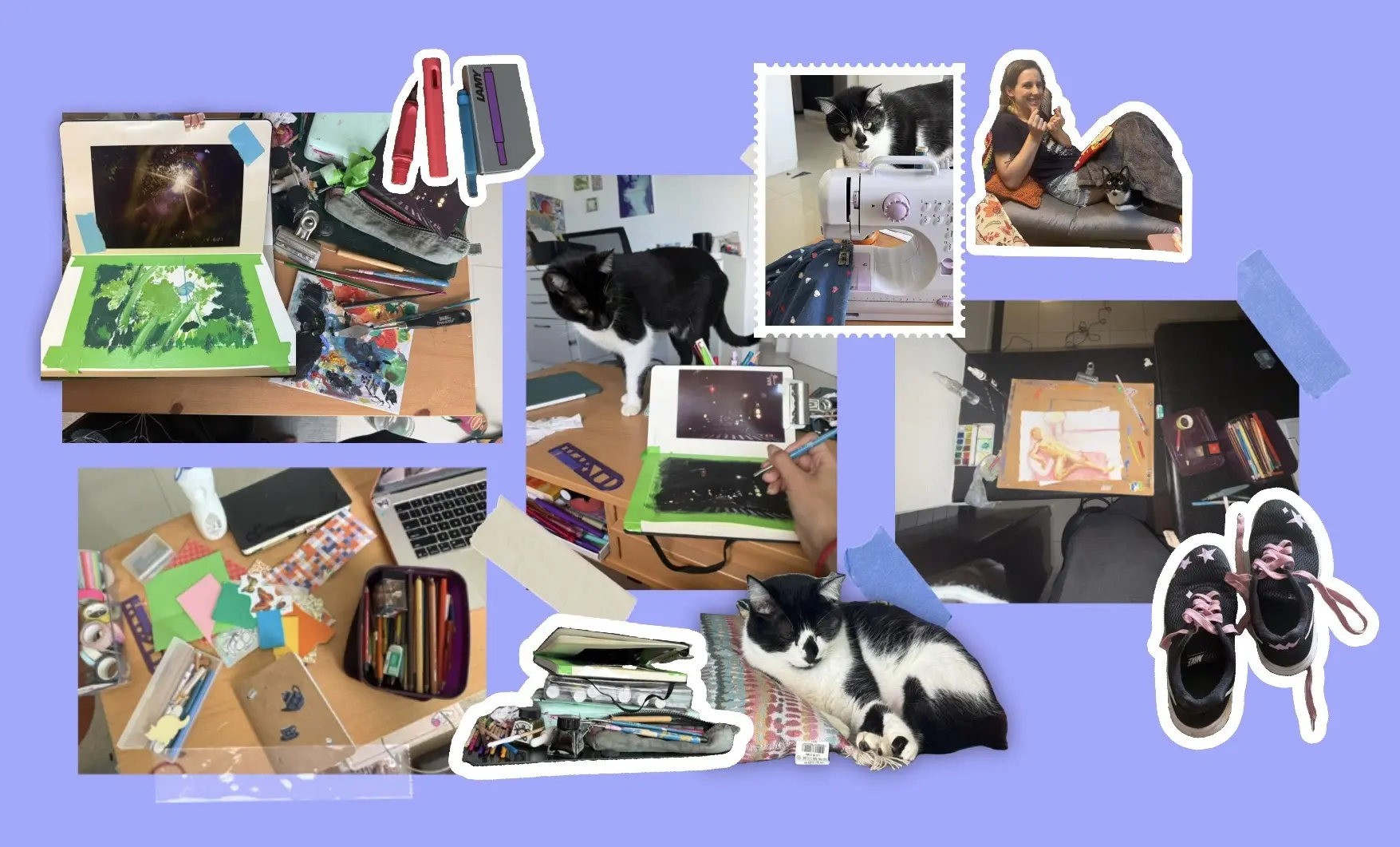
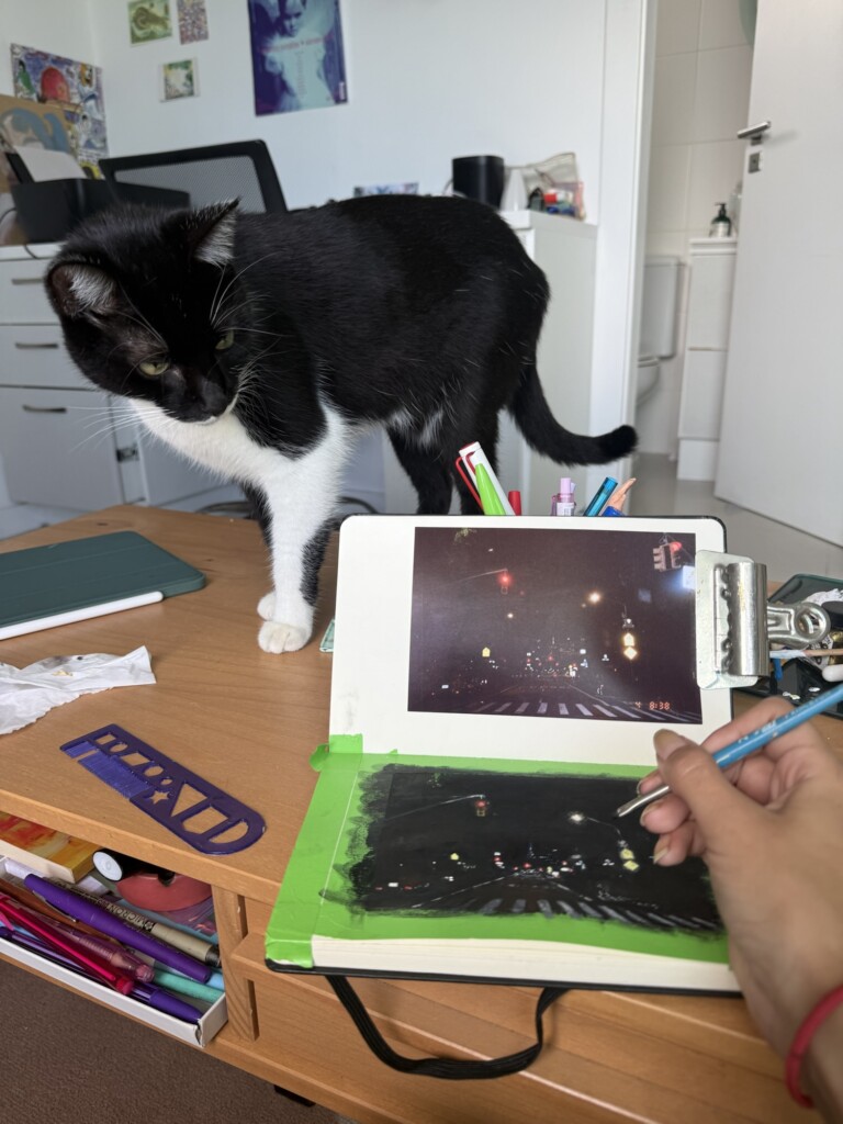
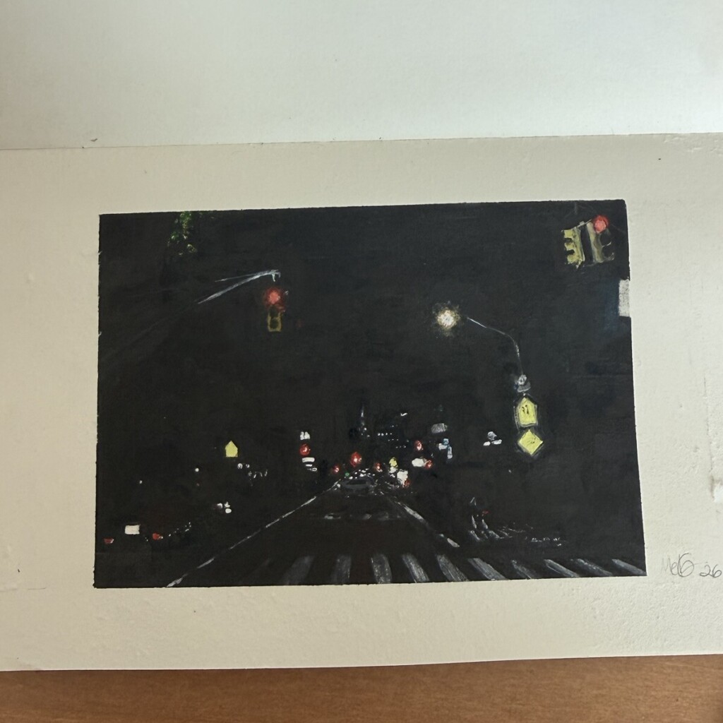
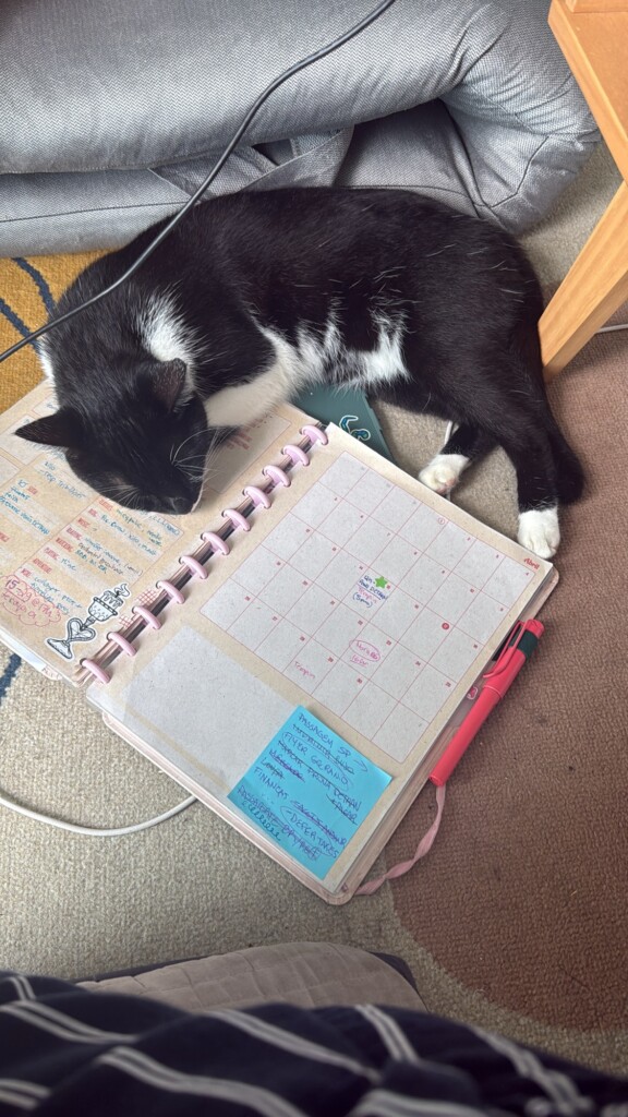
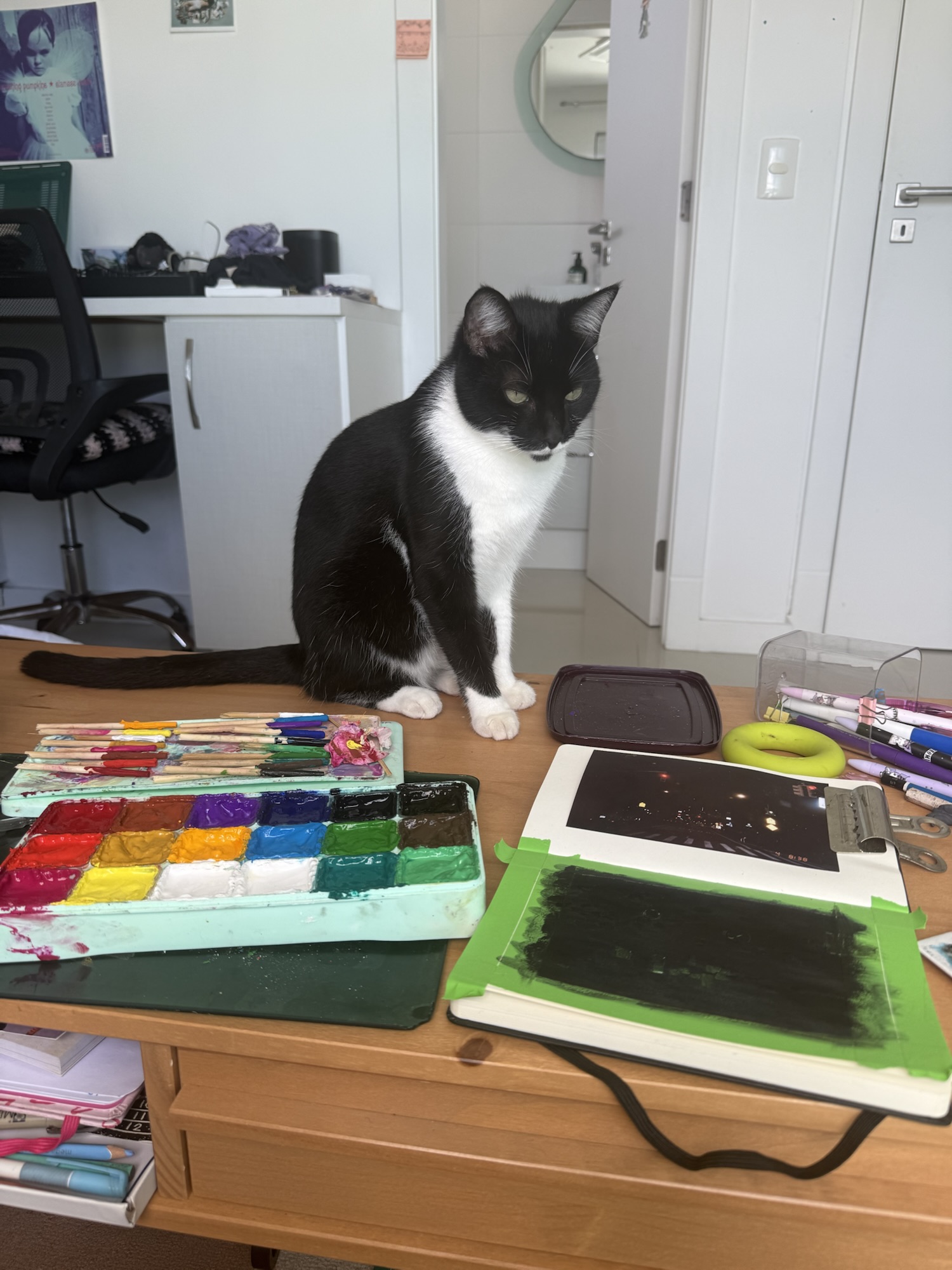
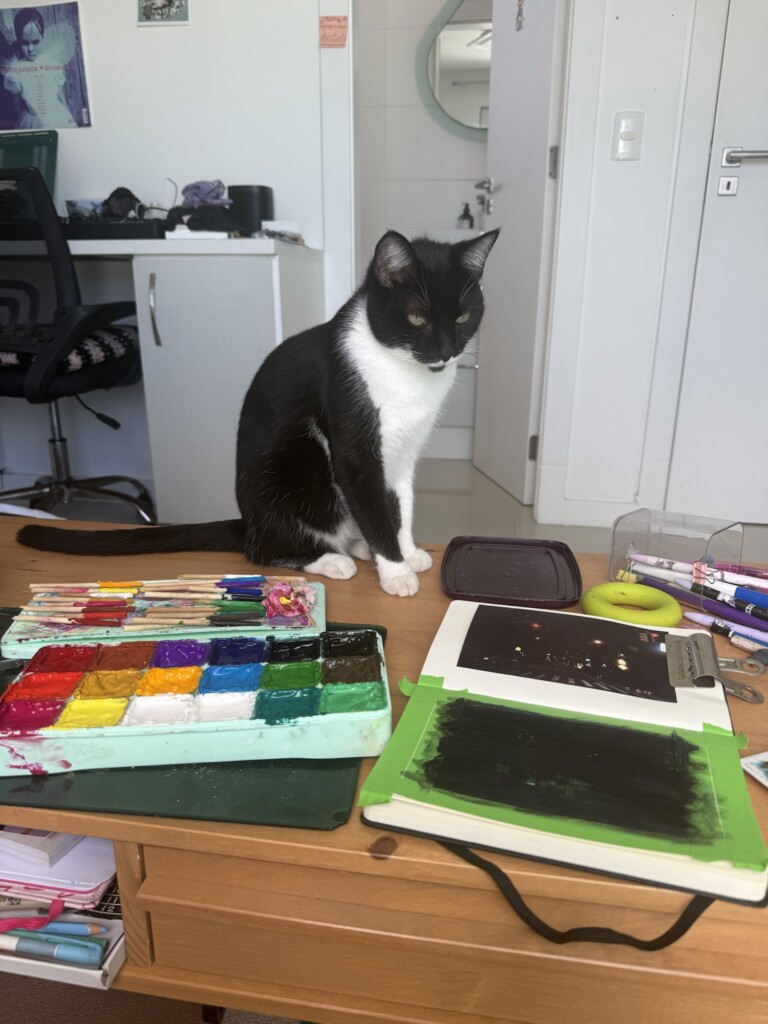
    I’ve decided to work on a little gouache series to improve my admittedly rusty painting skills. I’ve chosen a few analog pictures I’ve taken in college to try and recreate. This first piece is pretty minimalist yet it was still a challenge for me. My trusty studio-helper always by my side of course.

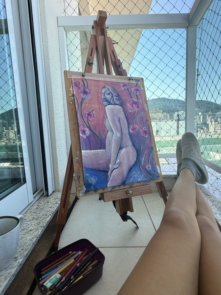
    Another painting I finished (or decided that I did not want to work on it anymore) was this weird experimental piece based on an old figure drawing study. I like it but the bad anatomy bothers me and I’ve been considering cropping up the top part: it’s a stronger composition but I also like the gradient background. Which version do you like better? Full or cropped?

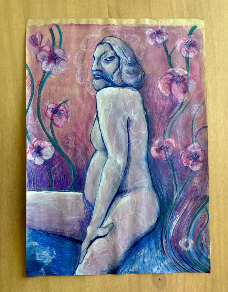
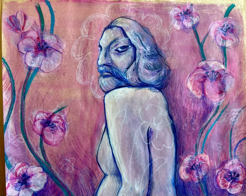
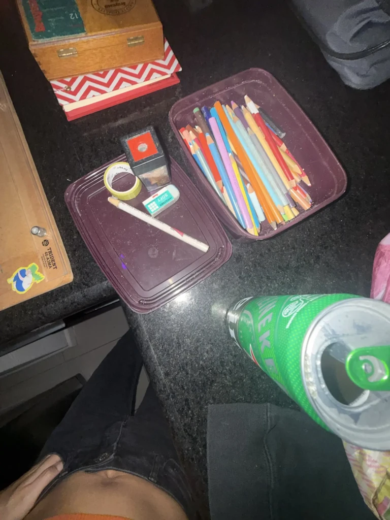
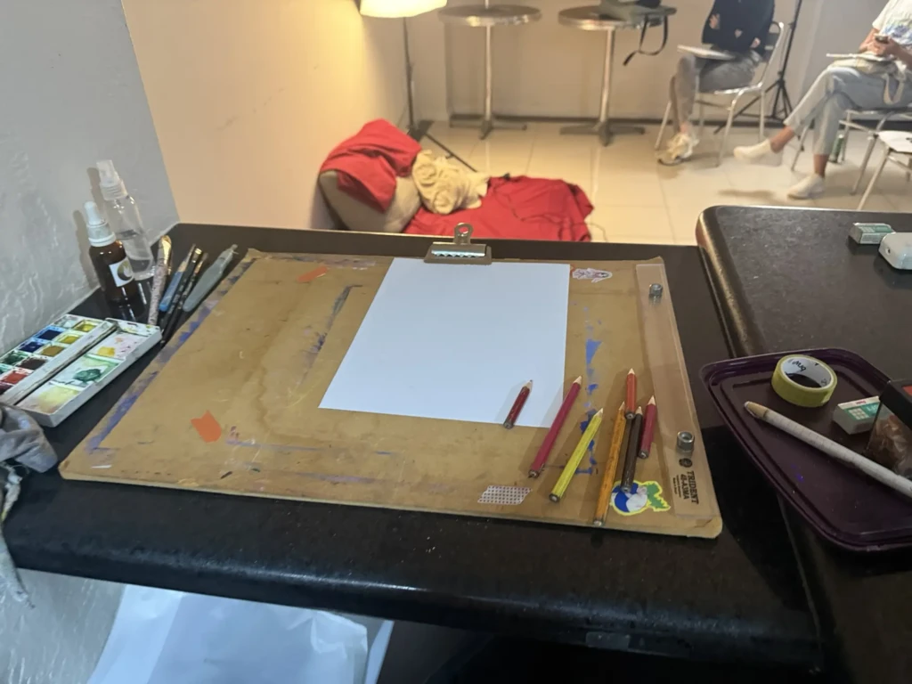
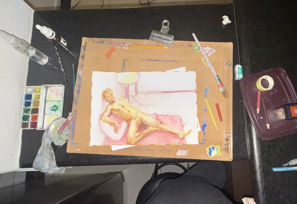
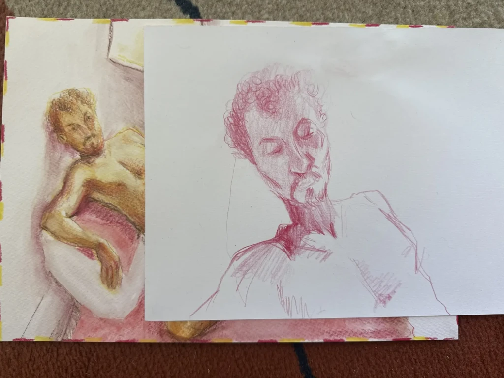
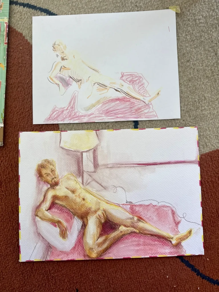
    I’ve also went for another figure drawing meet up this week and I tried somewhat of a new technique: watercolor pencils. It was fun to be able to blend in the colors and play with a paint-like medium without the pressure of using real wet-media. It was a single pose session, meaning we worked on this pose for two 45-min sections. I worked on a quick test first to figure out composition and colors and then moved to the real deal, I even splurged and used some nice watercolor paper. I also did a quick portrait sketch while the main one dried. Not my best work but it was fun 😉

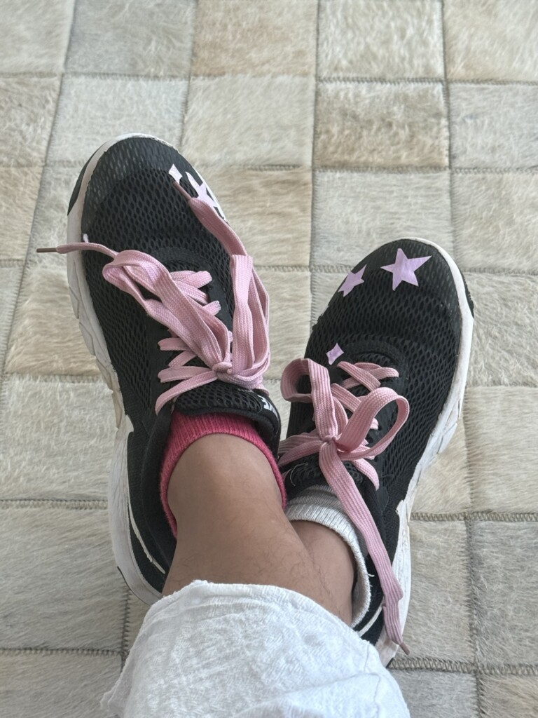
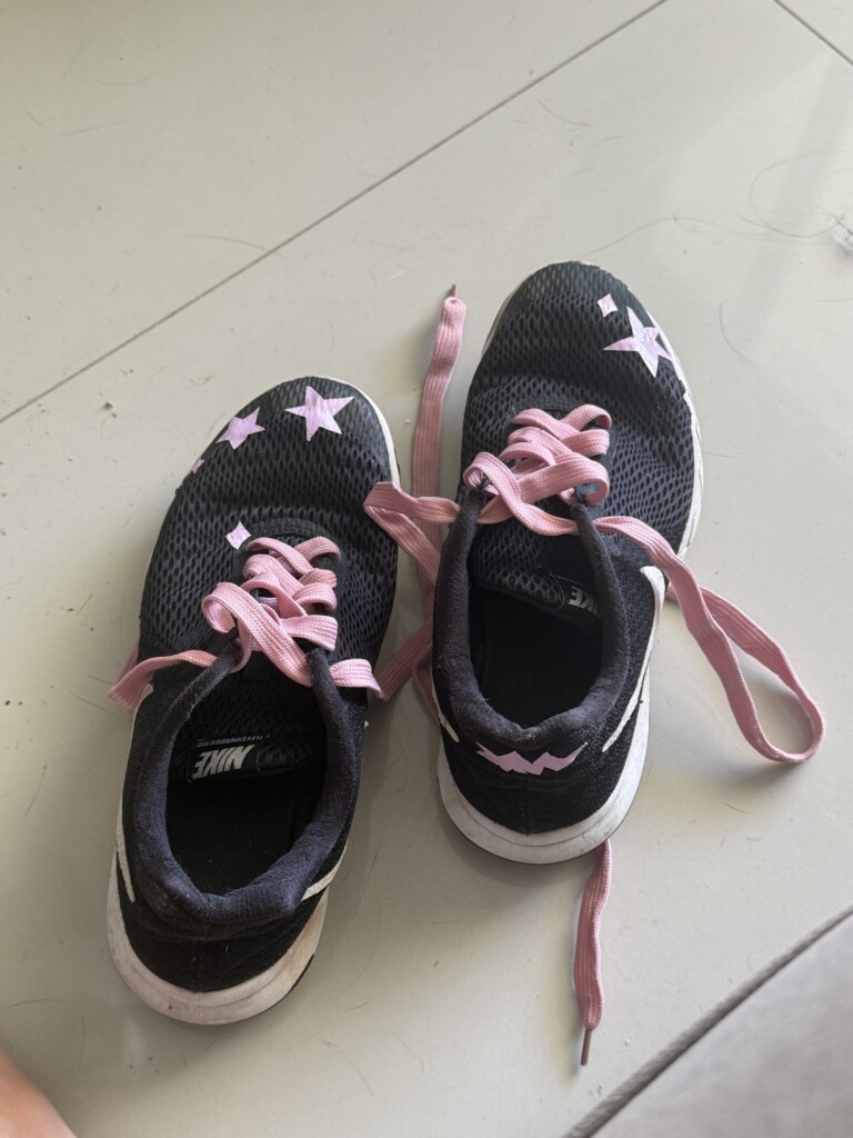
    Another quick diy project I did this week was customizing some old sneakers that are starting to give out on me. I love them and wanted to give them one last chance. I’ve added the hand-cut duct-tape stickers to cover a hole, but the cute stars paired with the new shoelaces made me really happy! I’ve been rocking these and the stars have not fallen yet as I feared!

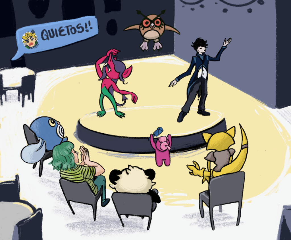
    I’ve been playing a Pokémon-themed tabletop RPG with some friends and I’ve been illustrating a few scenes from our adventures. Pretty cute and silly stuff.

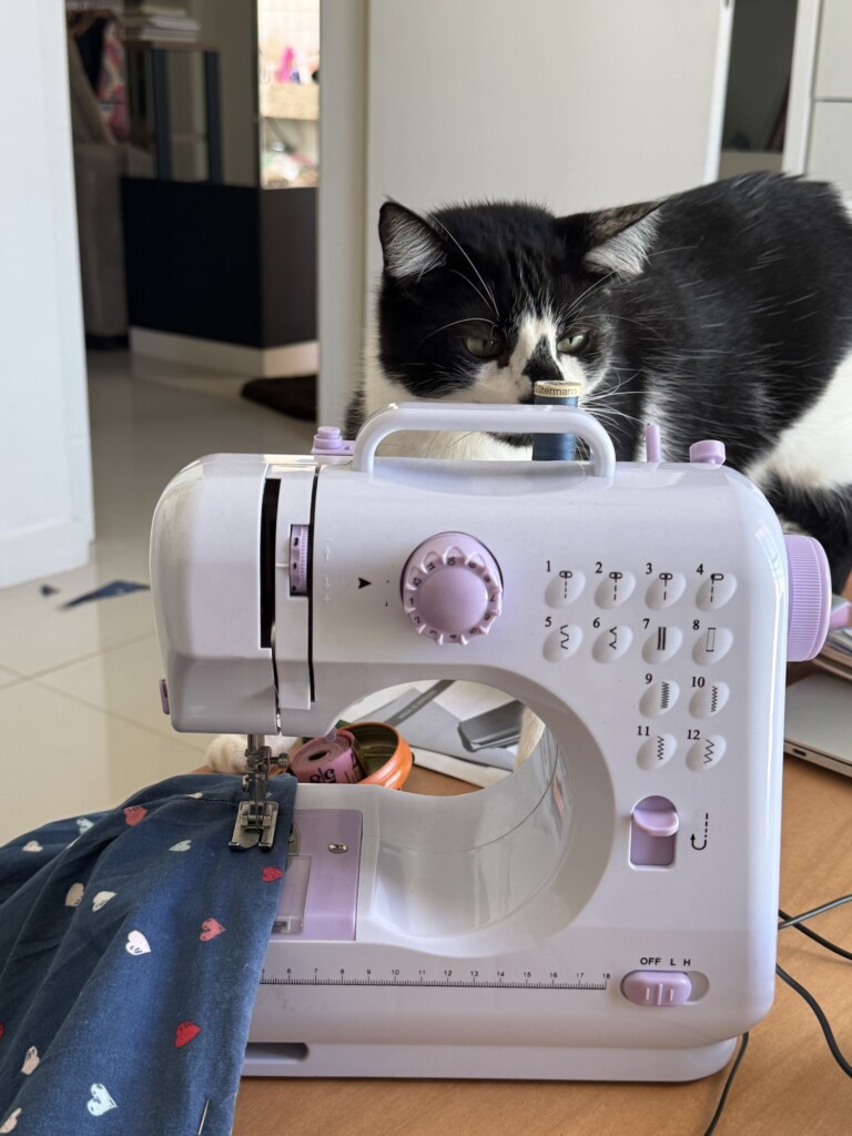
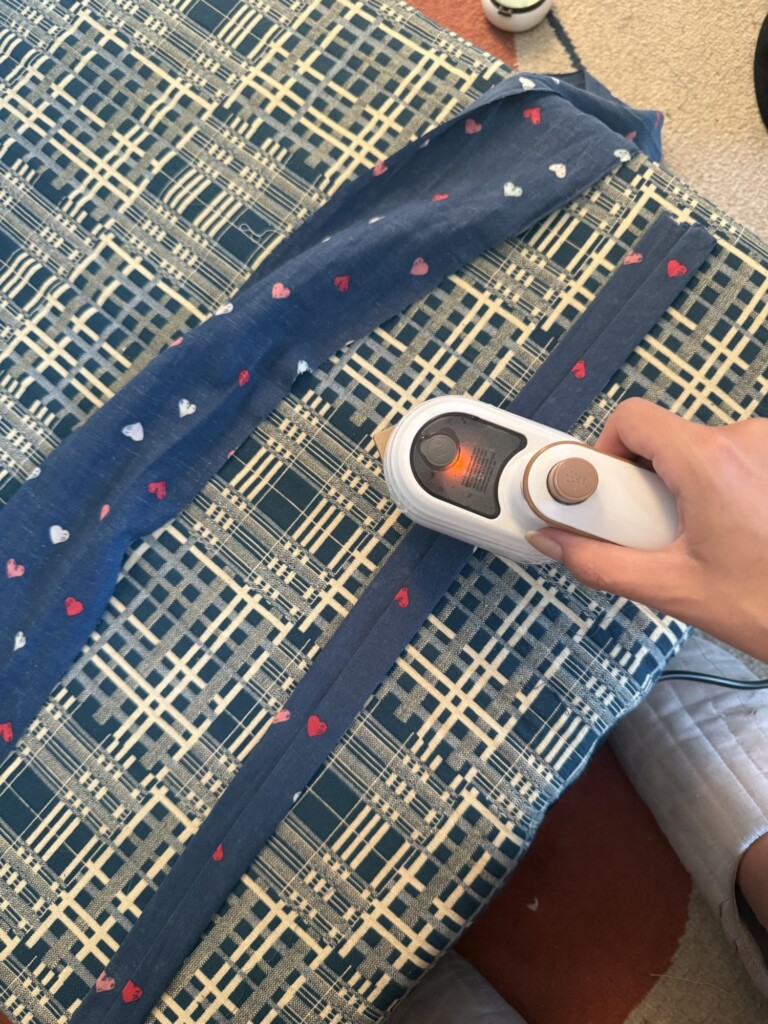
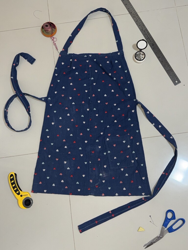
    Lastly I was getting everything ready for my new ceramics class, which included sowing myself a little apron from some old PJ pants I had. The apron turned out great, the class, no so much. I’ll share more later.

    Life has been very busy with a lot of work, responsibilities and bureaucracies to deal with. However, I’m happy to find the time to sprinkle some creativity and crafty projects throughout the fast-paced routine I’m carrying out.

    Thanks for following along. I hope you’ve been using up your creative juices too!

    Happy crafting!

  • Back at the Studio – Woodblock Printing Experiments

    Back at the Studio – Woodblock Printing Experiments

    The woodblock printing studio I attend recently open back up after a long summer break, and I am beyond excited to return to my printing practice!

    A bit of context: Last year I spent a few months working on a multi-layered pool print. I love the piece and I almost had it, but I struggled a lot with aligning the layers correctly because of some early decisions(and mistakes) I made in the process. The frustration of spending months without seeing the expected progress, layered on top of communication challenges within the studio dynamic, eventually got the better of me and led to months of inactivity with the craft.

    In the meantime I took DJ classes and explored my creativity in multiple other ways I’ve been sharing here. Enough time has passed now that I finally feel recharged and motivated to get back into the studio, workshop some new solutions and give the big project another try.

    Since the studio reopened in early March, I’ve been working on some simpler pieces I had on the ‘back burner’ from last year. They are experimental, single color, low-stakes pieces. I thought they were a good way to get back into the groove, polish up my rusty skills, and re-familiarize myself with the full process before jumping back into the pool project – pun intended 🙂

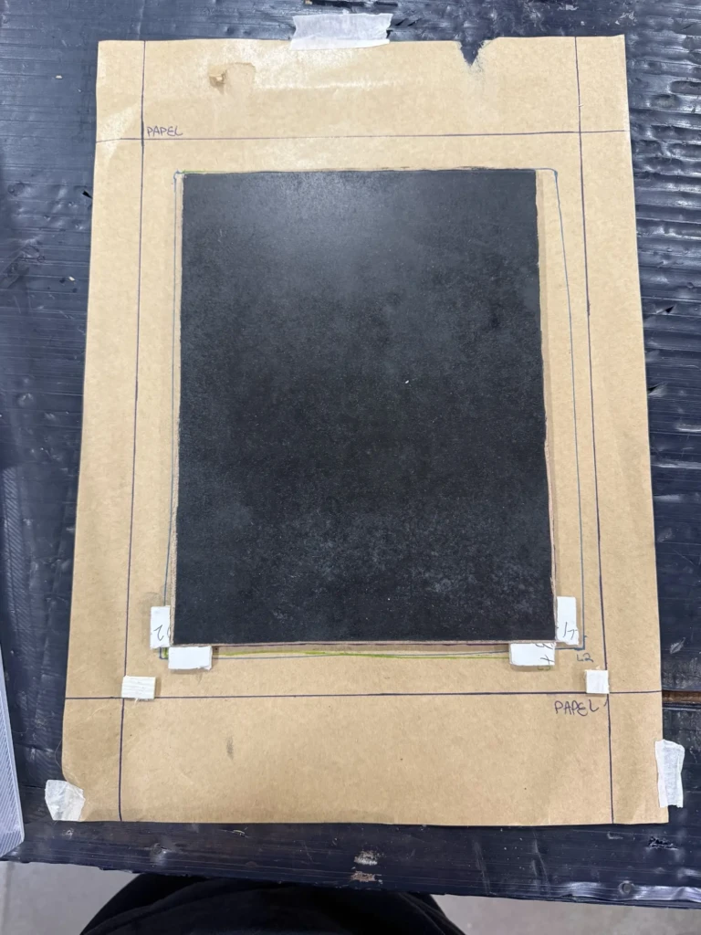
    The main challenge I had with the pool print was the alignment of the layers. I had already tried a few registration techniques (systems that help align paper and multiple print layers consistently) but none gave me reliable results. So I decided to use these experimental pieces as an opportunity to test better registration methods.


    Over these first weeks back, it’s been a constant cycle of test printing, spotting imperfections, carving corrections, printing again, noticing new issues, making more fixes, testing again… and yes, somehow still finding more things to adjust. At this point, I’m heading into round four of test prints.

    Each phase often takes an entire studio day, and many steps require drying time in between, so progress is slow, methodical, and honestly a real test of patience. It’s been a powerful reminder that this craft really demands presence. I always imagine things moving faster and smoother in my head than they actually do, so part of this return has also been about accepting the pace, trusting the process, and resisting my urge to rush results. Easier said than done… but we’re working on it.

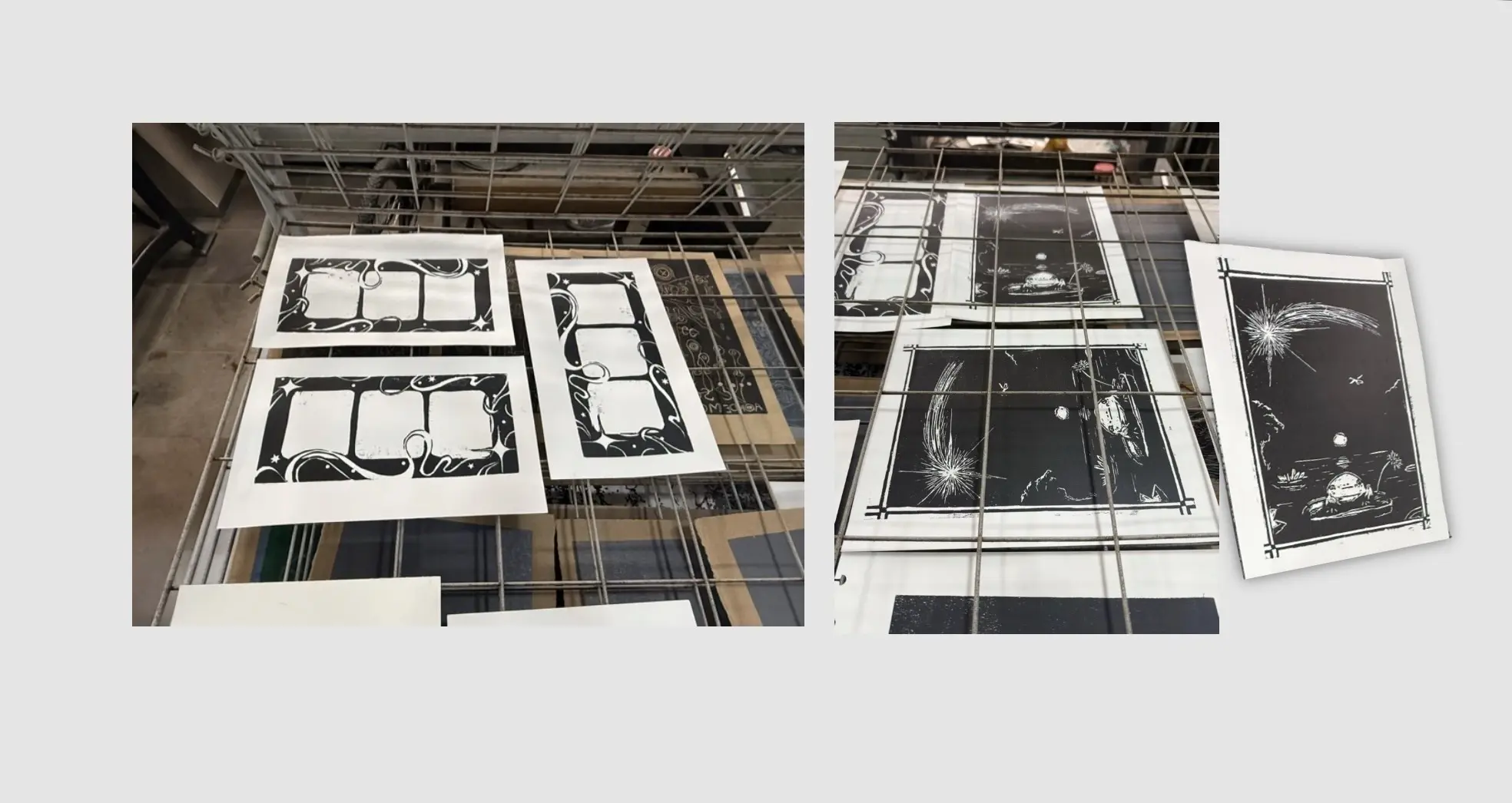
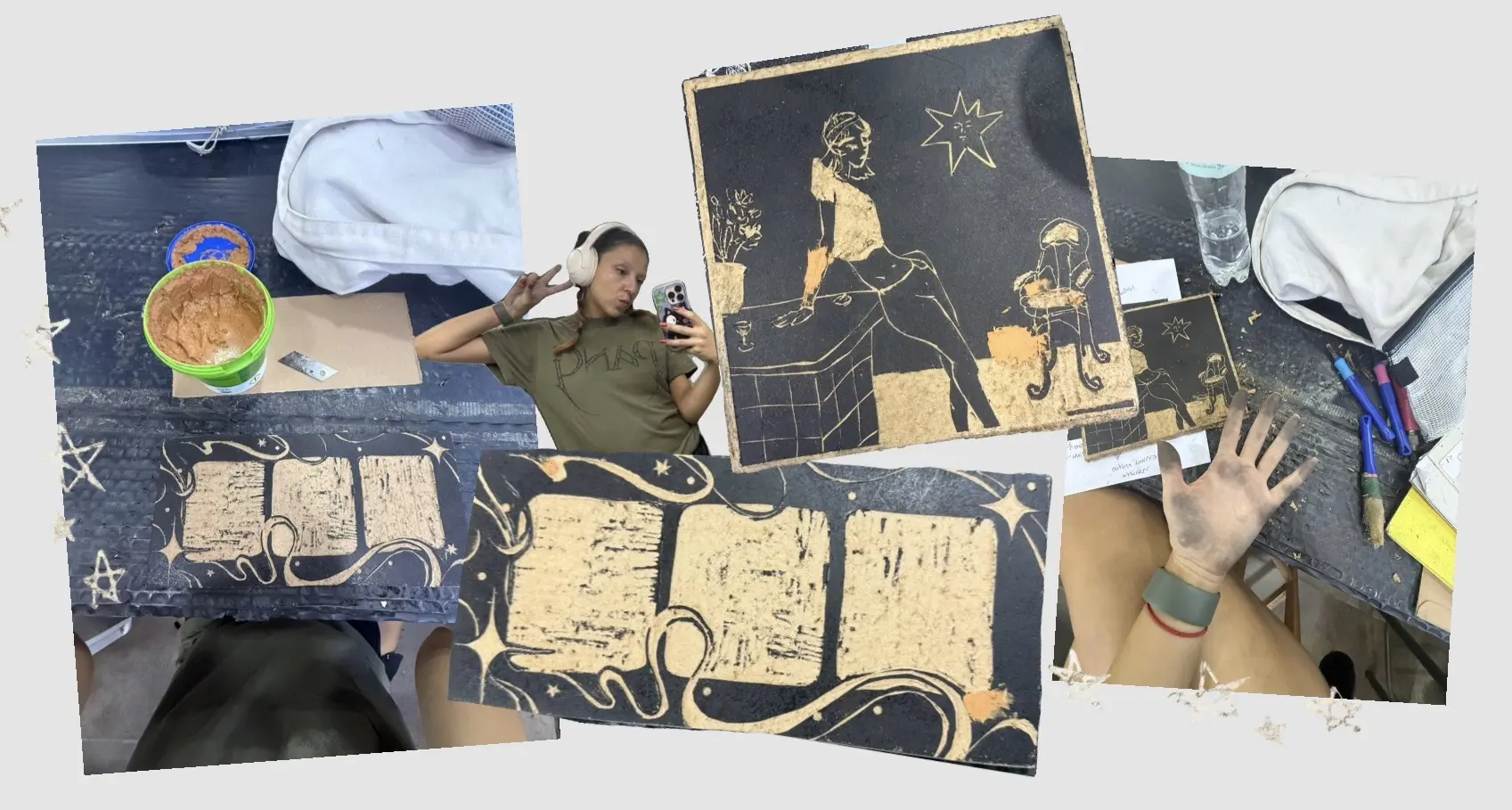
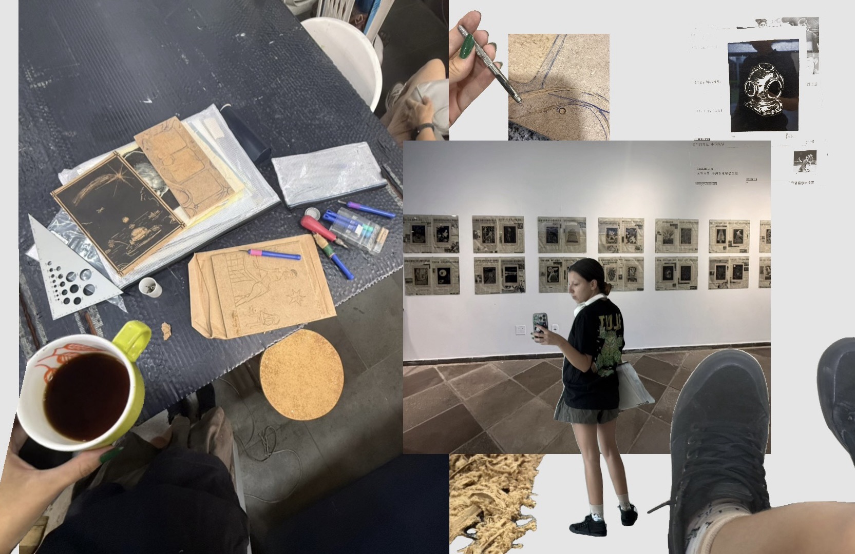
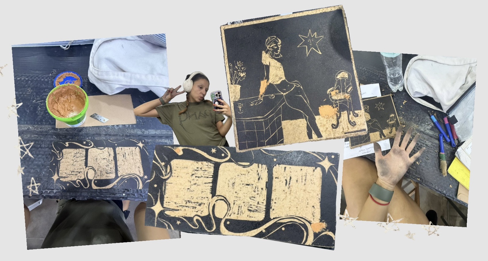
    Here’s a compilation of process-pictures from all the cleanup work, test prints, revisions, and multiple rounds of “polishes” of the design, along with some insights into my decision-making rationale:


    1. The Designs – Where we Started

    My first day back was a relatively chill one: revisiting my ongoing experiments, refamiliarizing myself with old projects, and deciding what felt most achievable.

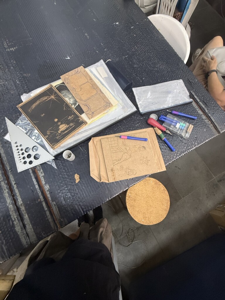
    Out of six unfinished projects, three were close enough to completion that they became my priority pieces. I had coffee, learned how to use a fun hole puncher my professor lent me, and checked out the current exhibition of woodblock studio artists.

    2. First Round of Test Prints

    The following week, I came in ready to print. After doing finishing touches and border cleanup both in the studio and at home, I finally tested the designs. Overall, the prints came out pretty well, but of course the process immediately revealed more issues: spots that needed cleanup, small imperfections, and even areas where the wood itself was beginning to lift and needed gluing. So… back to fixing.

    3. Cleanup, Corrections, and Wood Putty

    During that same visit, I spent a lot of time refining the blocks, including adding wood putty in areas where I had made carving mistakes and needed to essentially “reset” sections.

    This meant waiting for the putty to dry, returning later, carving those areas again, and trying to sand everything flat enough that the repairs would disappear into the print surface. Spoiler: I did not sand it quite enough.

    4. Registration Guide Experiments

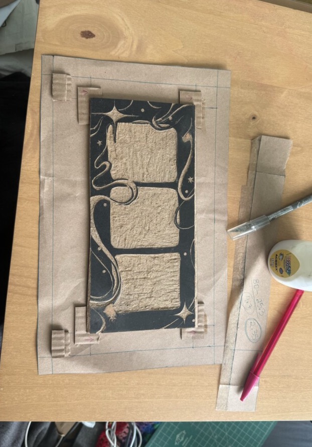
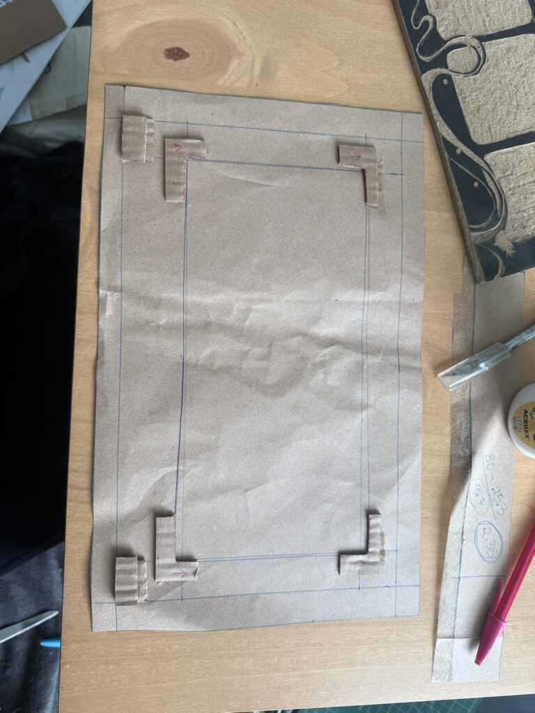
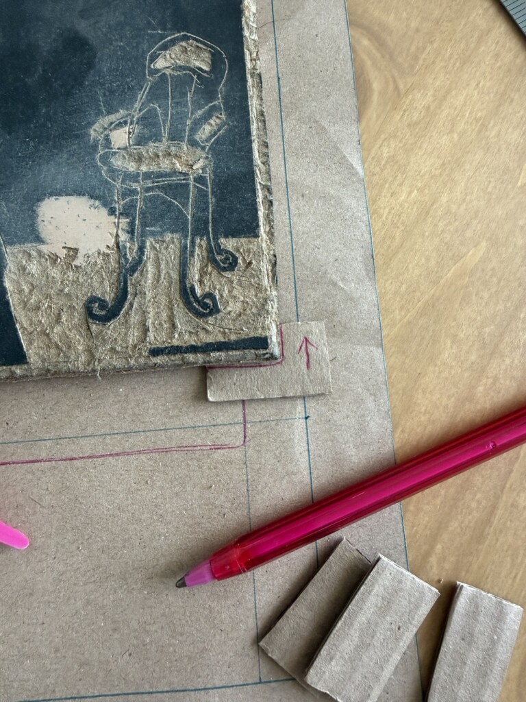
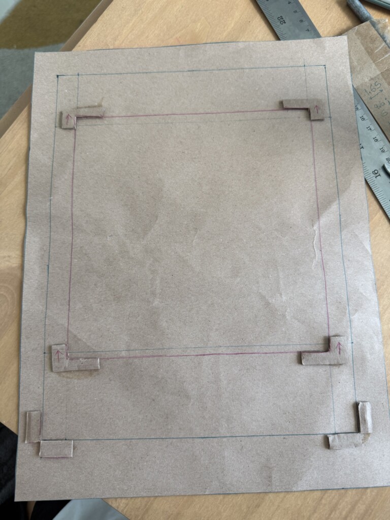
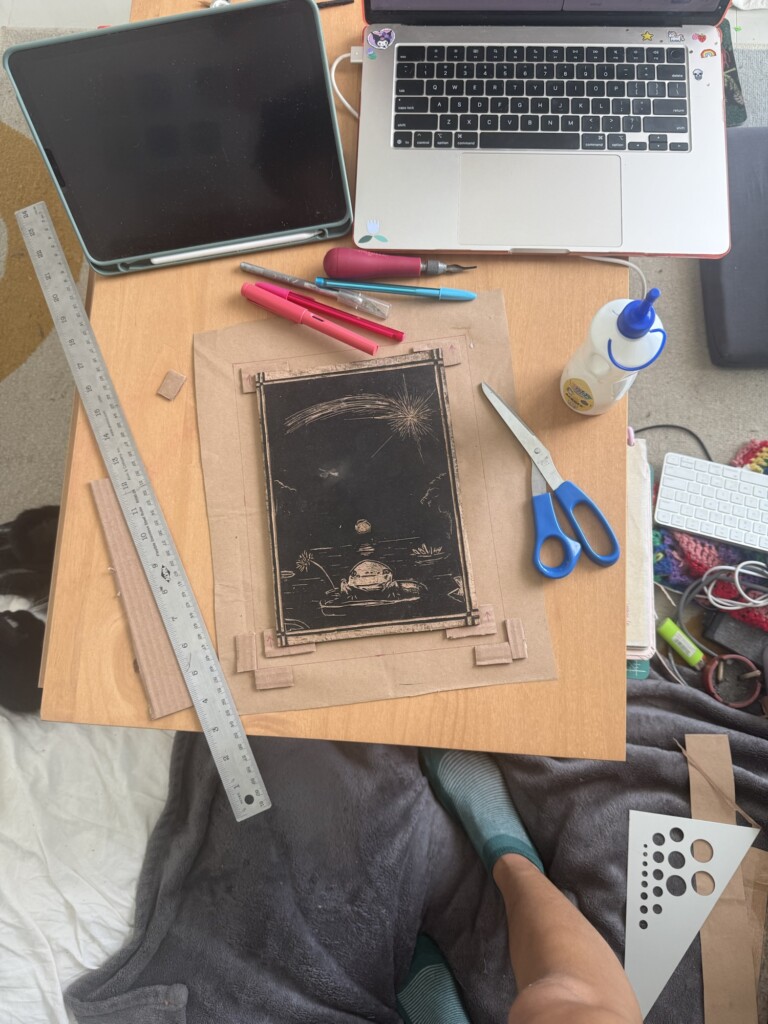
    At home, I also built a new set of registration guides for all my designs.

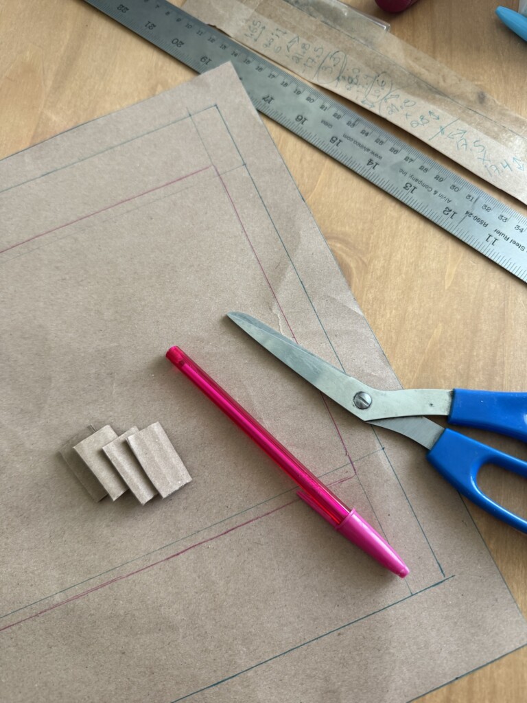
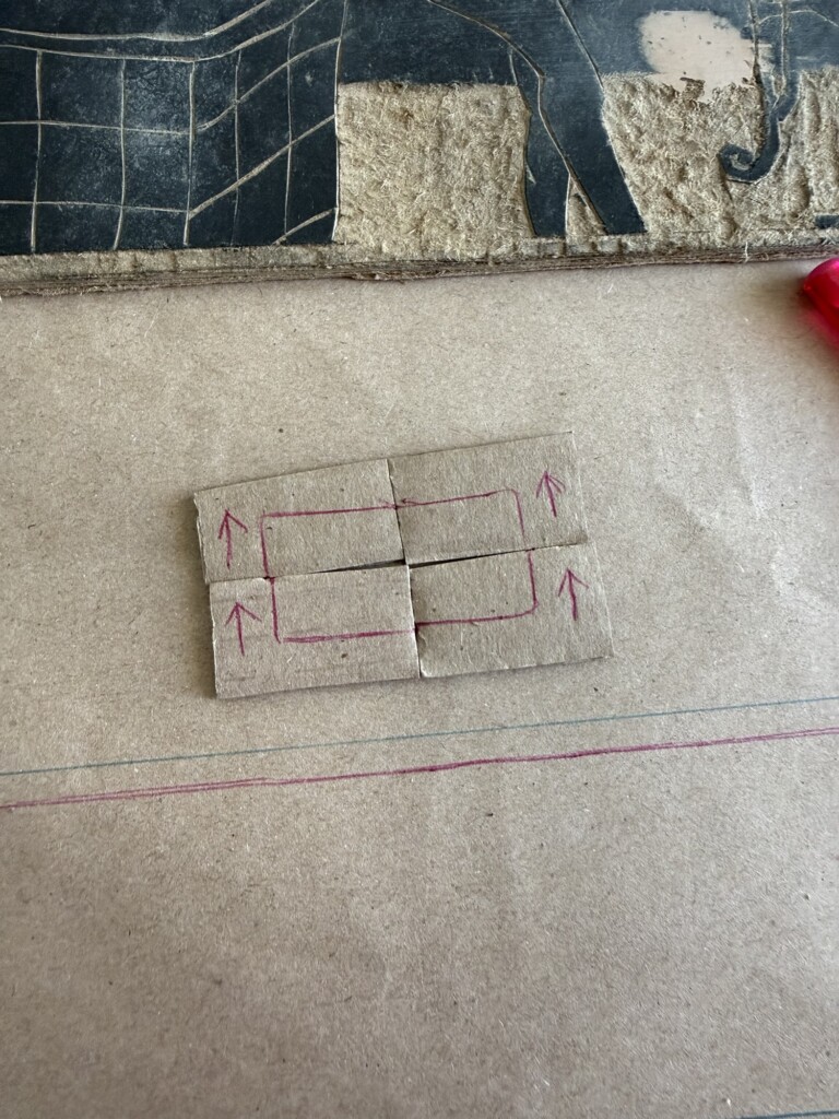
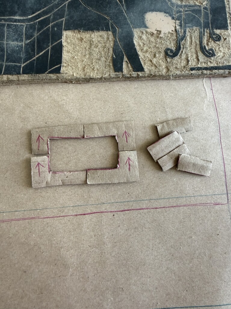
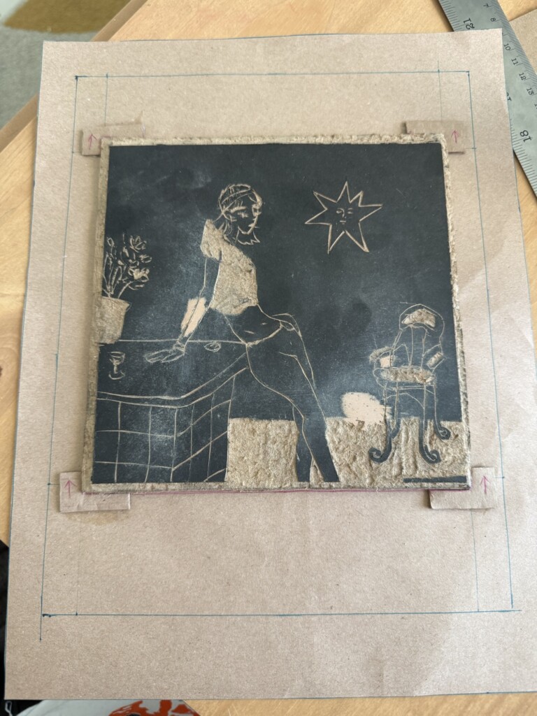
    This was a major step. I created upgraded templates with physical slots for the woodblock itself, plus two different paper alignment systems:

    • Outer alignment: paper fits inside corner slots
    • Inner alignment: paper corners align against raised squares

    After testing both, I found that for my medium-thickness paper, the raised-square method worked better. The corner-slot version sometimes let the paper dip below the edges, causing shifts.

    5. Second Round of Test Prints

    Back at the studio, now with my new registration guides and my intended final paper, I was ready for another set of test prints.

    As I printed I kept getting “grainy” results, instead of a solid layer of color. Bebeto, the studio master, helped me figure out that the blocks had gotten grainy after sitting in storage for months. Another issue I noticed was that I could see the border of the wood putty applications. So back to sending and smoothign these surfaces. Hopefully that would be the last fix.

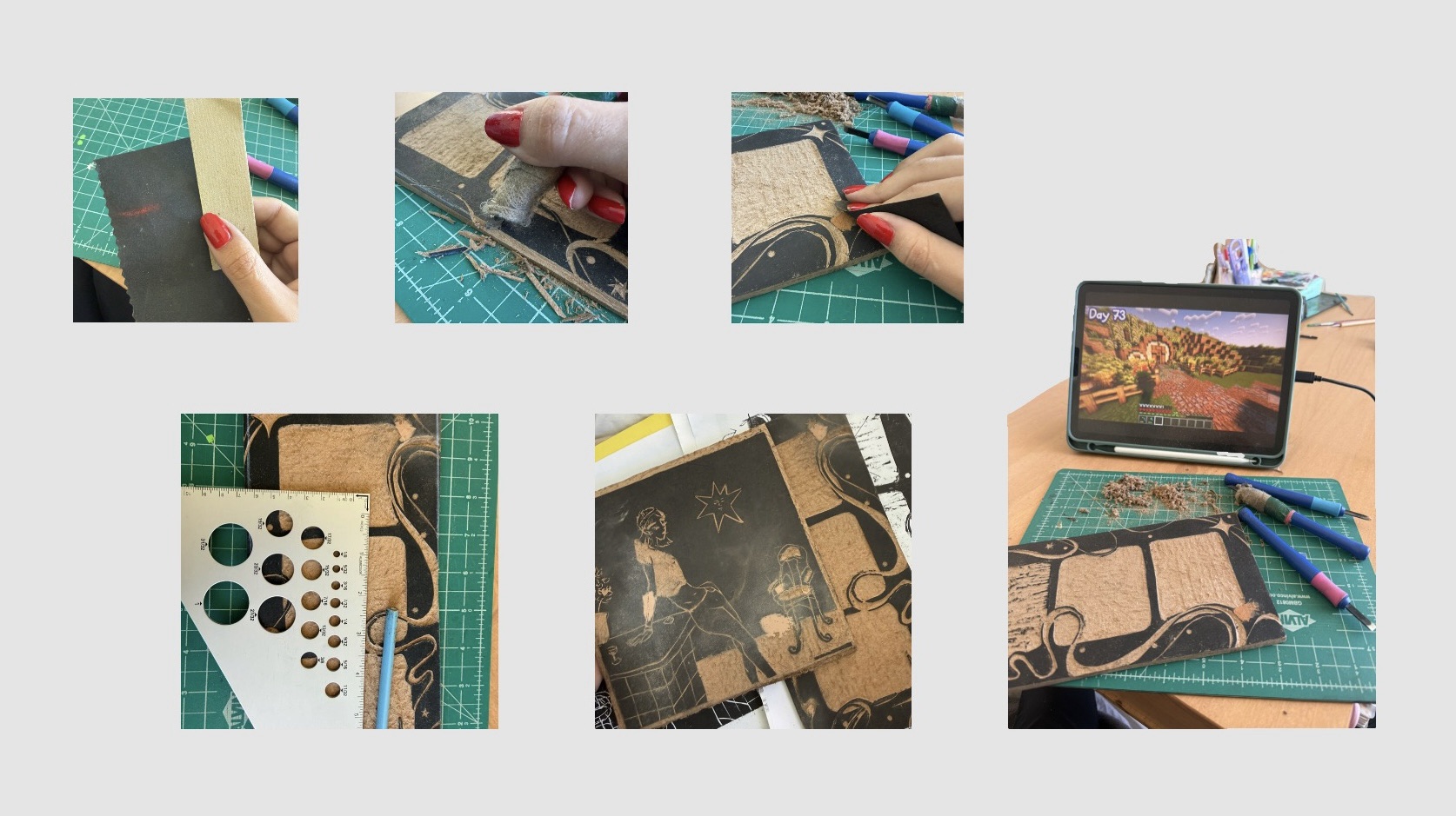
    6. Sanding, Polishing, and More Problem-Solving

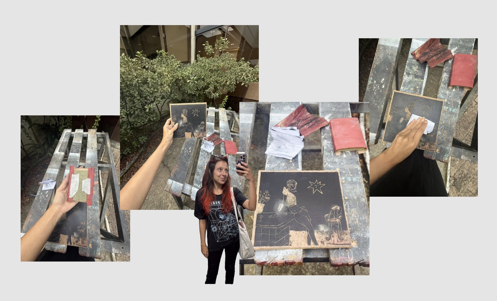
    After a few days I went back into the studio to sand my blocks down but unfortunately one or two were still not fully dried. Thankfully a studio friend was around and thought me a cool way to remove the paint and do a fine polishing/sanding to the board using regular printing paper as sandpapaer, slowly removing the ink and then polishing the surface. I was afraid that using actual sandpaper might remove sharpness of details (made that error before) and this was the perfect solution for 2 of my designs.

    For the design with the wood putty I had no other choice but to actually file it down, very carefully. Hopefully I didn’t mess it up :}

    After giving the ink time to dry, I returned to the studio planning to sand everything down.

    Some blocks still weren’t fully dry, but thankfully a studio friend showed me a brilliant trick: using regular printing paper like ultra-fine sandpaper to gently remove residual ink while polishing the block surface.

    Honestly? Game changer.

    This worked beautifully for two of my designs and avoided the risk of over-sanding delicate details with real sandpaper.

    For the wood-putty-heavy design, though, I had no other choice but to actually file it down, very carefully. Hopefully I didn’t mess it up :}

    Where we are at and future steps:

    At this stage, I can already see clear differences between test print rounds one and two, which is encouraging.

    I still need at least one more full round of test prints to see whether these latest fixes actually pay off — and I’ll also keep experimenting with paper smoothness, thickness, ink quantity, and alignment consistency.

    A bit of an exhausting process of trial and error. However, one that continues to teach me to be patient and mindful of my process.

    I hope you have been patient with yourself as well.

    Happy creafting!

  • Figure Drawing of March

    Figure Drawing of March

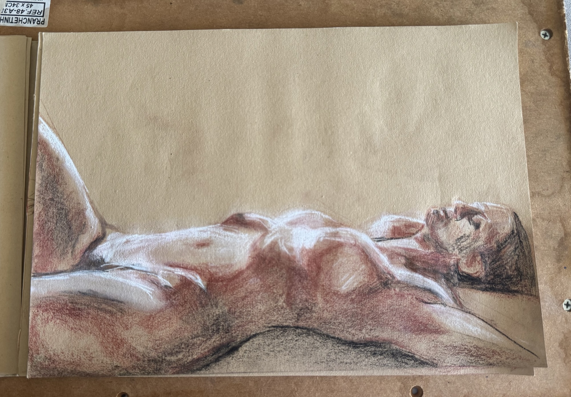
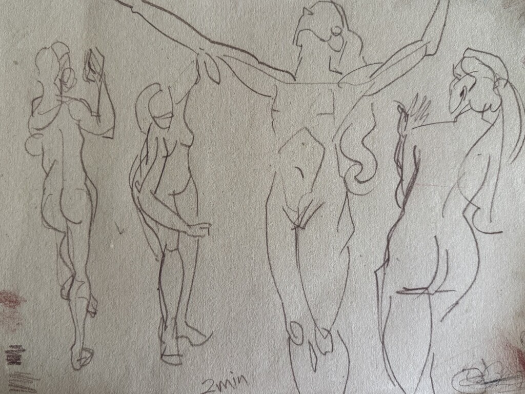
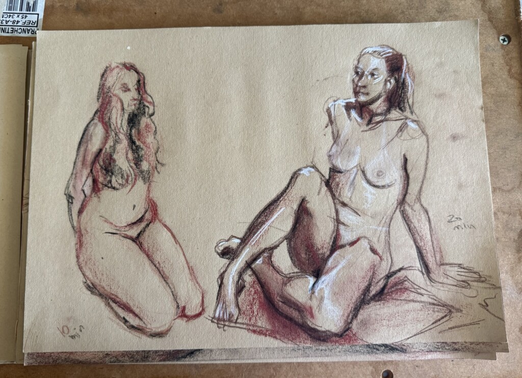
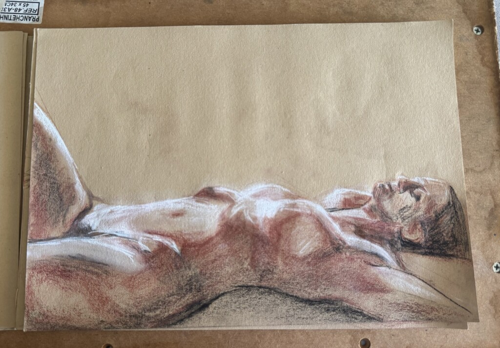
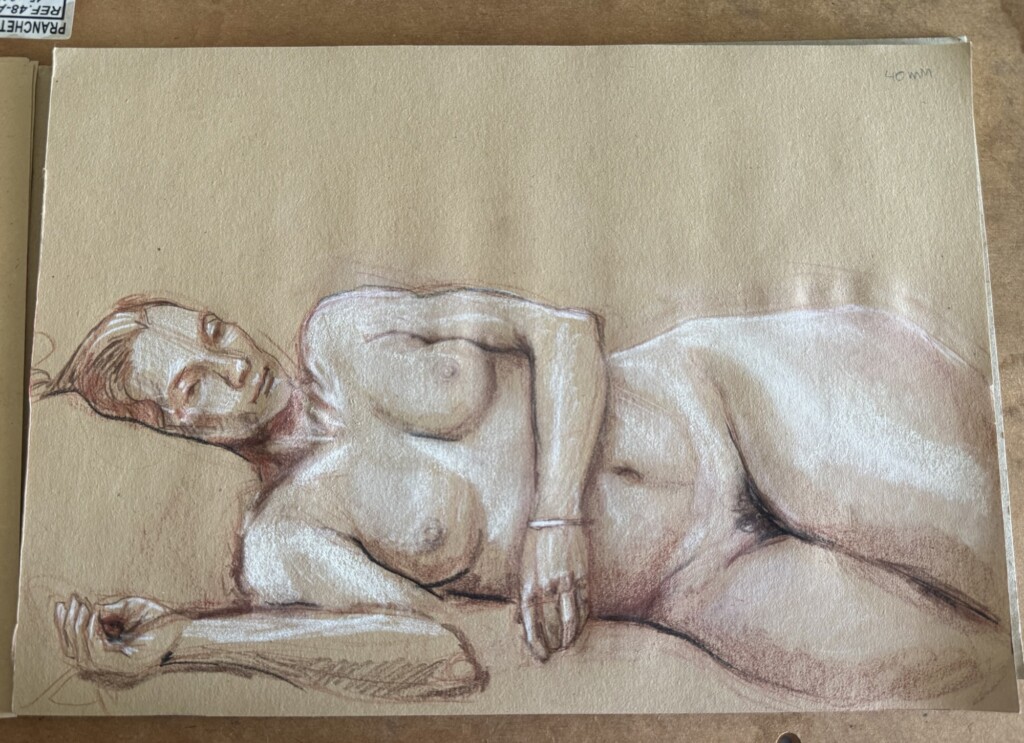
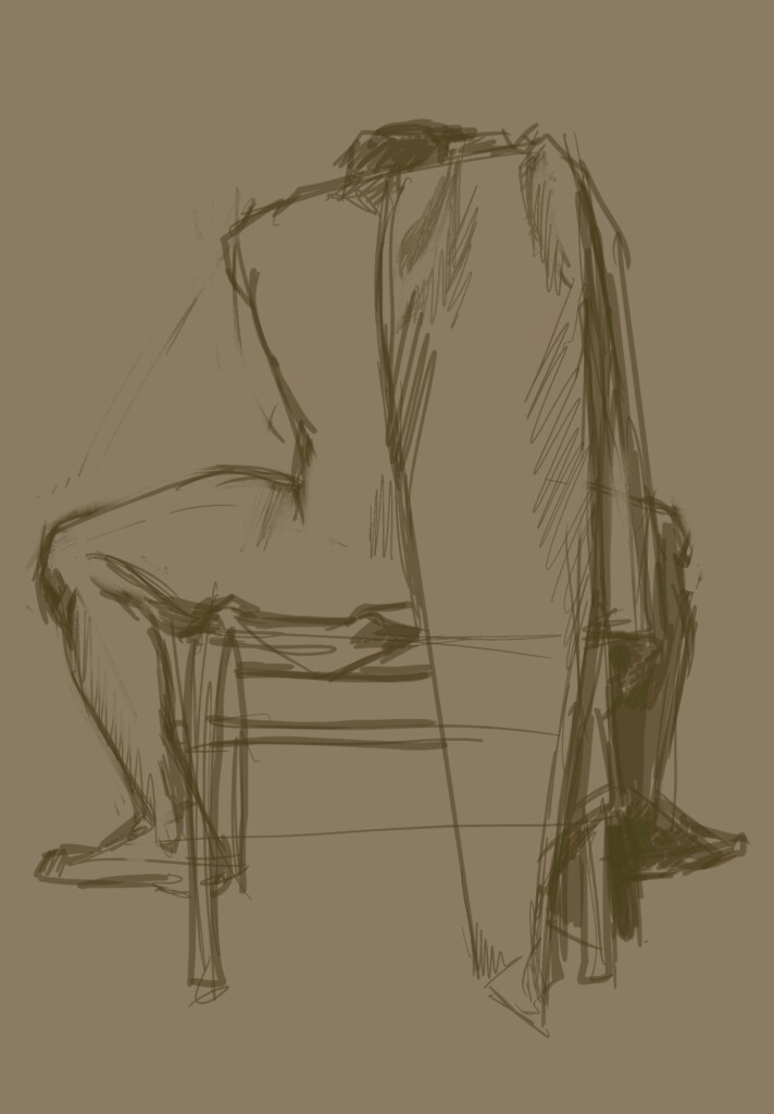
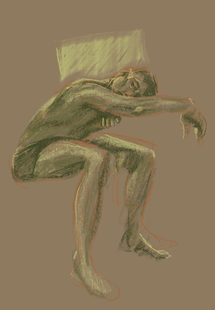
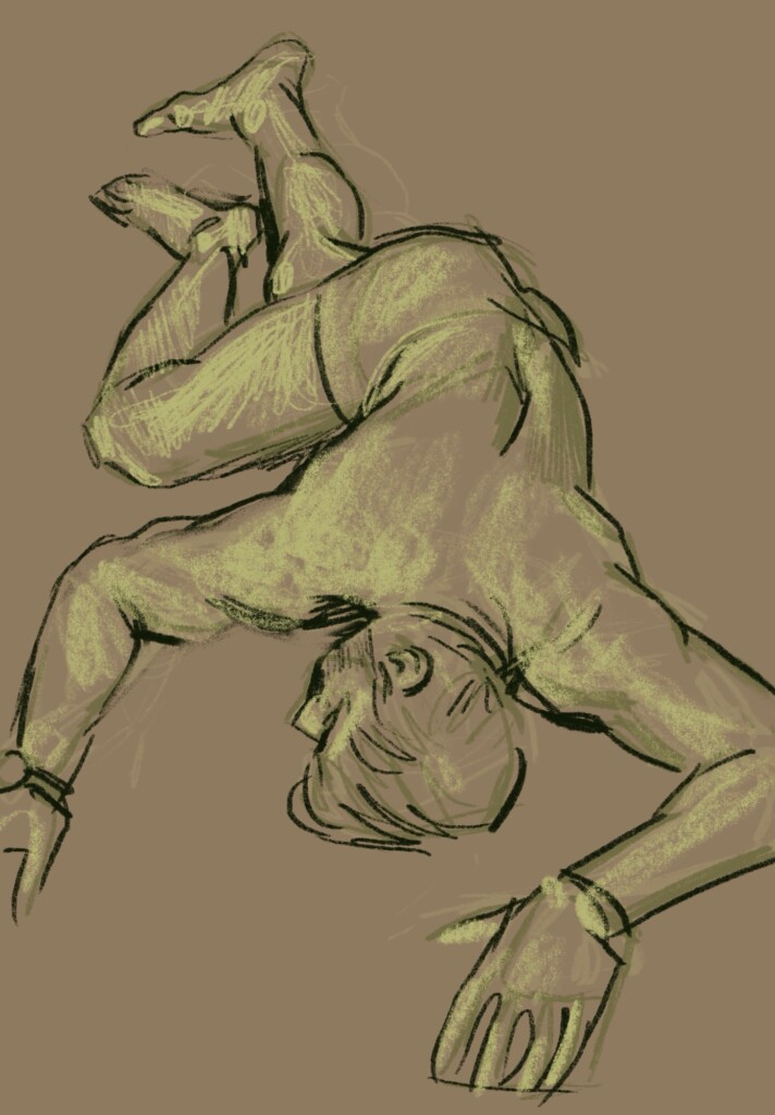
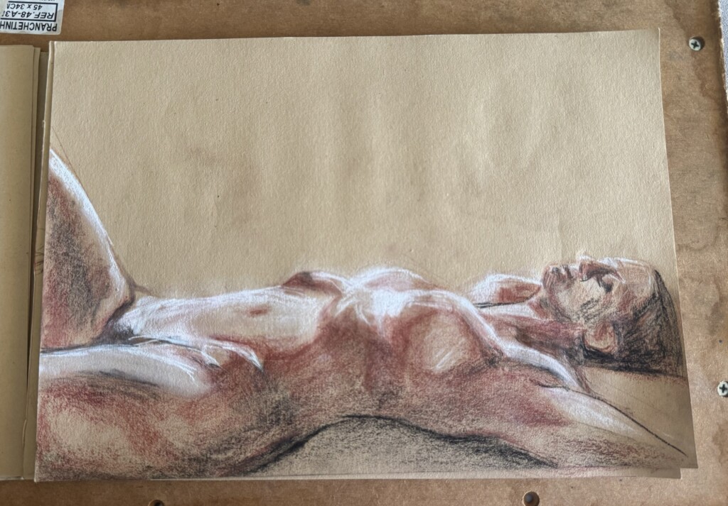
    I’ve been striving to frequent more figure drawing meet-ups this year, to continue honing this craft. In a march I went to two different events. Here are the results:

    Day 1: “Long Poses”

    2-40 minute drawings with a professional dancer as the model.

    Medium: Conté sticks and dry pastel sticks on tonned paper.

    2 mins
    40 mins

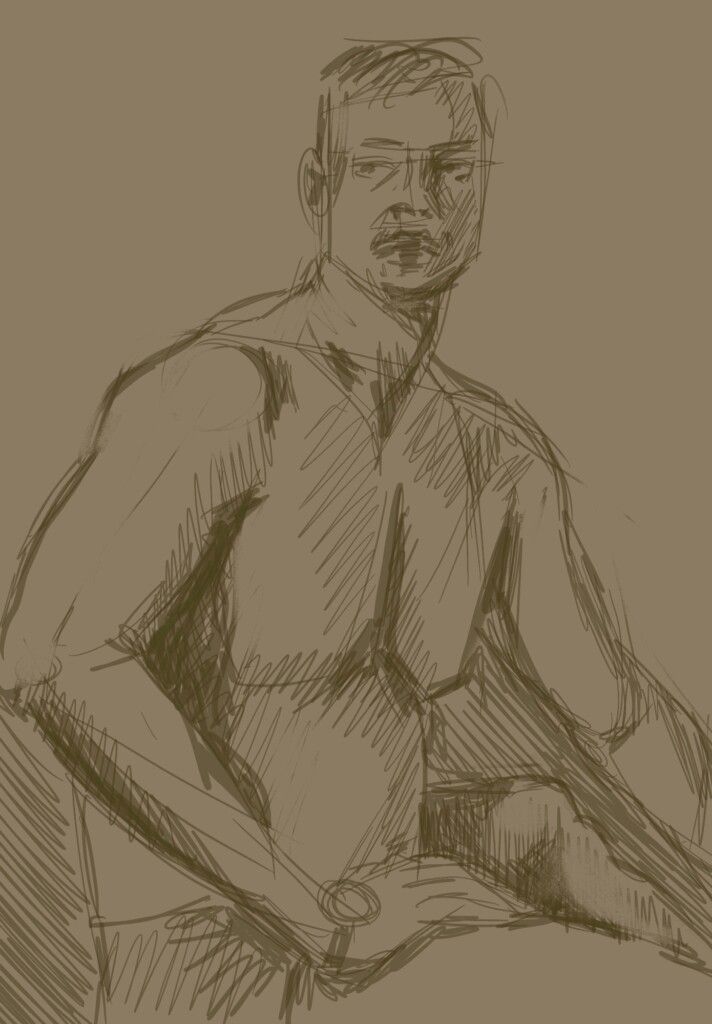
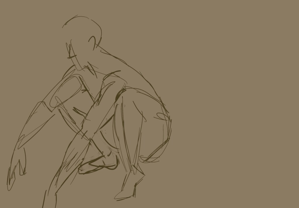
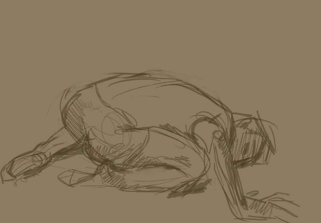
    Day 2: “Medium Poses”

    1-20 minute drawings with a martial-arts practitioner as the model.

    Medium: Digital drawings done on the Procreate app using ‘6B’ and a custom ‘marker’ brushes.

    I am surprised that after almost a year without practice, my work-quality didn’t drop as drastically as I thought! I was expecting to be quite rusty and not get very good results. I guess the years and years of practice did pay off. Of course, I struggled with these and I see a lot of room for improvement, but it’s nice to see my progress.

    Overall, I am happy to go back to this live-drawing practice; it is one of the most effective ways to improve my drawing skills, combining anatomy, composition, dynamism, realism and efficiency training.

    In the future I want to practice the “polishing phase” of my drawings to achieve as much realism as possible in a more efficient way. For that to happen, I also need to continue improving my eye for anatomy and proportions. With a good base, the finishing touches come together a lot more easily.

    I also love playing with different materials – it is what keeps the practice fresh and exciting for me. This year I’d like to experiment with paints and wet mediums, which I haven’t explored much yet.

    One challenge I want to overcome is dealing with small shifts and movements of the model that can change up the whole pose over time. One thing I’ve been trying to do is notice which muscles are most tense at the beginning of the pose and avoid focusing too much on those right away, waiting until the body is relaxed and grounded before moving into details. This helps me avoid overworking areas that are likely to shift and makes the overall drawing feel more stable. I’ve also been paying attention to weight-bearing portions of the body and emphasizing line weight there to better convey a sense of balance and gravity.

    As always, I will keep you posted on how things progress and continue sharing my explorations.

    Thanks for following along and happy crafting!

  • Back Into my Creative Routine

    Back Into my Creative Routine

    With summer coming to an end and fall beginning I’m feeling inspired and rested, ready to go back to creating even more things this year/cycle – maybe I’ve got a bit carried away by this feeling and have started more projects/hobbies and classes that I can sustain long term. If that happens and I need to prioritize some interests over others that’s ok and part of the creative process. But enough intro, I have lots to share!

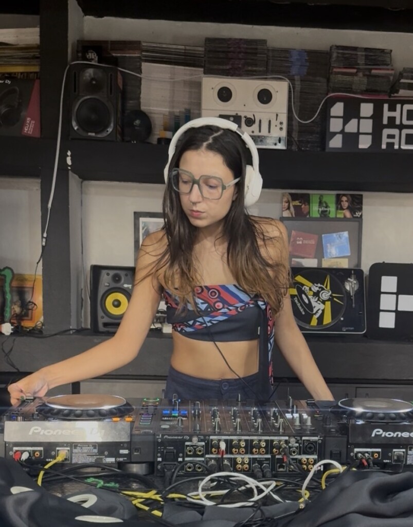
    How’s the Dj life going?

    I finished and recorded my first set! I was super nervous about it but thought I did pretty well. However when hearing back the audio recording I realized I had made a repeating mistake in my transitions: I was bringing in the coming track in a very low volume for a couple compasses before coming in with it. It works when we are listening on the speakers but the raw audio just sounds messy. I was bummed about it for a couple of days but I was able to come back around and learn from it instead of letting this keep me from continuing this hobby (even though I have been dealing with a lot of self-daubt and shyness about performin gin front of other people). I will practive my set with a few imrpovments, until. figure out a better way to transition some lyric heavy songs and then try recording again. This time probably at home, on my own controller (did I tell you guys about this purchase! so exciting! It is the DDJFL4) with my own stylistic voice comming through instead of recording at the school studio where I lack control and the support I need at this moment in my learning journey (no shame on the school, this is about me).

    2026 Classes & Workshops

    I might have overdone it this year by deciding to go back to the woodblock prinitng studio regularly, signing up for a ceramics class and also deciding to attend more figure drawing meetups… all this on top of all the other projects I describe in this post! It is quite ambitious for such a home-body like me, but that is exactly the point. I wan to keep active both creativelly and socially and thse classes are good excuses to practice both. I am beyond excited to have been selected for this ceramics class! It is free workshop offered by my local culture foundation, CIC, where the woodblock open studio is at as well. I talk a lot about this space, the gift it is to have access to it and the lack of care and funding that goes into it systematically/by design.

    I am excited to be beack into a active schedule and to have as much creative time as possible built into my routine. Of course I’ll share the whole journey here and keep you posted on how managable it becomes on the long run.

    Check out my recent Figure Drawing and Woodblock Printing posts/practices.

    Current W.I.Ps

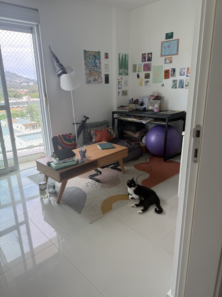
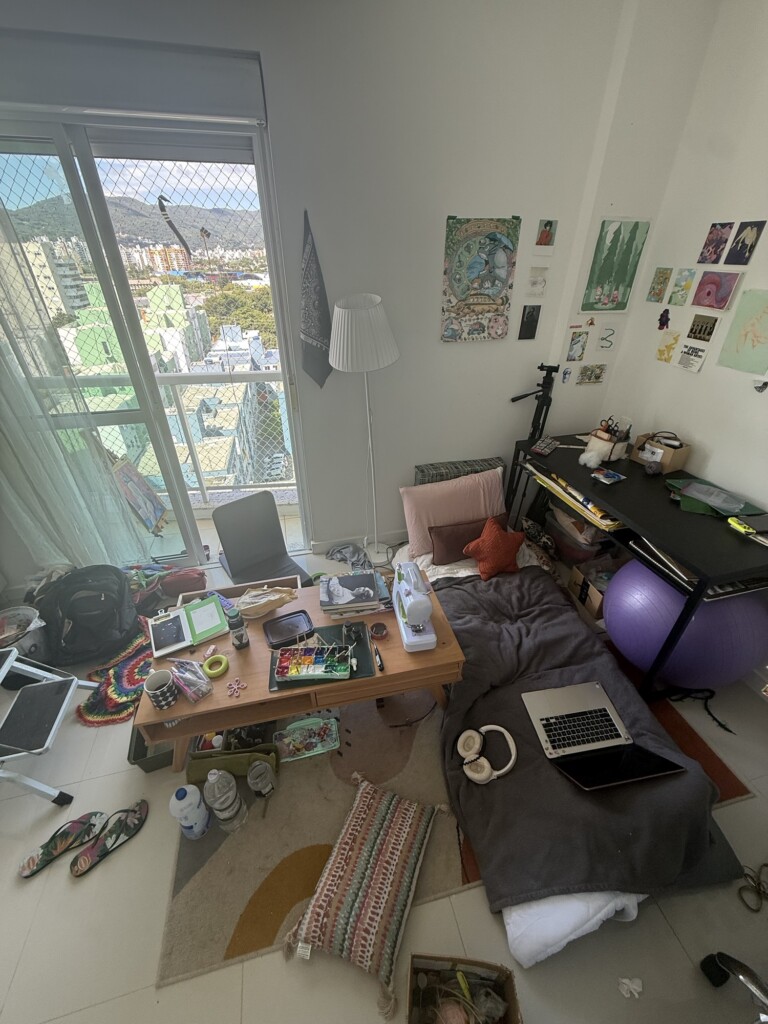
    Office space: I’ve finally achieved a good setup of my office (after almost 2 years!). I love the way I can be carring out multiple projects at once and all the possible sitting (and even laying down?!) option I have. It is the optimal space for the way I work -> in short spams of time, rotating between multiple projects and positions.

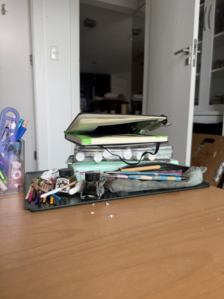
    Paint revival: I fell for the muchi jelly guaches back in 2020? and of course they became little colorful pebbles… I spent a few days reviving them and to my surprise, with enough patiance, they came back to life! I am excited to give them another try, which leads me to my next project in progress:

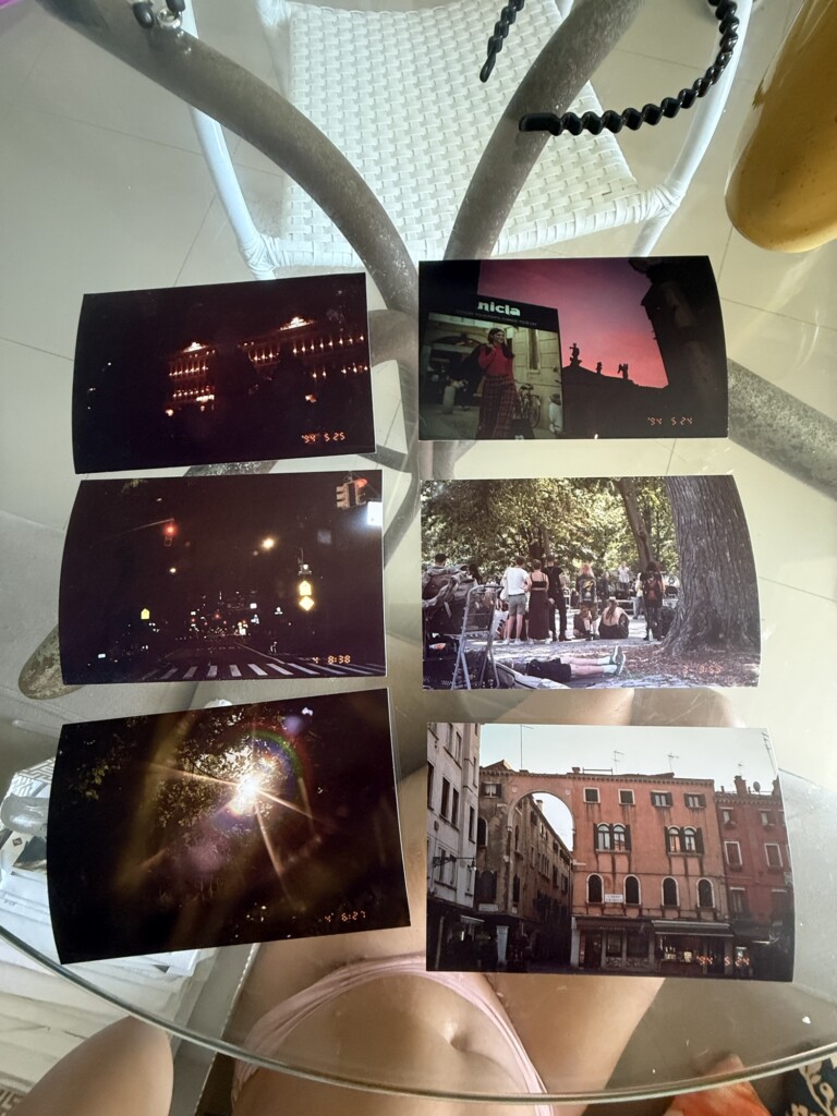
    Paintings: I decided to practice my painting skills by recreating some of my favorite analog photographs from my experiments with the media in college. I selected 6 photos to try and I have already staerted with the first one. I am not very skilled at paiting, specially with guaches, but I think having physical reference images will help me. I’ll report back on my progress and learnings.

    Crochet: I am working on a rolly-polly plushie for myself and it proing to be quite complicated with many small and moving pieces. I am excited to share this project with you soon!

    Digital: I have been brewing some digital project experiments as well but these are top-secret and I will only share when it is ready much further down the line… I guess this was just o make you curious, sorry.

    Collage Making: I wish this blog had more interesting imagery and I have been thinking about incorporating more collages into them instead of just image galleries. I am testing out Shuffles, Canva and good old Figma for this but I am not super sure when and how I should do these… We’ll see soon when I start incorporating some of them into my posts. Let me know what you think and if you have any tips please.