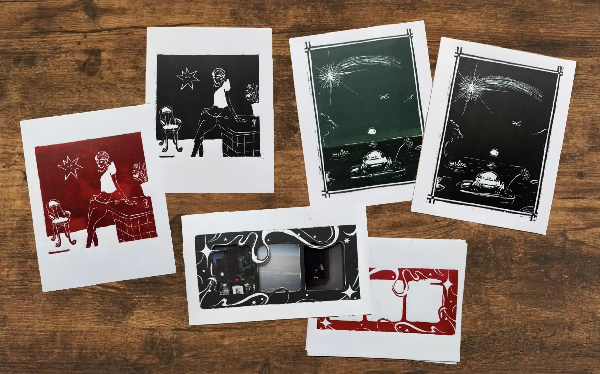
After a couple more weeks of work, I’m finally done with at least the first batch of prints I’ve been working on. I’m really happy with the resulting four series, plus an interesting experiment that I think still has more potential to explore in the future.
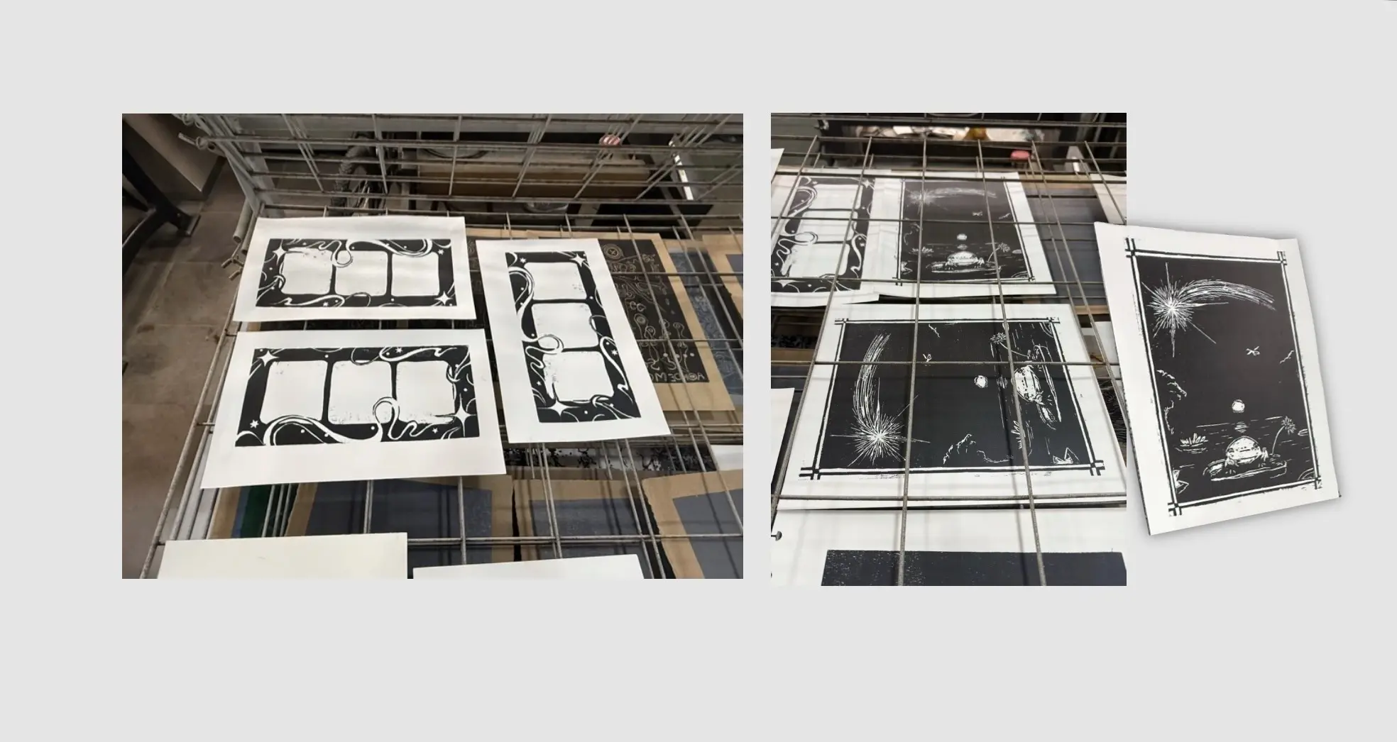
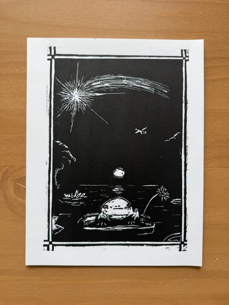
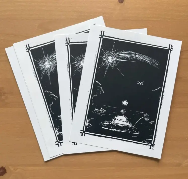
Enchanted Night – the Froggy print
I never took this piece too seriously. It started as a sketch and a test piece for an exhibition a couple of years ago that ultimately didn’t go anywhere. However, whenever I showed it to friends, they seemed surprisingly amused and drawn to it, so I decided to go ahead and finish the design.
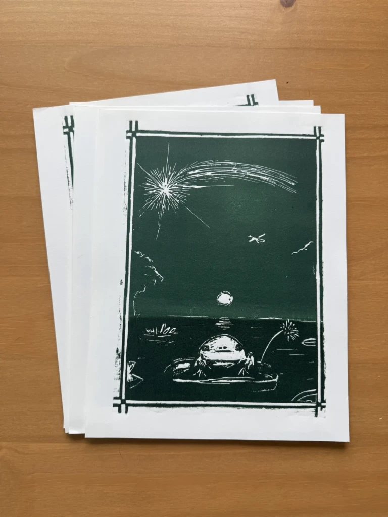
I’m really happy with how it turned out, especially the second series of multicolored prints. Here are some process pictures from several studio visits. Thankfully, I didn’t have to do any further cleanup on the design after the long cycle of test prints and adjustments described in my last studio log. You can read more about that process here, including all the ups and downs that got these designs to where they are now.
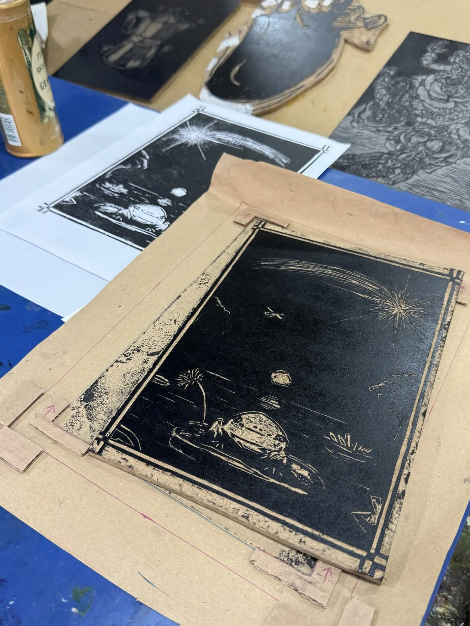
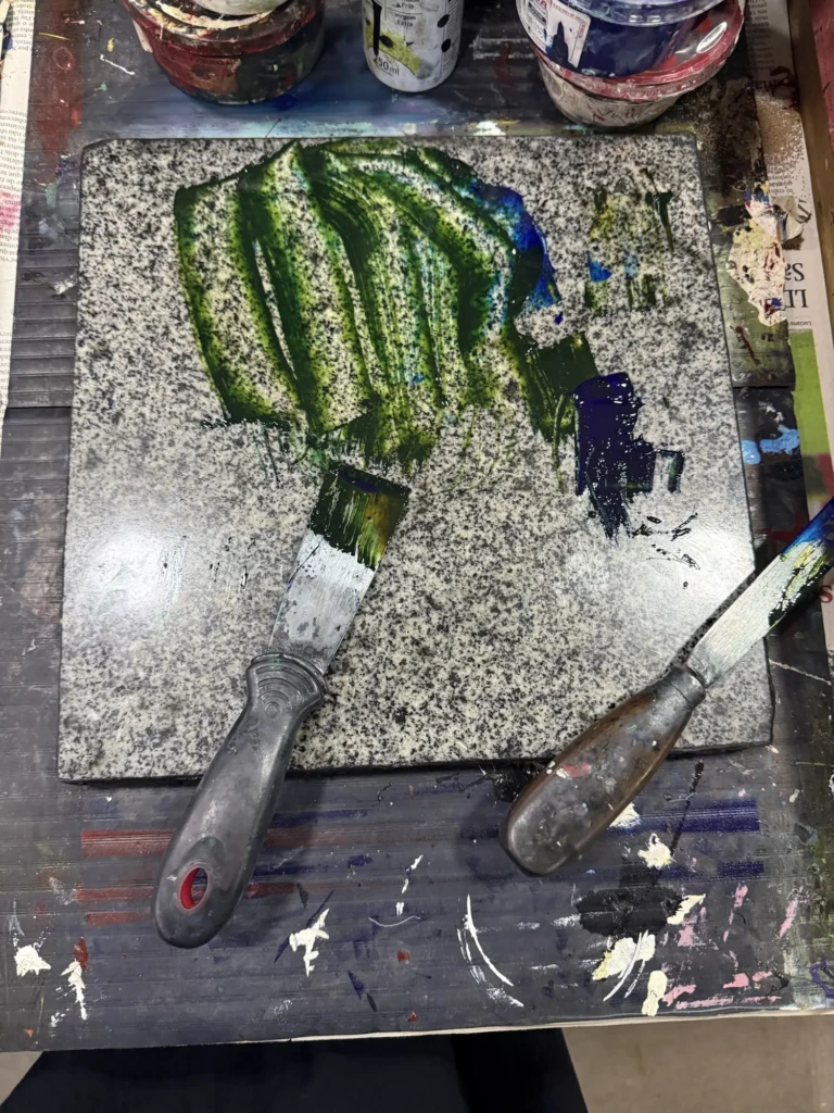
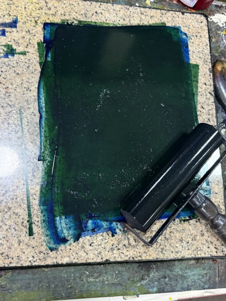
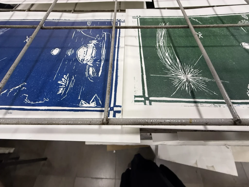
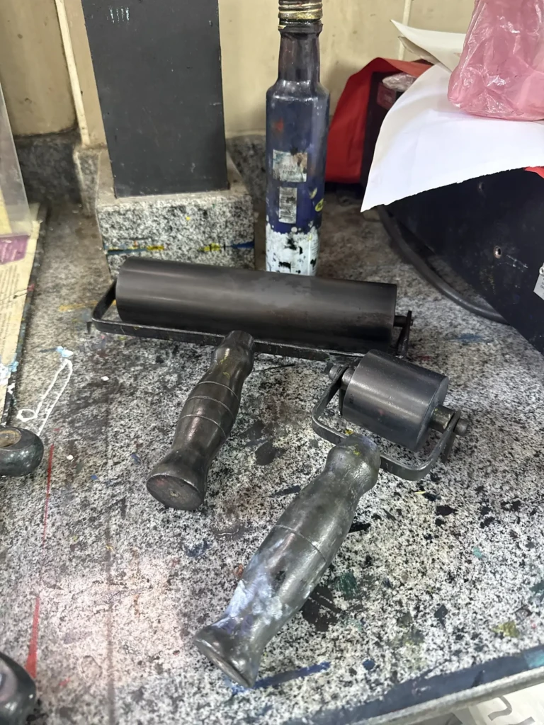
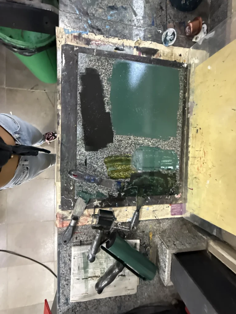
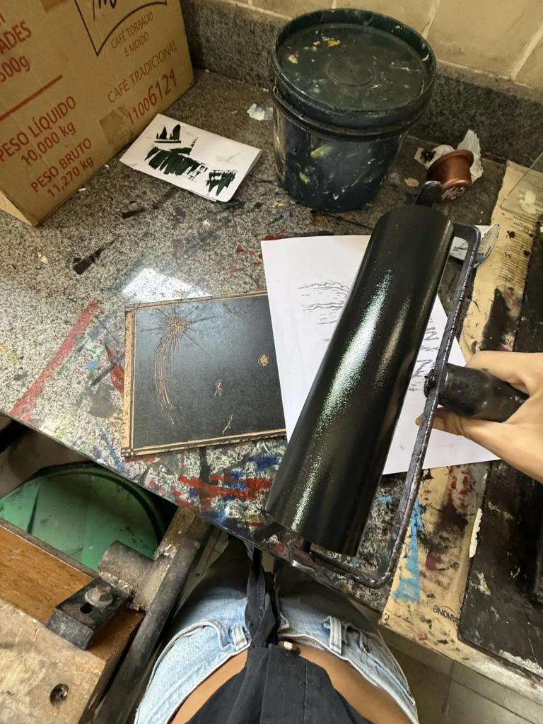
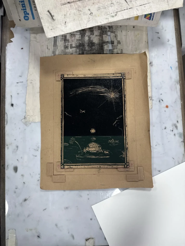
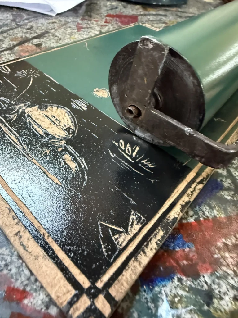
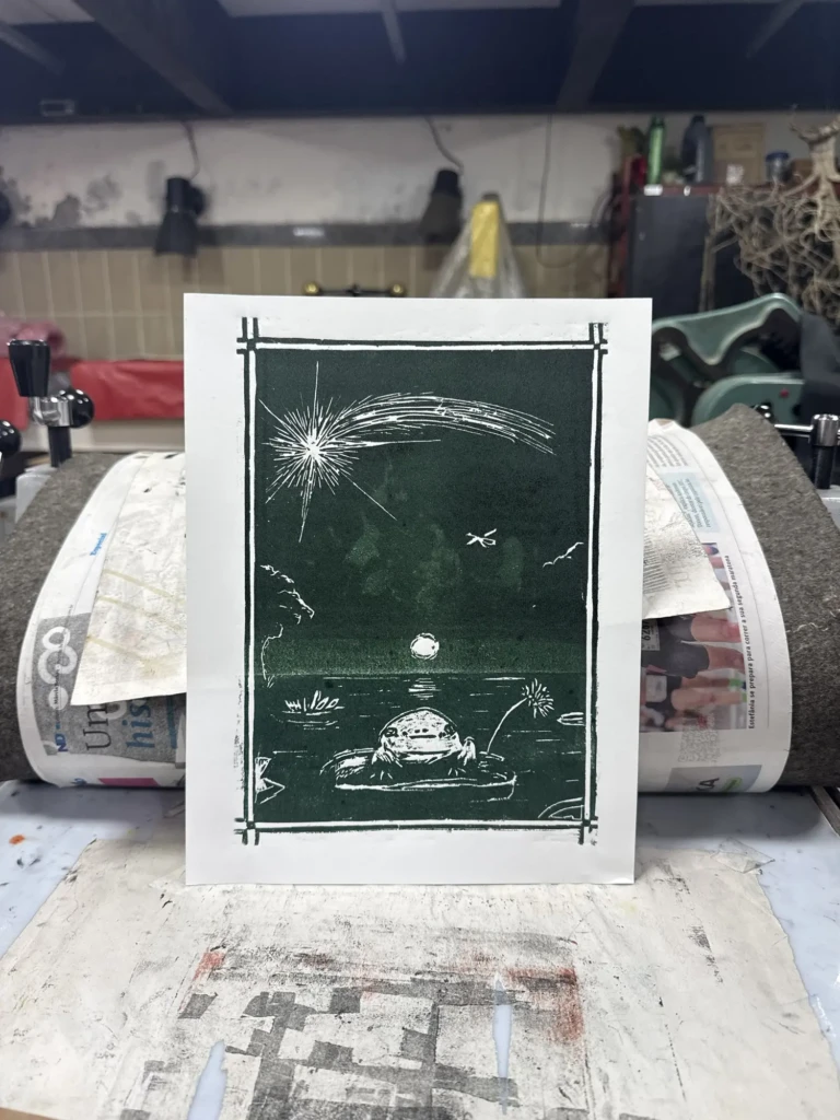
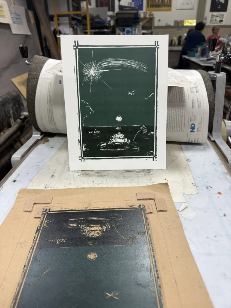
To achieve these split-color prints, I had to go through quite a bit of trial and error. My first attempt involved using a sheet of paper to mask half of the block while inking, but the results weren’t very clean. Once the masking paper touched the inked surface, it would leave behind subtle textures and inconsistencies, even if I rolled over the area again afterward.
The best results came from simply being very careful and following the dividing line with the edge of the brayer. It took a steady hand and several failed prints, but the color separation ended up much cleaner that way.
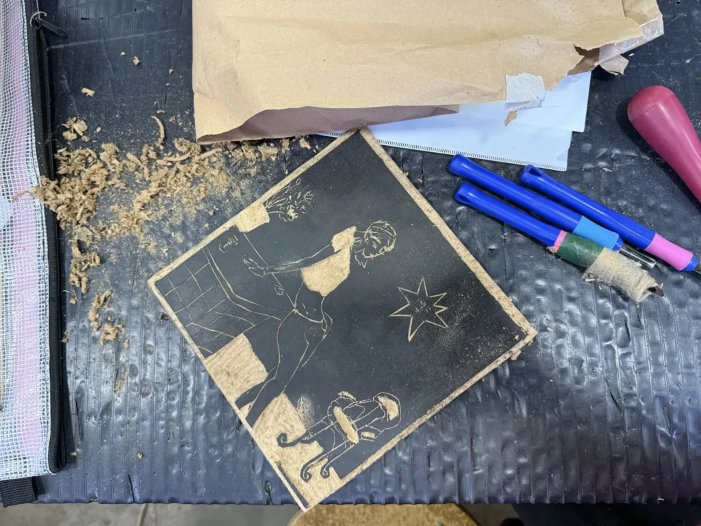
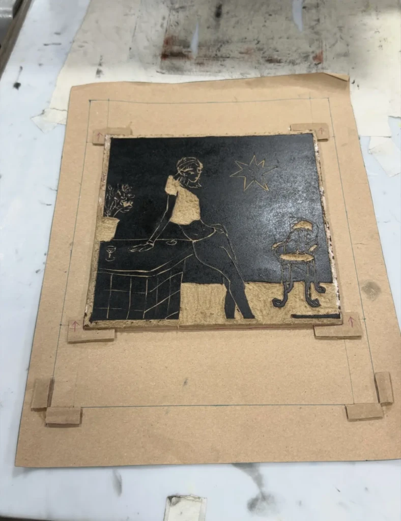
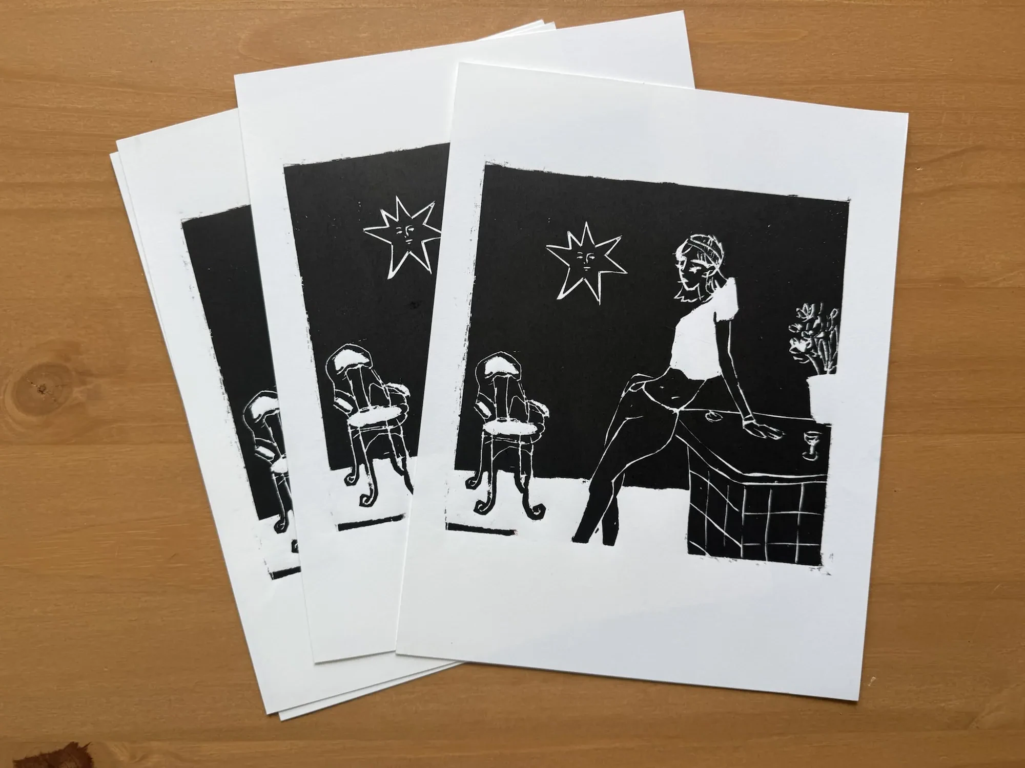
Untitled portrait design
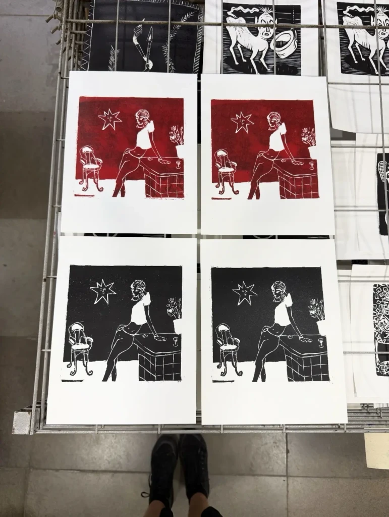
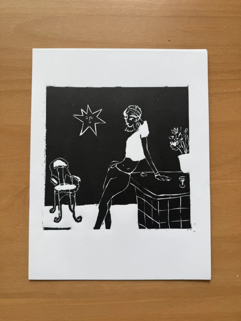
Although this design required several rounds of testing, cleaning, and adjustments, I’m beyond excited with the final result. I really like the composition, which originated as a digital illustration and transferred to printmaking much better than I expected.
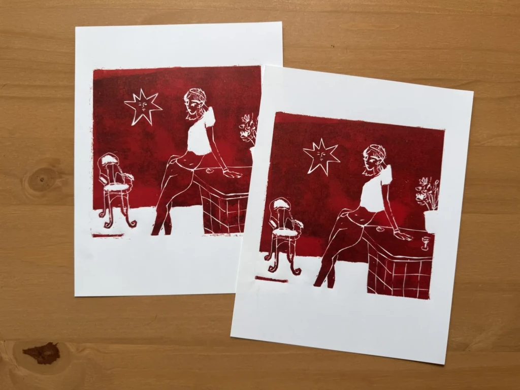
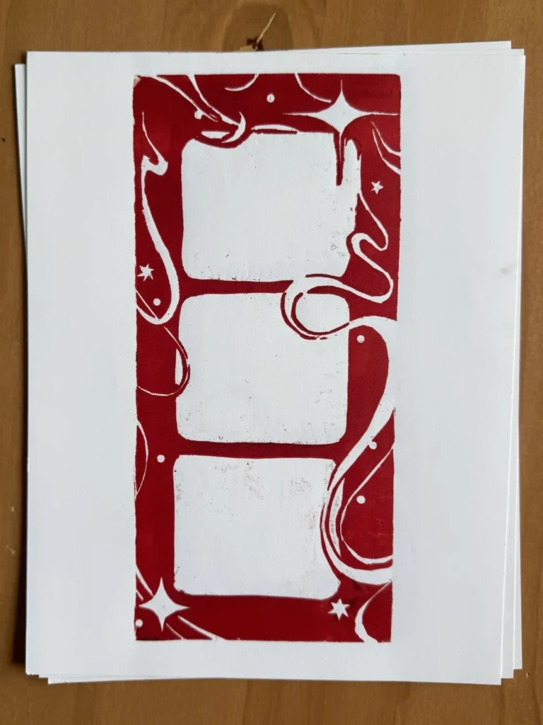
I also printed a small experimental series using a deep red ink. Despite my efforts to clean the block thoroughly, the prints came out a little blotchy. In the end, though, I think it created a beautiful rusty texture that adds character to the piece. Another happy accident, I guess.
Frame Design
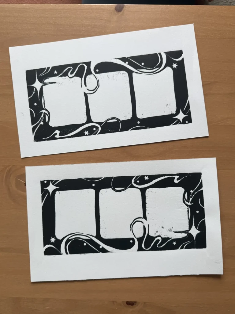
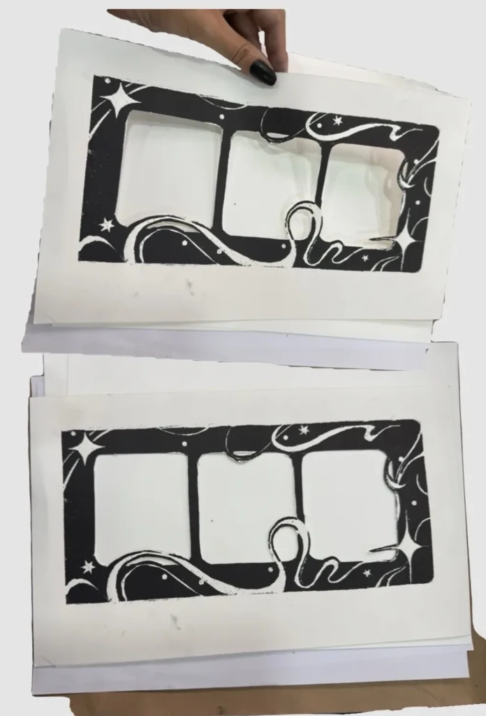
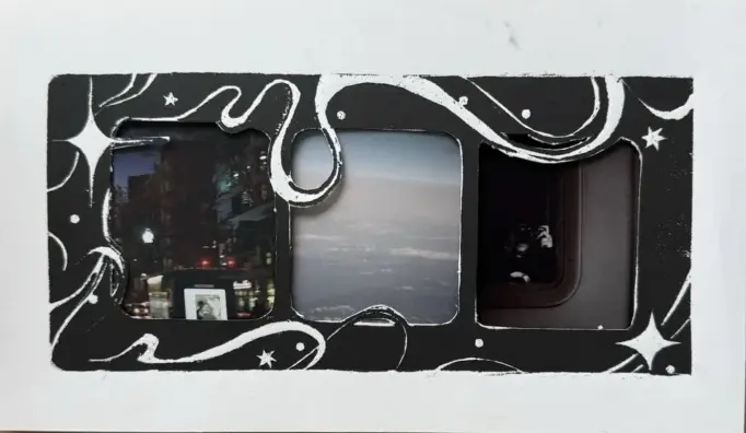
The third print I completed recently is this experimental design that could potentially be used as a decorative frame for photographs, stamps, or other small works.
This piece wasn’t particularly well planned—there are very few straight lines and almost no consistency in the construction—but I love the swirling elements and the overall sense of movement in the composition.
I printed the design in both black and red. I think it would work well in almost any color, including gradients, depending on its intended use. That said, the black version is probably the most versatile as an actual frame.
CIC expositions
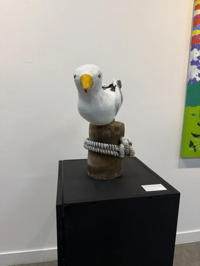
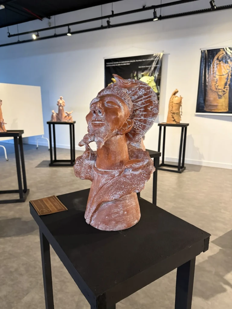
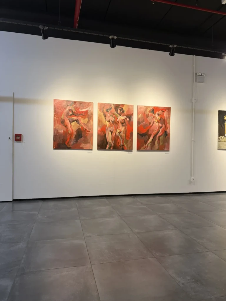
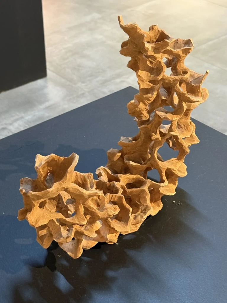
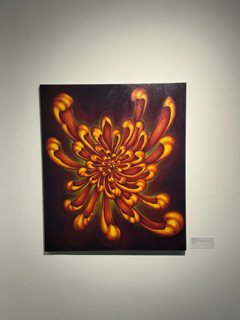
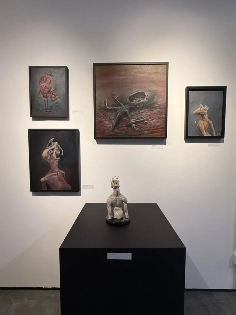
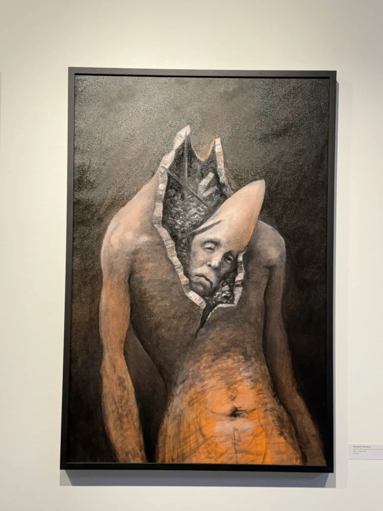
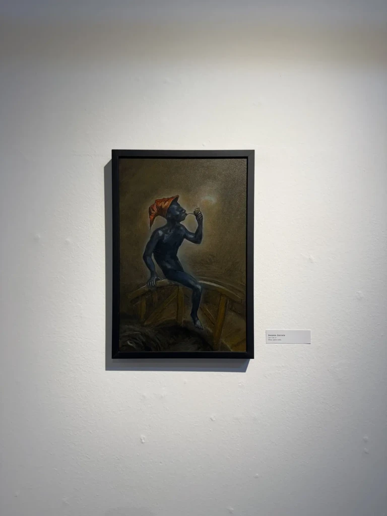
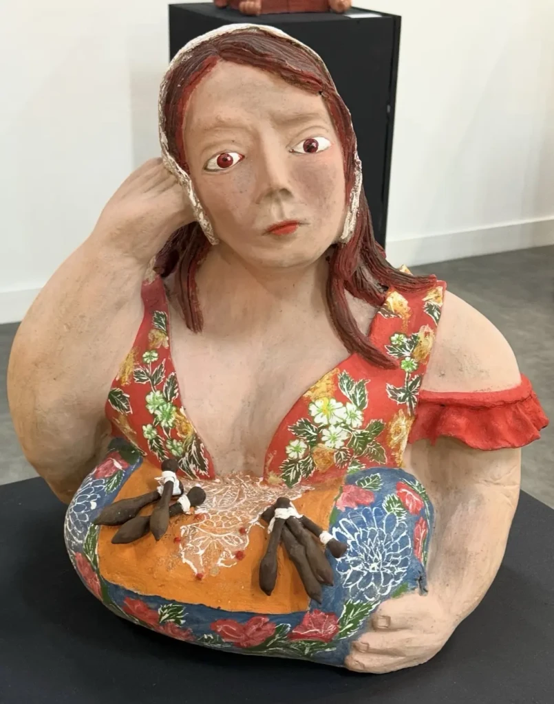
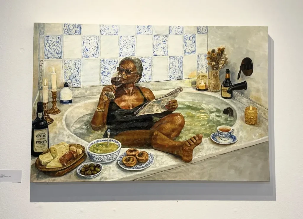
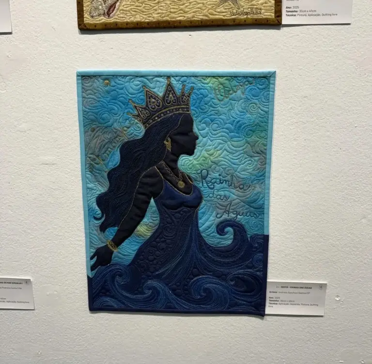
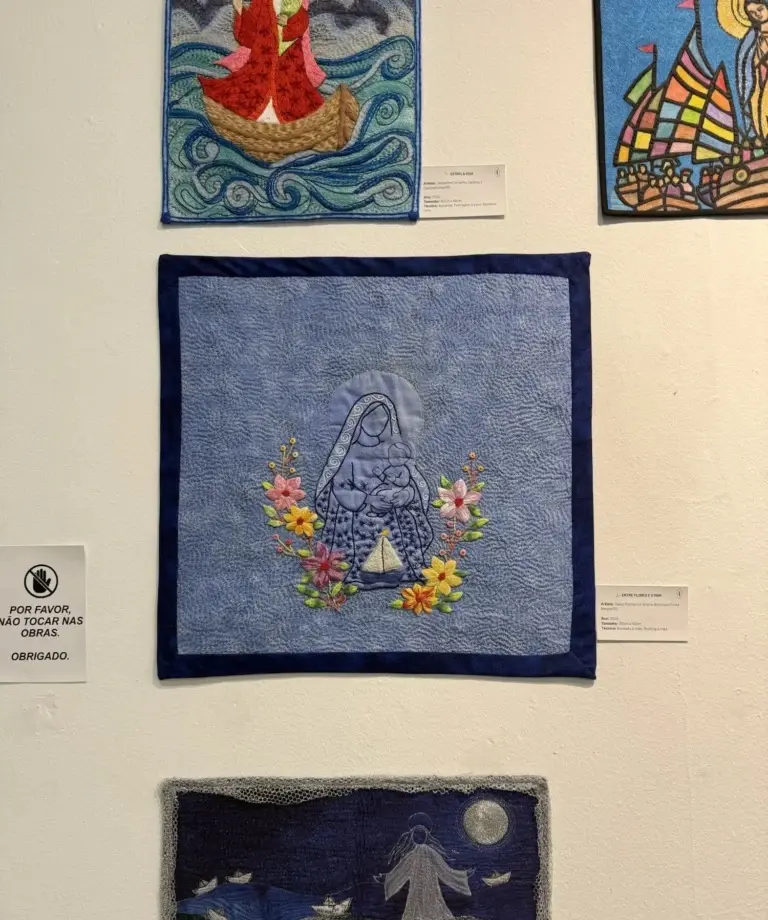
Throughout these studio visits, I also spent time wandering through CIC’s current exhibitions, drawing inspiration from a wide range of multimedia works by local artists. Here are a few pieces that particularly caught my attention, featuring the artist’s names: