Hi friends! How are you? What have you been working on lately?
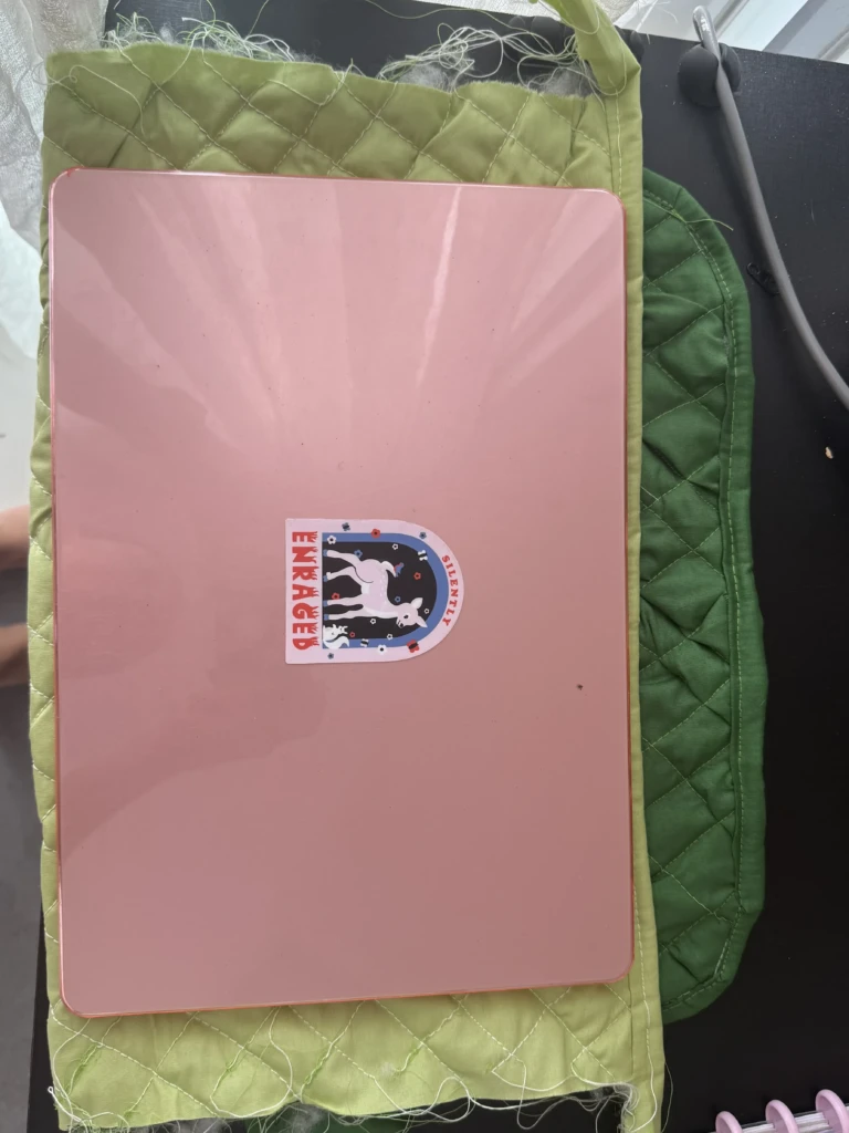
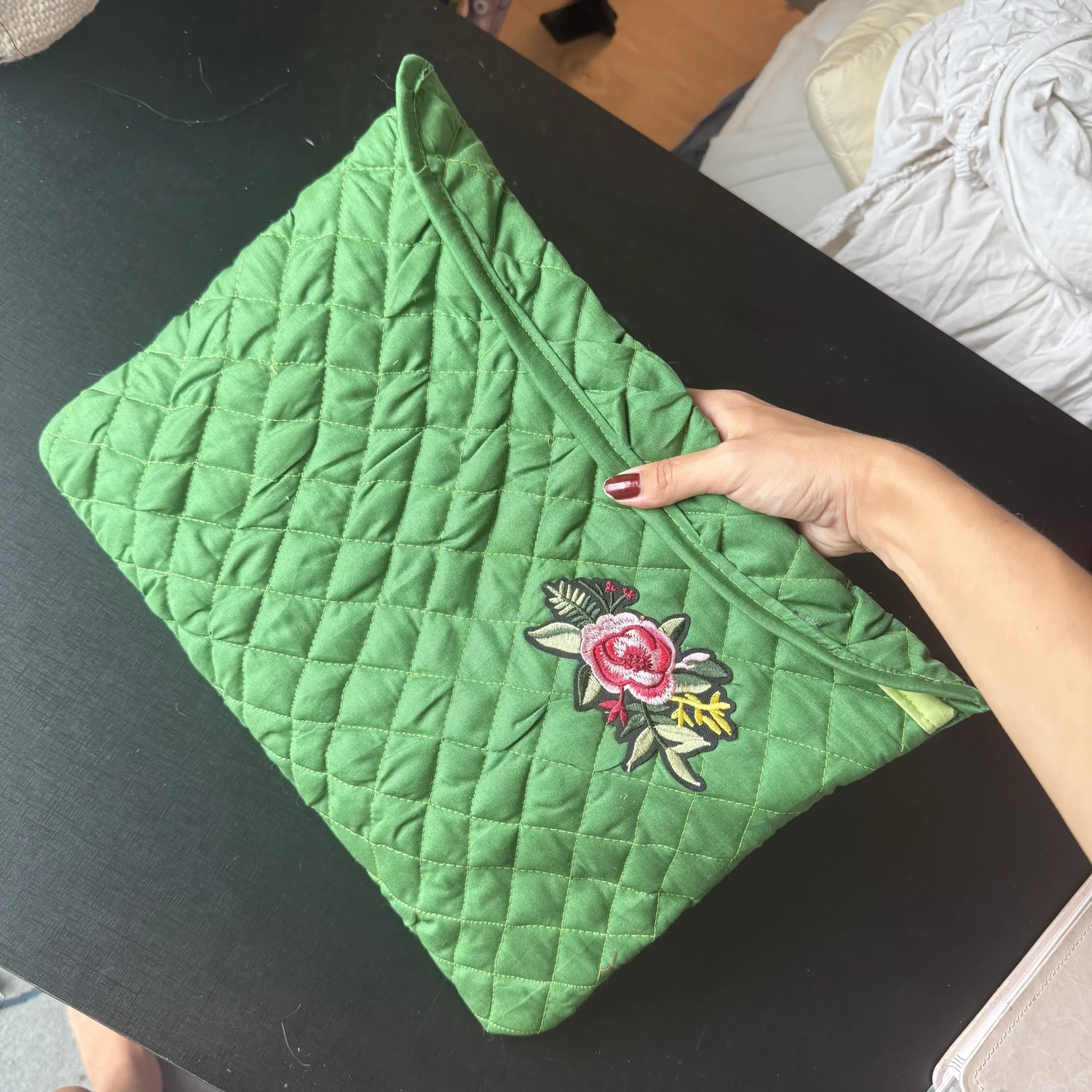
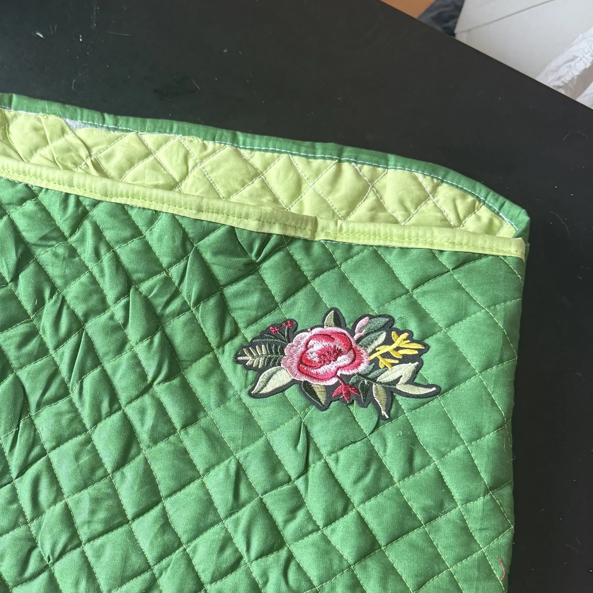
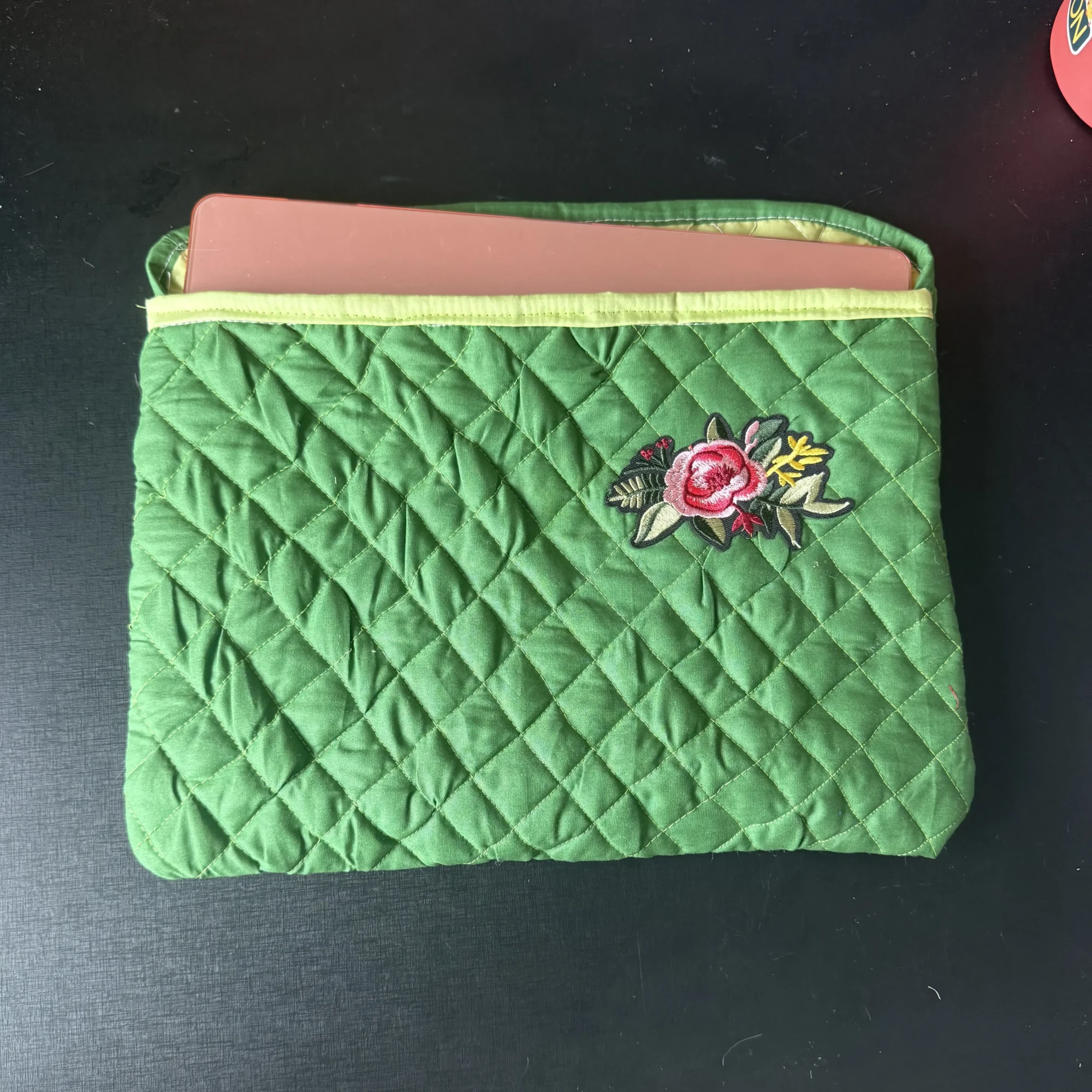
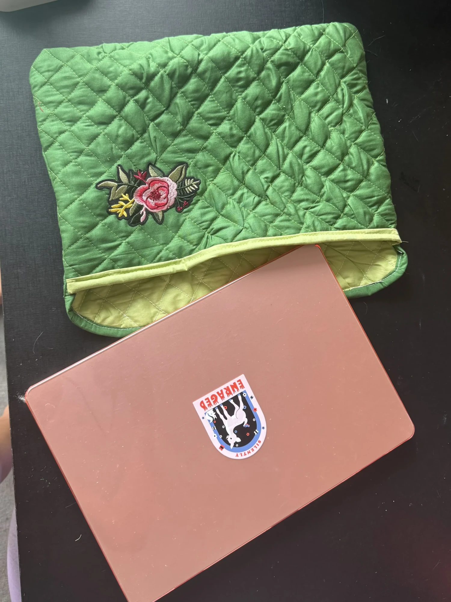
Another project I recently finished—and wanted to share with you—is a new laptop case I made for myself. A few years ago, I quickly put one together for my old computer using whatever materials I had on hand. It’s functional (it even has a zipper and felt lining), but let’s be honest… it’s not the cutest. These days, it’s mostly used by my partner anyway, so I took the opportunity to make something new—this time matching my current laptop.
The goal was to work with what I already had. I was inspired by those fluffy, quilted cases that look like cozy jackets—you know?. I was also recently gifted a sewing basics book from a friend, which includes a chapter on quilting. Between that and a few online resources, I learned the technique and decided to give it a try.
knew going in that this would be a bit of a challenge—my sewing machine isn’t the most powerful, and I didn’t have proper batting sheets, only loose polyfill. It definitely took patience (and a fair bit of finagling), but I’m really happy with how it turned out—imperfections and all.
Here’s how I made it:
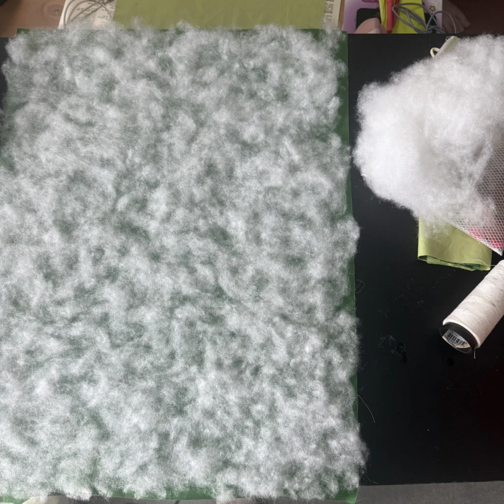
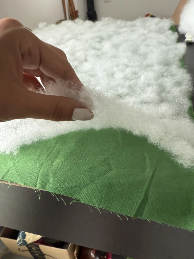
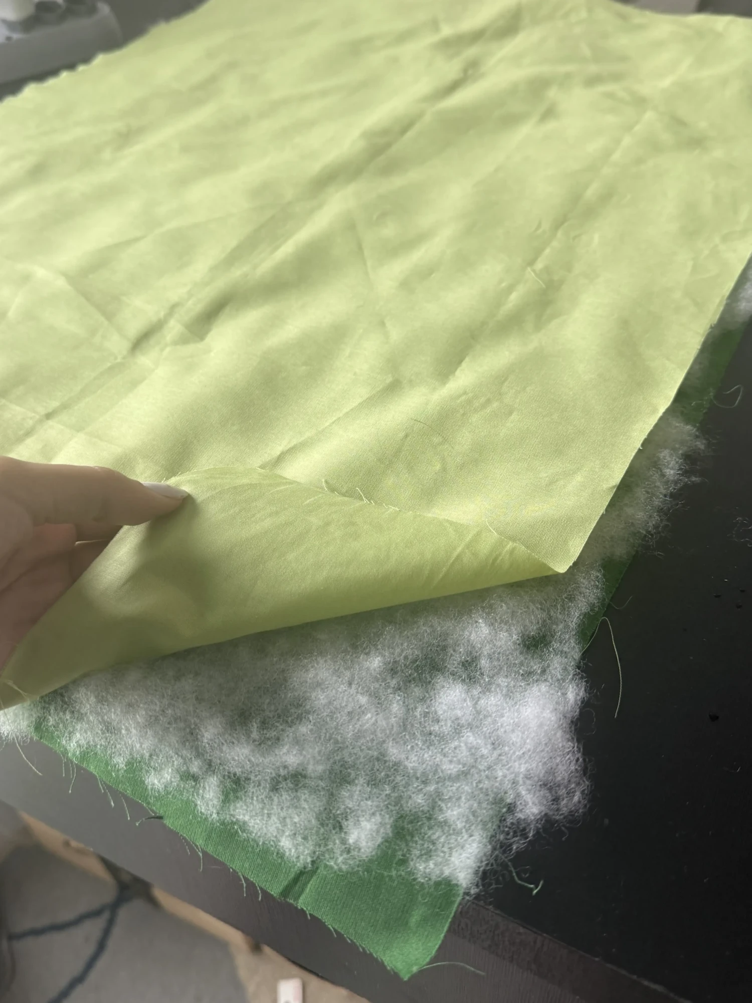
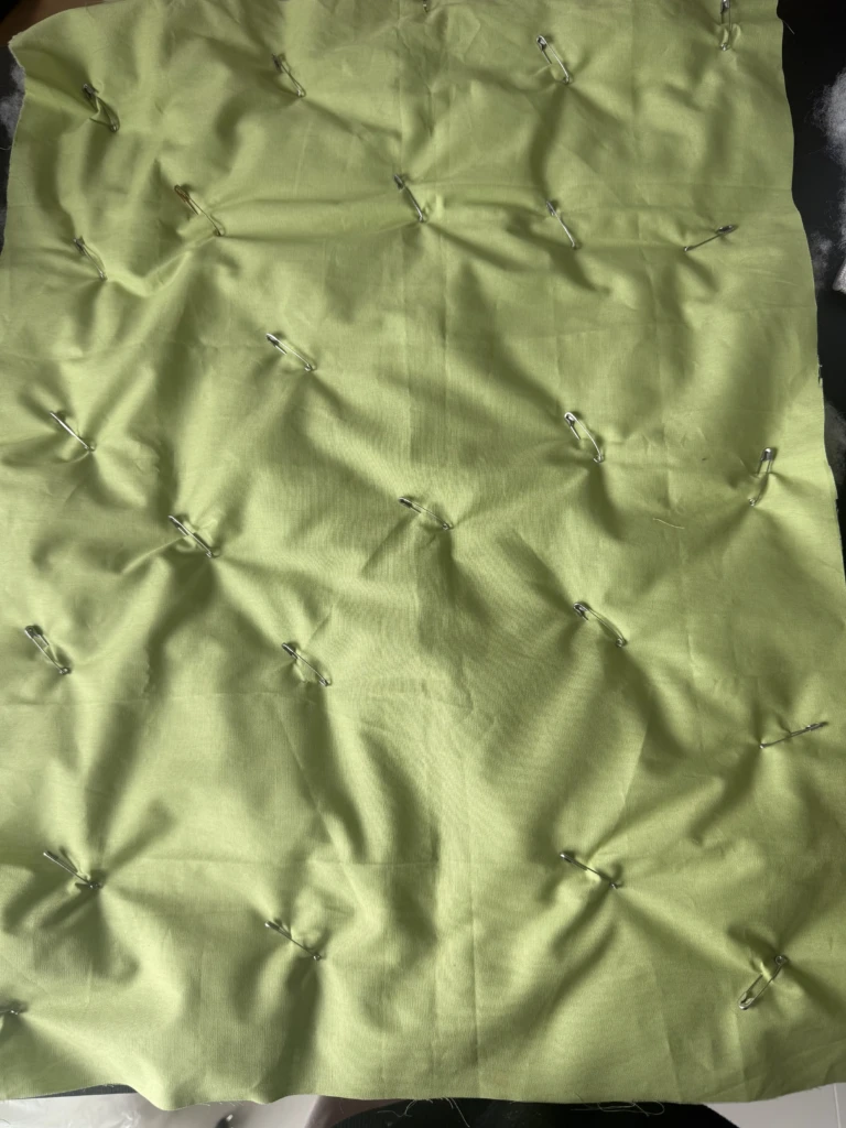
Step 1 — Preparing the layers I cut the outer and inner fabrics, then created an even layer of polyfill in between them. Once everything was aligned, I pinned the sandwich together using safety pins to keep it from shifting while sewing.
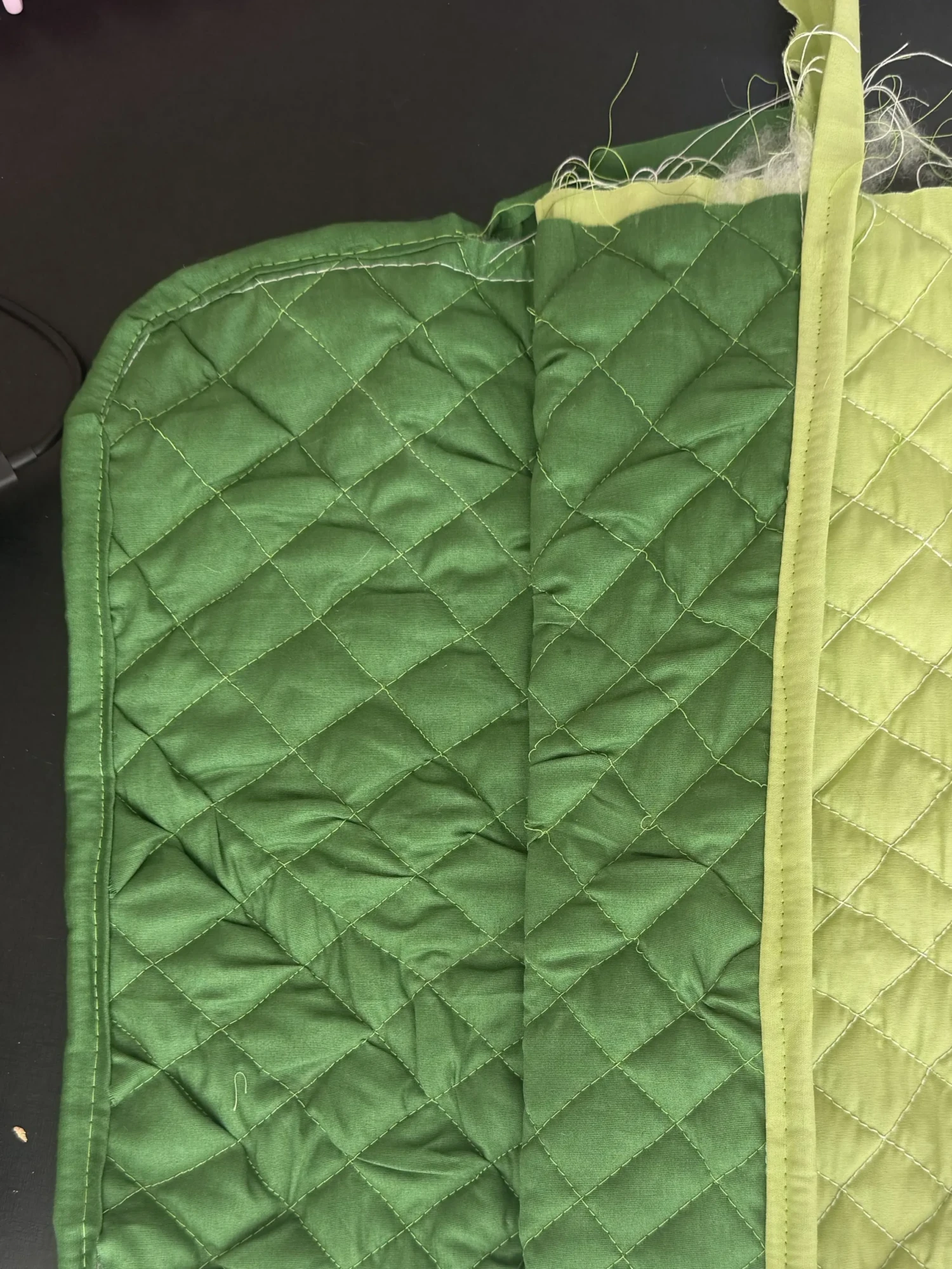
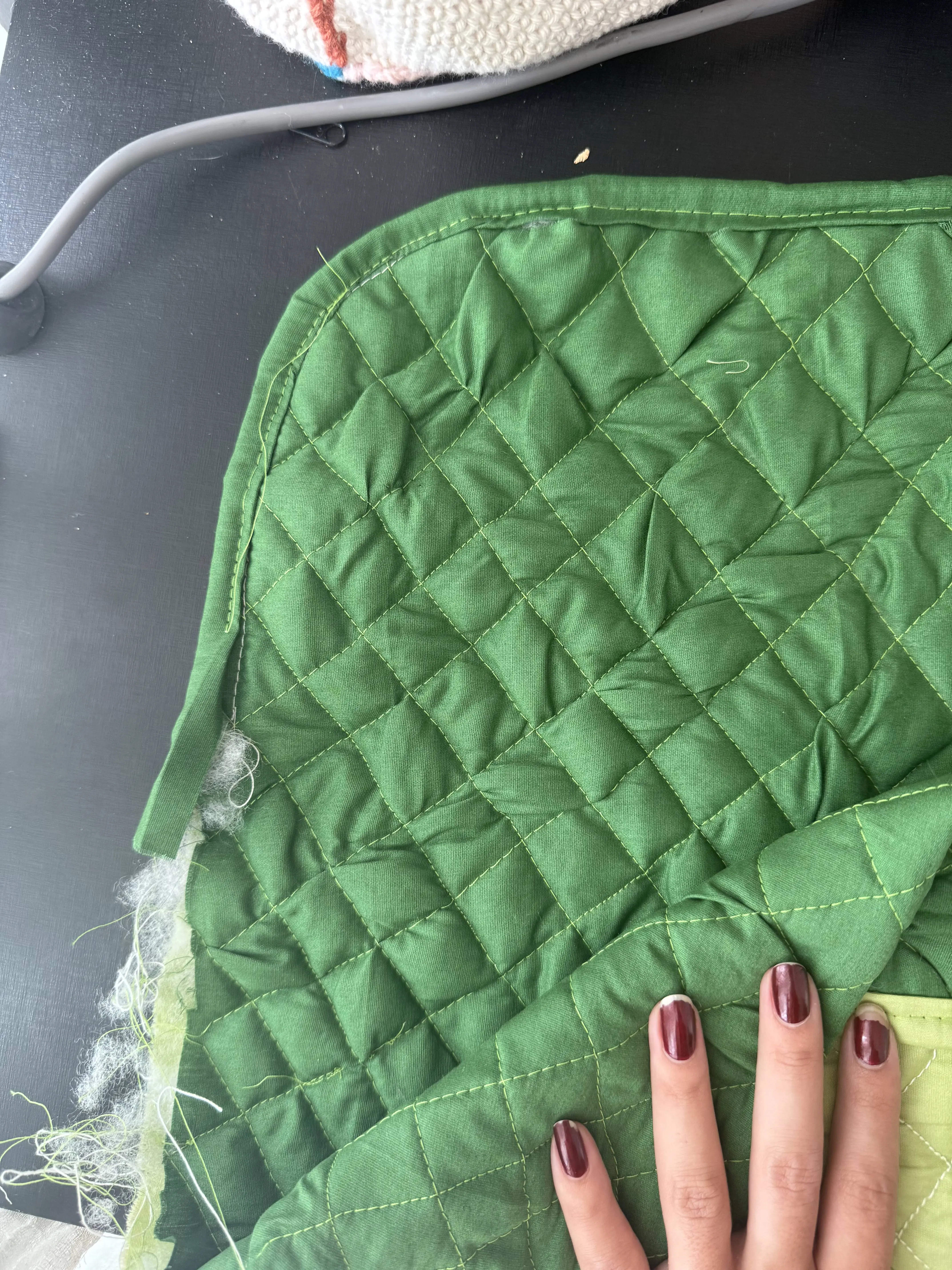
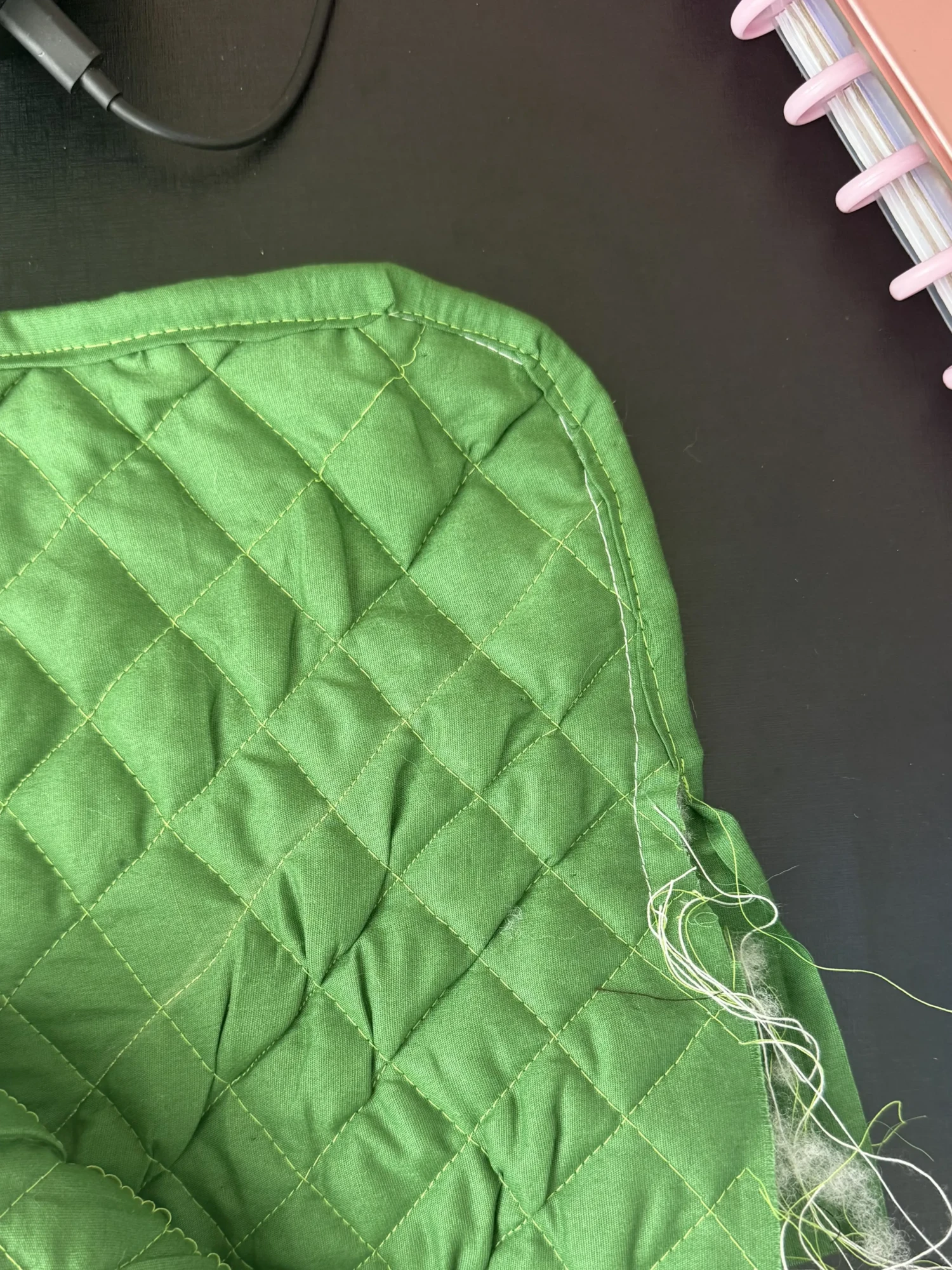
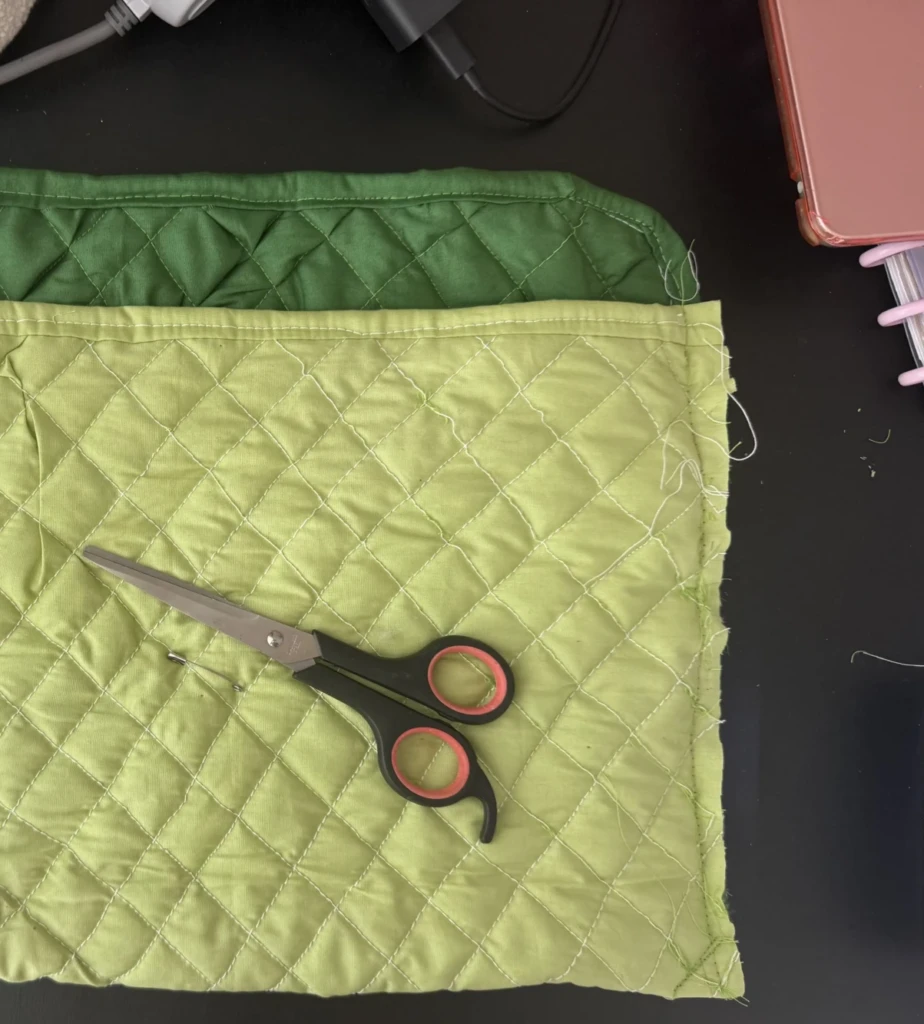
Step 2 — Quilting + edge finishing I stitched the quilted pattern and then finished the edges using a makeshift bias tape. (It’s not actually cut on the bias, but I made it work with fabric scraps.) My stitching isn’t the neatest—lines are a bit wobbly and corners aren’t perfect—but I focused on getting it done rather than getting it perfect. In the end, I’m really happy with the result, and those details don’t affect the functionality.
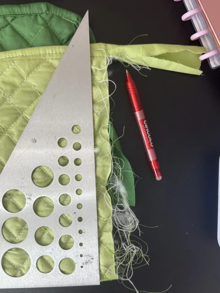
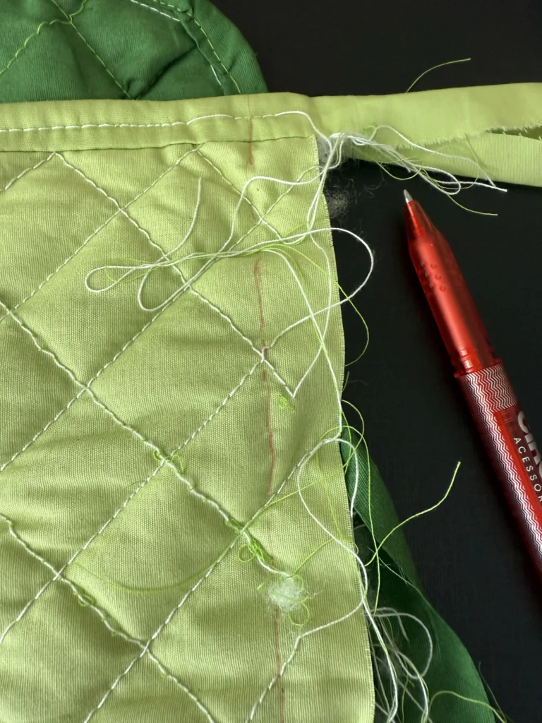
Step 3 — Shaping the case Next, I sewed the sides to form the case. I used my laptop as a size reference and marked the lines with a right-angle ruler. After sewing, I trimmed the excess fabric and threads close to the edge. The inside finishing could definitely be cleaner, but since it’s hidden, it doesn’t bother me. I did reinforce the seams to make sure it holds up over time.
Step 4 — Final touches At this point, it still felt like it was missing something. I went through my supplies and found a floral patch that matched the colors perfectly. Adding it made a huge difference—it gives the eye a focal point and ties everything together (instead of highlighting every little imperfection 😅).
If I were to improve anything, I’d make the closing flap a bit longer so it stays shut more naturally. I think I kept it small to fit the fabric I had, but it still does its job—especially when the case is inside a bag.
This ended up being less of a step-by-step guide and more of a “make something anyway” kind of post. If anything, I hope it encourages you to create something for yourself (or someone else), even if it’s not perfect.
Happy New Year, everyone! As a Brazilian, my year is only really starting now — after Carnaval, of course.
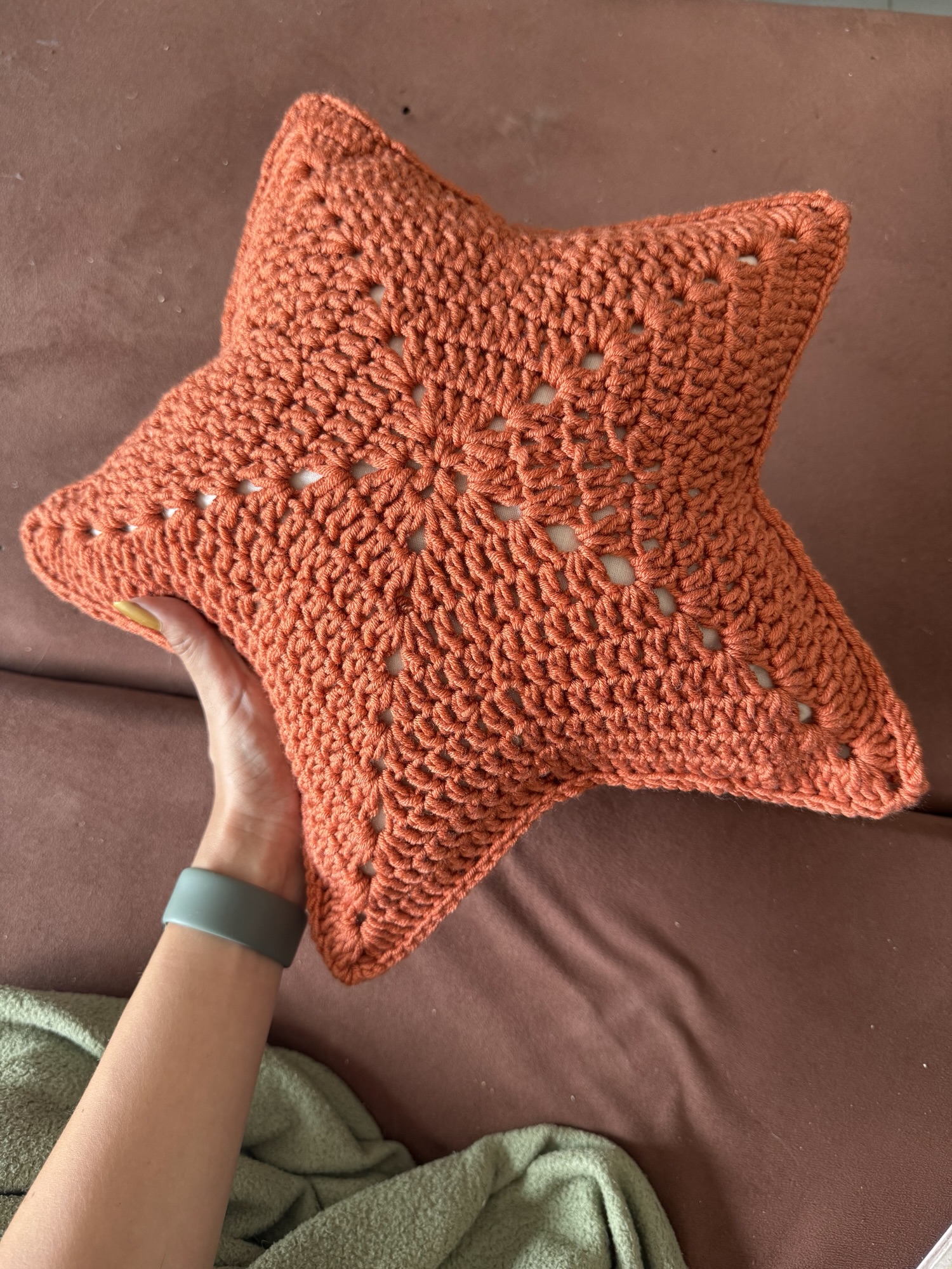
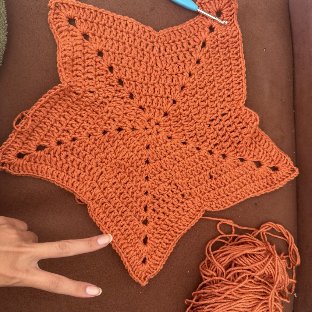
I took a few months off from blogging to rest, but I definitely didn’t stop creating. Lately I’ve been focusing on making more crochet pieces for myself instead of gifts, and this project had been sitting on my “to crochet” list for quite a while.
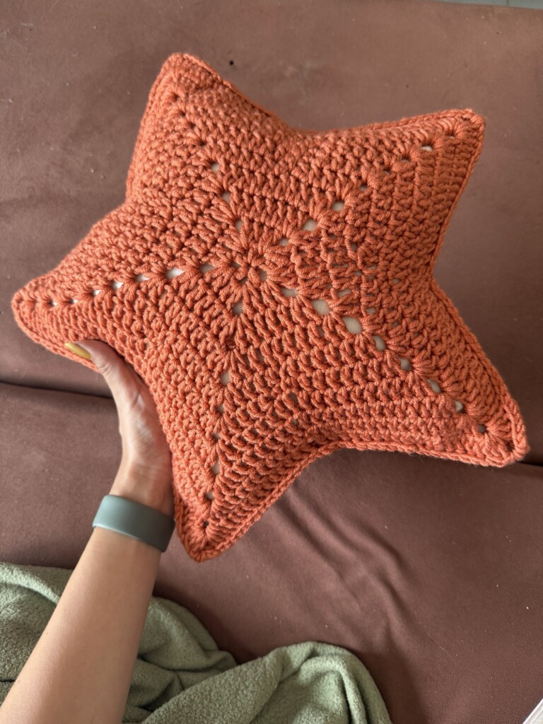
I took inspiration from a picture I found on Pinterest and worked from there without following a specific pattern. If you’d like to try making one yourself, here is the reference piece and the original pattern they have available for sale.
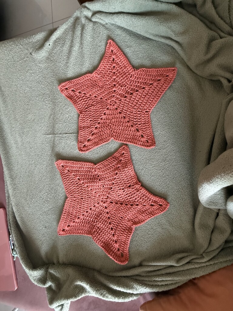
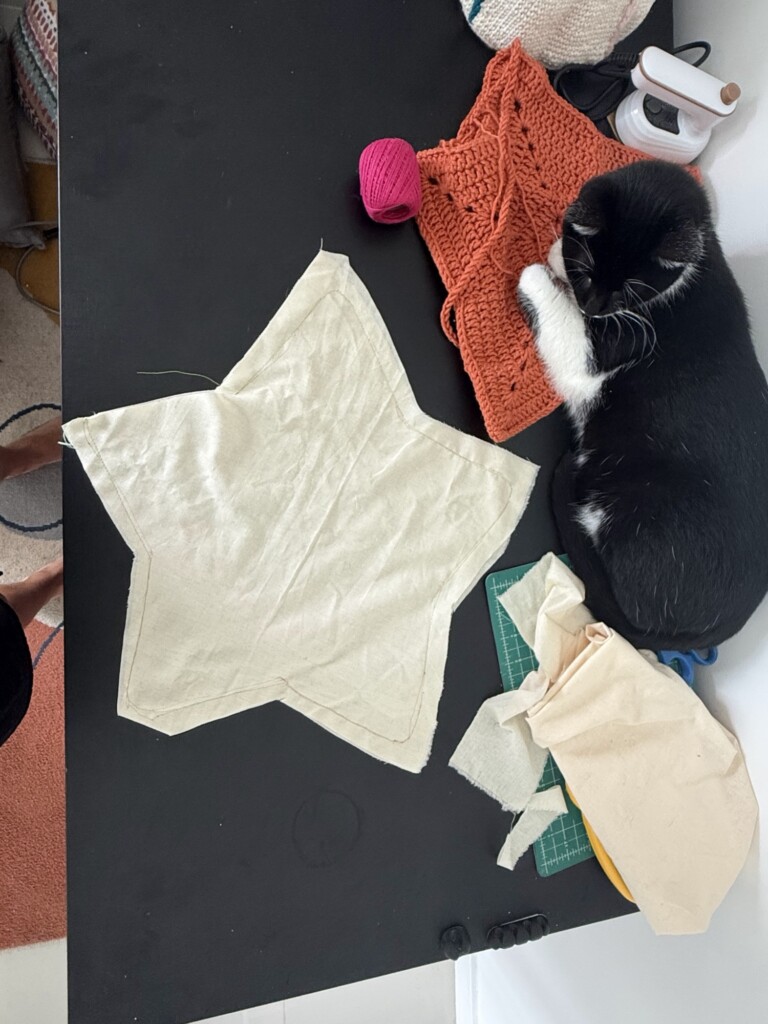
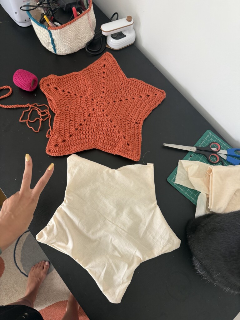
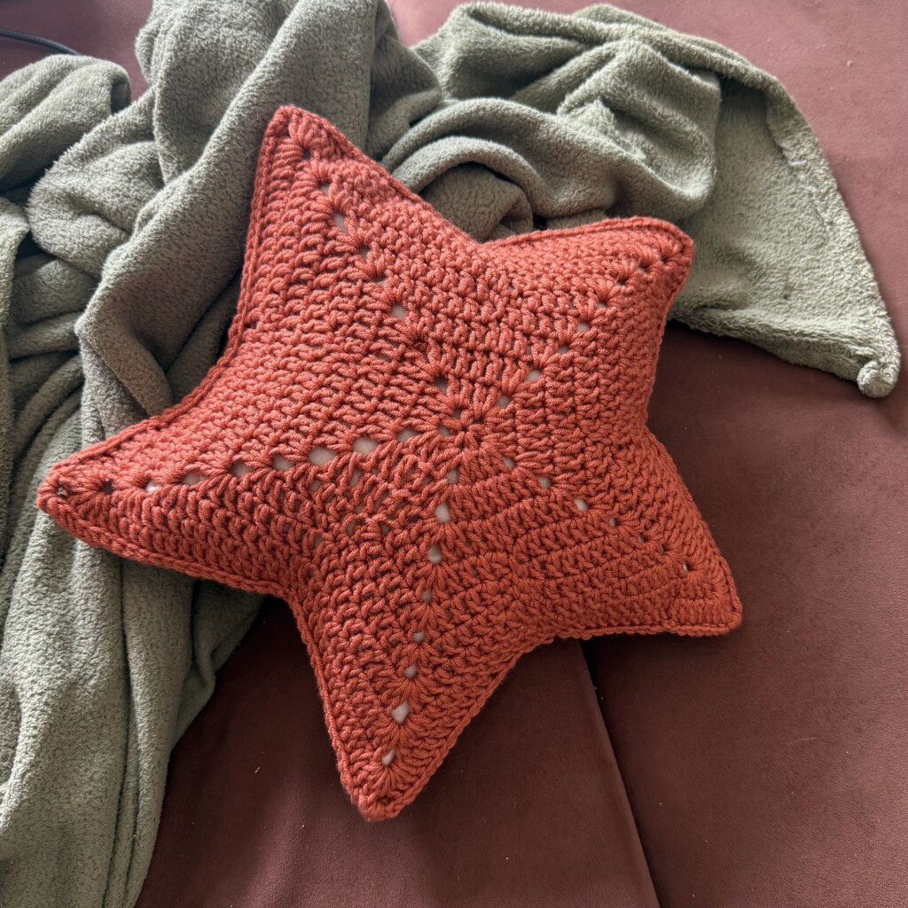
I won’t attempt to teach how to recreate this exact pillow here, since my version was very much a freestyle, trial-and-error process — and the result is definitely not perfect. What I do want to share are some process photos, the final result, and the fact that I had a lot of fun making it. I’d absolutely recommend this kind of project: it’s cute, functional, and not too difficult.
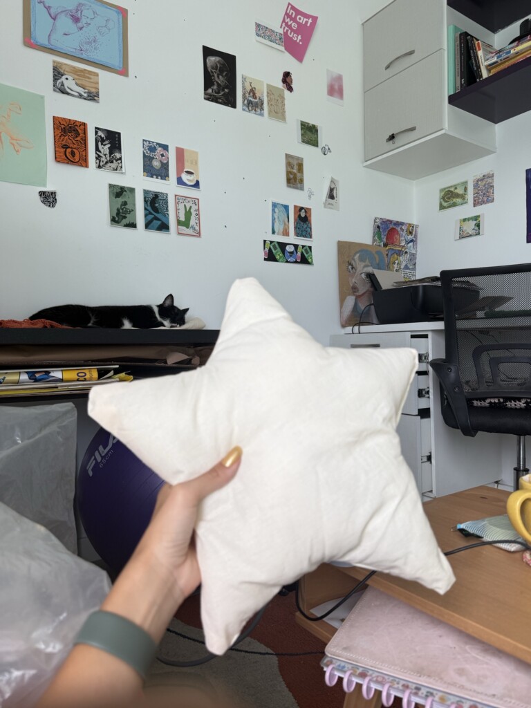
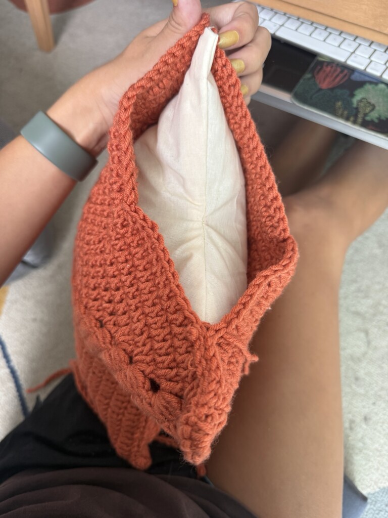
For the stuffing, I used some raw cotton I already had lying around, along with some generic pillow filling. I made sure to stuff it quite firmly so it would stay fluffy and highlight the star shape better.
Getting the shape right can be a bit tricky. As the piece grows, it tends to get a little wonky, and making the star “legs” stay sharp and pointy is harder than it looks. In the end, the points came out more rounded than I originally intended — but that seems to be more of a limitation of the medium than a design choice.
Overall, I’m really happy with how it turned out. It looks adorable and feels great to use!
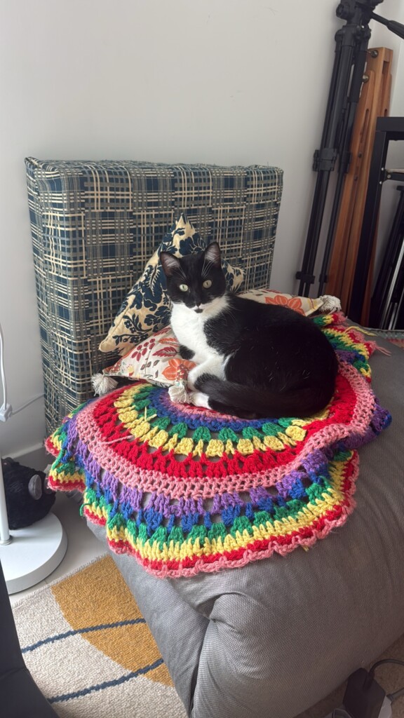
Bonus cat picture! Meet Kuru, the studio “helper”!
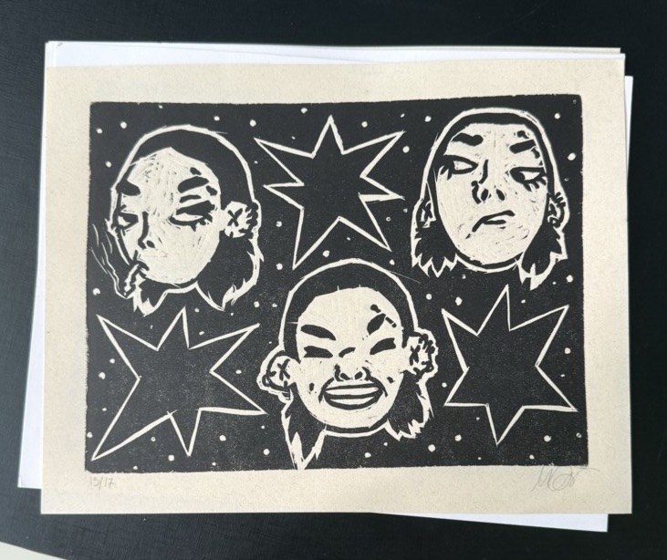
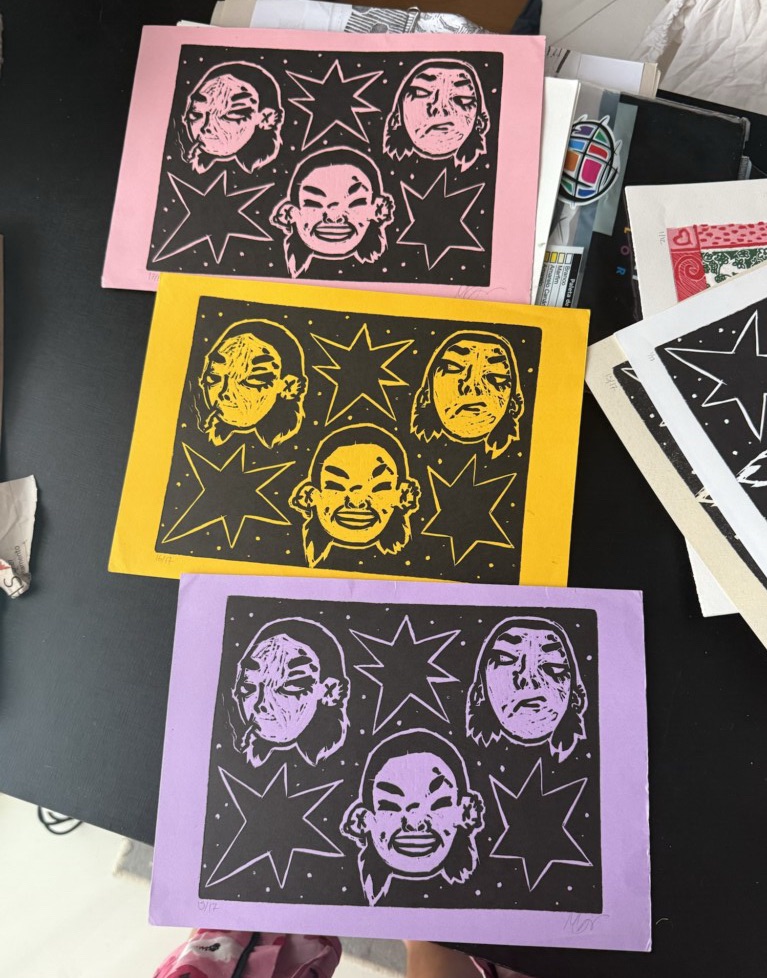
I’ve been learning woodblock printing for about two years now, but the pieces in this post were all created during my first year working with the medium — throughout 2024.
Unfortunately, this second year has been a bit rougher creatively, and I’ve been less active in the studio than I would have liked.
Even more ironically, that slowdown happened right as I started this blog — which originally launched with a strong focus on printmaking. Because of that, I feel like I’ve actually shared very little of my finished work here.
That said, I’m not interested in shaping my creativity just to keep the blog consistent. The whole point of this space is the opposite: to document my creative journey honestly, through all its messy turns, experiments, and emotional ups and downs.
Still, I realized that I never properly showed you the prints themselves — so here they are: the full collection of woodblock prints I created during 2024, presented in chronological order alongside a few notes from the process.
1. My first woodblock print
My first piece was based on an existing digital drawing I had made earlier. I chose it because it seemed simple enough to translate into a print — which was definitely the right call for a first attempt.
With this piece I learned a lot about carving sharp edges and corners, and I started getting familiar with the tools and with the general feeling of carving curves and lines into the wood.
Looking back now, it feels like the beginning of everything.
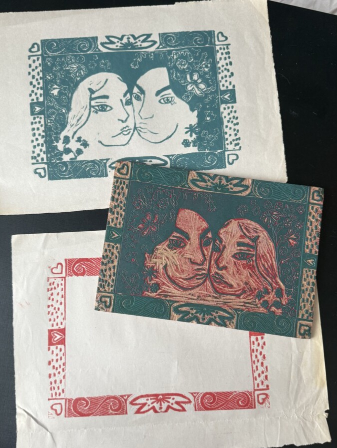
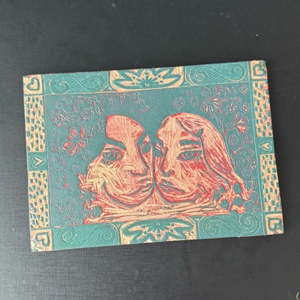
2. Couple self-portrait
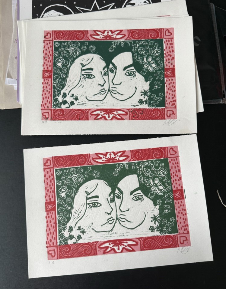
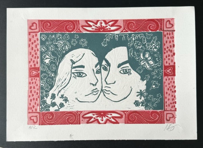
This piece also started as a digital design. It’s a stylized portrait of me and my partner.
Technically, this was a big leap forward for me. I experimented with organic shapes, thin lines, small details, multiple colors, and even learned how to create a masking border around the print.
It’s still one of my favorite pieces. A copy of it hangs on my front door.
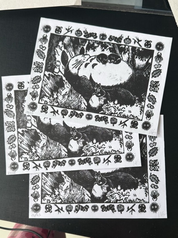
3. Totoro and my cats
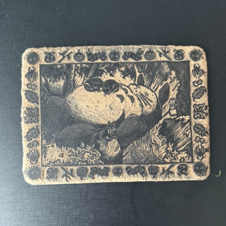
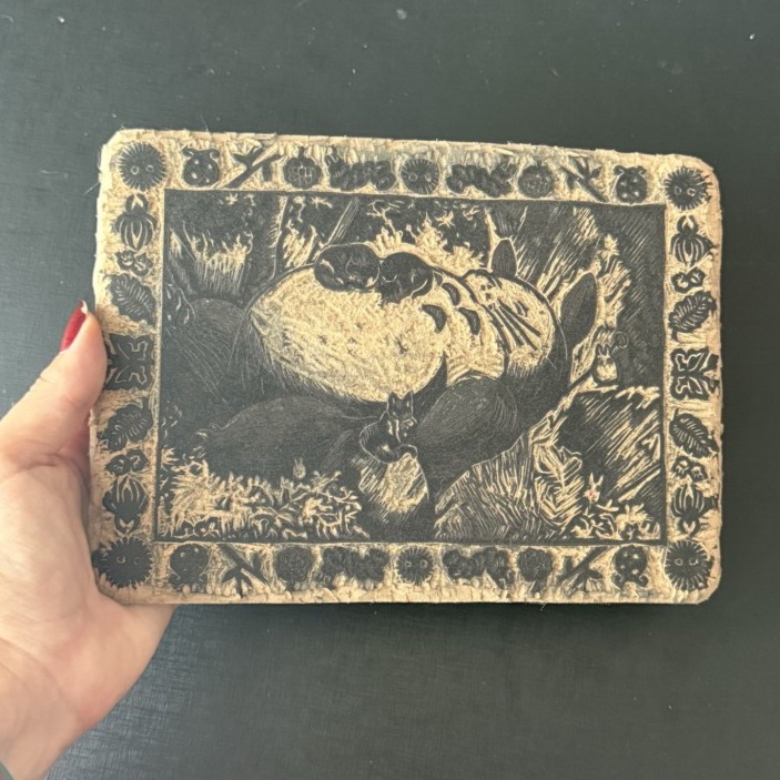
I created this print as a party favor for my birthday that year — the party theme was Studio Ghibli.
The design references the famous scene where Mei falls asleep on Totoro, except here Totoro is joined by my three cats. It ended up being quite a detailed piece for its size.
I’m really happy with how it turned out, although the centering could definitely have been better. The decorative border is my favorite part of the whole composition.
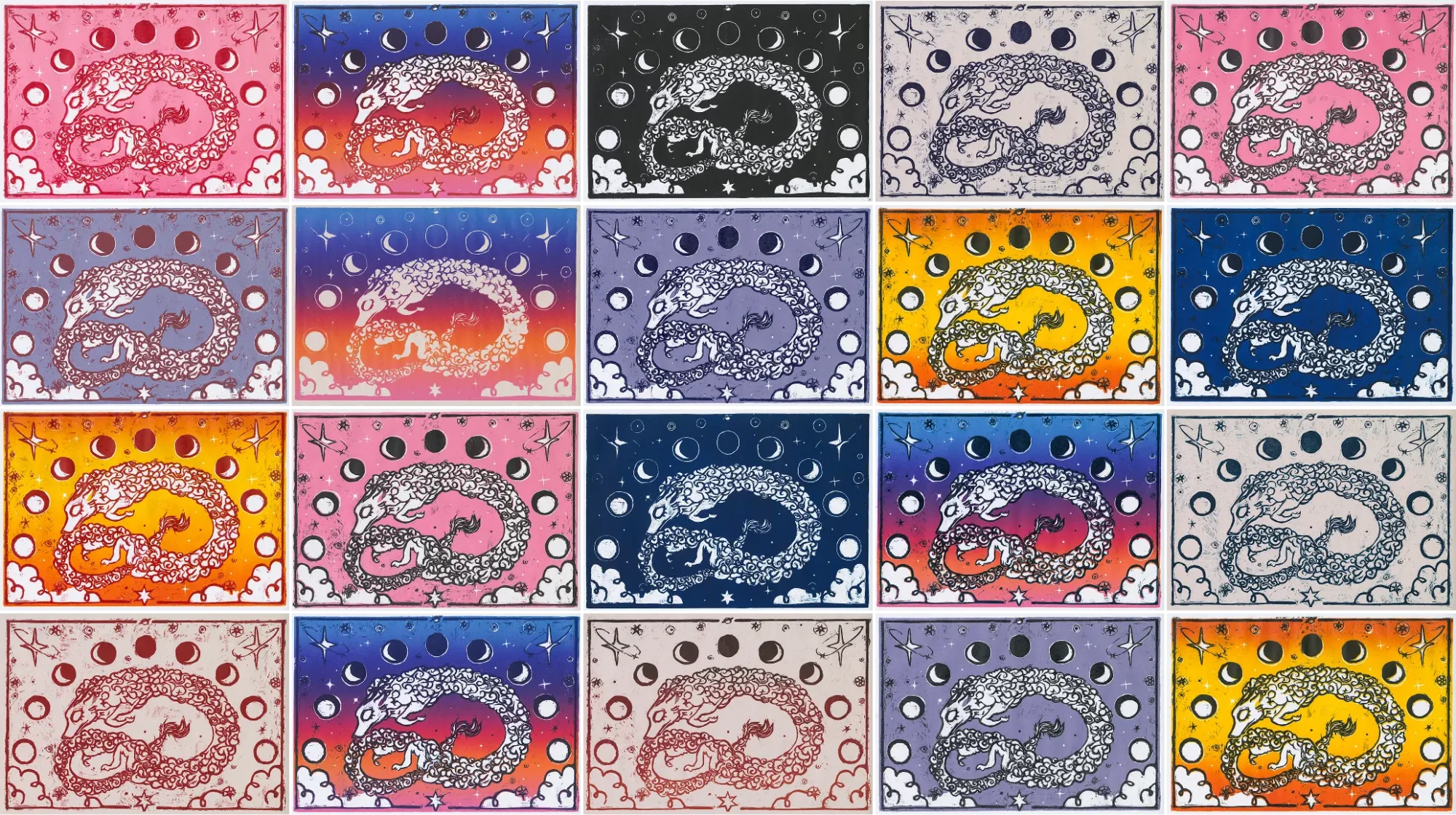
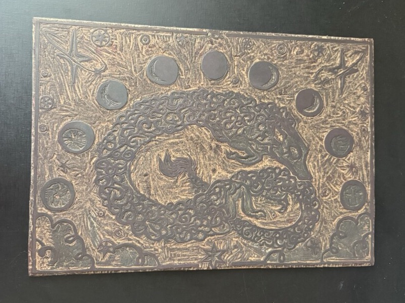
4. The sleepy time spirit
This piece was inspired by the book series The Priory of the Orange Tree and, once again, started as a digital design before becoming a print.
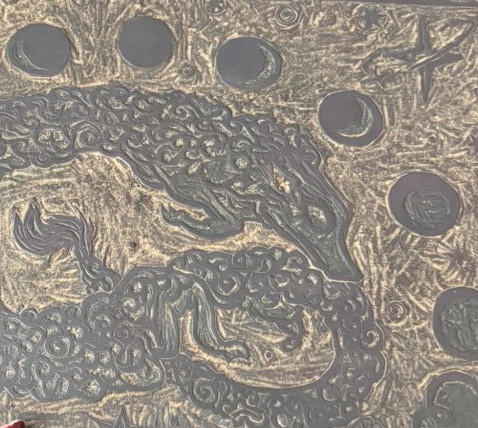
It’s my largest woodblock piece so far, and I really enjoyed experimenting with textures and color combinations in this one.
This is also the only piece I’ve professionally digitized and reprinted. Because the original prints vary so much in color combinations, they’re a very small and inconsistent edition — so the digitized versions became the copies I could actually gift to friends.
And speaking of variations… there are so many. I had an incredible time experimenting with color on this project. I genuinely cannot choose a favorite.
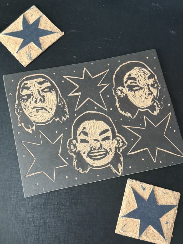
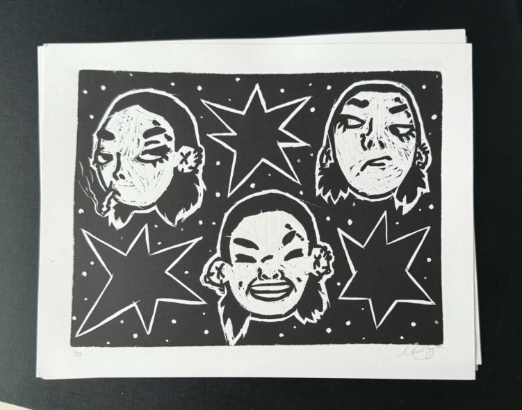
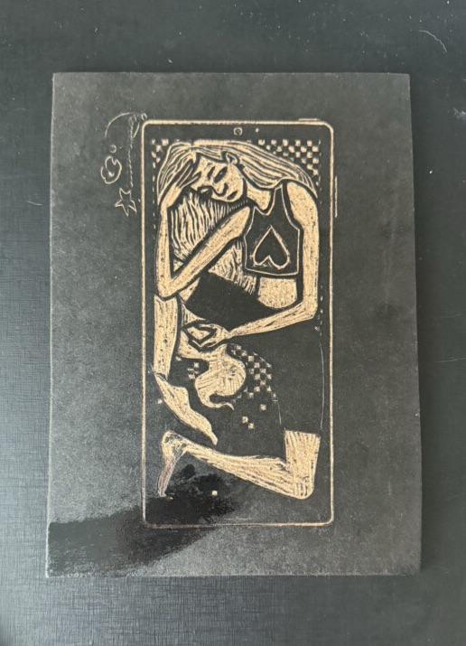
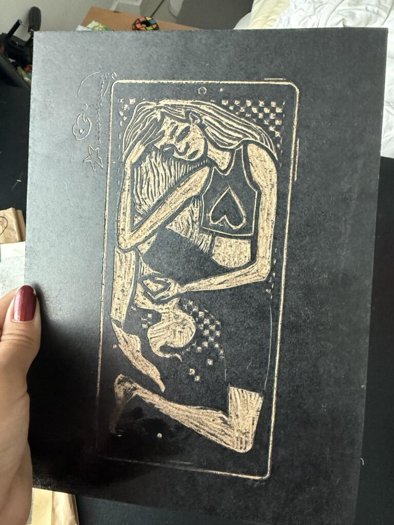
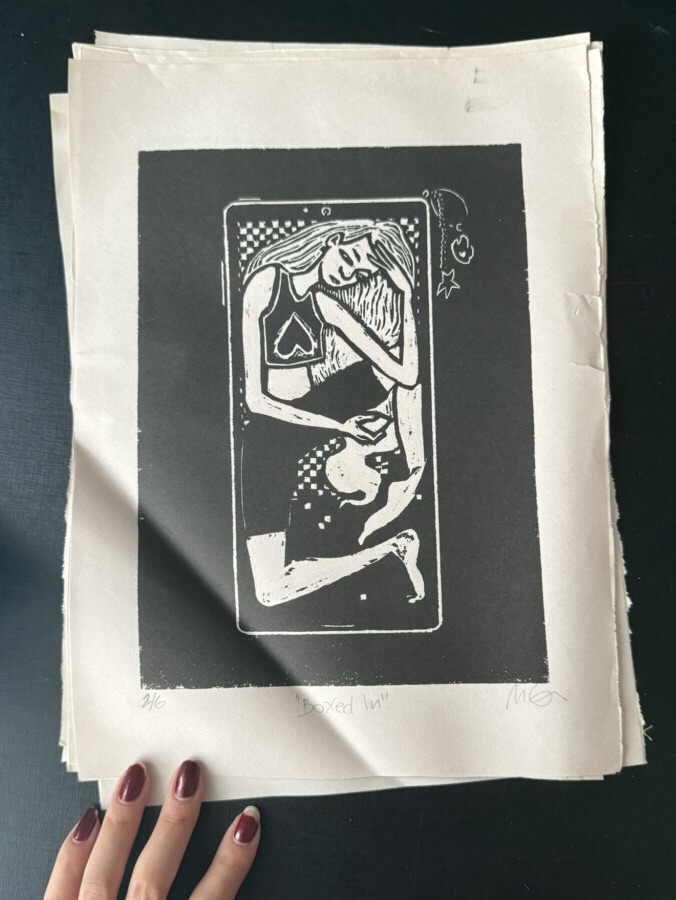
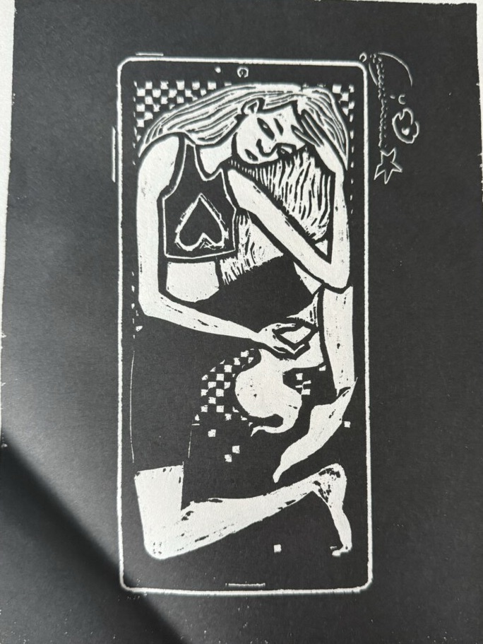
5. Boxed-In
This piece was created for the first annual student exhibition held at CIC at the end of the year. The requirements were a fixed size and black-and-white printing.
To be completely honest, this is probably my least favorite piece in the collection — even though I still like the concept behind it.
While reviewing my prints for this post, I discovered that some candy had melted on the board at some point 😬 and that a few of my limited prints had been stored with a fold in them…
This christmas morning, my mom and I decided to experiment with cyanoptype, a medium of shared interest that we’ve been meaning to play with for a while now. I had bought the kit a few months ago and we were just waiting for a good opportunity: This was it! We had tons of fun and learned a lot! Here is how it went:
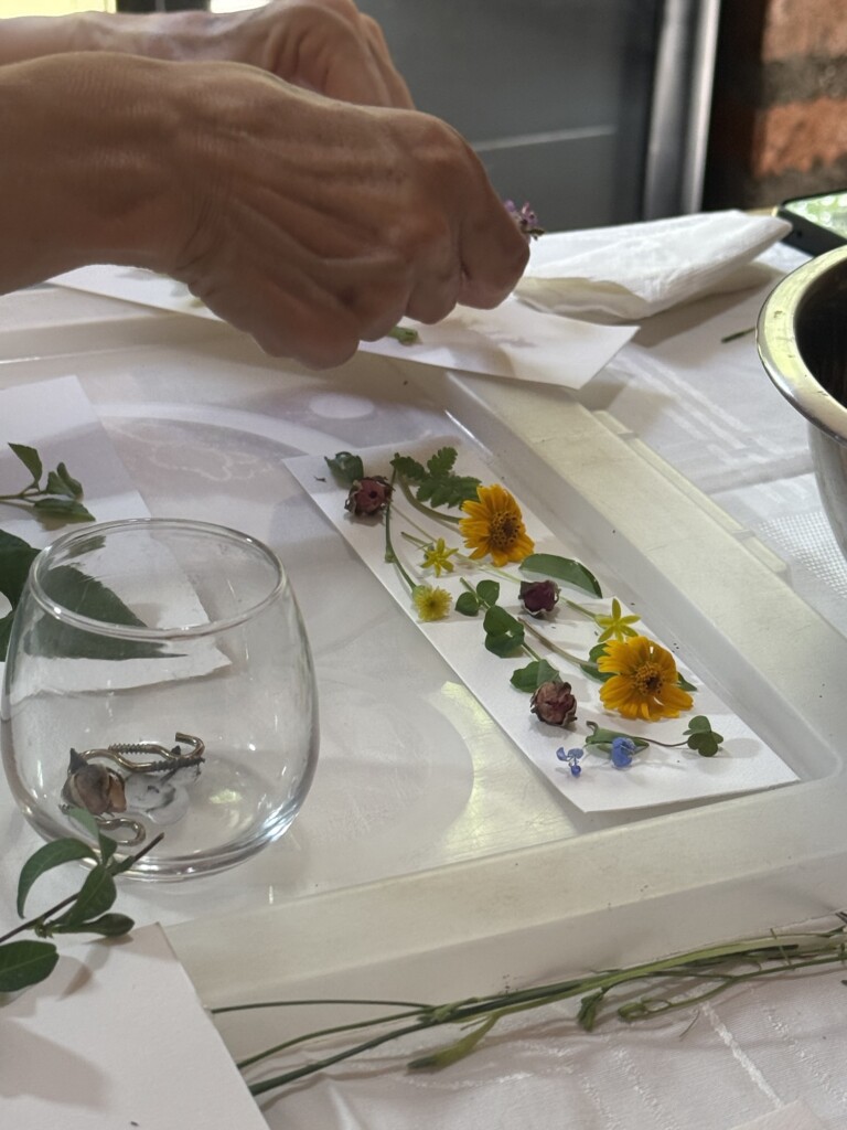
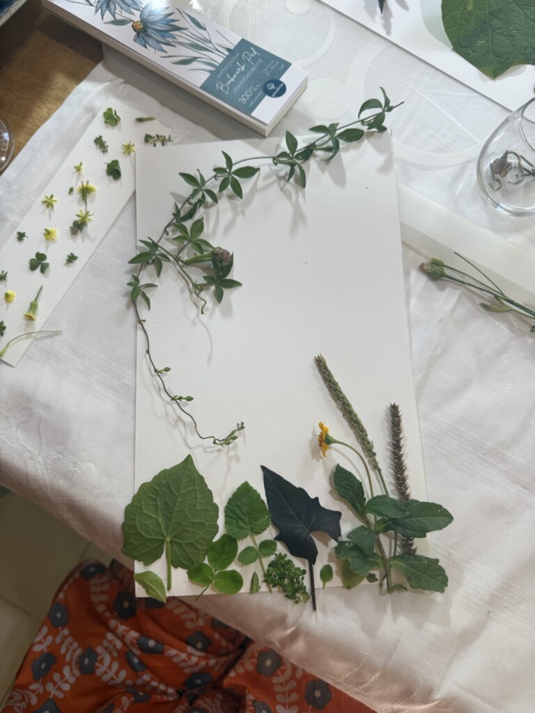
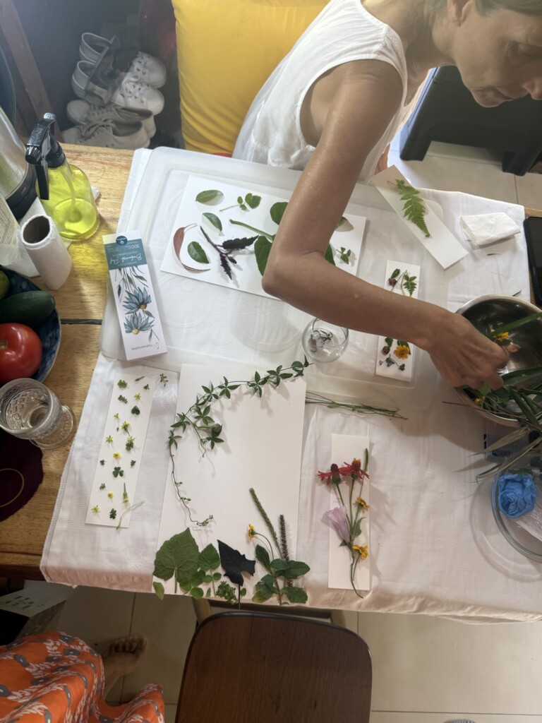
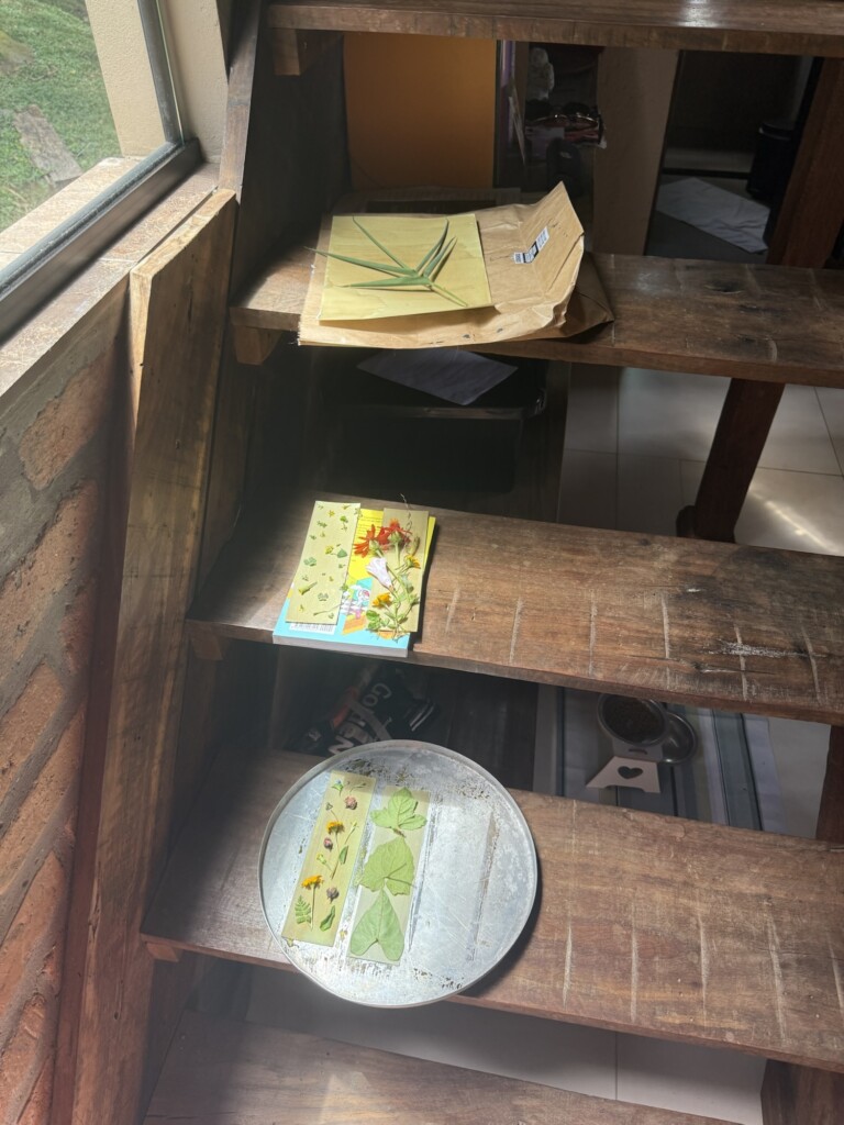
We started by reading the instructions that came in the kit, and gathering the needed materials and supplies. Then the fun part: going treasure foraging the garden for flowers, leaves and organic bits of all interesting shapes!
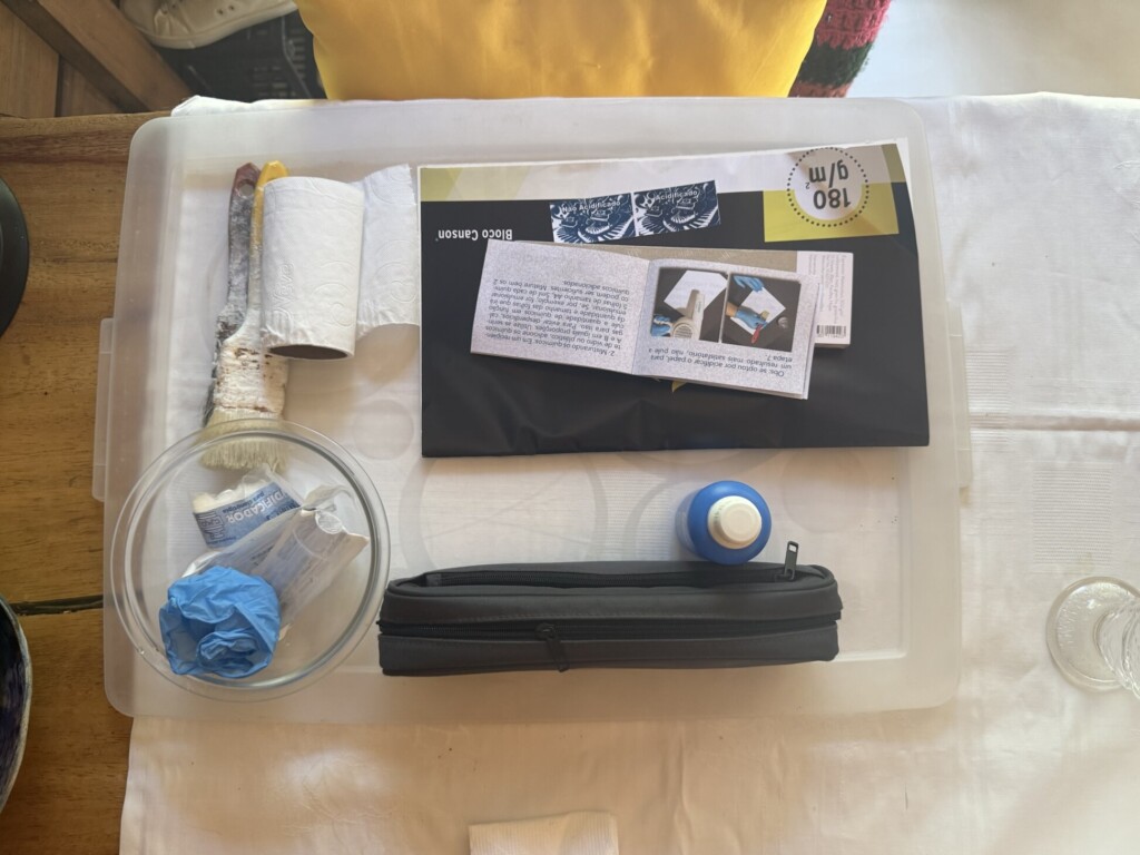
The supplies
Inside, we laid-out our designs on dry paper to have an idea of what we wanted to do (and not rush it when the dye started developing). Here are some of our “pre-designs”:
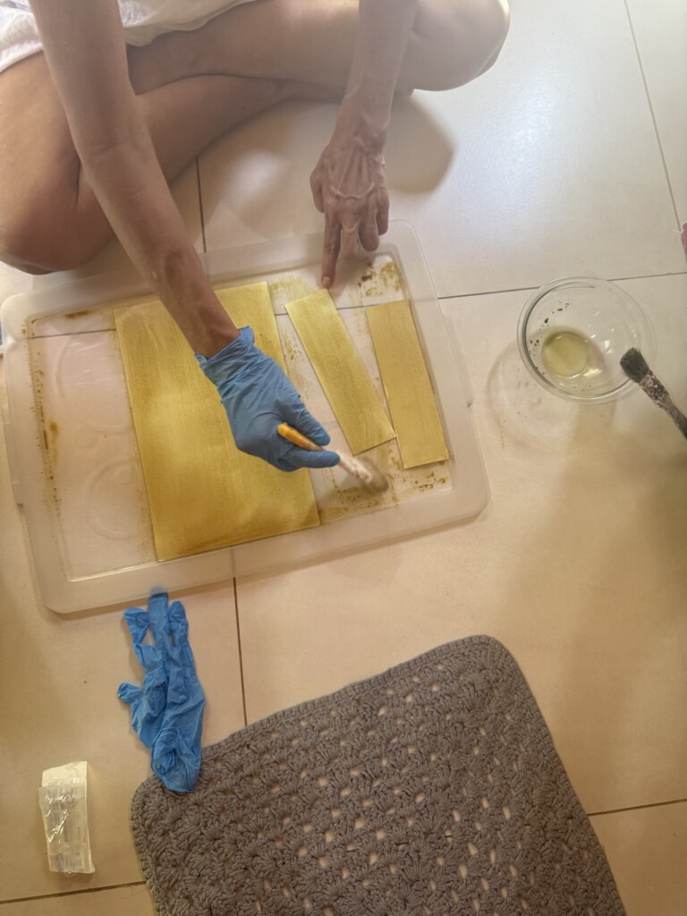
Continued following the given instructions we prepped the papers: We mixed the two parts into a bowl and carefully painted the pages fully with one thin coat. (The kit came with syringes and the two agents needed). At this point, the paper looked like a light mossy green. We left the papers hidden in a dark place to dry while we took a nice break in the sun, sipping kombuchas.
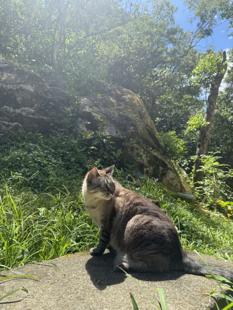
Coating the papers with the reagentPico, my mom’s cat, enjoying the sun
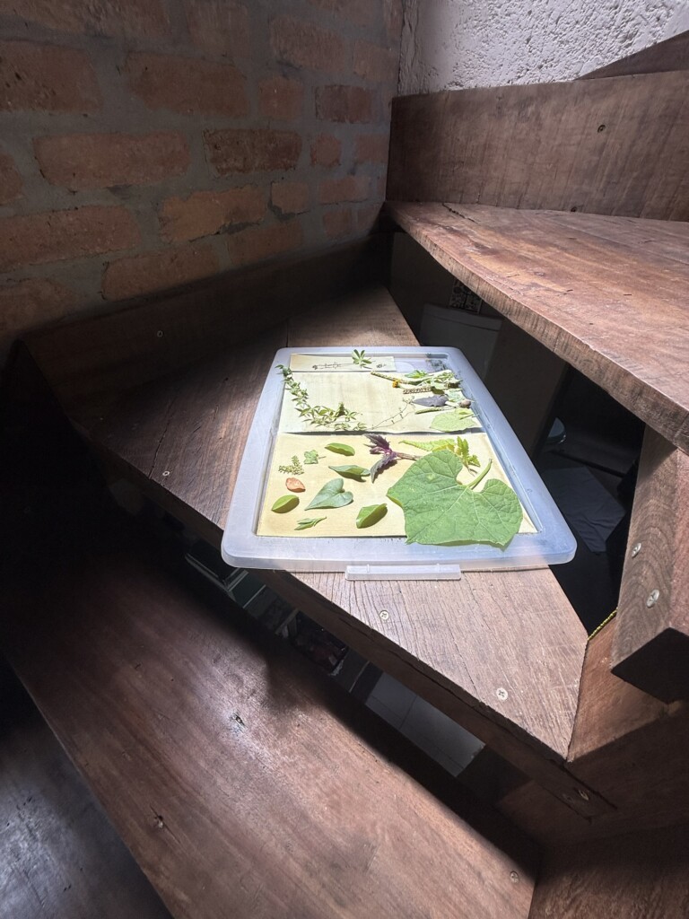
Once the papers were dry, we laid-out the plants back onto them, trying to recreate our initial designs. We had a few extra pages too we prepped using the leftover mixture. We freestyle a couple designs on those.
We left the designs in sunspots to activate the chemicals:
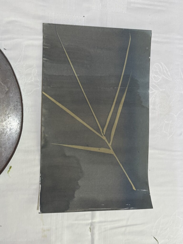
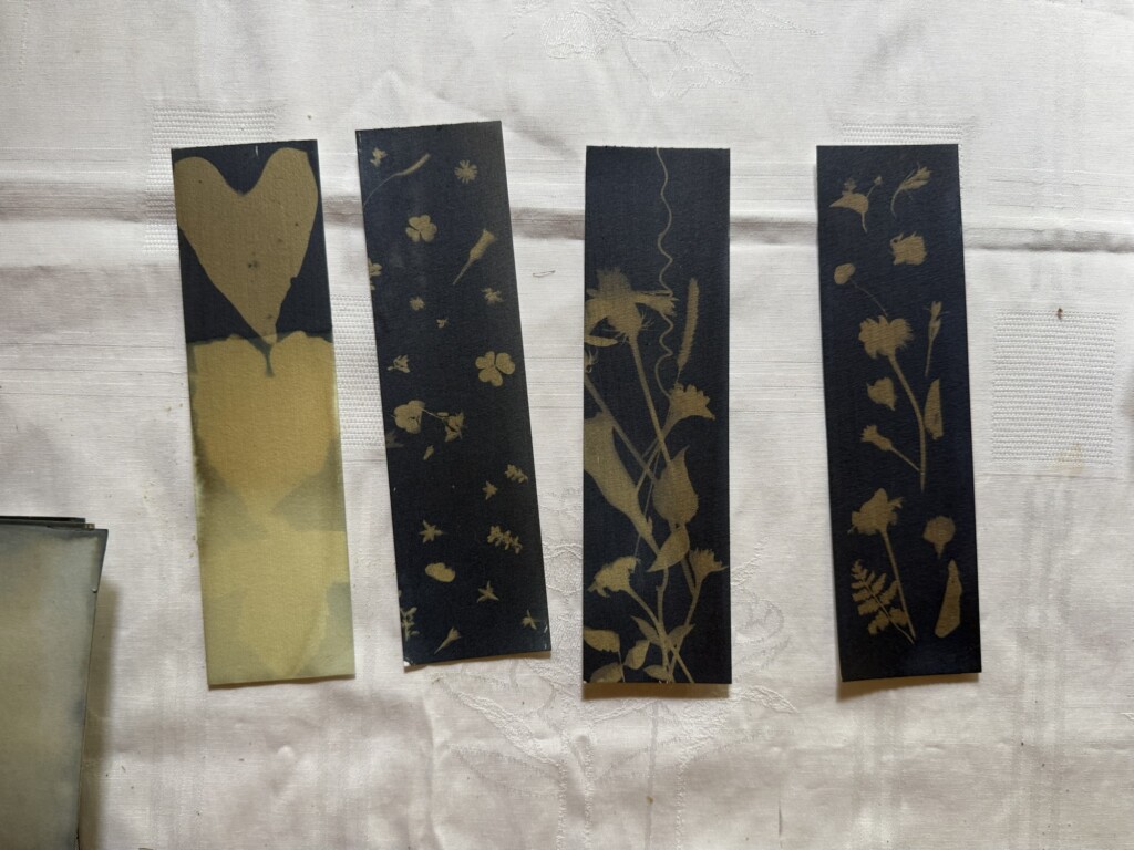
We’ve might been a bit too eager and took out some of our designs too early. We got excited when we saw the magic of this technique coming to life: The outlines of the selected florals perfectly captured onto the paper.
There was a difference in the color of the papers that were in the sun for longer, they became a darker blue instead of a paler green. This is a big lesson for the future, it is best to leave it out for around 10 minutes or so, and it’s safer to leave it out longer than not – although I don’t know what happens if it stays out for too long in the sun.
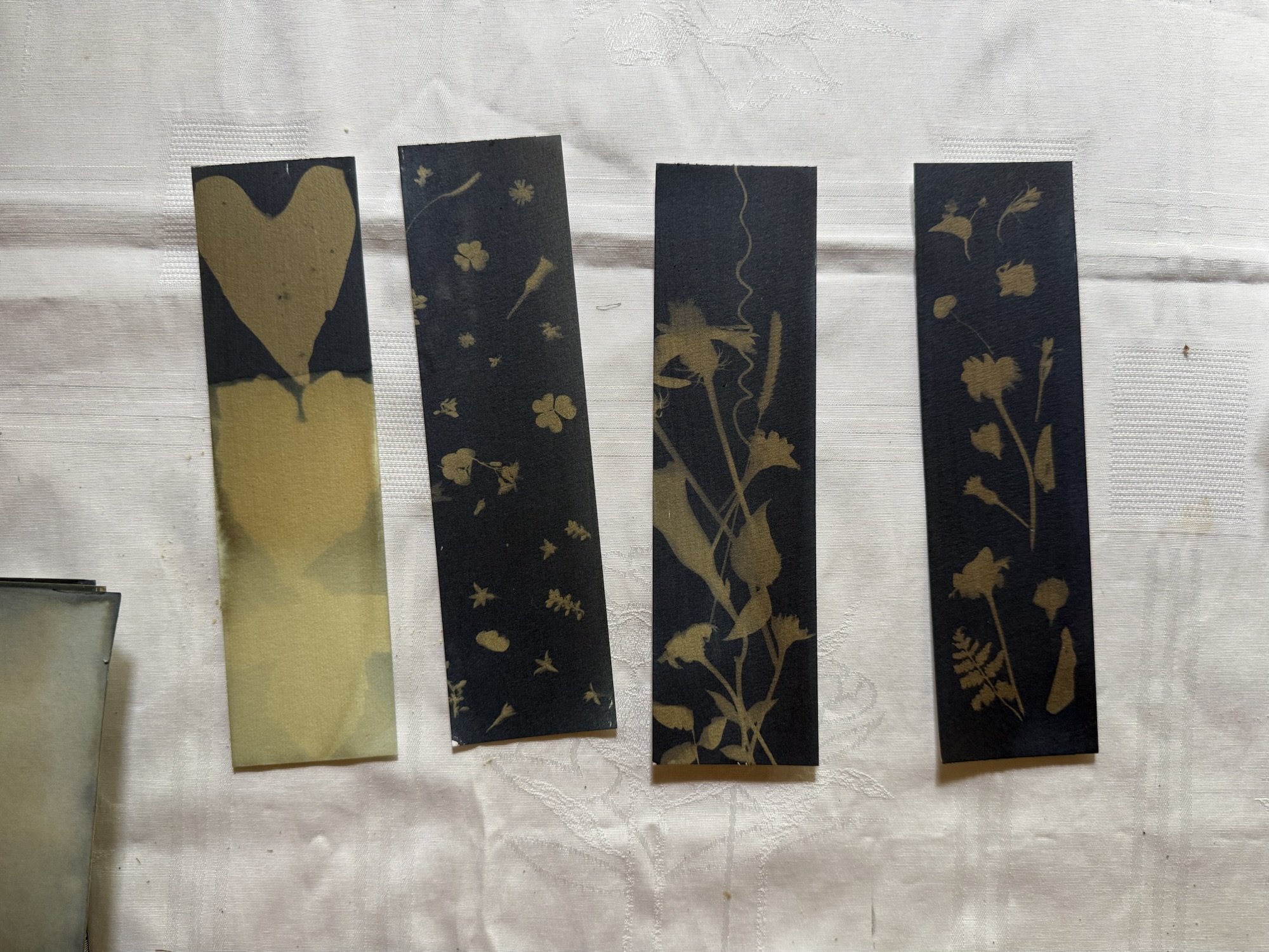
Then came the “washing the dye away” part which was tricky and emotional. The instructions said to wash it out under running water. I did that with one of my (favorite) designs and saw the whole thing wash away… (I’m glad I took a picture at least, I guess). Then we tried using hydrogen peroxide to clean the chemicals-out instead, which seemed to give better results but still took a lot of the color and contrast away. This was specified in the instructions as an optional step, to be done after the washing.
The design in the center here was the one that was washed away. You can see it’s a much lighter blue than the page markers below.I love how these turned out. The first one was dipped into hydrogen peroxide multiple times to different levels to create the ombré effect.
We got mixed results from our imperfect tests; it’s hard to say if the designs washed away because they did not “cure” for long enough in the sun or another mistake in the process. The hydrogen peroxide had a reaction to the blue, making it a bit darker but since it was mixed with water it also did more harm than good, generally. The instructions did say to use running water but I’m not sure about that.
For sure there is a lot more to test with this technique and the different variables that go into this chemical reaction. At the end we left most of our work “uncleaned” to preserve the patterns we had made. We don’t know if that means it will rub off or fade out with time but this was all a fun experiment anyway! I’ve learned a lot and I now have a lot of questions and research topics I can get into before giving this absolutely delicious technique another go. I hope you give it a try too and share what you’ve learned!
I fell in love with zines before I even knew what they were. I’ve always been drawn to interactive paper, collage, and “informational” art — the kind that feels playful, personal, and a little unconventional. Over the years, I’ve made quite a few zines, with varying levels of intention, polish, and seriousness.
While going through a bag of old mini zines recently, three of them stood out to me in particular. They’re definitely on the very-silly, low-effort end of the spectrum, but somehow they still manage to hold a lot of feeling. In a funny way, they capture complex emotions more honestly than some of my more “serious” projects ever did.
I’ve realized that my more carefully planned, highly produced zines often struggle to reach a true finished state — mostly because I place too many expectations on them. These tiny, scrappy ones don’t carry that pressure. They exist because I made them, and that’s enough.
So I wanted to share them here. I hope they make you smile, and maybe even inspire you to make your own shitty little zine too. Honestly — it’s fun, freeing, and very much worth it.
Creativity has been spilling into every corner of my life lately — new ideas, new hobbies, and a surprising amount of travel. It feels like I’m absorbing everything around me and letting it spark something new. Which brings me to my next little adventure.
Cultural Curitiba: Concerts & Contemporary Art
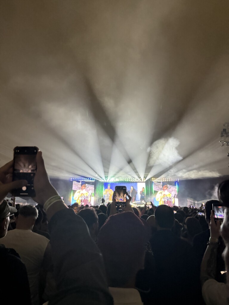
I recently went to Curitiba — one of Brazil’s great cultural hubs — to see Linkin Park on their From Zero tour. My partner is a huge fan, and over time I’ve grown more and more into their music after learning about their history. Seeing Emily live was incredible; her voice is stunning. Mike was sweet, charismatic, and effortlessly talented.
I was also pleasantly surprised by the opening act: Poppy. Back in 2020, I liked a few of her hyperpop songs like Am I a Girl?, and only recently found out she had gone “metal.” Her performance was amazing — the way she switches from delicate high notes to flawless screamo is wild.
Nothing revives the soul like a good concert: shaking, jumping, screaming, and absolutely destroying your feet (RIP to mine, who walked 30 minutes in tight heels to get there).
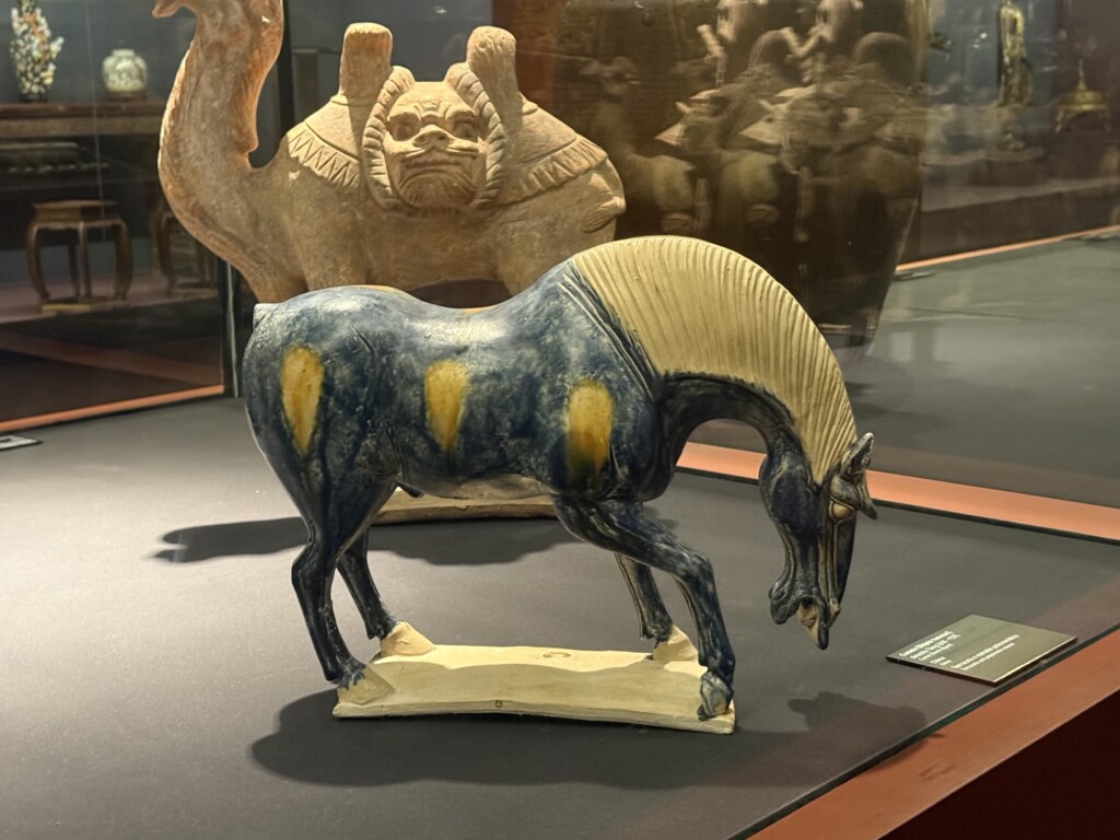
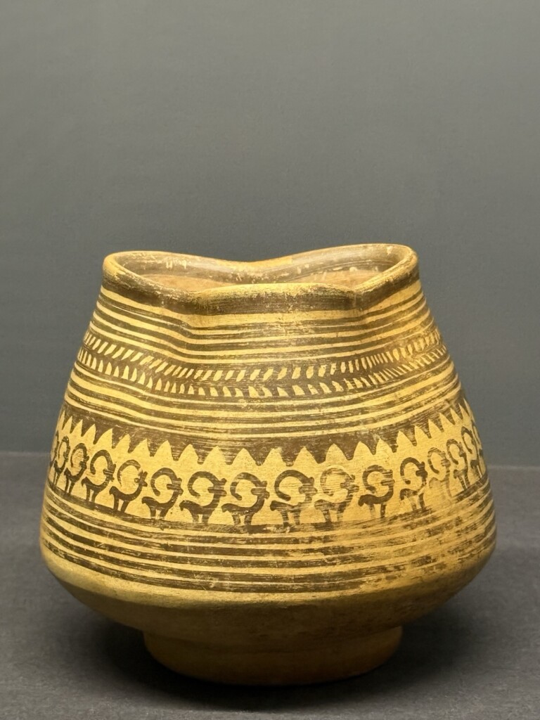
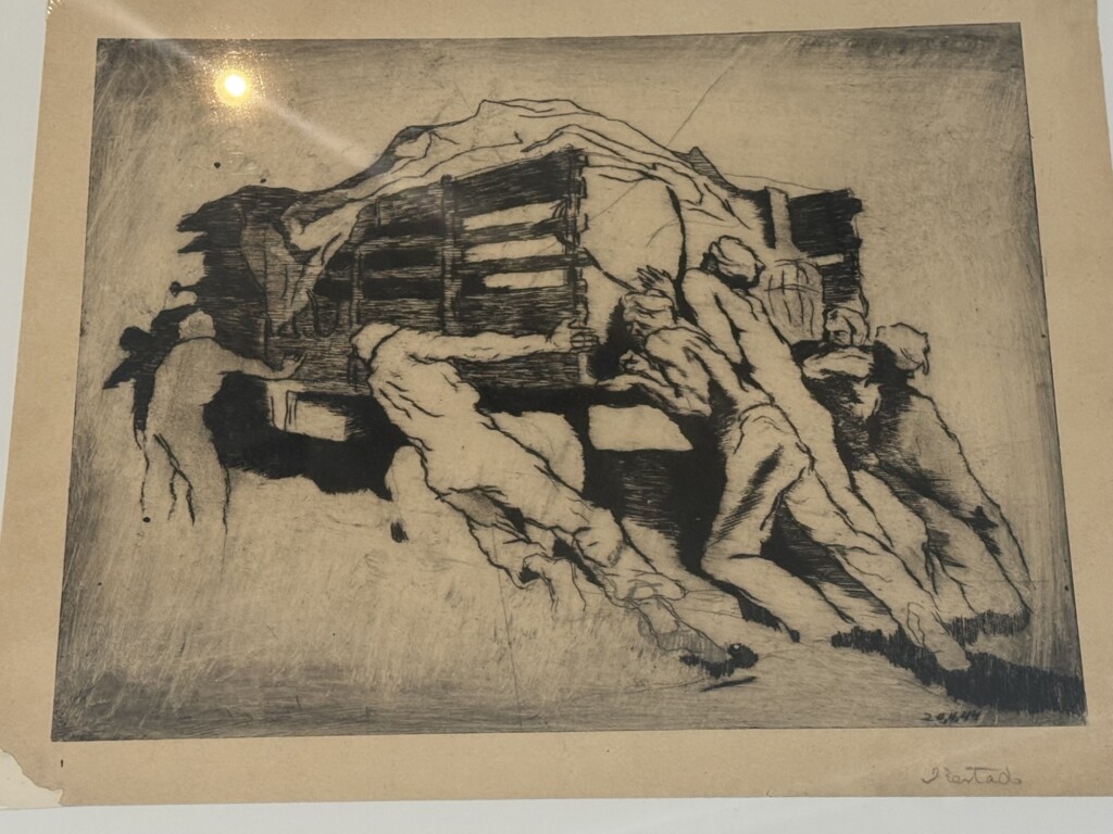
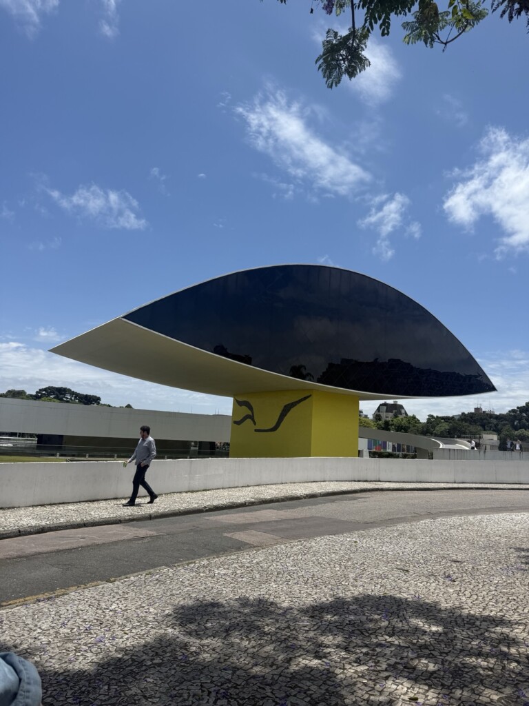
Another gem of Curitiba that I had to revisit is the contemporary art museum MON(also known as “Museu Oscar Niemeyer”), designed by Oscar Niemeyer, one of Brazil’s most iconic architects. The museum has a beautiful permanent collection of African and Asian artifacts — musical instruments, ceremonial objects, textiles, prints, paintings, fabrics, jewelry. Every room feels like stepping into a new world.
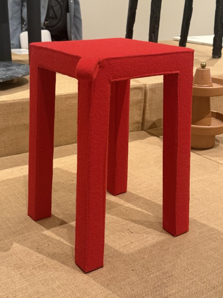
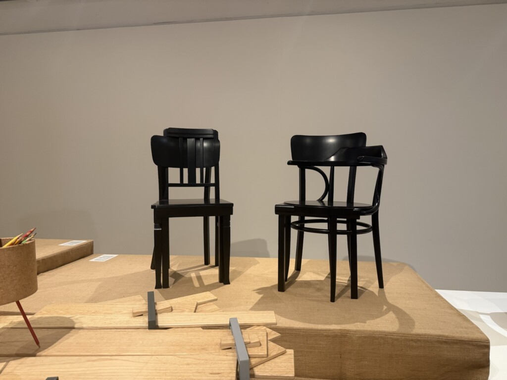
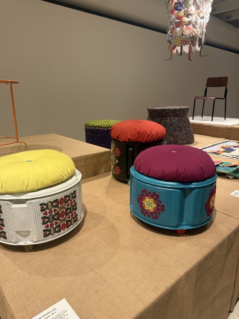
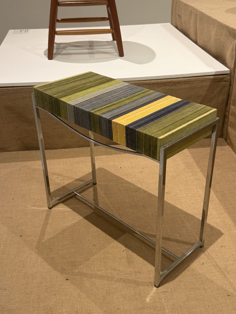
From the special exhibitions on display, my favorite was ‘Pure Gold – Upcycled! Upgraded!‘. It showcased chairs, stools, and couches made entirely from recycled or upcycled materials. A few pieces that caught my attention:
a chair made completely out of compressed wool (I’m so curious how sturdy it actually is — wool can get really dense, especially when steamed)
a stool made from pineapple skin-paper/material, glued together sheet by sheet
stools built using dismantled washing-machine drums, decorated in that charming “country” embroidery style
Some works were more conceptually interesting than pretty or practical, but I really enjoy seeing how the upcycling movement keeps evolving. There’s a cool article digging deeper into the exhibition here, in the ‘Design Do Bom’ blog if you want to read further (you might have to translate it to eng.). There were a few other special exhibitions I’ve stopped at to gather some inspiration but did not dig to deep into:
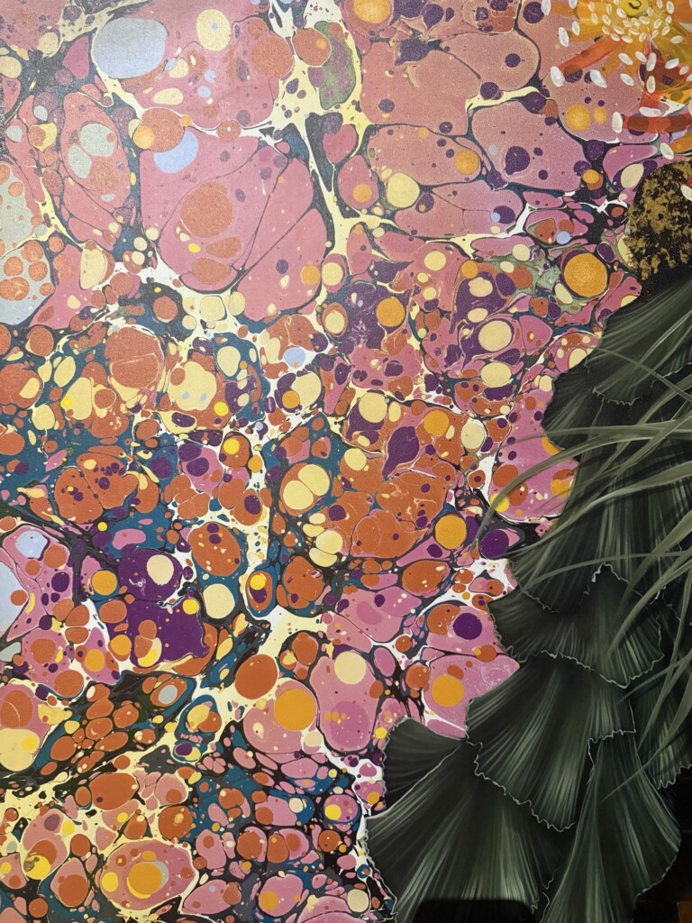
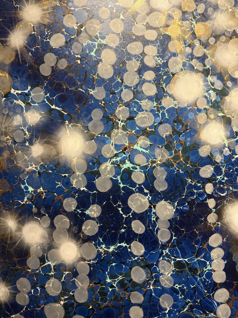
Através by Mariana Palma a trippy, floral, painting collection that incorporates sheer fabrics and colorful patterns
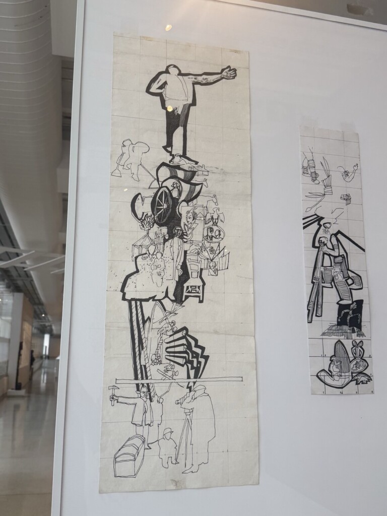
Trilhos e Traços by Poty a centenary celebratory collection from the important Brazilian artist, and
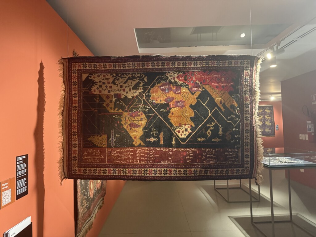
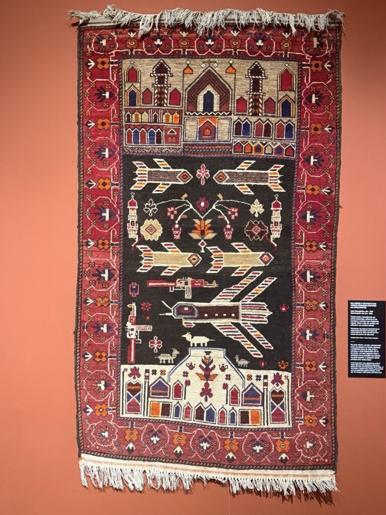
Afeganistão a collection of rugs with imagery surrounding themes of war and peace.
Below are some of my favorite pieces from the museum, along with translated captions from MON.
I’ve been invited to a couple of techno parties recently, and — very differently from before — I’ve started paying attention in a whole new way. Suddenly I’m noticing the transitions, effects, pacing, how the DJ interacts with the crowd… all the invisible details that shape the energy of a room. Something in me is shifting.
To be honest, I resisted this shift for a long time. I already consume visual art in such a technical, analytical way that I wanted music to stay pure — something I could just feel without needing the vocabulary to dissect it. But curiosity won (as it always does with me), and now I’m diving into the musical side of things too.
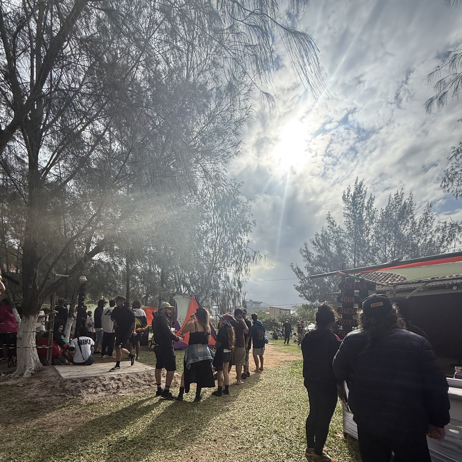
In the last few events, I met some DJs, got tips, saw things I want to try (and things I definitely don’t), and started discovering subgenres I might want to explore. One that surprised me was dark forest techno, which I heard at this witchy, high-BPM party played by DJ Cerridwen. In the middle of her set, she dropped some wild experimental blends — and even a full-on samba — and the crowd absolutely devoured it. That moment made me realize how much freedom there actually is in a well-built set.
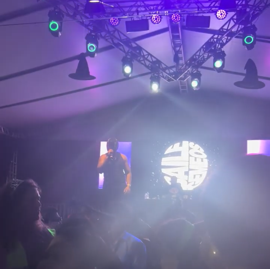
Around the same time, I went to Baile dos Gêmeos, the iconic local twin DJ duo, and their set was everything people promised: energetic, playful, technically sharp, and full of personality. It left me buzzing with ideas about what’s possible behind the decks.
All of this — the parties, the classes, the conversations — is pushing me out of the passive listener role and into something more active. In our last DJ class, I brought a few harder-techno tracks I wasn’t sure would land, but my classmates were super into it. It was such a small thing, but it gave me a surprising boost of confidence.
Which brings me to now: I’m preparing for my first real set. And even though everyone else will probably play house (of course), I’m feeling pulled toward something darker, heavier, and a little riskier. I don’t know if it’ll be the perfect fit, but I’m excited to try — and excited to keep finding my own sound, one experiment at a time.
Europaträume – song by Brutalismus 3000 (a little techno for ya)
One Kiss – Dua Lipa & Calvin Harris (my favorite from her)
Caetanear – album to get to know Caetano Veloso (see below)
A Pop-Powered Stop in São Paulo
This trip was mostly to see Dua Lipa — which was very exciting — and to visit some close friends. The concert was energetic and fun, and she kept the whole crowd dancing for the full two hours. As expected with large concerts, there were a few annoying moments with overly excited fans claiming too much space or screaming in your ear, but honestly that’s part of the concert ecosystem at this point. It wasn’t enough to spoil the night.
Her voice, outfits, and song list were great. The production was incredible — it felt like every song had its own mini music video. And the highlight of the night? The guest appearances by Carlinhos Brown and Caetano Veloso, my childhood #1 artist. It was surreal! Dua sang beautifully in Portuguese, and her choice of guests and songs was perfect.
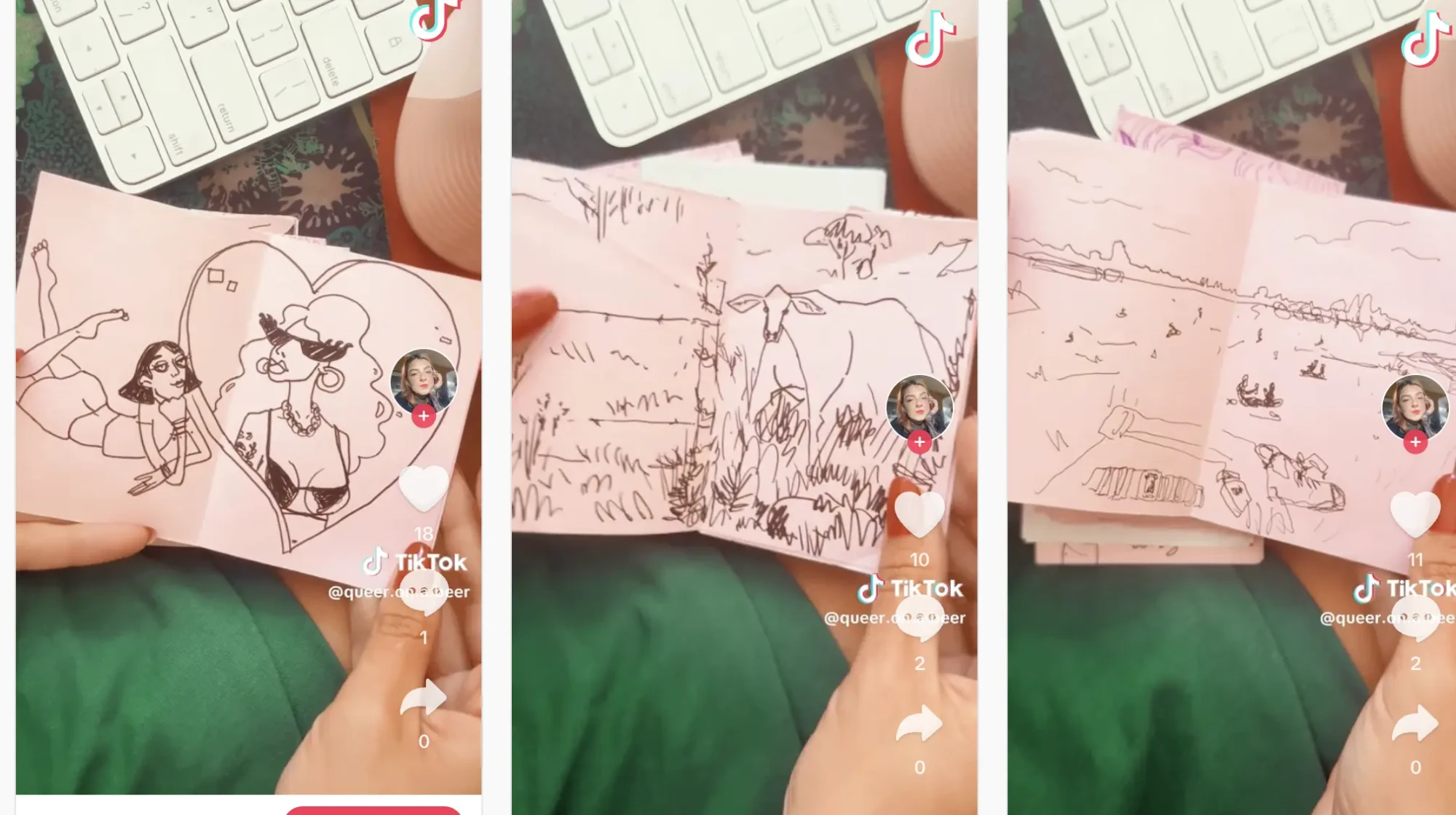
Dua is one of those rare mainstream artists I’ve come to like more over time. Hopefully I won’t be betrayed — I’ve been disappointed by public figures too many times to trust anyone easily anymore. If you want to check out the videos I made of the concert (and of Linkin Park and Poppy’s concerts too!) check out my tiktok @queer.on.a.beer.
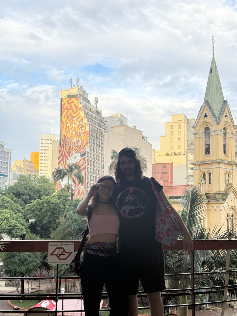
The rest of the trip was spent wandering around Liberdade with my partner, hunting for Yugioh cards to finish our decks, and eating delicious Asian snacks. (Any other players?)
Seeing my childhood friends was so healing, as always. There’s nothing like being with people who truly know you — the version of you that can say anything, without filters, and feel understood. Best part of the trip!
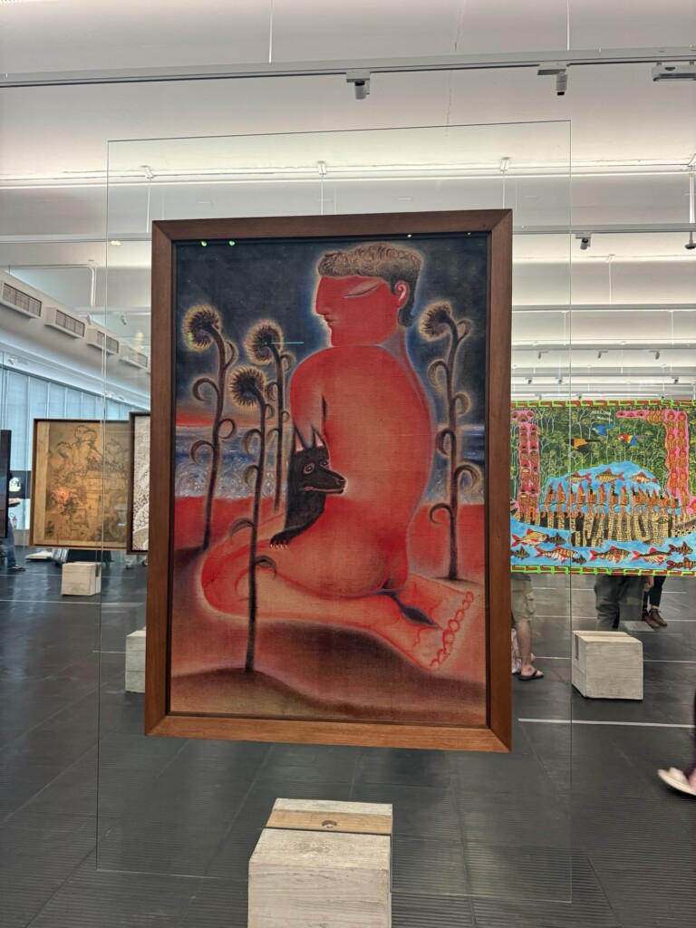
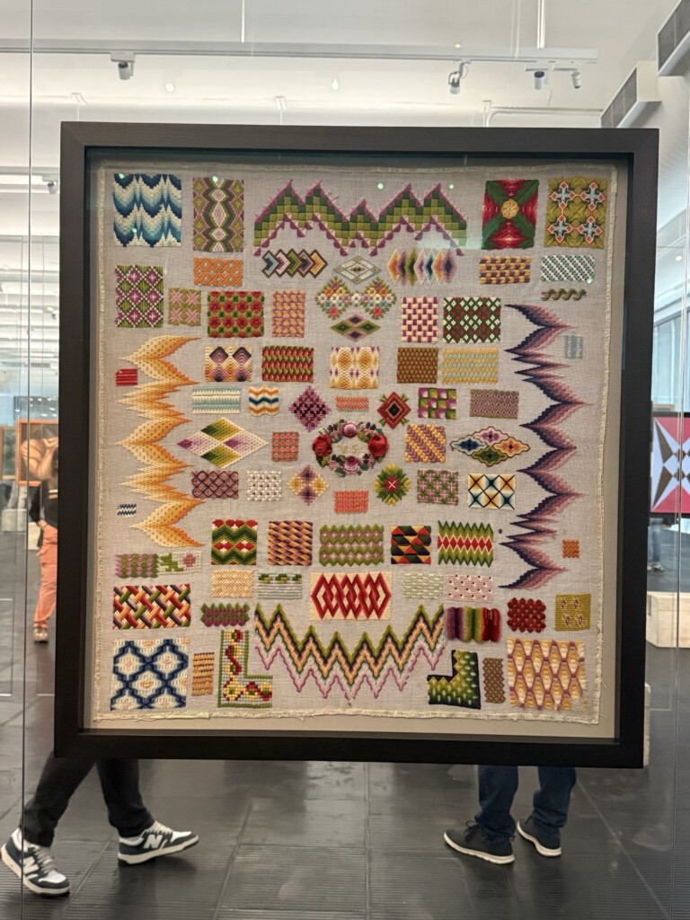
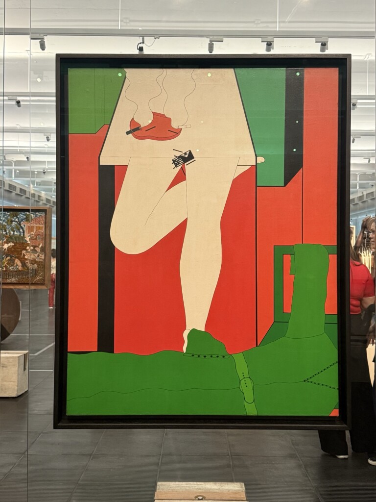
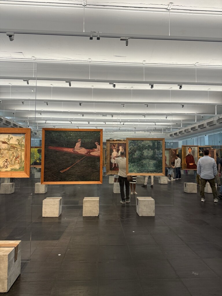
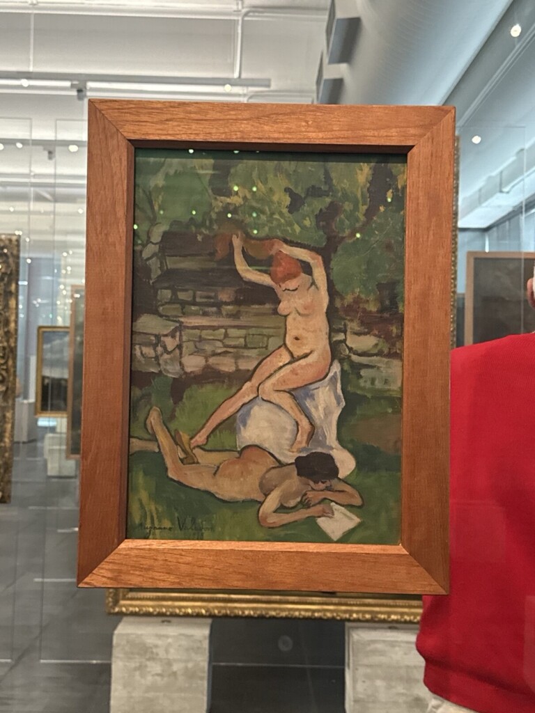
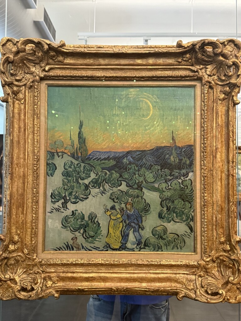
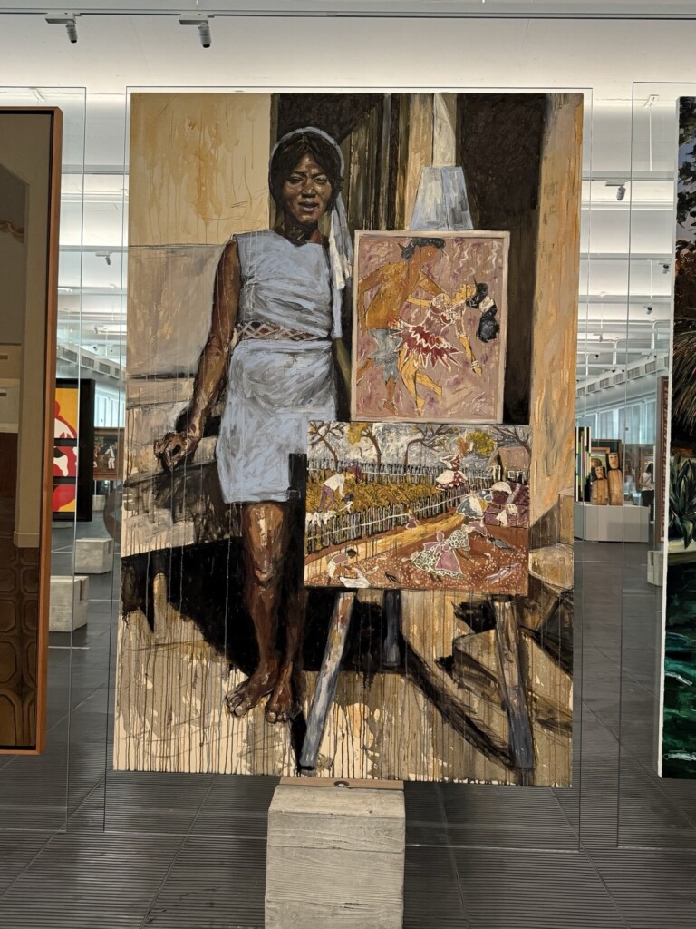
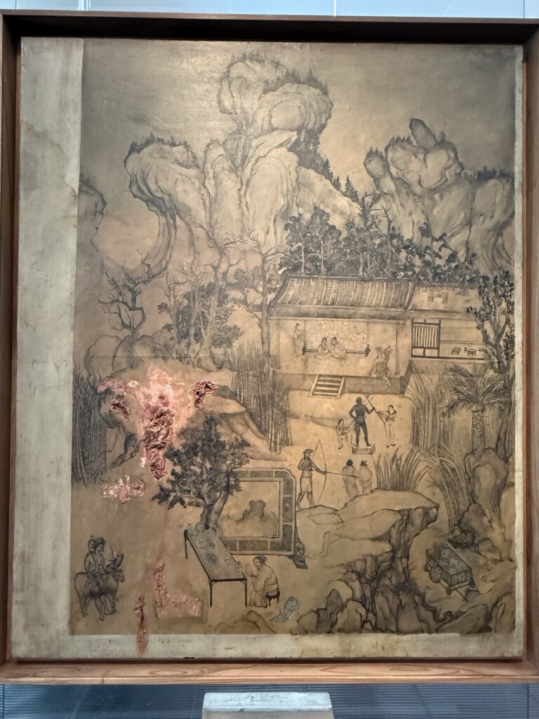
I also managed to squeeze in a visit to MASP, São Paulo’s most important art museum and one of my long-time bucket-list stops — and it was absolutely worth it. I explored:
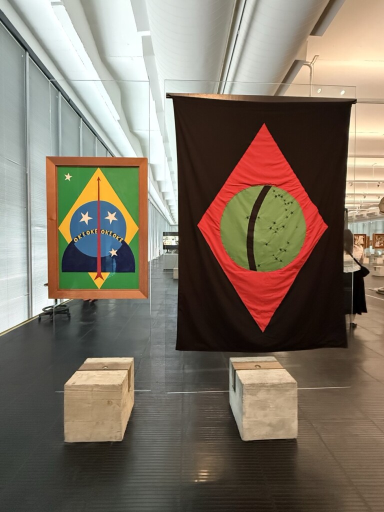
The Permanent Collection Gallery, a fascinating open-concept experience where artworks are mounted on transparent easels, layered through a wide, fluid space that lets you wander and discover pieces (and people) in your own organic path;
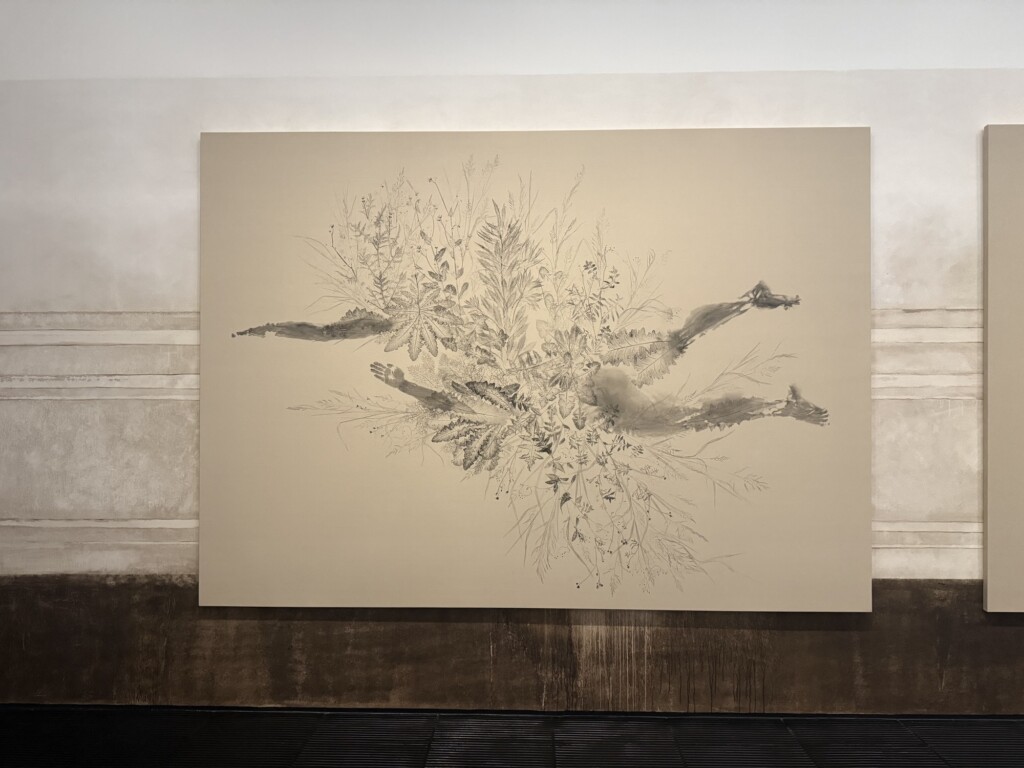
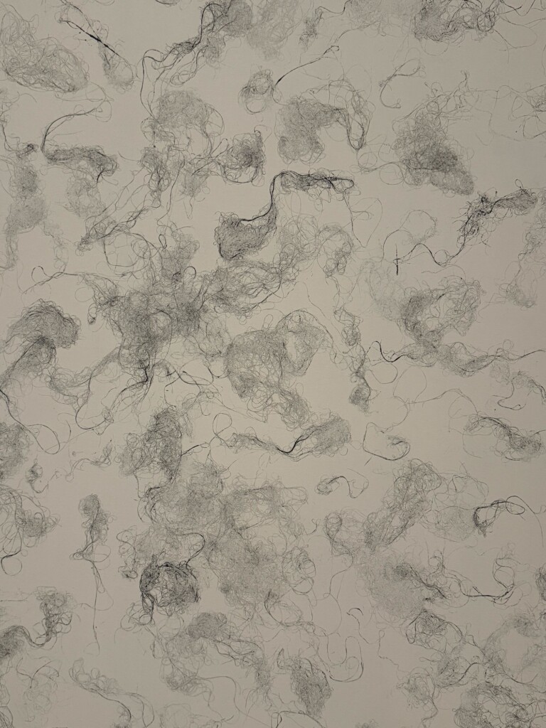
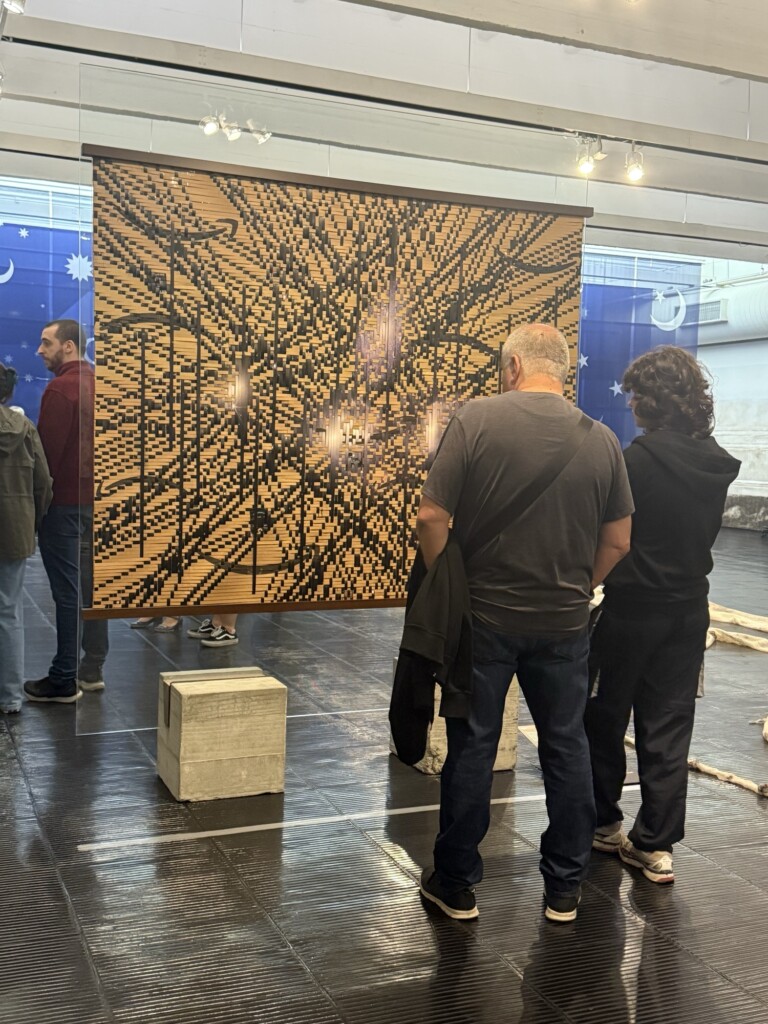
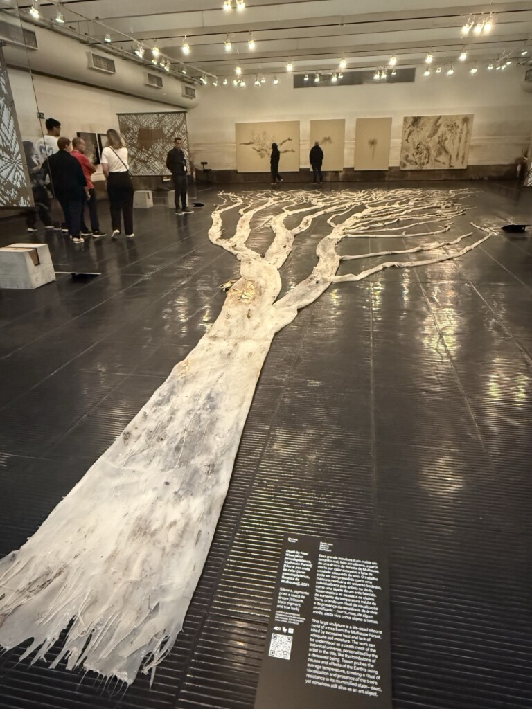
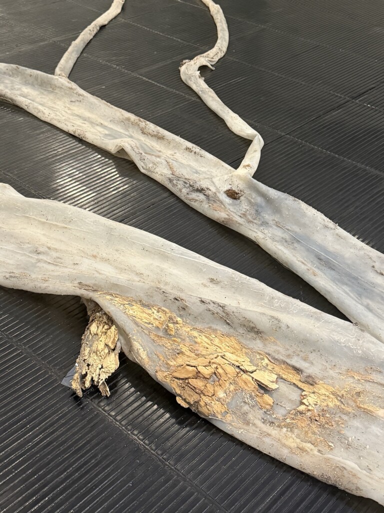
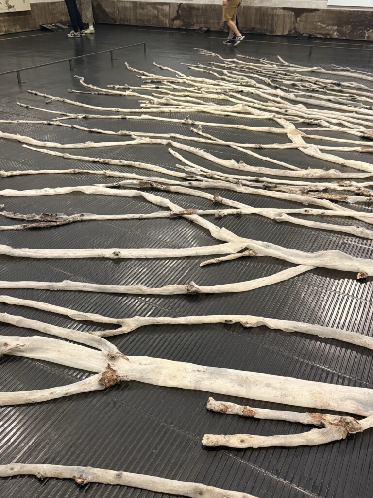
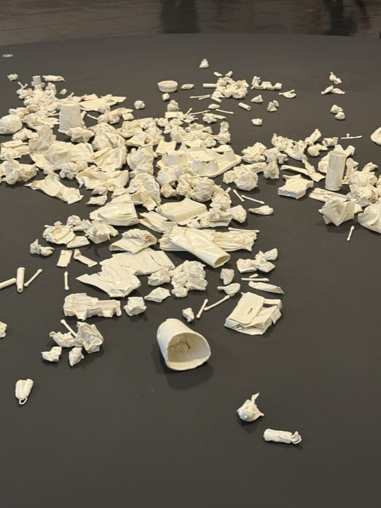
Ponto sem Retorno (Point of No Return)by Clarissa Tossin, a multifaceted solo exhibition with works exploring nature, the body, time, and the relationships between these themes; and
Histórias da Ecologia (Ecology Histories), the museum’s major exhibition at the time, spanning six floors of the newly opened building and presenting a wide range of ecological concepts through diverse mediums and artists.
Below are some highlights from the visit:
Piante vagabonde: famiglia Asteraceae, Roma [Ervas daninhas: família Asteraceae, Roma] [Weeds: Asteraceae Family, Rome], 2025. Ckarisa Tossin [Printmaking Ink on Canvas] A natureza da matéria (queda de cabelo) [The Nature of Matter (Hair Loss)], 2025. Ckarisa Tossin [Printmaking Ink on Canvas] Future Geography:
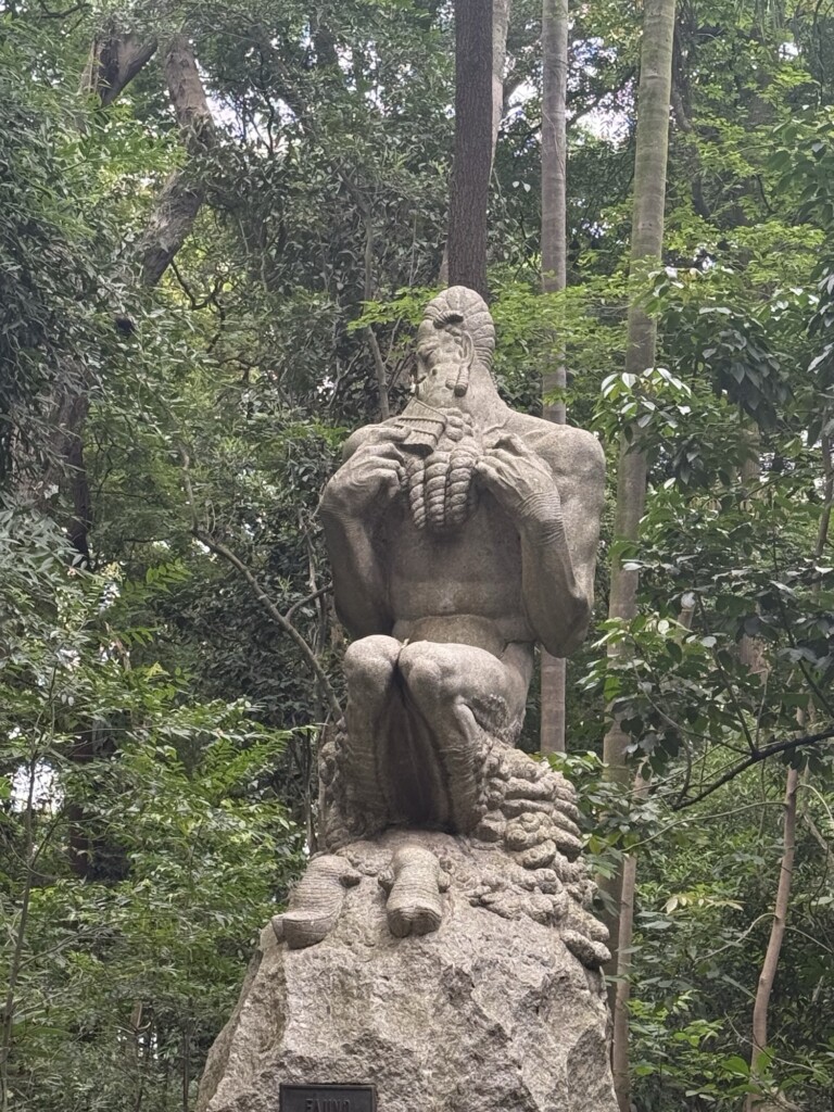
The Five Galaxies of Stephan’s Quintet, 2022. Ckarisa Tossin [Used Amazon cardboard boxes, inkjet print on laminated photographic paper, and wood]Death by Heat Wave (Acer pseudoplantus, Mulhouse Forest), 2021. Ckarisa Tossin [Silicone, black pigment and tree bark]Spent, 2009-2011. Ckarisa Tossin [Porcelain and waste ashes]Del otro lado, 2024. Daniel Correa MejíaSample of ‘Berlin Wool Work’ Needlework Stitches, 19th century. Unknown authorUntitled, from the series Envolvimento (Entanglement), 1968. Wanda Pimentela few Monet’s among the collectionNudes, 1919. Suzanne Valadon Couple Walking among Olive Trees in a Mountainous Landscape with Crescent Moon, 1889. Vincent van Gogh’s Retrato de Maria Auxiliadora, 2022. Panmela CastroQuadro ferido, 1994. Adriana VarejãoOkê Oxóssi, 1970. Abdias Nascimento & Afro-Brazilian Flag (in dialogue with David Hammons – 2nd version), 2020. Bruno BaptistelliFaun sculpture by Victor Brecheret at Park Trianon in front of MASP
I was recently in the Boston area visiting family and celebrating my brother’s Bar Mitzvah. Of course, I couldn’t resist stopping by my favorite art stores to pick up a few supplies that are harder to find here in Brazil. In this post, I’m sharing some of my favorite new art materials, journaling goodies, and printmaking tools — plus a peek at what’s next in my creative projects!
Favorites
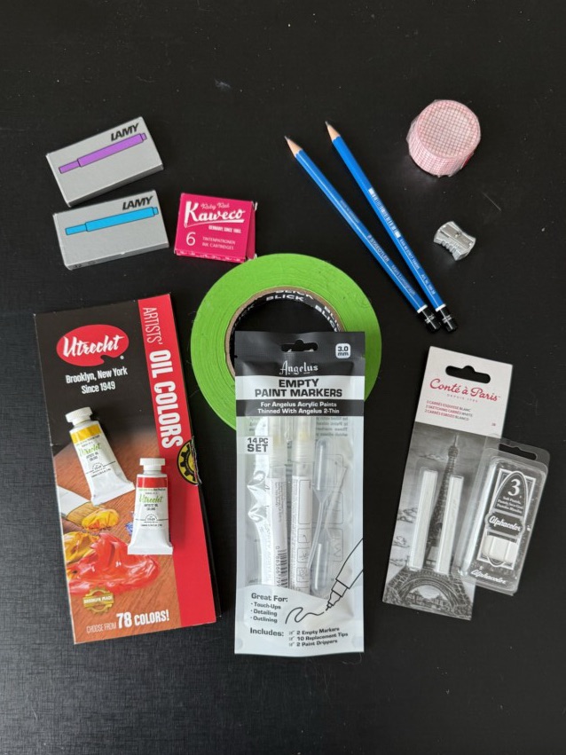
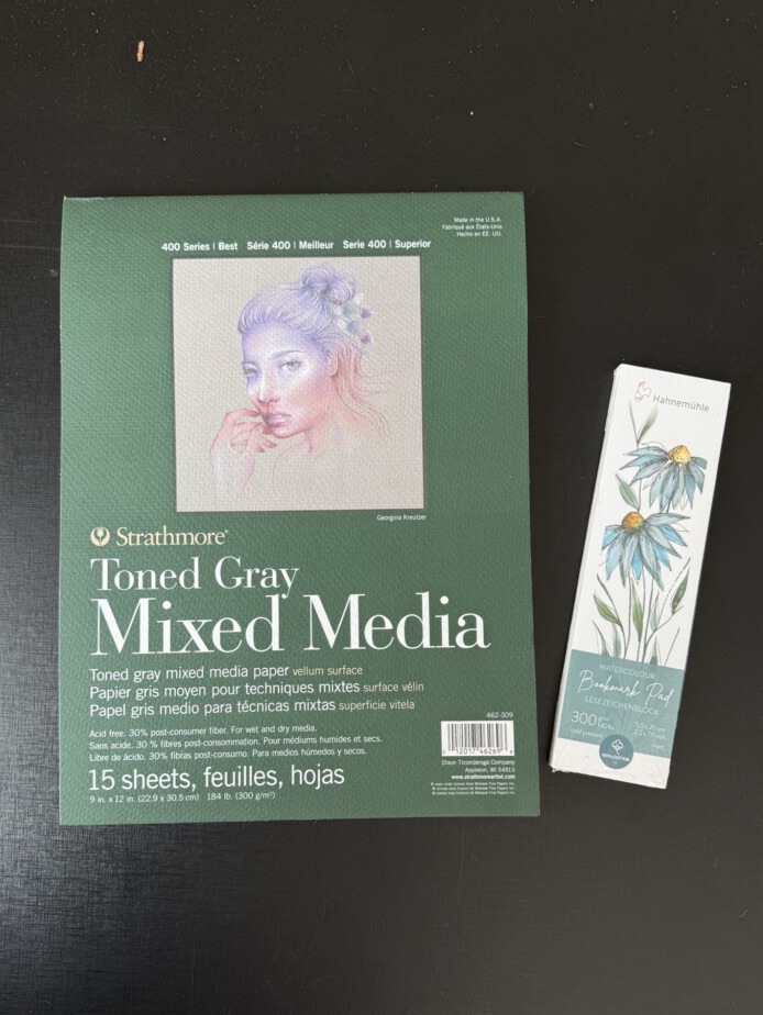
I restocked on some basics (painter’s tape, pencils, and a sharpener), a few long-time favorites (gray-toned paper, colorful inks, cute washi tape, white Conté, and pastels), and some new materials to experiment with — like watercolor bookmark paper, refillable paint markers, and sample oil paints I got as a gift.
Specs:
Painters tape: BLICK branded
Pencils: Stabler graphite, 2B + 3B
Pencil sharpener: Generic metallic one 🤷♀️
Paper: Strathmore Gray Toned Paper pad (love this brand) 15pcs, 9x12in sheets (300g/m2)
Ink-Cartridges (for fountain pens): Blue and Purple from LAMY (5pack of large cartridges); Pink from KAWECO (6pack of smaller cartridges)
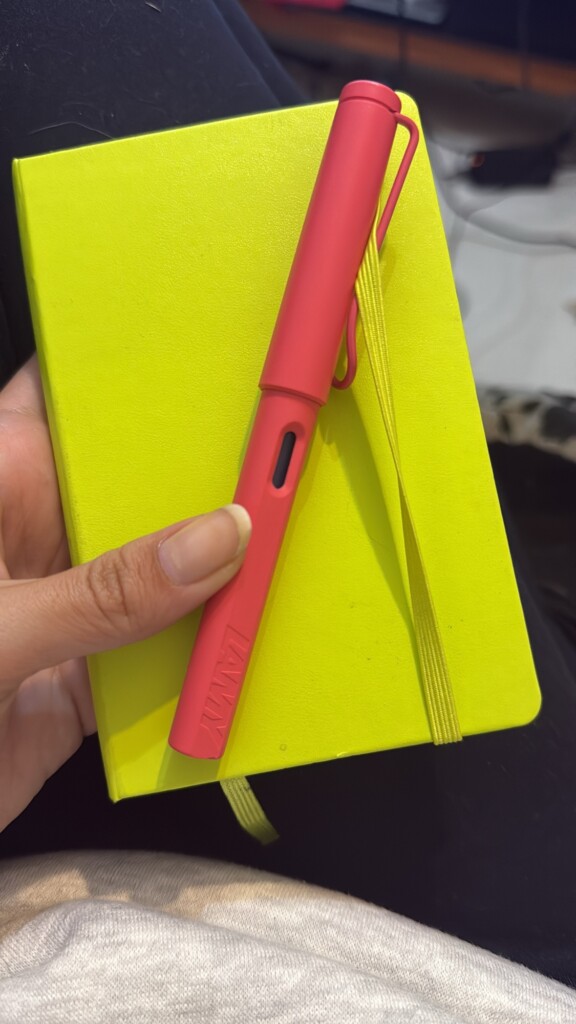
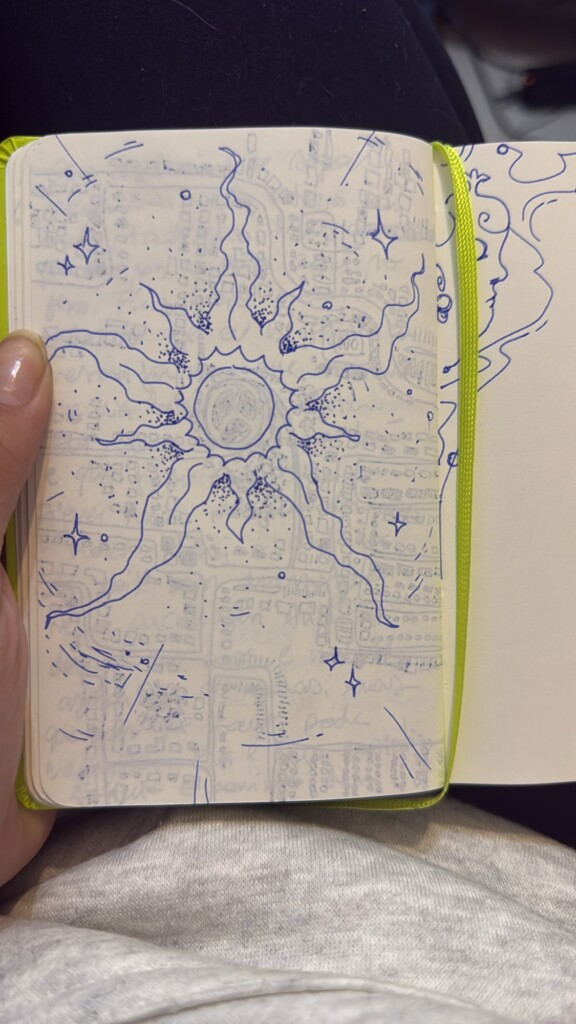
I treated myself to a new notebook and fountain pen — and I’m obsessed with this adorable guava-colored duo! I’ve been journaling and doodling a lot more thanks to them. The pen writes so smoothly and feels perfect in my hand. Definitely a little splurge that’s been totally worth it.
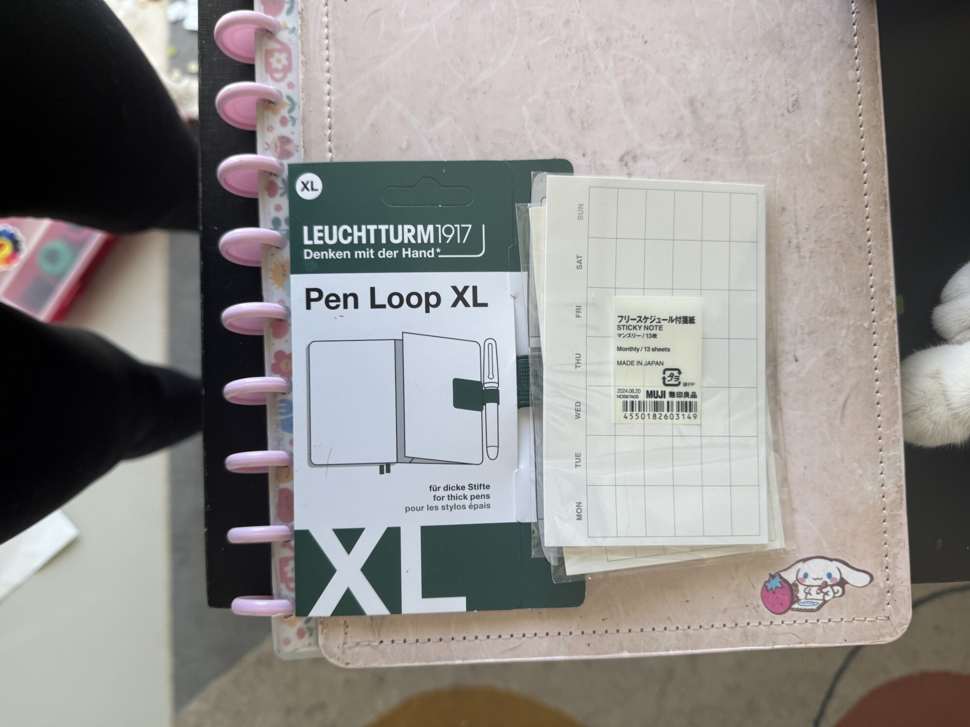
I also picked up a few planner accessories like a pen loop and sticky calendar notes.
Specs:
Notebook: Moleskine Classic Collection – pocket size; blank pages; hard cover; lime green
Pen: LAMY safari Fountain Pen in Sunset (with a Fine Tip)
Pen loop: Leuchtturm1917 Pen Loop XL in Forest Green
Calendar sticky notes: MUJI’s Monthly Sticky Note
Printmaking
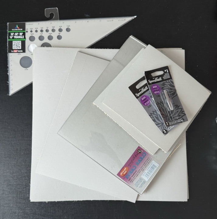
My main goal for this haul was to find some affordable linoleum and new carving blades — and I got lucky!
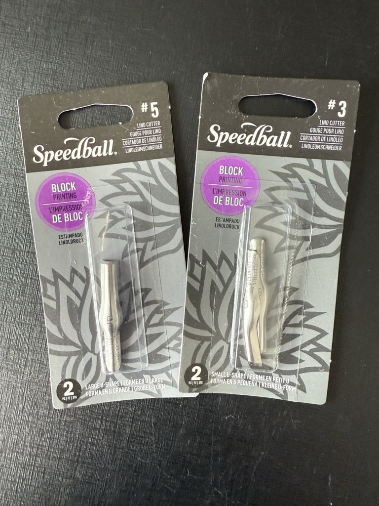
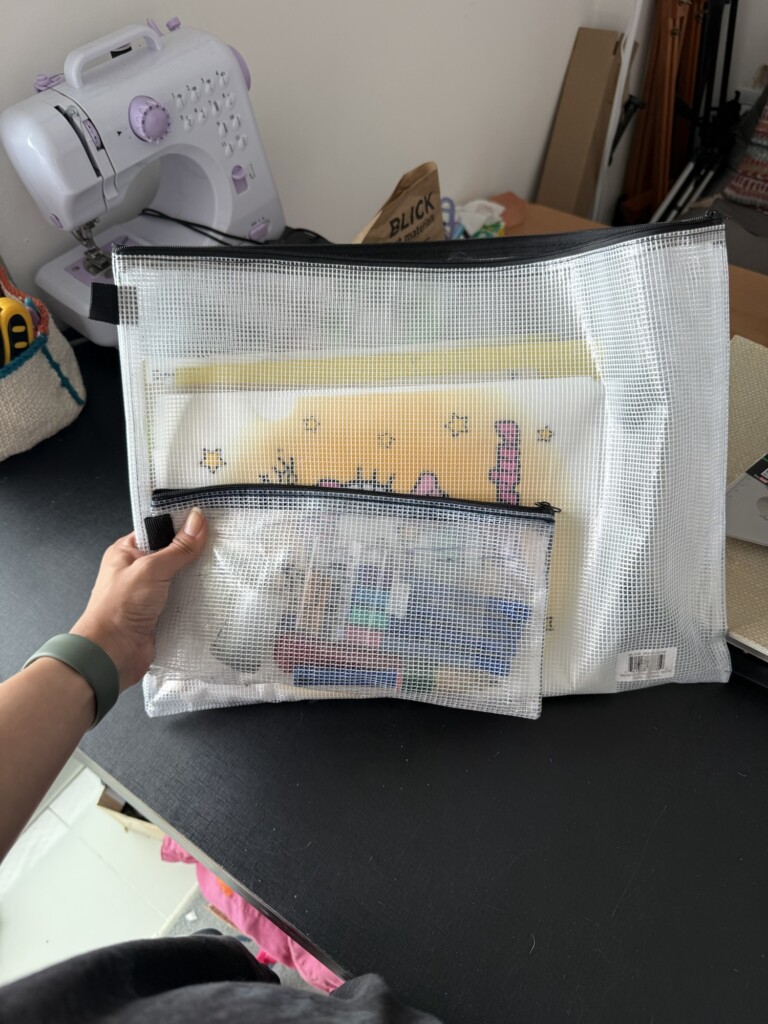
I grabbed two sets of “V” blades (sizes #3 and #5) to replace my old rusted ones, though I’m still hunting for a 0.5 tip to replace my favorite. I also found a large BLICK pouch (12x16in) to carry my studio tools — a much-needed upgrade from my overstuffed plastic folder.
For linoleum, I got a range of block sizes and one clear carve block, which I’ve used before and loved. Working on compressed wood has been hard on my hands lately, so I’m looking forward to testing these softer alternatives.
These should keep me busy for quite a while! I’ll be sharing the results of my printmaking experiments soon — stay tuned for updates on my carving process here.
Specs:
Blades: Speedball ‘lino cutters‘, in sizes #3 and #5
Pouches: BLICK branded 12×16 in.
Linoleum: BLICK branded, sizes: 6×6, 8×10, 12×12 in.
Clear Carve: Jack Richeson in 8×10 in.
Sewing
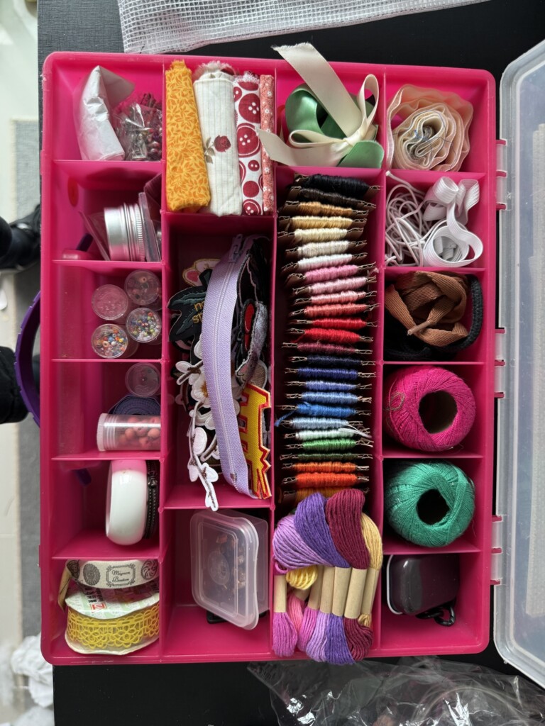
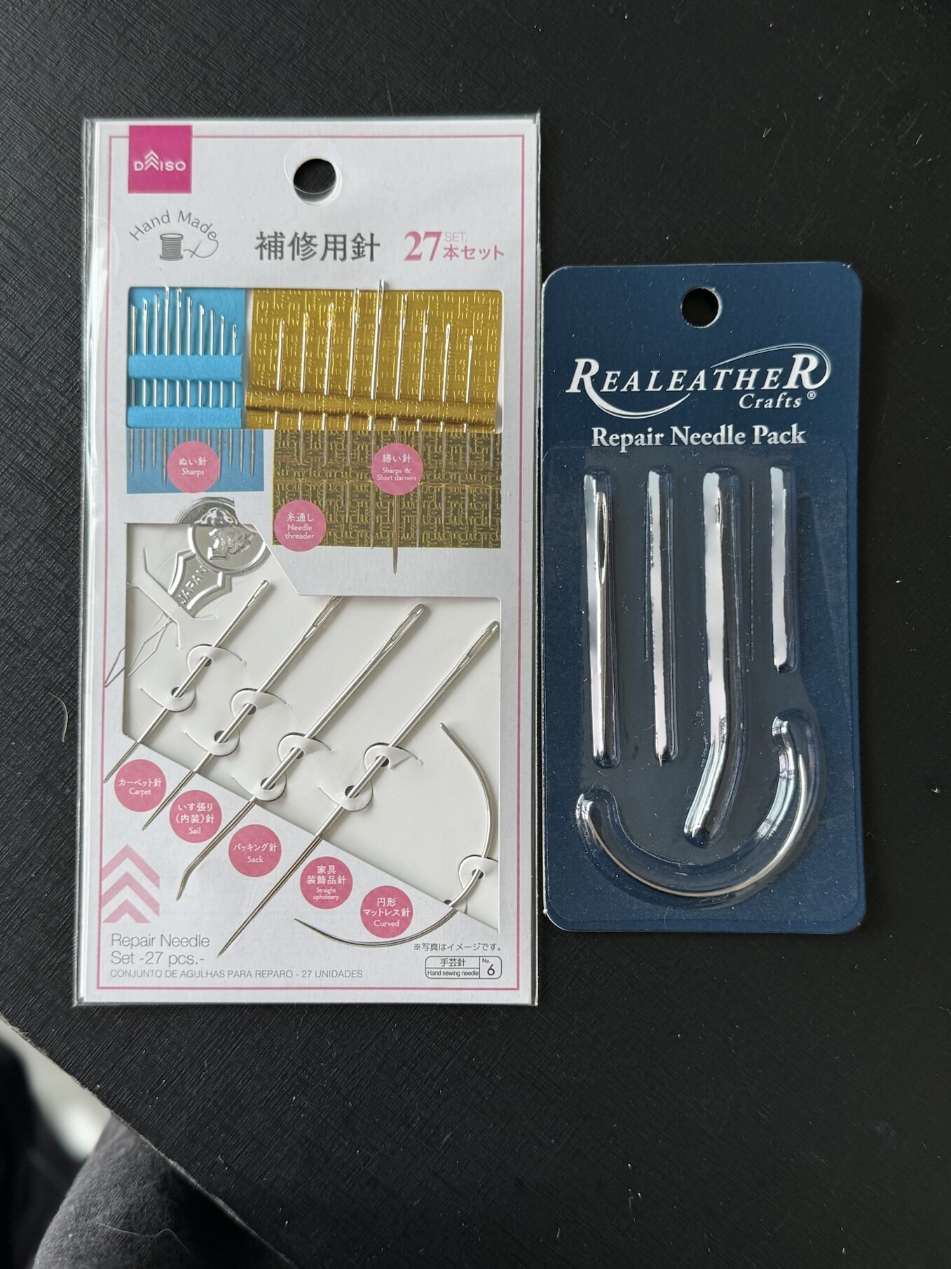
This trip was also a big one for bringing back some of my things from my dad’s house — sketchbooks, planners, my comic collection, my guitar, and my sewing kit (finally reunited with it!).
I’ve been reorganizing my sewing supplies and planning to post more about my collections soon — from stickers and postcards to old art, sketchbooks, and comics. It feels amazing to finally have most of my creative tools in one place for the first time in years.
My mom was looking for a notebook for her wedding speeches (she’s a ceremonialist on the side). She always writes a personalized text to read during the ceremonies, and it needs to be presented in a beautiful, fitting folder or notebook.
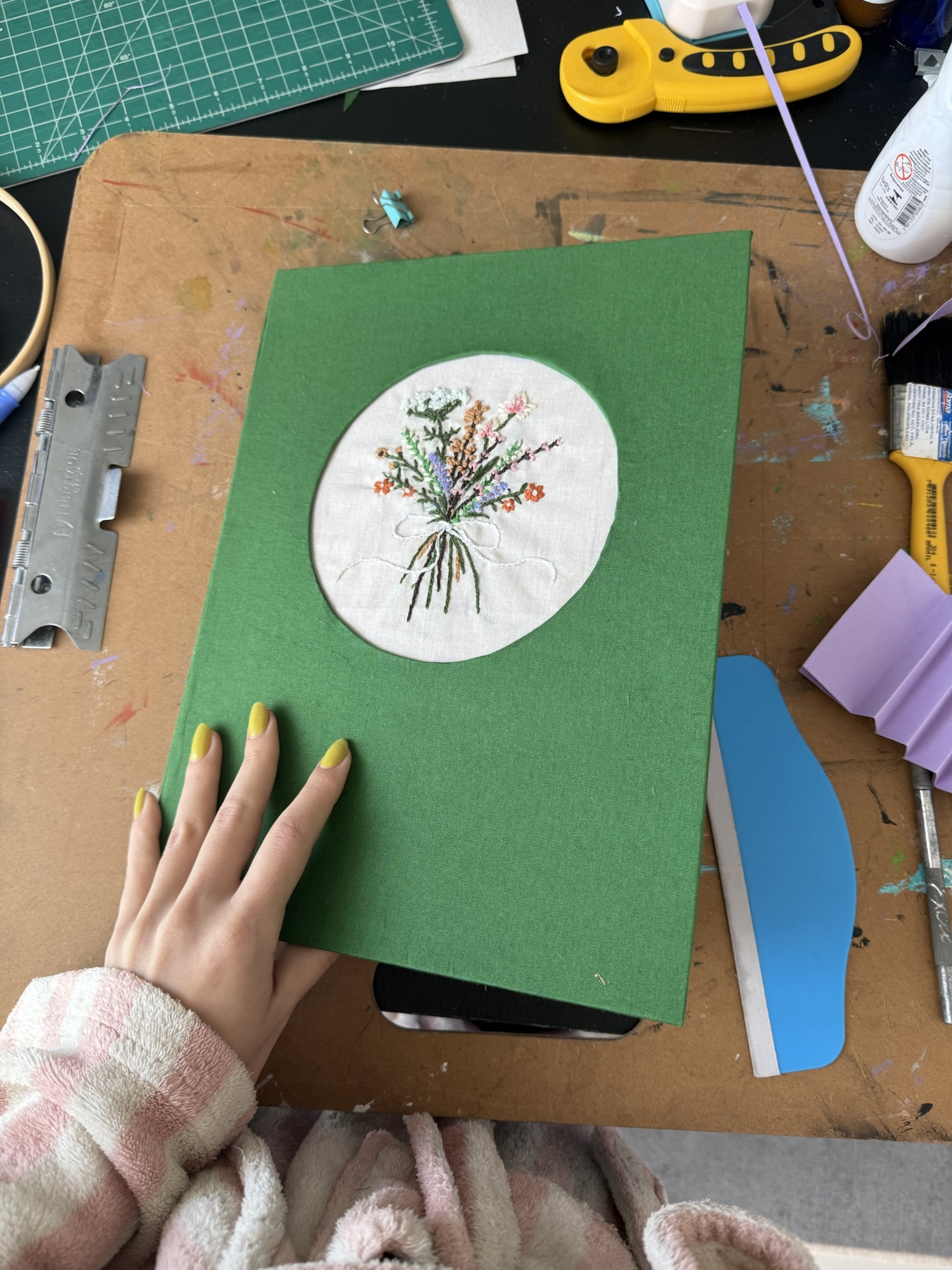
With that in mind, I thought this style of bookbinding would be the perfect solution — handmade, detailed, and much more personal than a store-bought version. So, I decided to embark on this project with not much prior experience. I’d just recently gotten into embroidery, and out of the dozen notebooks I’ve bound, I had never tried this particular technique.
Materials
Fabric – large enough to cover the notebook + embroidery base
Embroidery floss and needles of your choice, as well as any accessories like the hoop/frame I used
Sturdy cardboard for the cover
Heavyweight paper for the lining, the binding “accordion” pieces and the strips
White glue and a wide brush to apply it
Other tools and materials I used: rulers, pencil and pen, eraser, masking tape, rotary cutter, X-Acto knife, scissors, cutting mat, mini iron, corner rounder, and a bone folder.
I worked mostly with what I had on hand, so consider this an approximate materials list. The essentials are a sturdy piece of cardboard (I used the back of a paper pad) for the cover, and a heavyweight paper for the lining and binding. Everything else can be improvised!
Step 1: Embroidery
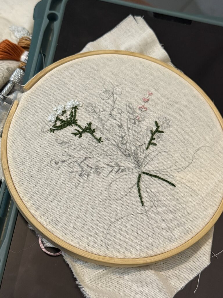
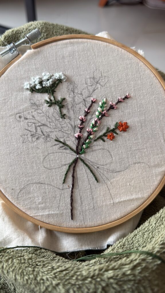
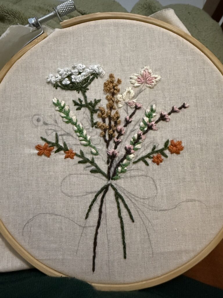
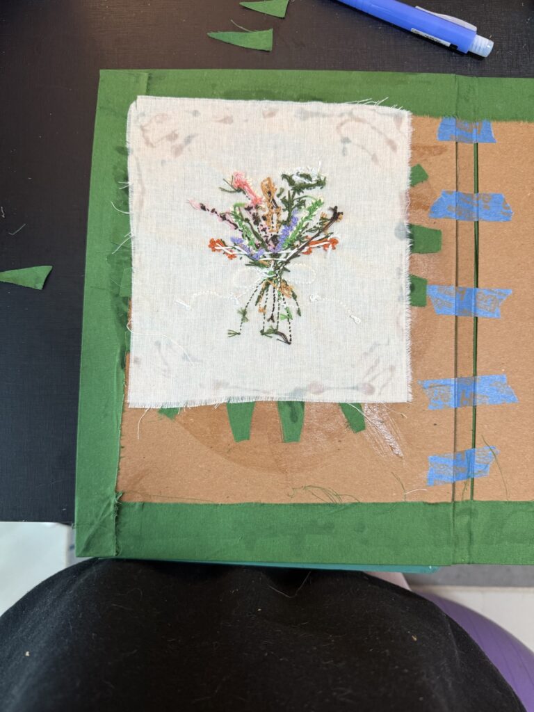
I gathered a few inspiration pictures of floral and bouquet embroidery designs, picked my favorite flower stitches, and collaged them digitally into one composition. Then, I traced and transferred the final design onto my fabric.
I didn’t practice any of these flower stitches beforehand — I just went straight for it and copied them from my reference images, which was risky but worked out surprisingly well. Seems like all the embroidery exercises I’ve done lately paid off! (Here’s a bit more about my embroidery journey.)
Step 2: Prepping the Materials
The notebook structure is made of three main parts: the cover, the inner lining, and the binding mechanism. I also needed to create paper strips that slide between the pages and into the cover to hold everything together.
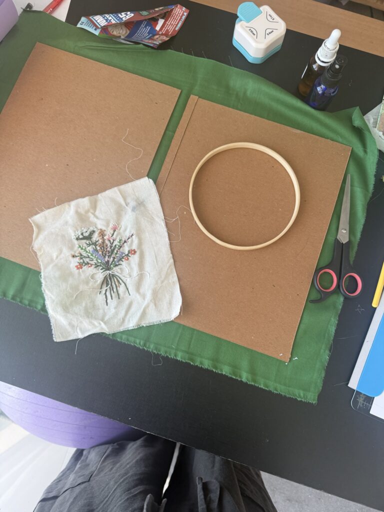
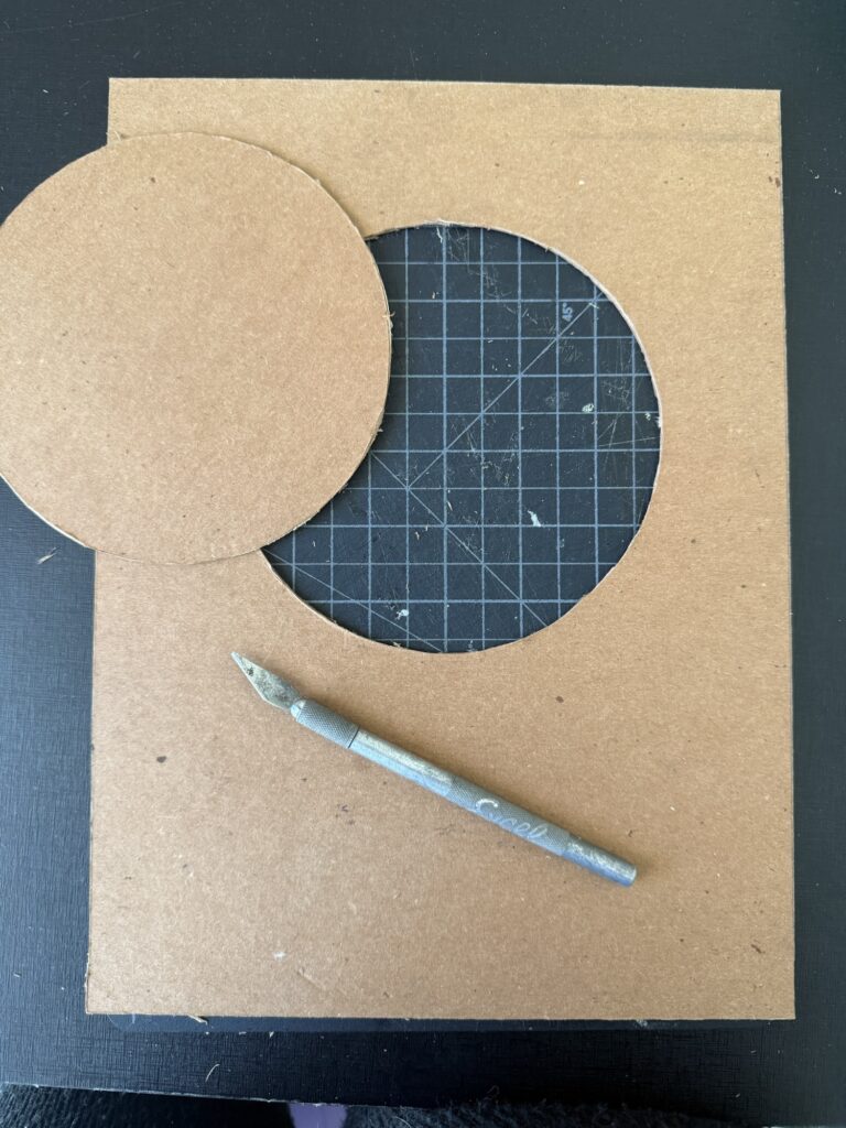
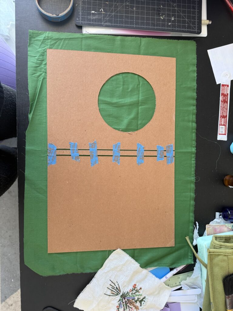
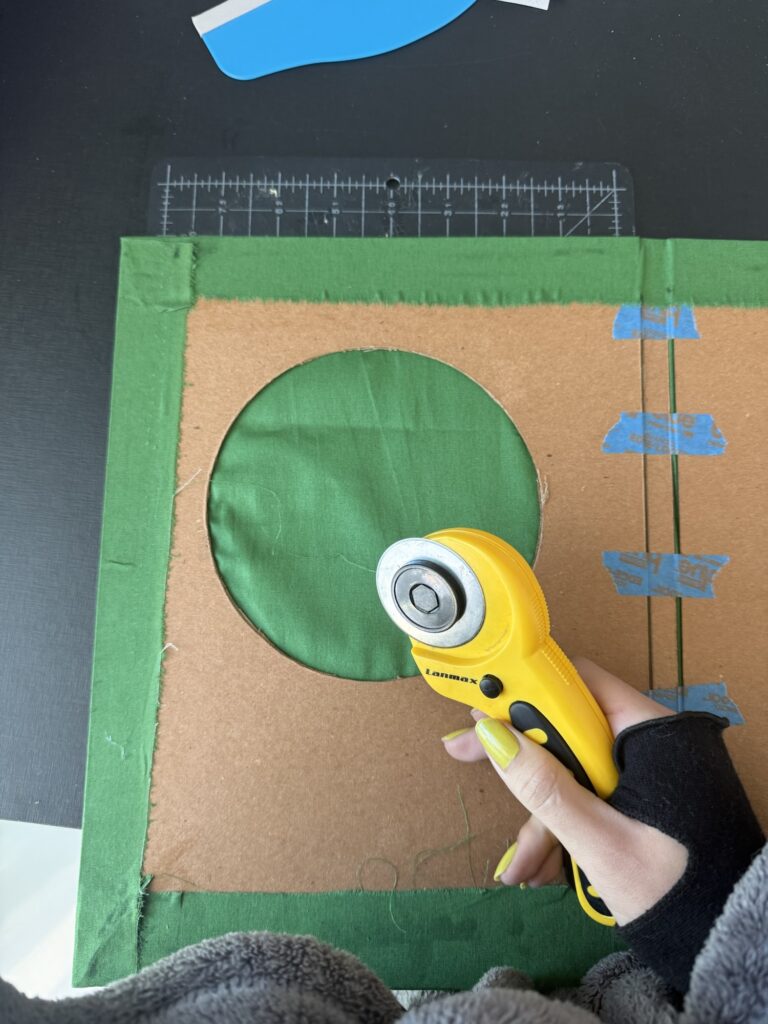
I started by cutting the cover pieces out of heavy cardboard — about one inch larger than an A4 sheet. The spine is quite thin since this notebook will only hold a few pages. I also cut out a circular window on the front cover (using my embroidery hoop as a template).
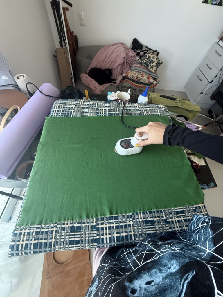
Next, I measured and cut the fabric to wrap around the front, spine, and back covers, leaving a couple of inches to fold over the edges. The fabric was a bit wrinkled from storage, so I ironed it as best I could.
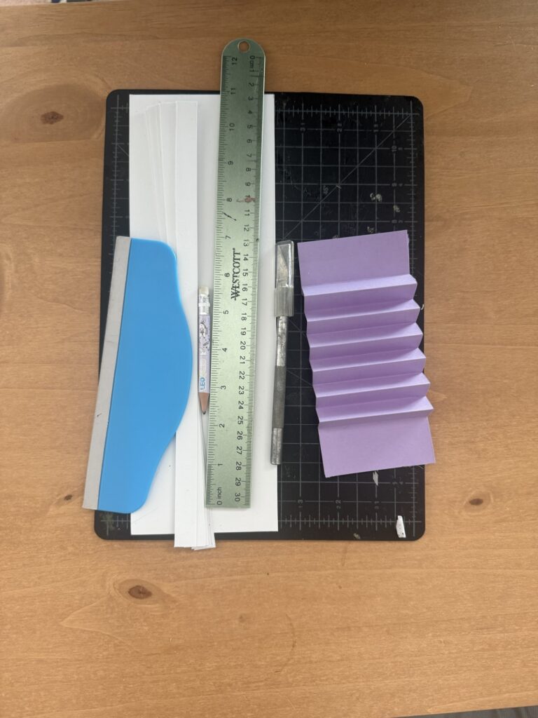
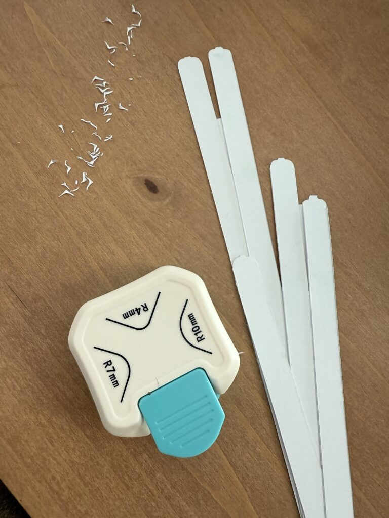
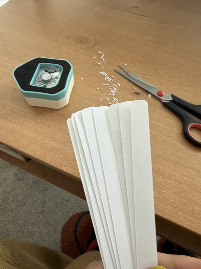
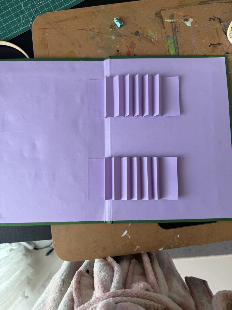
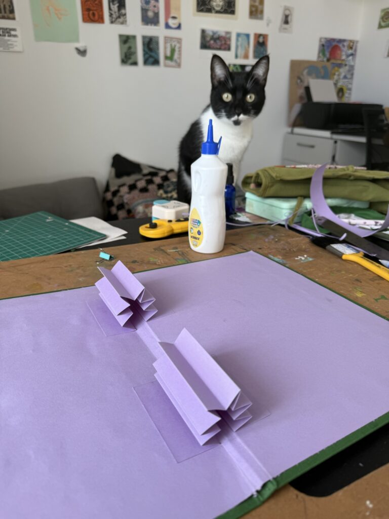
I prepped the lining paper but left it slightly oversized to trim later. Then, I cut out the paper strips that would slide into the spine “accordion” (the little folded pockets that hold the pages in place). I rounded their corners for a neater look and made a few extras, just in case some wore out over time.
Step 3: Creating the Cover
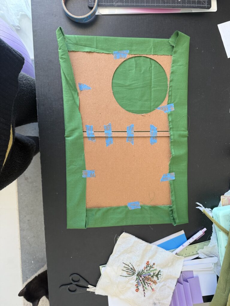
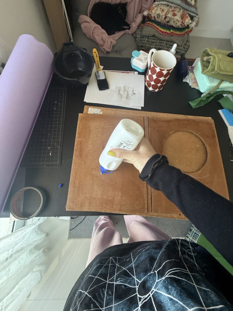
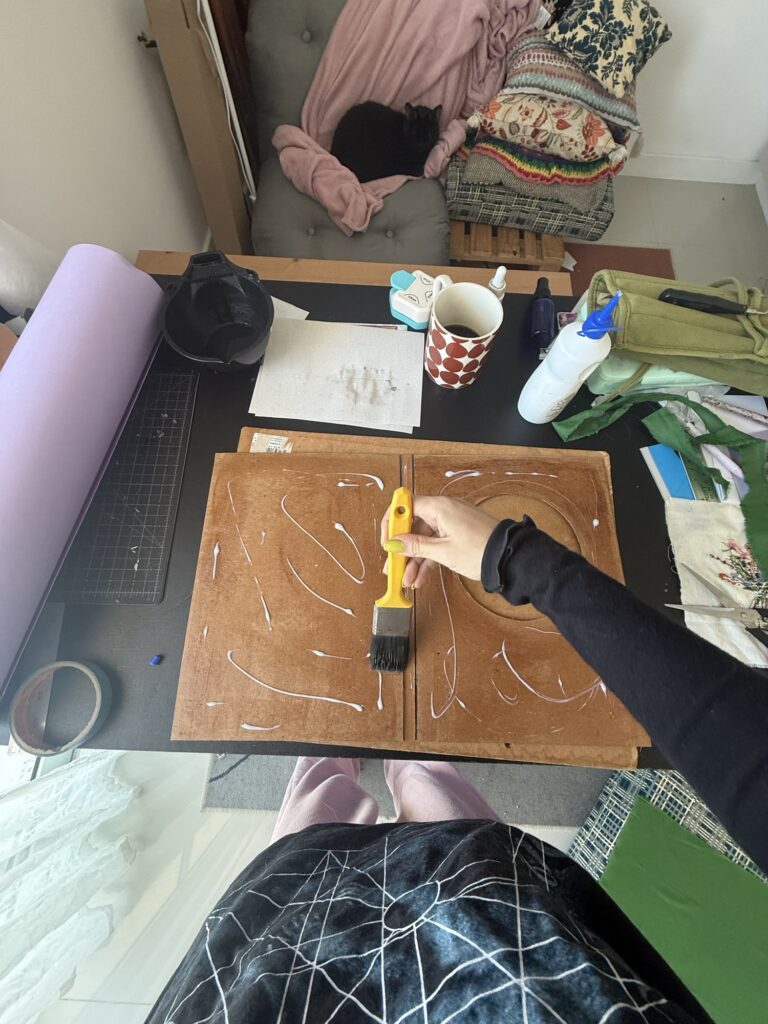
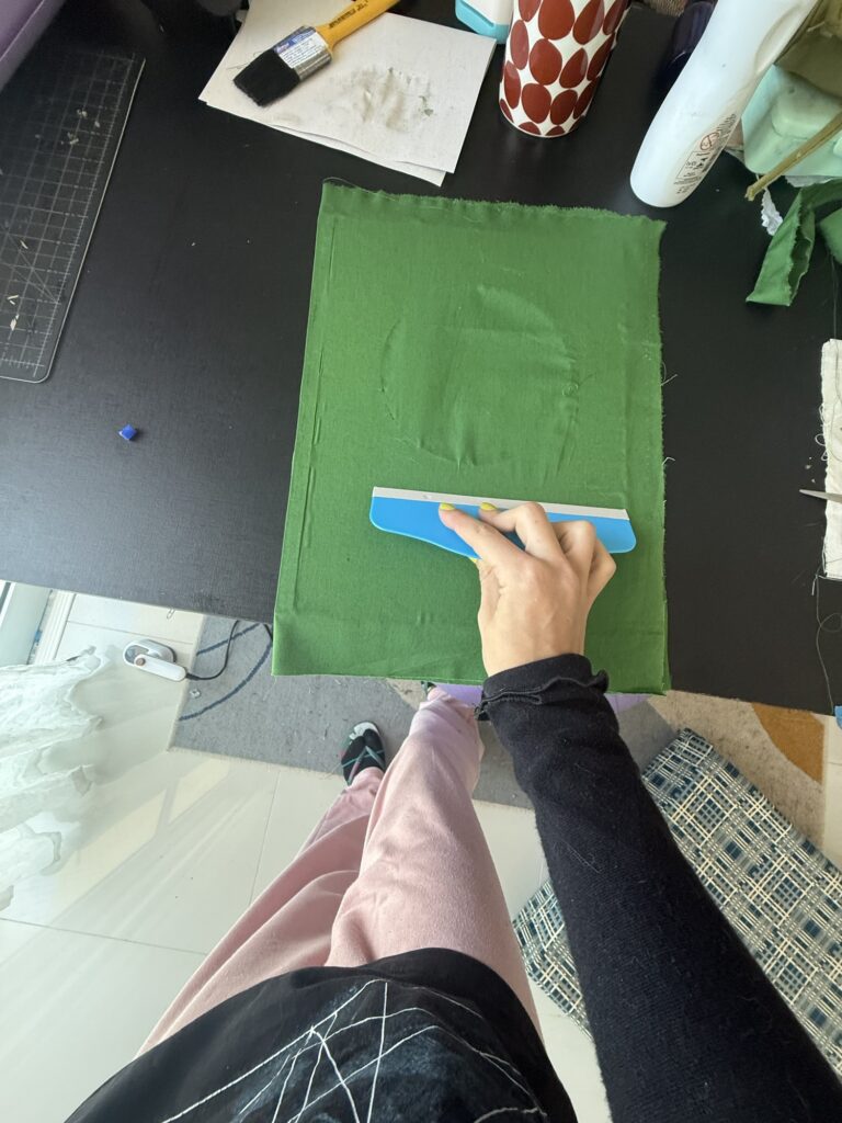
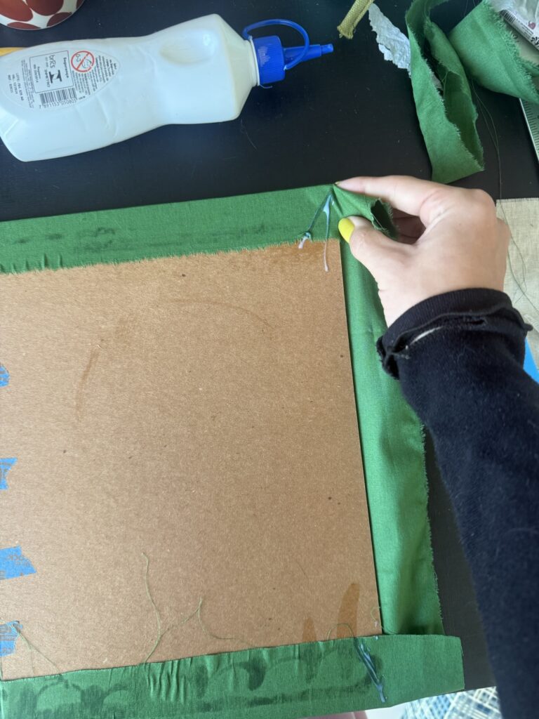
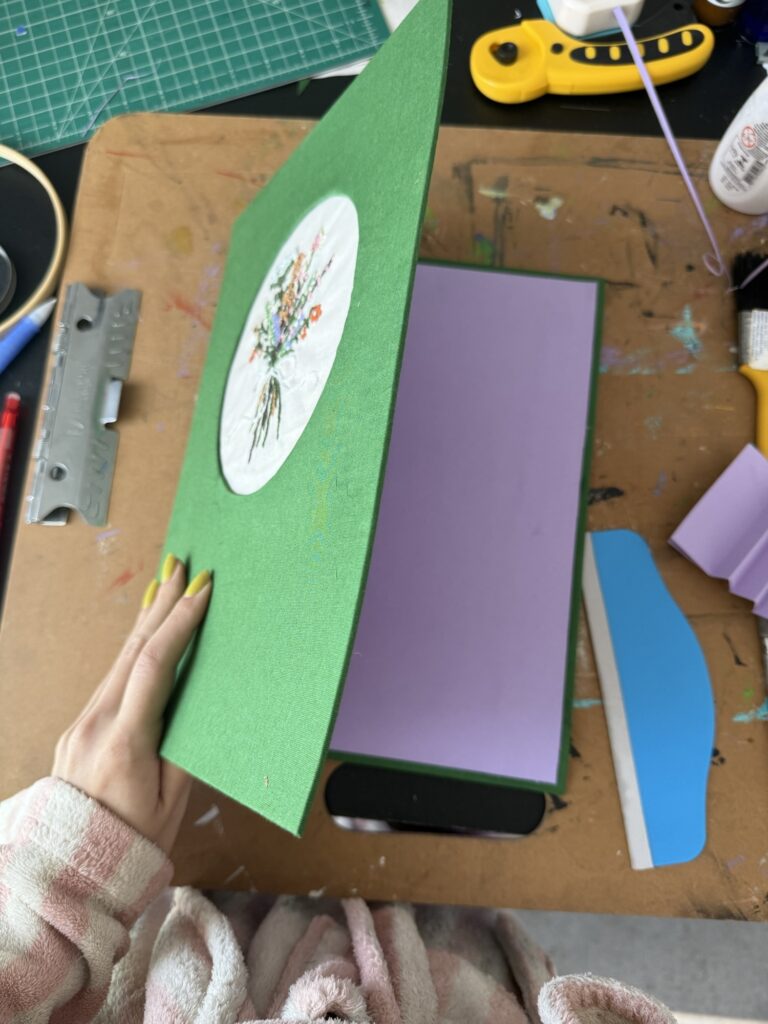
Once everything was prepped, I assembled the cover! I taped the cover pieces together, flipped them over, and brushed on an even coat of glue. Then, I carefully laid the fabric on top and smoothed it out with a flat tool — a tricky step since I needed to keep the fabric taut while still allowing the cover to open and close easily.
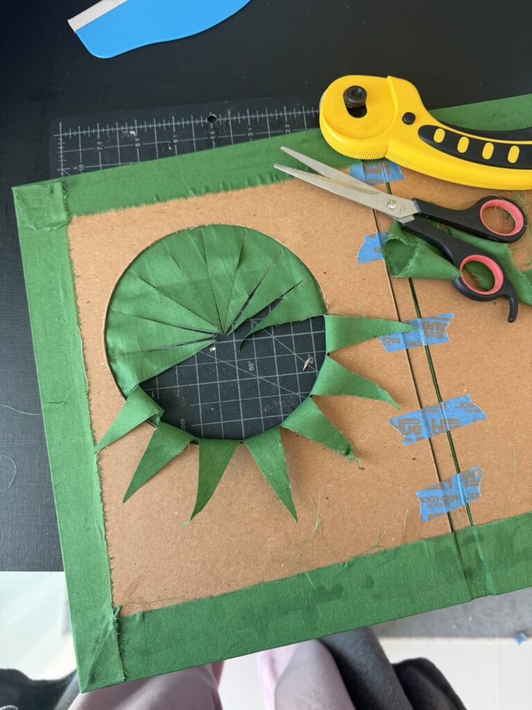
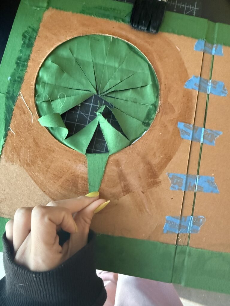
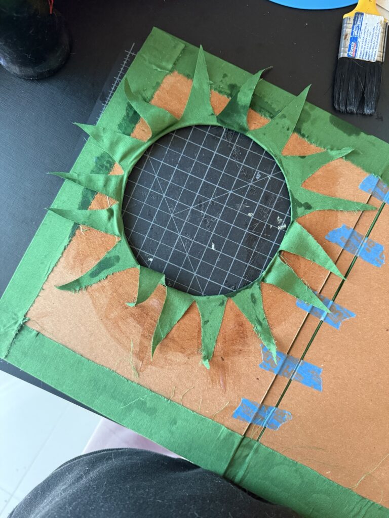
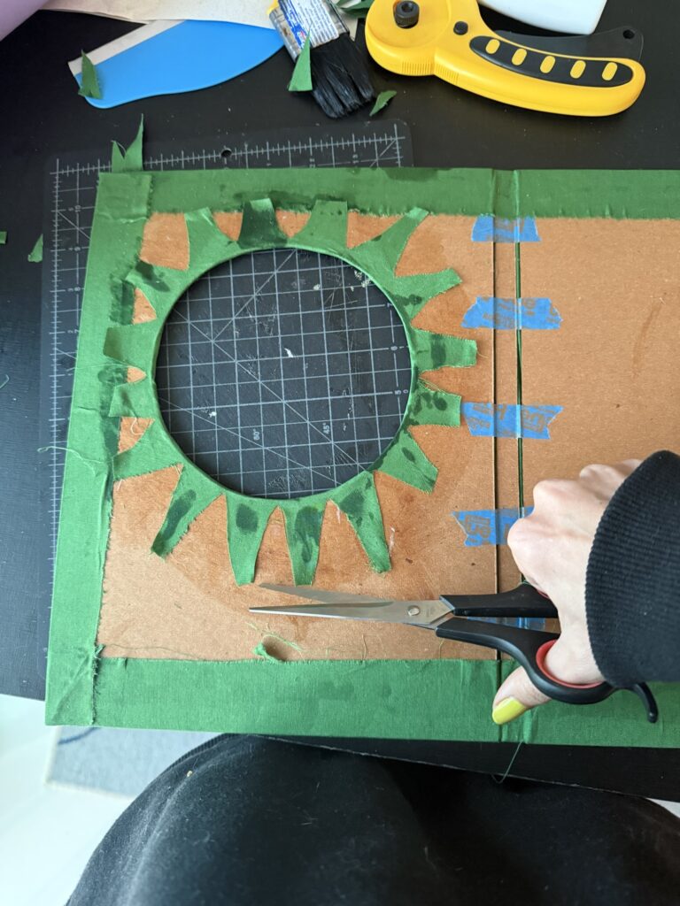
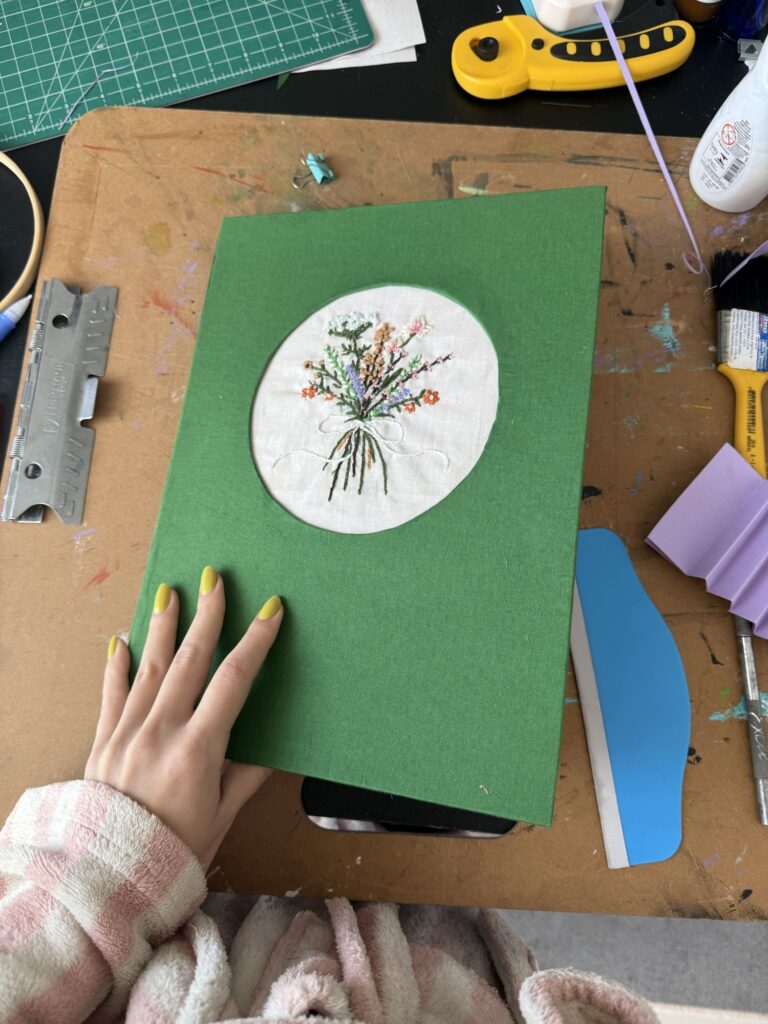
I flipped the piece over to glue down the fabric edges, taking extra care at the corners to avoid thick folds. For the circular window, I cut small slits, folded each one inward, and glued them down one by one — alternating sides to keep the tension balanced and the circle neat.
Step 4: Adding the Embroidery
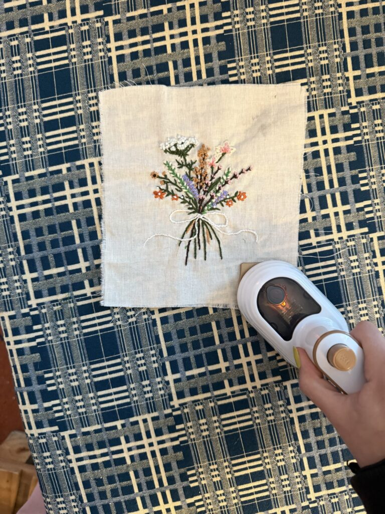
By the time I was ready to attach the embroidered fabric, it had gotten a bit wrinkly from stitching and handling. I used my mini-iron to smooth it out gently, especially around the tight corners.
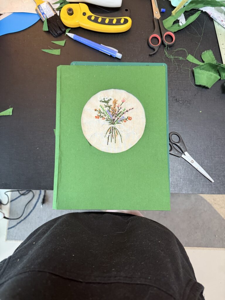
I aligned the embroidery by eye on the front cover, flipped it carefully, and glued one side at a time — pulling just enough to keep it smooth without warping the fabric.
Step 5: Prepping the Inside & Australian Bind
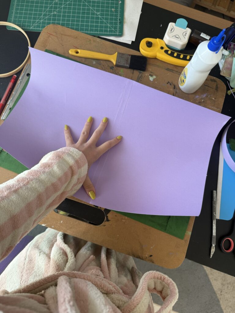
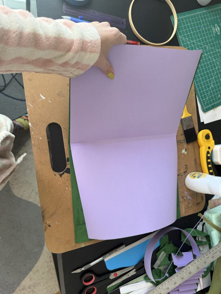
The inner lining was a bit tricky to glue down since the paper was thick and slightly curled. I tried not to overthink the minor imperfections in the cover’s shape (perfection is overrated anyway).
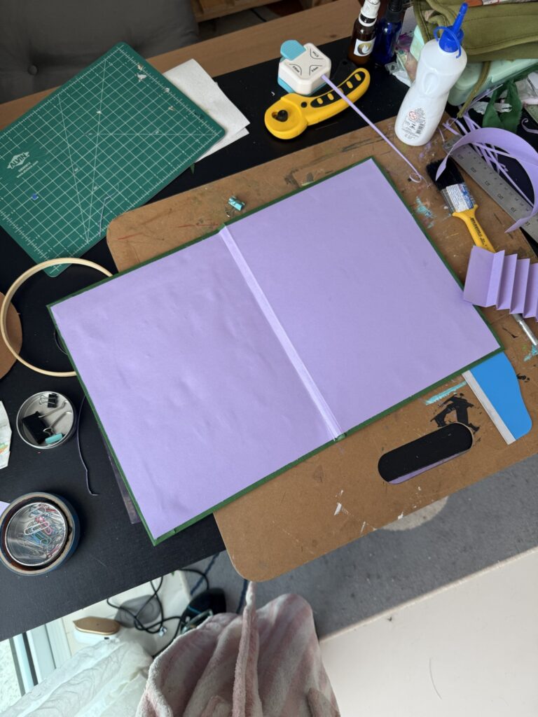
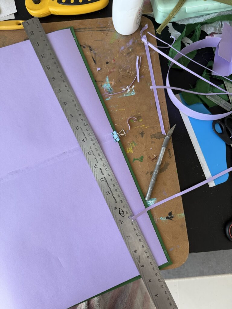
After roughly cutting the paper to size, I folded a center crease and glued it down. Then, I trimmed the edges with an X-Acto knife and ruler, cleaning it up by eye. I used a couple of paper clips to hold things in place while drying.
It’s not a perfect job, but honestly — it looks pretty close to it! I’m proud of how it turned out, and I’d love to make more of these in the future.
Final Touches
The last step was adding the pages! My mom prints her speeches on standard A4 paper, so I just needed to connect every two sheets to fit the binding system. I debated between using washi tape or making my own connector strips out of plain paper to match the paper’s color.
I ended up gifting her the notebook already because I was too excited to keep the surprise to myself. I explained the two options for making her printed pages compatible with the binding (washi tape vs. glued paper “hinges”). Once she starts using it, I’ll update you all on how the notebook looks in its full potential.
I’m really happy with how it turned out — it exceeded my expectations, especially considering the total lack of planning for this project! I’m even happier that my mom loved it too — maybe a little too much, since she says it’s too pretty to use and has kept it on display at her house ever since. 🩷
It’s been a minute since I last posted about my printmaking process, right?
Well… We hit a rough patch — talked it out, cried our feelings — and I didn’t want to drag you into the drama. We made up, but like any complicated relationship, we’re still figuring out our next chapter together…
All jokes aside, I really did have a hard time during the past few studio visits. I’ve been dealing with some personal things, and it was frustrating that one of my creative outlets became yet another challenge when I was looking for comfort.
Making art and learning new skills require a lot of introspection: facing challenges, sitting with difficult emotions, and figuring out ways to process and overcome them. And when life gets messy, of course it spills into your craft too. In the end, it’s not just about mastering a skill — it’s also about practicing bigger life lessons.
I’ve been struggling to finish this piece. You can probably see my frustrated decline into paralysis in the past posts — or in the lack of new updates altogether. I’ve been trying to figure out how to align the layers of the print, which has proven very difficult because of mistakes (or let’s be honest, my deviation from the recommended process) early on. I should’ve been more careful when cutting my boards so they were all the same size from the start…
Part of the struggle is technical, but it also touches on bigger things: my communication style, my resistance to rules, and the tug-of-war between perfectionism and artistic freedom. It’s frustrating to explain my problem and not feel understood. I’ve asked for help, followed tips, and still ended up stuck. I wish I had someone who could sit with me, look at it from my perspective, and help me problem-solve instead of brushing it off with, “just fix it next time.”
And yet — this project is my best piece so far. It took real research and reflection before I even began, and I’m proud of the gradient technique paired with the patterned layers I developed. It’s effective, original, and to have come up with it on my own in just my second year with this medium feels huge. That’s why it hurts when others don’t see what it means to me, or when I can’t quite get the help I need. At this point, it’s bigger than just aligning layers. It’s tied to my personal struggles and my growth as an artist.
After a few frustrated attempts, broken up by weeks away, I finally decided to take a proper break from this piece. I’ll return with a calmer mindset and fresh eyes. That was a hard call — I’m stubborn, I’m deeply invested in this work, and honestly, I felt pressure from this blog too. This is the first project I’ve shared with you step by step, and it feels strange to pause without finishing it. But that’s part of the process. And since I committed to sharing my creative process with you, here we are!
What projects and challenges have you been working on lately? Can you relate to my experience? Let me know 🙂
It’s been too long! I’ve missed you… This past month has been a bit of a whirlwind — lots of emotions and a very chaotic creative process. And when that happens, it’s hard to sit down and post, because I’m too busy living the process to be able to distill it into words here. But I’m back with some creative updates for you!
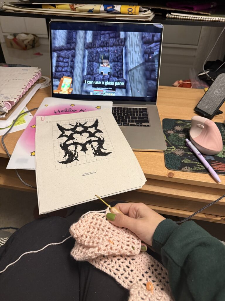
Lately, my energy has been all over the place: reconnecting with gouache paints, starting to learn filet crochet, finishing an embroidered notebook for my mom, and… spending way too much time playing Minecraft. Yep — I’m 28 and playing for the first time, and somehow got completely hooked.
I’ve been diving into Redstone engineering (basically an electrical system inside the game) and building automated machines, pretty houses, and — embarrassingly enough — catching cute Pokémon, since my friends and I are playing a modded version. It’s nerdy, but honestly, it’s been fun. Not my usual outlet, but still a creative one. So I am trying to embrace it instead of being too hard on myself.
I think I’ve been low-energy from a touch of seasonal depression (it’s the end of winter here) and because it was my birthday month. In Brazil, we call the month before your birthday “inferno astral” — “astral hell” — when everything feels off and internal challenges show up. It’s not always true for me, but this year I definitely felt it. So it’s been a slower season. Even working in a less focused way, though, I never fully stopped making. Here’s a look at what I managed to create these past couple of months:
Filet Crochet: Textile Pixel Art
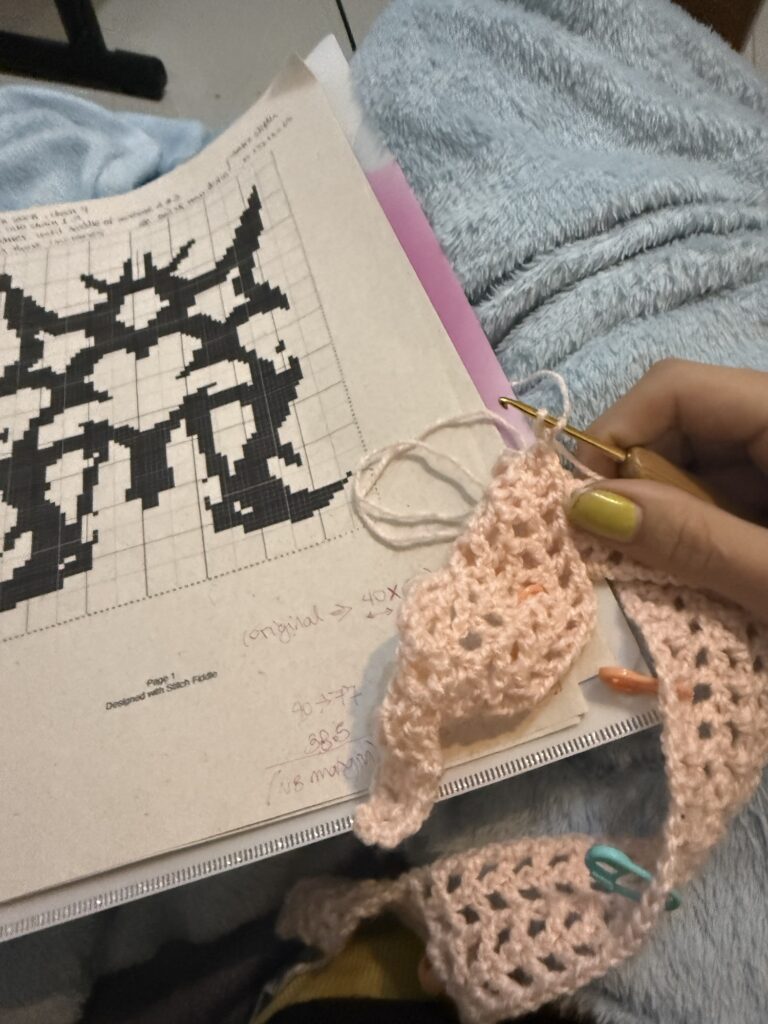
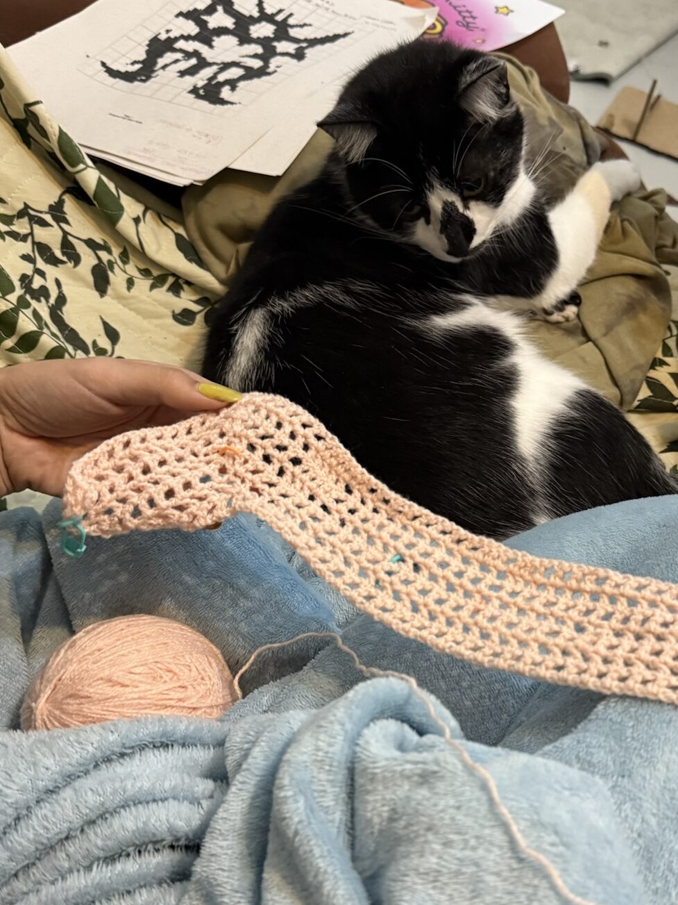
I decided to try filet crochet because it kinda feels like textile pixel art. Fun, right? Except… it’s also so much counting and precision. No mistakes allowed. Of course, I complicated things by making a custom design. To make it manageable, I bought a pattern for the top so I’m not counting every single stitch blindly.
The plan: a vest/top inspired by this Pinterest post, with my custom abstract/cybersigilism design worked in. I might add red embroidery on top to give it some color contrast, like the reference piece. Here’s the design template from Stitch Fiddle, and the pattern I’m following for the base is by Isabella Madsen.
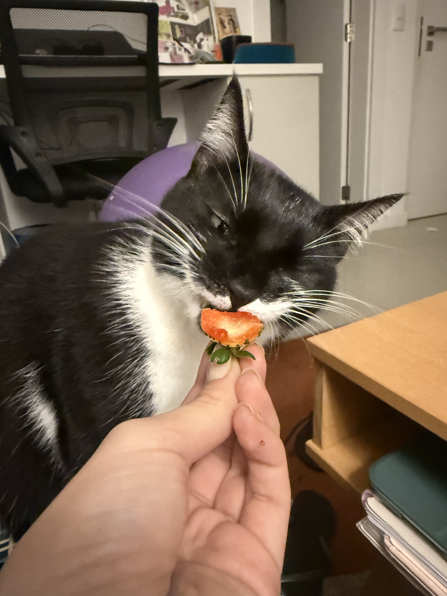
Counting these is the real challenge here…My cats are the best crafting companionsIn my Minecraft era, clearly
Gouache Experiments
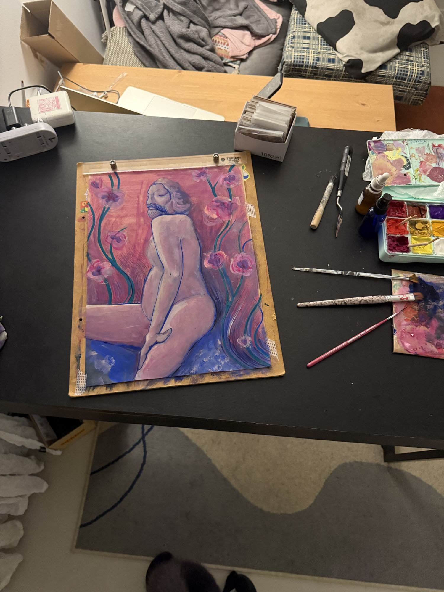
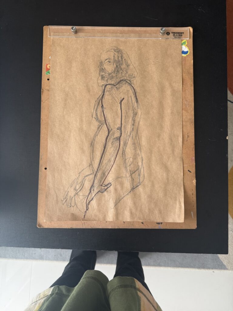
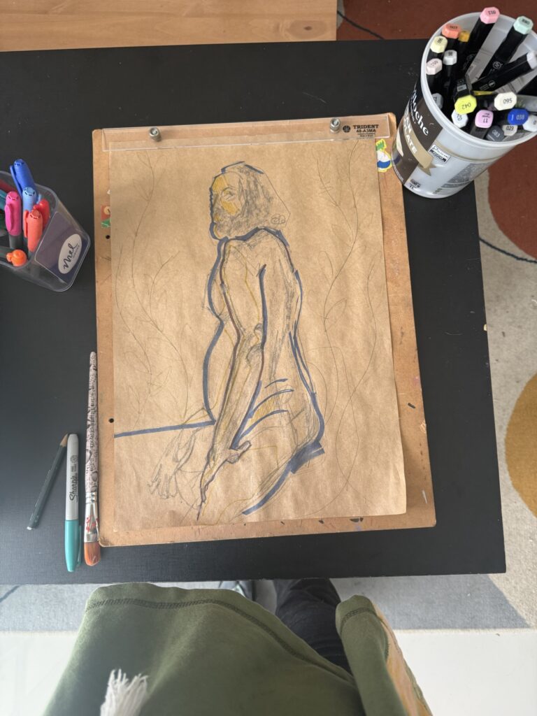
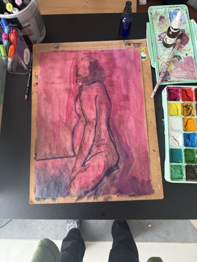
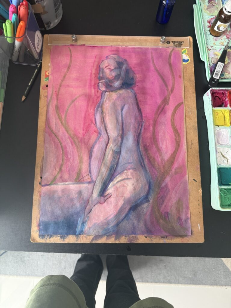
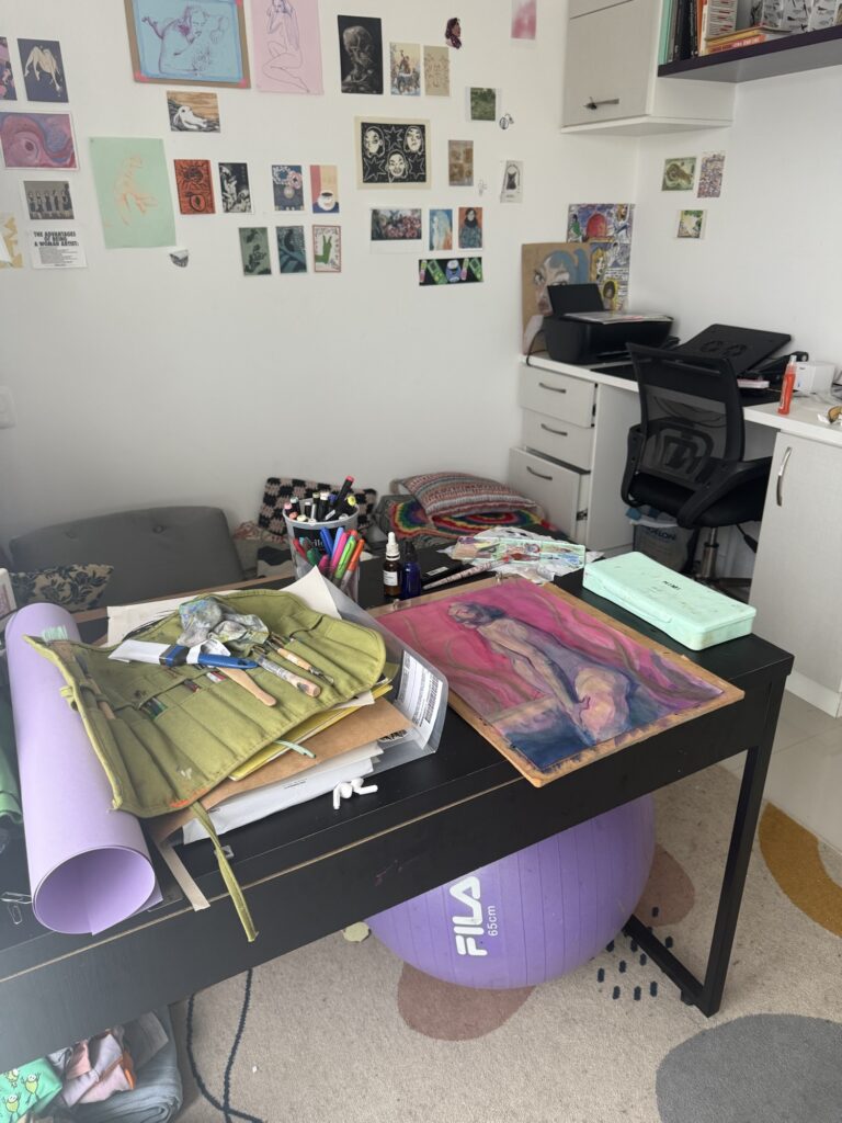
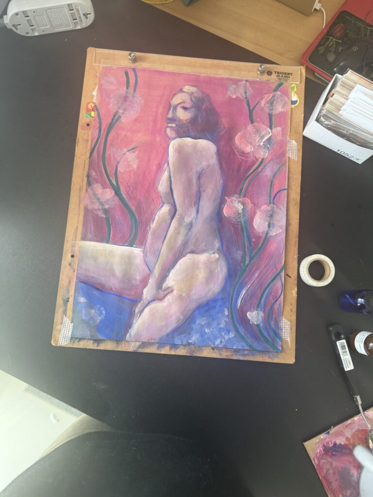
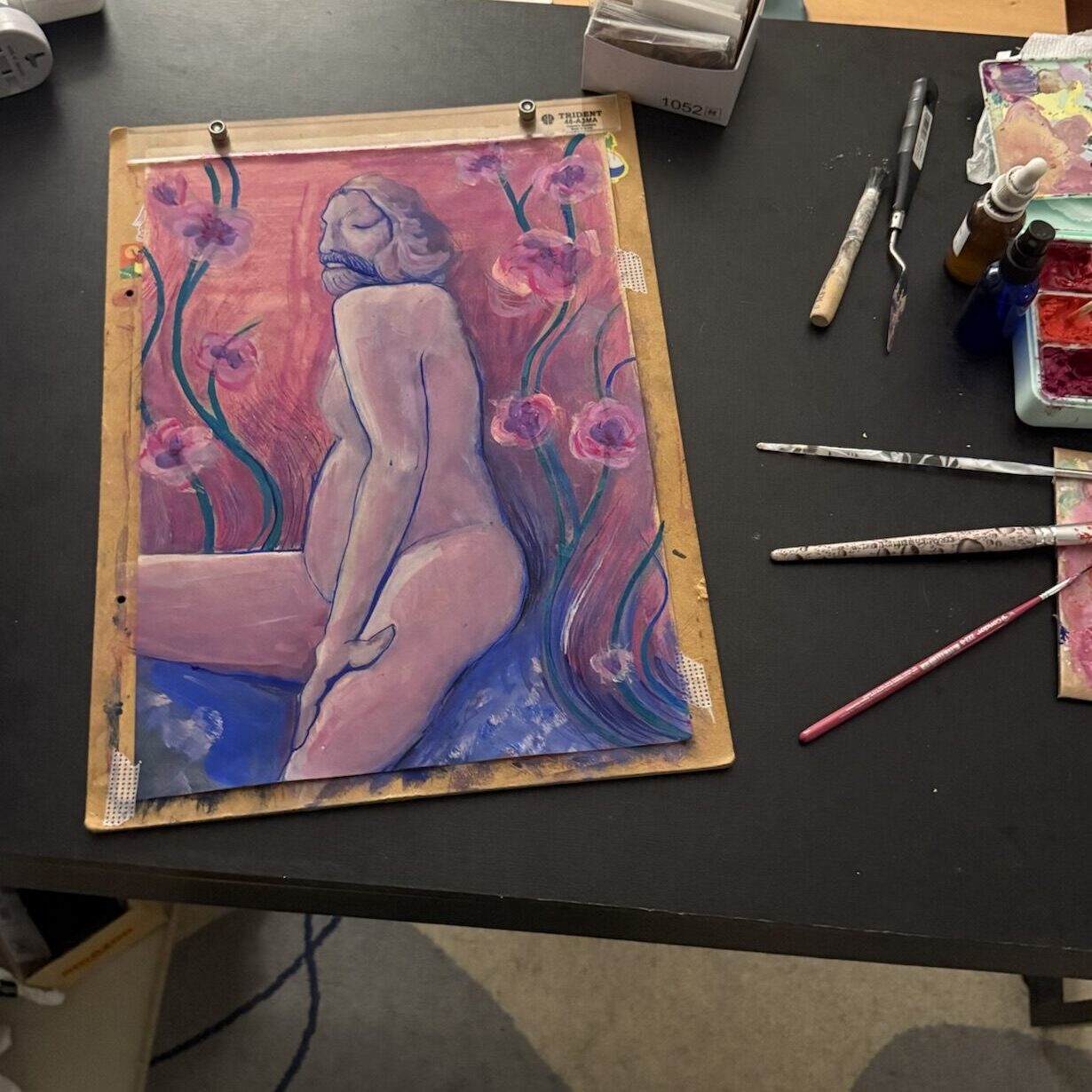
I’ve also been slowly working on a painting over one of my figure drawing studies. It had a strong composition, and I wanted to play with layering gouache on top.
My usual struggles showed up right away: color composition. The anatomy and volume came out well, considering I wasn’t using much reference, but the colors are muddy and blending together too much. I’m also trying to avoid leaning on line-art for contrast, which is my comfort zone, so that’s a challenge too.
It’s not there yet, but it feels like it’s heading somewhere, and I’m enjoying sneaking in a few minutes of work on it when I can.
One Finished Project (Finally)
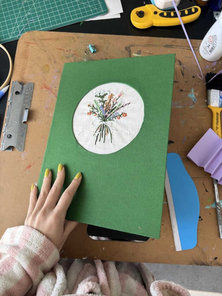
Among all these experiments, I did actually start and finish something: a beautiful embroidered notebook with Australian binding, made as a gift for my mom. That one I’m really happy with — a challenging piece with plenty of learning, but worth it. I am already working on a detailed process post all about this baby, so stay tuned for that. Here’s a sneak peak:
Reading Fuel
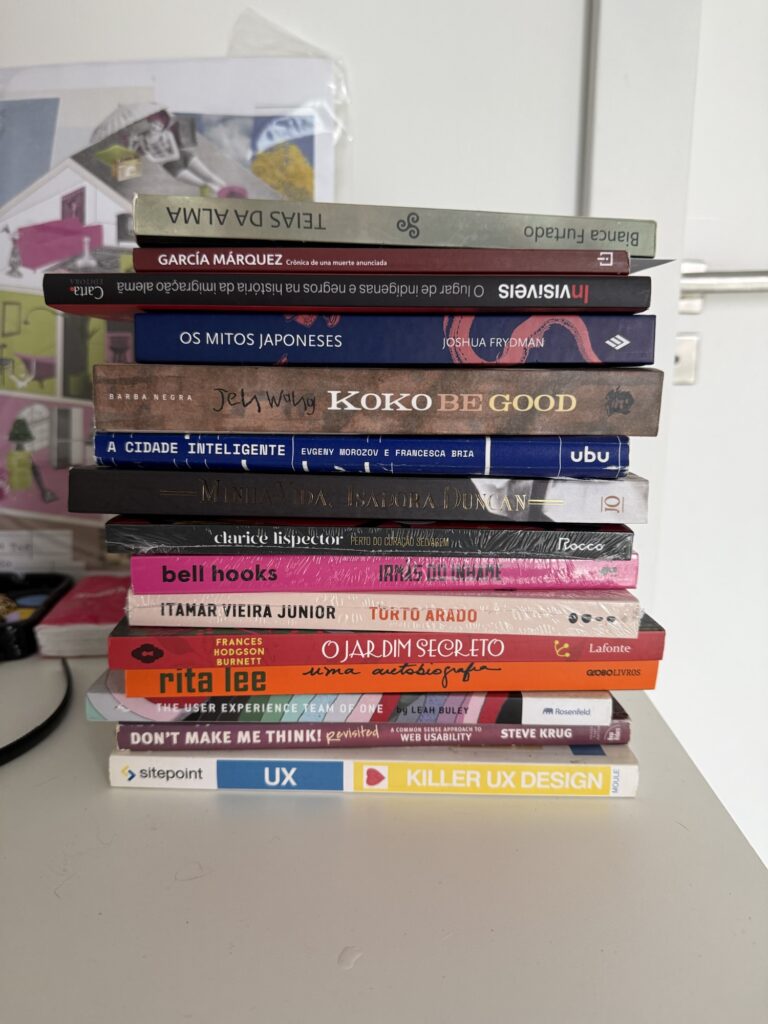
One activity that isn’t exactly “making,” but definitely feeds into my creative process, is reading. I’ve been trying to read more and even decided to double the number of books I’ve read this year. To help with that, I pulled a few titles from my to-be-read pile and went on a little book haul for extra motivation. Since taking this TBR picture, I finally finished a book I had been putting off forever, and I’m already a third of the way through Clarice Lispector’s ‘Perto do Coração Selvagem’ (Near to the Wild Heart ). I’m feeling good about my goal, my progress so far, and this renewed determination to keep reading. And of course, I’m always open to book recommendations if you have any!
That’s it for now. I’ll share more progress on the crochet and the gouache piece in future posts. And hopefully, I’ll manage another check-in sooner rather than later.