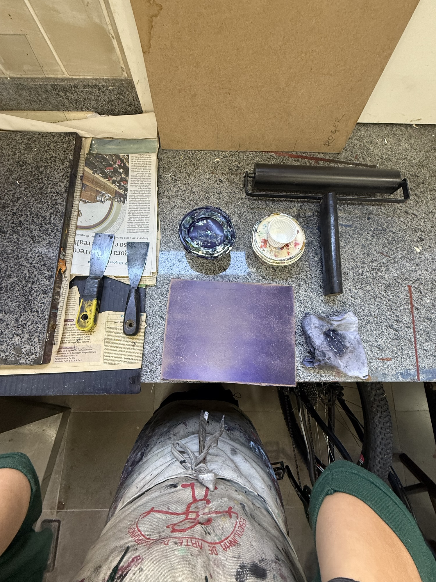
This was quite the week! We’re finally ready to begin the printing process, but first there were some last-minute preparations to be done before jumping straight in!
During the week before going to the studio I finished up the two supporting elements to my printing process:
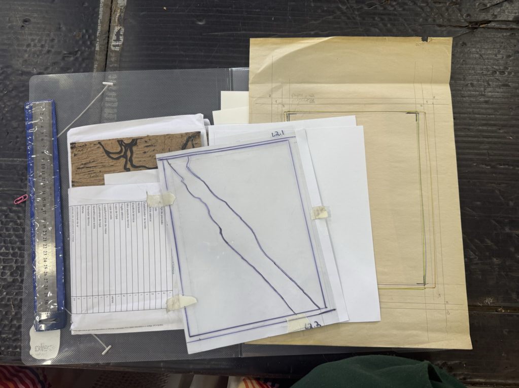
1. Cutting my masking shapes for printing two colors with one block (for the second and third layers). Note: I’ve been referring to the boards as layers 1-3, but from now on I’ll be referring to layers 1-4, counting the second block as 2 layers since it’s two colors, which are applied separately.
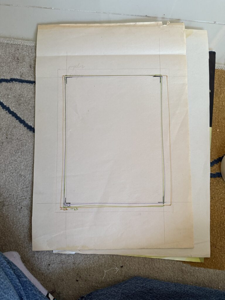
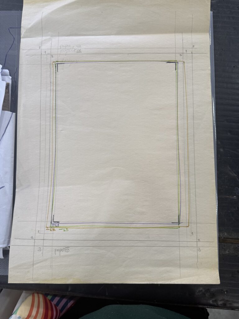
2. Creating the registration guide to help me print all colors aligned to each toner: It took me a while to get it right, but after a couple of trials and errors, I figured out my strategy.
This is a very simple guide system, where I align each layer facing up on the press, and then I align the bottom of the paper to the bottom edge of the guideline and let it fall forward into place. The boards are color-coded and clearly numbered on the back, and I drew an arrow pointing the way the board should go. These extra steps can help to avoid a lot of future mistakes, as I’ve learned the hard way. – I’m glad I did this at home without the pressure of other people watching me, so I could really connect with my intuition and come up with the best strategy for myself. In the future, I want to experiment with the registration tags, but I have not yet figured out how to create them at home.
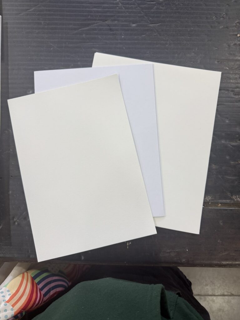
3. Cutting the paper for the prints: I had done this step previously, or so I thought. When I went to count my papers, there were only 6 sheets cut to size for my design. I could not find the same paper I had used, and the dimensions I had created did not fit efficiently in my available papers. To not waste material, I cut some sheets a bit larger and with a different weight than the first batch. (If I had cut the paper with the same size, I would be left with thin stripes of paper that I don’t have a use for besides recycling into more paper, and the thicker border enhances the design). With that, I had a total of 16 or so sheets made, when I found a closed package of high-quality Canson paper in A4, so I decided to take a few sheets of this too, to complete 20.
At this point, I’m bothered by this mismatch of papers, but at the same time, I want to work with what I have and avoid wasting materials. I reassure myself: “Who cares… It’s not like I’m selling this, and I enjoy the explorative process of creating non-identical prints!” But I will come back to debate this later on…
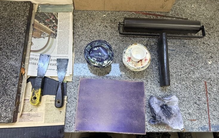
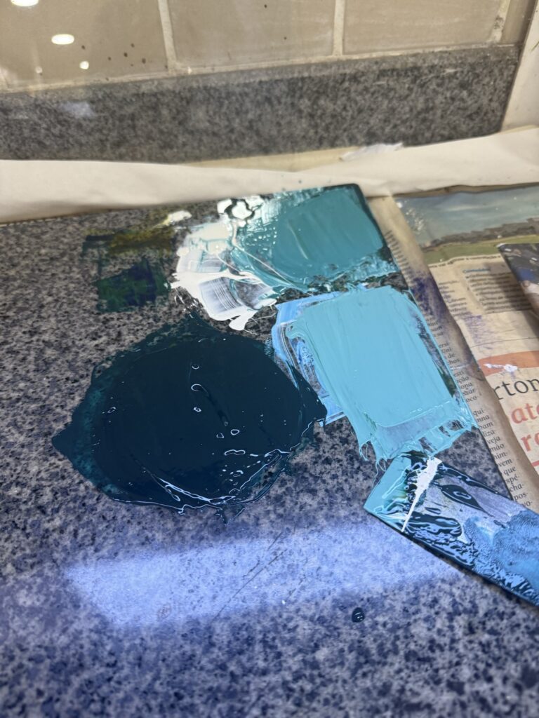
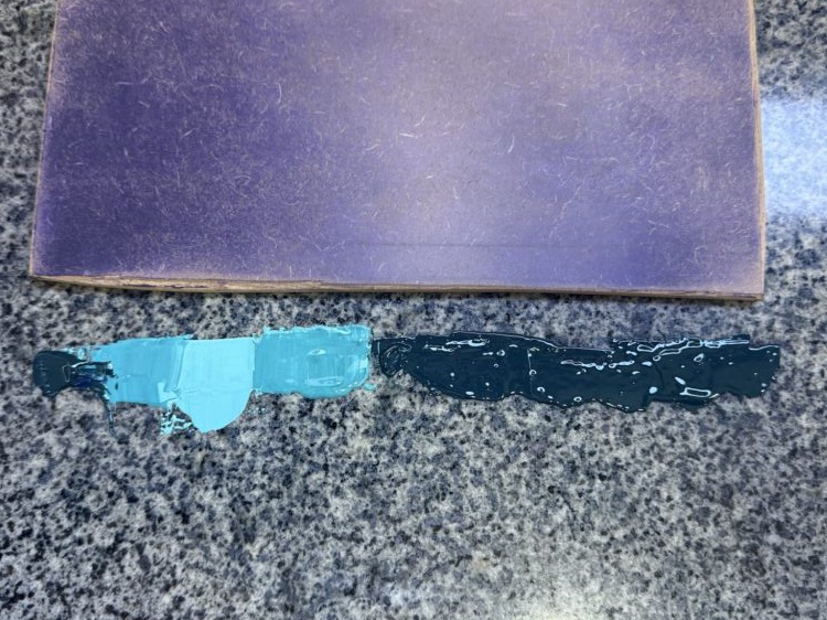
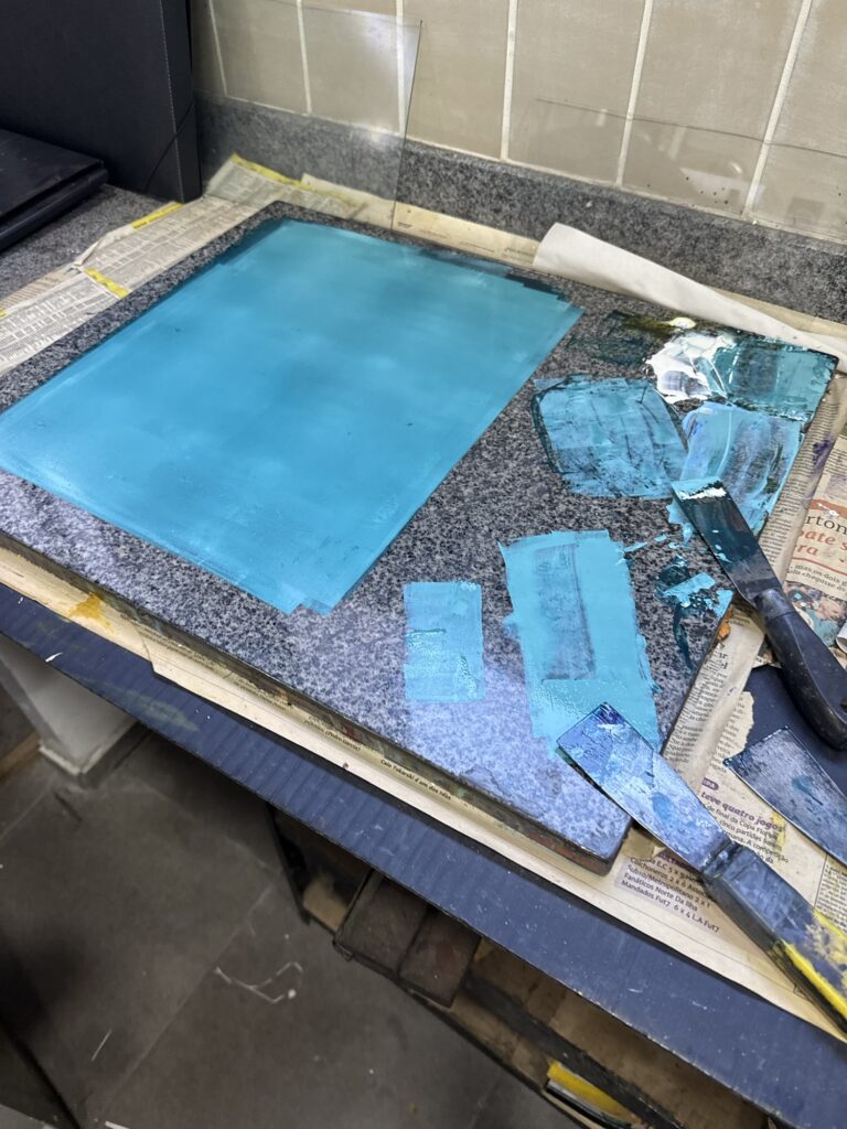
At the studio, I jumped right into work! I started by choosing the colors for the gradient and asked for Bebeto’s help to choose the best blue (so not to end up with purple this time). I blended blue, green, and white inks to achieve these 3 tones of tourquise – image below – (after some trial and errors, of course; Too much green, too much oil, too little paint… I always get a bit anxious mixing paints because I don’t want to waste material -it’s a theme, isn’t it? – but I often end up not making enough paint and waste more material this way… I’m getting more confident with practice, but I need to learn that sometimes being generous with the materials actually prevents more waste than the other way around.)
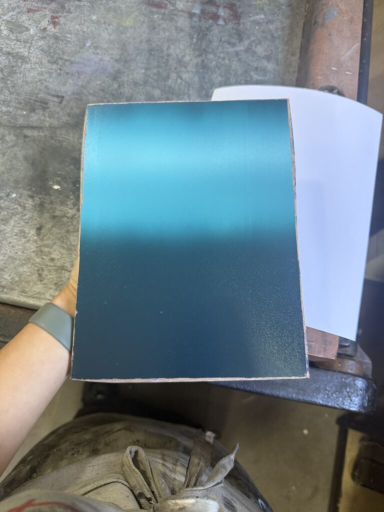
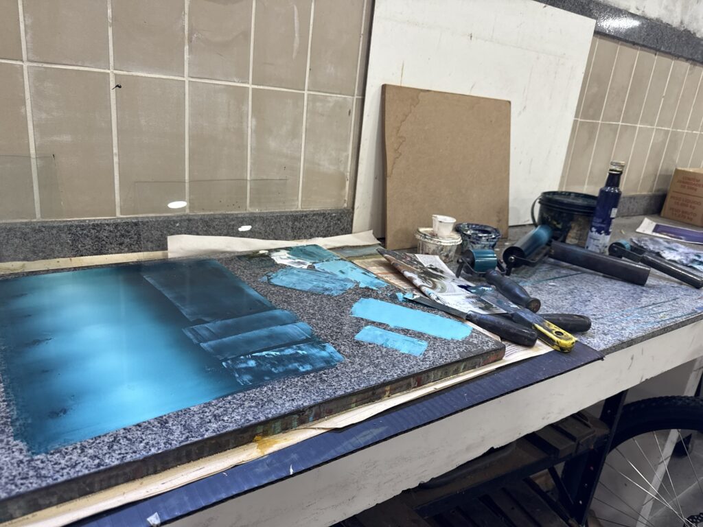
To make the gradient I chose a roll that was wider than my board, and used my board as a guide to create the gradient – since I wanted horizontal stripes I lay the board on its side and use the height as the measure for setting the ink in place. Then I rolled it out carefully to blend the colors, and it resulted in this beautiful linear gradient:
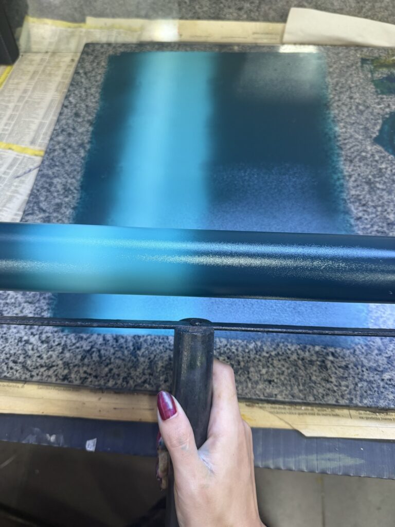
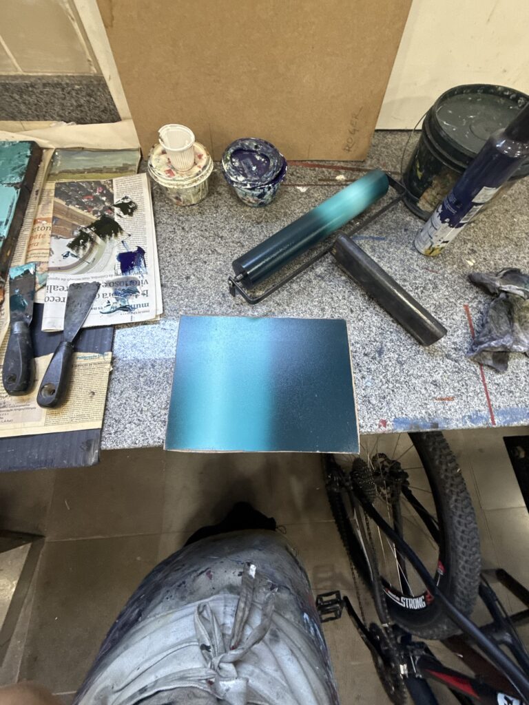
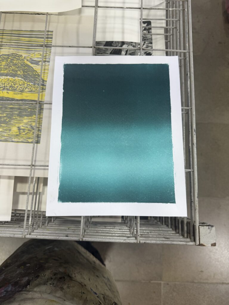
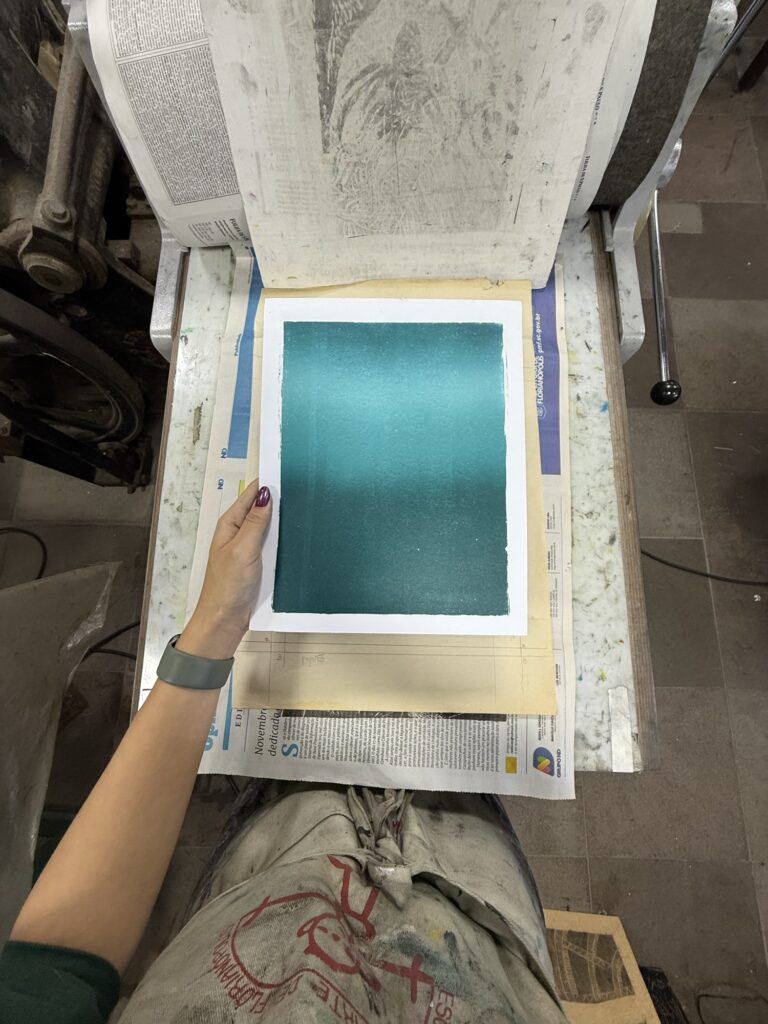
I was anxious to pull the first print… I took my time aligning the board and the paper, and letting it go carefully so the paper would fall aligned correctly. Surprisingly it all went well and my first print came out beautiful! A nice smooth gradient with the right colors and in the right proportions, with no excess of texture or other glaring mistakes that bothered me. I had enough ink to create 4 mostly identical prints.
With the gradient’s leftover gradient on the roll and on my working surface I diceded to do some experiments, against Leo’s (Bebeto’s assistant/studio manager) warnings of the limitations of woodblock printing.
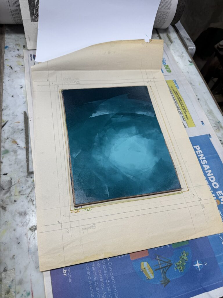
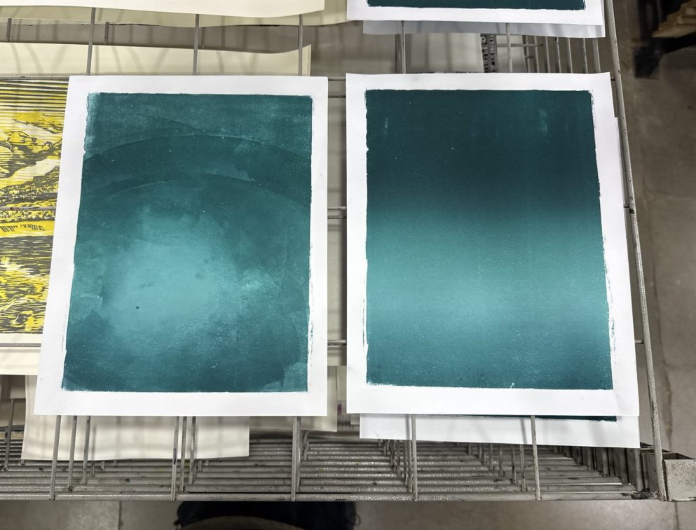
I had two sheets of paper on this batch, so I made two makeshift radial gradient prints using a couple of narrow rolls and an improvised technique: grabbing bits of color and applying to the board in circular motions, slowly mixing, moving and working with the tones.
The first trial came out beautiful, perfection, I love it. The second came out worse, there was even less paint on the stone now and the colors started to blend too much. Still might come out nice with the other layers added on top but we will see. (You can see the result of the last attempt at the end of the video below.)
At this point, I had used all the 8 sheets of paper of this set, but I did not have enough of the dark tourquise paint mixed to pull more prints. I took a quick break to think about my next steps and weight my options: I could try mixing more paint of the same color but my working station was pretty dirty already and I would probably need to clean up the whole thing and start the process over. I only had a couple hours left before the studio closed and I did not want to rush. Also I’m not super sure about the different paper sizes; I had a lot of questions and doubts about how to organize the series in the three paper sizes… Should I have them all be identical? Should I use the opportunity to have different color options on different papers? Do I still call it a series if they are all identical? (They are already not identical at this point since I did two freestyle/mono prints, so how do I split this). What order should I do things: print this first batch all the way through and go from there or print all sheets with layer 1?
This is something I struggled a lot last year and I’m starting to understand that it’s a theme on my work. I love making complex pieces with multiple layers, gradients and colors, and I tend to experiment as I go with variations throughout the whole process. I’ve done lots of research about how to number and signify prints in a series and varied editions, but I still don’t feel secure about making these choices. From my understanding it’s up to me at the end of the day, but why is it so hard to decide? I feel like I might need to decide on a personal system to how to deal with series for my work, and what I consider a variation and/or a series. I want to do more research and talk to other artists to make this decision though.
For now, I’ve decided to not make a real decision and just finish printing out these 6 copies I’ve started all the way through and see what I want to do at the end. I can chose if I want to make variations or not after testing printing the different layers and planned colors to learn from it and what I could/would want to do differently.
After this break, I still had to clean up my station, that although I did not have enough dark touruise it had plenty of the lighter tones, so I decided to do some prints of the third layer by itself with this nice aqua color. I really enjoyed the shape of this layer and I was already planning on doing some prints of it by itself so this was perfect. I love the results and the color came out beautiful! I did two pulls on those “extra” Canson sheets I had brought in. Between printing copies 1 and 2 I cleaned up the boarders of the design a bit – so that the noise would not go past the design boarders. Although it might look nice as a standalone print, I want to keep the boarders of the oficial design as clean as possible.
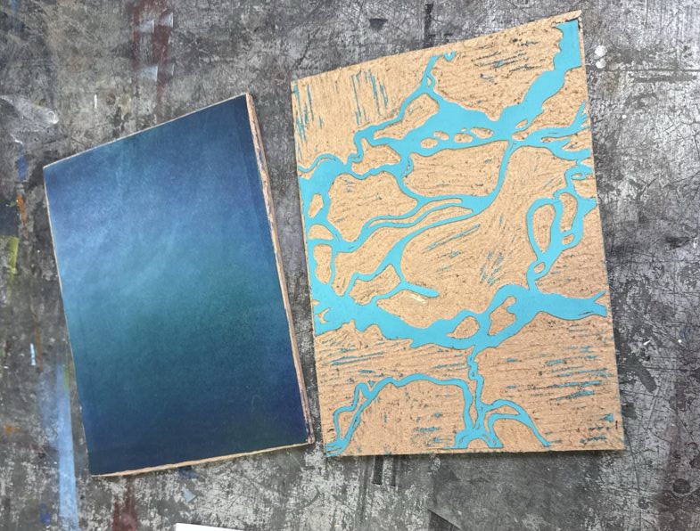
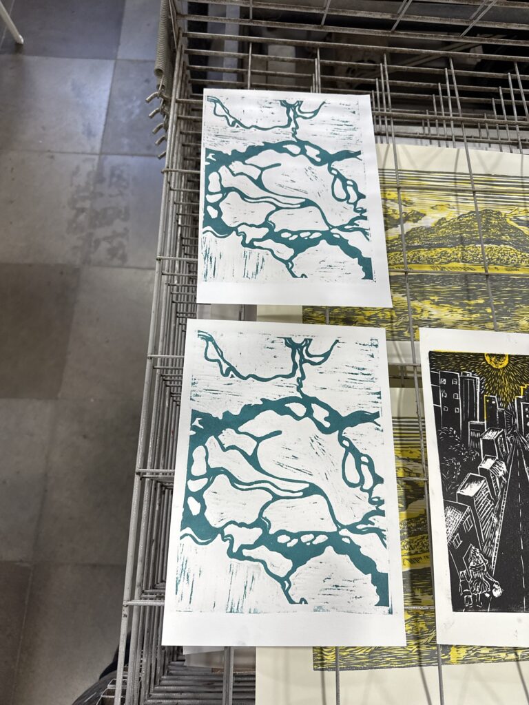
I took the rest of my time at the studio to clean up a bit and talk with my peers about their projects and get some feedback and ideas about my process too. Leo was talking about how the colors might end up mixing or changing once the layers are printed on top of one another, and it is something important to consider. For example the last layer was design to be an icy white but just by adding white it will become blue tinted by being printed on top of a blue base. Let’s see how layer 2 goes next week, when I’ll put to test the masking layer!
Check out last week’s studio log:
Context note: “Xilo is a nickname in Portuguese for woodblock printing. It’s a prefix related to wood, and it has Greek roots.“
‘Till next week, crafters!