This week marked the final round of testing for the Pool piece — all that was left was printing the last layer. Since I’d already learned (the hard way) that I’d need a new guide to align everything properly, I came in calm, focused, and ready. I felt good about where things were heading, and I was genuinely excited to refine the process ahead of the official print run.
I came in with a friend — we were catching up on the way, and he has another friend who works at the studio, so he popped in to take a look around. He didn’t stay long, though; I was laser-focused on getting this piece DONE.
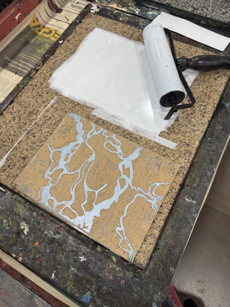
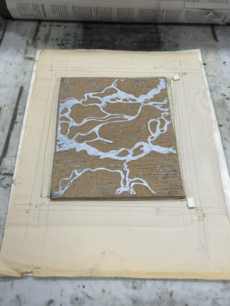
I set everything up: dry prints, the matrix for the third layer, tools, and ink. Originally, I’d designed the final layer as a very light blue. But knowing how transparent it might look on a dark background, I decided to test with plain white ink first — just to see how it would react when layered.
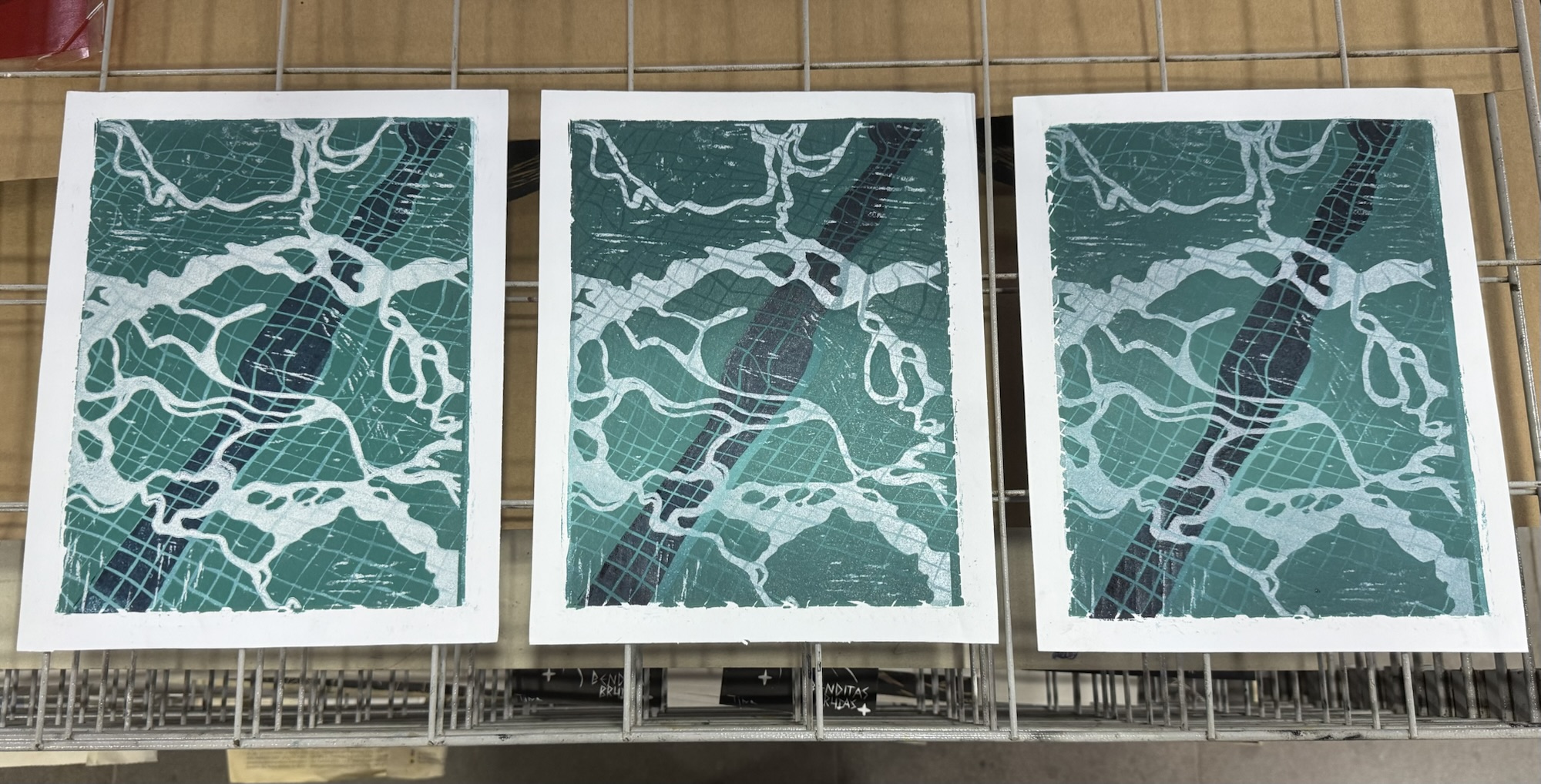
I printed three variations, each with a different level of ink saturation. Here’s how they turned out:
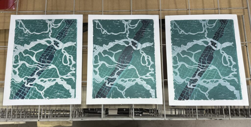
I was so happy with the color — no need to add blue at all! The middle option was my favorite; the way the colors layered and interacted felt just right.
I did notice some texture left behind from this layer that I think I’ll need to clean up. Normally, I like leaving behind a bit of that raw woodblock texture — it gives a nice handmade feel and shows the printing method. But in this case, where the piece is really graphic and clean, the rough edges are doing more harm than good. I’ll plan to clean up the matrix before I do the next round of printing.
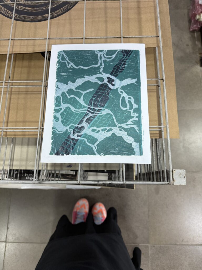
Honestly, once I pulled the third layer, I was amazed. The depth and light came together beautifully — almost magically. Sure, there are some dirty bits on the edges and my layers still need better alignment (my studio mates keep reminding me, haha), but those are exactly the kinds of things I can now fine-tune with confidence. The colors are working. The concept holds up. That moment when all the layers finally come together — even in test form — is one of the most rewarding parts of printmaking.
With that part done, I moved on to repairing the board from layer two. Remember how I lost a square last time? Well, turns out even more little bits had chipped off. I used wood putty to patch everything up, being careful to keep the surface level — not too smooth, so it sands evenly without flattening out too much. It’s a tricky balance, but it’s ready for the next phase.
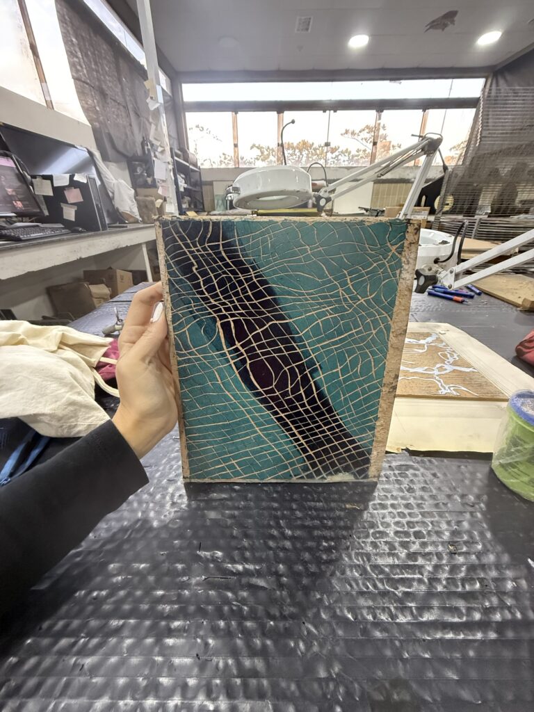
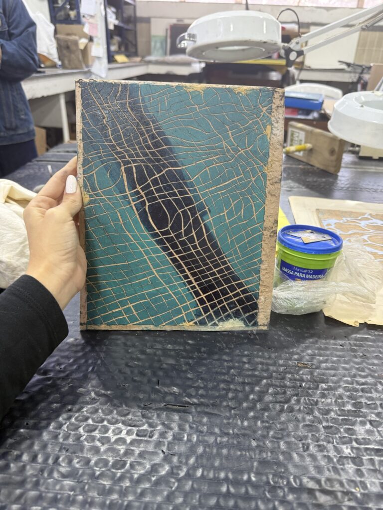
So! With tests wrapped up and boards repaired, I’m finally set to start the official print run for this piece. But that’s a story for next time.
I wrapped up with some good studio chitchat and headed home a little early — proud, satisfied, and very ready for what’s next.
Check out last week’s studio log:
Context note: “Xilo is a nickname in Portuguese for woodblock printing. It’s a prefix related to wood, and it has Greek roots.“
‘Till next week, crafters!